Smart Alex

Alex was aptly named because she’s, like, super smart. She likes teaching people, and her hobby is posing people questions so that she can explain the answers to them. Alex appears at the end of each chapter of Discovering Statistics Using R and RStudio (2nd edition) to pose you some questions and give you tasks to help you to practice your data analysis skills. This page contains her answers to those questions.
This document contains abridged sections from Discovering Statistics Using R and RStudio by Andy Field so there are some copyright considerations. You can use this material for teaching and non-profit activities but please do not meddle with it or claim it as your own work. See the full license terms at the bottom of the page.
General tips
When attempting these tasks, remember to use a setup code chunk at the start of your Quarto document (below the yaml) and load any packages you need using library(). In general, most tasks are likely to use the tidyverse and easystats packages so as a bare minimum your setup code chunk should contain
Many tasks will require you to load data. You can do this in one of two ways. The easiest is to grab the data directly from the discovr package using the general code:
my_tib <- discovr::name_of_datain which you replace my_tib with the name you wish to give the data once loaded and name_of_data is the data you wish to load. In RStudio if you type discovr:: it will list the datasets available. For example, to load the data called students into a tibble called students_tib we’d execute:
students_tib <- discovr::studentsAlternatively, download the CSV file from https://www.discovr.rocks/csv/name_of_file replacing name_of_file with the name of the csv file. For example, to download students.csv use this url: https://www.discovr.rocks/csv/students.csv
Set up an RStudio project (exactly as described in Chapter 4), place the csv file in your data folder and use this general code:
in which you replace my_tib with the name you wish to give the data once loaded and name_of_file.csv is the name of the file you wish to read into here to locate the file within the project and read_csv() to read it into students.csv you would execute
Chapter 1
Task 1.1
What are (broadly speaking) the five stages of the research process?
- Generating a research question: through an initial observation (hopefully backed up by some data).
- Generate a theory to explain your initial observation.
- Generate hypotheses: break your theory down into a set of testable predictions.
- Collect data to test the theory: decide on what variables you need to measure to test your predictions and how best to measure or manipulate those variables.
- Analyse the data: look at the data visually and by fitting a statistical model to see if it supports your predictions (and therefore your theory). At this point you should return to your theory and revise it if necessary.
Task 1.2
What is the fundamental difference between experimental and correlational research?
In a word, causality. In experimental research we manipulate a variable (predictor, independent variable) to see what effect it has on another variable (outcome, dependent variable). This manipulation, if done properly, allows us to compare situations where the causal factor is present to situations where it is absent. Therefore, if there are differences between these situations, we can attribute cause to the variable that we manipulated. In correlational research, we measure things that naturally occur and so we cannot attribute cause but instead look at natural covariation between variables.
Task 1.3
What is the level of measurement of the following variables?
- The number of downloads of different bands’ songs on iTunes:
- This is a discrete ratio measure. It is discrete because you can download only whole songs, and it is ratio because it has a true and meaningful zero (no downloads at all).
- The names of the bands downloaded.
- This is a nominal variable. Bands can be identified by their name, but the names have no meaningful order. The fact that Norwegian black metal band 1349 called themselves 1349 does not make them better than British boy-band has-beens 911; the fact that 911 were a bunch of talentless idiots does, though.
- Their positions in the download chart.
- This is an ordinal variable. We know that the band at number 1 sold more than the band at number 2 or 3 (and so on) but we don’t know how many more downloads they had. So, this variable tells us the order of magnitude of downloads, but doesn’t tell us how many downloads there actually were.
- The money earned by the bands from the downloads.
- This variable is continuous and ratio. It is continuous because money (pounds, dollars, euros or whatever) can be broken down into very small amounts (you can earn fractions of euros even though there may not be an actual coin to represent these fractions).
- The weight of drugs bought by the band with their royalties.
- This variable is continuous and ratio. If the drummer buys 100 g of cocaine and the singer buys 1 kg, then the singer has 10 times as much.
- The type of drugs bought by the band with their royalties.
- This variable is categorical and nominal: the name of the drug tells us something meaningful (crack, cannabis, amphetamine, etc.) but has no meaningful order.
- The phone numbers that the bands obtained because of their fame.
- This variable is categorical and nominal too: the phone numbers have no meaningful order; they might as well be letters. A bigger phone number did not mean that it was given by a better person.
- The gender of the people giving the bands their phone numbers.
- This variable is categorical: the people dishing out their phone numbers could fall into one of several categories based on how they self-identify when asked about their gender (their gender identity could be fluid). Taking a very simplistic view of gender, the variable might contain categories of male, female, and non-binary.
- This variable is categorical: the people dishing out their phone numbers could fall into one of several categories based on how they self-identify when asked about their gender (their gender identity could be fluid). Taking a very simplistic view of gender, the variable might contain categories of male, female, and non-binary.
- The instruments played by the band members.
- This variable is categorical and nominal too: the instruments have no meaningful order but their names tell us something useful (guitar, bass, drums, etc.).
- The time they had spent learning to play their instruments.
- This is a continuous and ratio variable. The amount of time could be split into infinitely small divisions (nanoseconds even) and there is a meaningful true zero (no time spent learning your instrument means that, like 911, you can’t play at all).
Task 1.4
Say I own 857 CDs. My friend has written a computer program that uses a webcam to scan my shelves in my house where I keep my CDs and measure how many I have. His program says that I have 863 CDs. Define measurement error. What is the measurement error in my friend’s CD counting device?
Measurement error is the difference between the true value of something and the numbers used to represent that value. In this trivial example, the measurement error is 6 CDs. In this example we know the true value of what we’re measuring; usually we don’t have this information, so we have to estimate this error rather than knowing its actual value.
Task 1.5
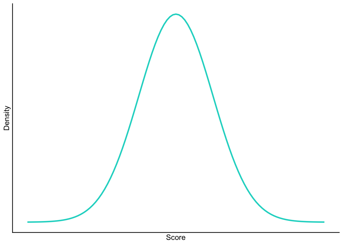
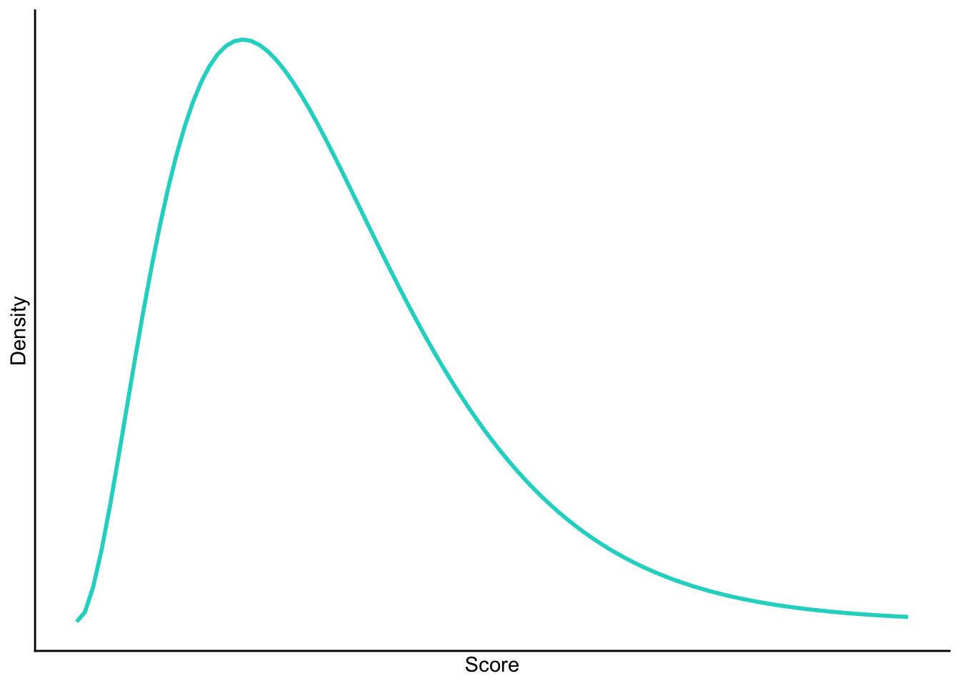
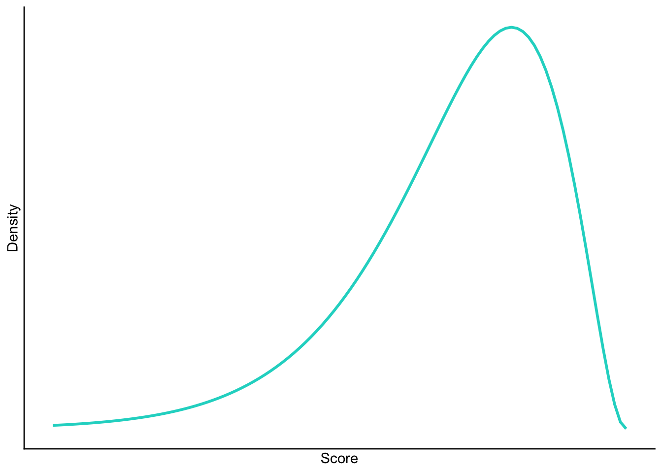
Sketch the shape of a normal distribution, a positively skewed distribution and a negatively skewed distribution.
Normal
Positive skew
Negative skew
Task 1.6
In 2011 I got married and we went to Disney Florida for our honeymoon. We bought some bride and groom Mickey Mouse hats and wore them around the parks. The staff at Disney are really nice and upon seeing our hats would say ‘congratulations’ to us. We counted how many times people said congratulations over 7 days of the honeymoon: 5, 13, 7, 14, 11, 9, 17. Calculate the mean, median, sum of squares, variance and standard deviation of these data.
First compute the mean:
\[ \begin{aligned} \overline{X} &= \frac{\sum_{i=1}^{n} x_i}{n} \\ &= \frac{5+13+7+14+11+9+17}{7} \\ &= \frac{76}{7} \\ &= 10.86 \end{aligned} \]
To calculate the median, first let’s arrange the scores in ascending order: 5, 7, 9, 11, 13, 14, 17. The median will be the (n + 1)/2th score. There are 7 scores, so this will be the 8/2 = 4th. The 4th score in our ordered list is 11.
To calculate the sum of squares, first take the mean from each score, then square this difference, finally, add up these squared values:
| Score | Error (score - mean) | Error squared | |
|---|---|---|---|
| 5 | -5.86 | 34.34 | |
| 13 | 2.14 | 4.58 | |
| 7 | -3.86 | 14.90 | |
| 14 | 3.14 | 9.86 | |
| 11 | 0.14 | 0.02 | |
| 9 | -1.86 | 3.46 | |
| 17 | 6.14 | 37.70 | |
| Total | — | — | 104.86 |
So, the sum of squared errors is (Table 1):
\[ \begin{aligned} \text{SS} &= 34.34 + 4.58 + 14.90 + 9.86 + 0.02 + 3.46 + 37.70 \\ &= 104.86 \\ \end{aligned} \]
The variance is the sum of squared errors divided by the degrees of freedom:
\[ \begin{aligned} s^2 &= \frac{SS}{N - 1} \\ &= \frac{104.86}{6} \\ &= 17.48 \end{aligned} \]
The standard deviation is the square root of the variance:
\[ \begin{aligned} s &= \sqrt{s^2} \\ &= \sqrt{17.48} \\ &= 4.18 \end{aligned} \]
Task 1.7
In this chapter we used an example of the time taken for 21 heavy smokers to fall off a treadmill at the fastest setting (18, 16, 18, 24, 23, 22, 22, 23, 26, 29, 32, 34, 34, 36, 36, 43, 42, 49, 46, 46, 57). Calculate the sums of squares, variance and standard deviation of these data.
To calculate the sum of squares, take the mean from each value, then square this difference. Finally, add up these squared values (the values in the final column). The sum of squared errors is a massive 2685.24 (Table 2).
| Score | Mean | Difference | Difference squared | |
|---|---|---|---|---|
| 18 | 32.19 | -14.19 | 201.356 | |
| 16 | 32.19 | -16.19 | 262.116 | |
| 18 | 32.19 | -14.19 | 201.356 | |
| 24 | 32.19 | -8.19 | 67.076 | |
| 23 | 32.19 | -9.19 | 84.456 | |
| 22 | 32.19 | -10.19 | 103.836 | |
| 22 | 32.19 | -10.19 | 103.836 | |
| 23 | 32.19 | -9.19 | 84.456 | |
| 26 | 32.19 | -6.19 | 38.316 | |
| 29 | 32.19 | -3.19 | 10.176 | |
| 32 | 32.19 | -0.19 | 0.036 | |
| 34 | 32.19 | 1.81 | 3.276 | |
| 34 | 32.19 | 1.81 | 3.276 | |
| 36 | 32.19 | 3.81 | 14.516 | |
| 36 | 32.19 | 3.81 | 14.516 | |
| 43 | 32.19 | 10.81 | 116.856 | |
| 42 | 32.19 | 9.81 | 96.236 | |
| 49 | 32.19 | 16.81 | 282.576 | |
| 46 | 32.19 | 13.81 | 190.716 | |
| 46 | 32.19 | 13.81 | 190.716 | |
| 57 | 32.19 | 24.81 | 615.536 | |
| Total | — | — | — | 2685.236 |
The variance is the sum of squared errors divided by the degrees of freedom (\(N-1\)). There were 21 scores and so the degrees of freedom were 20. The variance is, therefore:
\[ \begin{aligned} s^2 &= \frac{SS}{N - 1} \\ &= \frac{2685.24}{20} \\ &= 134.26 \end{aligned} \]
The standard deviation is the square root of the variance:
\[ \begin{aligned} s &= \sqrt{s^2} \\ &= \sqrt{134.26} \\ &= 11.59 \end{aligned} \]
Task 1.8
Sports scientists sometimes talk of a ‘red zone’, which is a period during which players in a team are more likely to pick up injuries because they are fatigued. When a player hits the red zone it is a good idea to rest them for a game or two. At a prominent London football club that I support, they measured how many consecutive games the 11 first team players could manage before hitting the red zone: 10, 16, 8, 9, 6, 8, 9, 11, 12, 19, 5. Calculate the mean, standard deviation, median, range and interquartile range.
First we need to compute the mean:
\[ \begin{aligned} \overline{X} &= \frac{\sum_{i=1}^{n} x_i}{n} \\ &= \frac{10+16+8+9+6+8+9+11+12+19+5}{11} \\ &= \frac{113}{11} \\ &= 10.27 \end{aligned} \]
Then the standard deviation, which we do as follows:
| Score | Error (score - mean) | Error squared | |
|---|---|---|---|
| 10 | -0.27 | 0.07 | |
| 16 | 5.73 | 32.83 | |
| 8 | -2.27 | 5.15 | |
| 9 | -1.27 | 1.61 | |
| 6 | -4.27 | 18.23 | |
| 8 | -2.27 | 5.15 | |
| 9 | -1.27 | 1.61 | |
| 11 | 0.73 | 0.53 | |
| 12 | 1.73 | 2.99 | |
| 19 | 8.73 | 76.21 | |
| 5 | -5.27 | 27.77 | |
| Total | — | — | 172.15 |
So, the sum of squared errors is (Table 3):
\[ \begin{aligned} \text{SS} &= 0.07 + 32.83 + 5.15 + 1.61 + 18.23 + 5.15 + 1.61 + 0.53 + 2.99 + 76.21 + 27.77 \\ &= 172.15 \\ \end{aligned} \]
The variance is the sum of squared errors divided by the degrees of freedom:
\[ \begin{aligned} s^2 &= \frac{SS}{N - 1} \\ &= \frac{172.15}{10} \\ &= 17.22 \end{aligned} \]
The standard deviation is the square root of the variance:
\[ \begin{aligned} s &= \sqrt{s^2} \\ &= \sqrt{17.22} \\ &= 4.15 \end{aligned} \]
- To calculate the median, range and interquartile range, first let’s arrange the scores in ascending order: 5, 6, 8, 8, 9, 9, 10, 11, 12, 16, 19. The median: The median will be the (\(n + 1\))/2th score. There are 11 scores, so this will be the 12/2 = 6th. The 6th score in our ordered list is 9 games. Therefore, the median number of games is 9.
- The lower quartile: This is the median of the lower half of scores. If we split the data at 9 (the 6th score), there are 5 scores below this value. The median of 5 = 6/2 = 3rd score. The 3rd score is 8, the lower quartile is therefore 8 games.
- The upper quartile: This is the median of the upper half of scores. If we split the data at 9 again (not including this score), there are 5 scores above this value. The median of 5 = 6/2 = 3rd score above the median. The 3rd score above the median is 12; the upper quartile is therefore 12 games.
- The range: This is the highest score (19) minus the lowest (5), i.e. 14 games.
- The interquartile range: This is the difference between the upper and lower quartile: 12−8 = 4 games.
Task 1.9
Celebrities always seem to be getting divorced. The (approximate) length of some celebrity marriages in days are: 240 (J-Lo and Cris Judd), 144 (Charlie Sheen and Donna Peele), 143 (Pamela Anderson and Kid Rock), 72 (Kim Kardashian, if you can call her a celebrity), 30 (Drew Barrymore and Jeremy Thomas), 26 (Axl Rose and Erin Everly), 2 (Britney Spears and Jason Alexander), 150 (Drew Barrymore again, but this time with Tom Green), 14 (Eddie Murphy and Tracy Edmonds), 150 (Renee Zellweger and Kenny Chesney), 1657 (Jennifer Aniston and Brad Pitt). Compute the mean, median, standard deviation, range and interquartile range for these lengths of celebrity marriages.
First we need to compute the mean:
\[ \begin{aligned} \overline{X} &= \frac{\sum_{i=1}^{n} x_i}{n} \\ &= \frac{240+144+143+72+30+26+2+150+14+150+1657}{11} \\ &= \frac{2628}{11} \\ &= 238.91 \end{aligned} \]
Then the standard deviation, which we do as follows:
| Score | Error (score - mean) | Error squared | |
|---|---|---|---|
| 240 | 1.09 | 1.19 | |
| 144 | -94.91 | 9007.91 | |
| 143 | -95.91 | 9198.73 | |
| 72 | -166.91 | 27858.95 | |
| 30 | -208.91 | 43643.39 | |
| 26 | -212.91 | 45330.67 | |
| 2 | -236.91 | 56126.35 | |
| 150 | -88.91 | 7904.99 | |
| 14 | -224.91 | 50584.51 | |
| 150 | -88.91 | 7904.99 | |
| 1657 | 1418.09 | 2010979.25 | |
| Total | — | — | 2268541 |
So, the sum of squared errors is the sum of the final column (Table 4). The variance is the sum of squared errors divided by the degrees of freedom:
\[ \begin{aligned} s^2 &= \frac{SS}{N - 1} \\ &= \frac{2268541}{10} \\ &= 226854.1 \end{aligned} \]
The standard deviation is the square root of the variance:
\[ \begin{aligned} s &= \sqrt{s^2} \\ &= \sqrt{226854.1} \\ &= 476.29 \end{aligned} \]
- To calculate the median, range and interquartile range, first let’s arrange the scores in ascending order: 2, 14, 26, 30, 72, 143, 144, 150, 150, 240, 1657. The median: The median will be the (n + 1)/2th score. There are 11 scores, so this will be the 12/2 = 6th. The 6th score in our ordered list is 143. The median length of these celebrity marriages is therefore 143 days.
- The lower quartile: This is the median of the lower half of scores. If we split the data at 143 (the 6th score), there are 5 scores below this value. The median of 5 = 6/2 = 3rd score. The 3rd score is 26, the lower quartile is therefore 26 days.
- The upper quartile: This is the median of the upper half of scores. If we split the data at 143 again (not including this score), there are 5 scores above this value. The median of 5 = 6/2 = 3rd score above the median. The 3rd score above the median is 150; the upper quartile is therefore 150 days.
- The range: This is the highest score (1657) minus the lowest (2), i.e. 1655 days.
- The interquartile range: This is the difference between the upper and lower quartile: 150−26 = 124 days.
Task 1.10
Repeat Task 9 but excluding Jennifer Anniston and Brad Pitt’s marriage. How does this affect the mean, median, range, interquartile range, and standard deviation? What do the differences in values between Tasks 9 and 10 tell us about the influence of unusual scores on these measures?
First let’s compute the new mean:
\[ \begin{aligned} \overline{X} &= \frac{\sum_{i=1}^{n} x_i}{n} \\ &= \frac{240+144+143+72+30+26+2+150+14+150}{11} \\ &= \frac{971}{11} \\ &= 97.1 \end{aligned} \]
The mean length of celebrity marriages is now 97.1 days compared to 238.91 days when Jennifer Aniston and Brad Pitt’s marriage was included. This demonstrates that the mean is greatly influenced by extreme scores.
Let’s now calculate the standard deviation excluding Jennifer Aniston and Brad Pitt’s marriage (Table 5):
| Score | Error (score - mean) | Error squared | |
|---|---|---|---|
| 240 | 142.9 | 20420.41 | |
| 144 | 46.9 | 2199.61 | |
| 143 | 45.9 | 2106.81 | |
| 72 | -25.1 | 630.01 | |
| 30 | -67.1 | 4502.41 | |
| 26 | -71.1 | 5055.21 | |
| 2 | -95.1 | 9044.01 | |
| 150 | 52.9 | 2798.41 | |
| 14 | -83.1 | 6905.61 | |
| 150 | 52.9 | 2798.41 | |
| Total | — | — | 56460.9 |
So, the sum of squared errors is:
\[ \begin{aligned} \text{SS} &= 20420.41 + 2199.61 + 2106.81 + 630.01 + 4502.41 + 5055.21 + 9044.01 + 2798.41 + 6905.61 + 2798.41 \\ &= 56460.90 \\ \end{aligned} \]
The variance is the sum of squared errors divided by the degrees of freedom:
\[ \begin{aligned} s^2 &= \frac{SS}{N - 1} \\ &= \frac{56460.90}{9} \\ &= 6273.43 \end{aligned} \]
The standard deviation is the square root of the variance:
\[ \begin{aligned} s &= \sqrt{s^2} \\ &= \sqrt{6273.43} \\ &= 79.21 \end{aligned} \]
From these calculations we can see that the variance and standard deviation, like the mean, are both greatly influenced by extreme scores. When Jennifer Aniston and Brad Pitt’s marriage was included in the calculations (see Smart Alex Task 9), the variance and standard deviation were much larger, i.e. 226854.09 and 476.29 respectively.
- To calculate the median, range and interquartile range, first, let’s again arrange the scores in ascending order but this time excluding Jennifer Aniston and Brad Pitt’s marriage: 2, 14, 26, 30, 72, 143, 144, 150, 150, 240.
- The median: The median will be the (n + 1)/2 score. There are now 10 scores, so this will be the 11/2 = 5.5th. Therefore, we take the average of the 5th score and the 6th score. The 5th score is 72, and the 6th is 143; the median is therefore 107.5 days.
- The lower quartile: This is the median of the lower half of scores. If we split the data at 107.5 (this score is not in the data set), there are 5 scores below this value. The median of 5 = 6/2 = 3rd score. The 3rd score is 26; the lower quartile is therefore 26 days.
- The upper quartile: This is the median of the upper half of scores. If we split the data at 107.5 (this score is not actually present in the data set), there are 5 scores above this value. The median of 5 = 6/2 = 3rd score above the median. The 3rd score above the median is 150; the upper quartile is therefore 150 days.
- The range: This is the highest score (240) minus the lowest (2), i.e. 238 days. You’ll notice that without the extreme score the range drops dramatically from 1655 to 238 – less than half the size.
- The interquartile range: This is the difference between the upper and lower quartile: 150 − 26 = 124 days of marriage. This is the same as the value we got when Jennifer Aniston and Brad Pitt’s marriage was included. This demonstrates the advantage of the interquartile range over the range, i.e. it isn’t affected by extreme scores at either end of the distribution
Chapter 2
Task 2.1
Why do we use samples?
We are usually interested in populations, but because we cannot collect data from every human being (or whatever) in the population, we collect data from a small subset of the population (known as a sample) and use these data to infer things about the population as a whole.
Task 2.2
What is the mean and how do we tell if it’s representative of our data?
The mean is a simple statistical model of the centre of a distribution of scores. A hypothetical estimate of the ‘typical’ score. We use the variance, or standard deviation, to tell us whether it is representative of our data. The standard deviation is a measure of how much error there is associated with the mean: a small standard deviation indicates that the mean is a good representation of our data.
Task 2.3
What’s the difference between the standard deviation and the standard error?
The standard deviation tells us how much observations in our sample differ from the mean value within our sample. The standard error tells us not about how the sample mean represents the sample itself, but how well the sample mean represents the population mean. The standard error is the standard deviation of the sampling distribution of a statistic. For a given statistic (e.g. the mean) it tells us how much variability there is in this statistic across samples from the same population. Large values, therefore, indicate that a statistic from a given sample may not be an accurate reflection of the population from which the sample came.
Task 2.4
In Chapter 1 we used an example of the time in seconds taken for 21 heavy smokers to fall off a treadmill at the fastest setting (18, 16, 18, 24, 23, 22, 22, 23, 26, 29, 32, 34, 34, 36, 36, 43, 42, 49, 46, 46, 57). Calculate standard error and 95% confidence interval for these data.
If you did the tasks in Chapter 1, you’ll know that the mean is 32.19 seconds:
\[ \begin{aligned} \overline{X} &= \frac{\sum_{i=1}^{n} x_i}{n} \\ &= \frac{16+(2\times18)+(2\times22)+(2\times23)+24+26+29+32+(2\times34)+(2\times36)+42+43+(2\times46)+49+57}{21} \\ &= \frac{676}{21} \\ &= 32.19 \end{aligned} \]
We also worked out that the sum of squared errors was 2685.24; the variance was 2685.24/20 = 134.26; the standard deviation is the square root of the variance, so was \(\sqrt(134.26)\) = 11.59. The standard error will be:
\[ SE = \frac{s}{\sqrt{N}} = \frac{11.59}{\sqrt{21}} = 2.53 \]
The sample is small, so to calculate the confidence interval we need to find the appropriate value of t. First we need to calculate the degrees of freedom, \(N − 1\). With 21 data points, the degrees of freedom are 20. For a 95% confidence interval we can look up the value in the column labelled ‘Two-Tailed Test’, ‘0.05’ in the table of critical values of the t-distribution (Appendix). The corresponding value is 2.09. The confidence intervals is, therefore, given by:
\[ \begin{aligned} \text{95% CI}_\text{lower boundary} &= \overline{X}-(2.09 \times SE)) \\ &= 32.19 – (2.09 × 2.53) \\ & = 26.90 \\ \text{95% CI}_\text{upper boundary} &= \overline{X}+(2.09 \times SE) \\ &= 32.19 + (2.09 × 2.53) \\ &= 37.48 \end{aligned} \]
Task 2.5
What do the sum of squares, variance and standard deviation represent? How do they differ?
All of these measures tell us something about how well the mean fits the observed sample data. Large values (relative to the scale of measurement) suggest the mean is a poor fit of the observed scores, and small values suggest a good fit. They are also, therefore, measures of dispersion, with large values indicating a spread-out distribution of scores and small values showing a more tightly packed distribution. These measures all represent the same thing, but differ in how they express it. The sum of squared errors is a ‘total’ and is, therefore, affected by the number of data points. The variance is the ‘average’ variability but in units squared. The standard deviation is the average variation but converted back to the original units of measurement. As such, the size of the standard deviation can be compared to the mean (because they are in the same units of measurement).
Task 2.6
What is a test statistic and what does it tell us?
A test statistic is a statistic for which we know how frequently different values occur. The observed value of such a statistic is typically used to test hypotheses, or to establish whether a model is a reasonable representation of what’s happening in the population.
Task 2.7
What are Type I and Type II errors?
A Type I error occurs when we believe that there is a genuine effect in our population, when in fact there isn’t. A Type II error occurs when we believe that there is no effect in the population when, in reality, there is.
Task 2.8
What is statistical power?
Power is the ability of a test to detect an effect of a particular size (a value of 0.8 is a good level to aim for).
Task 2.9
Figure 2.21 (in the book) shows two experiments that looked at the effect of singing versus conversation on how much time a woman would spend with a man. In both experiments the means were 10 (singing) and 12 (conversation), the standard deviations in all groups were 3, but the group sizes were 10 per group in the first experiment and 100 per group in the second. Compute the values of the confidence intervals displayed in the Figure.
Experiment 1:
In both groups, because they have a standard deviation of 3 and a sample size of 10, the standard error will be:
\[ SE = \frac{s}{\sqrt{N}} = \frac{3}{\sqrt{10}} = 0.95 \]
The sample is small, so to calculate the confidence interval we need to find the appropriate value of t. First we need to calculate the degrees of freedom, \(N − 1\). With 10 data points, the degrees of freedom are 9. For a 95% confidence interval we can look up the value in the column labelled ‘Two-Tailed Test’, ‘0.05’ in the table of critical values of the t-distribution (Appendix). The corresponding value is 2.26. The confidence interval for the singing group is, therefore, given by:
\[ \begin{aligned} \text{95% CI}_\text{lower boundary} &= \overline{X}-(2.26 \times SE) \\ &= 10 – (2.26 × 0.95) \\ & = 7.85 \\ \text{95% CI}_\text{upper boundary} &= \overline{X}+(2.26 \times SE) \\ &= 10 + (2.26 × 0.95) \\ &= 12.15 \end{aligned} \]
For the conversation group:
\[ \begin{aligned} \text{95% CI}_\text{lower boundary} &= \overline{X}-(2.26 \times SE) \\ &= 12 – (2.26 × 0.95) \\ & = 9.85 \\ \text{95% CI}_\text{upper boundary} &= \overline{X}+(2.26 \times SE) \\ &= 12 + (2.26 × 0.95) \\ &= 14.15 \end{aligned} \]
Experiment 2
In both groups, because they have a standard deviation of 3 and a sample size of 100, the standard error will be:
\[ SE = \frac{s}{\sqrt{N}} = \frac{3}{\sqrt{100}} = 0.3 \]
The sample is large, so to calculate the confidence interval we need to find the appropriate value of z. For a 95% confidence interval we should look up the value of 0.025 in the column labelled Smaller Portion in the table of the standard normal distribution (Appendix). The corresponding value is 1.96. The confidence interval for the singing group is, therefore, given by:
\[ \begin{aligned} \text{95% CI}_\text{lower boundary} &= \overline{X}-(1.96 \times SE) \\ &= 10 – (1.96 × 0.3) \\ & = 9.41 \\ \text{95% CI}_\text{upper boundary} &= \overline{X}+(1.96 \times SE) \\ &= 10 + (1.96 × 0.3) \\ &= 10.59 \end{aligned} \]
For the conversation group:
\[ \begin{aligned} \text{95% CI}_\text{lower boundary} &= \overline{X}-(1.96 \times SE) \\ &= 12 – (1.96 × 0.3) \\ & = 11.41 \\ \text{95% CI}_\text{upper boundary} &= \overline{X}+(1.96 \times SE) \\ &= 12 + (1.96 × 0.3) \\ &= 12.59 \end{aligned} \]
Task 2.10
Figure 2.22 shows a similar study to above, but the means were 10 (singing) and 10.01 (conversation), the standard deviations in both groups were 3, and each group contained 1 million people. Compute the values of the confidence intervals displayed in the figure.
In both groups, because they have a standard deviation of 3 and a sample size of 1,000,000, the standard error will be:
\[ SE = \frac{s}{\sqrt{N}} = \frac{3}{\sqrt{1000000}} = 0.003 \]
The sample is large, so to calculate the confidence interval we need to find the appropriate value of z. For a 95% confidence interval we should look up the value of 0.025 in the column labelled Smaller Portion in the table of the standard normal distribution (Appendix). The corresponding value is 1.96. The confidence interval for the singing group is, therefore, given by:
\[ \begin{aligned} \text{95% CI}_\text{lower boundary} &= \overline{X}-(1.96 \times SE) \\ &= 10 – (1.96 × 0.003) \\ & = 9.99412 \\ \text{95% CI}_\text{upper boundary} &= \overline{X}+(1.96 \times SE) \\ &= 10 + (1.96 × 0.003) \\ &= 10.00588 \end{aligned} \]
For the conversation group:
\[ \begin{aligned} \text{95% CI}_\text{lower boundary} &= \overline{X}-(1.96 \times SE) \\ &= 10.01 – (1.96 × 0.003) \\ & = 10.00412 \\ \text{95% CI}_\text{upper boundary} &= \overline{X}+(1.96 \times SE) \\ &= 10.01 + (1.96 × 0.003) \\ &= 10.01588 \end{aligned} \]
Note: these values will look slightly different than the plot because the exact means were 10.00147 and 10.01006, but we rounded off to 10 and 10.01 to make life a bit easier. If you use these exact values you’d get, for the singing group:
\[ \begin{aligned} \text{95% CI}_\text{lower boundary} &= \overline{X}-(1.96 \times SE) \\ &= 10.01006 – (1.96 × 0.003) \\ & = 9.99559 \\ \text{95% CI}_\text{upper boundary} &= \overline{X}+(1.96 \times SE) \\ &= 10.01006 + (1.96 × 0.003) \\ &= 10.00735 \end{aligned} \]
For the conversation group:
\[ \begin{aligned} \text{95% CI}_\text{lower boundary} &= \overline{X}-(1.96 \times SE) \\ &= 10.01006 – (1.96 × 0.003) \\ & = 10.00418 \\ \text{95% CI}_\text{upper boundary} &= \overline{X}+(1.96 \times SE) \\ &= 10.01006 + (1.96 × 0.003) \\ &= 10.01594 \end{aligned} \]
Task 2.11
In Chapter 1 (Task 8) we looked at an example of how many games it took a sportsperson before they hit the ‘red zone’ Calculate the standard error and confidence interval for those data.
We worked out in Chapter 1 that the mean was 10.27, the standard deviation 4.15, and there were 11 sportspeople in the sample. The standard error will be:
\[ SE = \frac{s}{\sqrt{N}} = \frac{4.15}{\sqrt{11}} = 1.25 \]
The sample is small, so to calculate the confidence interval we need to find the appropriate value of t. First we need to calculate the degrees of freedom, \(N − 1\). With 11 data points, the degrees of freedom are 10. For a 95% confidence interval we can look up the value in the column labelled ‘Two-Tailed Test’, ‘.05’ in the table of critical values of the t-distribution (Appendix). The corresponding value is 2.23. The confidence interval is, therefore, given by:
\[ \begin{aligned} \text{95% CI}_\text{lower boundary} &= \overline{X}-(2.23 \times SE) \\ &= 10.27 – (2.23 × 1.25) \\ & = 7.48 \\ \text{95% CI}_\text{upper boundary} &= \overline{X}+(2.23 \times SE) \\ &= 10.27 + (2.23 × 1.25) \\ &= 13.06 \end{aligned} \]
Task 2.12
At a rival club to the one I support, they similarly measured the number of consecutive games it took their players before they reached the red zone. The data are: 6, 17, 7, 3, 8, 9, 4, 13, 11, 14, 7. Calculate the mean, standard deviation, and confidence interval for these data.
First we need to compute the mean:
\[ \begin{aligned} \overline{X} &= \frac{\sum_{i=1}^{n} x_i}{n} \\ &= \frac{6+17+7+3+8+9+4+13+11+14+7}{11} \\ &= \frac{99}{11} \\ &= 9.00 \end{aligned} \]
Then the standard deviation, which we do as follows:
| Score | Error (score - mean) | Error squared | |
|---|---|---|---|
| 6 | -3 | 9 | |
| 17 | 8 | 64 | |
| 7 | -2 | 4 | |
| 3 | -6 | 36 | |
| 8 | -1 | 1 | |
| 9 | 0 | 0 | |
| 4 | -5 | 25 | |
| 13 | 4 | 16 | |
| 11 | 2 | 4 | |
| 14 | 5 | 25 | |
| 7 | -2 | 4 | |
| Total | — | — | 188 |
The sum of squared errors is (Table 6):
\[ \begin{aligned} \text{SS} &= 9 + 64 + 4 + 36 + 1 + 0 + 25 + 16 + 4 + 25 + 4 \\ &= 188 \\ \end{aligned} \]
The variance is the sum of squared errors divided by the degrees of freedom:
\[ \begin{aligned} s^2 &= \frac{SS}{N - 1} \\ &= \frac{188}{10} \\ &= 18.8 \end{aligned} \]
The standard deviation is the square root of the variance:
\[ \begin{aligned} s &= \sqrt{s^2} \\ &= \sqrt{18.8} \\ &= 4.34 \end{aligned} \]
There were 11 sportspeople in the sample, so the standard error will be: \[ SE = \frac{s}{\sqrt{N}} = \frac{4.34}{\sqrt{11}} = 1.31\]
The sample is small, so to calculate the confidence interval we need to find the appropriate value of t. First we need to calculate the degrees of freedom, \(N − 1\). With 11 data points, the degrees of freedom are 10. For a 95% confidence interval we can look up the value in the column labelled ‘Two-Tailed Test’, ‘0.05’ in the table of critical values of the t-distribution (Appendix). The corresponding value is 2.23. The confidence intervals is, therefore, given by:
\[ \begin{aligned} \text{95% CI}_\text{lower boundary} &= \overline{X}-(2.23\times SE)) \\ &= 9 – (2.23 × 1.31) \\ & = 6.08 \\ \text{95% CI}_\text{upper boundary} &= \overline{X}+(2.23\times SE) \\ &= 9 + (2.23 × 1.31) \\ &= 11.92 \end{aligned} \]
Task 2.13
In Chapter 1 (Task 9) we looked at the length in days of 11 celebrity marriages. Here are the approximate lengths in months of nine marriages, one being mine and the others being those of some of my friends and family. In all but two cases the lengths are calculated up to the day I’m writing this, which is 20 June 2023, but the 3- and 111-month durations are marriages that have ended – neither of these is mine, in case you’re wondering: 3, 144, 267, 182, 159, 152, 693, 50, and 111. Calculate the mean, standard deviation and confidence interval for these data.
First we need to compute the mean:
\[ \begin{aligned} \overline{X} &= \frac{\sum_{i=1}^{n} x_i}{n} \\ &= \frac{3 + 144 + 267 + 182 + 159 + 152 + 693 + 50 + 111}{9} \\ &= \frac{1761}{9} \\ &= 195.67 \end{aligned} \]
Compute the standard deviation as follows:
| Score | Error (score - mean) | Error squared | |
|---|---|---|---|
| 3 | -192.67 | 37121.73 | |
| 144 | -51.67 | 2669.79 | |
| 267 | 71.33 | 5087.97 | |
| 182 | -13.67 | 186.87 | |
| 159 | -36.67 | 1344.69 | |
| 152 | -43.67 | 1907.07 | |
| 693 | 497.33 | 247337.13 | |
| 50 | -145.67 | 21219.75 | |
| 111 | -84.67 | 7169.01 | |
| Total | — | — | 324044 |
The sum of squared errors is (Table 7):
\[ \begin{aligned} \text{SS} &= 37121.73 + 2669.79 + 5087.97 + 186.87 + 1344.69 + 1907.07 + 247337.13 + 21219.75 + 7169.01 \\ &= 324044 \\ \end{aligned} \]
The variance is the sum of squared errors divided by the degrees of freedom:
\[ \begin{aligned} s^2 &= \frac{SS}{N - 1} \\ &= \frac{324044}{8} \\ &= 40505.5 \end{aligned} \]
The standard deviation is the square root of the variance:
\[ \begin{aligned} s &= \sqrt{s^2} \\ &= \sqrt{40505.5} \\ &= 201.2598 \end{aligned} \]
The standard error is:
\[ \begin{aligned} SE &= \frac{s}{\sqrt{N}} \\ &= \frac{201.2598}{\sqrt{9}} \\ &= 67.0866 \end{aligned} \]
The sample is small, so to calculate the confidence interval we need to find the appropriate value of t. First we need to calculate the degrees of freedom, \(N − 1\). With 9 data points, the degrees of freedom are 8. For a 95% confidence interval we can look up the value in the column labelled ‘Two-Tailed Test’, ‘0.05’ in the table of critical values of the t-distribution (Appendix). The corresponding value is 2.31. The confidence interval is, therefore, given by:
\[ \begin{aligned} \text{95% CI}_\text{lower boundary} &= \overline{X}-(2.31 \times SE)) \\ &= 195.67 – (2.31 × 67.0866) \\ & = 40.70 \\ \text{95% CI}_\text{upper boundary} &= \overline{X}+(2.31 \times SE) \\ &= 195.67 + (2.31 × 67.0866) \\ &= 350.64 \end{aligned} \]
Chapter 3
Task 3.1
What is an effect size and how is it measured?
An effect size is an objective and standardized measure of the magnitude of an observed effect. Measures include Cohen’s d, the odds ratio and Pearson’s correlations coefficient, r. Cohen’s d, for example, is the difference between two means divided by either the standard deviation of the control group, or by a pooled standard deviation.
Task 3.2
In Chapter 1 (Task 8) we looked at an example of how many games it took a sportsperson before they hit the ‘red zone’, then in Chapter 2 we looked at data from a rival club. Compute and interpret Cohen’s \(\hat{d}\) for the difference in the mean number of games it took players to become fatigued in the two teams mentioned in those tasks.
Cohen’s d is defined as:
\[ \hat{d} = \frac{\bar{X_1}-\bar{X_2}}{s} \]
There isn’t an obvious control group, so let’s use a pooled estimate of the standard deviation:
\[ \begin{aligned} s_p &= \sqrt{\frac{(N_1-1) s_1^2+(N_2-1) s_2^2}{N_1+N_2-2}} \\ &= \sqrt{\frac{(11-1)4.15^2+(11-1)4.34^2}{11+11-2}} \\ &= \sqrt{\frac{360.23}{20}} \\ &= 4.24 \end{aligned} \]
Therefore, Cohen’s \(\hat{d}\) is:
\[ \hat{d} = \frac{10.27-9}{4.24} = 0.30 \]
Therefore, the second team fatigued in fewer matches than the first team by about 1/3 standard deviation. By the benchmarks that we probably shouldn’t use, this is a small to medium effect, but I guess if you’re managing a top-flight sports team, fatiguing 1/3 of a standard deviation faster than one of your opponents could make quite a substantial difference to your performance and team rotation over the season.
Task 3.3
Calculate and interpret Cohen’s \(\hat{d}\) for the difference in the mean duration of the celebrity marriages in Chapter 1 (Task 9) and me and my friend’s marriages (Chapter 2, Task 13).
Cohen’s \(\hat{d}\) is defined as:
\[ \hat{d} = \frac{\bar{X_1}-\bar{X_2}}{s} \]
There isn’t an obvious control group, so let’s use a pooled estimate of the standard deviation:
\[ \begin{aligned} s_p &= \sqrt{\frac{(N_1-1) s_1^2+(N_2-1) s_2^2}{N_1+N_2-2}} \\ &= \sqrt{\frac{(11-1)476.29^2+(9-1)8275.91^2}{11+9-2}} \\ &= \sqrt{\frac{550194093}{18}} \\ &= 5528.68 \end{aligned} \]
Therefore, Cohen’s d is: \[\hat{d} = \frac{5057-238.91}{5528.68} = 0.87\] Therefore, my friend’s marriages are 0.87 standard deviations longer than the sample of celebrities. By the benchmarks that we probably shouldn’t use, this is a large effect.
Task 3.4
What are the problems with null hypothesis significance testing?
- We can’t conclude that an effect is important because the p-value from which we determine significance is affected by sample size. Therefore, the word ‘significant’ is meaningless when referring to a p-value.
- The null hypothesis is never true. If the p-value is greater than .05 then we can decide to reject the alternative hypothesis, but this is not the same thing as the null hypothesis being true: a non-significant result tells us is that the effect is not big enough to be found but it doesn’t tell us that the effect is zero.
- A significant result does not tell us that the null hypothesis is false (see text for details).
- It encourages all or nothing thinking: if p < 0.05 then an effect is significant, but if p > 0.05 it is not. So, a p = 0.0499 is significant but a p = 0.0501 is not, even though these ps differ by only 0.0002.
Task 3.5
What is the difference between a confidence interval and a credible interval?
A 95% confidence interval is set so that before the data are collected there is a long-run probability of 0.95 (or 95%) that the interval will contain the true value of the parameter. This means that in 100 random samples, the intervals will contain the true value in 95 of them but won’t in 5. Once the data are collected, your sample is either one of the 95% that produces an interval containing the true value, or one of the 5% that does not. In other words, having collected the data, the probability of the interval containing the true value of the parameter is either 0 (it does not contain it) or 1 (it does contain it), but you do not know which. A credible interval is different in that it reflects the plausible probability that the interval contains the true value. For example, a 95% credible interval has a plausible 0.95 probability of containing the true value.
Task 3.6
What is a meta-analysis?
Meta-analysis is where effect sizes from different studies testing the same hypothesis are combined to get a better estimate of the size of the effect in the population.
Task 3.7
Describe what you understand by the term Bayes factor.
The Bayes factor is the ratio of the probability of the data given the alternative hypothesis to that of the data given the null hypothesis. A Bayes factor less than 1 supports the null hypothesis (it suggests the data are more likely given the null hypothesis than the alternative hypothesis); conversely, a Bayes factor greater than 1 suggests that the observed data are more likely given the alternative hypothesis than the null. Values between 1 and 3 are considered evidence for the alternative hypothesis that is ‘barely worth mentioning’, values between 3 and 10 are considered to indicate evidence for the alternative hypothesis that ‘has substance’, and values greater than 10 are strong evidence for the alternative hypothesis.
Task 3.8
Various studies have shown that students who use laptops in class often do worse on their modules (Payne-Carter et al., 2016). Table 3.3 (reproduced in in Table 8) shows some fabricated data that mimics what has been found. What is the odds ratio for passing the exam if the student uses a laptop in class compared to if they don’t?
| Laptop | No Laptop | Sum | |
|---|---|---|---|
| Pass | 24 | 49 | 73 |
| Fail | 16 | 11 | 27 |
| Sum | 40 | 60 | 100 |
First we compute the odds of passing when a laptop is used in class:
\[ \begin{aligned} \text{Odds}_{\text{pass when laptop is used}} &= \frac{\text{Number of laptop users passing exam}}{\text{Number of laptop users failing exam}} \\ &= \frac{24}{16} \\ &= 1.5 \end{aligned} \]
Next we compute the odds of passing when a laptop is not used in class:
\[ \begin{aligned} \text{Odds}_{\text{pass when laptop is not used}} &= \frac{\text{Number of students without laptops passing exam}}{\text{Number of students without laptops failing exam}} \\ &= \frac{49}{11} \\ &= 4.45 \end{aligned} \]
The odds ratio is the ratio of the two odds that we have just computed:
\[ \begin{aligned} \text{Odds Ratio} &= \frac{\text{Odds}_{\text{pass when laptop is used}}}{\text{Odds}_{\text{pass when laptop is not used}}} \\ &= \frac{1.5}{4.45} \\ &= 0.34 \end{aligned} \]
The odds of passing when using a laptop are 0.34 times those when a laptop is not used. If we take the reciprocal of this, we could say that the odds of passing when not using a laptop are 2.97 times those when a laptop is used.
Task 3.9
From the data in Table 3.1 (reproduced in Table 8) what is the conditional probability that someone used a laptop given that they passed the exam, p(laptop|pass). What is the conditional probability of that someone didn’t use a laptop in class given they passed the exam, p(no laptop |pass)?
The conditional probability that someone used a laptop given they passed the exam is 0.33, or a 33% chance:
\[ p(\text{laptop|pass})=\frac{p(\text{laptop ∩ pass})}{p(\text{pass})}=\frac{{24}/{100}}{{73}/{100}}=\frac{0.24}{0.73}=0.33 \]
The conditional probability that someone didn’t use a laptop in class given they passed the exam is 0.67 or a 67% chance.
\[ p(\text{no laptop|pass})=\frac{p(\text{no laptop ∩ pass})}{p(\text{pass})}=\frac{{49}/{100}}{{73}/{100}}=\frac{0.49}{0.73}=0.67 \]
Task 3.10
Using the data in Table 3.1 (reproduced in Table 8), what are the posterior odds of someone using a laptop in class (compared to not using one) given that they passed the exam?
The posterior odds are the ratio of the posterior probability for one hypothesis to another. In this example it would be the ratio of the probability that a used a laptop given that they passed (which we have already calculated above to be 0.33) to the probability that they did not use a laptop in class given that they passed (which we have already calculated above to be 0.67). The value turns out to be 0.49, which means that the probability that someone used a laptop in class if they passed the exam is about half of the probability that someone didn’t use a laptop in class given that they passed the exam.
\[ \text{posterior odds}= \frac{p(\text{hypothesis 1|data})}{p(\text{hypothesis 2|data})} = \frac{p(\text{laptop|pass})}{p(\text{no laptop| pass})} = \frac{0.33}{0.67} = 0.49 \]
Chapter 4
Task 4.1
Smart Alex’s first task for this chapter is to set up an RStudio project (you should have done this already if you’ve been following the chapter) and within the main project folder create folders called ‘data’, and ‘quarto’. Then create a Quarto document and follow the self-tests in the chapter to create a document containing some code and text.
This is a general video on workflow (note that I name the quarto folder as r_docs in this tutorial, but otherwise it follows the book chapter):
You can download a complete version of this file (chapter_4_self_tests.qmd) and it’s rendered output (chapter_4_self_tests.html) from www.discovr.rocks/repository/chapter_4_self_tests.zip.
Task 4.2
Render the document in Task 1, then locate the rendered file within your project folder.
A general tutorial on rendering is here:
You can download a complete version of this file (chapter_4_self_tests.qmd) and it’s rendered output (chapter_4_self_tests.html) from www.discovr.rocks/repository/chapter_4_self_tests.zip.
Task 4.3
The data below show the score (out of 20) for 20 different students, some of whom are male and some female, and some of whom were taught using positive reinforcement (being nice) and others who were taught using punishment (electric shock). Enter these data into a tibble. (Hint: the data below are in messy format, you need to enter them in tidy format.)
We have three variables here: sex (was the person male or female), the method of teaching they underwent and their mark on an assignment. Therefore, the tidy format is to arrange the data in three columns. There are several ways to do this, here’s one of them:
The data can be found in discovr::teaching (this version has an extra variable with the participant id).
Task 4.4
Thinking back to Labcoat Leni’s Real Research 4.1, Oxoby also measured the minimum acceptable offer; these MAOs (in dollars) are below (again, they are approximations based on the graphs in the paper). Enter these data into a tibble.
- Bon Scott group: 2, 3, 3, 3, 3, 4, 4, 4, 4, 4, 4, 4, 4, 5, 5, 5, 5, 5
- Brian Johnson group: 0, 1, 2, 2, 3, 3, 3, 3, 3, 4, 4, 4, 4, 4, 4, 4, 4, 1
The full data can be found in discovr::acdc
Task 4.5
According to some highly unscientific research done by a UK department store chain and reported in Marie Claire magazine, shopping is good for you. They found that the average woman spends 150 minutes and walks 2.6 miles when she shops, burning off around 385 calories. In contrast, men spend only about 50 minutes shopping, covering 1.5 miles. This was based on strapping a pedometer on a mere 10 participants. Although I don’t have the actual data, some simulated data based on these means are below. Enter these data into a tibble (again, you need to think about making the data tidy format).
We have three variables here: sex (was the person male or female), the distance they walked and the time they spent shopping. Therefore, we arrange the data in three columns:
The data can be found in discovr::shopping.
Task 4.6
I wondered whether a fish or cat made a better pet. I found some people who had either fish or cats as pets and measured their life satisfaction and how much they like animals. Enter these data into a tibble.
We have three variables here: pet (did the person have a fish or a cat as a pet?), their love of animals (animal) and their life_satisfaction score. The tidy format is to arrange the data in three columns. There are several ways to do this, here’s one of them:
The full data can be found in discovr::pets.
Task 4.7
One of my favourite activities, especially when trying to do brain-melting things like writing statistics books, is drinking tea. I am English, after all. Fortunately, tea improves your cognitive function – well, it does in old Chinese people at any rate (Feng et al., 2010). I may not be Chinese and I’m not that old, but I nevertheless enjoy the idea that tea might help me think. Here are some data based on Feng et al.’s study that measured the number of cups of tea drunk per day and cognitive functioning (out of 80) in 15 people. Enter these data into a tibble.
We have two variables here: the number of cups of tea a person drinks per day (tea) and their cognitive functioning out of 80 (cog_fun) The tidy format is to arrange the data in three columns. There are several ways to do this, here’s one of them:
The data (with an additional variable containing the participant id) can be found in discovr::tea_15.
Task 1.8
Statistics and maths anxiety are common and affect people’s performance on maths and stats assignments; women in particular can lack confidence in mathematics (Field, 2010). Zhang et al. (2013) did an intriguing study in which students completed a maths test in which some put their own name on the test booklet, whereas others were given a booklet that already had either a male or female name on. Participants in the latter two conditions were told that they would use this other person’s name for the purpose of the test. Women who completed the test using a different name performed significantly better than those who completed the test using their own name. (There were no such significant effects for men.) The data below are a random subsample of Zhang et al.’s data. Enter them into a tibble.
The design of this study is such that different people were put in one of three different conditions (female fake name, male fake name, own name), but the groups are not equal. In the female fake name group there were 10 females but only 7 males, in the fake male name there were 10 females and 9 males, and in the own name condition 7 females and 9 males. With a bit of adding we can see that there were 27 females in total, and 25 males. We’re going to have to use a lot of rep() statements and keep our wits about us!
We have three variables: whether the participant was male or female (sex), which booklet condition they were in (name_type) and their test score (accuracy). I’ve also included a participant id, just so that your data matches the file zhang_2013_subsample.csv that I provide for you. We can enter the data as follows (there are other ways too …):
zhang_tib <- tibble(.rows = 52) |>
  mutate(
    id = c(171, 35, 57, 36, 53, 176, 76, 184, 64, 166, 14, 100, 30, 49, 157, 14, 68, 71, 4, 40, 66, 27, 61, 27, 36, 33, 120, 113, 95, 99, 78, 32, 43, 183, 103, 31, 86, 54, 5, 20, 13, 59, 58, 188, 187, 15, 50, 9, 45, 60, 73, 189) |> as_factor(),
    sex = c(rep("Female", 27), rep("Male", 25)) |> as_factor(),
    name_type = c(rep("Female fake name", 10), rep("Male fake name", 10), rep("Own name", 7), rep("Female fake name", 7), rep("Male fake name", 9), rep("Own name", 9)) |> as_factor(),
        accuracy = c(33, 22, 46, 53, 14, 27, 64, 62, 75, 50, 69, 60, 82, 78, 38, 63, 46, 27, 61, 29, 75, 33, 83, 42, 10, 44, 27, 53, 47, 87, 41, 62, 67, 57, 31, 63, 34, 40, 22, 17, 60, 47, 57, 70, 57, 33, 83, 86, 65, 64, 37, 80)
        )
The data are in discovr::zhang_sample.
Task 4.9
What is a factor variable?
A variable in which numbers are used to represent group or category membership. An example would be a variable in which a score of 1 represents a person being female, and a 0 represents them being male.
Task 4.10
What is the difference between messy and tidy format data?
Tidy format data are arranged such that scores on an outcome variable appear in a single column and rows represent a combination of the attributes of those scores (for example, the entity from which the scores came, when the score was recorded etc.). In tidy format data, scores from a single entity can appear over multiple rows where each row represents a combination of the attributes of the score (e.g., levels of an independent variable or time point at which the score was recorded etc.) In contrast, messy format data are arranged such that scores from a single entity appear in a single row and levels of independent or predictor variables are arranged over different columns. As such, in designs with multiple measurements of an outcome variable within a case the outcome variable scores will be contained in multiple columns each representing a level of an independent variable, or a timepoint at which the score was observed. Columns can also represent attributes of the score or entity that are fixed over the duration of data collection (e.g., participant sex, employment status etc.).
Chapter 5
Task 5.1
The file students.csv contains some fictional data about students and lecturers including their number of friends, income (per anum), alcohol consumption per week (in units) and neuroticism (neurotic). Plot and interpret an error bar chart showing the mean number of friends for students and lecturers.
First, load the data (see Tip 2) using
student_tib <- discovr::studentsTo find out more about the data execute ?students. The code for the plot (Figure 1) is:
ggplot(student_tib, aes(group, friends)) +
  stat_summary(fun.data = "mean_cl_normal", geom = "pointrange") +
  coord_cartesian(ylim = c(0, 20)) +
  scale_y_continuous(breaks = seq(0, 20, 2)) +
  labs(x = "Group", y = "Number of friends") +
  theme_minimal()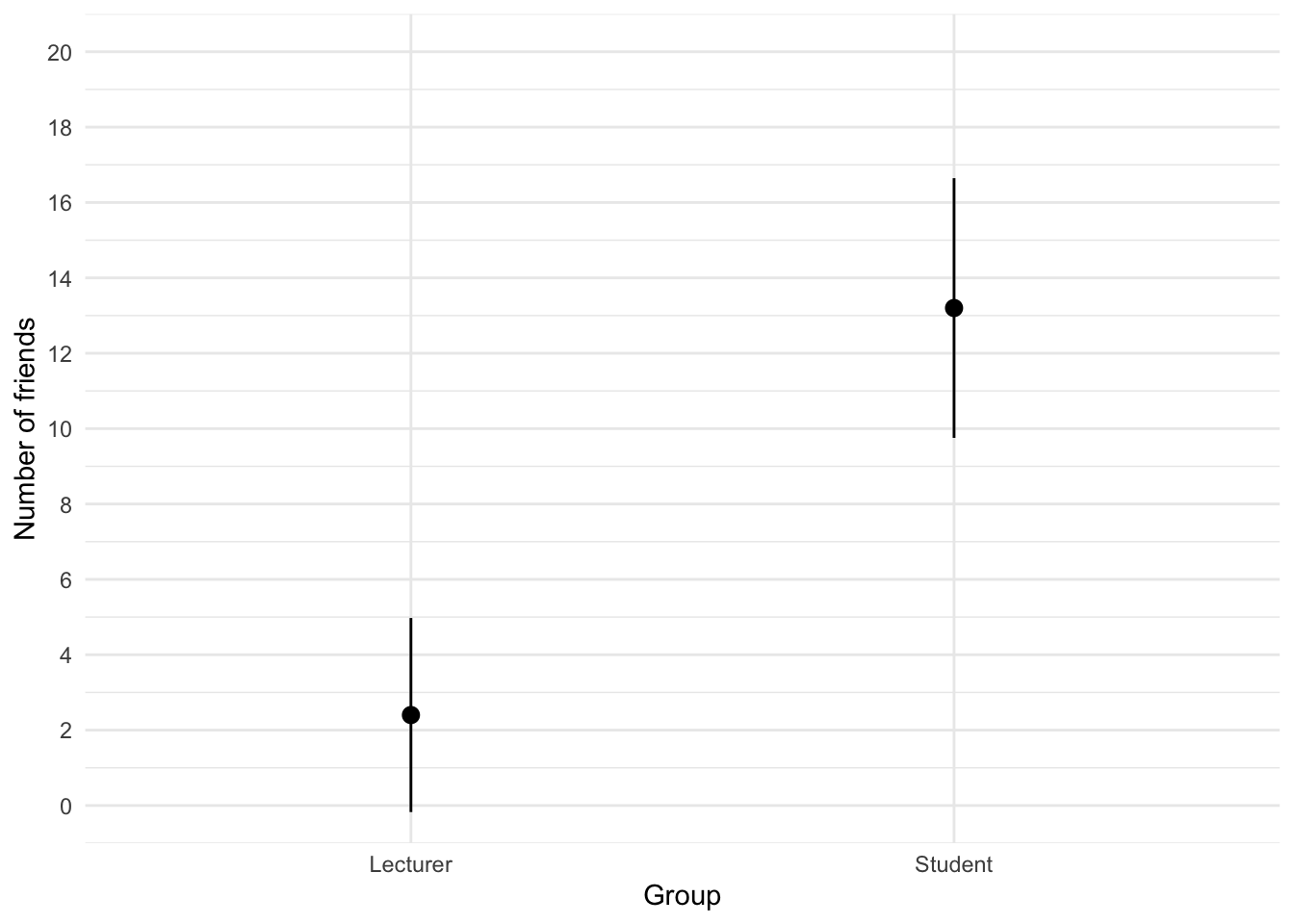
We can conclude that, on average, students had more friends than lecturers.
Task 5.2
Using the same data, plot and interpret an error bar chart showing the mean alcohol consumption for students and lecturers.
The code for the plot in Figure 2 is:
ggplot(student_tib, aes(group, alcohol)) +
  stat_summary(fun.data = "mean_cl_normal", geom = "pointrange") +
  coord_cartesian(ylim = c(0, 30)) +
  scale_y_continuous(breaks = seq(0, 30, 5)) +
  labs(x = "Group", y = "Alcohol consumption per week (units)") +
  theme_minimal()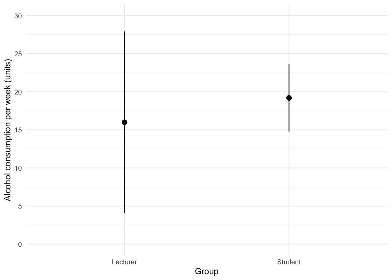
We can conclude that, on average, students and lecturers drank similar amounts, but the error bars tell us that the mean is a better representation of the population for students than for lecturers (there is more variability in lecturers’ drinking habits compared to students’).
Task 5.3
Using the same data, plot and interpret an error line chart showing the mean income for students and lecturers.
The code for the plot in Figure 3 is:
ggplot(student_tib, aes(group, income)) +
  stat_summary(fun.data = "mean_cl_normal", geom = "pointrange") +
  coord_cartesian(ylim = c(0, 50000)) +
  scale_y_continuous(breaks = seq(0, 50000, 5000)) +
  labs(x = "Group", y = "Income (p.a.)") +
  theme_minimal()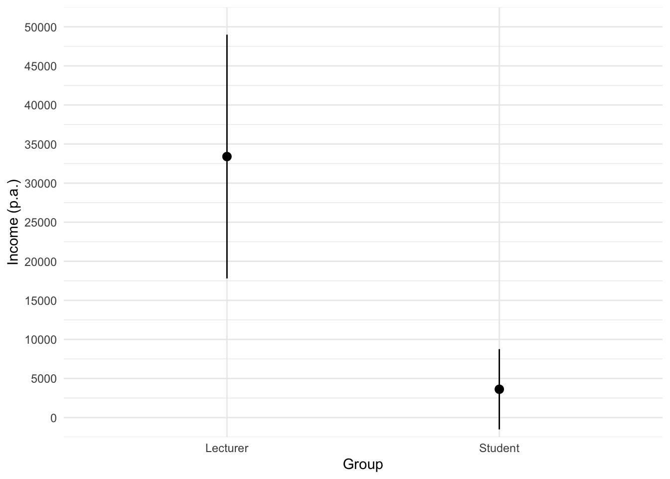
We can conclude that, on average, students earn less than lecturers, but the error bars tell us that the mean is a better representation of the population for students than for lecturers (there is more variability in lecturers’ income compared to students’).
Task 5.4
Using the same data, plot and interpret error a line chart showing the mean neuroticism for students and lecturers.
The code for the plot in Figure 4 is:
ggplot(student_tib, aes(group, neurotic)) +
  stat_summary(fun.data = "mean_cl_normal", geom = "pointrange") +
  coord_cartesian(ylim = c(0, 20)) +
  scale_y_continuous(breaks = seq(0, 20, 1)) +
  labs(x = "Group", y = "Neuroticism") +
  theme_minimal()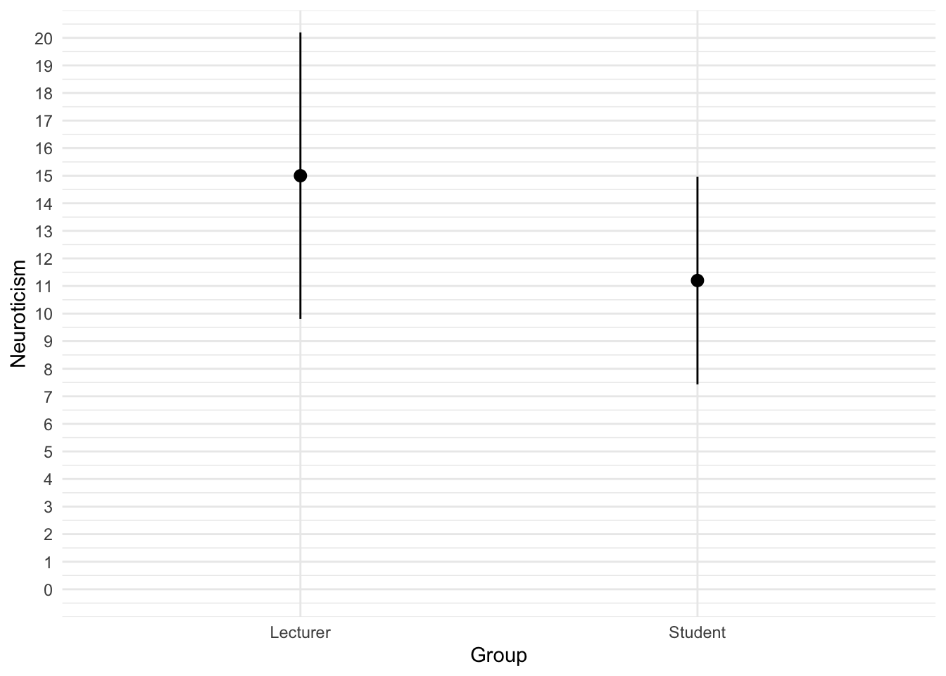
We can conclude that, on average, students are slightly less neurotic than lecturers.
Task 5.5
Using the same data, plot and interpret a scatterplot with regression lines of alcohol consumption and neuroticism grouped by lecturer/student.
The code for the plot in Figure 5 is:
ggplot(student_tib, aes(alcohol, neurotic, colour = group)) +
  geom_point() +
  geom_smooth(method = "lm", aes(fill = group), alpha = 0.1) +
  coord_cartesian(xlim = c(0, 30), ylim = c(0, 30)) +
  scale_x_continuous(breaks = seq(0, 30, 5)) +
  scale_y_continuous(breaks = seq(0, 30, 5)) +
  labs(x = "Alcohol consumption per week (units)", y = "Neuroticism", colour = "Group", fill = "Group") +
  theme_minimal()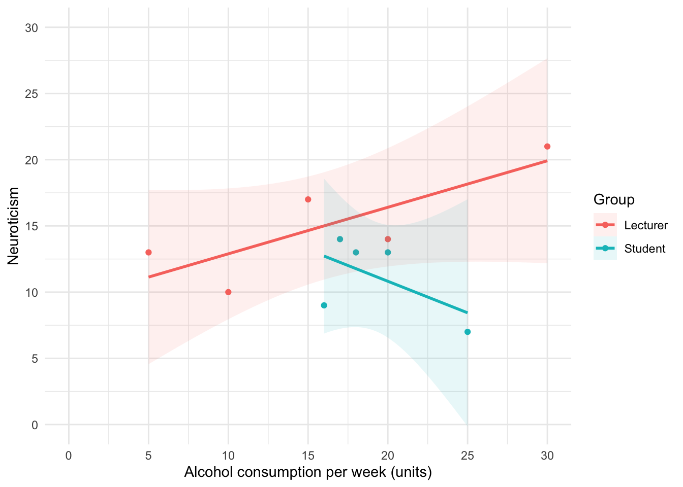
We can conclude that for lecturers, as neuroticism increases so does alcohol consumption (a positive relationship), but for students the opposite is true, as neuroticism increases alcohol consumption decreases.
Task 5.6
Using the same data, plot and interpret a scatterplot matrix with regression lines of alcohol consumption, neuroticism and number of friends.
The code for the plot in Figure 5 is:
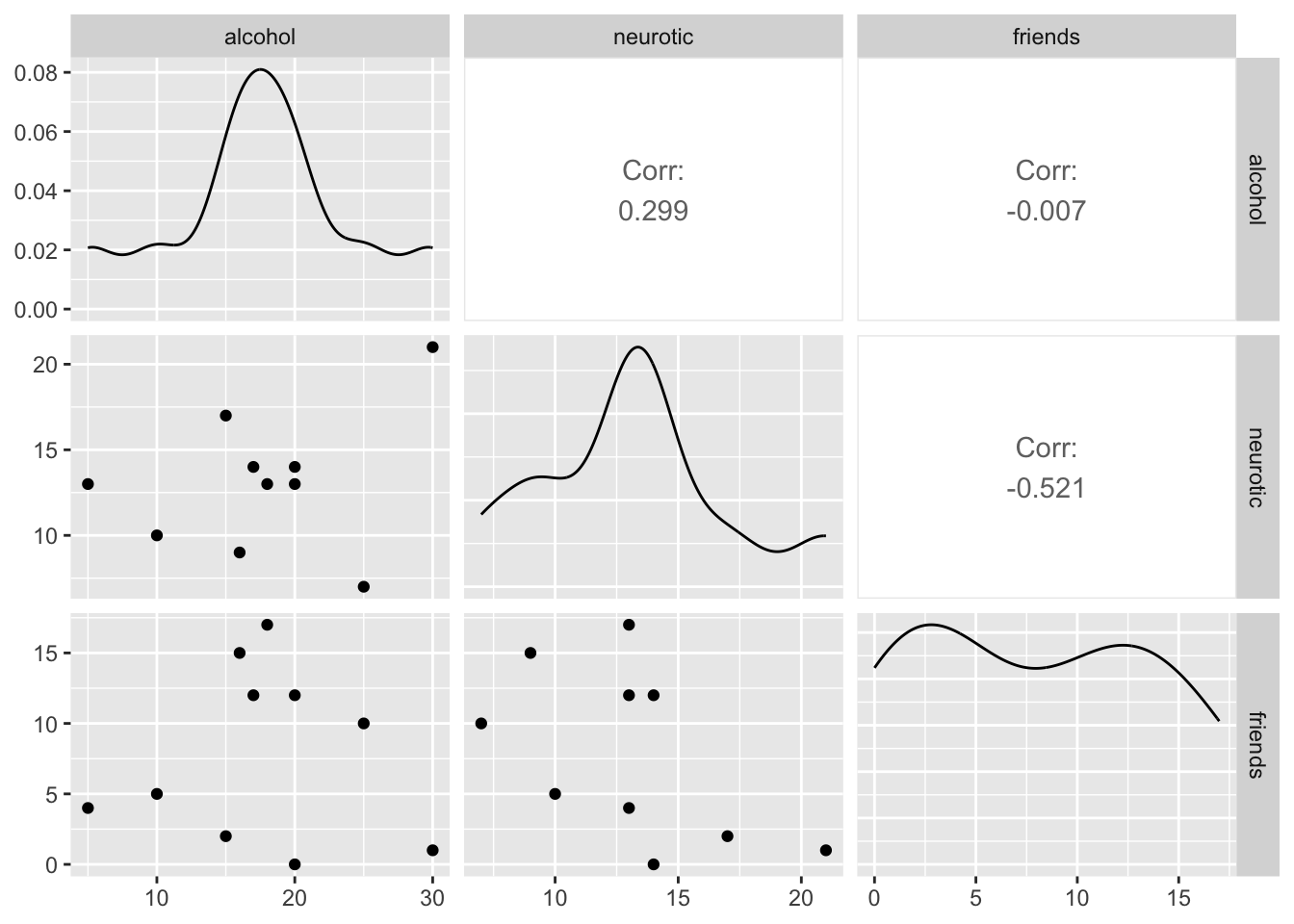
We can conclude that there is no relationship (flat line) between the number of friends and alcohol consumption; there was a negative relationship between how neurotic a person was and their number of friends ; and there was a slight positive relationship between how neurotic a person was and how much alcohol they drank.
Task 5.7
Using the zhang_2013_subsample.csv data from Chapter 1 (see Smart Alex’s task) plot a clustered error bar chart of the mean test accuracy as a function of the type of name participants completed the test under (x-axis) and whether they were male or female (different coloured bars).
First, let’s load the data (see Tip 2)
zhang_tib <- discovr::zhang_sampleTo find out more about the data execute ?zhang_sample.
To get the plot in Figure 7 execute:
ggplot(zhang_tib, aes(name_type, accuracy, colour = sex)) +
  stat_summary(fun.data = "mean_cl_normal", geom = "pointrange", position = position_dodge(width = 0.5)) +
  coord_cartesian(ylim = c(0, 80)) +
  scale_y_continuous(breaks = seq(0, 80, 10)) +
  labs(x = "Type of name", y = "Accuracy (%)", colour = "Biological sex") +
  theme_minimal()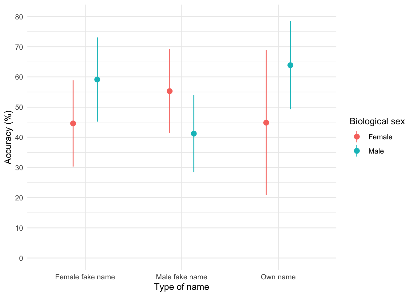
The plot shows that, on average, males did better on the test than females when using their own name (the control) but also when using a fake female name. However, for participants who did the test under a fake male name, the women did better than males.
Task 5.8
Using the teaching.csv data from Chapter 4 (Task 3), plot a clustered error line chart of the mean score when electric shocks were used compared to being nice, and plot males and females as different coloured lines.
First, let’s load the data (see Tip 2):
teaching_tib <- discovr::teachingTo find out more about the data execute ?teaching. To get the plot in Figure 8 execute:
ggplot(teaching_tib, aes(method, mark, colour = sex)) +
  stat_summary(fun.data = "mean_cl_normal", geom = "pointrange", position = position_dodge(width = 0.5)) +
  coord_cartesian(ylim = c(0, 20)) +
  scale_y_continuous(breaks = seq(0, 20, 1)) +
  labs(x = "Method of teaching", y = "Mark (out of 20)", colour = "Biological sex") +
  theme_minimal()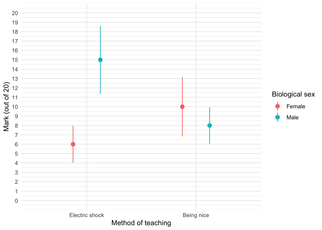
We can see that when the being nice method of teaching is used, males and females have comparable scores on their coursework, with females scoring slightly higher than males on average, although their scores are also more variable than the males’ scores as indicated by the longer error bar). However, when an electric shock is used, males score higher than females but there is more variability in the males’ scores than the females’ for this method (as seen by the longer error bar for males than for females). Additionally, the graph shows that females score higher when the being nice method is used compared to when an electric shock is used, but the opposite is true for males. This suggests that there may be an interaction effect of sex.
Task 5.9
Using the shopping_exercise.csv data from Chapter 3, plot two error bar graphs comparing men and women (x-axis): one for the distance walked, and the other of the time spent shopping.
First, let’s load the data (see Tip 2):
shopping_tib <- discovr::shoppingTo find out more about the data execute ?shopping. To get the plot in Figure 9 execute:
ggplot(shopping_tib, aes(sex, distance)) +
  stat_summary(fun.data = "mean_cl_normal", geom = "pointrange", position = position_dodge(width = 0.5)) +
  coord_cartesian(ylim = c(0, 5)) +
  scale_y_continuous(breaks = seq(0, 5, 1)) +
  labs(x = "Biological sex", y = "Distance walked (Miles)") +
  theme_minimal()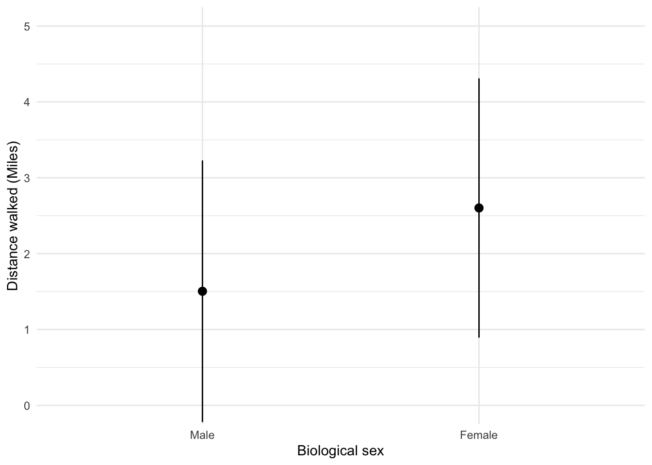
Looking at the plot in Figure 9, we can see that, on average, females walk longer distances (probably not significantly so) while shopping than males.
To get the plot in Figure 10 execute:
ggplot(shopping_tib, aes(sex, time)) +
  stat_summary(fun.data = "mean_cl_normal", geom = "pointrange", position = position_dodge(width = 0.5)) +
  coord_cartesian(ylim = c(0, 260)) +
  scale_y_continuous(breaks = seq(0, 260, 20)) +
  labs(x = "Biological sex", y = "Time spent shopping (minutes)") +
  theme_minimal()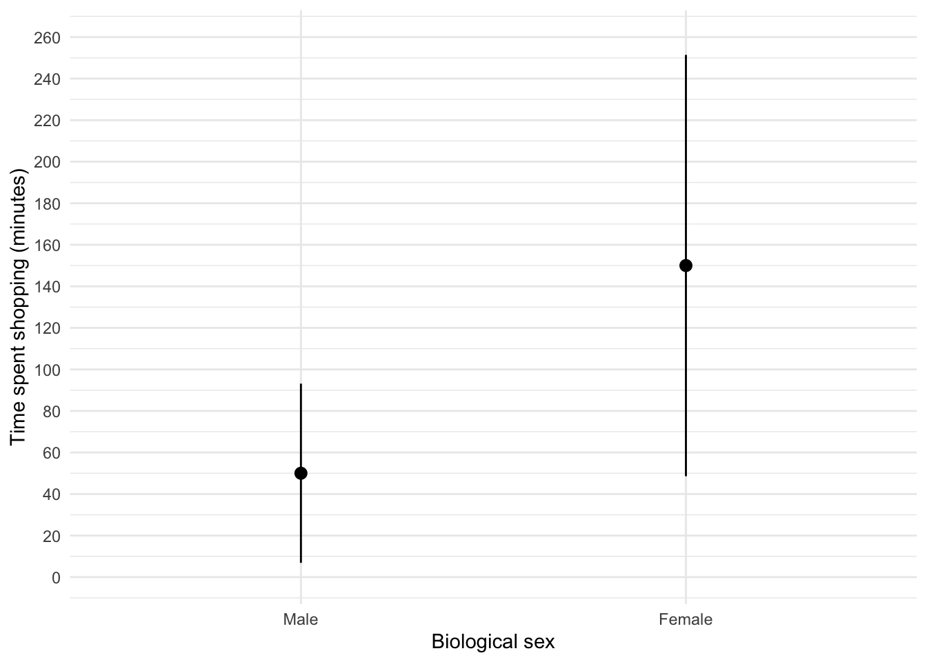
Figure 10 shows that, on average, females spend more time shopping than males (but again, probably not significantly so). The females’ scores are more variable than the males’ scores (longer error bar).
Task 5.10
Using the pets.csv data from Chapter 4 (Task 6), plot two error bar charts comparing scores when having a fish or cat as a pet (x-axis): one for the animal liking variable, and the other for the life satisfaction.
First, let’s load the data (see Tip 2):
pet_tib <- discovr::petsTo find out more about the data execute ?pets. To get the first plot execute:
ggplot(pet_tib, aes(pet, animal)) +
  stat_summary(fun.data = "mean_cl_normal", geom = "pointrange", position = position_dodge(width = 0.5)) +
  coord_cartesian(ylim = c(0, 60)) +
  scale_y_continuous(breaks = seq(0, 60, 5)) +
  labs(x = "Species of pet", y = "Liking of animals") +
  theme_minimal()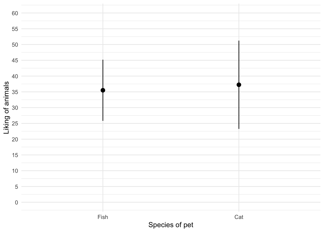
Figure 11 shows that the mean love of animals was the same for people with cats and fish as pets. To get the second plot execute:
ggplot(pet_tib, aes(pet, life_satisfaction)) +
  stat_summary(fun.data = "mean_cl_normal", geom = "pointrange", position = position_dodge(width = 0.5)) +
  coord_cartesian(ylim = c(0, 80)) +
  scale_y_continuous(breaks = seq(0, 80, 10)) +
  labs(x = "Species of pet", y = "Life satisfaction") +
  theme_minimal()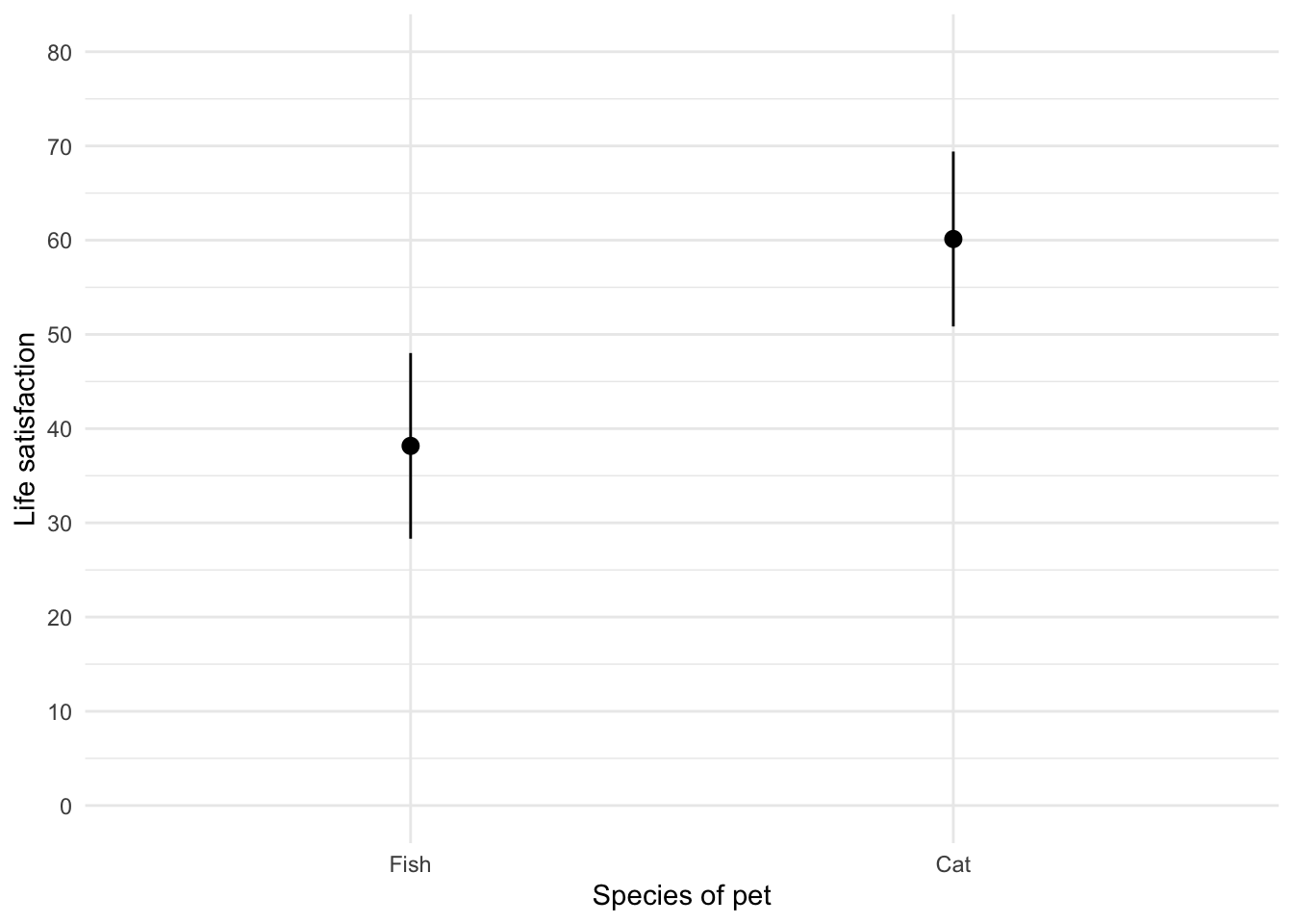
Figure 12 shows that, on average, life satisfaction was higher for people with a cat as a pety than those with a fish.
Task 5.11
Using the same data as above, plot a scatterplot of animal liking scores against life satisfaction (plot scores for those with fish and cats in different colours).
The code will be something like:
ggplot(pet_tib, aes(animal, life_satisfaction, colour = pet)) +
  geom_point() +
  geom_smooth(method = "lm", aes(fill = pet), alpha = 0.1) +
  coord_cartesian(xlim = c(0, 75), ylim = c(0, 100)) +
  scale_x_continuous(breaks = seq(0, 75, 5)) +
  scale_y_continuous(breaks = seq(0, 100, 5)) +
  labs(x = "Animal liking", y = "Life satisfaction", colour = "Species of pet",  fill = "Species of pet") +
  theme_minimal()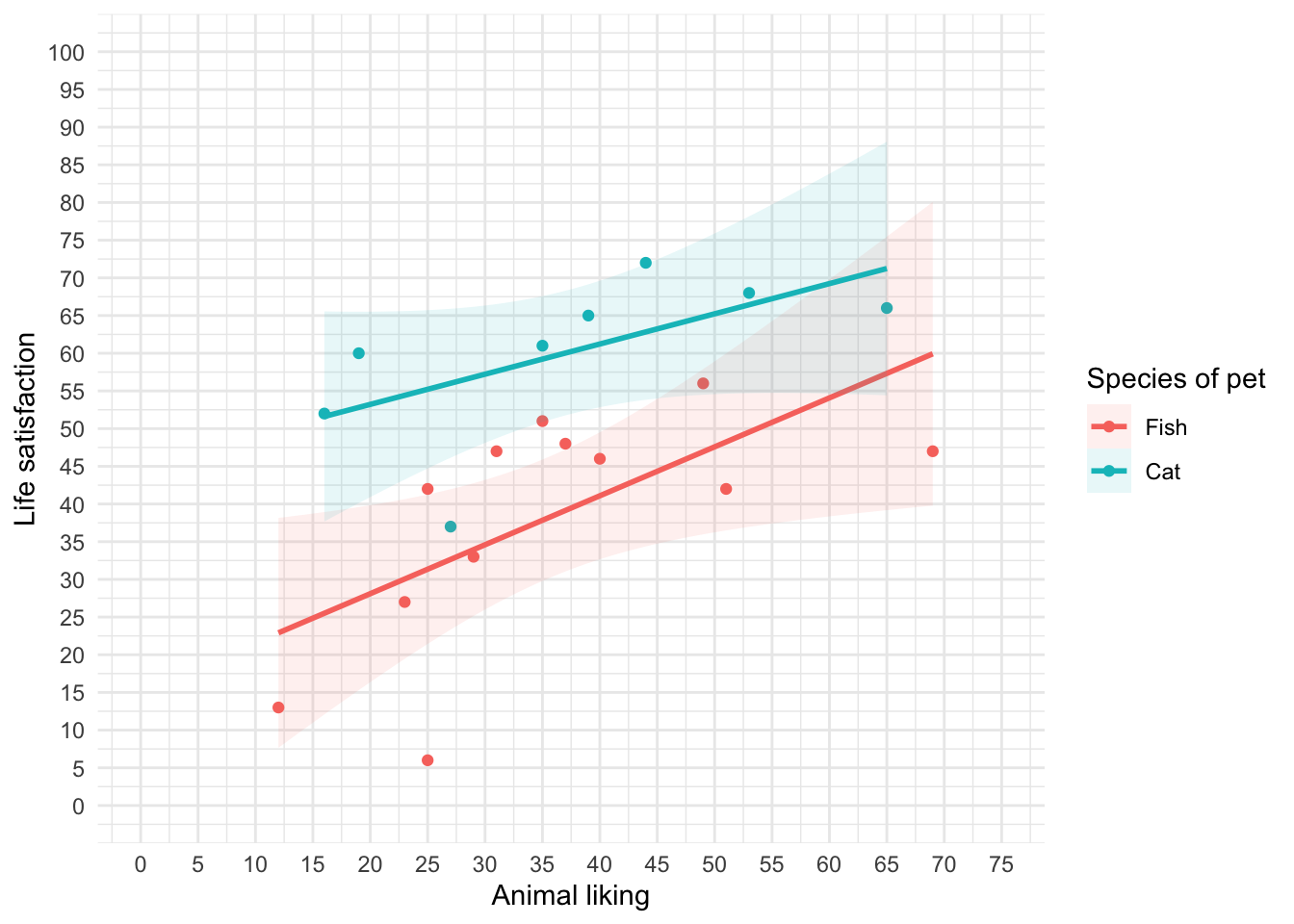
We can conclude from Figure 13 that for for regardles sof whether someone had a cat or fish as a pet, as love of animals increases so does life satisfaction (a positive relationship).
Task 5.12
Using the tea_15.csv data from Chapter 4, plot a scatterplot showing the number of cups of tea drunk (`
tea) on the x-axis against cognitive functioning (cog_fun) and the y-axis.
First, let’s load the data (see Tip 2):
#
tea15_tib <- discovr::tea_15
To find out more about the data execute ?tea_15. The code will be something like:
ggplot(tea15_tib, aes(tea, cog_fun)) +
  geom_point() +
  geom_smooth(method = "lm") +
  coord_cartesian(xlim = c(0, 6), ylim = c(0, 70)) +
  scale_x_continuous(breaks = seq(0, 6, 1)) +
  scale_y_continuous(breaks = seq(0, 70, 5)) +
  labs(x = "Cups of tea drunk (per day)", y = "Cognitive functioning") +
  theme_minimal()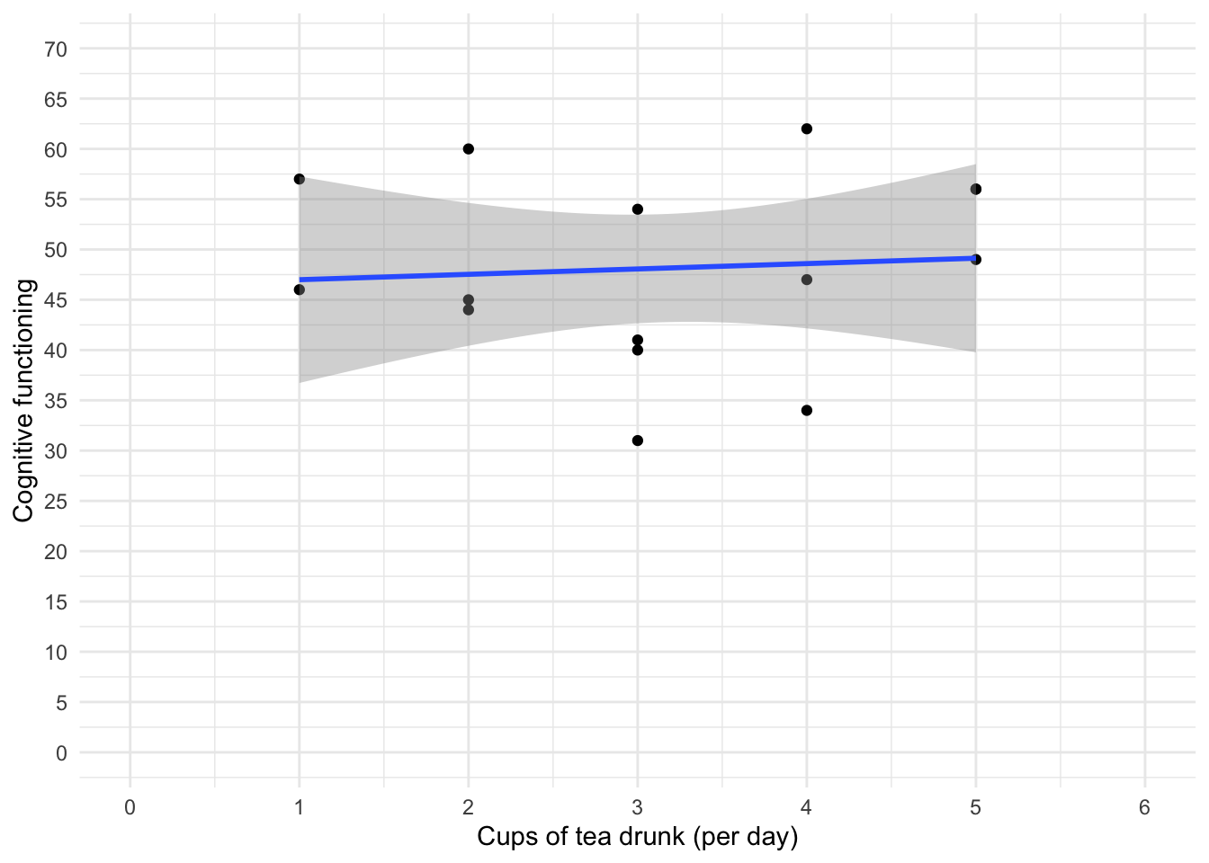
The scatterplot (and near-flat line especially) in Figure 14 tells us that there is a tiny relationship (practically zero) between the number of cups of tea drunk per day and cognitive function.
Chapter 6
Task 6.1
Using the
notebook.csvdata from Chapter 5, create and interpret a Q-Q plot for the two films (ignoresex)?
Load the data directly from the discovr package (see Tip 2).
notebook_tib <- discovr::notebookFigure 15 shows the plot.
ggplot(data = notebook_tib, aes(sample = arousal)) +
  qqplotr::stat_qq_band(fill = "#C4F134FF", alpha = 0.3) +
  qqplotr::stat_qq_line(colour = "#C4F134FF") +
  qqplotr::stat_qq_point(colour = "#3E9BFEFF", alpha = 0.9, size = 1) +
  labs(x = "Theoretical quantiles", y = "Sample quantiles") +
  facet_wrap(~film, ncol = 1, scales = "free") +
  theme_minimal()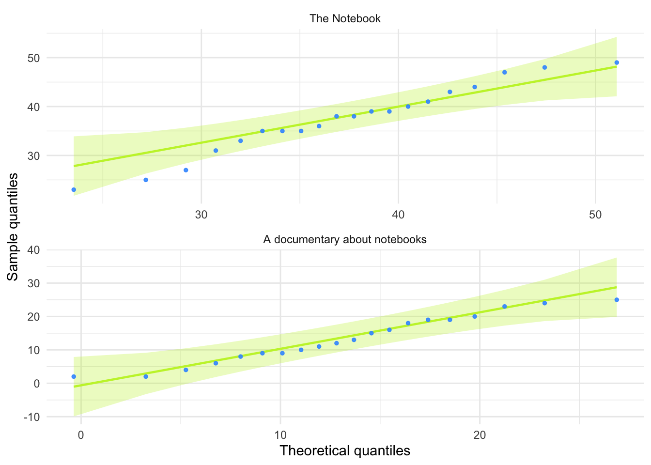
For both films the expected quantile points are close, on the whole, to those that would be expected from a normal distribution (i.e. the dots fall within the confidence interval for the line).
Task 6.2
The file
r_exam.csvcontains data on students’ performance on an SPSS exam. Four variables were measured:exam(first-year SPSS exam scores as a percentage),computer(measure of computer literacy in percent),lecture(percentage of statistics lectures attended) andnumeracy(a measure of numerical ability out of 15). There is a variable calleduniindicating whether the student attended Sussex University (where I work) or Duncetown University. Compute and interpret summary statistics forexam,computer,lecturesandnumeracyfor the sample as a whole.
Load the data (see Tip 2).
rexam_tib <- discovr::r_examTable 9 shows the table of descriptive statistics for the four variables in this example. From this table, we can see that, on average, students attended nearly 60% of lectures, obtained 58% in their exam, scored only 51% on the computer literacy test, and only 5 out of 15 on the numeracy test. In addition, the confidence interval for computer literacy was relatively narrow compared to that of the percentage of lectures attended and exam scores.
| Variable | Mean | 95% CI (Mean) | SD | IQR | Range | Skewness | Kurtosis | n | n_Missing |
|---|---|---|---|---|---|---|---|---|---|
| exam | 58.10 | (53.90, 61.24) | 21.32 | 37.00 | (15.00, 99.00) | -0.11 | -1.11 | 100 | 0 |
| computer | 50.71 | (49.17, 52.21) | 8.26 | 10.75 | (27.00, 73.00) | -0.17 | 0.36 | 100 | 0 |
| lectures | 59.77 | (54.93, 63.51) | 21.68 | 28.75 | (8.00, 100.00) | -0.42 | -0.18 | 100 | 0 |
| numeracy | 4.85 | (4.42, 5.31) | 2.71 | 4.00 | (1.00, 14.00) | 0.96 | 0.95 | 100 | 0 |
Task 6.3
Produce histograms for each of the four measures in the previous task and interpret them
The data are in messy format, so first let’s make the data tidy:
rexam_tidy_tib <- rexam_tib |>
  pivot_longer(
    cols = exam:numeracy,
    values_to = "score",
    names_to = "measure"
  )
The data now look like Table 10
DT::datatable(rexam_tidy_tib)To create the plot in Figure 16 use the code below.
ggplot(rexam_tidy_tib, aes(score)) +
  geom_histogram(bins = 20, fill = "#C42503FF", colour = "#C42503FF", alpha = 0.2) +
  labs(y = "Frequency", x = "Score") +
  facet_wrap(~measure, scale = "free") +
  theme_minimal()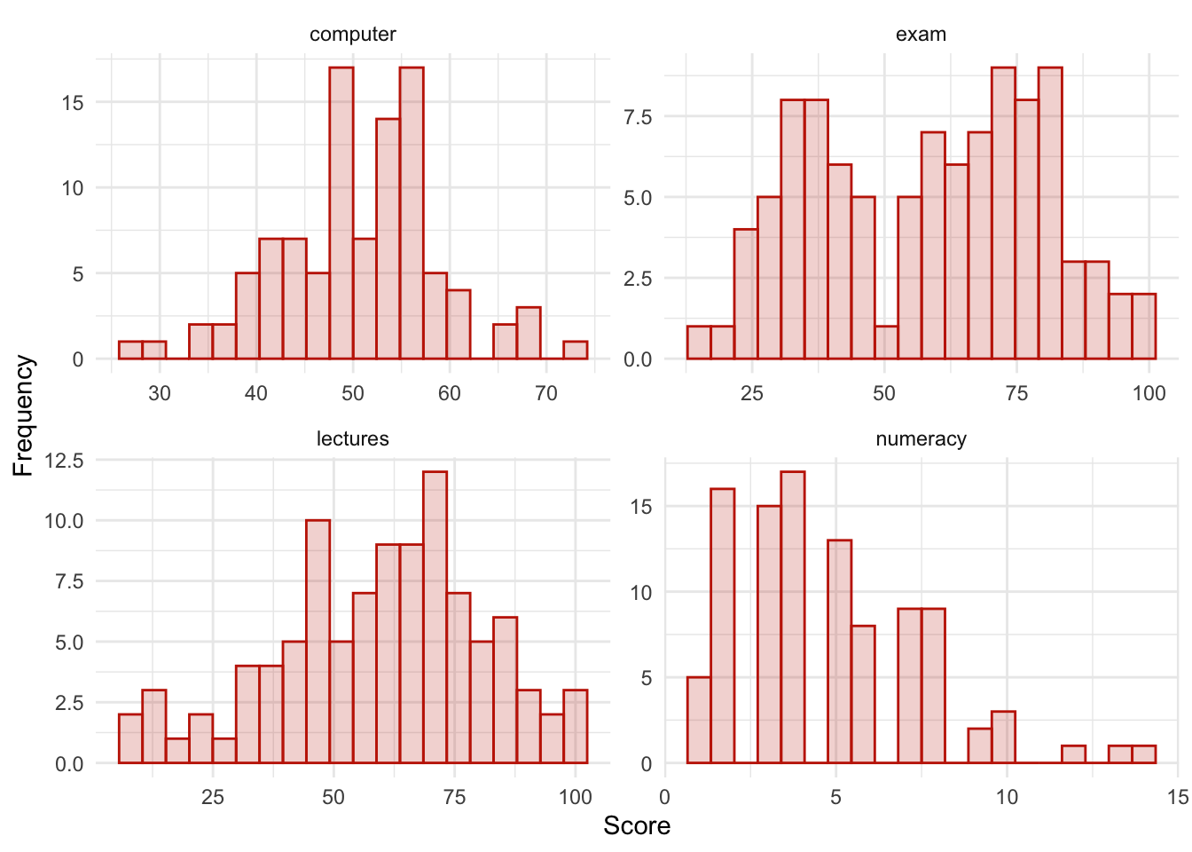
The histograms show us several things. The exam scores are very interesting because this distribution is quite clearly not normal; in fact, it looks suspiciously bimodal (there are two peaks, indicative of two modes). It looks as though computer literacy is somewhat normally distributed (a few people are very good with computers and a few are very bad, but the majority of people have a similar degree of knowledge) as is the lecture attendance. Both are a little negatively skewed. Finally, the numeracy test has produced very positively skewed data (the majority of people did very badly on this test and only a few did well).
Descriptive statistics and histograms are a good way of getting an instant picture of the distribution of your data. This snapshot can be very useful: for example, the bimodal distribution of exam scores instantly indicates a trend that students are typically either very good at statistics or struggle with it (there are relatively few who fall in between these extremes). Intuitively, this finding fits with the nature of the subject: statistics is very easy once everything falls into place, but before that enlightenment occurs it all seems hopelessly difficult!
Task 6.4
Produce Q-Q plots for the four measures in Task 2.
Figure 17 was created using the code below.
ggplot(rexam_tidy_tib, aes(sample = score)) +
  qqplotr::stat_qq_band(fill = "#C4F134FF", alpha = 0.3) +
  qqplotr::stat_qq_line(colour = "#C4F134FF") +
  qqplotr::stat_qq_point(colour = "#3E9BFEFF", alpha = 0.5, size = 1) +
  labs(x = "Theoretical quantiles", y = "Sample quantiles") +
  facet_wrap(~measure, scales = "free") +
  theme_minimal()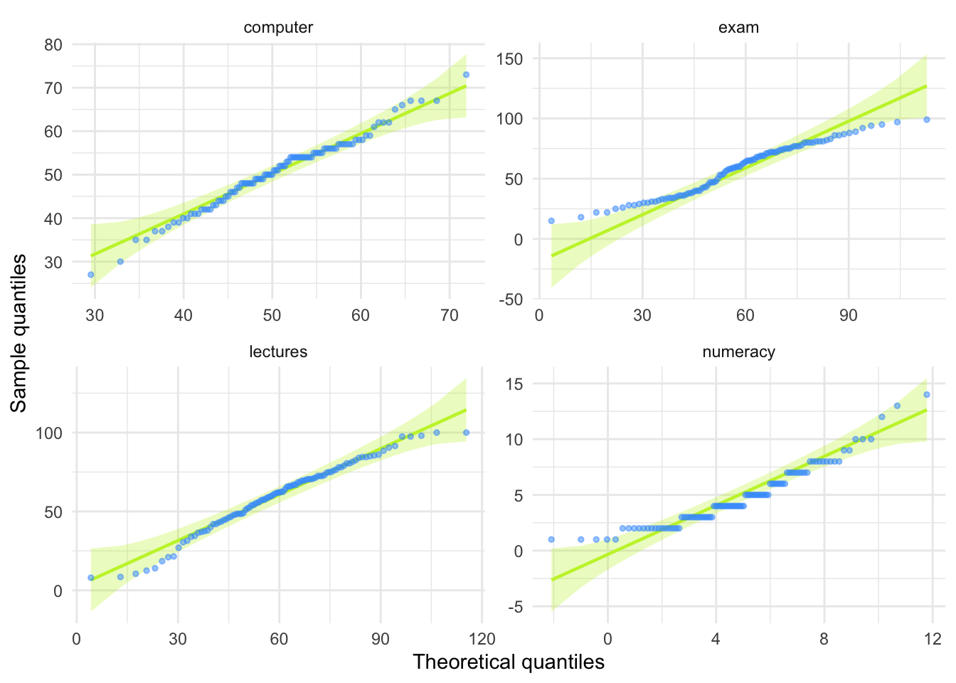
Task 6.5
Use Task 2 and 4 to interpret skew and kurtosis for each of the four measures.
The skewness values are calculated in the table for task 2. For all of the measures the value of skewness is fairly close to zero, indicating the expected value of 0. The exception is numeracy scores for which skew is about 1. This is within acceptable limits. Looking at the Q-Q plots, none of them show the characteristic upward or downward bend associated with skew.
For kurtosis, computer literacy and lecture attendance have kurtosis around the expected value of 3. The Q-Q plots confirm that these measures show the characteristic patterns of normality.
Exam scores have kurtosis below 2 suggesting lighter tails than you’d expect in a normal distribution, which is also shown in the Q-Q plot with observed quantiles at the low end being higher than expected and observed quantiles at the high end being lower than expected.
Numeracy scores have kurtosis close to 4 indicating heavier tails than expected in a normal distribution, but the Q-Q plot looks relatively normal (although observed quantiles rise above the normal line at the low end.
Task 6.6
Produce summary statistics for the four measures separately for each university.
Table 11 shows the summary statistics split by university. From this table it is clear that Sussex students scored higher on both their exam and the numeracy test than their Duncetown counterparts. In fact, looking at the means reveals that, on average, Sussex students scored an amazing 36% more on the exam than Duncetown students, and had higher numeracy scores too (what can I say, my students are the best). Skew statistics are all close to the expected value of 0 and most of the kurtosis values are close to the expected value of 3. The notable exception are the computer literacy scores in the Sussex students, which have a kurtosis value above 4 suggesting heavy tails.
| uni | Variable | Mean | 95% CI (Mean) | SD | IQR | Range | Skewness | Kurtosis | n | n_Missing |
|---|---|---|---|---|---|---|---|---|---|---|
| Duncetown University | exam | 40.18 | (36.97, 43.73) | 12.59 | 17.50 | (15.00, 66.00) | 0.31 | -0.57 | 50 | 0 |
| Duncetown University | computer | 50.26 | (48.07, 52.22) | 8.07 | 12.25 | (35.00, 67.00) | 0.23 | -0.51 | 50 | 0 |
| Duncetown University | lectures | 56.26 | (51.95, 61.96) | 23.77 | 28.75 | (8.00, 100.00) | -0.31 | -0.38 | 50 | 0 |
| Duncetown University | numeracy | 4.12 | (3.63, 4.63) | 2.07 | 3.25 | (1.00, 9.00) | 0.51 | -0.48 | 50 | 0 |
| Sussex University | exam | 76.02 | (73.60, 79.34) | 10.21 | 12.25 | (56.00, 99.00) | 0.27 | -0.26 | 50 | 0 |
| Sussex University | computer | 51.16 | (49.19, 53.36) | 8.51 | 9.25 | (27.00, 73.00) | -0.54 | 1.38 | 50 | 0 |
| Sussex University | lectures | 63.27 | (58.20, 67.81) | 18.97 | 30.00 | (12.50, 100.00) | -0.36 | -0.22 | 50 | 0 |
| Sussex University | numeracy | 5.58 | (4.79, 6.30) | 3.07 | 5.00 | (1.00, 14.00) | 0.79 | 0.26 | 50 | 0 |
Task 6.7
Produce and interpret histograms for the four measures split by the two universities.
ggplot(rexam_tidy_tib, aes(score)) +
  geom_histogram(bins = 20, fill = "#C42503FF", colour = "#C42503FF", alpha = 0.2) +
  labs(y = "Frequency", x = "Score") +
  facet_grid(uni~measure, scale = "free") +
  theme_minimal()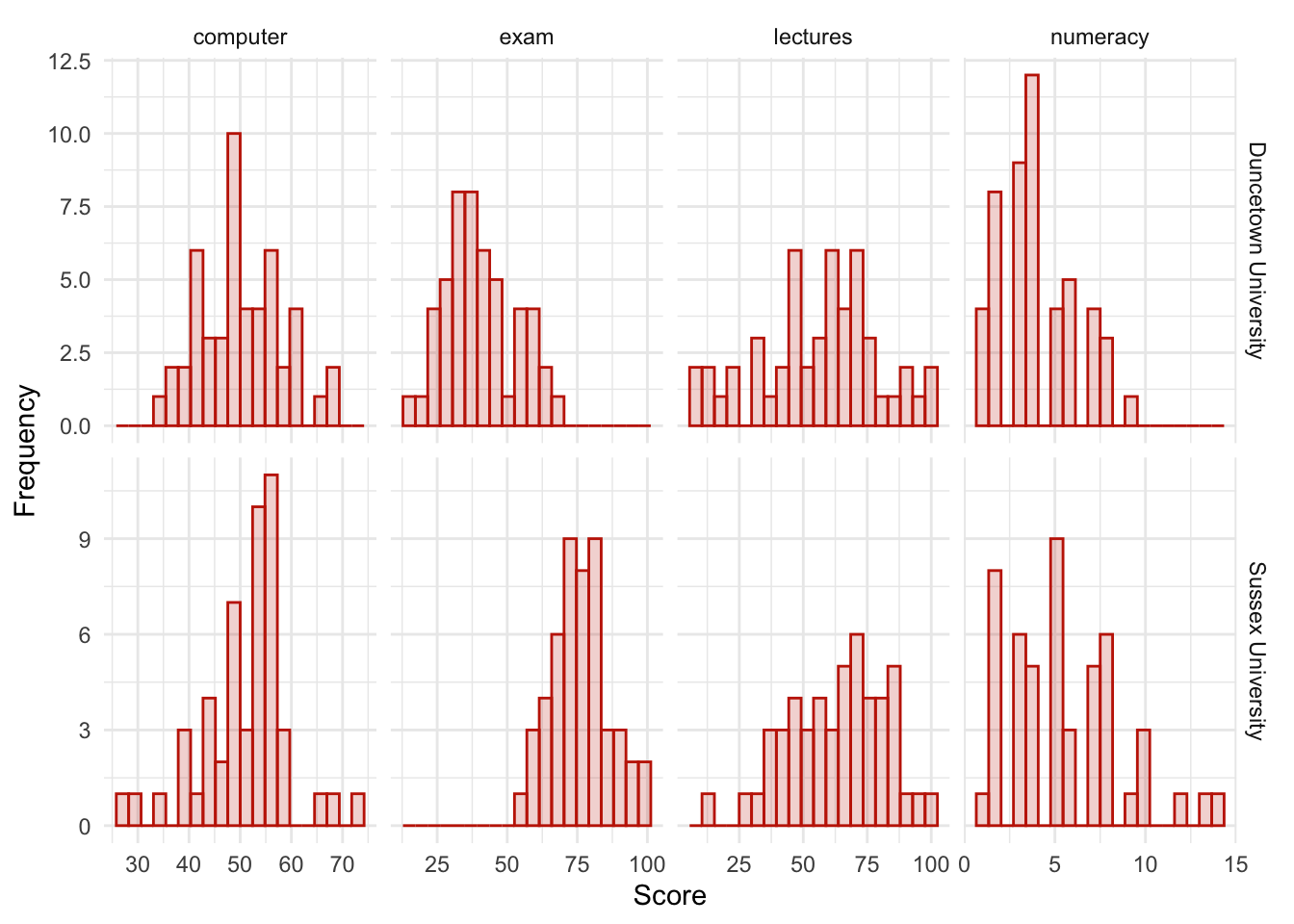
The histograms of these variables split according to the university attended show numerous things. The first interesting thing to note is that for exam marks, the distributions are both fairly normal. This seems odd because the overall distribution was bimodal. However, it starts to make sense when you consider that for Duncetown the distribution is centred around a mark of about 40%, but for Sussex the distribution is centred around a mark of about 76%. This illustrates how important it is to look at distributions within groups. If we were interested in comparing Duncetown to Sussex it wouldn’t matter that overall the distribution of scores was bimodal; all that’s important is that each group comes from a normal population, and in this case it appears to be true. When the two samples are combined, these two normal distributions create a bimodal one (one of the modes being around the centre of the Duncetown distribution, and the other being around the centre of the Sussex data!).
For numeracy scores, the distribution is slightly positively skewed (there is a larger concentration at the lower end of scores) in both the Duncetown and Sussex groups. Therefore, the overall positive skew observed before is due to the mixture of universities.
The remaining distributions look vaguely normal. The only exception is the computer literacy scores for the Sussex students. This is a fairly flat distribution apart from a huge peak between 50 and 60%. It looks potentially slightly heavy-tailed. This suggests positive kurtosis and, in fact kurtosis is above 4 in this group (see previous task).
Chapter 7
Task 7.1
A student was interested in whether there was a positive relationship between the time spent doing an essay and the mark received. He got 45 of his friends and timed how long they spent writing an essay (
hours) and the percentage they got in the essay (essay). He also translated these grades into their degree classifications (grade): in the UK, a student can get a first-class mark (the best), an upper-second-class mark, a lower second, a third, a pass or a fail (the worst). Using the data in the fileessay_marks.csvfind out what the relationship was between the time spent doing an essay and the eventual mark in terms of percentage and degree class (draw a scatterplot too).
Load the data using (see Tip 2):
essay_tib <- discovr::essay_marksWe’re interested in looking at the relationship between hours spent on an essay and the grade obtained. We could create a scatterplot of hours spent on the essay (x-axis) and essay mark (y-axis). In Figure 19 I’ve chosen to highlight the degree classification grades using different colours.
ggplot(essay_tib, aes(hours, essay, colour = grade)) +
  geom_point() +
  geom_smooth(method = "lm", alpha = 0.1) +
  coord_cartesian(xlim = c(0, 15), ylim = c(20, 80)) +
  scale_x_continuous(breaks = seq(0, 15, 1)) +
  scale_y_continuous(breaks = seq(20, 80, 5)) +
  labs(x = "Time spent on essay (hours)", y = "Essay mark (%)", colour = "Grade", fill = "Grade") +
  theme_minimal()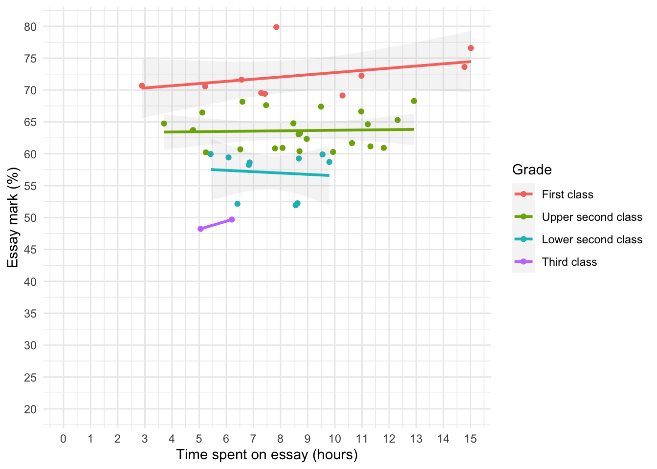
To get the correlation:
essay_r <- correlation(data = essay_tib, select = c("hours", "essay"))Table 13 indicate that the relationship between time spent writing an essay and grade awarded was not significant, \(r\) = 0.27 (-0.03, 0.52), t(43) = 1.81, p = 0.077.
display(essay_r)| Parameter1 | Parameter2 | r | 95% CI | t(43) | p |
|---|---|---|---|---|---|
| hours | essay | 0.27 | (-0.03, 0.52) | 1.81 | 0.077 |
p-value adjustment method: Holm (1979) Observations: 45
The second part of the question asks us to do the same analysis but when the percentages are recoded into degree classifications. The degree classifications are ordinal data (not interval): they are ordered categories. So we shouldn’t use Pearson’s test statistic, but Spearman’s and Kendall’s ones instead. grade is a factor:
essay_tib$grade [1] Upper second class First class Third class First class
[5] Lower second class Upper second class Upper second class Upper second class
[9] Upper second class Third class Upper second class First class
[13] First class Lower second class Lower second class Upper second class
[17] Upper second class Upper second class Upper second class Lower second class
[21] Lower second class First class Upper second class Upper second class
[25] First class Upper second class Lower second class Lower second class
[29] Lower second class First class Upper second class Upper second class
[33] Upper second class First class First class Upper second class
[37] Upper second class Upper second class Upper second class Upper second class
[41] Upper second class Upper second class Lower second class Lower second class
[45] First class
Levels: First class Upper second class Lower second class Third classWe need to convert it into numbers using as.numeric:
essay_tib <- essay_tib |>
  mutate(
    grade_num = as.numeric(grade)
    )
Let’s check the numeric grade matches the description (i.e. first = 1, upper second = 2 etc.):
| id | essay | hours | grade | grade_num |
|---|---|---|---|---|
| qxbcjg | 61.68 | 10.63 | Upper second class | 2 |
| csykgu | 69.55 | 7.29 | First class | 1 |
| npxgpl | 48.23 | 5.05 | Third class | 4 |
| gomiwl | 70.68 | 2.89 | First class | 1 |
| qdywaa | 59.90 | 9.55 | Lower second class | 3 |
| cmaprb | 61.16 | 11.31 | Upper second class | 2 |
| nrvhix | 67.62 | 7.47 | Upper second class | 2 |
| ybytlf | 64.78 | 8.47 | Upper second class | 2 |
| talwvg | 63.21 | 8.72 | Upper second class | 2 |
| ceylea | 49.69 | 6.20 | Third class | 4 |
| berjky | 63.72 | 4.77 | Upper second class | 2 |
| cjxgpl | 72.24 | 10.98 | First class | 1 |
| gufenh | 70.59 | 5.22 | First class | 1 |
| uaxxdm | 58.64 | 6.86 | Lower second class | 3 |
| unnhpl | 58.72 | 9.80 | Lower second class | 3 |
Now the correlation:
grade_r <- correlation(data = essay_tib, select = c("hours", "grade_num"), method = "spearman")Table 15 shows no significant relationship between degree grade classification for an essay and the time spent doing it, \(r_\text{s}\) = -0.19 (-0.47, 0.12), p = 0.204. Note that the direction of the relationship has reversed. This has happened because the essay marks were recoded as 1 (first), 2 (upper second), 3 (lower second), and 4 (third), so high grades were represented by low numbers.
display(grade_r)| Parameter1 | Parameter2 | rho | 95% CI | S | p |
|---|---|---|---|---|---|
| hours | grade_num | -0.19 | (-0.47, 0.12) | 18110.93 | 0.204 |
p-value adjustment method: Holm (1979) Observations: 45
Task 7.2
Using the
notebook.csvdata from Chapter 3, find out if the size of relationship between the participant’s gender identity and arousal.
Load the data using (see Tip 2):
notebook_tib <- discovr::notebookgender_identity is a categorical variable with two categories (in this dataset), therefore, we need to quantify this relationship using a point-biserial correlation. First, I’ll recode gender_identity into a new variable vcalled gi_bin and represent ‘Man’ with the number 0 and ‘woman’ with the number 1.
Now the correlation:
notebook_r <- correlation(data = notebook_tib, select = c("arousal", "gi_bin"))Table 17 shows that there was no significant relationship between gender identity and arousal, \(r_\text{pb}\) = -0.20 (-0.48, 0.12), t(38) = -1.23, p = 0.226.
display(notebook_r)| Parameter1 | Parameter2 | r | 95% CI | t(38) | p |
|---|---|---|---|---|---|
| arousal | gi_bin | -0.20 | (-0.48, 0.12) | -1.23 | 0.226 |
p-value adjustment method: Holm (1979) Observations: 40
Task 7.3
Using the notebook data again, quantify the relationship between the film watched and arousal.
film is a categorical variable with two categories (in this dataset), so as with the previous task I’ll recode into a new variable and represent ‘The Notebook’ with the number 0 and ‘woman’ with the number 1.
Now the correlation:
film_r <- correlation(data = notebook_tib, select = c("arousal", "film_bin"))Table 18 shows that there was a significant relationship between the film watched and arousal, \(r_\text{pb}\) = -0.86 (-0.93, -0.76), t(38) = -10.61, p < 0.001. Looking at how the groups were coded, you should see that The Notebook had a code of 0, and the documentary about notebooks had a code of 1, therefore the negative coefficient reflects the fact that as film goes up (changes from 0 to 1) arousal goes down. Put another way, as the film changes from The Notebook to a documentary about notebooks, arousal decreases. So The Notebook gave rise to the greater arousal levels.
display(film_r)| Parameter1 | Parameter2 | r | 95% CI | t(38) | p |
|---|---|---|---|---|---|
| arousal | film_bin | -0.86 | (-0.93, -0.76) | -10.61 | < .001*** |
p-value adjustment method: Holm (1979) Observations: 40
Task 7.4
As a statistics lecturer I am interested in the factors that determine whether a student will do well on a statistics course. Imagine I took 25 students and looked at their grades for my statistics course at the end of their first year at university: first, upper second, lower second and third class (see Task 1). I also asked these students what grade they got in their high school maths exams. In the UK GCSEs are school exams taken at age 16 that are graded A, B, C, D, E or F (an A grade is the best). The data for this study are in the file
grades.csv. To what degree does GCSE maths grade correlate with first-year statistics grade?
Load the data using Tip 2. The categories in the data file have a meaningful order, so after importing the data we transform stats and gcse to factors but also order the factor levels in the correct order (this is important!).
grade_tib <- read_csv("../data/grades.csv") |>
  mutate(
    stats = as_factor(stats) |> fct_relevel("First class", "Upper second class", "Lower second class", "Third class", "Pass", "Fail"),
    gcse = as_factor(gcse) |> fct_relevel("A", "B", "C", "D", "E", "F")
  )
Alternative, load the data directly from the discovr package:
grade_tib <- discovr::gradesLet’s look at these variables. In the UK, GCSEs are school exams taken at age 16 that are graded A, B, C, D, E or F. These grades are categories that have an order of importance (an A grade is better than all of the lower grades). In the UK, a university student can get a first-class mark, an upper second, a lower second, a third, a pass or a fail. These grades are categories, but they have an order to them (an upper second is better than a lower second). When you have categories like these that can be ordered in a meaningful way, the data are said to be ordinal. The data are not interval, because a first-class degree encompasses a 30% range (70–100%), whereas an upper second only covers a 10% range (60–70%). When data have been measured at only the ordinal level they are said to be non-parametric and Pearson’s correlation is not appropriate. Therefore, the Spearman correlation coefficient is used.
In the file, the scores are in two columns: one labelled stats and one labelled gcse (see Table 19).
DT::datatable(grade_tib)The first thing we need to do is to convert stats and gcse to numbers using as.numeric, which will return the numeric value attached to each factor level:
grade_tib <- grade_tib |>
  mutate(
    stat_num = as.numeric(stats),
    gcse_num = as.numeric(gcse)
    )
Let’s check the numeric grade matches the description (i.e. first = 1, upper second = 2 etc.) by looking at Table 20.
| id | stats | gcse | stat_num | gcse_num |
|---|---|---|---|---|
| wbmew | First class | A | 1 | 1 |
| ypusy | First class | A | 1 | 1 |
| sbumv | First class | C | 1 | 3 |
| wqicp | Upper second class | C | 2 | 3 |
| xnobi | Upper second class | C | 2 | 3 |
| glxdw | Upper second class | D | 2 | 4 |
| eomcn | Upper second class | E | 2 | 5 |
| bjhcl | Lower second class | A | 3 | 1 |
| wcype | Lower second class | B | 3 | 2 |
| grkvu | Lower second class | C | 3 | 3 |
Now the correlation
statgrade_r <- correlation(data = grade_tib, select = c("stat_num", "gcse_num"), method = "spearman")Table 21 shows the result. In the question I predicted that better grades in GCSE maths would correlate with better degree grades for my statistics course. This hypothesis is directional and so a one-tailed test could be selected; however, in the chapter I advised against one-tailed tests so I have done two-tailed. We could report these results as follows:
- There was a significant positive relationship between a person’s statistics grade and their GCSE maths grade, \(r_\text{s}\) = 0.45 (0.06, 0.73), p = 0.022 $r_.
display(statgrade_r)| Parameter1 | Parameter2 | rho | 95% CI | S | p |
|---|---|---|---|---|---|
| stat_num | gcse_num | 0.45 | (0.06, 0.73) | 1418.03 | 0.022* |
p-value adjustment method: Holm (1979) Observations: 25
Task 7.5
In Figure 3.4 we saw some data relating to people’s ratings of dishonest acts and the likeableness of the perpetrator (for a full description see Jane Superbrain Box 3.1). Compute the Spearman correlation between ratings of dishonesty and likeableness of the perpetrator. The data are in
honesty_lab.csv.
Load the data using (see Tip 2):
honesty_tib <- discovr::honesty_labEstimate the correlation:
honest_r <- correlation(data = honesty_tib, select = c("deed", "likeableness"), method = "spearman")Table 22 shows the result. The relationship between ratings of dishonesty and likeableness of the perpetrator was significant because the p-value is less than 0.05 (p = 0.000). The value of Spearman’s correlation coefficient is quite large and positive, indicating a large positive effect: the more likeable the perpetrator was, the more positively their dishonest acts were viewed.
We could report the results as:
- There was a large and significant positive relationship between the likeableness of a perpetrator and how positively their dishonest acts were viewed, \(r_\text{s}\) = 0.84 (0.77, 0.89), p < 0.001.
display(honest_r)| Parameter1 | Parameter2 | rho | 95% CI | S | p |
|---|---|---|---|---|---|
| deed | likeableness | 0.84 | (0.77, 0.89) | 26054.24 | < .001*** |
p-value adjustment method: Holm (1979) Observations: 100
Task 7.6
In Chapter 4 (Task 6) we looked at data from people who had fish or cats as pets and measured their life satisfaction and, also, how much they like animals (
pets.csv). Is there a significant correlation between life satisfaction and the type of animal the person had as a pet?
Load the data using (see Tip 2):
pet_tib <- discovr::petsPet is a categorical variable with two categories (cat or fish). Therefore, we need to look at this relationship using a point-biserial correlation. The code below creates the variable pet_bin within pet_tib by recoding ‘Fish’ to a 0 and ’Cat` to a 1.The correlation coefficients is estimated using these numeric values.
| Parameter1 | Parameter2 | r | 95% CI | t(18) | p |
|---|---|---|---|---|---|
| life_satisfaction | pet_bin | 0.63 | (0.26, 0.84) | 3.45 | 0.003** |
p-value adjustment method: Holm (1979) Observations: 20
I used a two-tailed test because one-tailed tests should never really be used (see book chapter for more explanation). As you can see (Table 23) there was a significant relationship between type of pet and life satisfaction because our p-value is less than 0.05, \(r_\text{pb}\) = 0.63 (0.26, 0.84), t(18) = 3.45, p = 0.003. Looking at how the groups were coded, you should see that fish had a code of 0 and cat had a code of 1, therefore this result reflects the fact that as pet ‘goes up’ one unit (changes from 0 to 1) life satisfaction goes up. Put another way, as the type of pet changes from fish to cat, life satisfaction increases. So, having a cat as a pet was associated with greater life satisfaction than having a fish.
Task 7.7
Repeat the analysis above taking account of animal liking when computing the correlation between life satisfaction and the animal to which a person was married.
We can conduct a partial correlation between life satisfaction and the type of pet while ‘adjusting’ for the effect of liking animals. Remember that we added the variable pet_bin to pet_tib in the previous solution. The results are in Table 24. Notice that the partial correlation between pet and life satisfaction is 0.70, which is greater than the correlation when the effect of animal liking is not adjusted for (r = 0.630 from the previous task). The correlation has become more statistically significant (its p-value has decreased from 0.003 to 0.002).
Running this analysis has shown us that type of pet alone explains a large portion of the variation in life satisfaction. In other words, the relationship between pet and life satisfaction is not due to animal liking.
| Parameter1 | Parameter2 | r | 95% CI | t(18) | p |
|---|---|---|---|---|---|
| life_satisfaction | pet_bin | 0.701 | (0.375, 0.873) | 4.173 | 0.002** |
| life_satisfaction | animal | 0.615 | (0.236, 0.831) | 3.306 | 0.008** |
| pet_bin | animal | -0.399 | (-0.715, 0.053) | -1.846 | 0.081 |
p-value adjustment method: Holm (1979) Observations: 20
Task 7.8
In Chapter 4 (Task 7) we looked at data based on findings that the number of cups of tea drunk was related to cognitive functioning Feng et al. (2010). The data are in the file
tea_15.csv. What is the correlation between tea drinking and cognitive functioning? Is there a significant effect?
Load the data using (see Tip 2):
tea15_tib <- discovr::tea_15Because the numbers of cups of tea and cognitive function are both interval variables, we can conduct a Pearson’s correlation coefficient.
tea15_r <- correlation(data = tea15_tib, select = c("tea", "cog_fun"))Table 25 shows the result. The relationship between number of cups of tea drunk per day and cognitive function was not significant, \(r\) = 0.08 (-0.45, 0.57), t(13) = 0.28, p = 0.783. We can tell this because our p-value is greater than 0.05. Note, the correlation itself is small.
display(tea15_r)| Parameter1 | Parameter2 | r | 95% CI | t(13) | p |
|---|---|---|---|---|---|
| tea | cog_fun | 0.08 | (-0.45, 0.57) | 0.28 | 0.783 |
p-value adjustment method: Holm (1979) Observations: 15
Task 7.9
The research in the previous task was replicated but in a larger sample (N = 716), which is the same as the sample size in Feng et al.’s research (tea_716.csv). Conduct a correlation between tea drinking and cognitive functioning. Compare the correlation coefficient and significance in this large sample, with the previous task. What statistical point do the results illustrate?
Load the data using (see Tip 2):
tea716_tib <- discovr::tea_716Because the numbers of cups of tea and cognitive function are both interval variables, we can conduct a Pearson’s correlation coefficient.
tea716_r <- correlation(data = tea716_tib, select = c("tea", "cog_fun"))Table 26 shows the result. We can see that although the value of Pearson’s r has not changed, the relationship between the number of cups of tea drunk per day and cognitive function is now just significant, \(r\) = 0.08 (0.00, 0.15), t(714) = 2.08, p = 0.038 (p is now less than 0.05). This example indicates one of the downfalls of significance testing; you can get significant results when you have large sample sizes even if the effect is very small. Basically, whether you get a significant result or not is entirely subject to the sample size.
display(tea716_r)| Parameter1 | Parameter2 | r | 95% CI | t(714) | p |
|---|---|---|---|---|---|
| tea | cog_fun | 0.08 | (4.41e-03, 0.15) | 2.08 | 0.038* |
p-value adjustment method: Holm (1979) Observations: 716
Task 7.10
In Chapter 6 we looked at hygiene scores over three days of a rock music festival (
download_festival.csv). Using Spearman’s correlation, were hygiene scores on day 1 of the festival significantly correlated with those on day 3?
Load the data using (see Tip 2):
download_tib <- discovr::downloadEstimate the correlation:
download_r <- correlation(data = download_tib, select = c("day_1", "day_3"), method = "spearman")Table 27 shows the result. The hygiene scores on day 1 of the festival correlated significantly with hygiene scores on day 3, \(r_\text{s}\) = 0.34 (0.17, 0.50), p < 0.001. The value of Spearman’s correlation coefficient is a positive value suggesting that the smellier you are on day 1, the smellier you will be on day 3.
display(honest_r)| Parameter1 | Parameter2 | rho | 95% CI | S | p |
|---|---|---|---|---|---|
| deed | likeableness | 0.84 | (0.77, 0.89) | 26054.24 | < .001*** |
p-value adjustment method: Holm (1979) Observations: 100
Task 7.11
Using the data in
shopping_exercise.csv(Chapter 4, Task 5), find out if there is a significant relationship between the time spent shopping and the distance covered.
Load the data using (see Tip 2):
shopping_tib <- discovr::shoppingThe variables time and distance are both interval. Therefore, we can conduct a Pearson’s correlation. I chose a two-tailed test because it is never really appropriate to conduct a one-tailed test (see the book chapter).
shop_r <- correlation(data = shopping_tib, select = c("distance", "time"))Table 28 shows that there was a significant positive relationship between time spent shopping and distance covered, \(r\) = 0.83 (0.42, 0.96), t(8) = 4.21, p = 0.003. We can tell that the relationship was significant because the p-value is smaller than 0.05. Also, our value for Pearson’s r is very large.
display(shop_r)| Parameter1 | Parameter2 | r | 95% CI | t(8) | p |
|---|---|---|---|---|---|
| distance | time | 0.83 | (0.42, 0.96) | 4.21 | 0.003** |
p-value adjustment method: Holm (1979) Observations: 10
Task 7.12
What effect does accounting for the participant’s biological sex have on the relationship between the time spent shopping and the distance covered?
To answer this question, we need to conduct a partial correlation between the time spent shopping (interval variable) and the distance covered (interval variable) while ‘adjusting’ for the effect of sex (dichotomous variable). First, let’s turn sex into a numeric variable:
The data look like this:
| sex | distance | time | sex_bin |
|---|---|---|---|
| Male | 0.16 | 15 | 0 |
| Male | 0.40 | 30 | 0 |
| Male | 1.36 | 37 | 0 |
| Male | 1.99 | 65 | 0 |
| Male | 3.61 | 103 | 0 |
| Female | 1.40 | 22 | 1 |
| Female | 1.81 | 140 | 1 |
| Female | 1.96 | 160 | 1 |
| Female | 3.02 | 183 | 1 |
| Female | 4.82 | 245 | 1 |
Now lets estimate the partial correlation:
shop_rp <- correlation(data = shopping_tib, select = c("distance", "time", "sex_bin"), partial = TRUE)Table 30 shows that there was still a significant positive relationship between time spent shopping and distance covered, \(r\) = 0.82 (0.39, 0.96), t(8) = 4.06, p = 0.011. The partial correlation between time and distance is 0.82, which is slightly smaller than the correlation when the effect of sex is not adjusted for (r = 0.83). The correlation has become slightly less statistically significant (its p-value has increased from p = 0.003 to p = 0.011). However, not a lot has changed, so even after adjusting for biological sex, the relationship between distance covered and time spent shopping is very strong.
display(shop_rp)| Parameter1 | Parameter2 | r | 95% CI | t(8) | p |
|---|---|---|---|---|---|
| distance | time | 0.82 | (0.39, 0.96) | 4.06 | 0.011* |
| distance | sex_bin | -0.35 | (-0.80, 0.36) | -1.06 | 0.320 |
| time | sex_bin | 0.64 | (0.02, 0.91) | 2.38 | 0.089 |
p-value adjustment method: Holm (1979) Observations: 10
Chapter 8
Task 8.1
In Chapter 7 (Task 9) we looked at data based on findings that the number of cups of tea drunk was related to cognitive functioning Feng et al. (2010). Using a linear model that predicts cognitive functioning from tea drinking, what would cognitive functioning be if someone drank 10 cups of tea? Is there a significant effect? (
tea_716.csv)
Load the data using (see Tip 2):
tea716_tib <- discovr::tea_716Fit the model and display the parameter estimates
| Parameter | Coefficient | SE | 95% CI | t(714) | p |
|---|---|---|---|---|---|
| (Intercept) | 49.22 | 0.76 | (47.72, 50.72) | 64.38 | < .001 |
| tea | 0.46 | 0.22 | (0.03, 0.89) | 2.08 | 0.038 |
Looking at Table 31, we can see that we have a model that significantly improves our ability to predict cognitive functioning. The positive beta value (0.46) indicates a positive relationship between number of cups of tea drunk per day and level of cognitive functioning, in that the more tea drunk, the higher your level of cognitive functioning. We can then use the model to predict level of cognitive functioning after drinking 10 cups of tea per day. The first stage is to define the model by replacing the b-values in the equation below with the values from Table 31. In addition, we can replace the X and Y with the variable names so that the model becomes:
\[ \begin{aligned} \text{Cognitive functioning}_i &= b_0 + b_1 \text{Tea drinking}_i \\\\ &= 49.22 +(0.46 \times \text{Tea drinking}_i) \end{aligned} \]
We can predict cognitive functioning, by replacing Tea drinking in the equation with the value 10:
\[ \begin{aligned} \text{Cognitive functioning}_i &= 49.22 +(0.460 \times \text{Tea drinking}_i) \\ &= 49.22 +(0.460 \times 10) \\ &= 53.82 \end{aligned} \]
Therefore, if you drank 10 cups of tea per day, your level of cognitive functioning would be 53.82.
Task 8.2
Estimate a linear model for the
pubs.csvdata in Jane Superbrain Box 8.1 predicting mortality from the number of pubs. Try repeating the analysis but bootstrapping the confidence intervals.
Load the data using (see Tip 2):
pubs_tib <- discovr::pubsFit the model
pub_lm <- lm(mortality ~ pubs, data = pubs_tib, na.action = na.exclude)Table 33 shows the parameter estimates. Looking at the output, we can see that the number of pubs significantly predicts mortality, \(\hat{b}\) = 14.34 (3.82, 24.86), t(6) = 3.33, p = 0.016. The positive beta value indicates a positive relationship between number of pubs and death rate in that, the more pubs in an area, the higher the rate of mortality (as we would expect). The value of \(R^2\) (Table 32) tells us that number of pubs accounts for 64.9% of the variance in mortality rate – that’s over half!
model_performance(pub_lm) |>
display()| AIC | AICc | BIC | R2 | R2 (adj.) | RMSE | Sigma |
|---|---|---|---|---|---|---|
| 146.9 | 152.9 | 147.1 | 0.65 | 0.59 | 1614.64 | 1864.43 |
model_parameters(pub_lm) |>
display()| Parameter | Coefficient | SE | 95% CI | t(6) | p |
|---|---|---|---|---|---|
| (Intercept) | 3351.96 | 781.24 | (1440.34, 5263.57) | 4.29 | 0.005 |
| pubs | 14.34 | 4.30 | (3.82, 24.86) | 3.33 | 0.016 |
The bootstrapped confidence intervals (Table 34) are both positive values – they do not cross zero – then assuming this interval is one of the 95% that contain the population value we can gain confidence that there is a positive and non-zero relationship between number of pubs in an area and its mortality rate.
model_parameters(pub_lm, bootstrap = TRUE) |>
display()| Parameter | Coefficient | 95% CI | p |
|---|---|---|---|
| (Intercept) | 2841.31 | (-1.93e-12, 4850.93) | 0.516 |
| pubs | 15.09 | (10.67, 100.00) | < .001 |
Task 8.3
In Jane Superbrain Box 2.1 we encountered data (
honesty_lab.csv) relating to people’s ratings of dishonest acts and the likeableness of the perpetrator. Run a linear model with bootstrapping to predict ratings of dishonesty from the likeableness of the perpetrator.
Load the data using (see Tip 2):
honesty_tib <- discovr::honesty_labFit the model
honest_lm <- lm(deed ~ likeableness, data = honesty_tib, na.action = na.exclude)Looking at Table 36 we can see that the likeableness of the perpetrator significantly predicts ratings of dishonest acts, \(\hat{b}\) = 0.94 (0.81, 1.07), t(98) = 14.80, p < 0.001. The positive beta value indicates a positive relationship between likeableness of the perpetrator and ratings of dishonesty, in that, the more likeable the perpetrator, the more positively their dishonest acts were viewed (remember that dishonest acts were measured on a scale from 0 = appalling behaviour to 10 = it’s OK really). The value of \(R^2\) (Table 35) tells us that likeableness of the perpetrator accounts for 69.1% of the variance in the rating of dishonesty, which is over half.
model_performance(honest_lm) |>
display()| AIC | AICc | BIC | R2 | R2 (adj.) | RMSE | Sigma |
|---|---|---|---|---|---|---|
| 324.8 | 325.1 | 332.6 | 0.69 | 0.69 | 1.19 | 1.20 |
model_parameters(honest_lm) |>
display()| Parameter | Coefficient | SE | 95% CI | t(98) | p |
|---|---|---|---|---|---|
| (Intercept) | -1.86 | 0.33 | (-2.51, -1.21) | -5.67 | < .001 |
| likeableness | 0.94 | 0.06 | (0.81, 1.07) | 14.80 | < .001 |
The bootstrapped confidence intervals (Table 37) do not cross zero, then assuming this interval is one of the 95% that contain the population value we can gain confidence that there is a non-zero relationship between the likeableness of the perpetrator and ratings of dishonest acts.
model_parameters(honest_lm, bootstrap = TRUE) |>
display()| Parameter | Coefficient | 95% CI | p |
|---|---|---|---|
| (Intercept) | -1.85 | (-2.50, -1.33) | < .001 |
| likeableness | 0.94 | (0.81, 1.07) | < .001 |
Task 8.4
A fashion student was interested in factors that predicted the salaries of catwalk models. She collected data from 231 models (supermodel.csv). For each model she asked them their salary per day (
salary), their age (age), their length of experience as models (years) and their industry status as a model as reflected in their percentile position rated by a panel of experts (status). Use a linear model to see which variables predict a model’s salary. How valid is the model?
Load the data using (see Tip 2):
model_tib <- discovr::supermodelFit the model:
model_lm <- lm(salary ~ age + years + status, data = model_tib, na.action = na.exclude)To begin with, a sample size of 231 with three predictors seems reasonable because this would easily detect medium to large effects (see the diagram in the chapter). Overall, the model accounts for 18.4% of the variance in salaries and is a significant fit to the data, F(3, 227) = 17.07, p < 0.001. The adjusted \(R^2\) (0.17) shows some shrinkage from the unadjusted value (0.18), indicating that the model may not generalize well ((Table 38, Table 39).
Table 40 shows the parameter estimates. It seems as though salaries are significantly predicted by the age of the model. This is a positive relationship (look at the sign of the \(\hat{b}\)), indicating that as age increases, salaries increase too. The number of years spent as a model also seems to significantly predict salaries, but this is a negative relationship indicating that the more years you’ve spent as a model, the lower your salary. This finding seems very counter-intuitive, but we’ll come back to it later. Finally, the status of the model doesn’t seem to predict salaries significantly.
model_performance(model_lm) |>
display()| AIC | AICc | BIC | R2 | R2 (adj.) | RMSE | Sigma |
|---|---|---|---|---|---|---|
| 1899.3 | 1899.5 | 1916.5 | 0.18 | 0.17 | 14.45 | 14.57 |
test_wald(model_lm) |>
display()| Name | Model | df | df_diff | F | p |
|---|---|---|---|---|---|
| Null model | lm | 230 | |||
| Full model | lm | 227 | 3 | 17.07 | < .001 |
Models were detected as nested (in terms of fixed parameters) and are compared in sequential order.
model_parameters(model_lm) |>
display()| Parameter | Coefficient | SE | 95% CI | t(227) | p |
|---|---|---|---|---|---|
| (Intercept) | -60.89 | 16.50 | (-93.40, -28.38) | -3.69 | < .001 |
| age | 6.23 | 1.41 | (3.45, 9.02) | 4.42 | < .001 |
| years | -5.56 | 2.12 | (-9.74, -1.38) | -2.62 | 0.009 |
| status | -0.20 | 0.15 | (-0.50, 0.10) | -1.29 | 0.199 |
The next part of the question asks whether this model is valid. Figure 20 shows the model residuals.
- The scatterplots of fitted values vs residuals do not show a random pattern. There is a distinct funnelling, and the trend line is not flat, indicating heteroscedasticity.
- The normal Q-Q plot shows a highly non-normal distribution of residuals because the dots deviate considerably from the straight line (which indicates what you’d get from normally distributed residuals).
- For the
ageandexperiencevariables in the model, VIF values are above 10, indicating multicollinearity in the data. In fact, the correlation between these two variables is around .9! So, these two variables are measuring very similar things. Of course, this makes perfect sense because the older a model is, the more years she would’ve spent modelling! So, it was fairly daft to measure both of these things! This also explains the weird result that the number of years spent modelling negatively predicted salary (i.e. more experience = less salary!): in fact if you fit a model with experience as the only predictor of salary you’ll find it has the expected positive relationship. This hopefully demonstrates why multicollinearity can bias the regression model.
All in all, several assumptions have not been met and so this model is probably fairly unreliable.
check_model(model_lm)
Task 8.5
A study was carried out to explore the relationship between aggression and several potential predicting factors in 666 children who had an older sibling. Variables measured were
parenting_style(high score = bad parenting practices),computer_games(high score = more time spent playing computer games),television(high score = more time spent watching television),diet(high score = the child has a good diet low in harmful additives) andsibling_aggression(high score = more aggression seen in their older sibling). Past research indicated that parenting style and sibling aggression were good predictors of the level of aggression in the younger child. All other variables were treated in an exploratory fashion. Analyse them with a linear model (child_aggression.csv).
Load the data using (see Tip 2):
aggress_tib <- discovr::child_aggressionFit the models. We need to conduct this analysis hierarchically, entering parenting_style and sibling_aggression in the first step and the remaining variables in a second step.
The second model is a significantly better fit than the first, F(3, 66) = 7.03, p < 0.001, so we’ll retain that model (Table 41). \(R^2\) is the squared correlation between the observed values of aggression and the values of aggression predicted by the model (Table 41). With all four of these predictors in the model only 8.3% of the variance in aggression can be explained.
test_wald(aggress_lm, aggress_full_lm) |>
display()| Name | Model | df | df_diff | F | p |
|---|---|---|---|---|---|
| aggress_lm | lm | 663 | |||
| aggress_full_lm | lm | 660 | 3 | 7.03 | < .001 |
Models were detected as nested (in terms of fixed parameters) and are compared in sequential order.
model_performance(aggress_full_lm) |>
display()| AIC | AICc | BIC | R2 | R2 (adj.) | RMSE | Sigma |
|---|---|---|---|---|---|---|
| 325.4 | 325.6 | 356.9 | 0.08 | 0.08 | 0.31 | 0.31 |
Table 43 shows the parameter estimates. Based on the final model (which is actually all we’re interested in) the following variables predict aggression:
- Parenting style significantly predicted aggression, \(\hat{b}\) = 0.06 (0.03, 0.09), t(66) = 3.89, p < 0.001. The beta value indicates that as parenting increases (i.e. as bad practices increase), aggression increases also.
- Sibling aggression significantly predicted aggression, \(\hat{b}\) = 0.08 (0.01, 0.16), t(66) = 2.11, p = 0.036. The beta value indicates that as sibling aggression increases (became more aggressive), aggression increases also.
- Television did not significantly predict aggression, \(\hat{b}\) = 0.03 (-0.06, 0.12), t(66) = 0.71, p = 0.475.
- Computer games significantly predicted aggression, \(\hat{b}\) = 0.14 (0.07, 0.21), t(66) = 3.85, p < 0.001. The beta value indicates that as the time spent playing computer games increases, aggression increases also.
- Good diet significantly predicted aggression, \(\hat{b}\) = -0.11 (-0.18, -0.03), t(66) = -2.86, p = 0.004. The beta value indicates that as the diet improved, aggression decreased.
model_parameters(agress_full_lm) |>
display()| Parameter | Coefficient | SE | 95% CI | t(660) | p |
|---|---|---|---|---|---|
| (Intercept) | -4.99e-03 | 0.01 | (-0.03, 0.02) | -0.42 | 0.677 |
| parenting style | 0.06 | 0.01 | (0.03, 0.09) | 3.89 | < .001 |
| sibling aggression | 0.08 | 0.04 | (5.54e-03, 0.16) | 2.11 | 0.036 |
| television | 0.03 | 0.05 | (-0.06, 0.12) | 0.71 | 0.475 |
| computer games | 0.14 | 0.04 | (0.07, 0.21) | 3.85 | < .001 |
| diet | -0.11 | 0.04 | (-0.18, -0.03) | -2.86 | 0.004 |
Figure 21 shows the residual plots.
- The scatterplot of predicted values vs residuals helps us to assess both homoscedasticity and independence of errors. The plot does show a random scatter, but the trend line is not completely flat. It would be useful to run a robust model. Using robust standard errors, sibling aggression is no longer significant (Table 44).
- The Q-Q plot suggests that errors may well deviate from normally distributed.
- The influence plot looks fine. There are no extreme Cook’s distances and the trend line is fairly flat.
check_model(agress_full_lm)
model_parameters(agress_full_lm, vcov = "HC4") |>
display()| Parameter | Coefficient | SE | 95% CI | t(660) | p |
|---|---|---|---|---|---|
| (Intercept) | -4.99e-03 | 0.01 | (-0.03, 0.02) | -0.42 | 0.675 |
| parenting style | 0.06 | 0.02 | (0.02, 0.09) | 2.93 | 0.003 |
| sibling aggression | 0.08 | 0.05 | (-7.26e-03, 0.17) | 1.80 | 0.072 |
| television | 0.03 | 0.06 | (-0.08, 0.15) | 0.55 | 0.581 |
| computer games | 0.14 | 0.05 | (0.05, 0.24) | 2.96 | 0.003 |
| diet | -0.11 | 0.05 | (-0.21, -0.01) | -2.19 | 0.029 |
Task 8.6
Repeat the analysis in Labcoat Leni’s Real Research 8.1 using bootstrapping for the confidence intervals. What are the confidence intervals for the regression parameters?
To recap, the models are fit as follows (see also the Labcoat Leni answers). Load the data using (see Tip 2):
ong_tib <- discovr::ong_2011Facebook status update frequency
Fit the models that look at whether narcissism predicts, above and beyond the other variables, the frequency of status updates.
Table 45 compares the models and shows that both adding extraversion and narcissism significantly improve the fit of the model.
test_wald(ong_base_lm, ong_ext_lm, ong_ncs_lm) |>
display()| Name | Model | df | df_diff | F | p |
|---|---|---|---|---|---|
| ong_base_lm | lm | 246 | |||
| ong_ext_lm | lm | 245 | 1 | 4.02 | 0.046 |
| ong_ncs_lm | lm | 244 | 1 | 8.98 | 0.003 |
Models were detected as nested (in terms of fixed parameters) and are compared in sequential order.
Table 47 shows the parameter estimates and bootstrap confidence intervals and significance tests. The main benefit of the bootstrap confidence intervals and significance values is that they do not rely on assumptions of normality or homoscedasticity, so they give us an accurate estimate of the true population value of b for each predictor. The bootstrapped confidence intervals in the output do not affect the conclusions reported in Ong et al. (2011). Ong et al.’s prediction was still supported in that, after controlling for age, grade and sex, narcissism significantly predicted the frequency of Facebook status updates over and above extroversion, \(\hat{b}\) = 0.07 (0.02, 0.11), p < 0.001.
model_parameters(model = ong_ncs_lm, bootstrap = TRUE) |>
display()| Parameter | Coefficient | 95% CI | p |
|---|---|---|---|
| (Intercept) | 0.03 | (-5.77, 5.59) | 0.994 |
| sex (Male) | -0.96 | (-1.60, -0.36) | < .001 |
| age | -0.01 | (-0.34, 0.39) | 0.924 |
| grade (Sec 2) | -0.42 | (-1.30, 0.55) | 0.384 |
| grade (Sec 3) | -1.04 | (-2.16, -2.20e-03) | 0.050 |
| extraversion | 0.01 | (-0.05, 0.07) | 0.650 |
| narcissism | 0.07 | (0.02, 0.11) | < .001 |
Facebook profile picture rating
Fit the models that look at whether narcissism predicts, above and beyond the other variables, the Facebook profile picture ratings.
Table 48 compares the models and shows that both adding extraversion and narcissism significantly improve the fit of the model.
test_wald(prof_base_lm, prof_ext_lm, prof_ncs_lm) |>
display()| Name | Model | df | df_diff | F | p |
|---|---|---|---|---|---|
| prof_base_lm | lm | 188 | |||
| prof_ext_lm | lm | 187 | 1 | 29.61 | < .001 |
| prof_ncs_lm | lm | 186 | 1 | 21.60 | < .001 |
Models were detected as nested (in terms of fixed parameters) and are compared in sequential order.
Table 50 shows the parameter estimates and bootstrap confidence intervals and significance tests. The bootstrapped confidence intervals for the final model are consistent with the conclusions reported in Ong et al. (2011). That is, after adjusting for age, grade and sex, narcissism significantly predicted the Facebook profile picture ratings over and above extroversion, \(\hat{b}\) = 0.17 (0.10, 0.24), p < 0.001.
model_parameters(model = prof_ncs_lm, bootstrap = TRUE) |>
display()| Parameter | Coefficient | 95% CI | p |
|---|---|---|---|
| (Intercept) | -3.79 | (-19.80, 8.67) | 0.612 |
| sex (Male) | 0.64 | (-0.53, 1.90) | 0.284 |
| age | 0.35 | (-0.52, 1.45) | 0.480 |
| grade (Sec 2) | -0.56 | (-2.21, 1.00) | 0.472 |
| grade (Sec 3) | -0.59 | (-2.94, 1.50) | 0.572 |
| extraversion | 0.11 | (0.02, 0.21) | 0.014 |
| narcissism | 0.17 | (0.10, 0.24) | < .001 |
Task 8.7
Coldwell et al. (2006) investigated whether household chaos predicted children’s problem behaviour over and above parenting. From 118 families they recorded the age and gender of the youngest child (
child_ageandchild_gender). They measured dimensions of the child’s perceived relationship with their mum: (1) warmth/enjoyment (child_warmth) and (2) anger/hostility (child_anger). Higher scores indicate more warmth/enjoyment and anger/hostility, respectively. They measured the mum’s perceived relationship with her child, resulting in dimensions of positivity (mum_pos) and negativity (mum_neg). Household chaos (chaos) was assessed. The outcome variable was the child’s adjustment (sdq): the higher the score, the more problem behaviour the child was reported to be displaying. Conduct a hierarchical linear model in three steps: (1) enter child age and gender; (2) add the variables measuring parent–child positivity, parent–child negativity, parent–child warmth, parent–child anger; and (3) add chaos. Is household chaos predictive of children’s problem behaviour over and above parenting? (coldwell_2006.csv).
Load the data using (see Tip 2):
chaos_tib <- discovr::coldwell_2006Fit the models
# Model 1: sdq predicted from child_age and child_gender:
chaos_base_lm <- lm(sdq ~ child_age + child_age, data = chaos_tib, na.action = na.exclude)

# Model 2: In a new block, add child_anger, child_warmth, mum_pos and mum_neg into the model:
chaos_emo_lm <- update(chaos_base_lm, .~. + child_anger + child_warmth + mum_pos + mum_neg)

# Model 3: In a final block, add chaos to the model:
chaos_chaos_lm <- update(chaos_emo_lm, .~. + chaos)
Table 51 shows the fit statistics. Note that the \(R^2\) is increasing as new predictors are added (althopugh the variance explained is small).
We can’t compare the models using test_wald() because they’re based on different amounts of data because of missing values.
compare_performance(chaos_base_lm, chaos_emo_lm, chaos_chaos_lm) |>
display()| Name | Model | R2 | R2 (adj.) | RMSE | Sigma |
|---|---|---|---|---|---|
| chaos_base_lm | lm | 9.04e-04 | -8.61e-03 | 0.17 | 0.17 |
| chaos_emo_lm | lm | 0.06 | 8.31e-03 | 0.17 | 0.17 |
| chaos_chaos_lm | lm | 0.10 | 0.04 | 0.16 | 0.17 |
Table 52 shows the parameter estimates. (Note that in the paper they report standardized betas so I have used standardize = "refit".) Household chaos significantly predicted younger sibling’s problem behaviour over and above maternal parenting, child age and gender, \(\hat{\beta}\) = 0.22 (0.01, 0.42), t(89) = 2.08, p = 0.040. The positive standardized beta value indicates that there is a positive relationship between household chaos and child’s problem behaviour. In other words, the higher the level of household chaos, the more problem behaviours the child displayed. The change in \(R^2\) (0.104 - 0.061 = 0.044) in the model with and without chaos as a predictor tells us that that household chaos accounts for 4.4% of the variance in child problem behaviour.
model_parameters(chaos_chaos_lm, standardize = "refit") |>
display()| Parameter | Coefficient | SE | 95% CI | t(89) | p |
|---|---|---|---|---|---|
| (Intercept) | 2.42e-16 | 0.10 | (-0.20, 0.20) | 2.42e-15 | > .999 |
| child age | 0.07 | 0.10 | (-0.14, 0.27) | 0.66 | 0.514 |
| child anger | 0.02 | 0.10 | (-0.19, 0.23) | 0.19 | 0.850 |
| child warmth | -0.01 | 0.11 | (-0.23, 0.21) | -0.09 | 0.926 |
| mum pos | 0.05 | 0.10 | (-0.15, 0.26) | 0.51 | 0.613 |
| mum neg | 0.20 | 0.11 | (-0.01, 0.41) | 1.86 | 0.066 |
| chaos | 0.22 | 0.10 | (9.90e-03, 0.42) | 2.08 | 0.040 |
Chapter 9
I had a massive brain fart with the Smart Alex questions in this chapter. Although I adapted the tasks from the IBM SPSS version of this book, for some tasks this adapted text didn’t find its way into the final manuscript. What Can I say, it was an intense time. The Tasks below reflect what should have been in the book (see also the errata page)
Task 9.1
Is arachnophobia (fear of spiders) specific to real spiders or will pictures of spiders evoke similar levels of anxiety? Twelve arachnophobes were asked to play with a big hairy tarantula with big fangs and an evil look in its eight eyes, and at a different point in time were shown only pictures of the same spider. The participants’ anxiety was measured in each case. Do a t-test to see whether anxiety is higher for real spiders than pictures (
big_hairy_spider.csv).
Load the data using (see Tip 2):
racnoss_tib <- discovr::big_hairy_spiderLet’s get the summary statistics in Table 53.
| spider_type | Variable | Mean | 95% CI (Mean) | SD | IQR | Range | Skewness | Kurtosis | n | n_Missing |
|---|---|---|---|---|---|---|---|---|---|---|
| Picture | anxiety | 40 | (35.00, 45.00) | 9.29 | 17.50 | (25.00, 55.00) | 0.00 | -1.00 | 12 | 0 |
| Real | anxiety | 47 | (41.00, 52.84) | 11.03 | 19.00 | (30.00, 65.00) | -7.32e-03 | -1.12 | 12 | 0 |
We need to run a paired samples t-test on these data, and to do so we need the data in messy format as in Table 54:
# Convert to messy
messy_racnoss_tib <- racnoss_tib |>
  pivot_wider(
    id_cols = id,
    values_from = anxiety,
    names_from = spider_type
    ) |>
  rename_with(.data = _, .fn = ~tolower(.x))

# show the data
DT::datatable(messy_racnoss_tib)Fit the model
Table 55 shows the parameter estimates.
model_parameters(racnoss_mod) |>
display()| Parameter | Difference | t(11) | p | 95% CI |
|---|---|---|---|---|
| Pair(real, picture) | 7 | 2.47 | 0.031 | (0.77, 13.23) |
Alternative hypothesis: true mean difference is not equal to 0
Table 56 shows the effect size estimate.
Task 9.2
Plot an error bar graph of the data in Task 1
Figure 22 shows an error bar plot.
ggplot(racnoss_tib, aes(spider_type, anxiety)) +
  geom_point(colour = "#46F884FF", position = position_jitter(width = 0.1)) +
  stat_summary(fun.data = "mean_cl_normal", colour = "#3E9BFEFF") +
  coord_cartesian(ylim = c(0, 60)) +
  scale_y_continuous(breaks = seq(0, 60, 5)) +
  labs(x = "Type of spider", y = "Anxiety") +
  theme_minimal()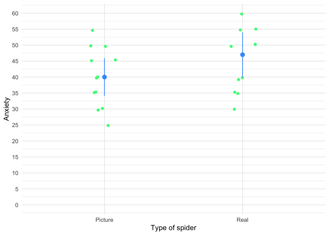
Task 9.3
‘Pop psychology’ books sometimes spout nonsense that is unsubstantiated by science. As part of my plan to rid the world of pop psychology, I took 20 people in relationships and randomly assigned them to one of two groups. One group read the famous popular psychology book Women are from Bras and Men are from Penis, and the other read Marie Claire. The outcome variable was their relationship happiness after their assigned reading. Were people happier with their relationship after reading the pop psychology book? (
self_help.csv).
Load the data using (see Tip 2):
selfhelp_tib <- discovr::self_helpLet’s get the summary statistics in Table 57.
| book | Variable | Mean | 95% CI (Mean) | SD | IQR | Range | Skewness | Kurtosis | n | n_Missing |
|---|---|---|---|---|---|---|---|---|---|---|
| Women are from Bras, Men are from Penis | happy | 20.00 | (17.60, 22.60) | 4.11 | 4.75 | (13.00, 28.00) | 0.28 | 0.93 | 10 | 0 |
| Marie Claire | happy | 24.20 | (21.20, 26.90) | 4.71 | 8.00 | (15.00, 30.00) | -0.77 | -0.14 | 10 | 0 |
Fit the model
book_mod <- t.test(happy ~ book, data = selfhelp_tib)Table 58 shows the parameter estimates.
model_parameters(book_mod) |>
display()| Parameter | Group | book = Women are from Bras, Men are from Penis | book = Marie Claire | Difference | 95% CI | t(17.68) | p |
|---|---|---|---|---|---|---|---|
| happy | book | 20 | 24.20 | -4.20 | (-8.36, -0.04) | -2.12 | 0.048 |
Alternative hypothesis: true difference in means between group Women are from Bras, Men are from Penis and group Marie Claire is not equal to 0
Table 59 shows the effect size estimate.
cohens_d(happy ~ book, data = selfhelp_tib) |>
display()| Cohen’s d | 95% CI |
|---|---|
| -0.95 | [-1.87, -0.01] |
Estimated using pooled SD.
Task 9.4
Twaddle and Sons, the publishers of Women are from Bras and Men are from Penis, were upset about my claims that their book was as useful as a paper umbrella. They ran their own experiment (N = 500) in which relationship happiness was measured after participants had read their book and after reading this one. (Participants read the books in counterbalanced order with a sixmonth delay.) Was relationship happiness greater after reading their wonderful contribution to pop psychology than after reading my tedious tome about experiments? (
self_help_dsur.csv).
Load the data using (see Tip 2):
self_help_dsur_tib <- discovr::self_help_dsurLet’s get the summary statistics in Table 57.
| book | Variable | Mean | 95% CI (Mean) | SD | IQR | Range | Skewness | Kurtosis | n | n_Missing |
|---|---|---|---|---|---|---|---|---|---|---|
| Self-help book | happiness | 20.02 | (19.19, 20.96) | 9.98 | 12 | (-18.00, 45.00) | -0.07 | 0.48 | 500 | 0 |
| Discovering statistics using R | happiness | 18.49 | (17.73, 19.21) | 8.99 | 12 | (-8.00, 42.00) | 0.06 | -0.12 | 500 | 0 |
We need to run a paired samples t-test on these data, and to do so we need the data in messy format as in Table 61:
# Convert to messy
messy_book_tib <- self_help_dsur_tib |>
  pivot_wider(
    id_cols = id,
    values_from = happiness,
    names_from = book
    ) |>
  rename(
    self_help = `Self-help book`,
    dsur = `Discovering statistics using R`
  )

# show the data
DT::datatable(messy_book_tib)Fit the model
Table 62 shows the parameter estimates.
model_parameters(bookr_mod) |>
display()| Parameter | Difference | t(499) | p | 95% CI |
|---|---|---|---|---|
| Pair(self_help, dsur) | 1.53 | 2.71 | 0.007 | (0.42, 2.64) |
Alternative hypothesis: true mean difference is not equal to 0
Table 63 shows the effect size estimate.
| d (rm) | 95% CI |
|---|---|
| 0.16 | [0.04, 0.28] |
Adjusted for small sample bias.
Although this effect is highly statistically significant, the size of the effect is small. In this example, it would be tempting for Twaddle and Sons to conclude that their book produced significantly greater relationship happiness than my book. In fact, many researchers would write conclusions like this:
However, to reach such a conclusion is to confuse statistical significance with the importance of the effect. By calculating the effect size we’ve discovered that although the difference in happiness after reading the two books is statistically different, the size of effect that this represents is small. A more balanced interpretation might, therefore, be:
Of course, this latter interpretation would be unpopular with Twaddle and Sons who would like to believe that their book had a huge effect on relationship happiness.
Task 9.5
In Chapter 4 (Task 6) we looked at data from people who had fish or cats as pets and measured their life satisfaction as well as how much they like animals (
pets.csv). Conduct a t-test to see whether life satisfaction depends upon the type of pet a person has.
Load the data using (see Tip 2):
pet_tib <- discovr::petsLet’s get the summary statistics in Table 64.
| pet | Variable | Mean | 95% CI (Mean) | SD | IQR | Range | Skewness | Kurtosis | n | n_Missing |
|---|---|---|---|---|---|---|---|---|---|---|
| Fish | life_satisfaction | 38.17 | (28.67, 45.84) | 15.51 | 19.25 | (6.00, 56.00) | -1.17 | 0.44 | 12 | 0 |
| Cat | life_satisfaction | 60.12 | (52.62, 66.13) | 11.10 | 13.50 | (37.00, 72.00) | -1.45 | 2.23 | 8 | 0 |
Fit the model
pet_mod <- t.test(life_satisfaction ~ pet, data = pet_tib)Table 65 shows the parameter estimates.
model_parameters(pet_mod) |>
display()| Parameter | Group | pet = Fish | pet = Cat | Difference | 95% CI | t(17.84) | p |
|---|---|---|---|---|---|---|---|
| life_satisfaction | pet | 38.17 | 60.12 | -21.96 | (-34.48, -9.44) | -3.69 | 0.002 |
Alternative hypothesis: true difference in means between group Fish and group Cat is not equal to 0
Table 66 shows the effect size estimate.
cohens_d(life_satisfaction ~ pet, data = pet_tib) |>
display()| Cohen’s d | 95% CI |
|---|---|
| -1.57 | [-2.59, -0.53] |
Estimated using pooled SD.
As well as being statistically significant, this effect is very large and so represents a substantive finding. We could report:
Task 9.6
Repeat the t-test from Task 5 but turn of Welch’s correction. Then fit a linear model to the data in Task 5 to see whether life satisfaction is significantly predicted from the type of animal. What do you notice about the t-value and significance in this model compared to Task 5?
First let’s fit the model without applying the default Welch correction by including var.equal = TRUE. The results are in Table 67.
| Parameter | Group | pet = Fish | pet = Cat | Difference | 95% CI | t(18) | p |
|---|---|---|---|---|---|---|---|
| life_satisfaction | pet | 38.17 | 60.12 | -21.96 | (-35.35, -8.57) | -3.45 | 0.003 |
Alternative hypothesis: true difference in means between group Fish and group Cat is not equal to 0
Now let’s fit a linear model. The results are in Table 68.
| Parameter | Coefficient | SE | 95% CI | t(18) | p |
|---|---|---|---|---|---|
| (Intercept) | 38.17 | 4.03 | (29.70, 46.63) | 9.47 | < .001 |
| pet (Cat) | 21.96 | 6.37 | (8.57, 35.35) | 3.45 | 0.003 |
The values of t and p are the same. (Technically, t is different because for the linear model it is a positive value and for the t-test it is negative However, the sign of t merely reflects which way around you coded the cat and fish groups. The linear model, by default, has coded the groups the opposite way around to the t-test.) The main point I wanted to make here is that whether you run these data through the lm() or t.test() functions, the results are identical.
Task 9.7
In Chapter 6 we looked at hygiene scores over three days of a rock music festival (
download.csv). Do a paired-samples t-test to see whether hygiene scores on day 1 differed from those on day 3.
Load the data using (see Tip 2):
download_tib <- discovr::downloadLet’s get the summary statistics in Table 69.
| Variable | Mean | 95% CI (Mean) | SD | IQR | Range | Skewness | Kurtosis | n | n_Missing |
|---|---|---|---|---|---|---|---|---|---|
| day_1 | 1.79 | (1.73, 1.86) | 0.94 | 0.93 | (0.02, 20.02) | 8.87 | 170.45 | 810 | 0 |
| day_3 | 0.98 | (0.86, 1.10) | 0.71 | 1.11 | (0.02, 3.41) | 1.03 | 0.73 | 123 | 687 |
We need to run a paired samples t-test on these data, and so the data need to be in messy format, which they are.
Fit the model:
Table 70 shows the parameter estimates.
model_parameters(download_mod) |>
display()| Parameter | Difference | t(122) | p | 95% CI |
|---|---|---|---|---|
| Pair(day_1, day_3) | 0.67 | 10.59 | < .001 | (0.55, 0.80) |
Alternative hypothesis: true mean difference is not equal to 0
Table 71 shows the effect size estimate.
Task 9.8
A psychologist was interested in the cross-species differences between men and dogs. She observed a group of dogs and a group of men in a naturalistic setting (20 of each). She classified several behaviours as being dog-like (urinating against trees and lampposts, attempts to copulate with anything that moved, and attempts to lick their own genitals). For each man and dog she counted the number of dog-like behaviours displayed in a 24-hour period. It was hypothesized that dogs would display more dog-like behaviours than men. Test this hypothesis using a robust test. (
men_dogs.csv)
Load the data using (see Tip 2):
mandog_tib <- discovr::men_dogsLet’s get the summary statistics in Table 72.
| species | Variable | Mean | 95% CI (Mean) | SD | IQR | Range | Skewness | Kurtosis | n | n_Missing |
|---|---|---|---|---|---|---|---|---|---|---|
| Dog | behaviour | 28.05 | (23.55, 33.00) | 10.98 | 17.25 | (15.00, 51.00) | 0.74 | -0.57 | 20 | 0 |
| Man | behaviour | 26.85 | (22.95, 31.65) | 9.90 | 11.25 | (12.00, 54.00) | 0.94 | 1.66 | 20 | 0 |
Fit the model
mandog_mod <- t.test(behaviour ~ species, data = mandog_tib)Table 73 shows the parameter estimates.
model_parameters(mandog_mod) |>
display()| Parameter | Group | species = Dog | species = Man | Difference | 95% CI | t(37.60) | p |
|---|---|---|---|---|---|---|---|
| behaviour | species | 28.05 | 26.85 | 1.20 | (-5.50, 7.90) | 0.36 | 0.719 |
Alternative hypothesis: true difference in means between group Dog and group Man is not equal to 0
Table 74 shows the effect size estimate.
cohens_d(behaviour ~ species, data = mandog_tib) |>
display()| Cohen’s d | 95% CI |
|---|---|
| 0.11 | [-0.51, 0.73] |
Estimated using pooled SD.
The effect is not statistically significant, and is a small effect. We could report:
Task 9.9
Both Ozzy Osbourne and Judas Priest have been accused of putting backward masked messages on their albums that subliminally influence poor unsuspecting teenagers into doing things like blowing their heads off with shotguns. A psychologist was interested in whether backward masked messages could have an effect. He created a version of Taylor Swifts’ ‘Shake it off’ that contained the masked message ‘deliver your soul to the dark lord’ repeated in the chorus. He took this version, and the original, and played one version (randomly) to a group of 32 people. Six months later he played them whatever version they hadn’t heard the time before. So, each person heard both the original and the version with the masked message, but at different points in time. The psychologist measured the number of satanic intrusions the person had in the week after listening to each version. Test the hypothesis that the backward message would lead to more intrusions (
dark_lord.csv) using a robust test.
Load the data using (see Tip 2):
darklord_tib <- discovr::dark_lordLet’s get the summary statistics in Table 75.
| message | Variable | Mean | 95% CI (Mean) | SD | IQR | Range | Skewness | Kurtosis | n | n_Missing |
|---|---|---|---|---|---|---|---|---|---|---|
| Message | intrusions | 9.16 | (7.91, 10.38) | 3.55 | 4 | (2.00, 17.00) | 0.08 | 0.24 | 32 | 0 |
| No message | intrusions | 11.50 | (10.09, 13.03) | 4.38 | 3 | (4.00, 21.00) | 0.79 | 0.23 | 32 | 0 |
We need to run a robust paired samples t-test on these data. Therefore, we need to make the data messy (as in Table 76):
# Convert to messy
dark_mess_tib <- darklord_tib |>
  pivot_wider(
    id_cols = id,
    values_from = intrusions,
    names_from = message
    ) |>
  rename_with(.data = _, ~ tolower(str_replace(.x, pattern = " ", replacement = "_")))

# show the data
DT::datatable(dark_mess_tib)Fit the robust model
darklord_rob <- WRS2::yuend(x = dark_mess_tib$message, y = dark_mess_tib$no_message)Table 77 shows the parameter estimates.
model_parameters(darklord_rob) |>
display()| t(19) | p | Difference | Difference 95% CI | Estimate | Effectsize |
|---|---|---|---|---|---|
| -1.96 | 0.064 | -1.55 | (-3.20, 0.10) | 0.36 | Explanatory measure of effect size |
Task 9.10
Thinking back to Labcoat Leni’s Real Research 4.1, test whether the number of offers was significantly different in people listening to Bon Scott than in those listening to Brian Johnson (
acdc.csv) using a robust independent t-test and bootstrapping. Do your results differ from Oxoby (2008)?
Load the data using (see Tip 2):
acdc_tib <- discovr::acdcLet’s get the summary statistics in Table 78.
| singer | Variable | Mean | 95% CI (Mean) | SD | IQR | Range | Skewness | Kurtosis | n | n_Missing |
|---|---|---|---|---|---|---|---|---|---|---|
| Bon Scott | offer | 3.28 | (2.72, 3.78) | 1.18 | 2 | (1.00, 5.00) | -0.12 | -0.77 | 18 | 0 |
| Brian Johnson | offer | 4.00 | (3.56, 4.50) | 0.97 | 2 | (2.00, 5.00) | -0.43 | -0.96 | 18 | 0 |
Fit the model
acdc_rob <- WRS2::yuenbt(offer ~ singer, data = acdc_tib, nboot = 1000, side = TRUE)Table 80 shows the parameter estimates.
model_parameters(acdc_rob) |>
display()display(acdc_pe)| t | p | Difference | Difference 95% CI |
|---|---|---|---|
| -1.73 | 0.086 | -0.83 | (-1.79, 0.12) |
Table 81 shows the effect size estimate.
cohens_d(offer ~ singer, data = acdc_tib) |>
display()| Cohen’s d | 95% CI |
|---|---|
| -0.67 | [-1.34, 0.01] |
Estimated using pooled SD.
The bootstrap confidence interval ranged from -1.79 to 0.12, which just about crosses zero suggesting that (if we assume that it is one of the 95% of confidence intervals that contain the true value) that the effect in the population could be zero.
Chapter 10
Task 10.1
McNulty et al. (2008) found a relationship between a person’s
attractivenessand how muchsupportthey give their partner among newlywed heterosexual couples. The data are inmcnulty_2008.csv, Is this relationship moderated byspouse(i.e., whether the data were from the husband or wife)?
Load the data using (see Tip 2):
mcnulty_tib <- discovr::mcnulty_2008Centre the predictors
mcnulty_ctib <- center(x = mcnulty_tib, select = c(attractiveness , support, satisfaction))Fit the model
support_lm <- lm(support ~ attractiveness*spouse, data = mcnulty_ctib)Table 82 shows the fit statistics
model_performance(support_lm) |>
display()| AIC | AICc | BIC | R2 | R2 (adj.) | RMSE | Sigma |
|---|---|---|---|---|---|---|
| -52.2 | -51.9 | -36.7 | 0.09 | 0.07 | 0.20 | 0.20 |
Evaluate the model assumptions in Figure 23. There’s potential heteroscedasticity.
check_model(support_lm)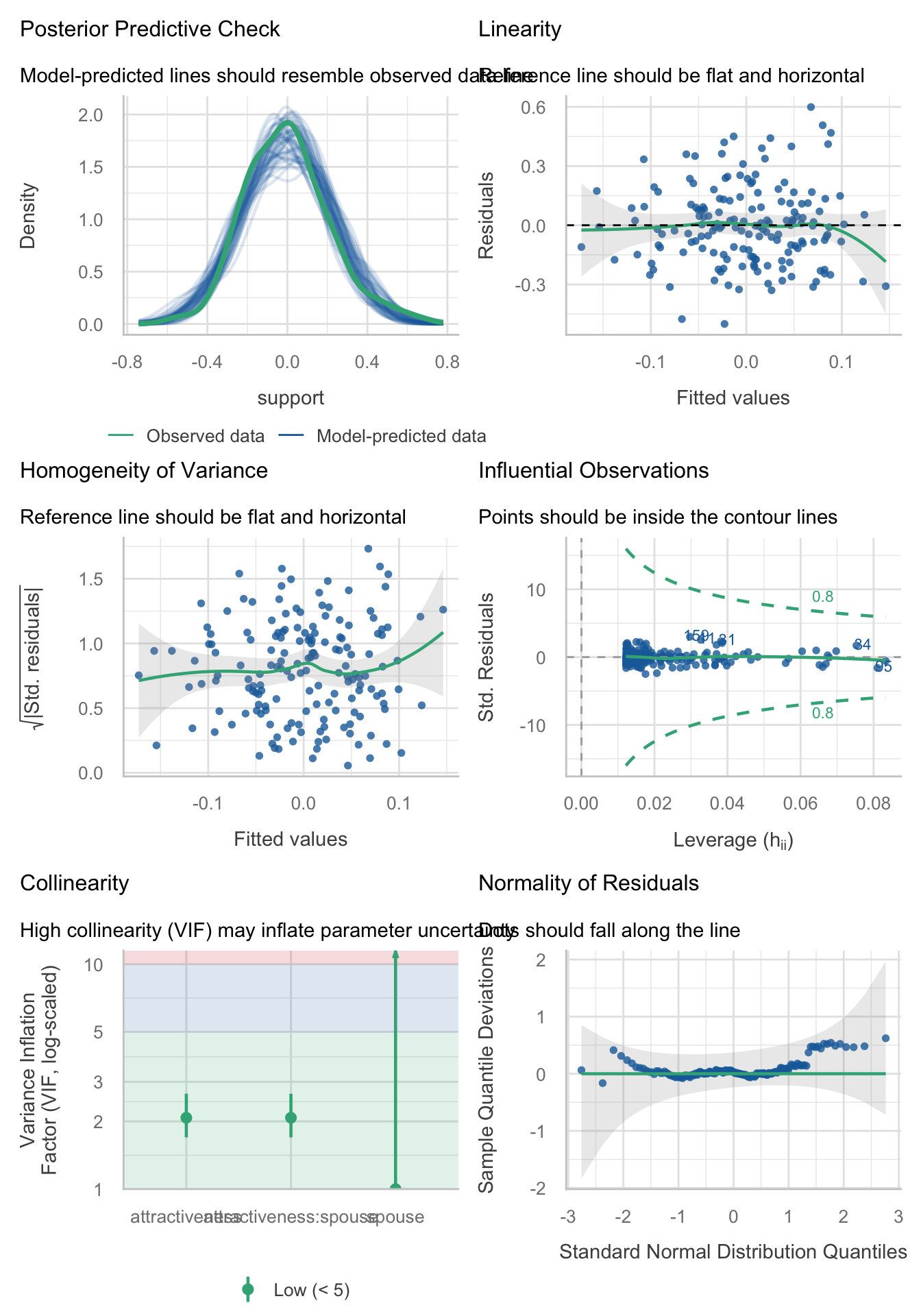
Table 83 shows the robust parameter estimates
model_parameters(support_lm, vcov = "HC4") |>
display()| Parameter | Coefficient | SE | 95% CI | t(160) | p |
|---|---|---|---|---|---|
| (Intercept) | -0.01 | 0.02 | (-0.06, 0.03) | -0.50 | 0.619 |
| attractiveness | -0.06 | 0.02 | (-0.10, -0.02) | -2.93 | 0.004 |
| spouse (Wife) | 0.02 | 0.03 | (-0.04, 0.09) | 0.75 | 0.455 |
| attractiveness × spouse (Wife) | 0.11 | 0.03 | (0.05, 0.16) | 3.54 | < .001 |
Task 10.2
Produce the simple slopes analysis for Task 1.
Table 84 tells us that the relationship between attractiveness of a person and amount of support given to their spouse is different for husbands and wives. Specifically, for wives, as attractiveness increases the level of support that they give to their husbands increases, whereas for husbands, as attractiveness increases the amount of support they give to their wives decreases.
support_ss <- estimate_slopes(model = support_lm,
                              trend = "attractiveness",
                              by = "spouse")

display(support_ss)| spouse | Slope | SE | 95% CI | t(160) | p |
|---|---|---|---|---|---|
| Husband | -0.06 | 0.02 | (-0.10, -0.02) | -2.97 | 0.003 |
| Wife | 0.05 | 0.02 | ( 0.01, 0.08) | 2.35 | 0.020 |
Marginal effects estimated for attractiveness; Type of slope was dY/dX
Task 10.3
McNulty et al. (2008) also found a relationship between a person’s
attractivenessand their relationshipsatisfactionamong newlyweds. Using the same data as in Tasks 1 and 2, find out if this relationship is moderated byspouse.
The data were loaded and variables centred in Task 1. To fit this model use:
satisfaction_lm <- lm(satisfaction ~ attractiveness*spouse, data = mcnulty_ctib)Table 85 shows the fit statistics
model_performance(satisfaction_lm) |>
display()| AIC | AICc | BIC | R2 | R2 (adj.) | RMSE | Sigma |
|---|---|---|---|---|---|---|
| 960.6 | 961.0 | 976.1 | 0.03 | 9.97e-03 | 4.39 | 4.44 |
Evaluate the model assumptions in Figure 24. There’s potential heteroscedasticity.
check_model(satisfaction_lm)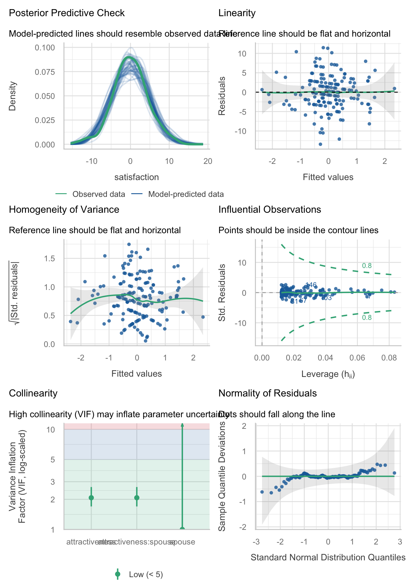
Table 86 shows the robust parameter estimates
model_parameters(satisfaction_lm, vcov = "HC4") |>
display()| Parameter | Coefficient | SE | 95% CI | t(160) | p |
|---|---|---|---|---|---|
| (Intercept) | 0.01 | 0.41 | (-0.79, 0.82) | 0.04 | 0.972 |
| attractiveness | -0.88 | 0.38 | (-1.64, -0.13) | -2.32 | 0.021 |
| spouse (Wife) | -0.02 | 0.70 | (-1.40, 1.35) | -0.03 | 0.973 |
| attractiveness × spouse (Wife) | 0.55 | 0.58 | (-0.59, 1.68) | 0.95 | 0.343 |
Task 10.4:
In this chapter we tested a mediation model of infidelity for Lambert et al.’s data (Lambert et al., 2012). Repeat this analysis but using
hook_upsas the measure of infidelity.
Load the data using (see Tip 2):
infidelity_tib <- discovr::lambert_2012Specify the model by changing the outcome in the code within the book chapter:
hookup_mod <- 'hook_ups ~ c*ln_porn + b*commit
                   commit ~ a*ln_porn

                   indirect_effect := a*b
                   total_effect := c + (a*b)
                   '
Fit the model
hookup_fit <- lavaan::sem(hookup_mod,
                          data = infidelity_tib,
                          missing = "FIML",
                          estimator = "MLR")
Table 87 shows the parameter estimates
model_parameters(hookup_fit) |>
display()| Link | Coefficient | SE | 95% CI | z | p |
|---|---|---|---|---|---|
| hook_ups ~ ln_porn (c) | 1.29 | 0.52 | (0.28, 2.30) | 2.50 | 0.013 |
| hook_ups ~ commit (b) | -0.62 | 0.13 | (-0.88, -0.36) | -4.72 | < .001 |
| commit ~ ln_porn (a) | -0.47 | 0.23 | (-0.92, -0.02) | -2.06 | 0.040 |
| To | Coefficient | SE | 95% CI | z | p |
|---|---|---|---|---|---|
| (indirect_effect) | 0.29 | 0.15 | (-7.47e-03, 0.59) | 1.91 | 0.056 |
| (total_effect) | 1.58 | 0.55 | (0.51, 2.65) | 2.89 | 0.004 |
Is there evidence for mediation? As such, there is not significant mediation (although there nearly is …).
Task 10.5:
Tablets like the iPad are very popular. A company owner was interested in how to make his brand of tablets more desirable. He collected data on how cool people perceived a product’s advertising to be (
advert_cool), how cool they thought the product was (product_cool) and how desirable they found the product (desirability). Test his theory that the relationship between cool advertising and product desirability is mediated by how cool people think the product is (tablets.csv). Am I showing my age by using the word ‘cool’?
Load the data using (see Tip 2):
tablet_tib <- discovr::tabletsSpecify the model:
tablet_mod <- 'desirability ~ c*advert_cool + b*product_cool
                   product_cool ~ a*advert_cool

                   indirect_effect := a*b
                   total_effect := c + (a*b)
                   '
Fit the model
tablet_fit <- lavaan::sem(tablet_mod,
                          data = tablet_tib,
                          estimator = "MLR")
Table 88 shows the parameter estimates
model_parameters(tablet_fit) |>
display()| Link | Coefficient | SE | 95% CI | z | p |
|---|---|---|---|---|---|
| desirability ~ advert_cool (c) | 0.20 | 0.06 | (0.07, 0.33) | 3.11 | 0.002 |
| desirability ~ product_cool (b) | 0.23 | 0.06 | (0.12, 0.35) | 3.96 | < .001 |
| product_cool ~ advert_cool (a) | 0.15 | 0.06 | (0.03, 0.27) | 2.43 | 0.015 |
| To | Coefficient | SE | 95% CI | z | p |
|---|---|---|---|---|---|
| (indirect_effect) | 0.04 | 0.02 | (1.23e-03, 0.07) | 2.03 | 0.042 |
| (total_effect) | 0.24 | 0.06 | (0.11, 0.36) | 3.68 | < .001 |
- Advert coolness significantly predicted desirability, \(\hat{b}\) = 0.20 (0.07, 0.33), z = 3.11, p = 0.002. As advert coolness increased, desirability increases also.
- Advert coolness significantly predicted perceptions of a product, \(\hat{b}\) = 0.15 (0.03, 0.27), z = 2.43, p = 0.015. As advert coolness increased, product coolness increased also.
- Product coolness significantly predicted desirability, \(\hat{b}\) = 0.23 (0.12, 0.35), z = 3.96, p < 0.001. Products perceived to be more cool were more desirable.
- The indirect effect of advert coolness on desirability through product coolness was significant, \(\hat{b}\) = 0.04 (0.00, 0.07), z = 2.03, p = 0.042. As such, there was evidence of significant mediation.
You could report this as:
Chapter 11
Task 11.1
To test how different teaching methods affected students’ knowledge I took three statistics modules (
group) where I taught the same material. For one module I wandered around with a large cane and beat anyone who asked daft questions or got questions wrong (punish). In the second I encouraged students to discuss things that they found difficult and gave anyone working hard a nice sweet (reward). In the final course I neither punished nor rewarded students’ efforts (indifferent). I measured the students’ exam marks (percentage). The data are in the fileteach_method.csv. Fit a model with planned contrasts to test the hypotheses that: (1) reward results in better exam results than either punishment or indifference; and (2) indifference will lead to significantly better exam results than punishment.
Load the data using (see Tip 2):
teach_tib <- discovr::teach_methodLet’s do the plot first. We can get an error bar plot in Figure 25 as follows:
ggplot(teach_tib, aes(group, exam)) +
  stat_summary(fun.data = "mean_cl_boot", colour = "#3E9BFEFF") +
  coord_cartesian(ylim = c(0, 70)) +
  scale_y_continuous(breaks = seq(0, 70, 10)) +
  labs(x = "Method of teaching", y = "Percentage on exam") +
  theme_minimal()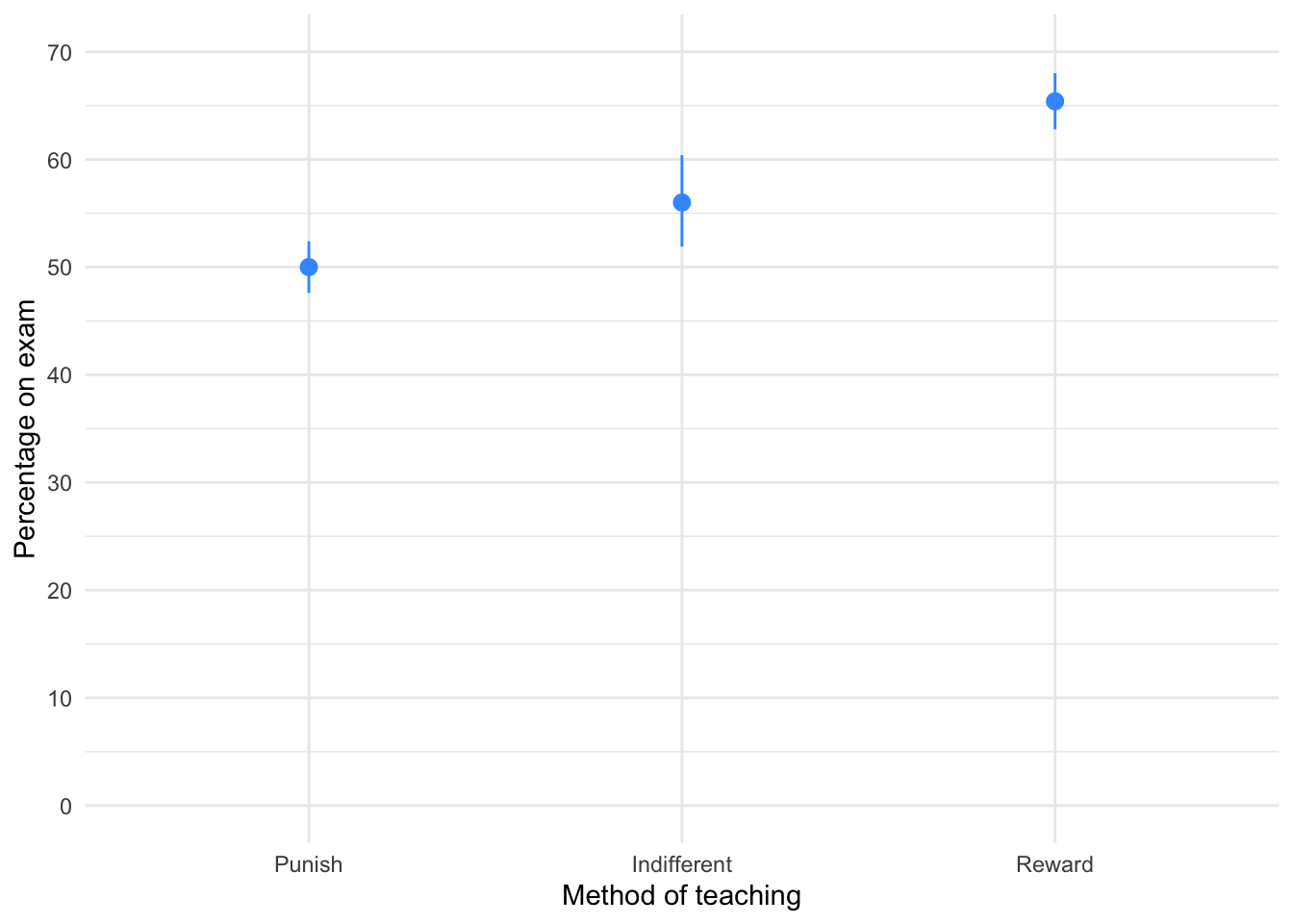
The plot shows that marks are highest after reward and lowest after punishment.
To fit the model we need to think about the hypotheses:
- Reward results in better exam results than either punishment or indifference
- Indifference will lead to significantly better exam results than punishment
To test our hypotheses we need to first enter the codes for the contrasts in Table 89.
| Group | Reward vs. other | Indifference vs. punish |
|---|---|---|
| Punish | 1/3 | 1/2 |
| Indifferent | 1/3 | -1/2 |
| Reward | -2/3 | 0 |
Contrast 1 tests hypothesis 1: reward results in better exam results than either punishment or indifference. To test this we compare the reward condition against the other two. So we compare chunk 1 (punish, indifferent) to chunk 2 (reward). In the table, the numbers assigned to the groups are the number of groups in the opposite chunk divided by the number of groups that have non-zero codes, and we randomly assigned one chunk to be a negative value. (The codes -1/3, -1/3, 2/3 would work fine as well.)
Contrast 2 tests hypothesis 2: indifference will lead to significantly better exam results than punishment. First we get rid of the reward condition by assigning a code of 0; next we compare chunk 1 (indifferent) to chunk 2 (punish). The numbers assigned to the groups are the number of groups in the opposite chunk divided by the number of groups that have non-zero codes, and then we randomly assigned one chunk to be a negative value. (The codes -1/2, 1/2, 0 would work fine as well.)
We set these contrasts for the variable group as follows:
            reward_vs_other indifferent_vs_punish
Punish            0.3333333                   0.5
Indifferent       0.3333333                  -0.5
Reward           -0.6666667                   0.0
Next we fit the model using this code:
| Parameter | Sum_Squares | df | Mean_Square | F | p | Omega2 | Omega2 95% CI |
|---|---|---|---|---|---|---|---|
| group | 1205.07 | 2 | 602.53 | 21.01 | < .001 | 0.57 | (0.34, 1.00) |
| Residuals | 774.40 | 27 | 28.68 |
Anova Table (Type 1 tests)
Table 90 tells us that there was a significant effect of the teaching method on exam scores, F(2, 27) = 21.01, p < 0.001, \(\hat{\omega}^2\) = 0.57 (0.34, 1.00). View the parameters using:
model_parameters(teach_lm) |>
display()| Parameter | Coefficient | SE | 95% CI | t(27) | p |
|---|---|---|---|---|---|
| (Intercept) | 57.13 | 0.98 | (55.13, 59.14) | 58.43 | < .001 |
| group (reward_vs_other) | -12.40 | 2.07 | (-16.66, -8.14) | -5.98 | < .001 |
| group (indifferent_vs_punish) | -6.00 | 2.40 | (-10.91, -1.09) | -2.51 | 0.019 |
Table 91 shows that hypothesis 1 is supported (groupreward_vs_other): teaching with rewards led to significantly higher exam scores than the other methods, \(\hat{b}\) = -12.40 (-16.66, -8.14), t(27) = -5.98, p < 0.001. Hypothesis 2 is also supported (groupindifferent_vs_punish): teaching with indifference was associated with higher exam scores than teaching with punishment, \(\hat{b}\) = -6.00 (-10.91, -1.09), t(27) = -2.51, p = 0.019.
We can get some basic diagnostic plots (Figure 26). There are no large Cook’s distances, the Q-Q plot suggests normal residuals but the residual vs. fitted plot and the scale-location plot suggest heterogeneity of variance (the columns of dots are different lengths and the red line is not flat especially in the scale location plot), which brings us to Task 2!
check_model(teach_lm)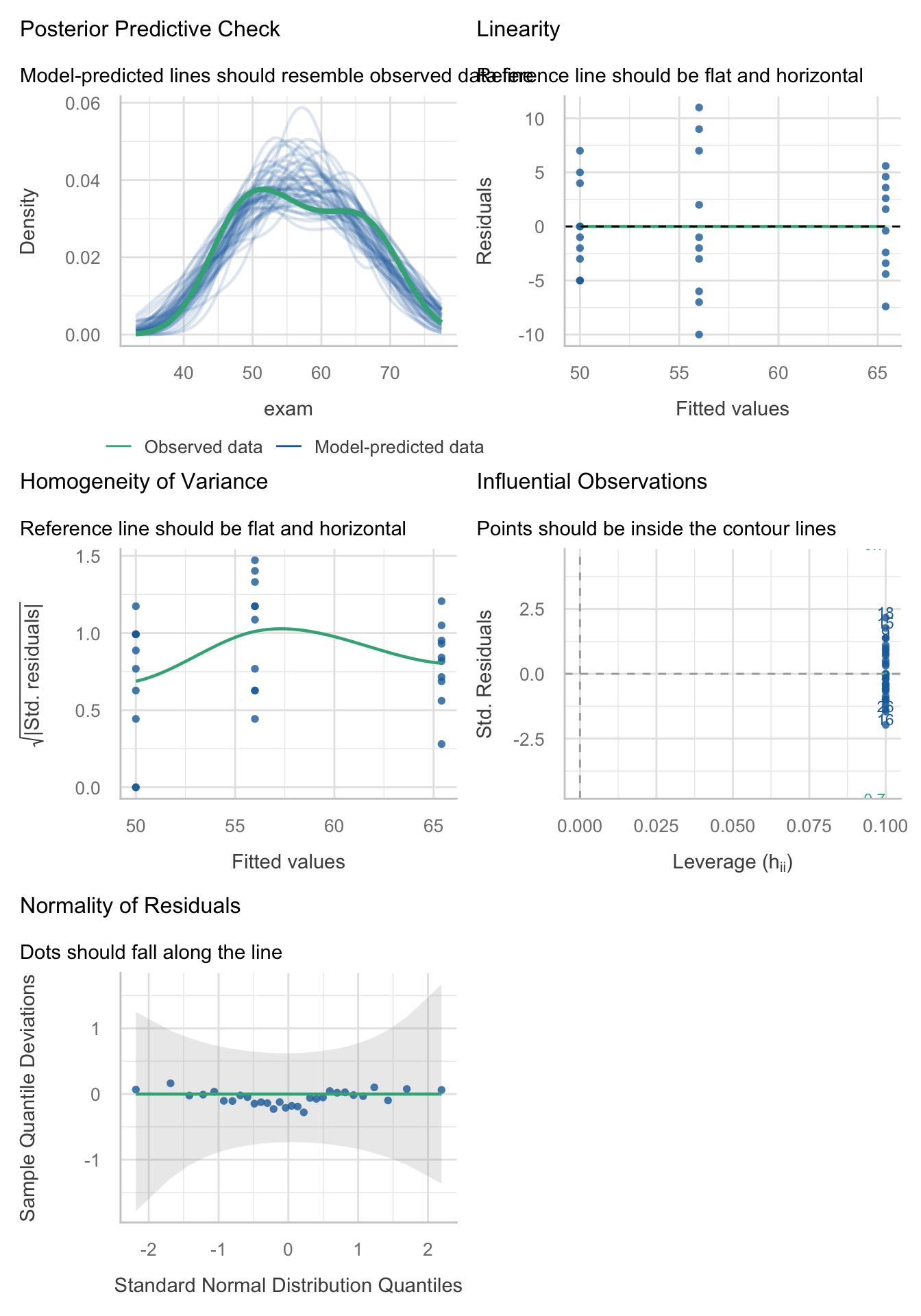
Task 11.2
Fit a robust model for Task 1.
Table 92 shows a robust F for the teaching data. The Welch F is highly significant like the non-robust F.
oneway.test(exam ~ group, data = teach_tib) |>
  model_parameters() |>
display()| F | df | df (error) | p |
|---|---|---|---|
| 32.24 | 2 | 17.34 | < .001 |
Table 93 The first contrast is still highly significant and the second contrast is also still significant. As such, our conclusions are unchanged when fitting a model that is robust to heteroscedasticity.
model_parameters(teach_lm, vcov = "HC4") |>
display()| Parameter | Coefficient | SE | 95% CI | t(27) | p |
|---|---|---|---|---|---|
| (Intercept) | 57.13 | 0.98 | (55.13, 59.14) | 58.43 | < .001 |
| group (reward_vs_other) | -12.40 | 1.88 | (-16.26, -8.54) | -6.59 | < .001 |
| group (indifferent_vs_punish) | -6.00 | 2.60 | (-11.33, -0.67) | -2.31 | 0.029 |
Task 11.3
Children wearing superhero costumes are more likely to harm themselves because of the unrealistic impression of invincibility that these costumes could create. For example, children have reported to hospital with severe injuries because of trying ‘to initiate flight without having planned for landing strategies’ (Davies, Surridge, Hole, & Munro-Davies, 2007). I can relate to the imagined power that a costume bestows upon you; indeed, I have been known to dress up as Fisher by donning a beard and glasses and trailing a goat around on a lead in the hope that it might make me more knowledgeable about statistics. Imagine we had data (
superhero.csv) about the severity ofinjury(on a scale from 0, no injury, to 100, death) for children reporting to the accident and emergency department at hospitals, and information on which superhero costume they were wearing (hero): Spiderman, Superman, the Hulk or a teenage mutant ninja turtle. Fit a model with planned contrasts to test the hypothesis that those wearing costumes of flying superheroes (Superman and Spiderman) have more severe injuries.
To get you into the mood for hulk-related data analysis, Figure 1 shows my wife and I on the Hulk rollercoaster at the islands of adventure in Orlando, on our honeymoon.

Not in the mood yet? OK, let’s ramp up the ‘weird’ with a photo (Figure 2) of some complete strangers reading one of my textbooks on the same Hulk roller-coaster that my wife and I rode (not at the same time as the book readers I should add). Nothing says ‘I love your textbook’ like taking it on a stomach-churning high speed ride. I dearly wish that reading my books on roller coasters would become a ‘thing’.

Load the data using (see Tip 2):
hero_tib <- discovr::superheroLets start with a violin plot of the data with some error bars (Figure 27):
ggplot(hero_tib, aes(hero, injury)) +
  geom_violin(colour = "#3E9BFEFF", fill = "#3E9BFEFF", alpha = 0.1) +
  stat_summary(fun.data = "mean_cl_boot", colour = "#3E9BFEFF") +
  coord_cartesian(ylim = c(0, 90)) +
  scale_y_continuous(breaks = seq(0, 90, 10)) +
  labs(x = "Costume worn", y = "Injury severity (0-100") +
  theme_minimal()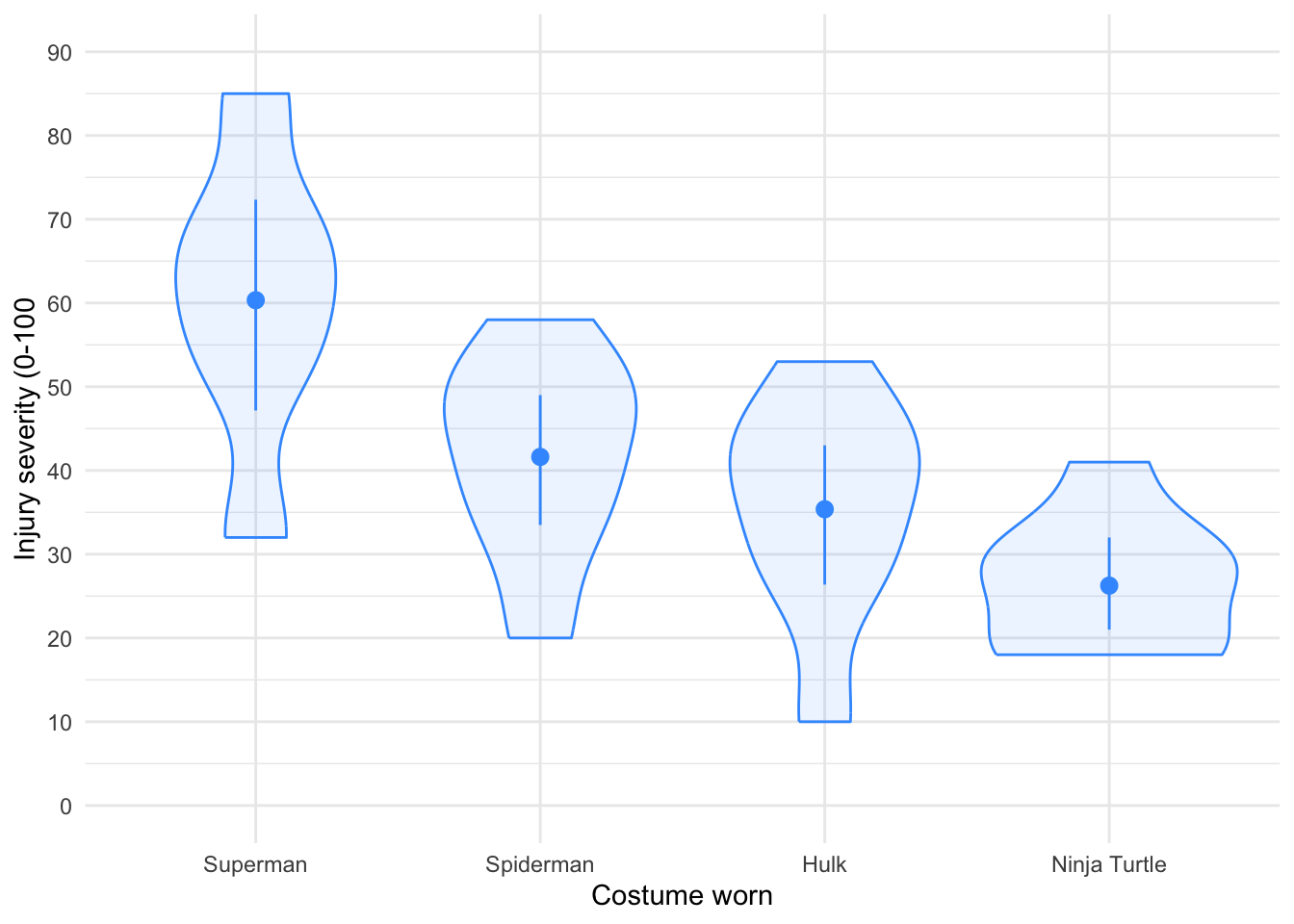
To test our main hypotheses we need to first work out some contrasts. In the book, we learned rules to generate contrasts. Figure 3 shows how we would apply these to the Superhero example to plan the contrasts that we want. We’re told that we want to compare flying superheroes (i.e. Superman and Spiderman) against non-flying ones (the Hulk and Ninja Turtles) in the first instance. That will be contrast 1. However, because each of these chunks is made up of two groups (e.g., the flying superheroes chunk comprises both children wearing Spiderman and those wearing Superman costumes), we need a second and third contrast that breaks each of these chunks down into their constituent parts.
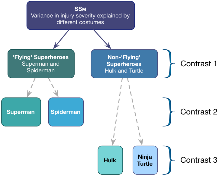
Contrast 1 compares flying (Superman, Spiderman) to non-flying (Hulk, Turtle) superheroes. Each chunk contains two groups, so the weights for the opposite chunks are both 2 divided by the number of groups with non-zero weights. This gives us \(\frac{2}{4} = \frac{1}{2}\).We assign one chunk positive weights and the other negative weights (in Table 94 I’ve chosen the flying superheroes to have positive weights, but you could do it the other way around).
Contrast two then compares the two flying superheroes to each other. First we assign both non-flying superheroes a 0 weight to remove them from the contrast. We’re left with two chunks: one containing the Superman group and the other containing the Spiderman group. Each chunk contains one group, so the weights for the opposite chunks are both 1 divided by the number of groups with non-zero weights (i.e. 1/2). We assign one chunk positive weights and the other negative weights (in Table 94 I’ve given Superman the positive weight, but you could do it the other way around).
Finally, Contrast three compares the two non-flying superheroes to each other. First we assign both flying superheroes a 0 weight to remove them from the contrast. We’re left with two chunks: one containing the Hulk group and the other containing the Turtle group. Each chunk contains one group, so the weights for the opposite chunks are both 1/2 (for the same reason as contrast 2). We assign one chunk positive weights and the other negative weights (in Table 94 I’ve given the Hulk the positive weight, but you could do it the other way around).
| Group | Flying vs. non | Superman vs. Spiderman | Hulk vs. Ninja turtle |
|---|---|---|---|
| Superman | 1/2 | 1/2 | 0 |
| Spiderman | 1/2 | -1/2 | 0 |
| Hulk | -1/2 | 0 | 1/2 |
| Ninja Turtle | -1/2 | 0 | -1/2 |
We set these contrasts for the variable hero as follows:
             flying_vs_not super_vs_spider hulk_vs_ninja
Superman               0.5             0.5           0.0
Spiderman              0.5            -0.5           0.0
Hulk                  -0.5             0.0           0.5
Ninja Turtle          -0.5             0.0          -0.5
Next we fit the model using this code:
| Parameter | Sum_Squares | df | Mean_Square | F | p | Omega2 | Omega2 95% CI |
|---|---|---|---|---|---|---|---|
| hero | 4180.62 | 3 | 1393.54 | 8.32 | < .001 | 0.42 | (0.14, 1.00) |
| Residuals | 4356.58 | 26 | 167.56 |
Anova Table (Type 1 tests)
Table 95 tells us that there was a significant effect of the teaching method on exam scores, F(3, 26) = 8.32, p < 0.001, \(\hat{\omega}^2\) = 0.42 (0.14, 1.00).
We can get evaluate the model by looking at Figure 28. There are no large Cook’s distances, the Q-Q plot suggests non-normal residuals and the residual vs fitted plot and the scale-location plot suggest heterogeneity of variance (the columns of dots are different lengths and the line is not flat especially in the scale location plot).
check_model(hero_lm)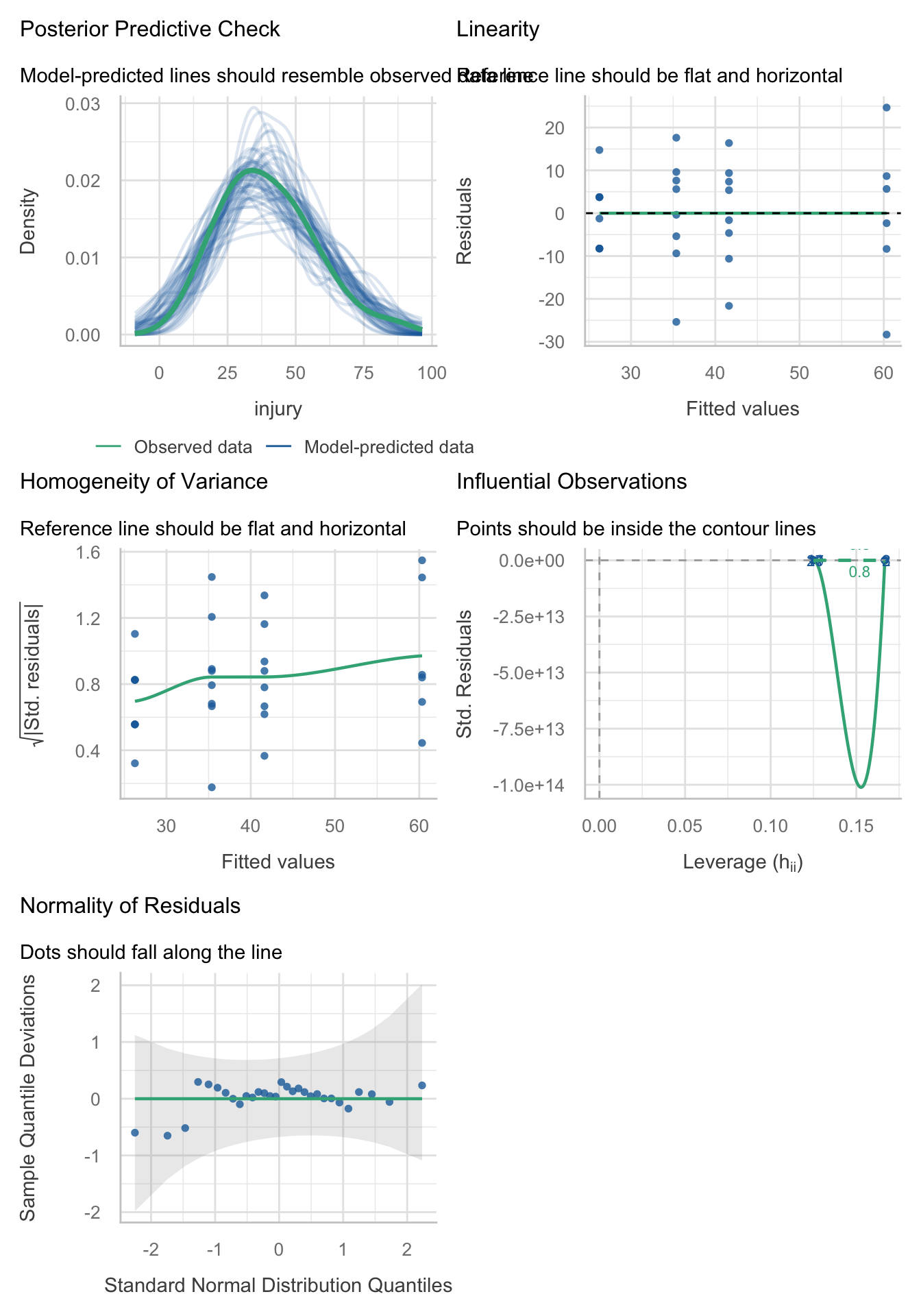
Let’s fit a robust model as a sensitivity check:
oneway.test(injury ~ hero, data = hero_tib) |>
  model_parameters() |>
display()| F | df | df (error) | p |
|---|---|---|---|
| 7.10 | 3 | 13.02 | 0.005 |
The Welch F is highly significant still. Now view the (robust) parameter estimates table using:
model_parameters(hero_lm, vcov = "HC4") |>
display()| Parameter | Coefficient | SE | 95% CI | t(26) | p |
|---|---|---|---|---|---|
| (Intercept) | 40.90 | 2.56 | (35.64, 46.15) | 16.00 | < .001 |
| hero (flying_vs_not) | 20.17 | 5.11 | (9.66, 30.67) | 3.95 | < .001 |
| hero (super_vs_spider) | 18.71 | 8.61 | (1.02, 36.40) | 2.17 | 0.039 |
| hero (hulk_vs_ninja) | 9.12 | 5.52 | (-2.22, 20.47) | 1.65 | 0.110 |
Table 96 shows that hypothesis 1 is supported: flying costumes were associated with more severe injuries than non-flying ones, \(\hat{b}\) = 20.17 (9.66, 30.67), t(26) = 3.95, p < 0.001. The other contrasts tell us that Superman costumes were associated with more sever injuries than Spiderman costumes, \(\hat{b}\) = 18.71 (1.02, 36.40), t(26) = 2.17, p = 0.039, but that injury severity was not significantly different between Hulk and Ninja turtle costumes, \(\hat{b}\) = 9.12 (-2.22, 20.47), t(26) = 1.65, p = 0.110.
Task 11.4
I read a story in a newspaper (yes, back when they existed) claiming that the chemical genistein, which is naturally occurring in soya, was linked to lowered sperm counts in Western males. When you read the actual study, it had been conducted on rats, it found no link to lowered sperm counts, but there was evidence of abnormal sexual development in male rats (probably because genistein acts like oestrogen). As journalists tend to do, a study showing no link between soya and sperm counts was used as the scientific basis for an article about soya being the cause of declining sperm counts in Western males. Imagine the rat study was enough for us to want to test this idea in humans. We recruit 80 males and split them into four groups that vary in the number of soya ‘meals’ (a dinner containing 75g of soya) they ate per week over a year: no soya meals (i.e., none in the whole year), one per week (52 over the year), four per week (208 over the year), and seven per week (364 over the year). At the end of the year, participants produced some sperm that I could count (when I say ‘I’, I mean someone else in a laboratory as far away from me as humanly possible). The data are in
soya.csv
Load the data using (see Tip 2):
soya_tib <- discovr::soyaLets start with a boxplot of the data (Figure 29):
ggplot(soya_tib, aes(soya, sperm)) +
  geom_boxplot(colour = "#F05B12FF", fill = "#F05B12FF", alpha = 0.3) +
  coord_cartesian(ylim = c(0, 130)) +
  scale_y_continuous(breaks = seq(0, 130, 10)) +
  labs(x = "Number of soya meals per week", y = "Sperm count (Millions)") +
  theme_minimal()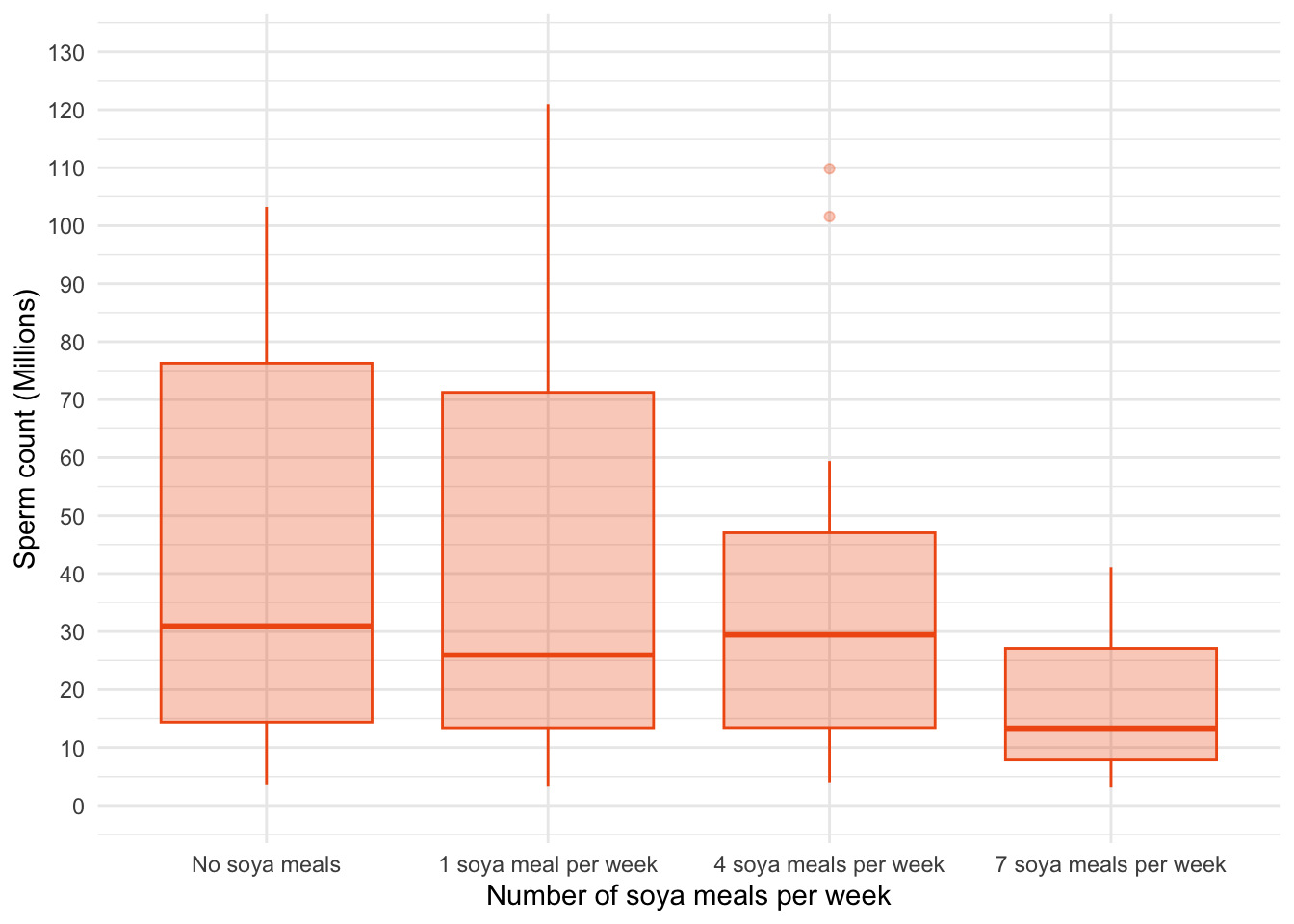
A boxplot of the data suggests that (1) scores within conditions are skewed; and (2) variability in scores is different across groups. Let’s verify this using some residual plots (Figure 30):
sperm_lm <- lm(sperm ~ soya, data = soya_tib)
check_model(sperm_lm)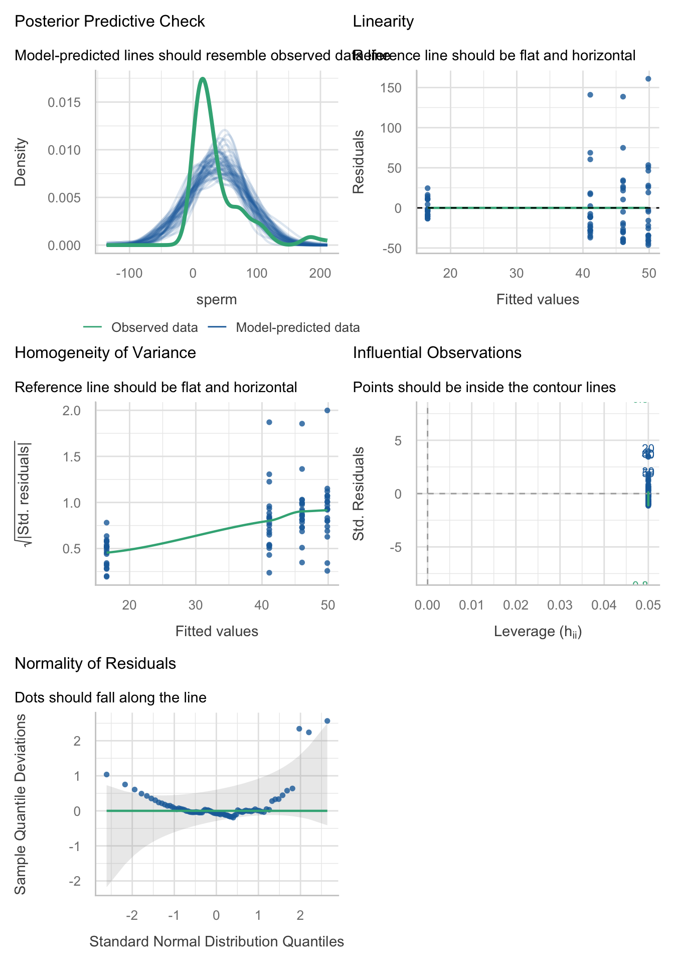
Yep, just as I suspected, the residuals are properly fucked. They’re hideously non-normal and the non-flat green line in the middle_left plot suggest heteroscedasticity. No problem, we’ll fit a robust model. By default
Let’s fit a robust model. Table 97 shows that The Welch F is highly significant suggesting that sperm counts are significantly affected by the amount of Soya meals you eat per week, F(3, 34.66) = 6.28, p = 0.002.
sperm_rob <- oneway.test(sperm ~ soya, data = soya_tib)
model_parameters(sperm_rob) |>
display()| F | df | df (error) | p |
|---|---|---|---|
| 6.28 | 3 | 34.66 | 0.002 |
Now the robust parameters:
model_parameters(model = sperm_lm, vcov = "HC4") |>
display()| Parameter | Coefficient | SE | 95% CI | t(76) | p |
|---|---|---|---|---|---|
| (Intercept) | 49.87 | 11.37 | (27.22, 72.51) | 4.39 | < .001 |
| soya (1 soya meal per week) | -3.82 | 15.44 | (-34.57, 26.94) | -0.25 | 0.806 |
| soya (4 soya meals per week) | -8.77 | 15.05 | (-38.74, 21.21) | -0.58 | 0.562 |
| soya (7 soya meals per week) | -33.34 | 11.64 | (-56.51, -10.16) | -2.86 | 0.005 |
Task 11.5
Mobile phones emit microwaves, and so holding one next to your brain for large parts of the day is a bit like sticking your brain in a microwave oven and pushing the ‘cook until well done’ button. If we wanted to test this experimentally, we could get six groups of people and strap a mobile phone on their heads, then by remote control turn the phones on for a certain amount of time each day. After six months, we measure the size of any tumour (in mm3) close to the site of the phone antenna (just behind the ear). The six groups experienced 0, 1, 2, 3, 4 or 5 hours per day of phone microwaves for six months. Do tumours significantly increase with greater daily exposure? The data are in
tumour.csv.
Load the data using (see Tip 2):
tumour_tib <- discovr::tumourPlot the data
Lets start with an error bar plot of the data (Figure 31):
ggplot(tumour_tib, aes(usage, tumour)) +
  stat_summary(fun.data = "mean_cl_boot", colour = "#3E9BFEFF") +
  coord_cartesian(ylim = c(0, 7)) +
  scale_y_continuous(breaks = 0:7) +
  labs(x = "Hours on phone per day", y = bquote(Size~of~tumour~(mm^3))) +
  theme_minimal()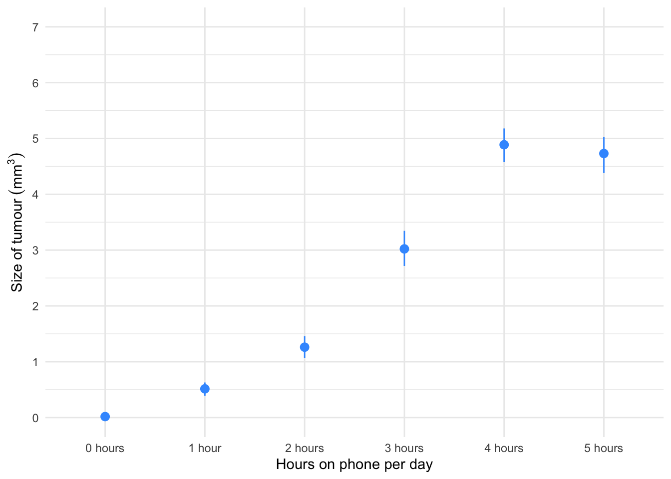
Figure 31 shows the mean size of brain tumour in each condition, and the funny ‘I’ shapes show the confidence interval of these means. Note that in the control group (0 hours), the mean size of the tumour is virtually zero (we wouldn’t expect them to have a tumour) and the error bar shows that there was very little variance across samples - this almost certainly means we cannot assume equal variances. Let’s verify this by fitting a model and viewing the residual plots (Figure 32).
phone_lm <- lm(tumour ~ usage, data = tumour_tib)
check_model(phone_lm)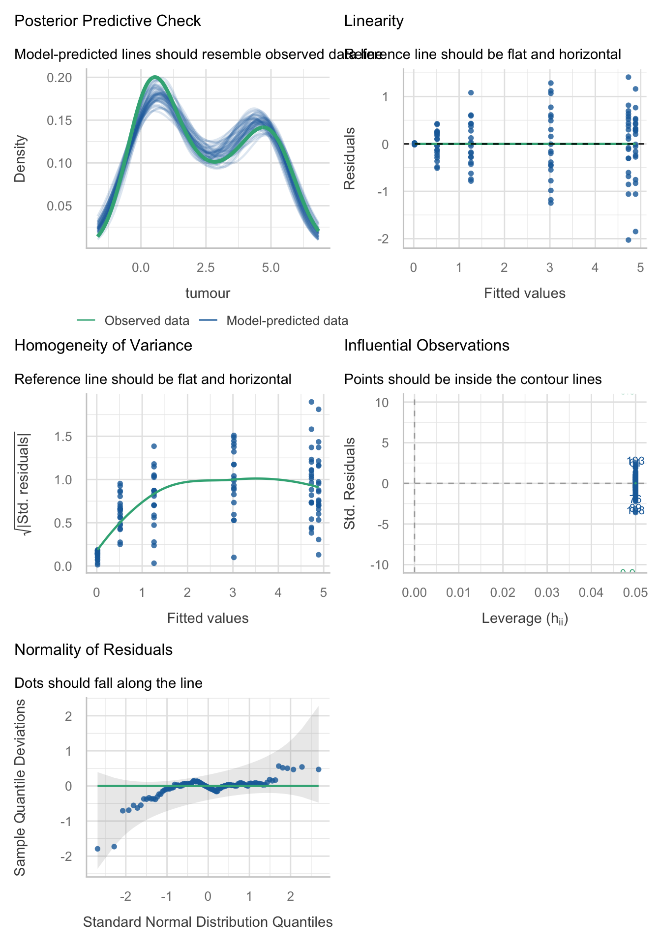
Holy shit, the residuals were bad in the last task, but these ones be like
These residuals are hideously non-normal and the non-flat green lines on the relevant plots suggest heteroscedasticity. However, we can have the last laugh by fitting a robust model. By default
Table 99 shows that The Welch F is highly significant suggesting tumour size is significantly affected by the amount of hours the phone was active per day, F(5, 44.39) = 414.93, p < 0.001.
phone_rob <- oneway.test(tumour ~ usage, data = tumour_tib)
model_parameters(phone_rob) |>
display()| F | df | df (error) | p |
|---|---|---|---|
| 414.93 | 5 | 44.39 | < .001 |
Table 100 shows the parameter estimates and robust confidence intervals and tests.
model_parameters(model = phone_lm, vcov = "HC4") |>
display()| Parameter | Coefficient | SE | 95% CI | t(114) | p |
|---|---|---|---|---|---|
| (Intercept) | 0.02 | 2.71e-03 | (0.01, 0.02) | 6.47 | < .001 |
| usage (1 hour) | 0.50 | 0.06 | (0.37, 0.62) | 7.82 | < .001 |
| usage (2 hours) | 1.24 | 0.11 | (1.03, 1.46) | 11.30 | < .001 |
| usage (3 hours) | 3.00 | 0.17 | (2.66, 3.34) | 17.55 | < .001 |
| usage (4 hours) | 4.87 | 0.16 | (4.56, 5.18) | 31.28 | < .001 |
| usage (5 hours) | 4.71 | 0.17 | (4.37, 5.06) | 26.96 | < .001 |
Task 11.6
Using the Glastonbury data from Chapter 8 (
glastonbury.csv), fit a model to see if the change in hygiene (change) is significant across people with different musical tastes (music). Use a simple contrast to compare each group against the no affiliation group.
Load the data using (see Tip 2):
glasters_tib <- discovr::glastonburyLets start with a boxplot of the data (Figure 33):
glasters_tib |>
  filter(!is.na(change)) |>  # filter out cases that have NA (missing values) on the outcome variable
  ggplot(data = _, aes(subculture, change)) +
  geom_boxplot(colour = "#F05B12FF", fill = "#F05B12FF", alpha = 0.3) +
  coord_cartesian(ylim = c(-3, 1.5)) +
  scale_y_continuous(breaks = seq(-3, 1.5, 0.5)) +
  labs(x = "Subculture", y = "Change in hygiene scores across the festival") +
  theme_minimal()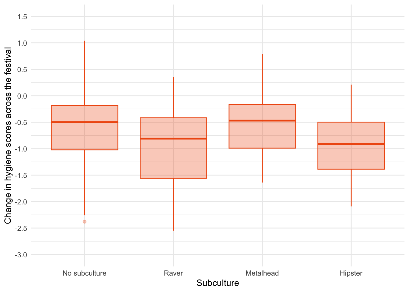
R§eember that negative scores mean that hygiene declines across the festival. Figure 33 suggests that there was the least decline in hygiene for people with no subculture and metalheads, and greater hygiene decline for ravers who had a similar change to hipsters. There looks like a bit of skew and different spreads of scores which might suggest the knock on effects of non-normal residuals and heteroscedasticity but let’s verify this by fitting a model and using it to view residual plots (Figure 34).
stink_lm <- lm(change ~ subculture, data = glasters_tib)
check_model(stink_lm)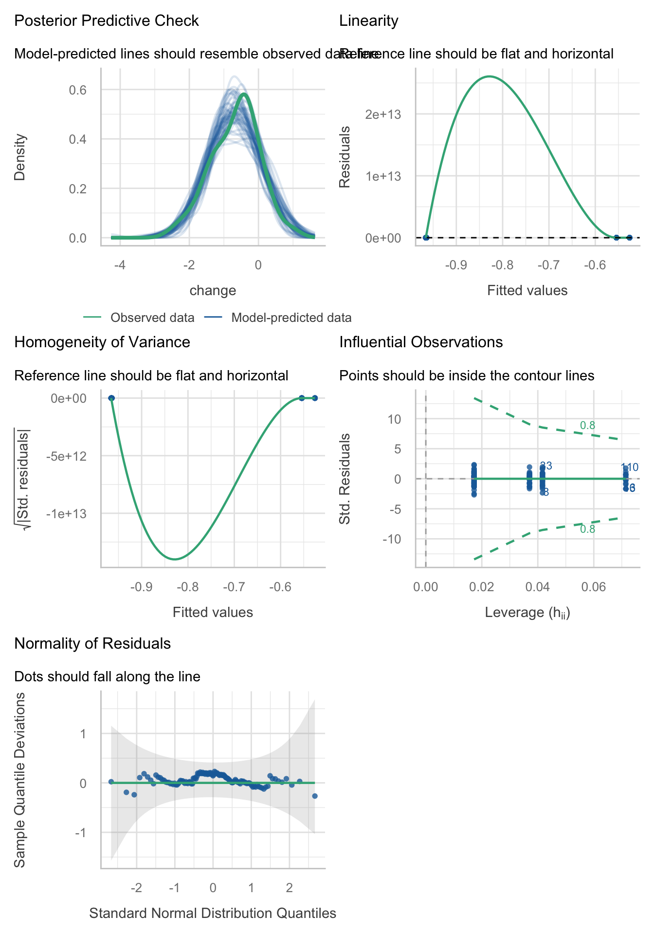
The Q-Q plot suggests normal residuals but the linearity and homoscedasticity plots look weird (Figure 34). This is because check_model() sometimes scale the y-axis weirdly. Figure 35 and Figure 36 use the native
plot(stink_lm, which = 1)
plot(stink_lm, which = 3)
Let’s fit the model. By default
Next we fit the model using this code:
| Parameter | Sum_Squares | df | Mean_Square | F | p | Omega2 | Omega2 95% CI |
|---|---|---|---|---|---|---|---|
| subculture | 4.65 | 3 | 1.55 | 3.27 | 0.024 | 0.05 | (0.00, 1.00) |
| Residuals | 56.36 | 119 | 0.47 |
Anova Table (Type 1 tests)
Table 101 tells us that there was a significant effect of the subculture membership on the change in hygiene scores, F(3, 119) = 3.27, p = 0.024, \(\hat{\omega}^2\) = 0.05 (0.00, 1.00). View the parameters using:
model_parameters(stink_lm) |>
display()| Parameter | Coefficient | SE | 95% CI | t(119) | p |
|---|---|---|---|---|---|
| (Intercept) | -0.55 | 0.09 | (-0.73, -0.38) | -6.13 | < .001 |
| subculture (Raver) | -0.41 | 0.17 | (-0.74, -0.08) | -2.46 | 0.015 |
| subculture (Metalhead) | 0.03 | 0.16 | (-0.29, 0.35) | 0.18 | 0.860 |
| subculture (Hipster) | -0.41 | 0.20 | (-0.82, -4.21e-03) | -2.00 | 0.048 |
Table 102 shows that hypothesis 1 is supported (groupreward_vs_other): teaching with rewards led to significantly higher exam scores than the other methods, \(\hat{b}\) = -12.40 (-16.66, -8.14), t(27) = -5.98, p < 0.001. Hypothesis 2 is also supported (groupindifferent_vs_punish): teaching with indifference was associated with higher exam scores than teaching with punishment, \(\hat{b}\) = -6.00 (-10.91, -1.09), t(27) = -2.51, p = 0.019
Task 11.7
Repeat the analysis in Labcoat Leni’s Real Research 11.2 but using copulatory efficiency as the outcome.
Load the data using (see Tip 2):
eggs_tib <- discovr::cetinkaya_2006Let’s first look at some boxplots (Figure 37):
ggplot(eggs_tib, aes(groups, efficiency)) +
  geom_boxplot(colour = "#3E9BFEFF", fill = "#3E9BFEFF", alpha = 0.4) +
  coord_cartesian(ylim = c(0, 35)) +
  scale_y_continuous(breaks = seq(0, 35, 5)) +
  labs(x = "Fetish group", y = "Copulatory efficiency (out of 33)") +
  theme_minimal()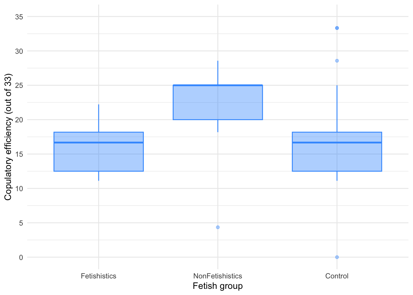
There are outliers and skew in the non-fetishistic group and skew in the control group also. This is confirmed by diagnostic plots from a standard linear model (Figure 38).1
egg_lm <- lm(efficiency ~ groups, data = eggs_tib)
check_model(egg_lm)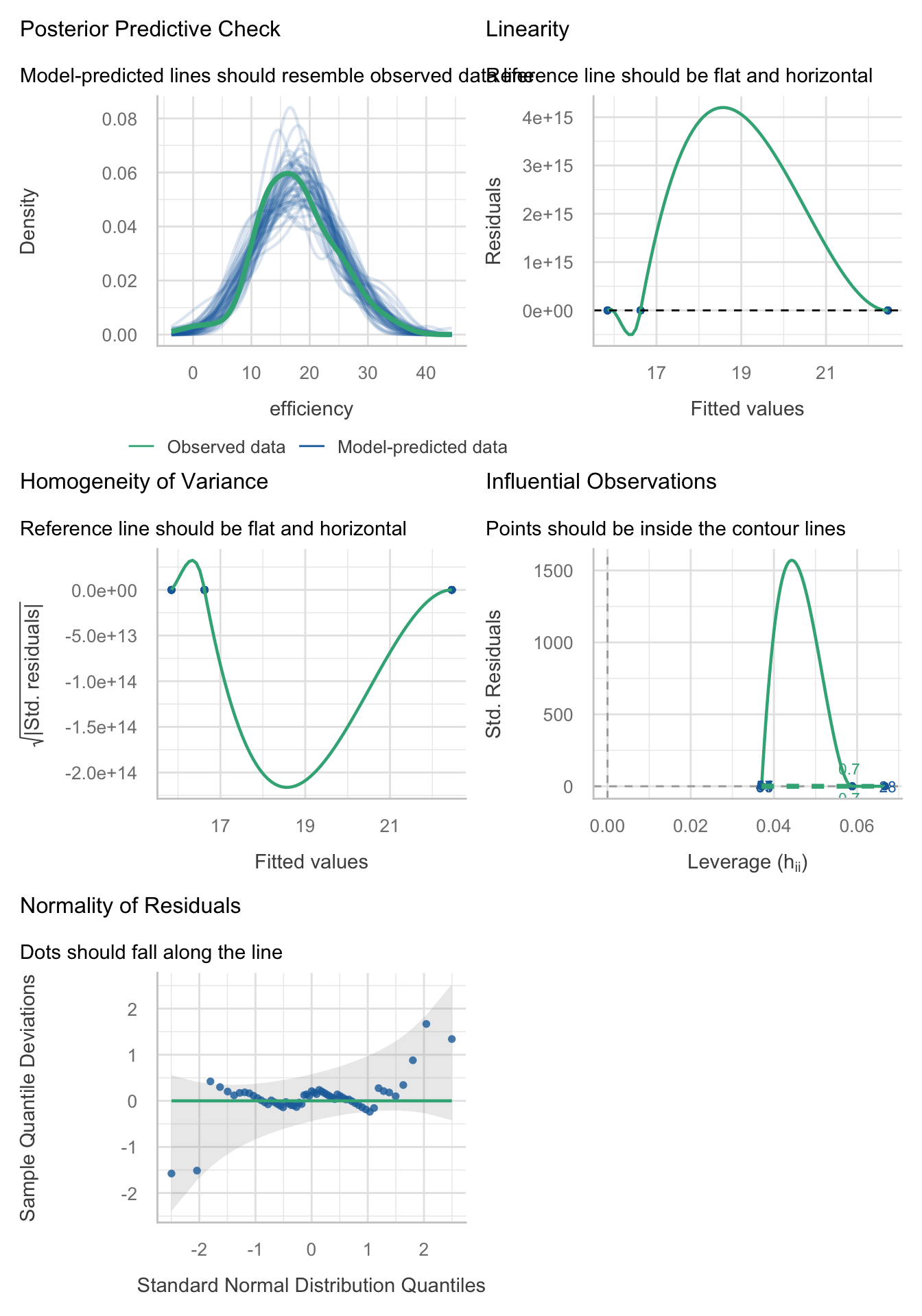
plot(egg_lm, which = 1)
plot(egg_lm, which = 3)
The authors were wise to fit a nonparametric test. We’ll use a 20% trimmed mean test with post hoc tests.
Table 103 tells us that there was a significant effect, F(2, 19.64) = 20.47, p < 0.001. Although we’ve applied a robust test rather than a nonparametric one the results of the study are confirmed.
| F | df | df (error) | p | Estimate | 95% CI | Effectsize |
|---|---|---|---|---|---|---|
| 20.47 | 2 | 19.64 | < .001 | 0.67 | (0.48, 0.88) | Explanatory measure of effect size |
Let’s look at the post hoc tests in Table 104. There was no significant difference between the control group and the fetishistic group, \(\hat{\Psi}\) = -0.03 (-3.33, 3.27), p = 0.983, but significant differences were found between the control group and the nonfetishistic group, \(\hat{\Psi}\) = 8.04 (4.49, 11.59), p < 0.001, and between the fetishistic group and the non-fetishistic group, \(\hat{\Psi}\) = -8.07 (-11.86, -4.28), p < 0.001. We know by looking at the boxplot (the medians in particular) that the nonfetishistic males yielded significantly higher efficiency scores than both the non-fetishistic male quail and the control male quail. These results confirm the findings reported from the nonparametric tests in the paper (page 430):
A one-way ANOVA yielded a significant main effect of groups, $ F(2, 56) = 6.04, p < .05, ^2 = 0.18$. Paired comparisons (with the Bonferroni correction) indicated that the nonfetishistic male quail copulated with the live female quail (US) more efficiently than both the fetishistic male quail (mean difference = 6.61; 95% CI = 1.41, 11.82; p < .05) and the control male quail (mean difference = 5.83; 95% CI = 1.11, 10.56; p < .05). The difference between the efficiency scores of the fetishistic and the control male quail was not significant (mean difference = 0.78; 95% CI = $ -5.33, 3.77 $; p > .05).
| Group1 | Group2 | Psihat | 95% CI | p |
|---|---|---|---|---|
| Fetishistics | NonFetishistics | -8.07 | [-11.86, -4.28] | < .001 |
| Fetishistics | Control | -0.03 | [ -3.33, 3.27] | 0.983 |
| NonFetishistics | Control | 8.04 | [ 4.49, 11.59] | < .001 |
Task 11.8
A sociologist wanted to compare murder rates (
murder) recorded in each month in a year at three high-profile locations in London (street): Ruskin Avenue, Acacia Avenue and Rue Morgue. Fit a robust model with bootstrapping to see in which streets the most murders happened. The data are inmurder.csv.
Load the data using (see Tip 2):
murder_tib <- discovr::murderLet’s first look at some boxplots (Figure 37):
ggplot(murder_tib, aes(street, murder)) +
  geom_boxplot(colour = "#3E9BFEFF", fill = "#3E9BFEFF", alpha = 0.4) +
  coord_cartesian(ylim = c(0, 7)) +
  scale_y_continuous(breaks = 0:7) +
  labs(x = "Street name", y = "Number of murders per month") +
  theme_minimal()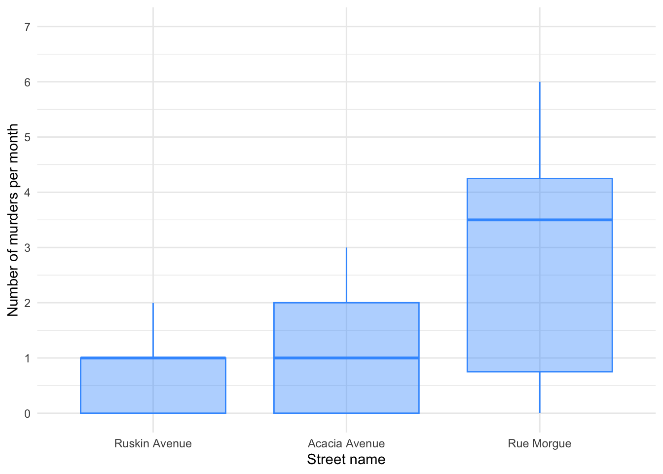
It looks like most murders were in the Rue Morgue, but there is skew in all of the groups. This is confirmed by diagnostic plots from a standard linear model (Figure 42):
murder_lm <- lm(murder ~ street, data = murder_tib)
check_model(murder_lm)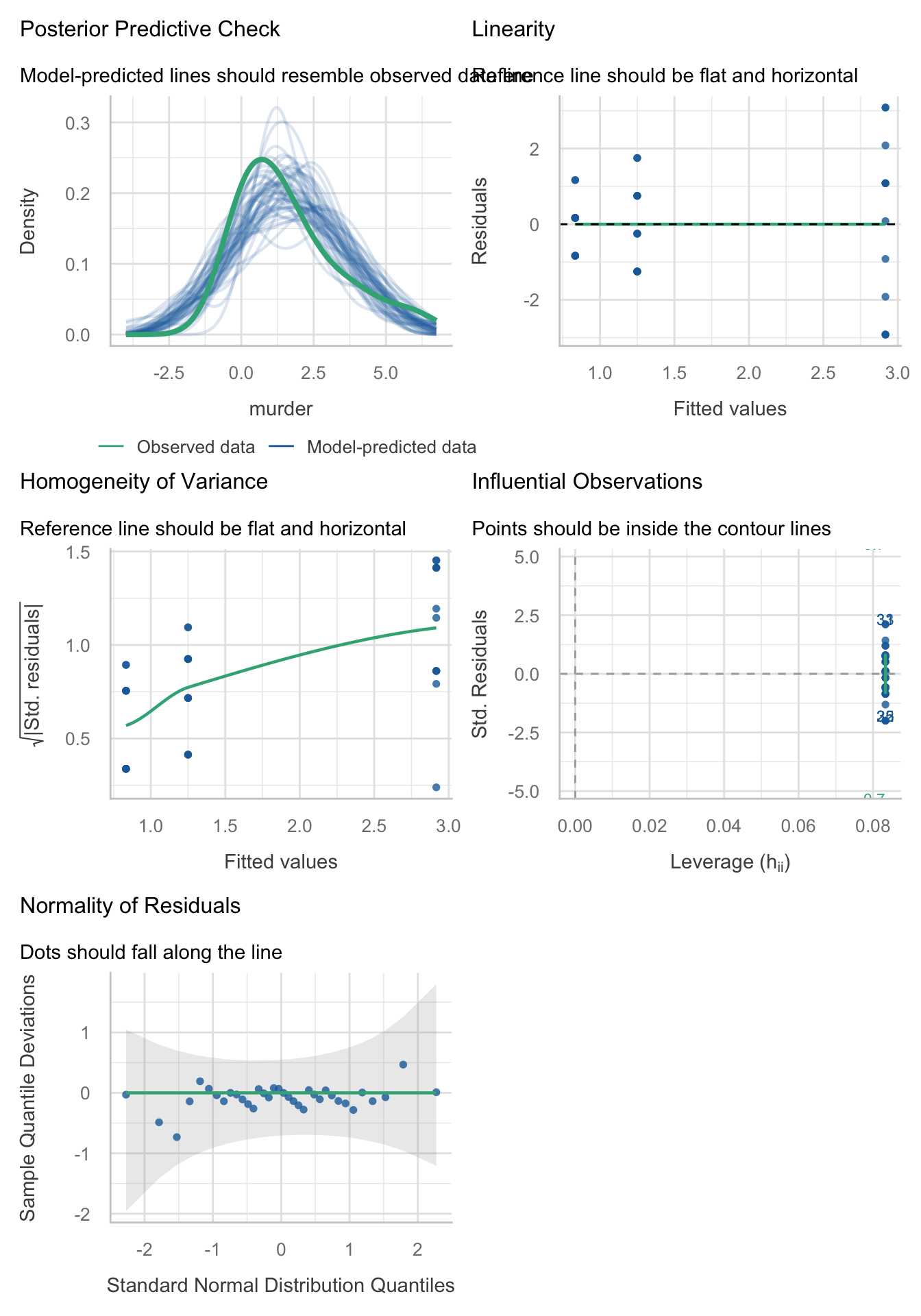
The residuals are both non-normal and heteroscedastic. We’ll use a 20% trimmed mean with bootstrap test with post hoc tests.
Call:
WRS2::t1waybt(formula = murder ~ street, data = murder_tib, nboot = 1000)

Effective number of bootstrap samples was 901.

Test statistic: 2.6011
p-value: 0.16315
Variance explained: 0.384
Effect size: 0.62
The output tells us that there was not a significant effect, F = 2.60, p = 0.163, although the effect size is large (38% of variance explained). We don’t need to look at the post hoc tests because the main effect is not significant.
Chapter 12
Task 12.1
A few years back I was stalked. You’d think they could have found someone a bit more interesting to stalk, but apparently times were hard. It wasn’t particularly pleasant, but could have been a lot worse. I imagined a world in which a psychologist tried two different therapies on different groups of stalkers (25 stalkers in each group – this variable is called
therapy). To the first group he gave cruel-to-be-kind therapy (every time the stalkers followed him around, or sent him a letter, the psychologist attacked them with a cattle prod). The second therapy was psychodyshamic therapy, in which stalkers were hypnotized and regressed into their childhood to discuss their penis (or lack of penis), their dog’s penis, the seventh penis of a seventh penis and any other penis that sprang to mind. The psychologist measured the number of hours stalking in one week both before (stalk_pre) and after (stalk_post) treatment (stalker.csv). Analyse the effect of therapy on stalking behaviour after therapy, adjusting for the amount of stalking behaviour before therapy.
Load the data using (see Tip 2):
stalk_tib <- discovr::stalkerThe design of this study warrants an ANCOVA approach to the model. First visualise the data (Figure 43 and Figure 44)
ggplot(stalk_tib, aes(x = therapy, y = stalk_post, colour = therapy)) +
  geom_point(position = position_jitter(width = 0.1), alpha = 0.6) +
  geom_violin(alpha = 0.2) +
  stat_summary(fun.data = "mean_cl_normal", geom = "pointrange", position = position_dodge(width = 0.9)) +
  coord_cartesian(ylim = c(0, 100)) +
  scale_y_continuous(breaks = seq(0, 100, 10)) +
  scale_colour_viridis_d(begin = 0.3, end = 0.8) +
  labs(x = "Therapy group", y = "Post-therapy stalking (hours)", colour = "Therapy group") +
  theme_minimal() +
  theme(legend.position = "none")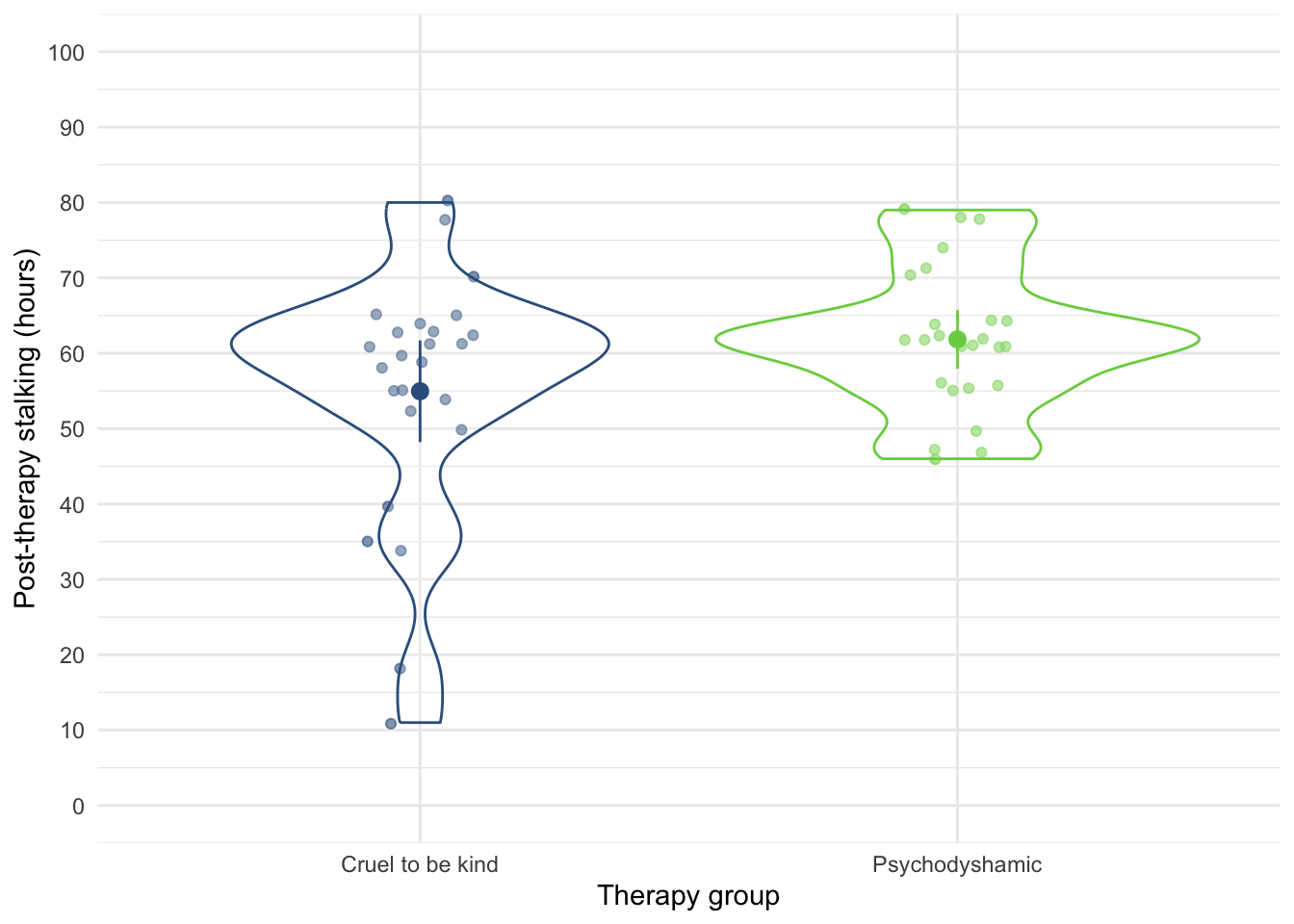
ggplot(stalk_tib, aes(x = stalk_pre, y = stalk_post)) +
  geom_smooth(method = "lm", colour = "#CC6677", fill = "#CC6677", alpha = 0.2) +
  geom_point(colour = "#882255") +
  coord_cartesian(ylim = c(0, 100)) +
  scale_x_continuous(breaks = seq(0, 100, 10)) +
  scale_y_continuous(breaks = seq(0, 100, 10)) +
  labs(x = "Pre-treatment stalking (hrs)", y = "Post-treatment stalking (hrs)") +
  facet_wrap(~therapy) +
  theme_minimal()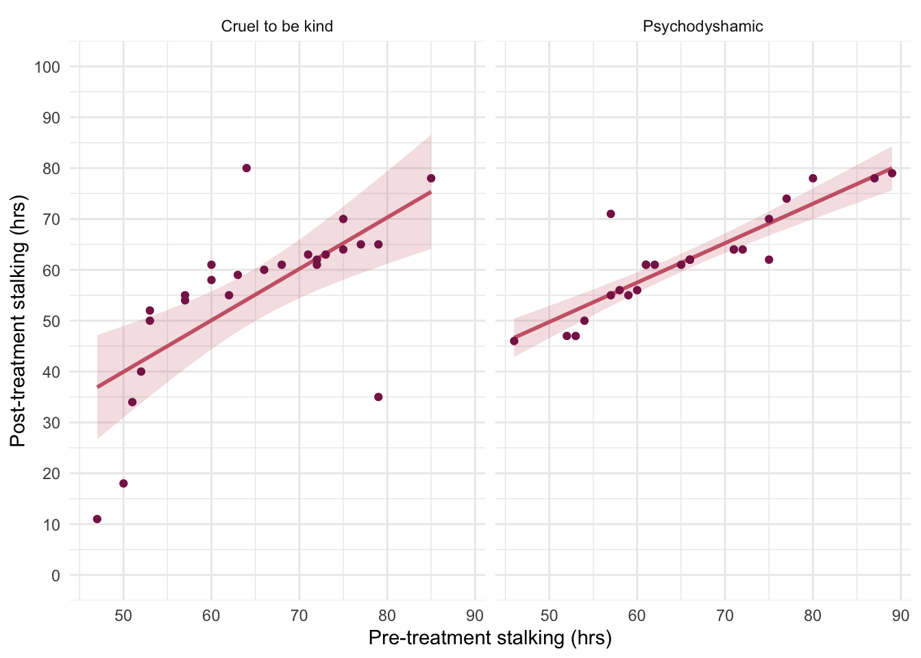
With only two therapy groups we don’t need to set contrasts. First let’s test the assumption of parallel slopes/homogeneity of regression slopes. Table 106 shows a non-significant interaction between the therapy type and pre-therapy stalking, F(1, 46) = 0.88, p = 0.353, suggesting that it’s reasonable to fit the parallel slopes model in stalk_lm.
| Name | Model | df | df_diff | F | p |
|---|---|---|---|---|---|
| stalk_lm | lm | 47 | |||
| full_lm | lm | 46 | 1 | 0.88 | 0.353 |
Models were detected as nested (in terms of fixed parameters) and are compared in sequential order.
Table 107 summarizes the main model. The covariate significantly predicted the outcome variable, F(1, 47) = 50.46, p < 0.001, so the hours spent stalking after therapy depend on the extent of the initial problem (i.e. the hours spent stalking before therapy). More interesting is that after adjusting for the effect of initial stalking behaviour, the effect of therapy is significant, F(1, 47) = 5.49, p = 0.023.
| Parameter | Sum_Squares | df | Mean_Square | F | p | ω² (partial) | ω² 95% CI |
|---|---|---|---|---|---|---|---|
| stalk_pre | 4414.60 | 1 | 4414.60 | 50.46 | < .001 | 0.50 | (0.33, 1.00) |
| therapy | 480.26 | 1 | 480.26 | 5.49 | 0.023 | 0.08 | (9.16e-04, 1.00) |
| Residuals | 4111.72 | 47 | 87.48 |
Anova Table (Type 3 tests)
To interpret the results of the main effect of therapy we look at the adjusted means in Table 108. The adjusted means tell us that stalking behaviour was lower after the therapy involving the cattle prod than after Psychodyshamic therapy (after adjusting for baseline stalking).
| therapy | Mean | SE | 95% CI | t(47) |
|---|---|---|---|---|
| Cruel to be kind | 55.30 | 1.87 | (51.53, 59.06) | 29.55 |
| Psychodyshamic | 61.50 | 1.87 | (57.74, 65.27) | 32.87 |
Variable predicted: stalk_post; Predictors modulated: therapy; Predictors averaged: stalk_pre (65)
To interpret the covariate look at the parameter estimates (Table 109). The parameter estimate shows that there is a positive relationship between stalking pre-therapy and post-therapy, \(\hat{b}\) = 0.89 (0.64, 1.14), t(47) = 7.10, p < 0.001. That is, higher stalking levels pre-therapy corresponded with higher levels post therapy.
model_parameters(stalk_lm) |>
display()| Parameter | Coefficient | SE | 95% CI | t(47) | p |
|---|---|---|---|---|---|
| (Intercept) | -2.84 | 8.35 | (-19.64, 13.96) | -0.34 | 0.735 |
| stalk pre | 0.89 | 0.13 | (0.64, 1.14) | 7.10 | < .001 |
| therapy (Psychodyshamic) | 6.20 | 2.65 | (0.88, 11.53) | 2.34 | 0.023 |
Evaluate the model assumptions using Figure 45. The plots suggest non-normal residuals and heterogeneity of variance. Which brings us to Task 2.
check_model(stalk_lm)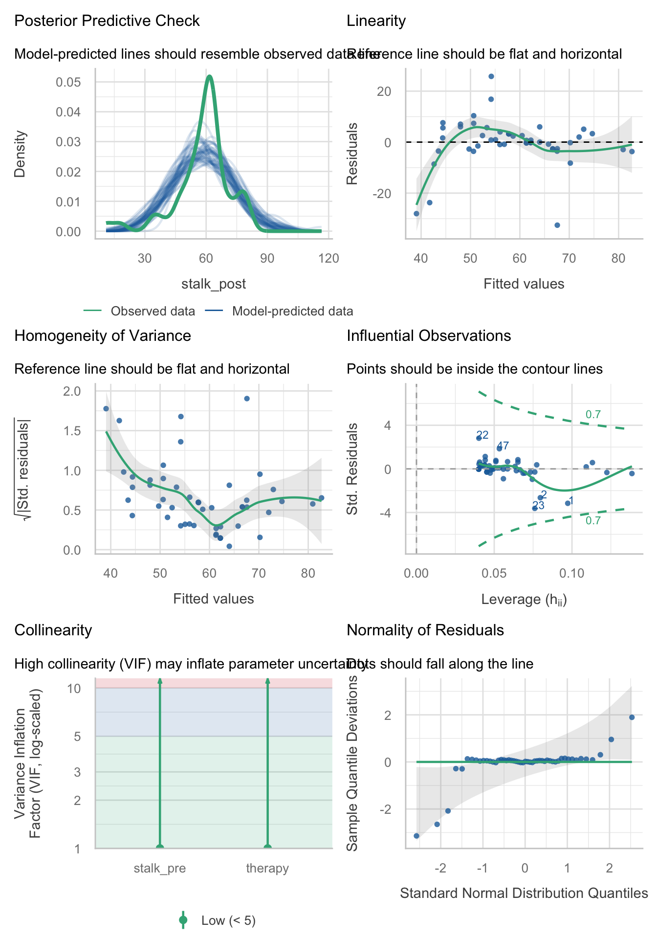
Task 12.2
Fit a robust model for Task 1
We should fit a robust model. We typically deal with the problem that matters most, which is heteroscedasticity. However, the Q-Q plot showed some fairly extreme deviations (especially in the lower tail) so we’ll re-fit the model using lmrob(), which will down-weight these cases. The robust model, contrary to the non-robust model, suggests that after adjusting for pre-therapy levels of stalking there is no significant difference between the types of treatments. Note also that the parameter estimate for the type of therapy has fallen from 6.2 (non-robust) to 1.6 (robust) suggesting a much smaller effect when robust estimation is used.
Call:
robust::lmRob(formula = stalk_post ~ stalk_pre + therapy, data = stalk_tib)

Residuals:
       Min         1Q     Median         3Q        Max
-34.783005  -2.426286   0.003723   1.894398  21.643705

Coefficients:
                      Estimate Std. Error t value Pr(>|t|)
(Intercept)            9.60233    3.20285   2.998  0.00433 **
stalk_pre              0.76178    0.04596  16.575  < 2e-16 ***
therapyPsychodyshamic  1.61503    0.92560   1.745  0.08755 .
---
Signif. codes:  0 '***' 0.001 '**' 0.01 '*' 0.05 '.' 0.1 ' ' 1

Residual standard error: 3.207 on 47 degrees of freedom
Multiple R-Squared: 0.5159

Test for Bias:
            statistic p-value
M-estimate      6.588 0.08627
LS-estimate     9.291 0.02567
Task 12.3
A marketing manager tested the benefit of soft drinks for curing hangovers. He took 15 people and got them drunk. The next morning as they awoke, dehydrated and feeling as though they’d licked a camel’s sandy feet clean with their tongue, he gave five of them water to drink, five of them Lucozade (a very nice glucose-based UK drink) and the remaining five a leading brand of cola (this variable is called
drink). He measured how well they felt (on a scale from 0 = I feel like death to 10 = I feel really full of beans and healthy) two hours later (this variable is calledwell). He measured howdrunkthe person got the night before on a scale of 0 = straight edge to 10 = flapping about like a haddock out of water (hangover.csv). Fit a model to see whether people felt better after different drinks when adjusting for how drunk they were the night before.
Load the data using (see Tip 2):
cure_tib <- discovr::hangoverThe design of this study warrants an ANCOVA approach to the model. First visualise the data (Figure 46 and Figure 47). Notice that the violin plots look like different drinking receptacles (cup, bottle, bowl).
ggplot(cure_tib, aes(x = drink, y = well, colour = drink)) +
  geom_point(position = position_jitter(width = 0.1), alpha = 0.6) +
  geom_violin(alpha = 0.2) +
  stat_summary(fun.data = "mean_cl_normal", geom = "pointrange", position = position_dodge(width = 0.9)) +
  coord_cartesian(ylim = c(0, 10)) +
  scale_y_continuous(breaks = seq(0, 10, 1)) +
  scale_colour_viridis_d(begin = 0.3, end = 0.8) +
  labs(x = "Drink", y = "Wellness (0-10)", colour = "Drink") +
  theme_minimal() +
  theme(legend.position = "none")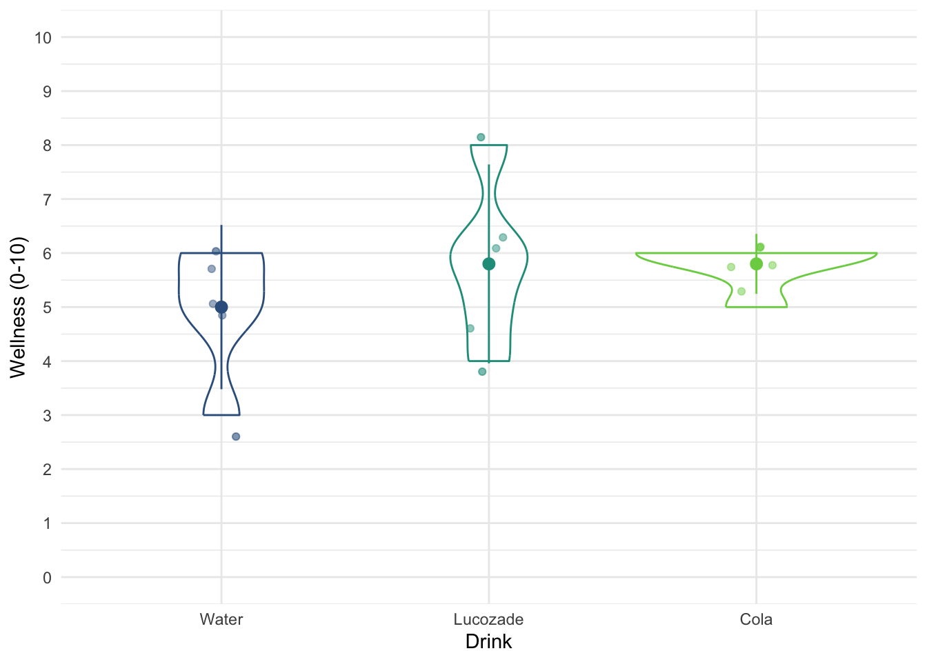
ggplot(cure_tib, aes(x = drunk, y = well)) +
  geom_smooth(method = "lm", colour = "#CC6677", fill = "#CC6677", alpha = 0.2) +
  geom_point(colour = "#882255", position = position_jitter()) +
  coord_cartesian(ylim = c(0, 10)) +
  scale_x_continuous(breaks = seq(0, 10, 1)) +
  scale_y_continuous(breaks = seq(0, 10, 1)) +
  labs(x = "Drunkness (0-10)", y = "Wellness (0-10)") +
  facet_wrap(~drink) +
  theme_minimal()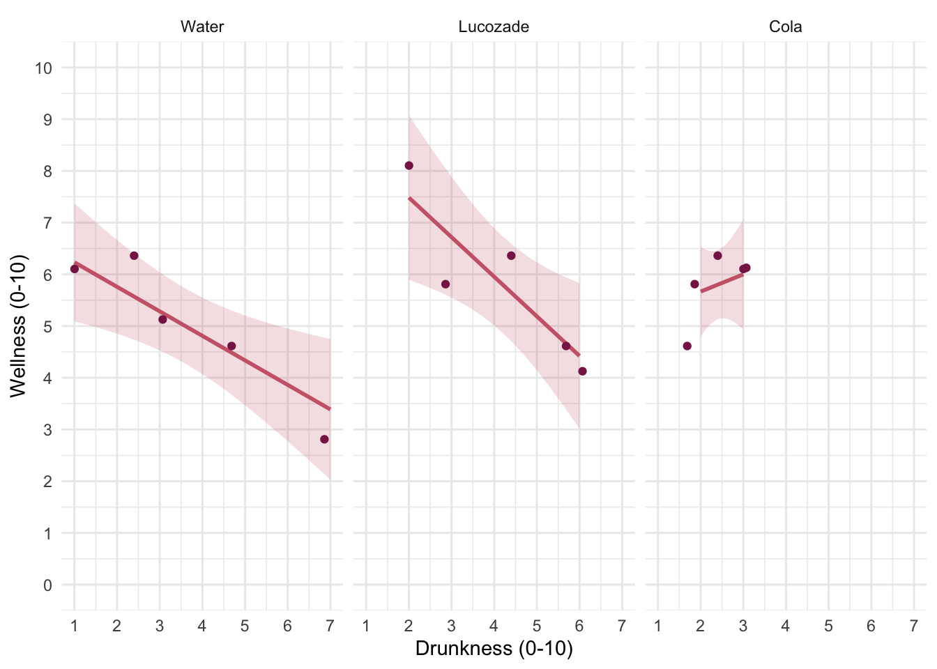
We have three levels of drink (water, Lucozade, Cola). Two of these drinks contain sugar/glucose, so water is a control. Therefore, we could reasonable set a contrast that compares ‘sugary drinks’ to water, and then a second contrast that compares the two sugary drinks. The order of the levels are Water, Lucozade, Cola, which we can confirm by executing:
levels(cure_tib$drink)[1] "Water" "Lucozade" "Cola" Therefore, we’d set these contrasts as:
         sugar_vs_none lucoz_vs_cola
Water       -0.6666667           0.0
Lucozade     0.3333333          -0.5
Cola         0.3333333           0.5
First let’s test the assumption of parallel slopes/homogeneity of regression slopes. Table 112 shows a non-significant interaction between the drink type and how drunk someone was the night before, F(2, 9) = 2.73, p = 0.119, suggesting that it’s reasonable to fit the parallel slopes model in cure_lm.
| Name | Model | df | df_diff | F | p |
|---|---|---|---|---|---|
| cure_lm | lm | 11 | |||
| full_lm | lm | 9 | 2 | 2.73 | 0.119 |
Models were detected as nested (in terms of fixed parameters) and are compared in sequential order.
Table 113 summarizes the main model. The covariate significantly predicted the outcome variable, F(1, 11) = 27.89, p < 0.001, so the drunkenness of the person influenced how well they felt the next day. More interesting is that at average levels of drunkenness the effect of the type of drink used as a hangover cure was significant, F(2, 11) = 4.32, p = 0.041.
| Parameter | Sum_Squares | df | Mean_Square | F | p |
|---|---|---|---|---|---|
| drunk | 11.19 | 1 | 11.19 | 27.89 | < .001 |
| drink | 3.46 | 2 | 1.73 | 4.32 | 0.041 |
| Residuals | 4.41 | 11 | 0.40 |
Anova Table (Type 3 tests)
Let’s look at the parameter estimates (Table 114). The parameter estimate shows that there was a negative relationship between how drunk a person got and their wellness the following day, \(\hat{b}\) = -0.55 (-0.78, -0.32), t(11) = -5.28, p < 0.001. That is, the more drunk someone got the less well they felt the following day. We can also see that at average levels of drunkeness, the mean wellness the following day was statistically comparable between the sugary drinks and water, \(\hat{b}\) = 0.64 (-0.13, 1.40), t(11) = 1.82, p = 0.095; however, the Cola and Lucozade groups had significantly different mean wellness, \(\hat{b}\) = -0.99 (-1.96, -0.01), t(11) = -2.23, p = 0.047.
model_parameters(cure_lm) |>
display()| Parameter | Coefficient | SE | 95% CI | t(11) | p |
|---|---|---|---|---|---|
| (Intercept) | 7.40 | 0.39 | (6.54, 8.25) | 19.01 | < .001 |
| drunk | -0.55 | 0.10 | (-0.78, -0.32) | -5.28 | < .001 |
| drink (sugar_vs_none) | 0.64 | 0.35 | (-0.13, 1.40) | 1.82 | 0.095 |
| drink (lucoz_vs_cola) | -0.99 | 0.44 | (-1.96, -0.01) | -2.23 | 0.047 |
The adjusted means (Table 115) tell us that people felt most well in the Lucozade group. Wellness was similar in the Cola and Water groups. This finding explains the pattern of significance for the contrasts: because the Cola group has a very similar mean to the Water group, the combined mean of the Lucozade and Cola groups is also quite similar to the mean for water. The Cola mean ‘drags down’ the mean for ‘sugary drinks’. This is evident from the second contrast that shows that Lucozade drinkers had a significantly higher mean than Cola drinkers.
| drink | Mean | SE | 95% CI | t(11) |
|---|---|---|---|---|
| Water | 5.11 | 0.28 | (4.48, 5.73) | 17.99 |
| Lucozade | 6.24 | 0.30 | (5.59, 6.89) | 21.13 |
| Cola | 5.25 | 0.30 | (4.59, 5.92) | 17.41 |
Variable predicted: well; Predictors modulated: drink; Predictors averaged: drunk (3.4)
Evaluate the model assumptions using Figure 48. The plots suggest heterogeneity of variance, so a wise researcher would abadon this analysis and fit a robust model. Because there was a problem with heteroscedasticity we could use a model that applies heteroscedasticity-consistent standard errors as in Table 116. Contrary to the non-robust model, these robust tests suggest that after adjusting for how much was drunk there are no significant differences at all in wellness between the groups who had different drinks as hangover cures.
check_model(cure_lm)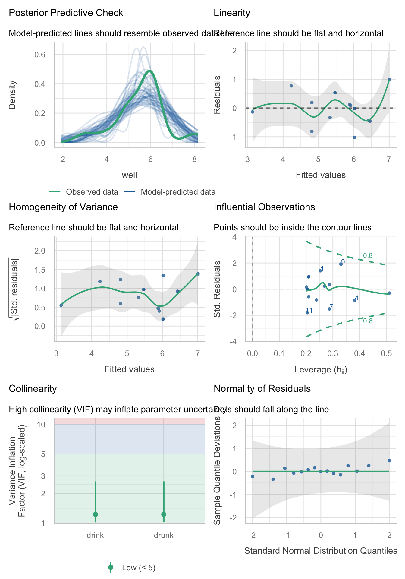
model_parameters(cure_lm, vcov = "HC4") |>
display()| Parameter | Coefficient | SE | 95% CI | t(11) | p |
|---|---|---|---|---|---|
| (Intercept) | 7.40 | 0.44 | (6.44, 8.36) | 16.93 | < .001 |
| drunk | -0.55 | 0.11 | (-0.79, -0.31) | -4.98 | < .001 |
| drink (sugar_vs_none) | 0.64 | 0.31 | (-0.06, 1.33) | 2.02 | 0.069 |
| drink (lucoz_vs_cola) | -0.99 | 0.52 | (-2.13, 0.16) | -1.90 | 0.084 |
Task 12.4
Compute effect sizes for Task 3 and report the results.
The effect sizes for the main effect of drink were obtained in the previous task by including es_type = "omega", ci = 0.95 on model_parameters() as in Table 117.
| Parameter | Sum_Squares | df | Mean_Square | F | p | ω² (partial) | ω² 95% CI |
|---|---|---|---|---|---|---|---|
| drunk | 11.19 | 1 | 11.19 | 27.89 | < .001 | 0.64 | (0.29, 1.00) |
| drink | 3.46 | 2 | 1.73 | 4.32 | 0.041 | 0.31 | (0.00, 1.00) |
| Residuals | 4.41 | 11 | 0.40 |
Anova Table (Type 3 tests)
Task 12.5
The highlight of the elephant calendar is the annual elephant football event in Nepal (Google it). A heated argument burns between the African and Asian elephants. In 2010, the president of the Asian Elephant Football Association, an elephant named Boji, claimed that Asian elephants were more talented than their African counterparts. The head of the African Elephant Football Association, an elephant called Tunc, issued a press statement that read, ‘I make it a matter of personal pride never to take seriously any remark made by something that looks like an enormous scrotum.’ I was called in to settle things. I collected data from the two types of elephant (
elephant) over a season and recorded how many goals each elephant scored (goals) and how many years of experience the elephant had (experience). Analyse the effect of the type of elephant on goal scoring, covarying for the amount of football experience the elephant had (elephooty.csv).
Load the data using (see Tip 2):
ele_tib <- discovr::elephootyThe design of this study warrants an ANCOVA approach to the model. First visualise the data (Figure 49 and Figure 50).
ggplot(ele_tib, aes(x = elephant, y = goals, colour = elephant)) +
  geom_point(position = position_jitter(width = 0.1), alpha = 0.6) +
  geom_violin(alpha = 0.2) +
  stat_summary(fun.data = "mean_cl_normal", geom = "pointrange", position = position_dodge(width = 0.9)) +
  coord_cartesian(ylim = c(0, 10)) +
  scale_y_continuous(breaks = seq(0, 10, 1)) +
  scale_colour_viridis_d(begin = 0.3, end = 0.8) +
  labs(x = "Elephant", y = "Goals", colour = "Elephant") +
  theme_minimal() +
  theme(legend.position = "none")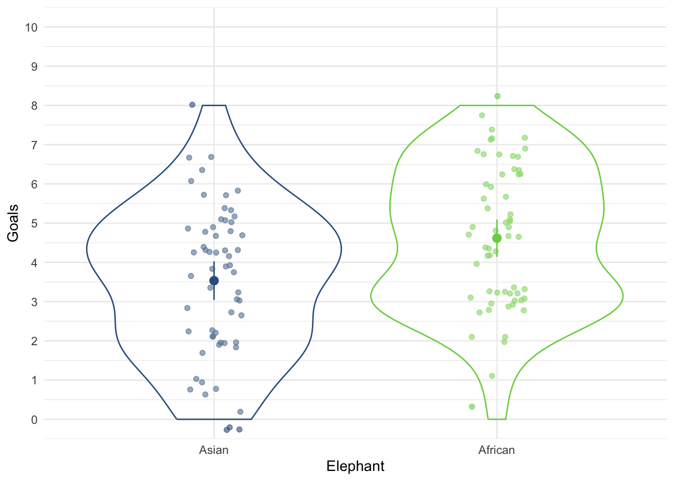
ggplot(ele_tib, aes(x = experience, y = goals)) +
  geom_smooth(method = "lm", colour = "#CC6677", fill = "#CC6677", alpha = 0.2) +
  geom_point(colour = "#882255", position = position_jitter()) +
  coord_cartesian(ylim = c(0, 9)) +
  scale_x_continuous(breaks = seq(0, 9, 1)) +
  scale_y_continuous(breaks = seq(0, 10, 1)) +
  labs(x = "Experience (Years)", y = "Goals scored") +
  facet_wrap(~elephant) +
  theme_minimal()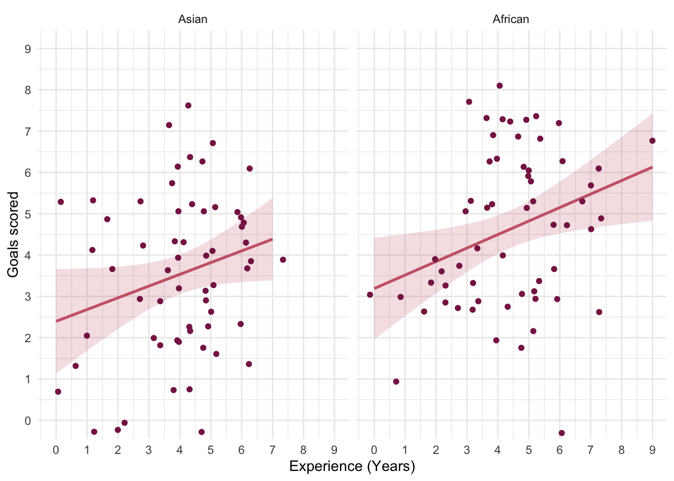
The categorical predictor (elephant) only has two levels/categories so we don’t need to set contrasts. First let’s test the assumption of parallel slopes/homogeneity of regression slopes. Table 119 shows a non-significant interaction between the type of elephant and their previous experience, F(1, 116) = 0.05, p = 0.828, suggesting that it’s reasonable to fit the parallel slopes model in elephant_lm.
| Name | Model | df | df_diff | F | p |
|---|---|---|---|---|---|
| elephant_lm | lm | 117 | |||
| full_lm | lm | 116 | 1 | 0.05 | 0.828 |
Models were detected as nested (in terms of fixed parameters) and are compared in sequential order.
Table 120 shows that the experience of the elephant significantly predicted how many goals they scored, F(1, 117) = 9.93, p = 0.002. After adjusting for the effect of experience, the effect of elephant is also significant. In other words, African and Asian elephants differed significantly in the number of goals they scored, F(1, 117) = 8.59, p = 0.004.
| Parameter | Sum_Squares | df | Mean_Square | F | p |
|---|---|---|---|---|---|
| experience | 32.32 | 1 | 32.32 | 9.93 | 0.002 |
| elephant | 27.95 | 1 | 27.95 | 8.59 | 0.004 |
| Residuals | 380.80 | 117 | 3.25 |
Anova Table (Type 3 tests)
The adjusted means (Table 121) tell us specifically, that African elephants scored significantly more goals than Asian elephants after adjusting for prior experience.
| elephant | Mean | SE | 95% CI | t(117) |
|---|---|---|---|---|
| Asian | 3.59 | 0.23 | (3.13, 4.05) | 15.37 |
| African | 4.56 | 0.23 | (4.10, 5.02) | 19.52 |
Variable predicted: goals; Predictors modulated: elephant; Predictors averaged: experience (4.2)
Let’s look at the parameter estimates (Table 122). The parameter estimate shows that there is a positive relationship between the two variables: the more prior football experience the elephant had, the more goals they scored in the season, \(\hat{b}\) = 0.31 (0.11, 0.50), t(117) = 3.15, p = 0.002.
model_parameters(elephant_lm) |>
display()| Parameter | Coefficient | SE | 95% CI | t(117) | p |
|---|---|---|---|---|---|
| (Intercept) | 2.31 | 0.45 | (1.41, 3.21) | 5.09 | < .001 |
| experience | 0.31 | 0.10 | (0.11, 0.50) | 3.15 | 0.002 |
| elephant (African) | 0.97 | 0.33 | (0.31, 1.63) | 2.93 | 0.004 |
Evaluate the model assumptions using Figure 51. The Q-Q plot suggests normal residuals but the scale-location plot suggests heterogeneity (possibly). We could do a sensitivity analysis by applying heteroscedasticity-consistent standard errors to the tests of parameters (Table 123). Both effects are still highly significant using robust standard errors. Happy days.
check_model(elephant_lm)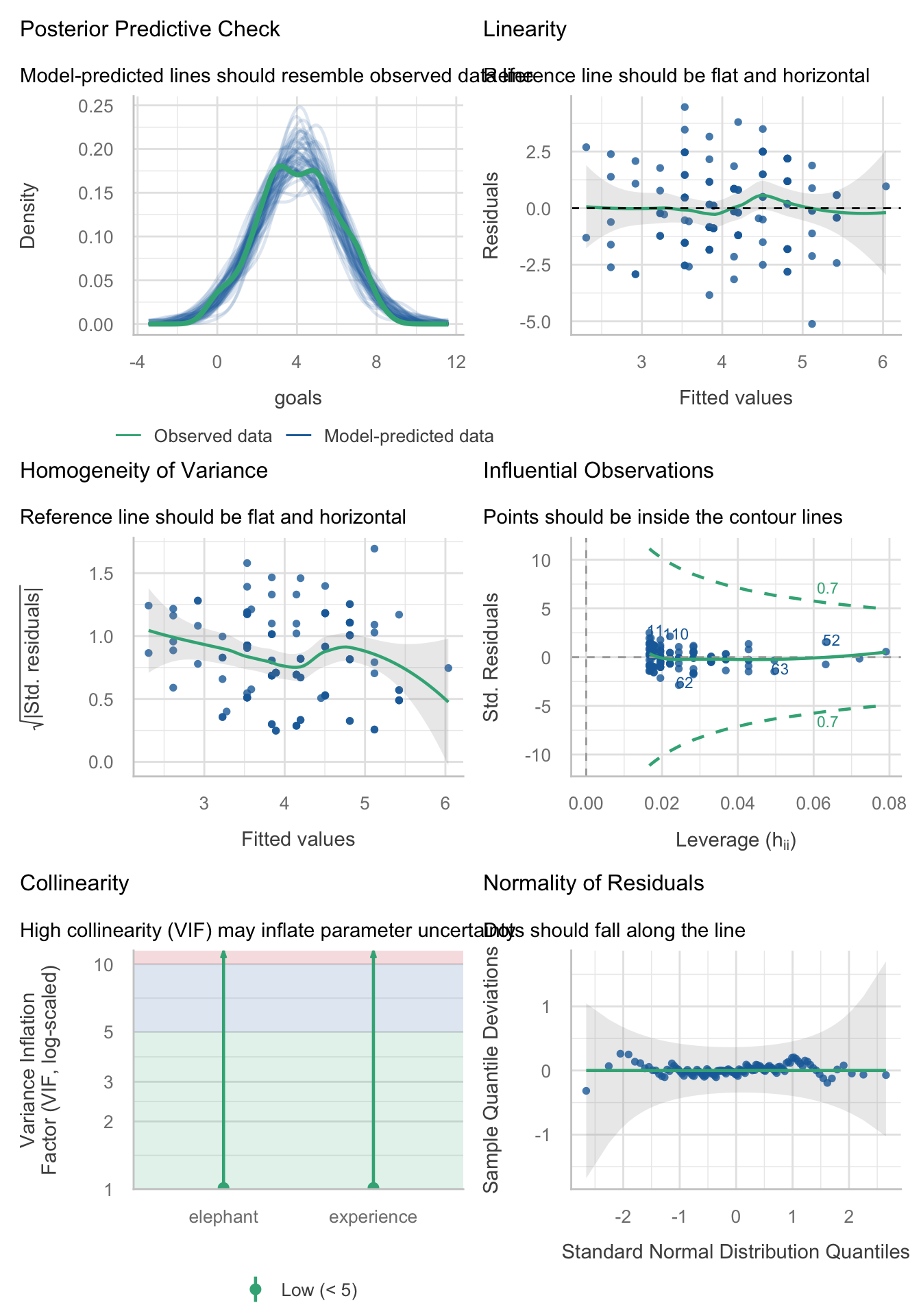
model_parameters(elephant_lm, vcov = "HC4") |>
display()| Parameter | Coefficient | SE | 95% CI | t(117) | p |
|---|---|---|---|---|---|
| (Intercept) | 2.31 | 0.45 | (1.41, 3.21) | 5.07 | < .001 |
| experience | 0.31 | 0.09 | (0.13, 0.48) | 3.46 | < .001 |
| elephant (African) | 0.97 | 0.33 | (0.33, 1.62) | 2.98 | 0.004 |
Task 12.6
In Chapter 4 (Task 6) we looked at data from people who had fish or cats as pets and measured their life satisfaction and also how much they like animals (
pets.csv). Fit a model predicting life satisfaction from the type of pet a person had and their animal liking score (covariate)
Load the data using (see Tip 2):
pet_tib <- discovr::petsThe design of this study warrants an ANCOVA approach to the model. First visualise the data (Figure 52 and Figure 53).
ggplot(pet_tib, aes(x = pet, y = life_satisfaction, colour = pet)) +
  geom_point(position = position_jitter(width = 0.1), alpha = 0.6) +
  geom_violin(alpha = 0.2) +
  stat_summary(fun.data = "mean_cl_normal", geom = "pointrange", position = position_dodge(width = 0.9)) +
  coord_cartesian(ylim = c(0, 80)) +
  scale_y_continuous(breaks = seq(0, 80, 10)) +
  scale_colour_viridis_d(begin = 0.3, end = 0.8) +
  labs(x = "Pet", y = "Life satisfaction", colour = "Pet") +
  theme_minimal() +
  theme(legend.position = "none")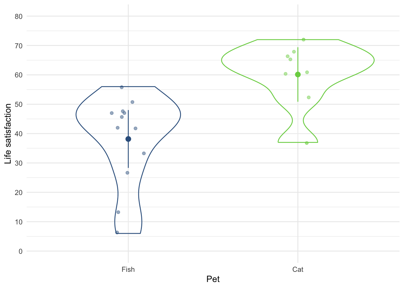
ggplot(pet_tib, aes(x = animal, y = life_satisfaction)) +
  geom_smooth(method = "lm", colour = "#CC6677", fill = "#CC6677", alpha = 0.2) +
  geom_point(colour = "#882255", position = position_jitter()) +
  coord_cartesian(ylim = c(0, 80), xlim = c(0, 80)) +
  scale_x_continuous(breaks = seq(0, 80, 10)) +
  scale_y_continuous(breaks = seq(0, 80, 10)) +
  labs(x = "Love of animals", y = "Life satisfaction") +
  facet_wrap(~pet) +
  theme_minimal()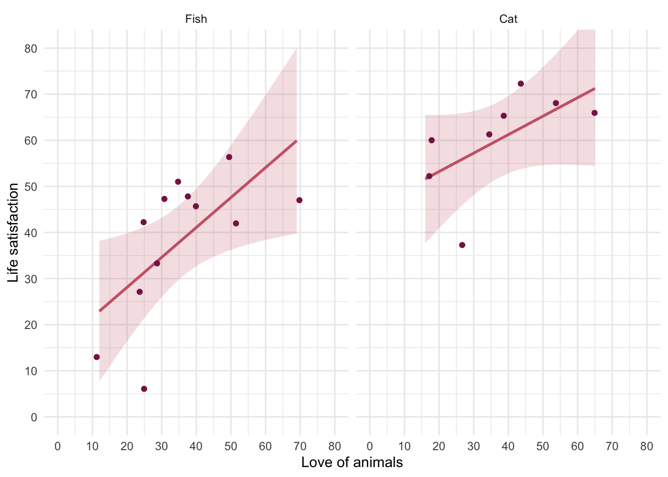
The categorical predictor (pet) only has two levels/categories so we don’t need to set contrasts. First let’s test the assumption of parallel slopes/homogeneity of regression slopes. Table 125 shows a non-significant interaction between the type of pet and their love of animals, F(1, 16) = 0.52, p = 0.481, suggesting that it’s reasonable to fit the parallel slopes model in pet_lm.
| Name | Model | df | df_diff | F | p |
|---|---|---|---|---|---|
| pet_lm | lm | 17 | |||
| full_lm | lm | 16 | 1 | 0.52 | 0.481 |
Models were detected as nested (in terms of fixed parameters) and are compared in sequential order.
Table 126 shows that the love of animals significantly predicted life satisfaction, F(1, 17) = 10.32, p = 0.005. After adjusting for the love of animals, the type of pet had a significant effect on life satisfaction. In other words, at average levels of liking animals whether someone owned a cat or fish significantly affected their life satisfaction, F(1, 17) = 16.45, p < 0.001.
| Parameter | Sum_Squares | df | Mean_Square | F | p |
|---|---|---|---|---|---|
| animal | 1325.40 | 1 | 1325.40 | 10.32 | 0.005 |
| pet | 2112.10 | 1 | 2112.10 | 16.45 | < .001 |
| Residuals | 2183.14 | 17 | 128.42 |
Anova Table (Type 3 tests)
The adjusted means (Table 127) tell us specifically that life satisfaction was higher in cat owners than fish owners at average levels of liking animals.
| pet | Mean | SE | 95% CI | t(17) |
|---|---|---|---|---|
| Fish | 38.55 | 3.27 | (31.64, 45.45) | 11.78 |
| Cat | 59.56 | 4.01 | (51.10, 68.02) | 14.85 |
Variable predicted: life_satisfaction; Predictors modulated: pet; Predictors averaged: animal (36)
Let’s look at the parameter estimates (Table 128). The parameter estimate shows that there is a positive relationship between liking animals and life satisfaction, \(\hat{b}\) = 0.54 (0.19, 0.90), t(17) = 3.21, p = 0.005: the more you like animals the higher your life satisfaction.
model_parameters(pet_lm) |>
display()| Parameter | Coefficient | SE | 95% CI | t(17) | p |
|---|---|---|---|---|---|
| (Intercept) | 18.94 | 6.82 | (4.56, 33.33) | 2.78 | 0.013 |
| animal | 0.54 | 0.17 | (0.19, 0.90) | 3.21 | 0.005 |
| pet (Cat) | 21.01 | 5.18 | (10.08, 31.94) | 4.06 | < .001 |
Evaluate the model assumptions using Figure 54. The Q-Q plot suggests non-normal residuals and the homogeneity of variance plot suggests heteroscedasticity. We should deal with the most problematic issue by applying heteroscedasticity-consistent standard errors to the tests of parameters (Table 129). Both effects are still highly significant using robust standard errors so our conclusions don’t change.
check_model(pet_lm)
model_parameters(pet_lm, vcov = "HC4") |>
display()| Parameter | Coefficient | SE | 95% CI | t(17) | p |
|---|---|---|---|---|---|
| (Intercept) | 18.94 | 7.99 | (2.08, 35.81) | 2.37 | 0.030 |
| animal | 0.54 | 0.19 | (0.15, 0.93) | 2.92 | 0.010 |
| pet (Cat) | 21.01 | 5.00 | (10.46, 31.56) | 4.20 | < .001 |
Task 12.7
Fit a linear model predicting life satisfaction from the type of pet and the effect of love of animals using what you learnt in Chapter 9. Compare this model to your results for Task 6. What differences do you notice and why?
The conclusions are the same as from the linear model (Table 130), all that has changes is that we haven’t done overall model fit using F-statistic. Basically, this task is all about re-iterating the false distinction that exists between ‘ANCOVA’ and ‘regressio/linear model’ you are, in both cases, using the general linear model.
| Parameter | Coefficient | SE | 95% CI | t(17) | p |
|---|---|---|---|---|---|
| (Intercept) | 18.94 | 7.99 | (2.08, 35.81) | 2.37 | 0.030 |
| animal | 0.54 | 0.19 | (0.15, 0.93) | 2.92 | 0.010 |
| pet (Cat) | 21.01 | 5.00 | (10.46, 31.56) | 4.20 | < .001 |
Task 12.8
In Chapter 9 we compared the number of mischievous acts in people who had invisibility cloaks to those without (
cloak). Imagine we replicated that study, but changed the design so that we recorded the number of mischievous acts in these participants before the study began (mischief_pre) as well as during the study (mischief). Fit a model to see whether people with invisibility cloaks get up to more mischief than those without when factoring in their baseline level of mischief (invisibility_base.csv).
Load the data using (see Tip 2):
cloak_tib <- discovr::invisibility_baseThe design of this study warrants an ANCOVA approach to the model. First visualise the data (Figure 55 and Figure 56).
ggplot(cloak_tib, aes(x = cloak, y = mischief_post, colour = cloak)) +
  geom_point(position = position_jitter(width = 0.1), alpha = 0.6) +
  geom_violin(alpha = 0.2) +
  stat_summary(fun.data = "mean_cl_normal", geom = "pointrange", position = position_dodge(width = 0.9)) +
  coord_cartesian(ylim = c(0, 15)) +
  scale_y_continuous(breaks = seq(0, 15, 1)) +
  scale_colour_viridis_d(begin = 0.3, end = 0.8) +
  labs(x = "Group", y = "Number of mischievous acts", colour = "Group") +
  theme_minimal() +
  theme(legend.position = "none")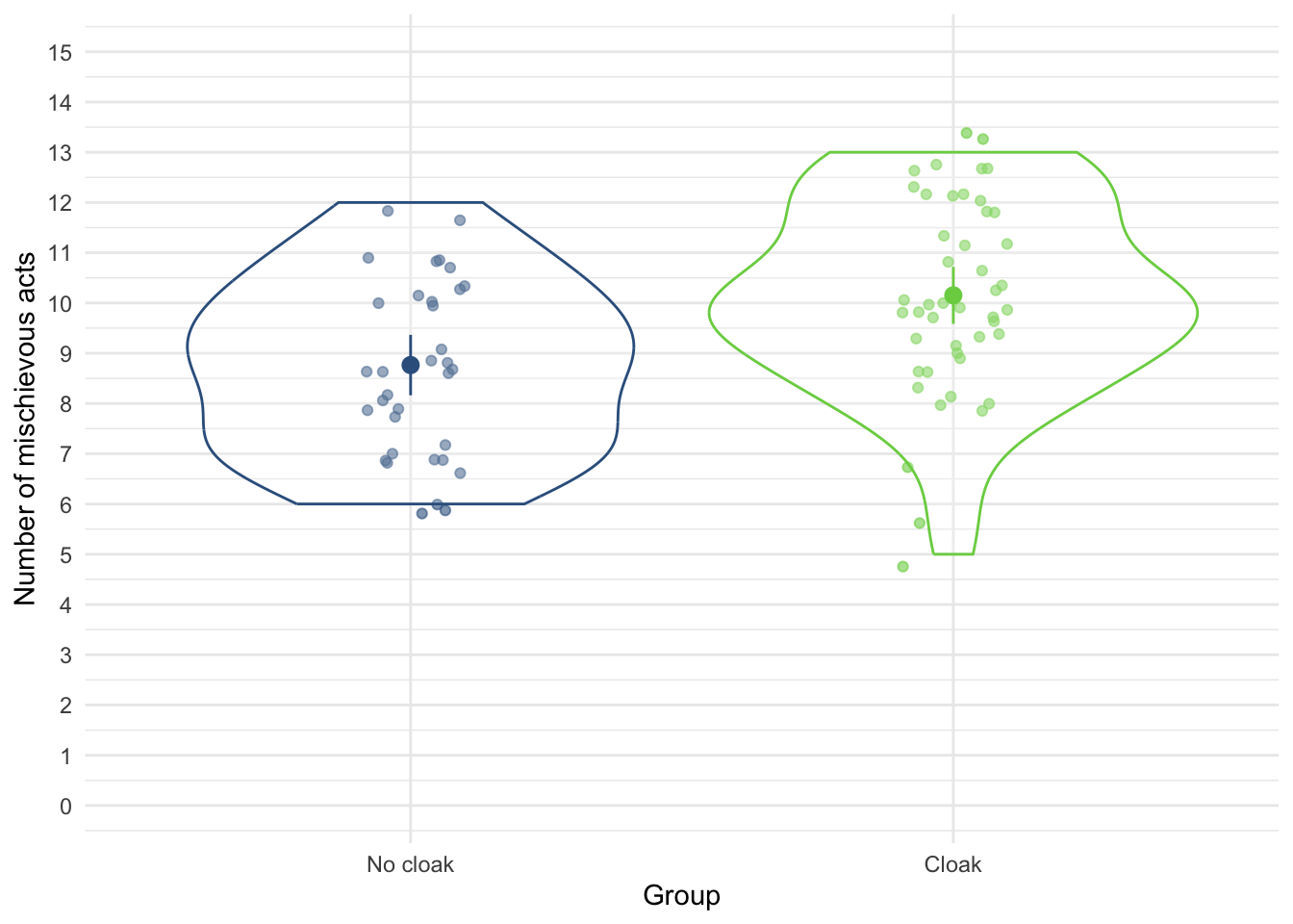
ggplot(cloak_tib, aes(x = mischief_pre, y = mischief_post)) +
  geom_smooth(method = "lm", colour = "#CC6677", fill = "#CC6677", alpha = 0.2) +
  geom_point(colour = "#882255", position = position_jitter()) +
  coord_cartesian(ylim = c(0, 15), xlim = c(0, 10)) +
  scale_x_continuous(breaks = seq(0, 10, 1)) +
  scale_y_continuous(breaks = seq(0, 15, 1)) +
  labs(x = "Number of mischievous acts  (baseline)", y = "Number of mischievous acts (post)") +
  facet_wrap(~cloak) +
  theme_minimal()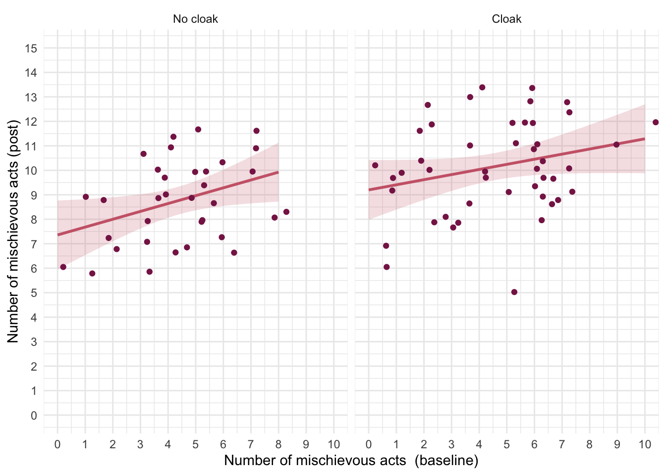
The categorical predictor (cloak) only has two levels/categories so we don’t need to set contrasts. First let’s test the assumption of parallel slopes/homogeneity of regression slopes. Table 132 shows a non-significant interaction between the group to which people were assigned and their pre-experiment mischief, F(1, 76) = 0.34, p = 0.562, suggesting that it’s reasonable to fit the parallel slopes model in cloak_lm.
| Name | Model | df | df_diff | F | p |
|---|---|---|---|---|---|
| cloak_lm | lm | 77 | |||
| full_lm | lm | 76 | 1 | 0.34 | 0.562 |
Models were detected as nested (in terms of fixed parameters) and are compared in sequential order.
Table 133 shows that the baseline mischief significantly predicted mischief during the study, F(1, 77) = 7.40, p = 0.008. After adjusting for baseline mischief, whether or not people were given an invisibility cloak significant affected mischief during the study. In other words, at average levels of baseline mischief givng someone an invisibility cloak (or not) significantly affected the number of mischievous acts committed, F(1, 77) = 11.33, p = 0.001.
| Parameter | Sum_Squares | df | Mean_Square | F | p |
|---|---|---|---|---|---|
| mischief_pre | 22.97 | 1 | 22.97 | 7.40 | 0.008 |
| cloak | 35.17 | 1 | 35.17 | 11.33 | 0.001 |
| Residuals | 239.08 | 77 | 3.10 |
Anova Table (Type 3 tests)
The adjusted means (Table 134) tell us specifically that those with an invisibility cloak committed more mischievous acts.
| cloak | Mean | SE | 95% CI | t(77) |
|---|---|---|---|---|
| No cloak | 8.79 | 0.30 | (8.19, 9.39) | 29.07 |
| Cloak | 10.13 | 0.26 | (9.62, 10.65) | 38.99 |
Variable predicted: mischief_post; Predictors modulated: cloak; Predictors averaged: mischief_pre (4.5)
Let’s look at the parameter estimates (Table 135). The parameter estimate shows that there is a positive relationship pre-experiment mischief and subsequent mischief: the more mischievous you are the more mischief you get up to regardless of whether you are given an invisibility cloak, \(\hat{b}\) = 0.25 (0.07, 0.43), t(77) = 2.72, p = 0.008.
model_parameters(cloak_lm) |>
display()| Parameter | Coefficient | SE | 95% CI | t(77) | p |
|---|---|---|---|---|---|
| (Intercept) | 7.68 | 0.50 | (6.69, 8.68) | 15.39 | < .001 |
| mischief pre | 0.25 | 0.09 | (0.07, 0.43) | 2.72 | 0.008 |
| cloak (Cloak) | 1.34 | 0.40 | (0.55, 2.14) | 3.37 | 0.001 |
Evaluate the model assumptions using Figure 57. The Q-Q plot suggests non-normal residuals and the homogeneity of variance plot suggests heteroscedasticity. We deal with the most problematic issue by applying heteroscedasticity-consistent standard errors to the tests of parameters (Table 136). Both effects are still highly significant using robust standard errors so our conclusions don’t change.
check_model(cloak_lm)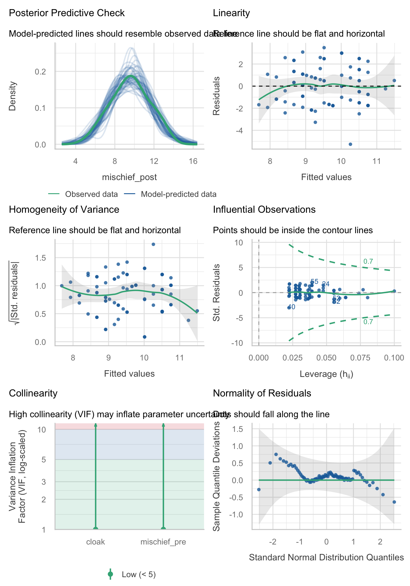
model_parameters(cloak_lm, vcov = "HC4") |>
display()| Parameter | Coefficient | SE | 95% CI | t(77) | p |
|---|---|---|---|---|---|
| (Intercept) | 7.68 | 0.46 | (6.77, 8.60) | 16.74 | < .001 |
| mischief pre | 0.25 | 0.08 | (0.08, 0.42) | 2.91 | 0.005 |
| cloak (Cloak) | 1.34 | 0.39 | (0.56, 2.13) | 3.41 | 0.001 |
Chapter 13
Task 13.1
People have claimed that listening to heavy metal, because of its aggressive sonic palette and often violent or emotionally negative lyrics, leads to angry and aggressive behaviour (Selfhout et al., 2008). As a very non-violent metal fan this accusation bugs me. Imagine I designed a study to test this possibility. I took groups of self-classifying metalheads and non-metalheads (
fan) and assigned them randomly to listen to 15 minutes of either the sound of an angle grinder scraping a sheet of metal (control noise), metal music, or pop music (soundtrack). Each person rated theirangeron a scale ranging from 0 (“All you need is love, da, da, da-da-da”) to 100 (“All you wanna do is drag me down, all I wanna do is stamp you out”). Fit a model to test my idea (metal.csv).
Load the data using (see Tip 2):
metal_tib <- discovr::metalFigure 58 shows that after listening to an angle grinder both groups are angry. After listening to metal, the metal heads score low on anger but the pop fans score high. The reverse is true after listening to pop music.
ggplot(metal_tib, aes(x = soundtrack, y = anger, colour = fan)) +
  geom_violin(alpha = 0.5) +
  stat_summary(fun.data = "mean_cl_normal", position = position_dodge(width = 0.9)) +
  scale_y_continuous(breaks = seq(0, 100, 10)) +
  scale_colour_viridis_d(begin = 0.3, end = 0.8) +
  labs(y = "Anger (out of 100)", x = "Soundtrack", colour = "Fan group") +
  theme_minimal()
Table 137 shows the model fitted using afex::aov_4(). The soundtrack × fan interaction was significant, F(2, 84) = 433.28, p < 0.001, indicating that the soundtrack combined with the type of fan significantly affected anger. This effect supersedes the main effects, so we’ll ignore them. Figure 58 shows that after listening to an angle grinder both groups are angry. After listening to metal, the metal heads score low on anger but the pop fans score high. The reverse is true after listening to pop music. We can test this formally with simple effects analysis. Table 138 shows (in combination with the means) that:
- Anger levels did not differ in pop and metal fans when listening to an angle grinder, F(1, 84) = 0.30, p = 1.000.
- When listening to metal music, anger was significantly higher in pop fans than metal fans, F(1, 84) = 431.55, p < 0.001.
- When listening to pop music, anger was significantly higher in metal fans than pop fans, F(1, 84) = 434.80, p < 0.001.
| Parameter | Sum_Squares | df | Mean_Square | F | p |
|---|---|---|---|---|---|
| soundtrack | 20469.76 | 2 | 10234.88 | 116.82 | < .001 |
| fan | 6.40 | 1 | 6.40 | 0.07 | 0.788 |
| soundtrack:fan | 75919.27 | 2 | 37959.63 | 433.28 | < .001 |
| Residuals | 7359.20 | 84 | 87.61 |
Anova Table (Type 3 tests)
estimate_contrasts(model = metal_afx,
                   contrast = "fan",
                   by = "soundtrack",
                   comparison = "joint",
                   p_adjust = "bonferroni") |>
display()| Contrast | soundtrack | df1 | df2 | F | p |
|---|---|---|---|---|---|
| fan | Angle grinder | 1 | 84 | 0.30 | > .999 |
| fan | Metal | 1 | 84 | 431.55 | < .001 |
| fan | Pop | 1 | 84 | 434.80 | < .001 |
Predictors averaged: id; p-value adjustment method: Bonferroni
Task 13.2
Compute omega squared for the effects in Task 1 and report the results of the analysis.
The simplest way to add effect sizes is by including es_type = "omega", ci = 0.95 in model_parameters() as in
model_parameters(metal_afx, es_type = "omega", ci = 0.95) |>
display()| Parameter | Sum_Squares | df | Mean_Square | F | p | Omega2 (partial) | Omega2 95% CI |
|---|---|---|---|---|---|---|---|
| soundtrack | 20469.76 | 2 | 10234.88 | 116.82 | < .001 | 0.72 | (0.64, 1.00) |
| fan | 6.40 | 1 | 6.40 | 0.07 | 0.788 | 0.00 | (0.00, 1.00) |
| soundtrack:fan | 75919.27 | 2 | 37959.63 | 433.28 | < .001 | 0.91 | (0.88, 1.00) |
| Residuals | 7359.20 | 84 | 87.61 |
Anova Table (Type 3 tests)
We could report (remember if you’re using APA format to drop the leading zeros before p-values and ω2, for example report p = .035 instead of p = 0.035).
Task 13.3
In Chapter 5 we used some data that related to male and female arousal levels when watching The Notebook or a documentary about notebooks (
notebook.csv). Fit a model to test whether men and women differ in their reactions to different types of films.
Load the data using (see Tip 2):
notebook_tib <- discovr::notebookTable 140 shows the model fitted using afex::aov_4(). The main effect of gender identity is significant, F(1, 36) = 7.29, p = 0.011, as is the main effect of film, F(1, 36) = 141.87, p < 0.001 and the interaction, F(1, 36) = 4.64, p = 0.038. The interaction supersedes the main effects, so we’ll ignore them. Figure 59 shows that psychological arousal is very similar for self-identifying men and women during the documentary about notebooks (it is low for both). However, for the notebook, self-identifying men experienced greater psychological arousal than self-identifying women. The interaction is likely to reflect that there is a difference between men and women for one type of film (the notebook) but not the other (the documentary about notebooks). This is confirmed by the simple effects analysis, which shows (Table 141)
- Arousal levels were significantly higher in self-identifying men when watching the film ‘The Notebook’, F(1, 36) = 11.78, p = 0.003.
- Arousal levels did not significantly differ between men and women when watching the documentary about notebooks, F(1, 36) = 0.15, p = 1.000.
| Parameter | Sum_Squares | df | Mean_Square | F | p |
|---|---|---|---|---|---|
| film | 5784.02 | 1 | 5784.02 | 141.87 | < .001 |
| gender_identity | 297.02 | 1 | 297.02 | 7.29 | 0.011 |
| film:gender_identity | 189.22 | 1 | 189.22 | 4.64 | 0.038 |
| Residuals | 1467.70 | 36 | 40.77 |
Anova Table (Type 3 tests)
ggplot(notebook_tib, aes(x = film, y = arousal, colour = gender_identity, shape = gender_identity)) +
  geom_point(position = position_jitterdodge(dodge.width = 0.2, jitter.width = 0.2), alpha = 0.5) +
  stat_summary(fun.data = "mean_cl_normal", geom = "pointrange", position = position_dodge(width = 0.2)) +
  coord_cartesian(ylim = c(0, 50)) +
  scale_y_continuous(breaks = seq(0, 50, 10)) +
  scale_colour_viridis_d(begin = 0.3, end = 0.85) +
  labs(x = "Film", y = "Arousal", colour = "Gender identity", shape = "Gender identity") +
  theme_minimal()
estimate_contrasts(model = notebook_afx,
                   contrast = "gender_identity",
                   by = "film",
                   comparison = "joint",
                   p_adjust = "bonferroni") |>
display()| Contrast | film | df1 | df2 | F | p |
|---|---|---|---|---|---|
| gender_identity | The Notebook | 1 | 36 | 11.78 | 0.003 |
| gender_identity | A documentary about notebooks | 1 | 36 | 0.15 | > .999 |
Predictors averaged: id; p-value adjustment method: Bonferroni
Task 13.4
Compute omega squared for the effects in Task 3 and report the results of the analysis.
The simplest way to add effect sizes is by including es_type = "omega", ci = 0.95 in model_parameters() as in
model_parameters(notebook_afx, es_type = "omega", ci = 0.95) |>
display()| Parameter | Sum_Squares | df | Mean_Square | F | p | Omega2 (partial) | Omega2 95% CI |
|---|---|---|---|---|---|---|---|
| film | 5784.02 | 1 | 5784.02 | 141.87 | < .001 | 0.78 | (0.67, 1.00) |
| gender_identity | 297.02 | 1 | 297.02 | 7.29 | 0.011 | 0.14 | (0.01, 1.00) |
| film:gender_identity | 189.22 | 1 | 189.22 | 4.64 | 0.038 | 0.08 | (0.00, 1.00) |
| Residuals | 1467.70 | 36 | 40.77 |
Anova Table (Type 3 tests)
We could report (remember if you’re using APA format to drop the leading zeros before p-values and ω2, for example report p = .035 instead of p = 0.035).
Task 13.5
In Chapter 5 we used some data that related to learning in men and women when either reinforcement or punishment was used in teaching (
teach_method.csv). Analyse these data to see whether men and women’s learning differs according to the teaching method used.
Load the data using (see Tip 2):[^I rename method to teaching_method because at the time of writing a variable name called method seems to really mess up estimate_contrasts().]
Table 143 shows the model fitted using afex::aov_4(). The main effect of sex was significant, F(1, 16) = 12.25, p = 0.003, but the main effect of the teaching method was not, F(1, 16) = 2.25, p = 0.153. The interaction was significant, F(1, 16) = 30.25, p < 0.001. The interaction supersedes the main effects, so we’ll ignore them. Figure 60 and the simple effects analysis (Table 144) shows that
- For women, marks were significantly higher when the teacher was nice than when they used punishment, F(1, 16) = 8.00, p = 0.024.
- For men the reverse was true, marks were significantly higher when the teacher used punishment than when they were nice, F(1, 16) = 24.50, p < 0.001.
| Parameter | Sum_Squares | df | Mean_Square | F | p |
|---|---|---|---|---|---|
| teaching_method | 11.25 | 1 | 11.25 | 2.25 | 0.153 |
| sex | 61.25 | 1 | 61.25 | 12.25 | 0.003 |
| teaching_method:sex | 151.25 | 1 | 151.25 | 30.25 | < .001 |
| Residuals | 80.00 | 16 | 5.00 |
Anova Table (Type 3 tests)
ggplot(teach_tib, aes(x = sex, y = mark, colour = teaching_method, shape = teaching_method)) +
  geom_point(position = position_jitterdodge(dodge.width = 0.2, jitter.width = 0.2), alpha = 0.5) +
  stat_summary(fun.data = "mean_cl_normal", geom = "pointrange", position = position_dodge(width = 0.2)) +
  coord_cartesian(ylim = c(0, 22)) +
  scale_y_continuous(breaks = seq(0, 22, 2)) +
  scale_colour_viridis_d(begin = 0.3, end = 0.85) +
  labs(x = "Sex", y = "Mark (%)", colour = "Teaching method", shape = "Teaching method") +
  theme_minimal()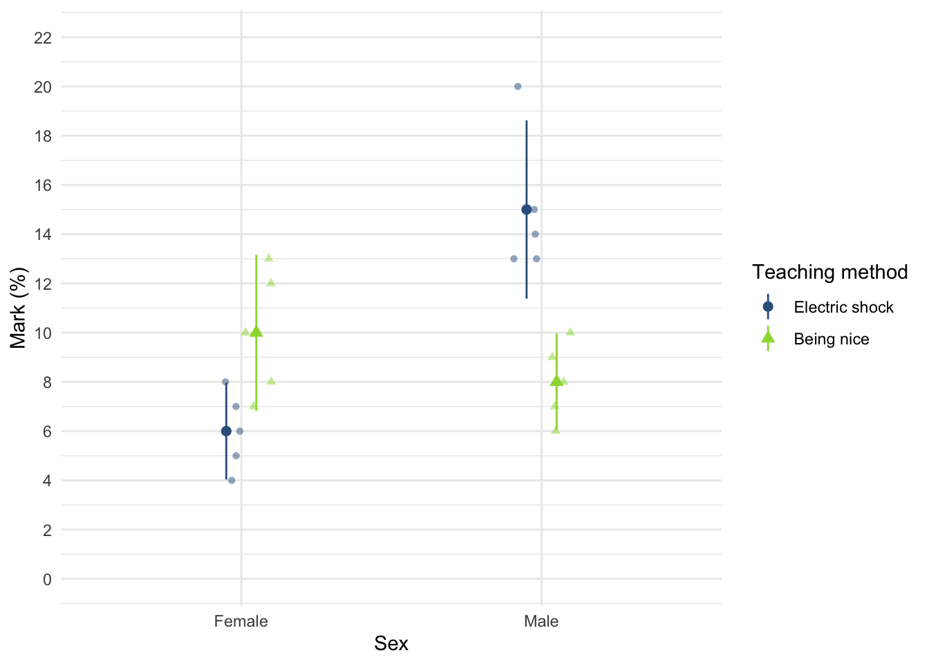
estimate_contrasts(model = teach_afx,
                   contrast = "sex",
                   by = "teaching_method",
                   comparison = "joint",
                   p_adjust = "bonferroni") |>
display()| Contrast | teaching_method | df1 | df2 | F | p |
|---|---|---|---|---|---|
| sex | Electric shock | 1 | 16 | 40.50 | < .001 |
| sex | Being nice | 1 | 16 | 2.00 | 0.353 |
Predictors averaged: id; p-value adjustment method: Bonferroni
Task 13.6
At the start of this Chapter I described a way of empirically researching whether I wrote better songs than my old bandmate Malcolm, and whether this depended on the type of song (a symphony or song about flies). The outcome variable was the number of screams elicited by audience members during the songs. Plot the data and fit a model to test my hypothesis that the type of song moderates which songwriter is preferred (
escape.csv).
Load the data using (see Tip 2):
escape_tib <- discovr::escapeTable 145 shows the model fitted using afex::aov_4(). The main effect of the type of song was significant, F(1, 64) = 20.87, p < 0.001, as was the main effect of the songwriter, F(1, 64) = 9.94, p = 0.002. The interaction was also significant, F(1, 64) = 5.07, p = 0.028. The interaction supersedes the main effects, so we’ll ignore them. Figure 61 and the simple effects analysis (Table 146) shows that for songs about a fly the number of screams were comparable between songwriters, F(1, 64) = 0.41, p = 1.000, but for symphonies there were significantly more screams when Andy wrote the song than when Malcolm did, F(1, 64) = 14.61, p < 0.001.
| Parameter | Sum_Squares | df | Mean_Square | F | p |
|---|---|---|---|---|---|
| song_type | 74.13 | 1 | 74.13 | 20.87 | < .001 |
| songwriter | 35.31 | 1 | 35.31 | 9.94 | 0.002 |
| song_type:songwriter | 18.01 | 1 | 18.01 | 5.07 | 0.028 |
| Residuals | 227.29 | 64 | 3.55 |
Anova Table (Type 3 tests)
ggplot(escape_tib, aes(x = song_type, y = screams, colour = songwriter, shape = songwriter)) +
  geom_point(position = position_jitterdodge(dodge.width = 0.2, jitter.width = 0.2), alpha = 0.5) +
  stat_summary(fun.data = "mean_cl_normal", geom = "pointrange", position = position_dodge(width = 0.2)) +
  coord_cartesian(ylim = c(0, 15)) +
  scale_y_continuous(breaks = seq(0, 15, 1)) +
  scale_colour_viridis_d(begin = 0.3, end = 0.85) +
  labs(x = "Type of song", y = "Number of screams", colour = "Songwriter", shape = "Songwriter") +
  theme_minimal()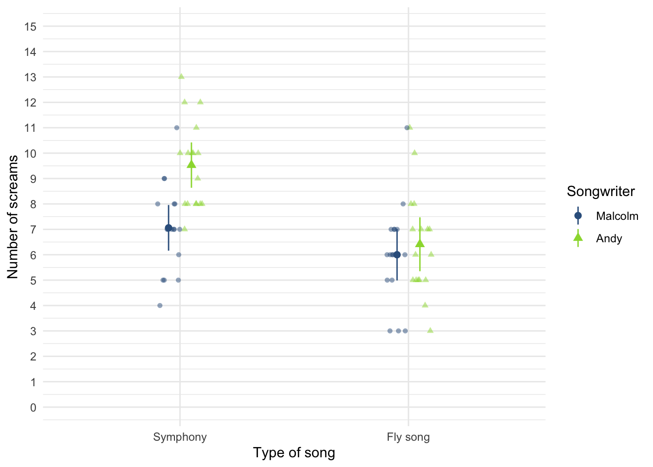
escape_se <- estimate_contrasts(model = escape_afx,
                               contrast = "songwriter",
                               by = "song_type",
                               comparison = "joint",
                               p_adjust = "bonferroni")


display(escape_se)| Contrast | song_type | df1 | df2 | F | p |
|---|---|---|---|---|---|
| songwriter | Symphony | 1 | 64 | 14.61 | < .001 |
| songwriter | Fly song | 1 | 64 | 0.41 | > .999 |
Predictors averaged: id; p-value adjustment method: Bonferroni
Task 13.7
Compute omega squared for the effects in Task 6 and report the results of the analysis.
The simplest way to add effect sizes is by including es_type = "omega", ci = 0.95 in model_parameters() as in
model_parameters(escape_afx, es_type = "omega", ci = 0.95) |>
display()| Parameter | Sum_Squares | df | Mean_Square | F | p | Omega2 (partial) | Omega2 95% CI |
|---|---|---|---|---|---|---|---|
| song_type | 74.13 | 1 | 74.13 | 20.87 | < .001 | 0.23 | (0.09, 1.00) |
| songwriter | 35.31 | 1 | 35.31 | 9.94 | 0.002 | 0.12 | (0.02, 1.00) |
| song_type:songwriter | 18.01 | 1 | 18.01 | 5.07 | 0.028 | 0.06 | (0.00, 1.00) |
| Residuals | 227.29 | 64 | 3.55 |
Anova Table (Type 3 tests)
We could report (remember if you’re using APA format to drop the leading zeros before p-values and ω2, for example report p = .035 instead of p = 0.035).
Task 13.8
There are reports of increases in injuries related to playing games consoles. These injuries were attributed mainly to muscle and tendon strains. A researcher hypothesized that a stretching warm-up before playing would help lower injuries, and that athletes would be less susceptible to injuries because their regular activity makes them more flexible. She took 60 athletes and 60 non-athletes (
athlete); half of them played on a Nintendo Switch and half watched others playing as a control (switch), and within these groups half did a 5-minute stretch routine before playing/watching whereas the other half did not (stretch). The outcome was a pain score out of 10 (where 0 is no pain, and 10 is severe pain) after playing for 4 hours (injury). Fit a model to test whether athletes are less prone to injury, and whether the prevention programme worked (switch.csv).
Load the data using (see Tip 2):
switch_tib <- discovr::switchTable 148 shows the model fitted using afex::aov_4().
| Parameter | Sum_Squares | df | Mean_Square | F | p |
|---|---|---|---|---|---|
| athlete | 99.01 | 1 | 99.01 | 64.82 | < .001 |
| switch | 85.01 | 1 | 85.01 | 55.66 | < .001 |
| stretch | 16.88 | 1 | 16.88 | 11.05 | 0.001 |
| athlete:switch | 69.01 | 1 | 69.01 | 45.18 | < .001 |
| athlete:stretch | 1.88 | 1 | 1.88 | 1.23 | 0.270 |
| switch:stretch | 21.68 | 1 | 21.68 | 14.19 | < .001 |
| athlete:switch:stretch | 9.08 | 1 | 9.08 | 5.94 | 0.016 |
| Residuals | 171.07 | 112 | 1.53 |
Anova Table (Type 3 tests)
ggplot(switch_tib, aes(switch, injury, colour = stretch)) +
  geom_point(position = position_jitterdodge(dodge.width = 0.75, jitter.width = 0.2), size = 1, alpha = 0.2) +
  stat_summary(fun.data = "mean_cl_normal", position = position_dodge(width = 0.75)) +
  facet_wrap(~athlete) +
  labs(x = "Playing or watching", y = "Injury score (out of 10)", colour = "Stretching before play") +
  discovr::scale_color_prayer() +
  coord_cartesian(ylim = c(0, 10)) +
  scale_y_continuous(breaks = seq(0, 10, 2)) +
  theme_minimal() +
  theme(axis.text.x = element_text(size = rel(0.8)))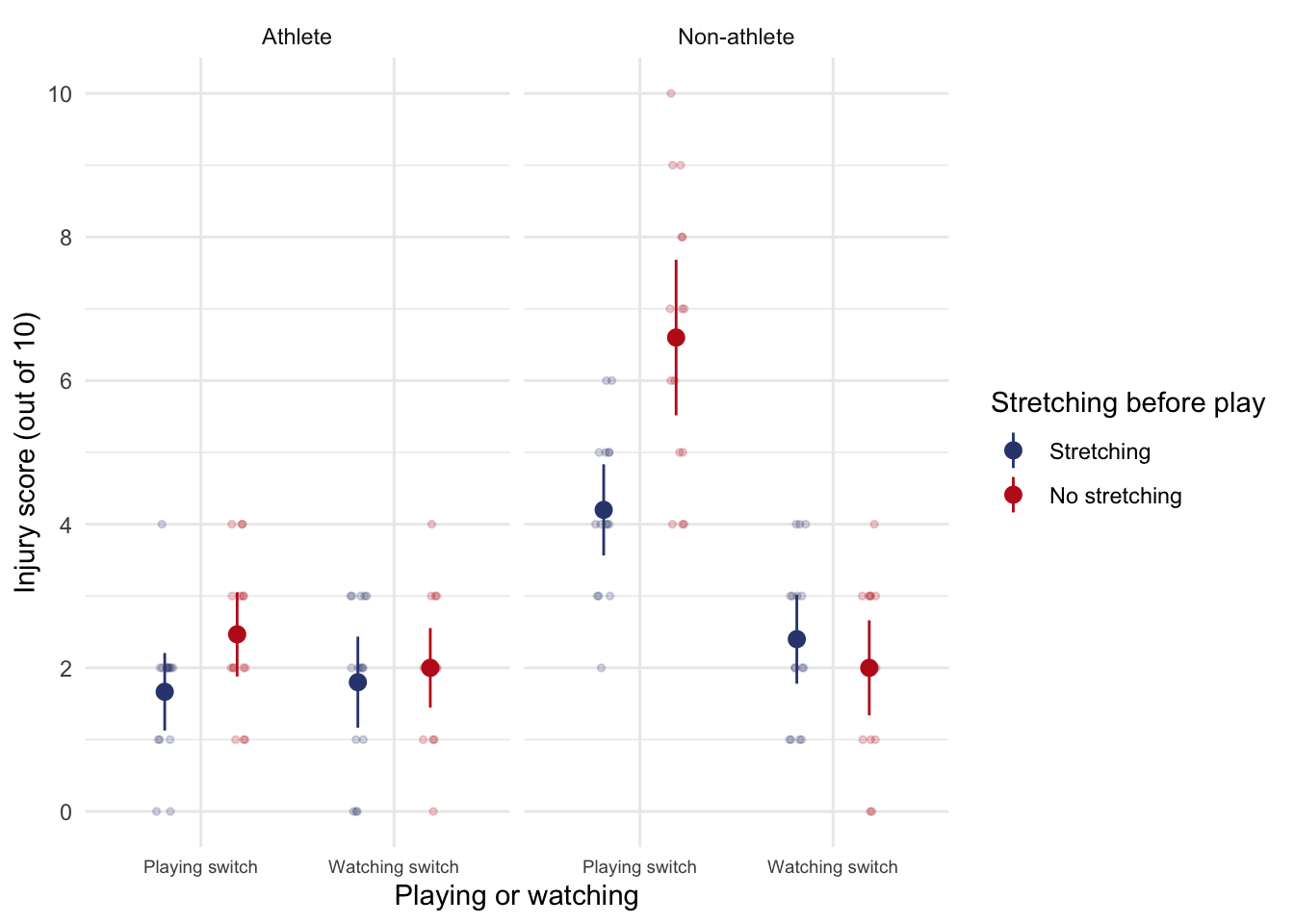
Task 13.9
A researcher was interested in what factors contributed to injuries resulting from game console use. She tested 40 participants who were randomly assigned to either an active or static game played on either a Nintendo Switch or Xbox One Kinect. At the end of the session their physical condition was evaluated on an injury severity scale. The data are in the file
xbox.csvwhich contains the variablesgame(0 = static, 1 = active),console(0 = Switch, 1 = Xbox), andinjury(a score ranging from 0 (no injury) to 20 (severe injury)). Fit a model to see whether injury severity is significantly predicted from the type of game, the type of console and their interaction
Load the data using (see Tip 2):
xbox_tib <- discovr::xboxTable 149 shows the model fitted using afex::aov_4(). The main effect of the type of game was significant, F(1, 36) = 25.86, p < 0.001, as was the main effect of the console, F(1, 36) = 3.58, p = 0.067. The interaction was also significant, F(1, 36) = 5.05, p = 0.031. The interaction supersedes the main effects, so we’ll ignore them. Figure 63 and the simple effects analysis (Table 150) shows that for active games there were significantly more injuries on the Switch than the Xbox, F(1, 36) = 8.57, p = 0.012, but for static games the number of injuries were comparable in the two consoles, F(1, 36) = 0.06, p = 1.000.
| Parameter | Sum_Squares | df | Mean_Square | F | p |
|---|---|---|---|---|---|
| game | 184.90 | 1 | 184.90 | 25.86 | < .001 |
| console | 25.60 | 1 | 25.60 | 3.58 | 0.067 |
| game:console | 36.10 | 1 | 36.10 | 5.05 | 0.031 |
| Residuals | 257.40 | 36 | 7.15 |
Anova Table (Type 3 tests)
ggplot(xbox_tib, aes(x = game, y = injury, colour = console, shape = console)) +
  geom_point(position = position_jitterdodge(dodge.width = 0.2, jitter.width = 0.2), alpha = 0.5) +
  stat_summary(fun.data = "mean_cl_normal", geom = "pointrange", position = position_dodge(width = 0.2)) +
  coord_cartesian(ylim = c(0, 20)) +
  scale_y_continuous(breaks = seq(0, 20, 1)) +
  scale_colour_viridis_d(begin = 0.3, end = 0.85) +
  labs(x = "Type of game", y = "Number of injuries", colour = "Console", shape = "Console") +
  theme_minimal()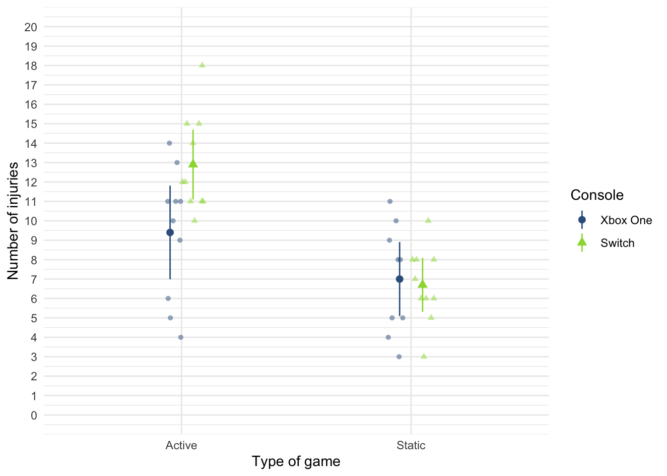
xbox_se <- estimate_contrasts(model = xbox_afx,
contrast = "console",
by = "game",
comparison = "joint",
p_adjust = "bonferroni")
display(escape_se)| Contrast | song_type | df1 | df2 | F | p |
|---|---|---|---|---|---|
| songwriter | Symphony | 1 | 64 | 14.61 | < .001 |
| songwriter | Fly song | 1 | 64 | 0.41 | > .999 |
Predictors averaged: id; p-value adjustment method: Bonferroni
Chapter 14
Task 14.1
Using the cosmetic surgery example, run the analysis described in Section 14.6.6 but also including BDI as a fixed effect predictor. What differences does including this predictor make?
Load the data using (see Tip 2):
cosmetic_tib <- discovr::cosmeticTo fit the model follow the instructions in section 14.6 of the book except that the model itself should include months, base_qoL, reason and bdi in the list of predictors. If you haven’t done so already create the variable months as described in Section 14.6.5.
cosmetic_tib <- cosmetic_tib |>
mutate(
months = days*12/365
)Fit the model by adapting the code in Section 14.6.7. In that section we build the model up sequentially and compared the models at each step. Therefore we can take the final model (cosmetic_mlm) as our starting point (because we’ve already seen the steps leading up to this model) and then update this model to also include bdi as a predictor. We can then use test_lrt() to compare the models. Table 151 shows that adding bdi significantly improves the fit of the model, \(\chi^2\)(1) = 55.49, p < 0.001. Table 152 also shows that including bdi explains an additional 1.02% of the variance.
Looking at the fixed effects (Table 153) bdi, significantly predicted quality of life after surgery, \(\hat{b}\) = 0.18 (0.13, 0.23), z = 7.52, p < 0.001. Including bdi has not affected the interpretation of the other variables in the model. Obviously the parameter estimates themselves have changed, but how we’d interpret them is unchanged except that we’re now interpreting each one at average levels of depression. Crucially the months by reason interaction is still significant. We can follow this up using the same code as in the chapter to obtain the simple slopes in Table 154. For those who had surgery to change their appearance, their quality of life increased over time but not significantly so, \(\hat{b}\) = 0.47 (-0.29, 1.23), z = 1.21, p = 0.227. In contrast, for those who had surgery to help with a physical problem, quality of life significantly increased over time, \(\hat{b}\) = 0.91 (0.15, 1.68), z = 2.33, p = 0.020. In essence, the inclusion of BDI has made very little difference to the conclusions or parameter estimates for the substantive interaction.
| Name | Model | df | df_diff | Chi2 | p |
|---|---|---|---|---|---|
| cosmetic_mlm | glmmTMB | 9 | |||
| bdi_mlm | glmmTMB | 10 | 1 | 55.49 | < .001 |
compare_performance(cosmetic_mlm, bdi_mlm) |>
display()| Name | Model | AIC (weights) | AICc (weights) | BIC (weights) | R2 (cond.) | R2 (marg.) | ICC | RMSE | Sigma |
|---|---|---|---|---|---|---|---|---|---|
| cosmetic_mlm | glmmTMB | 11667.1 (<.001) | 11667.2 (<.001) | 11715.4 (<.001) | 0.71 | 0.09 | 0.68 | 9.13 | 9.25 |
| bdi_mlm | glmmTMB | 11613.6 (>.999) | 11613.8 (>.999) | 11667.3 (>.999) | 0.72 | 0.10 | 0.69 | 8.97 | 9.08 |
model_parameters(bdi_mlm) |>
display()| Parameter | Coefficient | SE | 95% CI | z | p |
|---|---|---|---|---|---|
| (Intercept) | 22.01 | 3.94 | (14.28, 29.73) | 5.58 | < .001 |
| months | 0.47 | 0.39 | (-0.29, 1.23) | 1.21 | 0.227 |
| reason [Physical reason] | -1.87 | 0.96 | (-3.75, 0.01) | -1.95 | 0.051 |
| base qol | 0.47 | 0.02 | (0.43, 0.52) | 19.99 | < .001 |
| bdi | 0.18 | 0.02 | (0.13, 0.23) | 7.52 | < .001 |
| months × reason [Physical reason] | 0.45 | 0.13 | (0.20, 0.70) | 3.49 | < .001 |
| Parameter | Coefficient |
|---|---|
| SD (Intercept: clinic) | 16.63 |
| SD (months: clinic) | 1.69 |
| Cor (Intercept~months: clinic) | -0.71 |
| SD (Residual) | 9.08 |
estimate_slopes(bdi_mlm,
trend = "months",
by = "reason",
ci = 0.95) |>
display()| reason | Slope | SE | 95% CI | z | p |
|---|---|---|---|---|---|
| Change appearance | 0.47 | 0.39 | (-0.29, 1.23) | 1.21 | 0.227 |
| Physical reason | 0.91 | 0.39 | ( 0.15, 1.68) | 2.33 | 0.020 |
Marginal effects estimated for months; Type of slope was dY/dX
Task 14.2
Miller et al. (2007) tested the ‘hidden-estrus’ theory, which suggests that unlike other female mammals, humans do not experience an ‘estrus’ phase during which they are more sexually receptive, proceptive, selective and attractive. If this theory is wrong then human heterosexual men should find women most attractive during the fertile phase of their menstrual cycle compared to the pre-fertile (menstrual) and post-fertile (luteal) phase. Miller used the
tipsobtained by dancers (id) at a lap dancing club as a proxy for their sexual attractiveness and also recorded the phase of the dancer’s menstrual cycle during a given shift (cyclephase), and whether they were using hormonal contraceptives (contraceptive). Dancers provided data from between 9 and 29 of their shifts. Fit a multilevel model using these data (miller_2007.csv) to see whethertipscan be predicted fromcyclephase,contraceptiveand their interaction, allowing the overall level of tips to vary across dancers. Is the ‘hidden-estrus’ hypothesis supported?
Load the data using (see Tip 2):
miller_tib <- discovr::miller_2007In the model that Miller et al. (2007) fitted, they did not assume that there would be random slopes (i.e., the relationship between each predictor and tips was not assumed to vary within lap dancers). This decision is appropriate for contraceptive because this variable didn’t vary at level 2 (the lap dancer was either taking contraceptives or not, so this could not be set up as a random effect because it doesn’t vary over our level 2 variable of participant). Also, because cyclephase is a categorical variable with three unordered categories we could not expect a linear relationship with tips: we expect tips to vary over categories but the categories themselves have no meaningful order. However, we might expect tips to vary over participants (some lap dancers will naturally get more money than others) and we can factor this variability in by allowing the intercept to be random. As such, we’re fitting a random intercept model to the data.
The substantive hypothesis is around an interaction between cyclephase and contraceptive and to get at this we need the main effects in the model, so let’s fit the full model (rather than building up sequentially) and look at the F tests based on Type III sums of squares, as shown in Table 155. A few things to note:
- The authors report in the paper that they used restricted maximum-likelihood estimation (REML), so I have included
REML = TRUEto override the default of maximum likelihood estimation. - If using Type III sums of squares we need categorical variables to have orthogonal contrasts. We can achieve this by manually setting a contrast for
cyclephaseandcontraceptiveusingcontrasts()(which is covered in the book). However, we can also do this directly withinglmmTMB()using thecontrastsargument. Note I have includedcontrasts = list(contraceptive = "contr.sum", cyclephase = "contr.sum"). This sets a contrast for each variable included withinlist(), we can use any built in contrast, but I have chosen"contr.sum"for both variables, which is an orthogonal contrast.
Table 156 shows that about 51% of the variance in tips is explained by the model. Table 155 shows that the phase of the dancer’s cycle significantly predicted tip income, \(\Chi^2\)(2) = 54.90, p < 0.001 and this interacted with whether or not the dancer was having natural cycles or was on the contraceptive pill, \(\Chi^2\)(2) = 10.60, p = 0.005. Table 155 also tells us that standard deviation in tips across dancers was 59.76 95% CI [39.51, 90.39]. In other words, the average tip per dancer varied substantially confirming the decision to treat the intercept as a random variable.
To tease the interaction apart we can use the contrasts in Table 158. A few things to note about the code:
- The built in contrast
"trt.vs.ctrlk"compares each condition to the kth condition (e.g. the last). Socyclephase = "trt.vs.ctrlk"asks for each category ofcyclephaseto be compared to the last category. This variable is coded such that Fertile is the last category which means this contrast compares every category to Fertile. I have done this because the authors predictions stated that the fertile phase should differ from the other phases: “human heterosexual men should find women most attractive during the fertile phase of their menstrual cycle compared to the pre-fertile (menstrual) and post-fertile (luteal) phase” - The built in contrast
"trt.vs.ctrl1"compares each condition to the 1st condition. It’s the same as settingref = 1. Socyclephase = "trt.vs.ctrlk"asks for each category ofcontraceptiveto be compared to the first category. In fact there are only 2 categories so this is as good a comparison as any.
Table 158 shows these contrasts. The first contrast tells us the following: if we worked out the relative difference in tips between the fertile phase and the Luteal phase, how much more do those on contraceptive pill earn compared to those in their natural cycle? The answer is about $86 (the \(\hat{b}\)). In other words, there is a combined effect of being in a natural cycle and being in the fertile phase compared to the menstrual phase, and this is significant, \(\bar{X}_\text{Diff}\) = 86.09 (26.81, 145.36), t(247) = 2.86, p = 0.005. The second contrast tells us the following: if we worked out the relative difference in tips between the fertile phase and the menstrual phase, how much more do those in their natural cycle earn compared to those on contraceptive pills? The answer is about $90. In other words, there is a combined effect of being on the pill (relative to in a natural cycle) and being in the fertile phase (relative to the Menstrual phase), and this is significant, \(\bar{X}_\text{Diff}\) = 89.94 (22.63, 157.25), t(247) = 2.63, p = 0.009.
To conclude, then, this study showed that the ‘estrus-hidden’ hypothesis is wrong: men did find women more attractive (as indexed by how many lap dances a woman performed and therefore how much she earned) during the fertile phase of their cycle compared to the other phases.
| Parameter | χ² | df | p |
|---|---|---|---|
| contraceptive | 6.75 | 1 | 0.009 |
| cyclephase | 54.90 | 2 | < .001 |
| contraceptive:cyclephase | 10.60 | 2 | 0.005 |
Anova Table (Type 3 tests)
model_performance(miller_mlm) |>
display()| AIC | AICc | BIC | R2 (cond.) | R2 (marg.) | ICC | RMSE | Sigma |
|---|---|---|---|---|---|---|---|
| 3039.8 | 3040.4 | 3068.2 | 0.51 | 0.30 | 0.29 | 89.28 | 92.90 |
model_parameters(miller_mlm) |>
display()| Parameter | Coefficient | SE | 95% CI | z | p |
|---|---|---|---|---|---|
| (Intercept) | 224.76 | 15.96 | (193.48, 256.03) | 14.08 | < .001 |
| contraceptive1 | 41.47 | 15.96 | (10.19, 72.76) | 2.60 | 0.009 |
| cyclephase1 | -64.80 | 10.29 | (-84.98, -44.63) | -6.30 | < .001 |
| cyclephase2 | 3.72 | 9.17 | (-14.25, 21.69) | 0.41 | 0.685 |
| contraceptive1 × cyclephase1 | -15.63 | 10.29 | (-35.81, 4.55) | -1.52 | 0.129 |
| contraceptive1 × cyclephase2 | -13.71 | 9.17 | (-31.68, 4.27) | -1.49 | 0.135 |
| Parameter | Coefficient | 95% CI |
|---|---|---|
| SD (Intercept: id) | 59.76 | (39.51, 90.39) |
| SD (Residual) | 92.90 | (84.84, 101.74) |
| cyclephase_trt.vs.ctrlk | contraceptive_trt.vs.ctrl1 | Difference | 95% CI | SE | t(247) | p |
|---|---|---|---|---|---|---|
| Luteal - Fertile | Using contraceptives - Not using contraceptives | 86.09 | (26.81, 145.36) | 30.09 | 2.86 | 0.005 |
| Menstural - Fertile | Using contraceptives - Not using contraceptives | 89.94 | (22.63, 157.25) | 34.17 | 2.63 | 0.009 |
Variable predicted: tips; Predictors contrasted: cyclephase, contraceptive; p-values are uncorrected.
Task 14.3
Hill et al. (2007) examined whether providing children with a leaflet based on the ‘theory of planned behaviour’ increased their exercise. There were four different interventions (
intervention): a control group, a leaflet, a leaflet and quiz, and a leaflet and a plan. A total of 503 children from 22 different classrooms were sampled (classroom). The 22 classrooms were randomly assigned to the four different conditions. Children were asked ‘On average over the last three weeks, I have exercised energetically for at least 30 minutes ______ times per week’ after the intervention (post_exercise). Run a multilevel model analysis on these data (hill_2007.csv) to see whether the intervention affected the children’s exercise levels (the hierarchy is children within classrooms within interventions).
Load the data using (see Tip 2):
hill_tib <- discovr::hill_2007Table 160 shows that about 8% of the variance in post-intervention exercise is explained by the intervention. However, Table 159 shows that post-intervention exercise was not significantly different across intervention groups, \(\chi^2\)(3) = 5.50, p = 0.139. In terms of whether these effects varied by classroom, the ICC (Table 160) was 5.6% which is fairly small and the standard deviation of post-intervention exercise across classrooms was 0.13 95% CI [0.08, 0.22]
The result from these data could be that the intervention failed to affect exercise. However, there is a lot of individual variability in the amount of exercise people get. A better approach would be to take into account the amount of self-reported exercise prior to the study as a covariate, which leads us to the next task.
| Name | Model | df | df_diff | Chi2 | p |
|---|---|---|---|---|---|
| Null model | glmmTMB | 3 | |||
| Full model | glmmTMB | 6 | 3 | 5.50 | 0.139 |
model_performance(hill_mlm) |>
display()| AIC | AICc | BIC | R2 (cond.) | R2 (marg.) | ICC | RMSE | Sigma |
|---|---|---|---|---|---|---|---|
| 836.9 | 837.0 | 862.2 | 0.08 | 0.03 | 0.06 | 0.53 | 0.54 |
model_parameters(hill_mlm) |>
display()| Parameter | Coefficient | SE | 95% CI | z | p |
|---|---|---|---|---|---|
| (Intercept) | 1.65 | 0.07 | (1.51, 1.79) | 22.99 | < .001 |
| intervention [Leaflet] | 0.19 | 0.10 | (-0.02, 0.39) | 1.80 | 0.071 |
| intervention [Leaflet + Quiz] | 0.14 | 0.10 | (-0.06, 0.33) | 1.34 | 0.181 |
| intervention [Leaflet + Plan] | 0.25 | 0.11 | (0.04, 0.46) | 2.37 | 0.018 |
| Parameter | Coefficient | 95% CI |
|---|---|---|
| SD (Intercept: classroom) | 0.13 | (0.08, 0.22) |
| SD (Residual) | 0.54 | (0.51, 0.57) |
Task 14.4
Repeat the analysis in Task 3 but include the pre-intervention exercise scores (pre_exercise) as a covariate. What difference does this make to the results?
Given we have already fitted a model for intervention that we now want to extend to include pre_exercise as a predictor, we can use update() to create the new model. Table 162 shows that adding pre_exercise to the model significantly improves the fit, \(\chi^2\)(1) = 449.20, p < 0.001. Table 163 shows that about 61% of the variance in post-intervention exercise is explained by the model, which is 53.39% more than the previous model - a huge increase!
In terms of whether these effects varied by classroom, the ICC (Table 163) was 1.4% which is fairly small and the standard deviation of post-intervention exercise across classrooms was 0.04 95% CI [0.01, 0.14].
Looking at the parameter estimates (Table 164) shows that the effect of pre-intervention exercise level is a significant predictor of post-intervention exercise level, \(\hat{b}\) = 0.72 (0.66, 0.77), z = 27.12, p < 0.001, and, most interestingly, the effects of intervention are all now significant. Specifically, at average levels of pre-intervention exercise compared to no intervention, the post-intervention exercise was significantly greater after a leaflet, \(\hat{b}\) = 0.16 (0.06, 0.26), z = 3.13, p = 0.002, after a leaflet and quiz, \(\hat{b}\) = 0.21 (0.11, 0.30), z = 4.16, p < 0.001, and after a leaflet and plan, \(\hat{b}\) = 0.22 (0.12, 0.32), z = 4.25, p < 0.001. These results show that when we adjust for the amount of self-reported exercise prior to the study, the intervention group becomes a significant predictor of post-intervention exercise levels.
| Name | Model | df | df_diff | Chi2 | p |
|---|---|---|---|---|---|
| hill_mlm | glmmTMB | 6 | |||
| hill_pre_mlm | glmmTMB | 7 | 1 | 449.20 | < .001 |
model_performance(hill_mlm) |>
display()| AIC | AICc | BIC | R2 (cond.) | R2 (marg.) | ICC | RMSE | Sigma |
|---|---|---|---|---|---|---|---|
| 836.9 | 837.0 | 862.2 | 0.08 | 0.03 | 0.06 | 0.53 | 0.54 |
model_parameters(hill_mlm) |>
display()| Parameter | Coefficient | SE | 95% CI | z | p |
|---|---|---|---|---|---|
| (Intercept) | 1.65 | 0.07 | (1.51, 1.79) | 22.99 | < .001 |
| intervention [Leaflet] | 0.19 | 0.10 | (-0.02, 0.39) | 1.80 | 0.071 |
| intervention [Leaflet + Quiz] | 0.14 | 0.10 | (-0.06, 0.33) | 1.34 | 0.181 |
| intervention [Leaflet + Plan] | 0.25 | 0.11 | (0.04, 0.46) | 2.37 | 0.018 |
| Parameter | Coefficient | 95% CI |
|---|---|---|
| SD (Intercept: classroom) | 0.13 | (0.08, 0.22) |
| SD (Residual) | 0.54 | (0.51, 0.57) |
Chapter 15
Task 15.1
It is common that lecturers obtain reputations for being ‘hard’ or ‘light’ markers, but there is often little to substantiate these reputations. A group of students investigated the consistency of marking by submitting the same essays to four different lecturers. The outcome was the percentage mark given by each lecturer and the predictor was the lecturer who marked the report (
tutor_marks.csv). Compute the F-statistic for the effect of marker by hand.
Load the data using (see Tip 2):
tutor_tib <- discovr::tutor_marksThere were eight essays, each marked by four different lecturers. The data are in Table 165 The mean mark that each essay received and the variance of marks for a particular essay are shown too. Now, the total variance within essay marks will in part be due to different lecturers marking (some are more critical and some more lenient), and in part by the fact that the essays themselves differ in quality (individual differences). Our job is to tease apart these sources.
| Essay id | Tutor 1 | Tutor 2 | Tutor 3 | Tutor 4 | \(\overline{X}_\text{essay}\) | \(s_\text{essay}^2\) |
|---|---|---|---|---|---|---|
| qegggt | 62 | 58 | 63 | 64 | 61.75 | 6.92 |
| nghnol | 63 | 60 | 68 | 65 | 64.00 | 11.33 |
| gcomqu | 65 | 61 | 72 | 65 | 65.75 | 20.92 |
| hphjhp | 68 | 64 | 58 | 61 | 62.75 | 18.25 |
| jrcbpi | 69 | 65 | 54 | 59 | 61.75 | 43.58 |
| acnlxu | 71 | 67 | 65 | 50 | 63.25 | 84.25 |
| tenwth | 78 | 66 | 67 | 50 | 65.25 | 132.92 |
| unwyka | 75 | 73 | 75 | 45 | 67.00 | 216.00 |
The total sum of squares
The \(\text{SS}_\text{T}\) is calculated as:
\[ \text{SS}_\text{T} = \sum_{i=1}^{N} (x_i-\overline{X})^2 \]
To use this equation we need the overall mean of all marks (regardless of the essay marked or who marked it). Table 166 shows descriptive statistics for all marks. The grand mean (the mean of all scores) is 63.94.
| Mean | SD | IQR | Min | Max | n |
|---|---|---|---|---|---|
| 63.94 | 7.42 | 7.75 | 45 | 78 | 32 |
To get the total sum of squares, we take each mark, subtract from it the mean of all scores (63.94) and square this difference (that’s the \((x_i-\overline{X})^2\) in the equation) to get the squared errors. Table 167 shows this process. We then add these squared differences to get the sum of squared error:
\[ \begin{aligned} \text{SS}_\text{T} &= 3.76 + 35.28 + 0.88 + 0.00 + 0.88 + 15.52 + 16.48 + 1.12 + \\ &\quad 1.12 + 8.64 + 64.96 + 1.12 + 16.48 + 0.00 + 35.28 + 8.64 +\\ &\quad 25.60 + 1.12 + 98.80 + 24.40 + 49.84 + 9.36 + 1.12 + 194.32 +\\ &\quad 197.68 + 4.24 + 9.36 + 194.32 + 122.32 + 82.08 + 122.32 + 358.72 +\\ &= 1705.76 \end{aligned} \]
The degrees of freedom for this sum of squares is \(N–1\), or 31.
| Essay id | Tutor | Mark | Mean | Error (score - mean) | Error squared | |
|---|---|---|---|---|---|---|
| qegggt | Tutor 1 | 62 | 63.94 | -1.94 | 3.76 | |
| qegggt | Tutor 2 | 58 | 63.94 | -5.94 | 35.28 | |
| qegggt | Tutor 3 | 63 | 63.94 | -0.94 | 0.88 | |
| qegggt | Tutor 4 | 64 | 63.94 | 0.06 | 0.00 | |
| nghnol | Tutor 1 | 63 | 63.94 | -0.94 | 0.88 | |
| nghnol | Tutor 2 | 60 | 63.94 | -3.94 | 15.52 | |
| nghnol | Tutor 3 | 68 | 63.94 | 4.06 | 16.48 | |
| nghnol | Tutor 4 | 65 | 63.94 | 1.06 | 1.12 | |
| gcomqu | Tutor 1 | 65 | 63.94 | 1.06 | 1.12 | |
| gcomqu | Tutor 2 | 61 | 63.94 | -2.94 | 8.64 | |
| gcomqu | Tutor 3 | 72 | 63.94 | 8.06 | 64.96 | |
| gcomqu | Tutor 4 | 65 | 63.94 | 1.06 | 1.12 | |
| hphjhp | Tutor 1 | 68 | 63.94 | 4.06 | 16.48 | |
| hphjhp | Tutor 2 | 64 | 63.94 | 0.06 | 0.00 | |
| hphjhp | Tutor 3 | 58 | 63.94 | -5.94 | 35.28 | |
| hphjhp | Tutor 4 | 61 | 63.94 | -2.94 | 8.64 | |
| jrcbpi | Tutor 1 | 69 | 63.94 | 5.06 | 25.60 | |
| jrcbpi | Tutor 2 | 65 | 63.94 | 1.06 | 1.12 | |
| jrcbpi | Tutor 3 | 54 | 63.94 | -9.94 | 98.80 | |
| jrcbpi | Tutor 4 | 59 | 63.94 | -4.94 | 24.40 | |
| acnlxu | Tutor 1 | 71 | 63.94 | 7.06 | 49.84 | |
| acnlxu | Tutor 2 | 67 | 63.94 | 3.06 | 9.36 | |
| acnlxu | Tutor 3 | 65 | 63.94 | 1.06 | 1.12 | |
| acnlxu | Tutor 4 | 50 | 63.94 | -13.94 | 194.32 | |
| tenwth | Tutor 1 | 78 | 63.94 | 14.06 | 197.68 | |
| tenwth | Tutor 2 | 66 | 63.94 | 2.06 | 4.24 | |
| tenwth | Tutor 3 | 67 | 63.94 | 3.06 | 9.36 | |
| tenwth | Tutor 4 | 50 | 63.94 | -13.94 | 194.32 | |
| unwyka | Tutor 1 | 75 | 63.94 | 11.06 | 122.32 | |
| unwyka | Tutor 2 | 73 | 63.94 | 9.06 | 82.08 | |
| unwyka | Tutor 3 | 75 | 63.94 | 11.06 | 122.32 | |
| unwyka | Tutor 4 | 45 | 63.94 | -18.94 | 358.72 | |
| Total | — | — | — | — | — | 1705.76 |
The within-participant sum of squares
The within-participant sum of squares, \(\text{SS}_\text{W}\), is calculated using the variance in marks for each essay, which are shown in Table 165. The ns are the number of scores on which the variances are based (i.e. in this case the number of marks each essay received, which was 4).
\[ \text{SS}_\text{W} = s_\text{essay 1}^2(n_1-1)+s_\text{essay 2}^2(n_2-1) + s_\text{essay 3}^2(n_3-1) +\ldots+ s_\text{essay 8}^2(n_8-1) \]
Using the values in in Table 165 we get
\[ \begin{aligned} \text{SS}_\text{W} &= s_\text{essay 1}^2(n_1-1)+s_\text{essay 2}^2(n_2-1) + s_\text{essay 3}^2(n_3-1) +\ldots+ s_\text{essay 8}^2(n_8-1) \\ &= 6.92(4-1) + 11.33(4-1) + 20.92(4-1) + 18.25(4-1) + \\ &\quad 43.58(4-1) + 84.25(4-1) + 132.92(4-1) + 216.00(4-1)\\ &= 1602.51. \end{aligned} \]
The degrees of freedom for each essay are \(n–1\) (i.e. the number of marks per essay minus 1). To get the total degrees of freedom we add the df for each essay
\[ \begin{aligned} \text{df}_\text{W} &= df_\text{essay 1}+df_\text{essay 2} + df_\text{essay 3} +\ldots+ df_\text{essay 8} \\ &= (4-1) + (4-1) + (4-1) + (4-1) + (4-1) + (4-1) + (4-1) + (4-1)\\ &= 24 \end{aligned} \]
A shortcut would be to multiply the degrees of freedom per essay (3) by the number of essays (8): \(3 \times 8 = 24\)
The model sum of squares
We calculate the model sum of squares \(\text{SS}_\text{M}\) as:
\[ \sum_{g = 1}^{k}n_g(\overline{x}_g-\overline{x}_\text{grand})^2 \]
Therefore, we need to subtract the mean of all marks (in Table 165) from the mean mark awarded by each tutor (in Table 168), then squares these differences, multiply them by the number of essays marked and sum the results.
| tutor | Mean | Variance |
|---|---|---|
| Tutor 1 | 68.88 | 31.84 |
| Tutor 2 | 64.25 | 22.21 |
| Tutor 3 | 65.25 | 47.93 |
| Tutor 4 | 57.38 | 62.55 |
Using the values in Table 168, \(\text{SS}_\text{M}\) is
\[ \begin{aligned} \text{SS}_\text{M} &= 8(68.88 – 63.94)^2 +8(64.25 – 63.94)^2 + 8(65.25 – 63.94)^2 + 8(57.38–63.94)^2\\ &= 554 \end{aligned} \] The degrees of freedom are the number of conditions (in this case the number of markers) minus 1, \(df_M = k-1 = 3\)
The residual sum of squares
We now know that there are 1706 units of variation to be explained in our data, and that the variation across our conditions accounts for 1602 units. Of these 1602 units, our experimental manipulation can explain 554 units. The final sum of squares is the residual sum of squares (\(\text{SS}_\text{R}\)), which tells us how much of the variation cannot be explained by the model. Knowing \(\text{SS}_\text{W}\) and \(\text{SS}_\text{M}\) already, the simplest way to calculate \(\text{SS}_\text{R}\) is through subtraction
\[ \begin{aligned} \text{SS}_\text{R} &= \text{SS}_\text{W}-\text{SS}_\text{M}\\ &=1602.51-554\\ &=1048.51. \end{aligned} \]
The degrees of freedom are calculated in a similar way
\[ \begin{aligned} df_\text{R} &= df_\text{W}-df_\text{M}\\ &= 24-3\\ &= 21. \end{aligned} \]
The mean squares
Next, convert the sums of squares to mean squares by dividing by their degrees of freedom
\[ \begin{aligned} \text{MS}_\text{M} &= \frac{\text{SS}_\text{M}}{df_\text{M}} = \frac{554}{3} = 184.67 \\ \text{MS}_\text{R} &= \frac{\text{SS}_\text{R}}{df_\text{R}} = \frac{1048.51}{21} = 49.93. \\ \end{aligned} \]
The F-statistic
The F-statistic is calculated by dividing the model mean squares by the residual mean squares:
\[ F = \frac{\text{MS}_\text{M}}{\text{MS}_\text{R}} = \frac{184.67}{49.93} = 3.70. \]
This value of F can be compared against a critical value based on its degrees of freedom (which are 3 and 21 in this case).
Task 2
Repeat the analysis for Task 1 using R and interpret the results.
We already loaded the data in Task 1.
Figure 64 shows the mean marks for each tutor as well as the distribution. Tutors 1 yo 3 have a lot of overlap in their distributions and have similar average marks, whereas Tutor 4 seems a little lower on average (although the distribution still overlaps a lot with other tutors).
ggplot(tutor_tib, aes(x = tutor, y = mark)) +
geom_violin(colour = "#28BBECFF", fill = "#28BBECFF", alpha = 0.1) +
stat_summary(fun.data = "mean_cl_normal", colour = "#28BBECFF") +
coord_cartesian(ylim = c(0, 80)) +
scale_y_continuous(breaks = seq(0, 80, 10)) +
labs(y = "Mark (%)", x = "Marker") +
theme_minimal()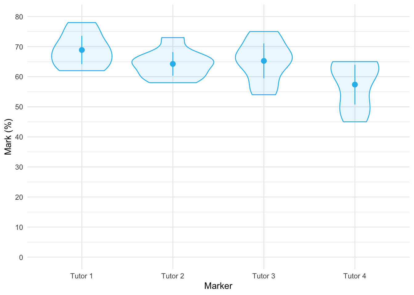
Table 169 shows the main summary table from the model. We would conclude that tutors did not significantly differ in the marks they awarded, F(1.67, 11.71) = 3.70, p = 0.063. In light of this non-significance, no follow up tests are necessary.
| Parameter | Sum_Squares | Sum_Squares_Error | df | df (error) | Mean_Square | F | p |
|---|---|---|---|---|---|---|---|
| tutor | 554.13 | 1048.38 | 1.67 | 11.71 | 89.53 | 3.70 | 0.063 |
Anova Table (Type 3 tests)
Task 3
Calculate the effect sizes for the analysis in Task 1
The easiest way to do this is to add es_type = "omega" into model_parameters() so that the effect sizes are added to the summary table as in Table 170.
model_parameters(tutor_afx, es_type = "omega") |>
display(use_symbols = TRUE)| Parameter | Sum_Squares | Sum_Squares_Error | df | df (error) | Mean_Square | F | p | ω² (partial) |
|---|---|---|---|---|---|---|---|---|
| tutor | 554.13 | 1048.38 | 1.67 | 11.71 | 89.53 | 3.70 | 0.063 | 0.24 |
Anova Table (Type 3 tests)
Alternatively, we could pass the model (tutor_afx) into omega_squared() using the code below
omega_squared(tutor_afx) |>
display()| Parameter | Omega2 (partial) | 95% CI |
|---|---|---|
| tutor | 0.24 | [0.00, 1.00] |
One-sided CIs: upper bound fixed at [1.00].
Either way we get the same results, which show a fairly substantial effect size, \(\hat{\omega}_p\) = 0.24 [0.00, 1.00]. In light of this, we might amend how we report this model.
Task 4
In the previous chapter we came across the beer-goggles effect. In that chapter, we saw that the beer-goggles effect was stronger for unattractive faces. We took a follow-up sample of 26 people and gave them doses of alcohol (0 pints, 2 pints, 4 pints and 6 pints of lager) over four different weeks. We asked them to rate a bunch of photos of unattractive faces in either dim or bright lighting. The outcome measure was the mean attractiveness rating (out of 100) of the faces and the predictors were the dose of alcohol and the lighting conditions (
goggles_lighting.csv). Do alcohol dose and lighting interact to magnify the beer goggles effect?
Load the data using (see Tip 2):
goggle_tib <- discovr::goggles_lightingTable 171 shows the main summary table from the model and Figure 65 shows the interaction plot. The plot shows a similar profile or ratings after no and 2 pints in the dim and light environments. However, at 4 and 6 pints the attractiveness ratings decline faster in dim lighting conditions than in bright environments.
From Table 171, the main effect of lighting shows that the attractiveness ratings of photos was significantly lower when the lighting was dim compared to when it was bright, F(1, 25) = 23.42, p < 0.001, \(\hat{\omega}^2_p\) = 0.25. The main effect of alcohol shows that the attractiveness ratings of photos of faces was significantly affected by how much alcohol was consumed, F(2.62, 65.47) = 104.39, p < 0.001, \(\hat{\omega}^2_p\) = 0.75. However, both of these effects are superseded by the interaction, which shows that the effect that alcohol had on ratings of attractiveness was significantly moderated by the brightness of the lighting, F(2.81, 70.23) = 22.22, p < 0.001, \(\hat{\omega}^2_p\) = 0.35. To interpret this effect let’s move onto the next task.
| Parameter | Sum_Squares | Sum_Squares_Error | df | df (error) | Mean_Square | F | p | ω² (partial) |
|---|---|---|---|---|---|---|---|---|
| lighting | 1993.92 | 2128.33 | 1.00 | 25.00 | 85.13 | 23.42 | < .001 | 0.25 |
| alcohol | 38591.65 | 9242.60 | 2.62 | 65.47 | 141.18 | 104.39 | < .001 | 0.75 |
| lighting:alcohol | 5765.42 | 6487.33 | 2.81 | 70.23 | 92.37 | 22.22 | < .001 | 0.35 |
Anova Table (Type 3 tests)
afex::afex_plot(object = goggles_afx,
x = "alcohol",
trace = "lighting",
legend_title = "Lighting condition",
error = "within",
mapping = c("shape", "color")) +
labs(x = "Dose of alcohol", y = "Attractiveness rating (0-100)") +
scale_color_viridis_d(begin = 0.2, end = 0.85, option = "turbo") +
theme_minimal()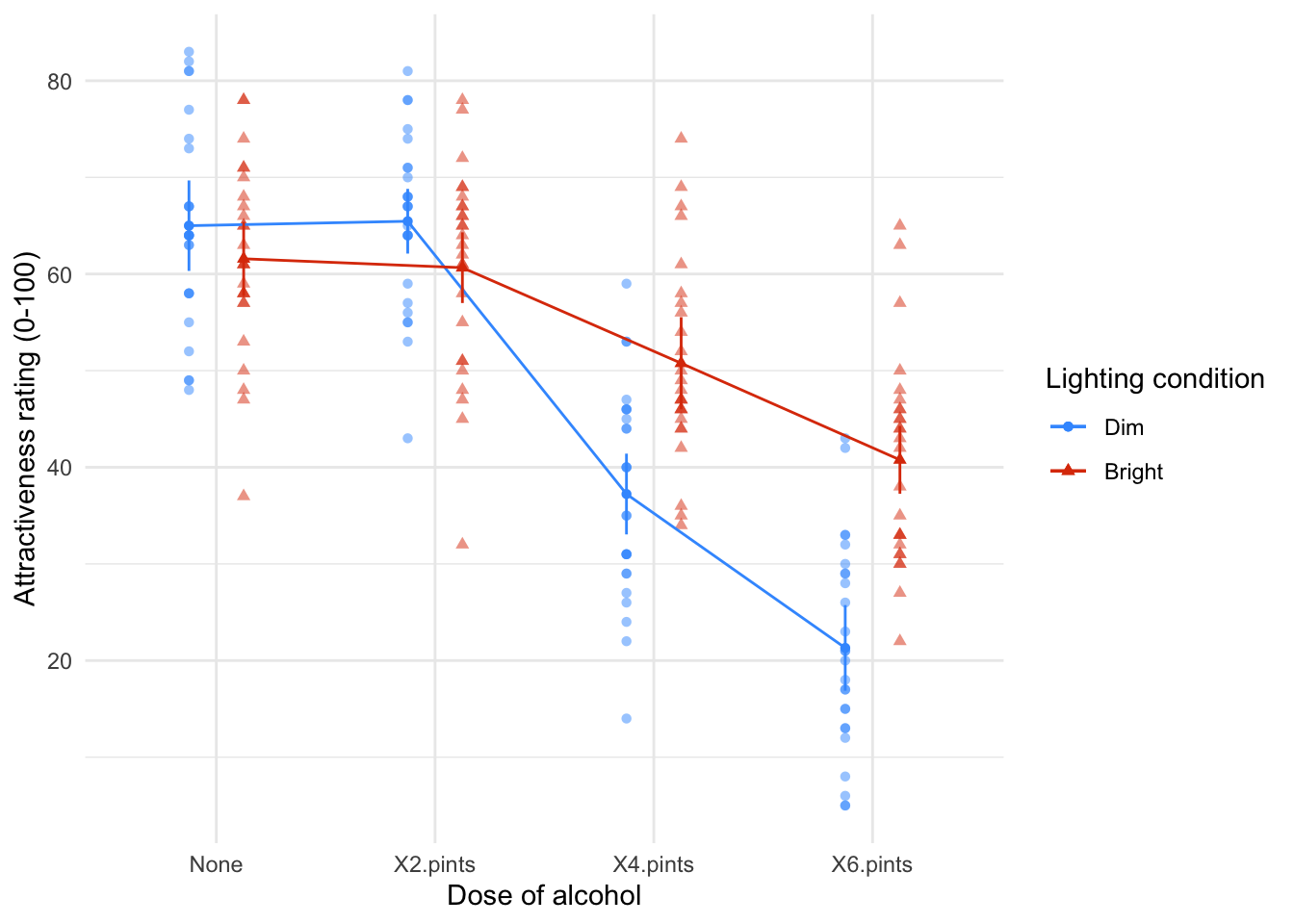
Task 5
Interpret the simple effect of alcohol at different levels of lighting.
The interaction effect is shown in Figure 65. Table 172 shows the simple effect of alcohol at different levels of lighting. These analyses are not particularly helpful because they show that alcohol significantly affected attractiveness ratings both when lights were dim, F(3, 25) = 169.88, p < 0.001, and when they were bright, F(3, 25) = 39.12, p < 0.001. This is an example where it might be worth looking at the alternative simple effects, that is, the simple effect of lighting within each dose of alcohol. These effects are shown in Table 173 and they are somewhat more useful because they show that lighting did not have a significant effect on attractiveness ratings after no alcohol, F(1, 25) = 1.49, p = 0.937, or after 2 pints of lager, F(1, 25) = 4.56, p = 0.171, but did have a significant effect after 4, F(1, 25) = 27.17, p < 0.001, and 6, F(1, 25) = 55.59, p < 0.001, pints. Basically the effect of lighting got stronger as the alcohol dose increased: you can see this on Figure 65 by the circle and triangle getting further apart as we move up the doses of alcohol.
estimate_contrasts(model = goggles_afx,
contrast = "alcohol",
by = "lighting",
comparison = "joint",
p_adjust = "bonferroni") |>
display()| Contrast | lighting | df1 | df2 | F | p |
|---|---|---|---|---|---|
| alcohol | Dim | 3 | 25 | 169.88 | < .001 |
| alcohol | Bright | 3 | 25 | 39.12 | < .001 |
Predictors averaged: id; p-value adjustment method: Bonferroni
estimate_contrasts(model = goggles_afx,
contrast = "lighting",
by = "alcohol",
comparison = "joint",
p_adjust = "bonferroni") |>
display()| Contrast | alcohol | df1 | df2 | F | p |
|---|---|---|---|---|---|
| lighting | None | 1 | 25 | 1.49 | 0.937 |
| lighting | X2.pints | 1 | 25 | 4.56 | 0.171 |
| lighting | X4.pints | 1 | 25 | 27.17 | < .001 |
| lighting | X6.pints | 1 | 25 | 55.59 | < .001 |
Predictors averaged: id; p-value adjustment method: Bonferroni
Task 6
Early in my career I looked at the effect of giving children information about entities. In one study (Field, 2006), I used three novel entities (the quoll, quokka and cuscus) and children were told negative things about one of the entities, positive things about another, and given no information about the third (our control). After the information I asked the children to place their hands in three wooden boxes each of which they believed contained one of the aforementioned entities (
field_2006.csv). Draw and interpret error bar and Q-Q plots of the data.
Load the data using (see Tip 2):
field_tib <- discovr::field_2006Figure 66 shows the mean latency to latency to approach each box. Children were sloer to approach the box they believed contained an animal about which they’d heard threat information. The Q-Q plots (Figure 67) show that latencies are very non-normal for all three boxes. This will be, in part, because if a child hadn’t approached the box within 15 seconds we (for ethical reasons) assumed that they did not want to complete the task and so assigned a score of 15 and asked them to approach the next box. These days, given these data, I’d use a robust test (Task 8!) back when I conducted these research these tests were not so readily available and I log-transformed the scores to reduce the skew (a practice I’m not keen on these days). This brings us onto Task 7!
ggplot(field_tib, aes(x = info_type, y = latency)) +
stat_summary(fun.data = "mean_cl_normal", colour = "#28BBECFF") +
coord_cartesian(ylim = c(0, 10)) +
scale_y_continuous(breaks = seq(0, 10, 1)) +
labs(y = "Latency to appoach (s)", x = "Information type") +
theme_minimal()
ggplot(field_tib, aes(sample = latency)) +
qqplotr::stat_qq_band(fill = "#C4F134FF", alpha = 0.3) +
qqplotr::stat_qq_line(colour = "#C4F134FF") +
qqplotr::stat_qq_point(colour = "#3E9BFEFF", alpha = 0.5, size = 1) +
labs(x = "Theoretical quantiles", y = "Sample quantiles") +
facet_wrap(~info_type, scales = "free") +
theme_minimal()
Task 7
Log-transform the scores in Task 7, make a Q-Q plot of the transformed scores and interpret it.
First we use mutate() to transform the latency scores.
We obtain the Q-Q plots using the same code except that we change the variable to be plotted from latency to ln_latency. The Q-Q plots (Figure 68) show that log latencies for all boxes are a lot more normally distributed than the raw latencies but the positive and no information latencies still show a lack of normality. This brings us onto Task 8!
ggplot(field_tib, aes(sample = ln_latency)) +
qqplotr::stat_qq_band(fill = "#C4F134FF", alpha = 0.3) +
qqplotr::stat_qq_line(colour = "#C4F134FF") +
qqplotr::stat_qq_point(colour = "#3E9BFEFF", alpha = 0.5, size = 1) +
labs(x = "Theoretical quantiles", y = "Sample quantiles") +
facet_wrap(~info_type, scales = "free") +
theme_minimal()
Task 8
Analyse the data in Task 7 with a robust model. Do children take longer to put their hands in a box that they believe contains an entity about which they have been told nasty things?
The results are shown below and they mirror the analysis that I conducted on the log-transformed values in the paper itself (in case you want to check). The main effect of the type of information was significant, F(1.24, 94.32) = 1.24, p < 0.001. The post hoc tests show a significantly longer time to approach the box containing the negative information animal compared to the positive information animal, \(\hat{\psi}\) = 2.42, pobserved < 0.001, pcrit = 0.017, and compared to the no information box, \(\hat{\psi}\) = 2.07, pobserved < 0.001, pcrit = 0.025. Children also approached the box containing the positive information animal significantly faster than the no information animal, \(\hat{\psi}\) = -0.21, pobserved = 0.014, pcrit = 0.050.
WRS2::rmanova(y = field_tib$latency, groups = field_tib$info_type, blocks = field_tib$id)Call:
WRS2::rmanova(y = field_tib$latency, groups = field_tib$info_type,
blocks = field_tib$id)
Test statistic: F = 78.1521
Degrees of freedom 1: 1.24
Degrees of freedom 2: 94.32
p-value: 0 WRS2::rmmcp(y = field_tib$latency, groups = field_tib$info_type, blocks = field_tib$id)Call:
WRS2::rmmcp(y = field_tib$latency, groups = field_tib$info_type,
blocks = field_tib$id)
psihat ci.lower ci.upper p.value p.crit sig
Threat vs. Positive 2.41558 1.71695 3.11421 0.00000 0.0169 TRUE
Threat vs. No information 2.07013 1.35313 2.78713 0.00000 0.0250 TRUE
Positive vs. No information -0.20597 -0.40537 -0.00658 0.01351 0.0500 TRUEChapter 16
Task 16.1
A marketing researcher was interested in the effects of types of imagery (positive, negative or neutral) on perceptions of different types of drink (beer, wine, water). Participants viewed videos of different drink products in the context of positive, negative or neutral imagery and then rated the products on a scale from –100 (extremely dislike) through 0 (neutral) to 100 (extremely like). Those who identify as men and women might respond differently to the products, so participants self-reported their gender (a between-group variable). The data are in the file
mixed_attitude.csv. Analyse the data to see whether there is a combined effect ofimagery,drinkandgenderon ratings of the products.
Load the data using (see Tip 2):
attitude_tib <- discovr::mixed_attitudeWe’re going to need to know the order of factor levels to set contrasts so let’s view them.
levels(attitude_tib$gender)[1] "Identify as male" "Identify as female"levels(attitude_tib$drink)[1] "Beer" "Wine" "Water"levels(attitude_tib$imagery)[1] "Positive" "Negative" "Neutral" Note that:
- For
drink, the control category of water is the last category, so in our contrasts we’ll want to compare each category to the last. We can do this using usingtrt.vs.ctrlk(the ‘k’ inctrlkrefers to the kth, or last, category) - For
imagery, the control category of neutral is the last category, so in our contrasts we’ll want to compare each category to the last. We can again do this using usingtrt.vs.ctrlk - For
gender, male is the first category so we could usetrt.vs.ctrl1to compare females to males, ortrt.vs.ctrlkto compare males to females. It doesn’t matter which, we just need to remember which comparison we’re making. I usetrt.vs.ctrlkin my code.
Table 174 shows the main summary table from the model. The question specifically asks about the combined effect of imagery, drink and gender on ratings of the products so well focus on the three-way interaction. In short, there is a significant three-way drink × imagery × gender interaction, F(3.25, 58.52) = 3.70, p = 0.014. The nature of this interaction is shown up in the means, which are plotted in Figure 69 The male plot shows that when positive imagery is used (circles), males generally rated all three drinks positively (the circles are higher than the other shapes for all drinks). This pattern is true of females also (the blue line/circles representing positive imagery are above the other two lines). When neutral imagery is used (red line/squares), males rate beer very highly, but rate wine and water fairly neutrally. Females, on the other hand rate beer and water neutrally, but rate wine more positively (in fact, the pattern of the positive and neutral imagery lines show that women generally rate wine slightly more positively than water and beer). So, for neutral imagery males still rate beer positively, and females still rate wine positively. For the negative imagery (green line/triangles), the males still rate beer very highly, but give low ratings to the other two types of drink. So, regardless of the type of imagery used, males rate beer very positively (if you look at the plot you’ll note that ratings for beer are virtually identical for the three types of imagery). Females, however, rate all three drinks very negatively when negative imagery is used. The three-way interaction is, therefore, likely to reflect that males seem fairly immune to the effects of imagery when beer is being used as a stimulus, whereas females are not.
The contrasts (Table 175) show up what this interaction represents. Note that I have used trt.vs.ctrlk for gender, drink and imagery which compares each category to the last category. This means the contrasts compare males to females, each drink to water (the control) and each imagery condition to Neutral (the control).
- Contrast 1: beer vs. water, negative vs. neutral imagery, male vs. female. This contrast is significant, \(\bar{X}_\text{Diff}\) = 9.80 (1.09, 18.51), t(18) = 2.36, p = 0.029. This result tells us that the difference in ratings between beer and water when negative imagery is used (compared to neutral imagery) is different between males and females. With respect to Figure 69 it means that the distance between the triangles and squares in the beer condition relative to the same distance for water was different in males and females.
- Contrast 2: beer vs. water, positive vs. neutral imagery, male vs. female. This contrast is not significant, \(\bar{X}_\text{Diff}\) = -9.40 (-22.34, 3.54), t(18) = -1.53, p = 0.144. The non-significance of this contrast tells us that the difference in ratings when positive imagery is used compared to neutral imagery is roughly equal when beer is used as a stimulus and when water is used, and these differences are equivalent in male and female participants. With respect to Figure 69 it means that the distance between the circles and squares in the beer condition is the same as the distance between the circles and squares in the water condition and that these distances are equivalent in males and females.
- Contrast 3: wine vs. water, negative vs. neutral imagery, male vs. female. This contrast is very close to significance, \(\bar{X}_\text{Diff}\) = 9.00 (-0.03, 18.03), t(18) = 2.09, p = 0.051. This result tells us that the difference in ratings between wine and water when negative imagery is used (compared to neutral imagery) is not different between men and women (although this difference was close to significance). With respect to Figure 69 it means that the distance between the triangles and squares in the wine condition relative to the same distance for water was not significantly different (depending on how you interpret a p of 0.051) in males and females. It is noteworthy that this contrast was close to the 0.051 threshold.
- Contrast 4: wine vs. water, positive vs. neutral imagery, male vs. female. This contrast is non-significant, \(\bar{X}_\text{Diff}\) = -0.90 (-12.91, 11.11), t(18) = -0.16, p = 0.877. This result tells us that the difference in ratings when positive imagery is used compared to neutral imagery is roughly equal when wine is used as a stimulus and when water is used, and these differences are equivalent in male and female participants. With respect to Figure 69 it means that the distance between the circles and squares in the wine condition is the same as the corresponding distance in the water condition and that these distances are equivalent in males and females.
| Parameter | Sum_Squares | Sum_Squares_Error | df | df (error) | Mean_Square | F | p | ω² (partial) |
|---|---|---|---|---|---|---|---|---|
| gender | 523.61 | 1396.50 | 1.00 | 18.00 | 77.58 | 6.75 | 0.018 | 0.22 |
| drink | 2092.34 | 3216.87 | 1.40 | 25.22 | 127.57 | 11.71 | < .001 | 0.28 |
| gender:drink | 4569.01 | 3216.87 | 1.40 | 25.22 | 127.57 | 25.57 | < .001 | 0.47 |
| imagery | 21628.68 | 1354.53 | 1.93 | 34.77 | 38.96 | 287.42 | < .001 | 0.88 |
| gender:imagery | 1998.34 | 1354.53 | 1.93 | 34.77 | 38.96 | 26.56 | < .001 | 0.40 |
| drink:imagery | 2624.42 | 2411.00 | 3.25 | 58.52 | 41.20 | 19.59 | < .001 | 0.38 |
| gender:drink:imagery | 495.69 | 2411.00 | 3.25 | 58.52 | 41.20 | 3.70 | 0.014 | 0.08 |
Anova Table (Type 3 tests)
afex::afex_plot(object = attitude_afx,
x = "drink",
trace = "imagery",
panel = "gender",
legend_title = "Type of Imagery",
error = "within",
mapping = c("shape", "color")) +
labs(x = "Type of drink", y = "Mean rating of product") +
scale_color_viridis_d(begin = 0.2, end = 0.85, option = "turbo") +
theme_minimal()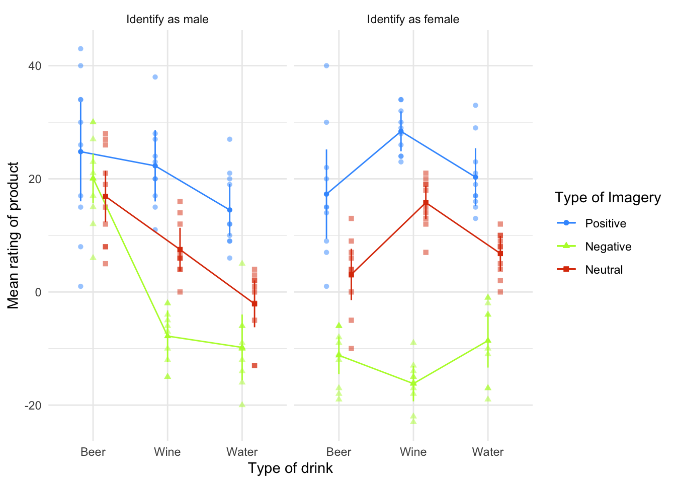
| gender_trt.vs.ctrlk | drink_trt.vs.ctrlk | imagery_trt.vs.ctrlk | Difference | 95% CI | SE | t(18) | p |
|---|---|---|---|---|---|---|---|
| Identify as male - Identify as female | Beer - Water | Negative - Neutral | 9.80 | ( 1.09, 18.51) | 4.14 | 2.36 | 0.029 |
| Identify as male - Identify as female | Beer - Water | Positive - Neutral | -9.40 | (-22.34, 3.54) | 6.16 | -1.53 | 0.144 |
| Identify as male - Identify as female | Wine - Water | Negative - Neutral | 9.00 | ( -0.03, 18.03) | 4.30 | 2.09 | 0.051 |
| Identify as male - Identify as female | Wine - Water | Positive - Neutral | -0.90 | (-12.91, 11.11) | 5.72 | -0.16 | 0.877 |
Variable predicted: rating; Predictors contrasted: gender, drink, imagery; p-values are uncorrected.
Task 16.2
Text messaging and social media encourage communication using abbreviated forms of words (if u no wat I mean). A researcher wanted to see the effect this had on children’s understanding of grammar. One group of 25 children was encouraged to send text messages on their mobile phones over a 6-month period. A second group of 25 was forbidden from sending text messages for the same period (to ensure adherence, this group were given armbands that administered painful shocks in the presence of a phone signal). The outcome was a score on a grammatical test (as a percentage) that was measured both before and after the experiment. The data are in the file
text_messages.csv. Does using text messages affect grammar?
Load the data using (see Tip 2):
grammar_tib <- discovr::text_messagesTable 176 shows that there was a significant interaction between the time at which grammar was measured and whether or not children were allowed to text-message within that time, F(1, 48) = 4.17, p = 0.047, \(\hat{\omega}^2_p\) = 0.02. The mean ratings in all conditions help us to interpret this effect. Looking at the earlier interaction plot, we can see that although grammar scores fell in controls, the drop was much more marked in the text messagers; so, text messaging does seem to ruin your ability at grammar compared to controls. Figure 70 shows the mean grammar score (and 95% confidence interval) before and after the experiment for the text message group and the controls. It’s clear that in the text message group grammar scores went down over the six-month period whereas they remained fairly static for the controls.
The simple effects analysis (Table 177), in combination with the means (Figure 70) indicate that grammar scores significantly decreased in the text message group, F(1, 48) = 17.84, p < 0.001, but not the control group, F(1, 48) = 1.79, p = 0.375.
| Parameter | Sum_Squares | Sum_Squares_Error | df | df (error) | Mean_Square | F | p | ω² (partial) |
|---|---|---|---|---|---|---|---|---|
| text_gp | 580.81 | 9334.08 | 1 | 48 | 194.46 | 2.99 | 0.090 | 0.04 |
| time | 1528.81 | 4747.60 | 1 | 48 | 98.91 | 15.46 | < .001 | 0.09 |
| text_gp:time | 412.09 | 4747.60 | 1 | 48 | 98.91 | 4.17 | 0.047 | 0.02 |
Anova Table (Type 3 tests)
afex::afex_plot(object = grammar_afx,
x = "time",
trace = "text_gp",
legend_title = "Group",
error = "within",
mapping = c("shape", "color")) +
labs(x = "Time", y = "Grammar test score (%)") +
scale_color_viridis_d(begin = 0.2, end = 0.85, option = "turbo") +
theme_minimal()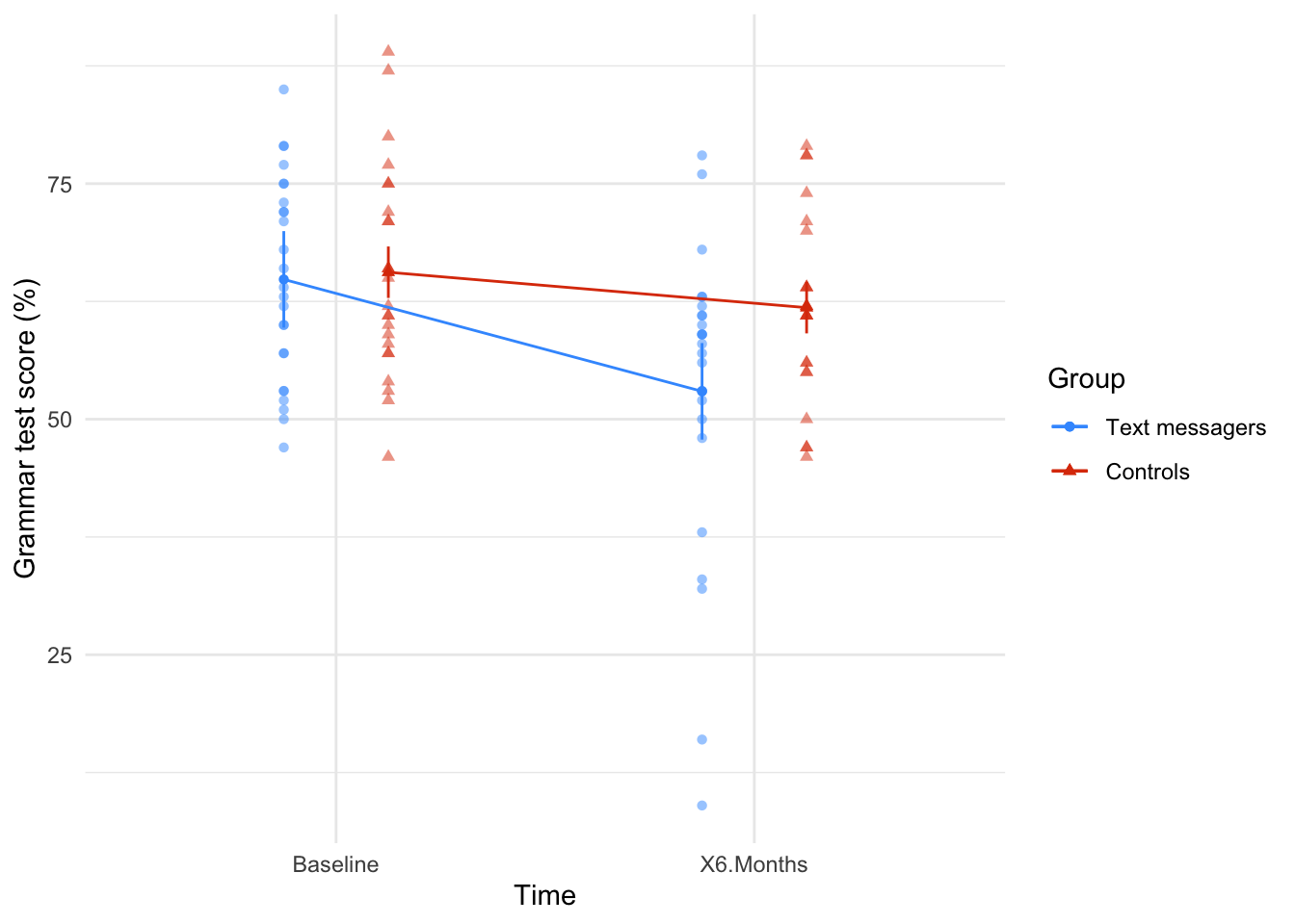
estimate_contrasts(model = grammar_afx,
contrast = "time",
by = "text_gp",
comparison = "joint",
p_adjust = "bonferroni") |>
display()| Contrast | text_gp | df1 | df2 | F | p |
|---|---|---|---|---|---|
| time | Text messagers | 1 | 48 | 17.84 | < .001 |
| time | Controls | 1 | 48 | 1.79 | 0.375 |
Predictors averaged: id; p-value adjustment method: Bonferroni
Task 16.3
A researcher hypothesized that reality TV show contestants start off with personality disorders that are exacerbated by being forced to spend time with people as attention-seeking as them (see Chapter 1). To test this hypothesis, she gave eight contestants a questionnaire measuring personality disorders before and after they entered the show. A second group of eight people were given the questionnaires at the same time; these people were short-listed to go on the show, but never did. The data are in
reality_tv.csv. Does entering a reality TV competition give you a personality disorder?
Load the data using (see Tip 2):
tv_tib <- discovr::reality_tvTable 178 shows that the main effect of time was not significant, F(1, 14) = 0.67, p = 0.427, \(\hat{\omega}^2_p\) = 0.00, so we can conclude that when we ignore group personality disorder scores did not change over time. The main effect of contestant was also not significant, F(1, 14) = 0.09, p = 0.765, \(\hat{\omega}^2_p\) = 0.00, so when we ignore the time at which personality traits were measured contestants did not differ significantly from short listed candidates on personality disorder traits.
There was a significant interaction between the time at which personality disorders were measured and whether or not the participant was a contestant or short listed group, F(1, 14) = 7.15, p = 0.018, \(\hat{\omega}^2_p\) = 0.06. The significant interaction seems to indicate that for controls PDS scores went down (slightly) from before entering the show to after leaving it, but for contestants these opposite is true: PDS scores increased over time (Figure 71). Simple effects analysis (Table 179) indicated that personality disorder scores did not significantly change in short listed controls, F(1, 14) = 2.81, p = 0.116, but came close to showing significant change in contestants, F(1, 14) = 4.44, p = 0.054.
| Parameter | Sum_Squares | Sum_Squares_Error | df | df (error) | Mean_Square | F | p | ω² (partial) |
|---|---|---|---|---|---|---|---|---|
| contestant | 331.53 | 6942.69 | 1 | 14 | 495.91 | 0.67 | 0.427 | 0.00 |
| time | 9.03 | 1358.69 | 1 | 14 | 97.05 | 0.09 | 0.765 | 0.00 |
| contestant:time | 693.78 | 1358.69 | 1 | 14 | 97.05 | 7.15 | 0.018 | 0.06 |
Anova Table (Type 3 tests)
afex::afex_plot(object = tv_afx,
x = "time",
trace = "contestant",
legend_title = "Group",
error = "within",
mapping = c("shape", "color")) +
labs(x = "Time", y = "Personality disorder score") +
scale_color_viridis_d(begin = 0.2, end = 0.85, option = "turbo") +
theme_minimal()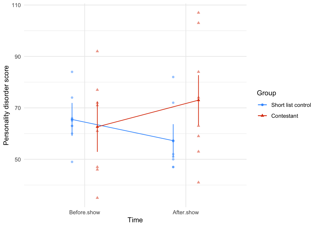
estimate_contrasts(model = tv_afx,
contrast = "time",
by = "contestant",
comparison = "joint",
p_adjust = "bonferroni") |>
display()| Contrast | contestant | df1 | df2 | F | p |
|---|---|---|---|---|---|
| time | Short list control | 1 | 14 | 2.81 | 0.232 |
| time | Contestant | 1 | 14 | 4.44 | 0.107 |
Predictors averaged: id; p-value adjustment method: Bonferroni
Task 16.4
Angry Birds is a video game in which you fire birds at pigs. A (fabricated) study was set up in which people played Angry Birds and a control game (Tetris) over a 2-year period (1 year per game). They were put in a pen of pigs for a day before the study, and after 1 month, 6 months and 12 months. Their violent acts towards the pigs were counted. Does playing Angry Birds make people more violent to pigs compared to a control game? (
angry_pigs.csv)
Load the data using (see Tip 2):
pigs_tib <- discovr::angry_pigsTable 180 shows that the main effect of game was significant, F(1, 82) = 12.87, p < 0.001, \(\hat{\omega}^2_p\) = 0.12, indicating that (ignoring the time at which the aggression scores were measured), the type of game being played significantly affected participant’s aggression towards pigs. The main effect of time was also significant, F(2.82, 230.85) = 8.92, p < 0.001, \(\hat{\omega}^2_p\) = 0.06, so we can conclude that (ignoring the type of game being played), aggression was significantly different at different points in time. However, the effect that we are most interested in is the time × game interaction, which was also significant, F(2.82, 230.85) = 17.57, p < 0.001, \(\hat{\omega}^2_p\) = 0.12. This effect tells us that changes in aggression scores over time were different when participants played Tetris compared to when they played angry birds. Looking at Figure 72, we can see that for angry birds, aggression scores increase over time, whereas for Tetris, aggression scores decreased over time. The simple effects analysis (Table 181) confirms this: for Tetris aggression to pigs does not significantly change over time, F(3, 82) = 1.38, p = 0.254, but for angry pigs it does, F(3, 82) = 20.42, p < 0.001.
| Parameter | Sum_Squares | Sum_Squares_Error | df | df (error) | Mean_Square | F | p | ω² (partial) |
|---|---|---|---|---|---|---|---|---|
| game | 39.36 | 250.82 | 1.00 | 82.00 | 3.06 | 12.87 | < .001 | 0.12 |
| time | 61.75 | 567.40 | 2.82 | 230.85 | 2.46 | 8.92 | < .001 | 0.06 |
| game:time | 121.60 | 567.40 | 2.82 | 230.85 | 2.46 | 17.57 | < .001 | 0.12 |
Anova Table (Type 3 tests)
afex::afex_plot(object = pig_afx,
x = "time",
trace = "game",
legend_title = "Game",
error = "within",
mapping = c("shape", "color")) +
labs(x = "Time", y = "Aggression") +
scale_color_viridis_d(begin = 0.2, end = 0.85, option = "turbo") +
theme_minimal()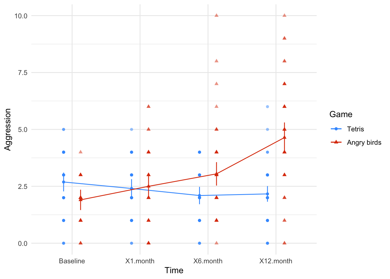
estimate_contrasts(model = pig_afx,
contrast = "time",
by = "game",
comparison = "joint",
p_adjust = "none") |>
display()| Contrast | game | df1 | df2 | F | p |
|---|---|---|---|---|---|
| time | Tetris | 3 | 82 | 1.38 | 0.254 |
| time | Angry birds | 3 | 82 | 20.42 | < .001 |
Predictors averaged: id; p-values are uncorrected.
Task 16.5
A different study was conducted with the same design as in Task 4. The only difference was that the participant’s violent acts in real life were monitored before the study, and after 1 month, 6 months and 12 months. Does playing Angry Birds make people more violent in general compared to a control game? (
angry_real.csv)
Load the data using (see Tip 2):
angry_tib <- discovr::angry_realTable 182 whos that the main effect of game was not significant, F(1, 124) = 1.89, p = 0.171, \(\hat{\omega}^2_p\) = 0.01, indicating that (ignoring the time at which the aggression scores were measured), the type of game being played did not significantly affected participant’s aggression in everyday life. The main effect of time was also not significant, F(2.96, 367.36) = 0.87, p = 0.457, \(\hat{\omega}^2_p\) = 0.00 so we can conclude that (ignoring the type of game being played), aggression was not significantly different at different points in time. However, the effect that we are most interested in is the time × game interaction, which was also not significant, F(2.96, 367.36) = 1.34, p = 0.261, \(\hat{\omega}^2_p\) = 0.00. This effect tells us that changes in aggression over time were comparable when participants played Tetris and Angry Birds. Looking at Figure 73, we can see that for both tetris and Angry Birds, aggression scores do not change over time (both lines are fairly flat).
| Parameter | Sum_Squares | Sum_Squares_Error | df | df (error) | Mean_Square | F | p | ω² (partial) |
|---|---|---|---|---|---|---|---|---|
| game | 4.38 | 286.85 | 1.00 | 124.00 | 2.31 | 1.89 | 0.171 | 7.05e-03 |
| time | 5.15 | 736.64 | 2.96 | 367.36 | 2.01 | 0.87 | 0.457 | 0.00 |
| game:time | 7.96 | 736.64 | 2.96 | 367.36 | 2.01 | 1.34 | 0.261 | 1.95e-03 |
Anova Table (Type 3 tests)
afex::afex_plot(object = angry_afx,
x = "time",
trace = "game",
legend_title = "Game",
error = "within",
mapping = c("shape", "color")) +
labs(x = "Time", y = "Aggression") +
scale_color_viridis_d(begin = 0.2, end = 0.85, option = "turbo") +
theme_minimal()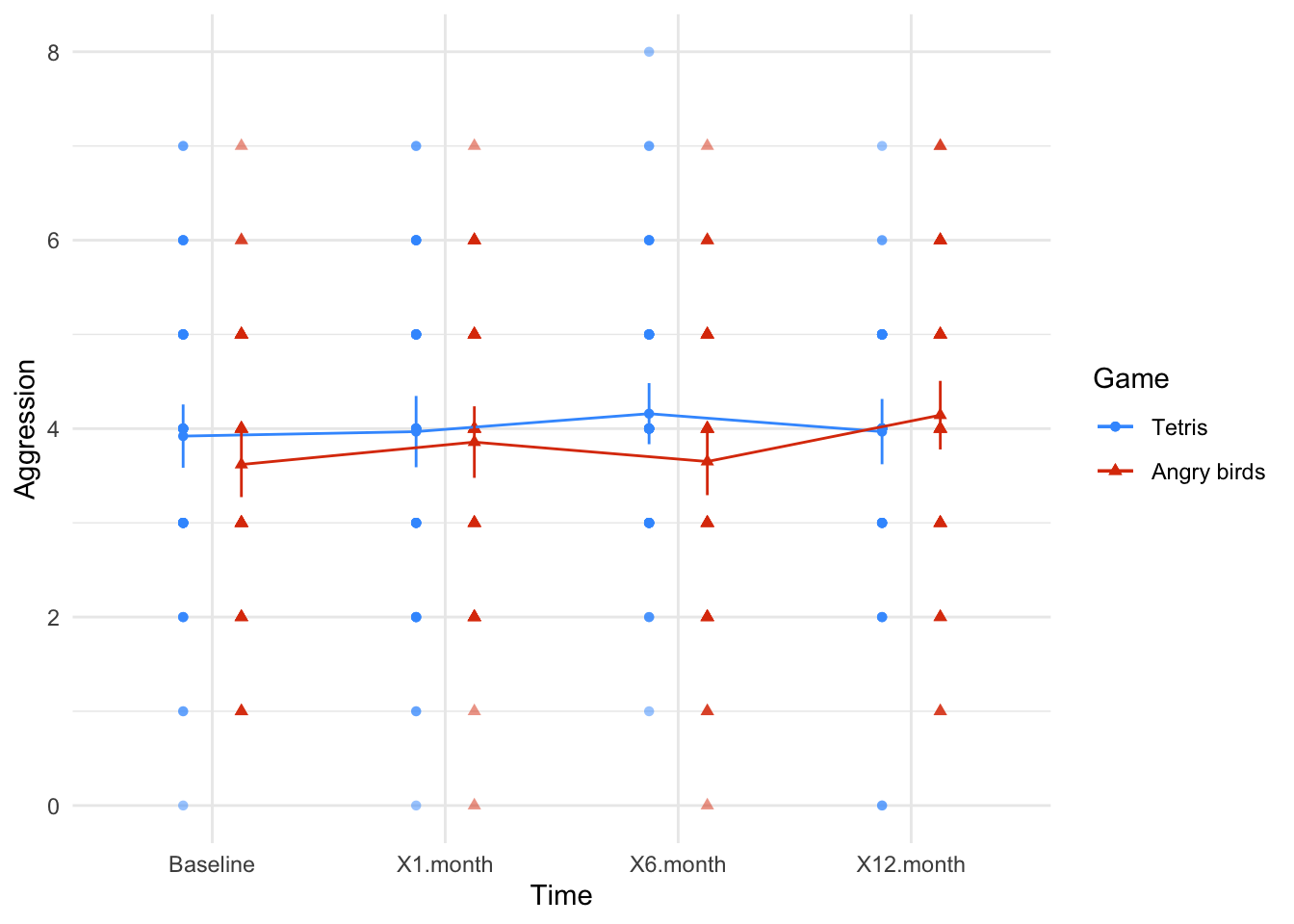
Task 16.6
My wife believes that she has received fewer friend requests from random men on Facebook since she changed her profile picture to a photo of us both. Imagine we took 40 women who had profiles on a social networking website; 17 of them had a relationship status of ‘single’ and the remaining 23 had their status as ‘in a relationship’ (
rel_status). We asked these women to set their profile picture (profile_pic) to a photo of them on their own (alone) and to count how many friend request they got from men over 3 weeks, then to switch it to a photo of them with a man (couple) and record their friendrequestsfrom random men over 3 weeks. Fit a model to see if friend requests are affected by relationship status and type of profile picture (profile_pic.csv).
Load the data using (see Tip 2):
profile_tib <- discovr::profile_picTable 183 shows that the main effect of rel_status was significant, F(1, 38) = 16.29, p < 0.001, \(\hat{\omega}^2_p\) = 0.28, so we can conclude that, ignoring the type of profile picture, the number of friend requests was significantly affected by the relationship status of the woman. The exact nature of this effect is easily determined because there were only two levels of relationship status (and so this main effect is comparing only two means). If you look at Figure 74 single people always get more requests than those in a relationship (the circles are higher than the triangles)
The main effect of profile_picture was also significant, F(1, 38) = 114.77, p < 0.001, \(\hat{\omega}^2_p\) = 0.54. Therefore, when ignoring relationship status, there was a significant main effect of whether the person was alone in their profile picture or with a partner on the number of friend requests. If you look at Figure 74, the number of friend requests was higher when women were alone in their profile picture compared to when they were with a partner.
The interaction effect is the effect that we are most interested in and it is also significant, F(1, 38) = 7.41, p = 0.010, \(\hat{\omega}^2_p\) = 0.06. We would conclude that there is a significant interaction between the relationship status of women and whether they had a photo of themselves alone or with a partner. From Figure 74 the significant interaction seems to indicate that when displaying a photo of themselves with a partner relationship status doesn’t have much impact on friend requests (the circle and triangle are in a similar location); however, when they are alone in their profile photo relationship status matters and they seem to get a lot more friend requests when single than when in a relationship (the circle a higher than the triangle). Simple effects analysis (Table 184) confirms that there is a significant effect of relationship status when a woman was alone in her profile picture, F(1, 38) = 17.38, p < 0.001, but not when she was pictured with a partner, F(1, 38) = 3.11, p = 0.086.
| Parameter | Sum_Squares | Sum_Squares_Error | df | df (error) | Mean_Square | F | p | ω² (partial) |
|---|---|---|---|---|---|---|---|---|
| rel_status | 41.91 | 97.77 | 1 | 38 | 2.57 | 16.29 | < .001 | 0.28 |
| profile_pic | 194.57 | 64.42 | 1 | 38 | 1.70 | 114.77 | < .001 | 0.54 |
| rel_status:profile_pic | 12.57 | 64.42 | 1 | 38 | 1.70 | 7.41 | 0.010 | 0.06 |
Anova Table (Type 3 tests)
afex::afex_plot(object = profile_afx,
x = "rel_status",
trace = "profile_pic",
legend_title = "Profile Picture",
error = "within",
mapping = c("shape", "color")) +
labs(x = "Relationship status", y = "Number of friend requests") +
scale_color_viridis_d(begin = 0.2, end = 0.85, option = "turbo") +
theme_minimal()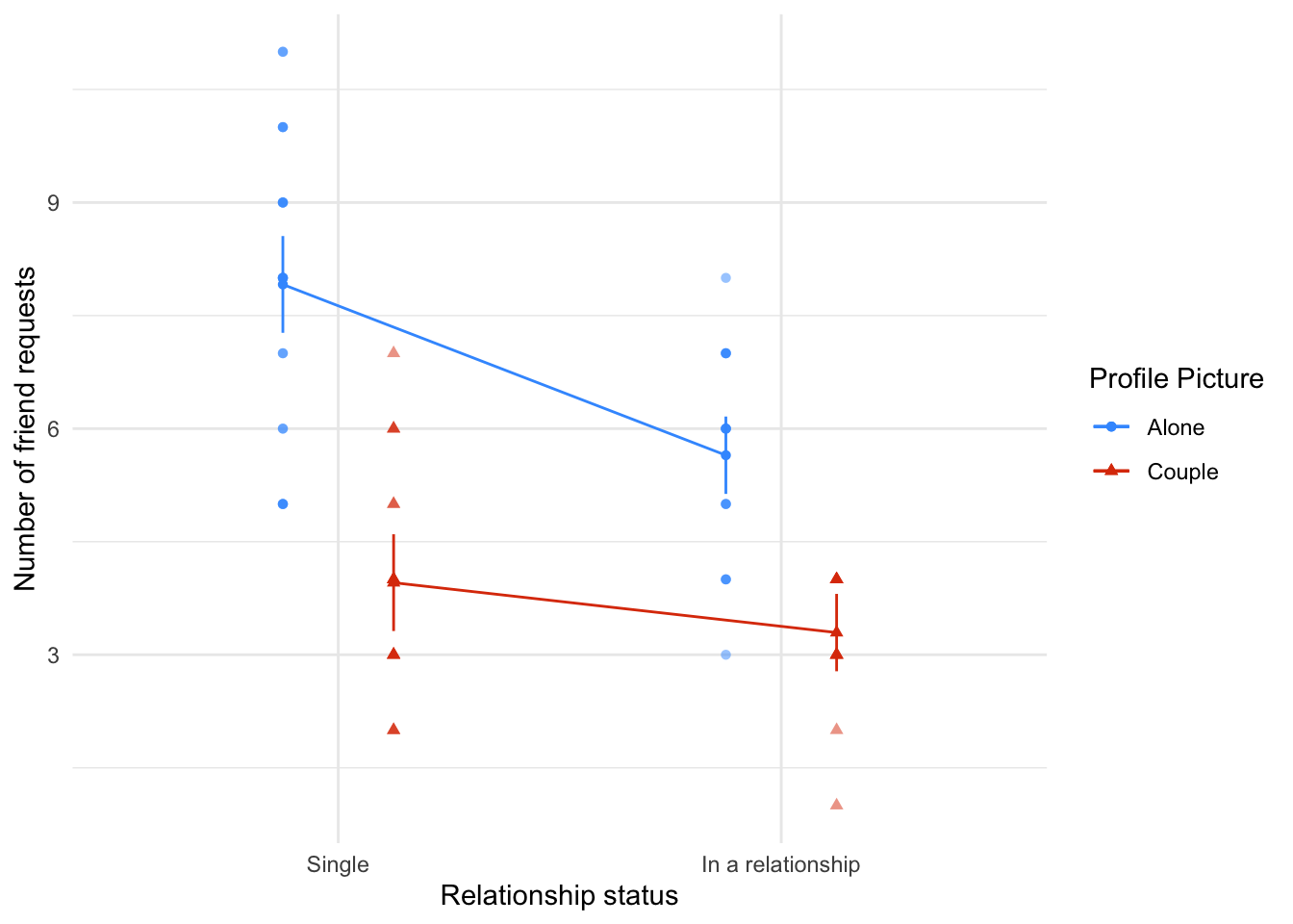
estimate_contrasts(model = profile_afx,
contrast = "rel_status",
by = "profile_pic",
comparison = "joint",
p_adjust = "none") |>
display()| Contrast | profile_pic | df1 | df2 | F | p |
|---|---|---|---|---|---|
| rel_status | Alone | 1 | 38 | 17.38 | < .001 |
| rel_status | Couple | 1 | 38 | 3.11 | 0.086 |
Predictors averaged: id; p-values are uncorrected.
Task 16.7
Labcoat Leni’s Real Research 5.2 described a study in which researchers reasoned that if red was a proxy signal to indicate sexual proceptivity then men should find red female genitalia more attractive than other colours (Johns et al., 2012). They also recorded the men’s sexual experience (
partners) as ‘some’ or ‘very little’. Fit a model to test whetherattractivenesswas affected by genitaliacolour(pale pink, light pink, darkpink, red) and sexual experience (johns_2012.csv). Look at page 3 of Johns et al. to see how to report the results.
Load the data using (see Tip 2):
johns_tib <- discovr::johns_2012Table 185 shows that the main effect of colour is significant, F(2.29, 87.03) = 11.59, p < 0.001, \(\hat{\omega}^2_p\) = 0.01, so we can conclude that, ignoring sexual experience, attractiveness ratings were significantly affected by the genital colour. The main effect of sexual experience was not significant, F(1, 38) = 0.48, p = 0.492, \(\hat{\omega}^2_p\) = 0.00. Therefore, we can conclude that when ignoring genital colour, attractiveness ratings were not significantly different for those with ‘some’ compared to ‘very little’ sexual experience. The colour × Partners interaction was not significant, F(1, 38) = 0.48, p = 0.492, \(\hat{\omega}^2_p\) = 0.00, suggesting that the effect of colour was not significantly moderated by sexual experience. Figure 75 shows this lack of interaction in that the lines are relatively parallel suggesting that the difference in attractiveness ratings for those with some sexual experience compared to those with very little is relatively similar for each colour (the distances between the circles and triangles are similar for each colour).
Given the interaction was not significant we can focus on interpreting the main effect of colour. The contrasts for the main effect of colour (Table 186) show that attractiveness ratings were significantly lower when the colour was red compared to dark pink, \(\bar{X}_\text{Diff}\) = 4.72 (1.72, 7.73), t(38) = 3.93, p = 0.001, light pink, \(\bar{X}_\text{Diff}\) = 6.05 (2.88, 9.23), t(38) = 4.78, p < 0.001, and pale pink, \(\bar{X}_\text{Diff}\) = 4.06 (1.62, 6.49), t(38) = 4.18, p < 0.001. This is contrary to the theory, which suggested that red would be rated as more attractive than other colours.
| Parameter | Sum_Squares | Sum_Squares_Error | df | df (error) | Mean_Square | F | p | ω² (partial) |
|---|---|---|---|---|---|---|---|---|
| partners | 692.02 | 54530.22 | 1.00 | 38.00 | 1435.01 | 0.48 | 0.492 | 0.00 |
| colour | 815.92 | 2674.43 | 2.29 | 87.03 | 30.73 | 11.59 | < .001 | 0.01 |
| partners:colour | 148.33 | 2674.43 | 2.29 | 87.03 | 30.73 | 2.11 | 0.121 | 1.33e-03 |
Anova Table (Type 3 tests)
afex::afex_plot(object = johns_afx,
x = "colour",
trace = "partners",
legend_title = "Sexual partners",
error = "within",
mapping = c("shape", "color")) +
labs(x = "Genitalia colour", y = "Attractiveness rating") +
scale_color_viridis_d(begin = 0.2, end = 0.85, option = "turbo") +
theme_minimal()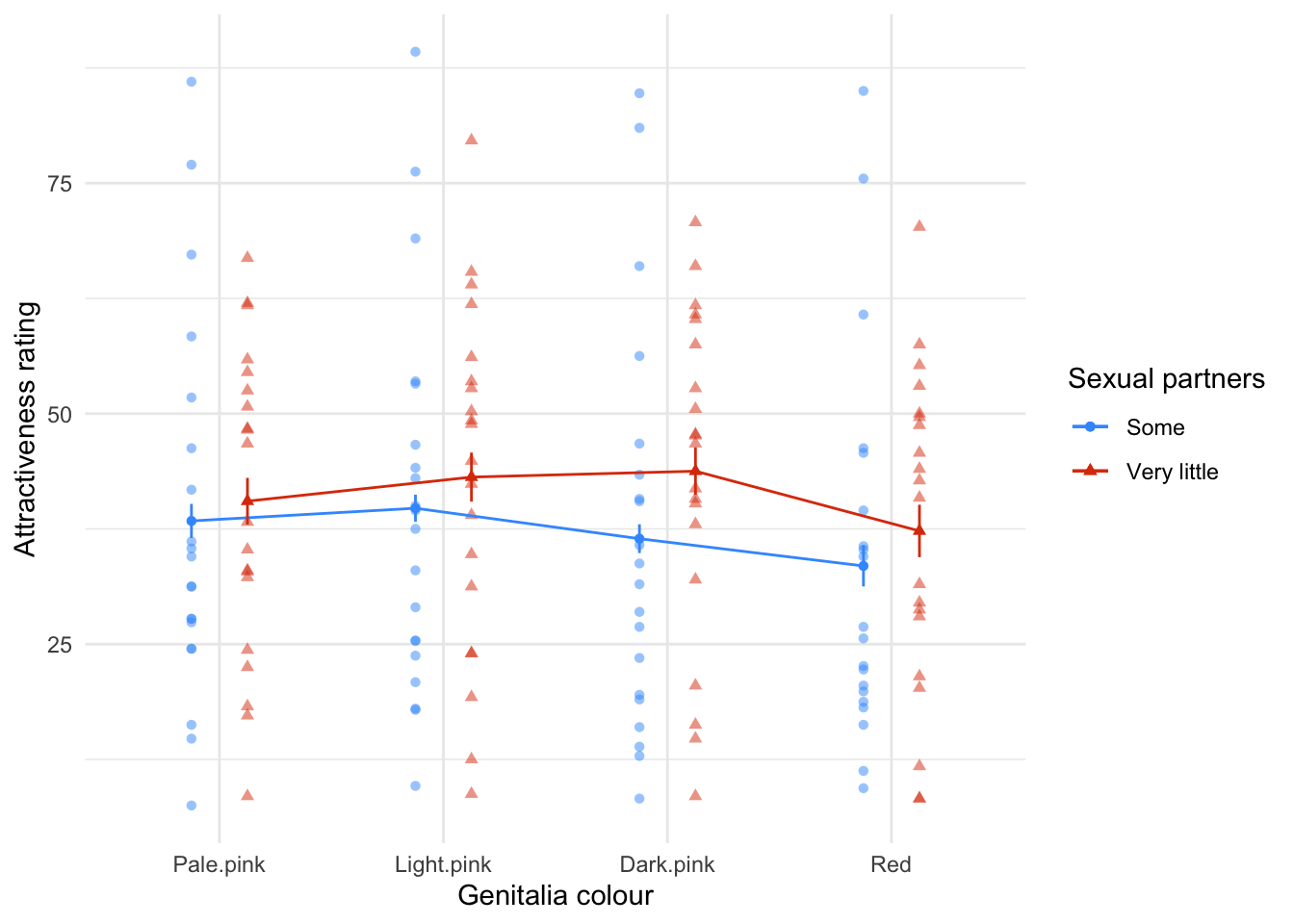
estimate_contrasts(johns_afx,
comparison = "trt.vs.ctrl",
contrast = "colour",
ref = 4,
p_adjust = "bonferroni",
backend = "emmeans") |>
display()| Level1 | Level2 | Difference | 95% CI | SE | t(38) | p |
|---|---|---|---|---|---|---|
| Dark.pink | Red | 4.72 | (1.72, 7.73) | 1.20 | 3.93 | 0.001 |
| Light.pink | Red | 6.05 | (2.88, 9.23) | 1.27 | 4.78 | < .001 |
| Pale.pink | Red | 4.06 | (1.62, 6.49) | 0.97 | 4.18 | < .001 |
Variable predicted: attractiveness; Predictors contrasted: colour; p-value adjustment method: Bonferroni
Chapter 17
Task 17.1
Rerun the analysis in this chapter using principal component analysis and compare the results to those in the chapter. (Set the iterations to convergence to 30.)
Load the data using (see Tip 2):
raq_tib <- discovr::raqAll of the descriptives, correlation matrices, KMO tests and so on are unaffected by our choice of principal components as the method of dimension reduction. Also in the book chapter we did parallel analysis based on components and this suggested 4 components (as did the parallel analysis based on components). So, follow everything in the book (code and interpretation) up to the point at which we for the main model.
As a reminder, we set up the correlation matrix to be based on polychoric correlations
# create tibble that contains only the questionnaire items and reverse scores item 3
raq_items <- raq_tib |>
select(-id) |>
reverse(select = "raq_03", range = c(1, 5))
# get the polychoric correlation object
raq_poly <- correlation(raq_items, method = "polychoric")
# store the polychoric correlation matrix
raq_poly_mtx <- as.matrix(raq_poly)Things start to get different at the point of fitting the model. We can use the same code as the book chapter except that we use the principal_components() function instead of factor_analysis() and we need to explicitly include rotation = "oblimin" because for PCA the default is "none". By default, principal_components() uses standardize = TRUE (unlike factor_analysis(), which uses standardize = FALSE). When using polychoric correlations we want to set this to FALSE I’ve also changed the name of the object to store this in to raq_pca to reflect the fact we’ve done PCA and not component analysis.
raq_pca <- principal_components(x = raq_items,
n = 4,
rotation = "oblimin",
standardize = FALSE,
cor = "poly")Note in Table 187 that the components are labelled TC1 to TC4 (unlike for the factor analysis in the book where the labels were MR1 etc.). We are given some information about how much variance each component accounts for in Table 187.
- Variance Explained: The first component (TC1) accounts for 0.16 (16%) of the overall variance and the second component (TC2) accounts for 0.12 (12%) of the variance and so on.
- Variance Explained (Cumulative): cumulatively, TC1 accounts for 0.16 (16%) of the overall variance and TC1 and TC2 together account for 0.16 + 0.12 = 0.28 (28%) of the variance. Importantly, we can see that all four components in combination explain 0.49 (49%) of the overall variance.
- Variance Explained (Proportion): Of the 49% of variance accounted for, 0.32 (32%) is attributable to TC1, 0.24 (24%) to TC2, 0.23 (23%) to TC3, and 0.20 (20%) to TC4.
The correlations between components are also displayed. These are all non-zero indicating that components are correlated (and oblique rotation was appropriate). It also tells us the degree to which components are correlated. All of the components positively, and fairly strongly, correlate with each other. In other words, the latent constructs represented by the components are related.
| Parameter | TC1 | TC2 | TC3 | TC4 |
|---|---|---|---|---|
| Eigenvalues | 6.381 | 2.090 | 1.619 | 1.272 |
| Variance Explained | 0.159 | 0.120 | 0.113 | 0.101 |
| Variance Explained (Cumulative) | 0.159 | 0.280 | 0.393 | 0.494 |
| Variance Explained (Proportion) | 0.323 | 0.244 | 0.229 | 0.205 |
| Factor | TC1 | TC2 | TC3 | TC4 |
|---|---|---|---|---|
| TC1 | 1.000 | 0.339 | 0.377 | 0.406 |
| TC2 | 0.339 | 1.000 | 0.213 | 0.249 |
| TC3 | 0.377 | 0.213 | 1.000 | 0.415 |
| TC4 | 0.406 | 0.249 | 0.415 | 1.000 |
Let’s look at the loadings in Table 188 (note, I’ve suppressed values below 0.2 and sorted). The clusters of items match the book chapter where we used factor analysis instead of PCA. The questions that load highly on TC1 seem to be items that relate to Fear of computers:
-
raq_05: I don’t understand statistics -
raq_06: I have little experience of computers -
raq_07: All computers hate me -
raq_10: Computers are useful only for playing games -
raq_13: I worry that I will cause irreparable damage because of my incompetence with computers -
raq_14: Computers have minds of their own and deliberately go wrong whenever I use them -
raq_15: Computers are out to get me -
raq_18: R always crashes when I try to use it
Note that item 5 also loads highly onto TC3.
The questions that load highly on TC2 seem to be items that relate to **Fear of peer/social evaluation`:
-
raq_02: My friends will think I’m stupid for not being able to cope with -
raq_09: My friends are better at statistics than me -
raq_19: Everybody looks at me when I use -
raq_22: My friends are better atthan I am -
raq_23: If I am good at statistics people will think I am a nerd
The questions that load highly on TC3 seem to be items that relate to Fear of statistics:
-
raq_01: Statistics make me cry -
raq_03: Standard deviations excite me -
raq_04: I dream that Pearson is attacking me with correlation coefficients -
raq_05: I don’t understand statistics -
raq_12: People try to tell you thatmakes statistics easier to understand but it doesn’t -
raq_16: I weep openly at the mention of central tendency -
raq_20: I can’t sleep for thoughts of eigenvectors -
raq_21: I wake up under my duvet thinking that I am trapped under a normal distribution
The questions that load highly on TC4 seem to be items that relate to Fear of mathematics:
-
raq_08: I have never been good at mathematics -
raq_11: I did badly at mathematics at school -
raq_17: I slip into a coma whenever I see an equation
Basically using PCA hasn’t changed the interpretation.
display(raq_pca, threshold = 0.2, sort = TRUE)| Variable | TC1 | TC2 | TC3 | TC4 | Complexity | Uniqueness | MSA |
|---|---|---|---|---|---|---|---|
| raq_06 | 0.80 | 1.02 | 0.29 | 0.91 | |||
| raq_18 | 0.69 | 1.03 | 0.49 | 0.94 | |||
| raq_13 | 0.68 | 1.02 | 0.56 | 0.94 | |||
| raq_07 | 0.65 | 1.01 | 0.56 | 0.95 | |||
| raq_10 | 0.63 | 1.09 | 0.63 | 0.94 | |||
| raq_15 | 0.58 | 1.02 | 0.63 | 0.95 | |||
| raq_14 | 0.53 | 1.03 | 0.70 | 0.95 | |||
| raq_05 | 0.50 | 0.36 | 1.86 | 0.42 | 0.94 | ||
| raq_23 | 0.86 | 1.03 | 0.31 | 0.83 | |||
| raq_09 | 0.86 | 1.03 | 0.30 | 0.84 | |||
| raq_19 | 0.24 | 0.65 | 1.27 | 0.41 | 0.92 | ||
| raq_22 | 0.62 | 1.16 | 0.48 | 0.94 | |||
| raq_02 | 0.24 | 0.59 | 1.36 | 0.52 | 0.93 | ||
| raq_16 | 0.63 | 1.02 | 0.63 | 0.92 | |||
| raq_04 | 0.62 | 1.03 | 0.58 | 0.93 | |||
| raq_21 | 0.59 | 1.13 | 0.53 | 0.93 | |||
| raq_12 | 0.58 | -0.21 | 1.26 | 0.72 | 0.90 | ||
| raq_20 | 0.56 | 1.09 | 0.60 | 0.92 | |||
| raq_03 | 0.54 | 1.01 | 0.70 | 0.93 | |||
| raq_01 | 0.51 | 1.06 | 0.72 | 0.94 | |||
| raq_08 | 0.84 | 1.01 | 0.24 | 0.86 | |||
| raq_11 | 0.83 | 1.00 | 0.30 | 0.88 | |||
| raq_17 | 0.83 | 1.00 | 0.33 | 0.90 |
The 4 principal components (oblimin rotation) accounted for 49.40% of the total variance of the original data (TC1 = 15.95%, TC2 = 12.04%, TC3 = 11.31%, TC4 = 10.11%).
Task 17.2
The University of Sussex constantly seeks to employ the best people possible as lecturers. They wanted to revise the ‘Teaching of Statistics for Scientific Experiments’ (TOSSE) questionnaire, which is based on Bland’s theory which says that good research methods lecturers should have: (1) a profound love of statistics; (2) an enthusiasm for experimental design; (3) a love of teaching; and (4) a complete absence of normal interpersonal skills. These characteristics should be related (i.e., correlated). The University revised this questionnaire to become the ‘Teaching of Statistics for Scientific Experiments – Revised’ (TOSSE–R). They gave this questionnaire to 239 research methods lecturers to see if it supported Bland’s theory. Conduct a factor analysis (with appropriate rotation) and interpret the factor structure (
tosser.csv).
Load the data using (see Tip 2):
tosser_tib <- discovr::tosserLike in the chapter, let’s run the analysis with principal axis factoring and oblique rotation. First, let’s remove the id variable so we just have the items, reverse score items tosr_02 and tosr_06 (both phrased negatively about teaching):
Let’s also make a tidy version of the data for plotting.
tosr_tidy_tib <- tosr_items |>
pivot_longer(
cols = tosr_01:tosr_28,
names_to = "Item",
values_to = "Response"
) |>
mutate(
Item = gsub("tosr_", "TOSSE-R ", Item)
)We set up the correlation matrix to be based on polychoric correlations
# get the polychoric correlation object
tosr_poly <- correlation(tosr_items, method = "polychoric")
# store the polychoric correlation matrix
tosr_poly_mtx <- as.matrix(tosr_poly)Figure 76 shows the distributions of all items. Many are fairly symmetrical although items 3, 12 and 19 are fairly negatively skewed; whereas items 2, 7, 17, and 27 are fairly positively skewed. All items have responses for at least 4 of the 5 points on the Likert scale and most have responses for all 5.
Figure 77 shows a plot of the correlations. All items have at least some strong correlations with other items so it seems reasonable to retain all of them.
ggplot(tosr_tidy_tib, aes(Response)) +
geom_histogram(binwidth = 1, fill = "#CC6677", colour = "#882255", alpha = 0.5) +
labs(y = "Frequency") +
facet_wrap(~ Item, ncol = 6) +
theme_minimal()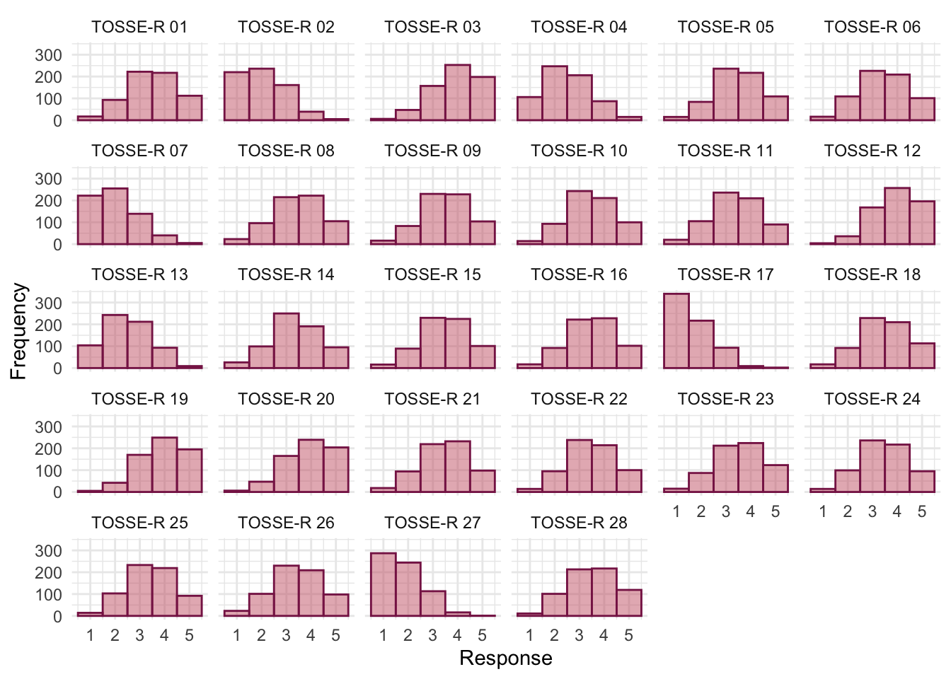
tosr_poly |>
summary() |>
plot(stars = FALSE) +
theme_minimal()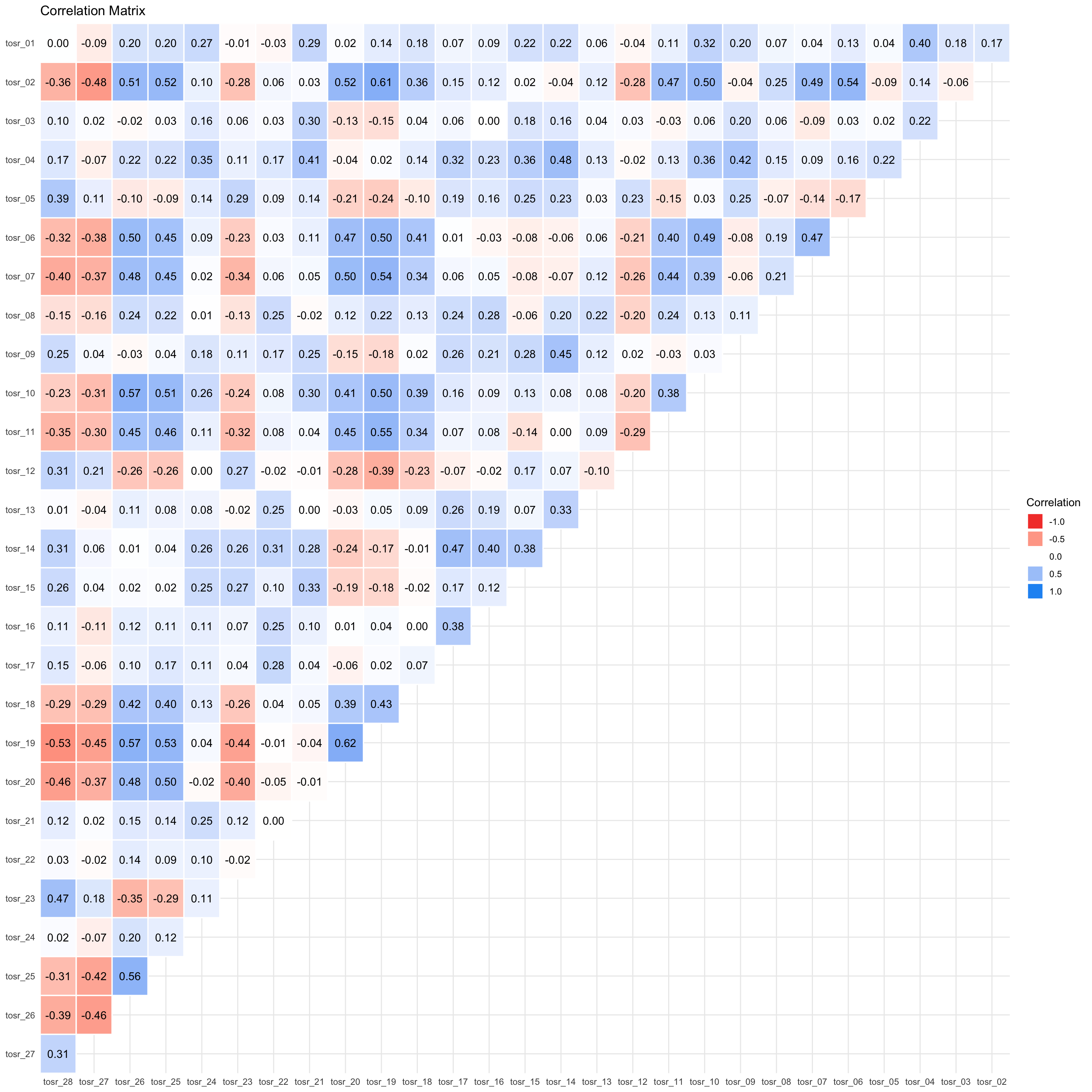
To get Bartlett’s test and the KMO we use check_factorstructure(). The overall KMO statistic is 0.91, which is well above the minimum criterion of 0.5 and falls into the range of marvellous. The KMO values for individual variables range from 0.77 to 0.96. All values are, therefore, well above 0.5, which is good news. Bartlett’s test is significant, \(\chi^2\)(378) = 5075.02, p < 0.001, indicating that the correlations within the R-matrix are sufficiently different from zero to warrant factor analysis.
check_factorstructure(tosr_items)# Is the data suitable for Factor Analysis?
- Sphericity: Bartlett's test of sphericity suggests that there is sufficient significant correlation in the data for factor analysis (Chisq(378) = 5075.02, p < .001).
- KMO: The Kaiser, Meyer, Olkin (KMO) overall measure of sampling adequacy suggests that data seems appropriate for factor analysis (KMO = 0.91). The individual KMO scores are: tosr_01 (0.85), tosr_02 (0.94), tosr_03 (0.77), tosr_04 (0.88), tosr_05 (0.86), tosr_06 (0.93), tosr_07 (0.95), tosr_08 (0.86), tosr_09 (0.87), tosr_10 (0.92), tosr_11 (0.95), tosr_12 (0.93), tosr_13 (0.82), tosr_14 (0.85), tosr_15 (0.87), tosr_16 (0.82), tosr_17 (0.84), tosr_18 (0.96), tosr_19 (0.94), tosr_20 (0.95), tosr_21 (0.82), tosr_22 (0.82), tosr_23 (0.91), tosr_24 (0.87), tosr_25 (0.95), tosr_26 (0.94), tosr_27 (0.93), tosr_28 (0.93).Parallel analysis (Figure 78) suggests extracting 4 factors.
psych::fa.parallel(tosr_items, fa = "fa")Parallel analysis suggests that the number of factors = 4 and the number of components = NA 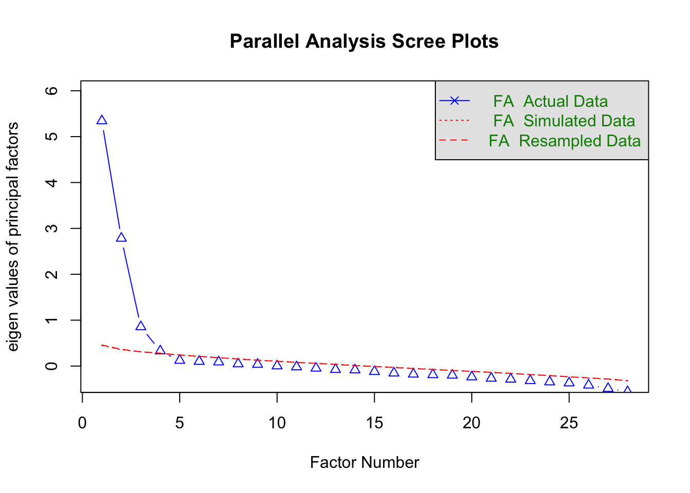
We fit the model using the following code:
tosr_fa <- factor_analysis(tosr_items, n = 4, cor = "poly")Table 189 shows the fit statistics. The mode was a poor fit in terms of significance but a good fit in terms of RMSR, \(\chi^2\)(272) = 452.65, p < 0.001, RMSEA = 0.03, 90% CI [0.03, 0.04]. Given the sample size of 661, a significant chi-square is not too surprising because even small deviations from a good fit will be significant. The TLI is given as 0.96. We noted in the book to look for a combination of TLI > 0.96 and RMSR < 0.06, and a combined rule of RMSEA < 0.05 and RMSR < 0.09. Our values meet these criteria comfortably. With the caveat that universal cut-offs need to be taken with a pinch of salt, it’s reasonable to conclude that the model has good fit.
model_performance(tosr_fa) |>
display()| Chi2(272) | p (Chi2) | RMSR | RMSR_corrected | TLI | RMSEA | RMSEA 90% CI | BIC |
|---|---|---|---|---|---|---|---|
| 452.65 | < .001 | 0.02 | 0.02 | 0.96 | 0.03 | [0.03, 0.04] | -1313.7 |
A quick check of residuals shows that they are likley normally distributed and only a small proportion exceeed 0.05. No concerns here.
check_residuals(tosr_fa)OK: residuals appear as normally distributed (p = 0.384).
Absolute residuals > 0.05 = 18 (4.76%)Table 191 summarizes the model.
- Variance Explained: The first factor (MR1) accounts for 0.20 (20%) of the overall variance and the second factor (MR2) accounts for 0.07 (7%) of the variance and so on. (Note that MR2 is in the third column.)
- Variance Explained (Cumulative): cumulatively, MR1 accounts for 0.20 (20%) of the overall variance and MR1 and MR3 together account for 0.20 + 0.08 = 0.28 (28%) of the variance. Importantly, we can see that all four components in combination explain 0.41 (41%) of the overall variance.
- Variance Explained (Proportion): Of the 41% of variance accounted for, 0.49 (49%) is attributable to MR1, 0.20 (20%) to MR3, 0.18 (18%) to MR2 and 0.13 (13%) to MR4.
The correlations between factors are also displayed. These are all non-zero indicating that components are correlated (and oblique rotation was appropriate). It also tells us the degree to which components are correlated. Factor 1 is weakly positively correlated to Factors 2 and 3 but strongly negatively correlated to factor 4. Factors 2, 3 and 4 are fairly strongly positively correlated.
| Parameter | MR1 | MR3 | MR2 | MR4 |
|---|---|---|---|---|
| Eigenvalues | 6.113 | 3.499 | 1.250 | 0.564 |
| Variance Explained | 0.199 | 0.080 | 0.075 | 0.055 |
| Variance Explained (Cumulative) | 0.199 | 0.279 | 0.354 | 0.408 |
| Variance Explained (Proportion) | 0.487 | 0.197 | 0.183 | 0.134 |
| Factor | MR1 | MR3 | MR2 | MR4 |
|---|---|---|---|---|
| MR1 | 1.000 | 0.081 | 0.107 | -0.374 |
| MR3 | 0.081 | 1.000 | 0.318 | 0.226 |
| MR2 | 0.107 | 0.318 | 1.000 | 0.315 |
| MR4 | -0.374 | 0.226 | 0.315 | 1.000 |
Table 192 shows the factor loadings. It appears that we have then following 4 factors:
Factor 1 (Love of teaching)
-
tosr_02: If I had a big gun I’d shoot all the students I have to teach -
tosr_19: I like to help students -
tosr_20: Passing on knowledge is the greatest gift you can bestow an individual -
tosr_26: I spend lots of time helping students -
tosr_10: I could spend all day explaining statistics to people -
tosr_25: I love teaching -
tosr_06: Teaching others makes me want to swallow a large bottle of bleach because the pain of my burning oesophagus would be light relief in comparison -
tosr_07: Helping others to understand Sums of Squares is a great feeling -
tosr_27: I love teaching because students have to pretend to like me or they’ll get bad marks -
tosr_11: I like it when people tell me I’ve helped them to understand factor rotation -
tosr_18: Standing in front of 300 people in no way makes me lose control of my bowels
Factor 2 (Love of Statistics)
-
tosr_21: Thinking about Bonferroni corrections gives me a tingly feeling in my groin -
tosr_04: I worship at the shrine of Pearson -
tosr_01: I once woke up in the middle of a vegetable patch hugging a turnip that I’d mistakenly dug up thinking it was Roy’s largest root -
tosr_03: I memorize probability values for the F-distribution -
tosr_24: I tried to build myself a time machine so that I could go back to the 1930s and follow Fisher around on my hands and knees licking the floor on which he’d just trodden -
tosr_15: I soil my pants with excitement at the mere mention of Factor Analysis -
tosr_09: I calculate 3 ANOVAs in my head before getting out of bed every morning
Factor 3 (Love of research design)
-
tosr_14: I’d rather think about appropriate dependent variables than go to the pub -
tosr_17: I enjoy sitting in the park contemplating whether to use participant observation in my next experiment -
tosr_16: Thinking about whether to use repeated or independent measures thrills me -
tosr_08: I like control conditions -
tosr_22: I quiver with excitement when thinking about designing my next experiment -
tosr_13: Designing experiments is fun
Factor 4 (Interpersonal skills)
-
tosr_05: I still live with my mother and have little personal hygiene -
tosr_28: My cat is my only friend -
tosr_23: I often spend my spare time talking to the pigeons … and even they die of boredom -
tosr_12: People fall asleep as soon as I open my mouth to speak
This factor structure supports the original four-factor model.
display(tosr_fa, threshold = 0.2, sort = TRUE)| Variable | MR1 | MR3 | MR2 | MR4 | Complexity | Uniqueness |
|---|---|---|---|---|---|---|
| tosr_02 | 0.79 | 1.07 | 0.42 | |||
| tosr_19 | 0.77 | 1.10 | 0.30 | |||
| tosr_20 | 0.72 | 1.15 | 0.44 | |||
| tosr_26 | 0.71 | 1.08 | 0.42 | |||
| tosr_10 | 0.69 | 0.31 | 1.48 | 0.41 | ||
| tosr_25 | 0.68 | 1.07 | 0.48 | |||
| tosr_06 | 0.65 | 1.08 | 0.55 | |||
| tosr_07 | 0.63 | 1.08 | 0.56 | |||
| tosr_27 | -0.58 | 1.05 | 0.68 | |||
| tosr_11 | 0.54 | 1.31 | 0.59 | |||
| tosr_18 | 0.48 | 1.29 | 0.69 | |||
| tosr_14 | 0.65 | 0.27 | 1.49 | 0.34 | ||
| tosr_17 | 0.62 | 1.15 | 0.58 | |||
| tosr_16 | 0.54 | 1.21 | 0.69 | |||
| tosr_08 | 0.51 | -0.28 | 1.73 | 0.68 | ||
| tosr_22 | 0.51 | 1.07 | 0.77 | |||
| tosr_13 | 0.47 | 1.14 | 0.80 | |||
| tosr_21 | 0.62 | 1.06 | 0.61 | |||
| tosr_04 | 0.26 | 0.56 | 1.62 | 0.43 | ||
| tosr_01 | 0.53 | 1.14 | 0.71 | |||
| tosr_03 | 0.48 | 1.62 | 0.80 | |||
| tosr_24 | 0.39 | 1.40 | 0.78 | |||
| tosr_15 | 0.36 | 0.33 | 2.07 | 0.65 | ||
| tosr_09 | 0.33 | 0.34 | 2.35 | 0.68 | ||
| tosr_05 | 0.55 | 1.09 | 0.67 | |||
| tosr_28 | -0.37 | 0.46 | 2.10 | 0.47 | ||
| tosr_23 | -0.29 | 0.43 | 1.79 | 0.62 | ||
| tosr_12 | -0.23 | 0.36 | 1.97 | 0.76 |
The 4 latent factors (oblimin rotation) accounted for 40.81% of the total variance of the original data (MR1 = 19.86%, MR3 = 8.03%, MR2 = 7.46%, MR4 = 5.45%).
Task 17.3
Dr Sian Williams (University of Brighton) devised a questionnaire to measure organizational ability. She predicted five factors to do with organizational ability: (1) preference for organization; (2) goal achievement; (3) planning approach; (4) acceptance of delays; and (5) preference for routine. These dimensions are theoretically independent. Williams’s questionnaire contains 28 items using a seven-point Likert scale (1 = strongly disagree, 4 = neither, 7 = strongly agree). She gave it to 239 people. Run a principal component analysis on the data in
williams.csv.
Load the data using (see Tip 2):
williams_tib <- discovr::williamsThe questionnaire items are as follows:
- I like to have a plan to work to in everyday life
- I feel frustrated when things don’t go to plan
- I get most things done in a day that I want to
- I stick to a plan once I have made it
- I enjoy spontaneity and uncertainty
- I feel frustrated if I can’t find something I need
- I find it difficult to follow a plan through
- I am an organized person
- I like to know what I have to do in a day
- Disorganized people annoy me
- I leave things to the last minute
- I have many different plans relating to the same goal
- I like to have my documents filed and in order
- I find it easy to work in a disorganized environment
- I make ‘to do’ lists and achieve most of the things on it
- My workspace is messy and disorganized
- I like to be organized
- Interruptions to my daily routine annoy me
- I feel that I am wasting my time
- I forget the plans I have made
- I prioritize the things I have to do
- I like to work in an organized environment
- I feel relaxed when I don’t have a routine
- I set deadlines for myself and achieve them
- I change rather aimlessly from one activity to another during the day
- I have trouble organizing the things I have to do
- I put tasks off to another day
- I feel restricted by schedules and plans
The question asks us to use principal components and we’ll also apply an oblique rotation. First, let’s remove the id variable so we just have the items, there are no items to reverse score.
# create tibble that contains only the questionnaire items and reverse scores items 2 and 6
org_items <- williams_tib |>
select(-id)Let’s also make a tidy version of the data for plotting.
org_tidy_tib <- org_items |>
pivot_longer(
cols = org_01:org_28,
names_to = "Item",
values_to = "Response"
) |>
mutate(
Item = gsub("org_", "OAQ ", Item)
)We set up the correlation matrix to be based on polychoric correlations
# get the polychoric correlation object
org_poly <- correlation(org_items, method = "polychoric")
# store the polychoric correlation matrix
org_poly_mtx <- as.matrix(org_poly)Figure 79 shows the distributions of all items. Many are fairly although many items have moderate positive skew. All items have responses for at least 6 of the 7 points on the Likert scale and most have responses for all 7.
Figure 80 shows a plot of the correlations. All items have at least some strong correlations with other items so it seems reasonable to retain all of them.
ggplot(org_tidy_tib, aes(Response)) +
geom_histogram(binwidth = 1, fill = "#CC6677", colour = "#882255", alpha = 0.5) +
labs(y = "Frequency") +
facet_wrap(~ Item, ncol = 6) +
theme_minimal()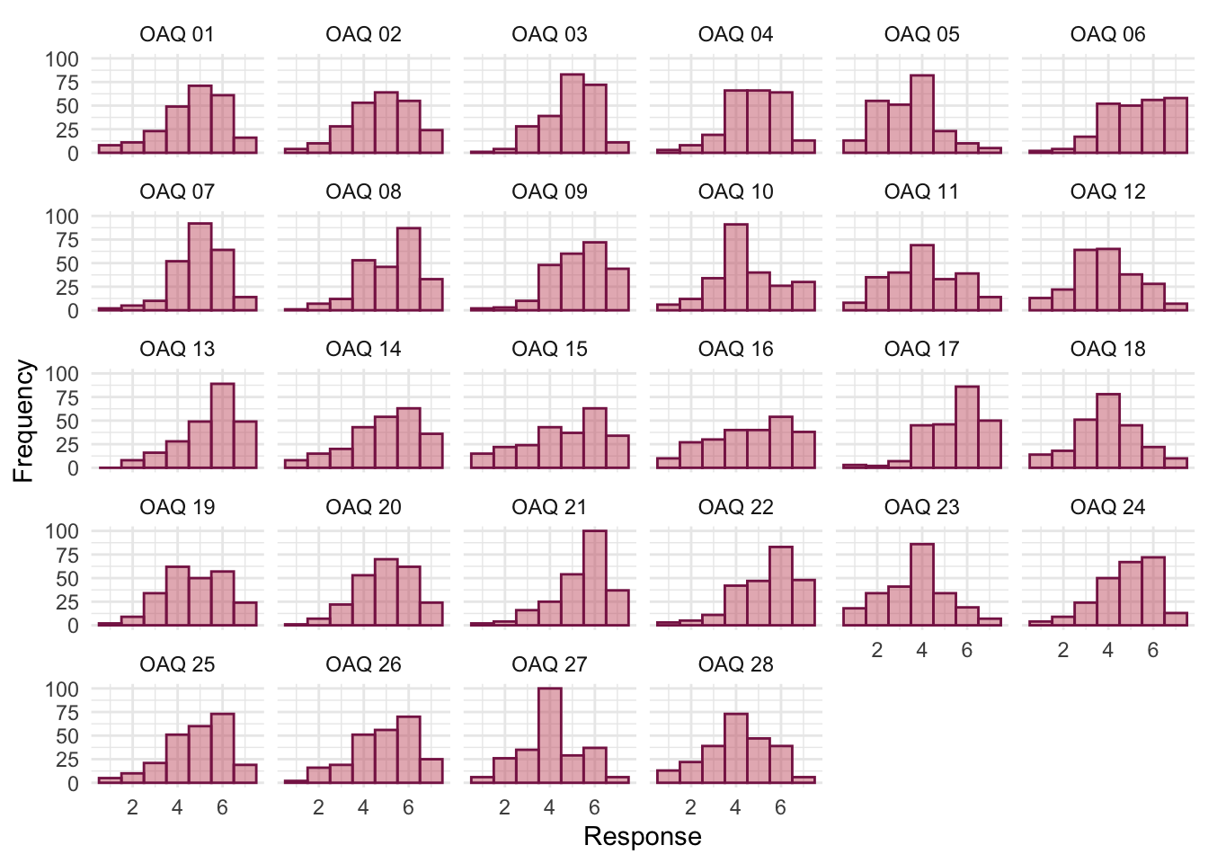
org_poly |>
summary() |>
plot(stars = FALSE) +
theme_minimal()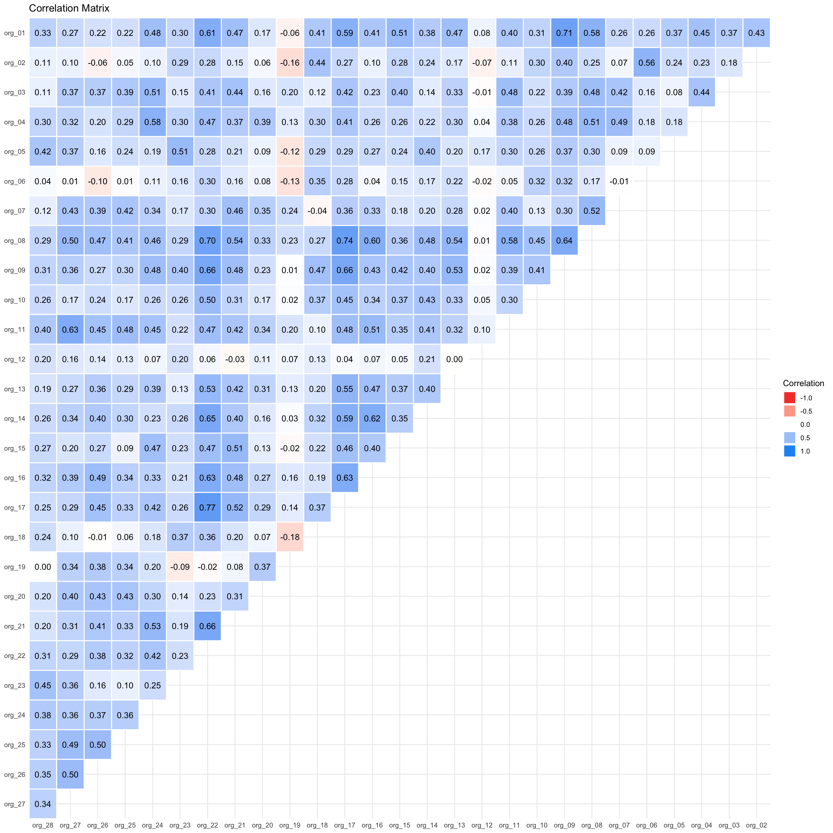
To get Bartlett’s test and the KMO we use check_factorstructure(). The overall KMO statistic is 0.89, which is well above the minimum criterion of 0.5 and falls into the range of marvellous. The KMO values for individual variables range from 0.65 to 0.95. All values are, therefore, above 0.5, which is good news. Bartlett’s test is significant, \(\chi^2\)(378) = 3055.52, p < 0.001, indicating that the correlations within the R-matrix are sufficiently different from zero to warrant factor analysis.
check_factorstructure(tosr_items)# Is the data suitable for Factor Analysis?
- Sphericity: Bartlett's test of sphericity suggests that there is sufficient significant correlation in the data for factor analysis (Chisq(378) = 5075.02, p < .001).
- KMO: The Kaiser, Meyer, Olkin (KMO) overall measure of sampling adequacy suggests that data seems appropriate for factor analysis (KMO = 0.91). The individual KMO scores are: tosr_01 (0.85), tosr_02 (0.94), tosr_03 (0.77), tosr_04 (0.88), tosr_05 (0.86), tosr_06 (0.93), tosr_07 (0.95), tosr_08 (0.86), tosr_09 (0.87), tosr_10 (0.92), tosr_11 (0.95), tosr_12 (0.93), tosr_13 (0.82), tosr_14 (0.85), tosr_15 (0.87), tosr_16 (0.82), tosr_17 (0.84), tosr_18 (0.96), tosr_19 (0.94), tosr_20 (0.95), tosr_21 (0.82), tosr_22 (0.82), tosr_23 (0.91), tosr_24 (0.87), tosr_25 (0.95), tosr_26 (0.94), tosr_27 (0.93), tosr_28 (0.93).Let’s use n_factors() to determine how many components to extract. Figure 81 and Table 193 suggests that 5 components should be extracted based on the criterion of ‘the majority of methods’.
org_nfac <- n_factors(x = org_items, cor = org_poly_mtx, type = "PCA", rotation = "oblimin")
plot(org_nfac)
display(org_nfac)| n_Factors | Method | Family |
|---|---|---|
| 1 | Acceleration factor | Scree |
| 2 | Scree (R2) | Scree_SE |
| 3 | Bentler | Bentler |
| 3 | CNG | CNG |
| 4 | beta | Multiple_regression |
| 4 | Velicer’s MAP | Velicers_MAP |
| 5 | Optimal coordinates | Scree |
| 5 | Parallel analysis | Scree |
| 5 | Kaiser criterion | Scree |
| 5 | Scree (SE) | Scree_SE |
| 17 | t | Multiple_regression |
| 17 | p | Multiple_regression |
| 26 | Bartlett | Barlett |
| 26 | Anderson | Barlett |
| 27 | Lawley | Barlett |
| 27 | VSS complexity 1 | VSS |
| 27 | VSS complexity 2 | VSS |
We fit the model using the following code:
org_pca <- principal_components(x = org_items,
n = 5,
rotation = "oblimin",
standardize = FALSE,
cor = "poly")Table 194 summarizes the model.
- Variance Explained: The first component (TC1) accounts for 0.18 (18%) of the overall variance and the fourth component (TC4) accounts for 0.13 (13%) of the variance and so on. (Note that TC4 is in the second column.)
- Variance Explained (Cumulative): cumulatively, TC1 accounts for 0.18 (18%) of the overall variance and TC1 and TC4 together account for 0.185 + 0.133 = 0.318 (31.8%) of the variance. Importantly, we can see that all four components in combination explain 0.61 (61%) of the overall variance.
- Variance Explained (Proportion): Of the 61% of variance accounted for, 0.30 (30%) is attributable to TC1, 0.17 (17%) to TC2, 0.16 (16%) to TC3, 0.22 (22%) to TC4, and 0.15 (15%) to TC5.
The correlations between components are also displayed. These are all non-zero indicating that components are correlated (and oblique rotation was appropriate). It also tells us the degree to which components are correlated. All components are fairly strongly positively correlated apart from components 2 and 5.
| Parameter | TC1 | TC4 | TC2 | TC3 | TC5 |
|---|---|---|---|---|---|
| Eigenvalues | 9.754 | 2.893 | 1.772 | 1.535 | 1.234 |
| Variance Explained | 0.185 | 0.133 | 0.105 | 0.097 | 0.094 |
| Variance Explained (Cumulative) | 0.185 | 0.318 | 0.423 | 0.520 | 0.614 |
| Variance Explained (Proportion) | 0.301 | 0.217 | 0.171 | 0.158 | 0.153 |
| Factor | TC1 | TC4 | TC2 | TC3 | TC5 |
|---|---|---|---|---|---|
| TC1 | 1.000 | 0.394 | 0.232 | 0.343 | 0.240 |
| TC4 | 0.394 | 1.000 | 0.251 | 0.215 | 0.211 |
| TC2 | 0.232 | 0.251 | 1.000 | 0.133 | -0.084 |
| TC3 | 0.343 | 0.215 | 0.133 | 1.000 | 0.205 |
| TC5 | 0.240 | 0.211 | -0.084 | 0.205 | 1.000 |
Table 195 shows the component loadings. It appears that we have then following 5 components:
Component 1: preference for organization
Note: It’s odd that none of these have reverse loadings.
- Q16: My workspace is messy and disorganized
- Q14: I find it easy to work in a disorganized environment
- Q22: I like to work in an organized environment
- Q17: I like to be organized
- Q13: I like to have my documents filed and in order
- Q8: I am an organized person
Component 2: goal achievement
- Q7: I find it difficult to follow a plan through
- Q11: I leave things to the last minute
- Q19: I feel that I am wasting my time
- Q20: I forget the plans I have made
- Q25: I change rather aimlessly from one activity to another during the day
- Q26: I have trouble organizing the things I have to do
- Q27: I put tasks off to another day
Component 3: preference for routine
- Q5: I enjoy spontaneity and uncertainty
- Q12: I have many different plans relating to the same goal
- Q23: I feel relaxed when I don’t have a routine
- Q28: I feel restricted by schedules and plans
Component 4: plan approach
- Q1: I like to have a plan to work to in everyday life
- Q3: I get most things done in a day that I want to
- Q4: I stick to a plan once I have made it
- Q9: I like to know what I have to do in a day
- Q15: I make ‘to do’ lists and achieve most of the things on it
- Q 21: I prioritize the things I have to do
- Q24: I set deadlines for myself and achieve them
Component 5: acceptance of delays
- Q2: I feel frustrated when things don’t go to plan
- Q6: I feel frustrated if I can’t find something I need
- Q10: Disorganized people annoy me
- Q18: Interruptions to my daily routine annoy me
It seems as though there is some factorial validity to the structure.
display(org_pca, threshold = 0.2, sort = TRUE)| Variable | TC1 | TC4 | TC2 | TC3 | TC5 | Complexity | Uniqueness | MSA |
|---|---|---|---|---|---|---|---|---|
| org_16 | 0.84 | 1.10 | 0.28 | 0.93 | ||||
| org_14 | 0.83 | -0.30 | 1.39 | 0.25 | 0.88 | |||
| org_22 | 0.75 | 0.21 | 1.30 | 0.19 | 0.90 | |||
| org_17 | 0.72 | 0.21 | 1.31 | 0.23 | 0.94 | |||
| org_13 | 0.57 | 0.26 | 1.51 | 0.45 | 0.94 | |||
| org_08 | 0.53 | 0.30 | 0.24 | 2.24 | 0.27 | 0.94 | ||
| org_10 | 0.47 | 0.41 | 2.09 | 0.55 | 0.89 | |||
| org_11 | 0.31 | 0.29 | 0.30 | 0.26 | 4.27 | 0.43 | 0.92 | |
| org_24 | 0.74 | 1.14 | 0.35 | 0.90 | ||||
| org_03 | 0.70 | 0.20 | 1.17 | 0.37 | 0.86 | |||
| org_04 | 0.63 | 0.23 | 0.31 | 1.95 | 0.36 | 0.87 | ||
| org_21 | 0.49 | 0.49 | 2.09 | 0.38 | 0.89 | |||
| org_01 | 0.31 | 0.48 | -0.20 | 0.26 | 3.09 | 0.33 | 0.92 | |
| org_15 | 0.43 | 0.46 | -0.33 | 3.10 | 0.44 | 0.89 | ||
| org_07 | 0.45 | 0.43 | 2.14 | 0.48 | 0.86 | |||
| org_09 | 0.33 | 0.37 | 0.37 | 3.28 | 0.32 | 0.95 | ||
| org_19 | 0.74 | 1.13 | 0.44 | 0.81 | ||||
| org_20 | 0.69 | 1.17 | 0.47 | 0.85 | ||||
| org_25 | 0.64 | 1.20 | 0.43 | 0.87 | ||||
| org_27 | 0.54 | 0.41 | 2.07 | 0.37 | 0.88 | |||
| org_26 | 0.45 | 0.48 | -0.27 | 2.74 | 0.36 | 0.90 | ||
| org_23 | 0.74 | 1.27 | 0.39 | 0.84 | ||||
| org_28 | 0.72 | 1.10 | 0.44 | 0.84 | ||||
| org_05 | 0.70 | 1.19 | 0.42 | 0.88 | ||||
| org_12 | -0.30 | 0.54 | 1.89 | 0.66 | 0.59 | |||
| org_06 | 0.82 | 1.04 | 0.36 | 0.80 | ||||
| org_02 | 0.75 | 1.04 | 0.37 | 0.82 | ||||
| org_18 | 0.31 | 0.57 | 1.79 | 0.45 | 0.89 |
The 5 principal components (oblimin rotation) accounted for 61.39% of the total variance of the original data (TC1 = 18.47%, TC4 = 13.35%, TC2 = 10.50%, TC3 = 9.69%, TC5 = 9.37%).
Task 17.4
Zibarras et al. (2008) looked at the relationship between personality and creativity. They used the Hogan Development Survey (HDS), which measures 11 dysfunctional dispositions of employed adults: being
volatile,mistrustful,cautious,detached,passive_aggressive,arrogant,manipulative,dramatic,eccentric,perfectionist, anddependent. Zibarras et al. wanted to reduce these 11 traits down and, based on parallel analysis, found that they could be reduced to three components. They ran a principal component analysis with varimax rotation. Repeat this analysis (zibarras_2008.csv) to see which personality dimensions clustered together (see page 210 of the original paper).
Load the data using (see Tip 2):
zibarras_tib <- discovr::zibarras_2008As indicated in the question, we should use principal components and varimax rotation to mimic the published paper. First, let’s remove the id variable so we just have the items, and because all scales represent negative traits no scores need to be reversed. .
# create tibble that contains only the questionnaire items and reverse scores items 2 and 6
hds_items <- zibarras_tib |>
select(-id)Let’s also make a tidy version of the data for plotting.
hds_tidy_tib <- hds_items |>
pivot_longer(
cols = volatile:dependent,
names_to = "Scale",
values_to = "Response"
) |>
mutate(
Scale = str_to_sentence(Scale)
)We set up the correlation matrix to be based on Pearson correlations
# get the correlation object
hds_cor <- correlation(hds_items)
# store the polychoric correlation matrix
hds_cor_mtx <- as.matrix(hds_cor)Figure 82 shows the distributions of all scales. Many are fairly normal although some items have mild skew. Figure 83 shows a plot of the correlations. All scales have at least some strong correlations with other items so it seems reasonable to retain all of them.
ggplot(hds_tidy_tib, aes(Response)) +
geom_histogram(binwidth = 1, fill = "#CC6677", colour = "#882255", alpha = 0.5) +
labs(y = "Frequency") +
facet_wrap(~ Scale, ncol = 6) +
theme_minimal()
hds_cor |>
summary() |>
plot(stars = FALSE) +
theme_minimal()
To get Bartlett’s test and the KMO we use check_factorstructure(). The overall KMO statistic is 0.68, which is above the minimum criterion of 0.5 but is merely “Mediocre”. The KMO values for individual variables range from 0.50 to 0.82. All values scrape above 0.5, so OK but not inspiring. Bartlett’s test is significant, \(\chi^2\)(55) = 527.90, p < 0.001, indicating that the correlations within the R-matrix are sufficiently different from zero to warrant factor analysis.
check_factorstructure(hds_items)# Is the data suitable for Factor Analysis?
- Sphericity: Bartlett's test of sphericity suggests that there is sufficient significant correlation in the data for factor analysis (Chisq(55) = 527.90, p < .001).
- KMO: The Kaiser, Meyer, Olkin (KMO) overall measure of sampling adequacy suggests that data seems appropriate for factor analysis (KMO = 0.68). The individual KMO scores are: volatile (0.52), mistrustful (0.62), cautious (0.71), detached (0.56), passive_aggressive (0.50*), arrogant (0.76), manipulative (0.81), dramatic (0.72), eccentric (0.82), perfectist (0.54), dependent (0.58).Zibarras et al. (2008) extracted 3 components, so let’s go with that decision and fit the model using the following code:
hds_pca <- principal_components(x = hds_items,
n = 3,
rotation = "varimax")Table 196 summarizes the model.
- Variance Explained: The first component (RC1) accounts for 0.27 (27%) of the overall variance and the second component (RC2) accounts for 0.15 (15%) of the variance and so on.
- Variance Explained (Cumulative): cumulatively, RC1 accounts for 0.27 (27%) of the overall variance and RC1 and RC2 together account for 0.265 + 0.146 = 0.412 (41.2%) of the variance. Importantly, we can see that all four components in combination explain 0.55 (55%) of the overall variance.
- Variance Explained (Proportion): Of the 55% of variance accounted for, 0.48 (48%) is attributable to RC1, 0.27 (27%) to RC2, and 0.25 (25%) to RC3.
| Parameter | RC1 | RC2 | RC3 |
|---|---|---|---|
| Eigenvalues | 2.960 | 1.795 | 1.285 |
| Variance Explained | 0.265 | 0.146 | 0.137 |
| Variance Explained (Cumulative) | 0.265 | 0.412 | 0.549 |
| Variance Explained (Proportion) | 0.483 | 0.267 | 0.250 |
Table 197 shows the component loadings. It appears that we have then following 5 components:
- Component 1:
- Dramatic
- Manipulative
- Arrogant
- Cautious (negative weight)
- Eccentric
- Perfectionist (negative weight)
- Component 2:
- Volatile
- Mistrustful
- Component 3:
- Detached
- Dependent (negative weight)
- Passive-aggressive
Compare these results to those of Zibarras et al. (Table 4 from the original paper reproduced in Figure 84), and note that they are the same.
display(hds_pca, threshold = 0.3, sort = TRUE)| Variable | RC1 | RC2 | RC3 | Complexity | Uniqueness | MSA |
|---|---|---|---|---|---|---|
| dramatic | 0.83 | 1.11 | 0.27 | 0.72 | ||
| manipulative | 0.79 | 1.03 | 0.37 | 0.81 | ||
| arrogant | 0.68 | 1.06 | 0.53 | 0.76 | ||
| cautious | -0.66 | 0.50 | 1.87 | 0.31 | 0.71 | |
| eccentric | 0.55 | 1.73 | 0.59 | 0.82 | ||
| perfectist | -0.32 | 1.09 | 0.89 | 0.54 | ||
| volatile | 0.79 | 1.03 | 0.37 | 0.52 | ||
| mistrustful | 0.68 | 1.58 | 0.40 | 0.62 | ||
| detached | 0.76 | 1.39 | 0.30 | 0.56 | ||
| dependent | -0.38 | 0.33 | -0.64 | 2.21 | 0.33 | 0.58 |
| passive_aggressive | 0.62 | 1.17 | 0.59 | 0.50 |
The 3 principal components (varimax rotation) accounted for 54.91% of the total variance of the original data (RC1 = 26.51%, RC2 = 14.65%, RC3 = 13.75%).
Chapter 18
Task 18.1
Research suggests that people who can switch off from work (
detachment) during off-hours are more satisfied with life and have fewer symptoms of psychological strain (Sonnentag, 2012). Factors at work, such as time pressure, affect your ability to detach when away from work. A study of 1709 employees measured their time pressure (time_pressure) at work (no time pressure, low, medium, high and very high time pressure). Data generated to approximate Figure 1 in Sonnentag (2012) are in the filesonnentag_2012.csv. Carry out a chi-square test to see if time pressure is associated with the ability to detach from work.
Load the data using (see Tip 2):
sonnentag_tib <- discovr::sonnentag_2012First, we need to create a contingency table from the data as in Table 198. The responses are in the variable frequency, so we use weights = "frequency" in our code.
sonnentag_xtbl <- data_tabulate(x = sonnentag_tib,
select = "time_pressure",
by = "detachment",
weights = "frequency",
remove_na = TRUE,
proportions = NULL)
# view the table
display(sonnentag_xtbl)| time_pressure | Very low detachment | Low detachment | Total |
|---|---|---|---|
| No time pressure | 94 | 84 | 178 |
| Low time pressure | 94 | 89 | 183 |
| Medium time pressure | 175 | 147 | 322 |
| High time pressure | 267 | 206 | 473 |
| Very high time pressure | 354 | 199 | 553 |
| Total | 984 | 725 | 1709 |
The chi-square test is highly significant, \(\chi^2\)(4) = 15.55, p = 0.004 (Table 199), indicating that the profile of low-detachment and very low-detachment responses differed significantly across different time pressures. Looking at the standardized residuals (Table 202), the only time pressure for which these are significant is very high time pressure, which showed the greatest split of whether the employees experienced low detachment (36%) or very low detachment (64%) (Table 201). Within the other time pressure groups all of the standardized residuals are lower than 1.96. It’s interesting to look at the direction of the residuals (i.e., whether they are positive or negative). For all time pressure groups except very high time pressure, the residual for ‘low detachment’ was positive but for ‘very low detachment’ was negative; these are, therefore, people who responded more than we would expect that they experienced low detachment from work and less than expected that they experienced very low detachment from work. It was only under very high time pressure that the opposite pattern occurred: the residual for ‘low detachment’ was negative but for ‘very low detachment’ was positive; these are, therefore, people who responded less than we would expect that they experienced low detachment from work and more than expected that they experienced very low detachment from work. In short, there are similar numbers of people who experience low detachment and very low detachment from work when there is no time pressure, low time pressure, medium time pressure and high time pressure. However, when time pressure was very high, significantly more people experienced very low detachment than low detachment.
sonnentag_chi <- sonnentag_xtbl |>
as.table(simplify = TRUE) |>
chisq.test()
model_parameters(sonnentag_chi) |>
display()| Chi2(4) | p |
|---|---|
| 15.55 | 0.004 |
get_predicted(sonnentag_chi) |>
display()| Very low detachment | Low detachment | |
|---|---|---|
| No time pressure | 102.49 | 75.51 |
| Low time pressure | 105.37 | 77.63 |
| Medium time pressure | 185.40 | 136.60 |
| High time pressure | 272.34 | 200.66 |
| Very high time pressure | 318.40 | 234.60 |
sonnentag_prop <- data_tabulate(x = sonnentag_tib,
select = "time_pressure",
by = "detachment",
weights = "frequency",
remove_na = TRUE,
proportions = "row")
# view the table
display(sonnentag_prop)| time_pressure | Very low detachment | Low detachment | Total |
|---|---|---|---|
| No time pressure | 94 (52.8%) | 84 (47.2%) | 178 |
| Low time pressure | 94 (51.4%) | 89 (48.6%) | 183 |
| Medium time pressure | 175 (54.3%) | 147 (45.7%) | 322 |
| High time pressure | 267 (56.4%) | 206 (43.6%) | 473 |
| Very high time pressure | 354 (64.0%) | 199 (36.0%) | 553 |
| Total | 984 | 725 | 1709 |
get_residuals(sonnentag_chi) |>
display()| Very low detachment | Low detachment | |
|---|---|---|
| No time pressure | -0.84 | 0.98 |
| Low time pressure | -1.11 | 1.29 |
| Medium time pressure | -0.76 | 0.89 |
| High time pressure | -0.32 | 0.38 |
| Very high time pressure | 1.99 | -2.32 |
Task 18.2
Labcoat Leni’s Real Research 19.1 describes a study (Daniels, 2012) that looked at the impact of sexualized images of atheletes compared to performance pictures on women’s perceptions of the athletes and of themselves. Women looked at different types of pictures (
picture) and then did a writing task. Daniels identified whether certain themes were present or absent in each written piece (theme_present). We looked at the self-evaluation theme, but Daniels idetified others: commenting on the athlete’s body/appearance (athletes_body), indicating admiration or jelousy for the athlete (admiration), indicating that the athlete was a role model or motivating (role_model), and their own physical activity (self_physical_activity). Test whether the type of picture viewed was associated with commenting on the athlete’s body/appearance (daniels_2012.csv).
Load the data using (see Tip 2):
daniels_tib <- discovr::daniels_2012First, we need to create a contingency table from the data as in Table 203. The responses to this question are in the variable athletes_body, so we use weights = "athletes_body" in our code. Also note for the chi-square test that to replicate Daniels’ results we need to use correct = FALSE because she did not apply Yates’ continuity correction.
athletes_body_xtbl <- data_tabulate(x = daniels_tib,
select = "picture",
by = "theme_present",
weights = "athletes_body",
remove_na = TRUE,
proportions = NULL)
# view the table
display(athletes_body_xtbl)| picture | Absent | Present | Total |
|---|---|---|---|
| Performance athletes | 88 | 29 | 117 |
| Sexualized athletes | 17 | 123 | 140 |
| Total | 105 | 152 | 257 |
The chi-square test is highly significant, \(\chi^2\)(1) = 104.92, p < 0.001 (Table 204). This indicates that the profile of theme present vs. theme absent differed across different pictures. Looking at the standardized residuals (Table 207), they are significant for both pictures of performance athletes and sexualized pictures of athletes. If we look at the direction of these residuals (i.e., whether they are positive or negative), we can see that for pictures of performance athletes, the residual for ‘theme absent’ was positive but for ‘theme present’ was negative; this indicates that in this condition, more people than we would expect did not include the theme her appearance and attractiveness and fewer people than we would expect did include this theme in what they wrote. In the sexualized picture condition on the other hand, the opposite was true: the residual for ‘theme absent’ was negative and for ‘theme present’ was positive. This indicates that in the sexualized picture condition, more people than we would expect included the theme her appearance and attractiveness in what they wrote and fewer people than we would expect did not include this theme in what they wrote. All expected frequencies are above 5 (Table 205).
athletes_body_chi <- athletes_body_xtbl |>
as.table(simplify = TRUE) |>
chisq.test(correct = FALSE)
model_parameters(athletes_body_chi) |>
display()| Chi2(1) | p |
|---|---|
| 104.92 | < .001 |
get_predicted(athletes_body_chi) |>
display()| Absent | Present | |
|---|---|---|
| Performance athletes | 47.80 | 69.20 |
| Sexualized athletes | 57.20 | 82.80 |
athletes_body_prop <- data_tabulate(x = daniels_tib,
select = "picture",
by = "theme_present",
weights = "athletes_body",
remove_na = TRUE,
proportions = "column")
# view the table
display(athletes_body_prop)| picture | Absent | Present | Total |
|---|---|---|---|
| Performance athletes | 88 (83.8%) | 29 (19.1%) | 117 |
| Sexualized athletes | 17 (16.2%) | 123 (80.9%) | 140 |
| Total | 105 | 152 | 257 |
get_residuals(athletes_body_chi) |>
display()| Absent | Present | |
|---|---|---|
| Performance athletes | 5.81 | -4.83 |
| Sexualized athletes | -5.32 | 4.42 |
These results are reported in the article as follows:
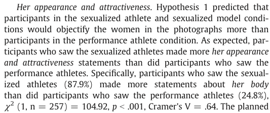
Task 18.3
Using the data in Task 2, see whether the type of picture viewed was associated with indicating admiration or jelousy for the athlete.
First, we need to create a contingency table from the data as in Table 208. The responses to this question are in the variable admiration, so we use weights = "admiration" in our code. Also note for the chi-square test that to replicate Daniels’ results we need to use correct = FALSE because she did not apply Yates’ continuity correction.
admiration_xtbl <- data_tabulate(x = daniels_tib,
select = "picture",
by = "theme_present",
weights = "admiration",
remove_na = TRUE,
proportions = NULL)
# view the table
display(admiration_xtbl)| picture | Absent | Present | Total |
|---|---|---|---|
| Performance athletes | 105 | 12 | 117 |
| Sexualized athletes | 84 | 56 | 140 |
| Total | 189 | 68 | 257 |
The chi-square test is highly significant, \(\chi^2\)(1) = 28.98, p < 0.001 (Table 209). This indicates that the profile of theme present vs. theme absent differed across different pictures. Looking at the standardized residuals (Table 212), they are significant for both pictures of performance athletes and sexualized pictures of athletes. If we look at the direction of these residuals (i.e., whether they are positive or negative), we can see that for pictures of performance athletes, the residual for ‘theme absent’ was positive but for ‘theme present’ was negative; this indicates that in this condition, more people than we would expect did not include the theme My admiration or jealousy for the athlete and fewer people than we would expect did include this theme in what they wrote. In the sexualized picture condition, on the other hand, the opposite was true: the residual for ‘theme absent’ was negative and for ‘theme present was positive’. This indicates that in the sexualized picture condition, more people than we would expect included the theme My admiration or jealousy for the athlete in what they wrote and fewer people than we would expect did not include this theme in what they wrote. All expected frequencies are above 5 (Table 210).
admiration_chi <- admiration_xtbl |>
as.table(simplify = TRUE) |>
chisq.test(correct = FALSE)
model_parameters(admiration_chi) |>
display()| Chi2(1) | p |
|---|---|
| 28.98 | < .001 |
get_predicted(admiration_chi) |>
display()| Absent | Present | |
|---|---|---|
| Performance athletes | 86.04 | 30.96 |
| Sexualized athletes | 102.96 | 37.04 |
admiration_prop <- data_tabulate(x = daniels_tib,
select = "picture",
by = "theme_present",
weights = "admiration",
remove_na = TRUE,
proportions = "column")
# view the table
display(admiration_prop)| picture | Absent | Present | Total |
|---|---|---|---|
| Performance athletes | 105 (55.6%) | 12 (17.6%) | 117 |
| Sexualized athletes | 84 (44.4%) | 56 (82.4%) | 140 |
| Total | 189 | 68 | 257 |
get_residuals(admiration_chi) |>
display()| Absent | Present | |
|---|---|---|
| Performance athletes | 2.04 | -3.41 |
| Sexualized athletes | -1.87 | 3.11 |
These results are reported in the article as follows:
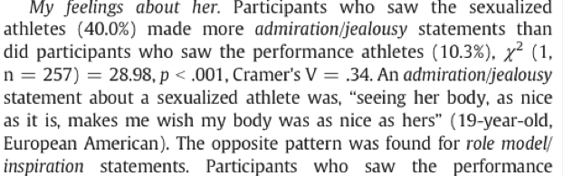
Task 18.4
Using the data in Task 2, see whether the type of picture viewed was associated with indicating that the athlete was a role model or motivating.
First, we need to create a contingency table from the data as in Table 213. The responses to this question are in the variable role_model, so we use weights = "role_model" in our code. Also note for the chi-square test that to replicate Daniels’ results we need to use correct = FALSE because she did not apply Yates’ continuity correction.
role_model_xtbl <- data_tabulate(x = daniels_tib,
select = "picture",
by = "theme_present",
weights = "role_model",
remove_na = TRUE,
proportions = NULL)
# view the table
display(role_model_xtbl)| picture | Absent | Present | Total |
|---|---|---|---|
| Performance athletes | 70 | 47 | 117 |
| Sexualized athletes | 133 | 7 | 140 |
| Total | 203 | 54 | 257 |
The chi-square test is highly significant, \(\chi^2\)(1) = 47.50, p < 0.001 (Table 214). This indicates that the profile of theme present vs. theme absent differed across different pictures. Looking at the standardized residuals (Table 217), they are significant for both types of pictures. If we look at the direction of these residuals (i.e., whether they are positive or negative), we can see that for pictures of performance athletes, the residual for ‘theme absent’ was negative but was positive for ‘theme present’. This indicates that when looking at pictures of performance athletes, more people than we would expect included the theme Athlete is a good role model and fewer people than we would expect did not include this theme in what they wrote. In the sexualized picture condition on the other hand, the opposite was true: the residual for ‘theme absent’ was positive and for ‘theme present’ it was negative. This indicates that in the sexualized picture condition, more people than we would expect did not include the theme Athlete is a good role model in what they wrote and fewer people than we would expect did include this theme in what they wrote. All expected frequencies are above 5 (Table 215).
role_model_chi <- role_model_xtbl |>
as.table(simplify = TRUE) |>
chisq.test(correct = FALSE)
model_parameters(role_model_chi) |>
display()| Chi2(1) | p |
|---|---|
| 47.50 | < .001 |
get_predicted(role_model_chi) |>
display()| Absent | Present | |
|---|---|---|
| Performance athletes | 92.42 | 24.58 |
| Sexualized athletes | 110.58 | 29.42 |
role_model_prop <- data_tabulate(x = daniels_tib,
select = "picture",
by = "theme_present",
weights = "role_model",
remove_na = TRUE,
proportions = "column")
# view the table
display(role_model_prop)| picture | Absent | Present | Total |
|---|---|---|---|
| Performance athletes | 70 (34.5%) | 47 (87.0%) | 117 |
| Sexualized athletes | 133 (65.5%) | 7 (13.0%) | 140 |
| Total | 203 | 54 | 257 |
get_residuals(role_model_chi) |>
display()| Absent | Present | |
|---|---|---|
| Performance athletes | -2.33 | 4.52 |
| Sexualized athletes | 2.13 | -4.13 |
These results are reported in the article as follows:
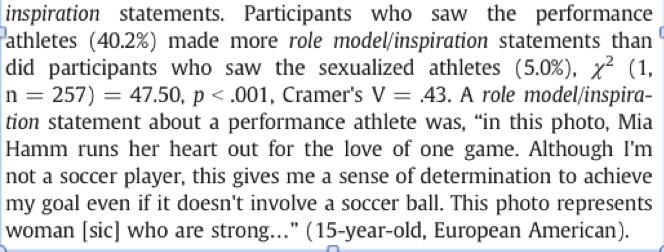
Task 18.5
Using the data in Task 2, see whether the type of picture viewed was associated with the participant commenting on their own physical activity.
First, we need to create a contingency table from the data as in Table 218. The responses to this question are in the variable self_physical_activity, so we use weights = "self_physical_activity" in our code. Also note for the chi-square test that to replicate Daniels’ results we need to use correct = FALSE because she did not apply Yates’ continuity correction.
self_physical_activity_xtbl <- data_tabulate(x = daniels_tib,
select = "picture",
by = "theme_present",
weights = "self_physical_activity",
remove_na = TRUE,
proportions = NULL)
# view the table
display(self_physical_activity_xtbl)| picture | Absent | Present | Total |
|---|---|---|---|
| Performance athletes | 84 | 33 | 117 |
| Sexualized athletes | 118 | 22 | 140 |
| Total | 202 | 55 | 257 |
The chi-square test is significant, \(\chi^2\)(1) = 5.91, p = 0.015 (Table 219). This indicates that the profile of theme present vs. theme absent differed across different pictures. Looking at the standardized residuals (Table 222), they are not significant for either type of picture (i.e., they are less than 1.96). If we look at the direction of these residuals (i.e., whether they are positive or negative), we can see that for pictures of performance athletes, the residual for ‘theme absent’ was negative and for ‘theme present’ was positive. This indicates that when looking at pictures of performance athletes, more people than we would expect included the theme My own physical activity and fewer people than we would expect did not include this theme in what they wrote. In the sexualized picture condition on the other hand, the opposite was true: the residual for ‘theme absent’ was positive and for ‘theme present’ it was negative. This indicates that in the sexualized picture condition, more people than we would expect did not include the theme My own physical activity in what they wrote and fewer people than we would expect did include this theme in what they wrote. All expected frequencies are above 5 (Table 220).
self_physical_activity_chi <- self_physical_activity_xtbl |>
as.table(simplify = TRUE) |>
chisq.test(correct = FALSE)
model_parameters(self_physical_activity_chi) |>
display()| Chi2(1) | p |
|---|---|
| 5.91 | 0.015 |
get_predicted(self_physical_activity_chi) |>
display()| Absent | Present | |
|---|---|---|
| Performance athletes | 91.96 | 25.04 |
| Sexualized athletes | 110.04 | 29.96 |
self_physical_activity_prop <- data_tabulate(x = daniels_tib,
select = "picture",
by = "theme_present",
weights = "self_physical_activity",
remove_na = TRUE,
proportions = "column")
# view the table
display(self_physical_activity_prop)| picture | Absent | Present | Total |
|---|---|---|---|
| Performance athletes | 84 (41.6%) | 33 (60.0%) | 117 |
| Sexualized athletes | 118 (58.4%) | 22 (40.0%) | 140 |
| Total | 202 | 55 | 257 |
get_residuals(self_physical_activity_chi) |>
display()| Absent | Present | |
|---|---|---|
| Performance athletes | -0.83 | 1.59 |
| Sexualized athletes | 0.76 | -1.45 |
These results are reported in the article as follows:
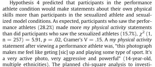
Task 18.6
I wrote much of the third edition of this book in the Netherlands (I have a soft spot for it). The Dutch travel by bike much more than the English. I noticed that many more Dutch people cycle while steering with only one hand. I pointed this out to one of my friends, Birgit Mayer, and she said that I was a crazy English fool and that Dutch people did not cycle one-handed. Several weeks of me pointing at one-handed cyclists and her pointing at two-handed cyclists ensued. To put it to the test I counted the number of Dutch and English cyclists who ride with one or two hands on the handlebars (
handlebars.csv). Can you work out which one of us is correct?
Load the data using (see Tip 2):
handlebars_tib <- discovr::handlebarsFirst, we need to create a contingency table from the data as in Table 223. The responses are in the variable frequency, so we use weights = "frequency" in our code.
handlebars_xtbl <- data_tabulate(x = handlebars_tib,
select = "nationality",
by = "hands",
weights = "frequency",
remove_na = TRUE,
proportions = NULL)
# view the table
display(handlebars_xtbl)| nationality | One handed | Two handed | Total |
|---|---|---|---|
| Dutch | 120 | 578 | 698 |
| English | 17 | 154 | 171 |
| Total | 137 | 732 | 869 |
The pattern of bike riding (i.e., relative numbers of one- and two-handed riders) significantly differs in English and Dutch people, \(\chi^2\)(1) = 4.90, p = 0.027 (Table 224). Looking at the frequencies (Table 226), this significant finding seems to show that the ratio of one- to two-handed riders differs in Dutch and English people. In Dutch people 17.2% ride their bike one-handed compared to 82.8% who ride two-handed. In England, though, only 9.9% ride their bike one-handed (almost half as many as in Holland), and 90.1% ride two-handed. If we look at the standardized residuals (Table 227) we can see that the only cell with a residual approaching significance (a value that lies outside of ±1.96) is the cell for English people riding one-handed (z = -1.9). The fact that this value is negative tells us that fewer people than expected fell into this cell. Expected frequencies are all above 5 (Table 225).
handlebars_chi <- handlebars_xtbl |>
as.table(simplify = TRUE) |>
chisq.test()
model_parameters(handlebars_chi) |>
display()| Chi2(1) | p |
|---|---|
| 4.90 | 0.027 |
get_predicted(handlebars_chi) |>
display()| One handed | Two handed | |
|---|---|---|
| Dutch | 110.04 | 587.96 |
| English | 26.96 | 144.04 |
handlebars_prop <- data_tabulate(x = handlebars_tib,
select = "nationality",
by = "hands",
weights = "frequency",
remove_na = TRUE,
proportions = "row")
# view the table
display(handlebars_prop)| nationality | One handed | Two handed | Total |
|---|---|---|---|
| Dutch | 120 (17.2%) | 578 (82.8%) | 698 |
| English | 17 (9.9%) | 154 (90.1%) | 171 |
| Total | 137 | 732 | 869 |
get_residuals(handlebars_chi) |>
display()| One handed | Two handed | |
|---|---|---|
| Dutch | 0.95 | -0.41 |
| English | -1.92 | 0.83 |
Task 18.7
Compute and interpret the odds ratio for Task 6.
The odds of someone riding one-handed if they are Dutch are:
\[ \text{odds}_\text{one-handed, Dutch} = \frac{120}{578} = 0.21 \]
The odds of someone riding one-handed if they are English are:
\[ \text{odds}_\text{one-handed, English} = \frac{17}{154} = 0.11 \]
Therefore, the odds ratio is:
\[ \text{odds ratio} = \frac{\text{odds}_\text{one-handed, Dutch}}{\text{odds}_\text{one-handed, English}} = \frac{0.21}{0.11} = 1.90 \]
In other words, the odds of riding one-handed if you are Dutch are 1.9 times higher than if you are English (or, conversely, the odds of riding one-handed if you are English are about half that of a Dutch person). Let’s check this using
Task 18.8
Certain editors at Sage like to think they’re great at football (soccer). To see whether they are better than Sussex lecturers and postgraduates we invited employees of Sage to join in our football matches. Every person played in one match. Over many matches, we counted the number of players that scored goals. Is there a significant relationship between scoring goals and whether you work for Sage or Sussex? (
sage_editors_cant_play_football.csv)
Load the data using (see Tip 2):
football_tib <- discovr::sage_editors_cant_play_footballFirst, we need to create a contingency table from the data as in Table 229. The responses are in the variable frequency, so we use weights = "frequency" in our code. The contingency table and cell proportions (Table 232) contains the number of cases that fall into each combination of categories. We can see that in total 28 people scored goals and of these 5 were from Sage Publications and 23 were from Sussex; 49 people didn’t score at all and, of those, 19 worked for Sage and 30 were from Sussex.
football_xtbl <- data_tabulate(x = football_tib,
select = "employer",
by = "score",
weights = "frequency",
remove_na = TRUE,
proportions = NULL)
# view the table
display(football_xtbl)| employer | No | Yes | Total |
|---|---|---|---|
| University of Sussex | 30 | 23 | 53 |
| Sage Publications | 19 | 5 | 24 |
| Total | 49 | 28 | 77 |
Before moving on to look at the test statistic itself we check that the assumption for chi-square has been met. The assumption is that in 2 × 2 tables (which is what we have here), all expected frequencies should be greater than 5. The smallest expected count in Table 231 is 8.7 (for Sage editors who scored); because this value exceeds 5 and so the assumption has been met.
Pearson’s chi-square test examines whether there is an association between two categorical variables (in this case the job and whether the person scored or not). This association is not significant, \(\chi^2\)(1) = 2.72, p = 0.099, suggesting that SAGE editors aren’t worse at scoring goals then Sussex faculty.
The chi-square statistic has a two-tailed significance of p = 0.099, which is bigger than .05 (hence, non-significant). However, because we made a specific prediction (that Sussex people would score more than Sage people), there is a temptation to halve this p-value, which would give us a significant association (because p = 0.049, which is less than .05). However, as explained in the book, I’m not a big fan of one-tailed tests. In any case, we’d be well-advised to look for other information such as an effect size. Which brings us neatly onto the next task …
football_chi <- football_xtbl |>
as.table(simplify = TRUE) |>
chisq.test()
model_parameters(football_chi) |>
display()| Chi2(1) | p |
|---|---|
| 2.72 | 0.099 |
get_predicted(football_chi) |>
display()| No | Yes | |
|---|---|---|
| University of Sussex | 33.73 | 19.27 |
| Sage Publications | 15.27 | 8.73 |
football_prop <- data_tabulate(x = football_tib,
select = "employer",
by = "score",
weights = "frequency",
remove_na = TRUE,
proportions = "row")
# view the table
display(football_prop)| employer | No | Yes | Total |
|---|---|---|---|
| University of Sussex | 30 (56.6%) | 23 (43.4%) | 53 |
| Sage Publications | 19 (79.2%) | 5 (20.8%) | 24 |
| Total | 49 | 28 | 77 |
get_residuals(football_chi) |>
display()| No | Yes | |
|---|---|---|
| University of Sussex | -0.64 | 0.85 |
| Sage Publications | 0.95 | -1.26 |
Task 18.9
Compute and interpret the odds ratio for Task 8.
The odds of someone scoring given that they were employed by SAGE are:
\[ \text{odds}_\text{scored, Sage} = \frac{5}{19}= 0.26 \]
The odds of someone scoring given that they were employed by Sussex are:
\[ \text{odds}_\text{scored, Sussex} = \frac{23}{30} = 0.77 \]
Therefore, the odds ratio is:
\[
\text{odds ratio} = \frac{\text{odds}_\text{scored, Sage}}{\text{odds}_\text{scored, Sussex}} = \frac{0.26}{0.77} = 0.34
\] The odds of scoring if you work for Sage are 0.34 times as high as if you work for Sussex; another way to express this is that if you work for Sussex, the odds of scoring are 1/0.34 = 2.95 times higher than if you work for Sage. Let’s check this using
Task 18.10
I was interested in whether horoscopes are tosh. I recruited 2201 people, made a note of their star sign (this variable, obviously, has 12 categories: Capricorn, Aquarius, Pisces, Aries, Taurus, Gemini, Cancer, Leo, Virgo, Libra, Scorpio and Sagittarius) and whether they believed in horoscopes (this variable has two categories: believer or unbeliever). I sent them an identical horoscope about events in the next month, which read: ‘August is an exciting month for you. You will make friends with a tramp in the first week and cook him a cheese omelette. Curiosity is your greatest virtue, and in the second week, you’ll discover knowledge of a subject that you previously thought was boring. Statistics perhaps. You might purchase a book around this time that guides you towards this knowledge. Your new wisdom leads to a change in career around the third week, when you ditch your current job and become an accountant. By the final week you find yourself free from the constraints of having friends, your boy/girlfriend has left you for a Russian ballet dancer with a glass eye, and you now spend your weekends doing loglinear analysis by hand with a pigeon called Hephzibah for company.’ At the end of August I interviewed these people and I classified the horoscope as having come true, or not, based on how closely their lives had matched the fictitious horoscope. Conduct a loglinear analysis to see whether there is a relationship between the person’s star sign, whether they believe in horoscopes and whether the horoscope came true (
horoscope.csv).
horoscope_tib <- discovr::horoscopeFirst, let’s visualise the frequencies with a mosiac plot (Figure 89). The plot is fairly tricky to disentangle because there are so many categories. It does look a little when the horoscope didn’t come true (left of Figure 89) there are slightly more unbelievers than believers (the blue areas are generally larger than the red); conversely when the horoscope did come true (right of Figure 89) there are slightly more believers than unbelievers (the red areas are generally larger than the blue).
horoscope_tib |>
mutate(
true = ifelse(true == "Horoscope came true", "Yes", "No")
) |>
ggplot(data = _) +
geom_mosaic(aes(x = product(star_sign, true), fill = believe, weight = frequency)) +
scale_fill_viridis_d(option = "turbo", begin = 0.3, end = 0.85) +
labs(fill = "Star sign", x = "Did horoscope come true?", y = "Believe in horoscopes?") +
theme_minimal()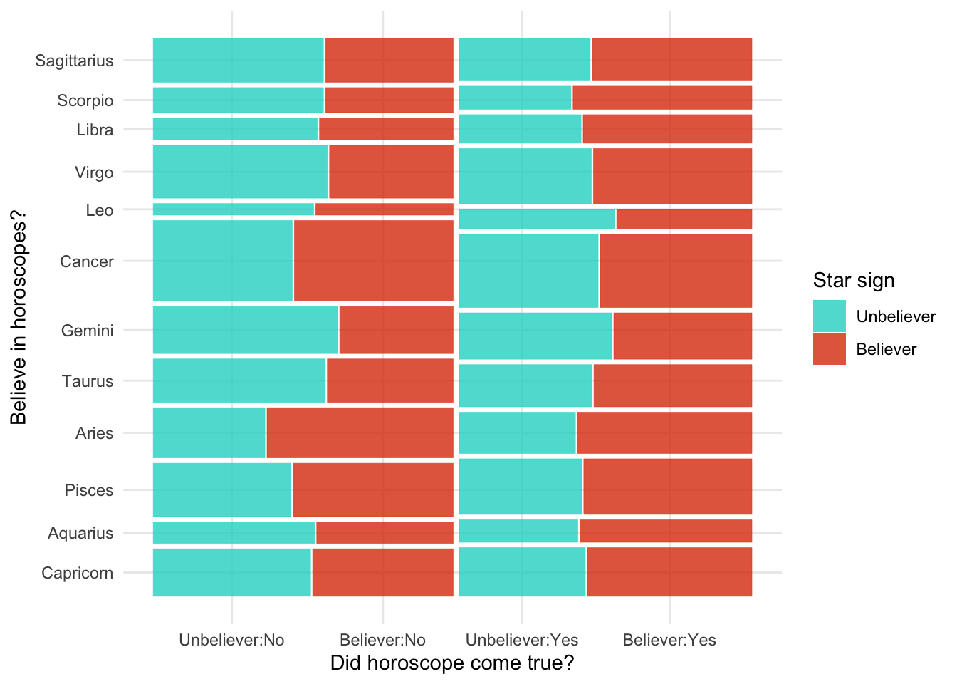
As in the book chapter, we build the model up each effect at a time
intcpt_glm <- glm(frequency ~ 1, family = "poisson", data = horoscope_tib)
star_sign_glm <- update(intcpt_glm, .~. + star_sign)
believe_glm <- update(star_sign_glm, .~. + believe)
all_main_glm <- update(believe_glm, .~. + true)
star_believe_glm <- update(all_main_glm, .~. + star_sign:believe)
true_believe_glm <- update(star_believe_glm, .~. + true:believe)
all_two_way_glm <- update(true_believe_glm, .~. + star_sign:true)
saturated_glm <- update(all_two_way_glm, .~. + star_sign:believe:true)Table 235 compares models going from the saturated model to the model without the three-way interaction (all_two_way_glm), then to the model without any two-way interactions (all_main_glm) and finally to the model without any main effects (intcpt_glm). This shows us that:
- Removing the three way interaction does not significantly affect the fit of the model, \(\chi^2\)(-11) = 8.84, p = 0.637. In other words, the three way interaction is not significant, and we can remove it from the model.
- Removing the two-way interactions significantly affects the fit of the model, \(\chi^2\)(-23) = 42.09, p = 0.009. In other words, the two-way interactions should be retained.
test_lrt(saturated_glm, all_two_way_glm, all_main_glm, intcpt_glm) |>
display()| Name | Model | df | df_diff | Chi2 | p |
|---|---|---|---|---|---|
| saturated_glm | glm | 48 | |||
| all_two_way_glm | glm | 37 | -11 | 8.84 | 0.637 |
| all_main_glm | glm | 14 | -23 | 42.09 | 0.009 |
| intcpt_glm | glm | 1 | -13 | 360.46 | < .001 |
We can now look at which two-way interaction to retain by working backwards through our from all_two_way_glm to all_main_glm. Table 236 shows us that:
- Removing the
star_sign:trueinteraction (which is what differentiatesall_two_way_glmfromtrue_believe_glm) does not significantly affect the model so we can remove this interaction, \(\chi^2\)(-11) = 10.74, p = 0.465. - Removing the
true:believeinteraction (which is what differentiatestrue_believe_glmfromstar_believe_glm) significantly affects the model so we should retain this interaction, \(\chi^2\)(-1) = 11.61, p < 0.001. - Removing the
star_sign:believeinteraction (which is what differentiatesstar_believe_glmfromall_main_glm) significantly affects the model so we should retain this interaction, \(\chi^2\)(-11) = 19.74, p = 0.049.
Note that the variables true, believe and star_sign are represented in the interactions we are retaining so we must retain all main effects of these variables. The final mode, therefore is true_believe_glm which contains the following effects:
- Main effect of
star_sign - Main effect of
believe - Main effect of
true - The
star_sign:believeinteraction - The
true:believeinteraction
test_lrt(all_two_way_glm, true_believe_glm, star_believe_glm, all_main_glm) |>
display()| Name | Model | df | df_diff | Chi2 | p |
|---|---|---|---|---|---|
| all_two_way_glm | glm | 37 | |||
| true_believe_glm | glm | 26 | -11 | 10.74 | 0.465 |
| star_believe_glm | glm | 25 | -1 | 11.61 | < .001 |
| all_main_glm | glm | 14 | -11 | 19.74 | 0.049 |
Table 237 shows the parameter estimates for the final model and, yes, there’s lots of them (largely because there are 12 categories of star sign!). There was a significant interaction between believing in horoscopes and whether they came true, \(\hat{b}\) = 0.29 (0.12, 0.46), z = 3.40, p < 0.001, which means we can ignore the main effect of believing in star signs, \(\hat{b}\) = -0.07 (-0.35, 0.21), z = -0.47, p = 0.637, and whether they came true, \(\hat{b}\) = -0.17 (-0.29, -0.05), z = -2.84, p = 0.005.
Interestingly, although the overall interaction of star sign and believing was significant none of the individual contrasts are (although two come close). This might seem odd, but a couple of points here
- Star sign is dummy coded so each contrast compares each star sign to the first (Capricorn). This is an arbitrary reference category and had we chosen a different one some of these contrasts may well have been significant.
- Our hypothesis is around whether or not horoscopes come true, so we don’t really care about the interaction of star sign and believing because it doesn’t include the variable
true. Instead it tells us about whether believing in star signs tends to be associated with particular star signs (interesting perhaps, but not related to our hypothesis).
To make sense of significant interaction between believing in horoscopes and whether they came true we can create another mosaic plot but ignoring star sign (Figure 90). Focussing on the believers (red), it looks like more of their horoscopes came true than not (the right-hand red box is larger than the left-hand red box); conversely, for the non-believers (blue), it looks like more of their horoscopes didn’t come true than did (the left-hand blue box is larger than the right-hand blue box).
model_parameters(true_believe_glm) |>
display()| Parameter | Log-Mean | SE | 95% CI | z | p |
|---|---|---|---|---|---|
| (Intercept) | 4.02 | 0.10 | (3.81, 4.21) | 39.02 | < .001 |
| star sign (Aquarius) | -0.80 | 0.18 | (-1.15, -0.45) | -4.48 | < .001 |
| star sign (Pisces) | 0.04 | 0.14 | (-0.23, 0.31) | 0.28 | 0.782 |
| star sign (Aries) | -0.27 | 0.15 | (-0.57, 0.03) | -1.78 | 0.075 |
| star sign (Taurus) | -0.04 | 0.14 | (-0.32, 0.24) | -0.28 | 0.777 |
| star sign (Gemini) | 0.15 | 0.14 | (-0.12, 0.41) | 1.08 | 0.281 |
| star sign (Cancer) | 0.45 | 0.13 | (0.20, 0.70) | 3.55 | < .001 |
| star sign (Leo) | -1.01 | 0.19 | (-1.40, -0.65) | -5.28 | < .001 |
| star sign (Virgo) | 0.20 | 0.13 | (-0.07, 0.46) | 1.46 | 0.144 |
| star sign (Libra) | -0.65 | 0.17 | (-0.99, -0.33) | -3.87 | < .001 |
| star sign (Scorpio) | -0.67 | 0.17 | (-1.01, -0.35) | -3.95 | < .001 |
| star sign (Sagittarius) | -0.05 | 0.14 | (-0.33, 0.23) | -0.35 | 0.723 |
| believe (Believer) | -0.07 | 0.14 | (-0.35, 0.21) | -0.47 | 0.637 |
| true (Horoscope came true) | -0.17 | 0.06 | (-0.29, -0.05) | -2.84 | 0.005 |
| star sign (Aquarius) × believe (Believer) | 0.03 | 0.25 | (-0.45, 0.51) | 0.11 | 0.910 |
| star sign (Pisces) × believe (Believer) | 0.16 | 0.19 | (-0.21, 0.53) | 0.84 | 0.401 |
| star sign (Aries) × believe (Believer) | 0.39 | 0.20 | (-1.80e-03, 0.78) | 1.95 | 0.052 |
| star sign (Taurus) × believe (Believer) | -0.15 | 0.20 | (-0.54, 0.24) | -0.75 | 0.455 |
| star sign (Gemini) × believe (Believer) | -0.37 | 0.20 | (-0.76, 0.02) | -1.87 | 0.061 |
| star sign (Cancer) × believe (Believer) | 0.04 | 0.18 | (-0.31, 0.38) | 0.21 | 0.834 |
| star sign (Leo) × believe (Believer) | -0.22 | 0.28 | (-0.77, 0.32) | -0.79 | 0.427 |
| star sign (Virgo) × believe (Believer) | -0.15 | 0.19 | (-0.52, 0.22) | -0.80 | 0.424 |
| star sign (Libra) × believe (Believer) | 0.01 | 0.23 | (-0.45, 0.48) | 0.06 | 0.950 |
| star sign (Scorpio) × believe (Believer) | -1.40e-03 | 0.24 | (-0.47, 0.46) | -5.92e-03 | 0.995 |
| star sign (Sagittarius) × believe (Believer) | -0.13 | 0.20 | (-0.52, 0.26) | -0.64 | 0.521 |
| believe (Believer) × true (Horoscope came true) | 0.29 | 0.09 | (0.12, 0.46) | 3.40 | < .001 |
ggplot(data = horoscope_tib) +
geom_mosaic(aes(x = product(true), fill = believe, weight = frequency)) +
scale_fill_viridis_d(option = "turbo", begin = 0.3, end = 0.85) +
labs(fill = "Star sign", x = "Did horoscope come true?", y = "Believe in horoscopes?") +
theme_minimal()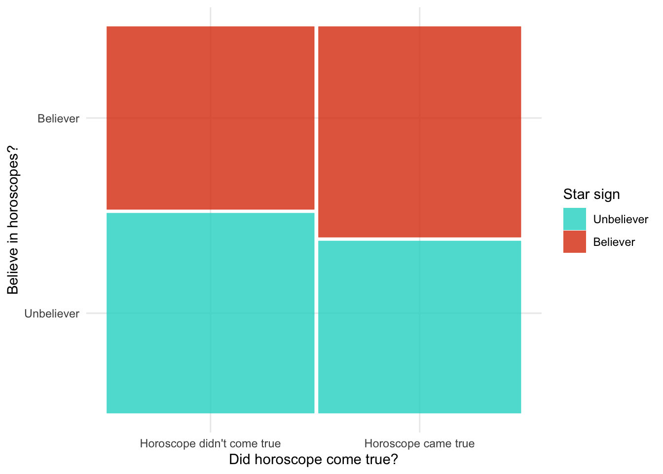
Task 18.11
On my statistics module students have weekly practical statistics classes in a computer laboratory. I’ve noticed that many students are studying social media more than the very interesting statistics assignments that I have set them. I wanted to see the impact that this behaviour had on their exam performance. I collected data from all 260 students on my module. I classified their attendance as being either more or less than 50% of their practical classes, and I classified them as someone who I’d noticed sneakily looking at social_media during their class, or someone who I’d never seen looking at social media. After the exam, I noted whether they passed or failed (exam). Do a loglinear analysis to see if there is an association between looking at social media during class, attendance and failing your exam (
distracted_by_social_media.csv).
distracted_tib <- discovr::distracted_by_social_mediaFirst, let’s visualise the frequencies with a mosiac plot (Figure 91). To interpret this plot let’s focus on each quadrant:
- Top-left quadrant: The left-hand side is those who looked at social media during class. The top of the left-hand side is those that attended more than 50% of classes. In this group, it’s about an even split of people who passed the exam or didn’t (the red area is similar to the blue).
- Bottom-left quadrant: The left-hand side is those who looked at social media during class. The bottom of the left-hand side is those that attended less than 50% of classes. In this group, more people failed than passed the exam (the blue area is larger than the red)
Based on the left-hand side, if you looked at social media during class and had low attendence you were much more likley to fail, but if you attended well you were as likely to fail as not.
- Top-right quadrant: The right-hand side is those who didn’t look at social media during class. The top of the right-hand side is those that attended more than 50% of classes. In this group, the vast majority of people passed (the red area is much larger than the blue).
- Bottom-right quadrant: The right-hand side is those who didn’t look at social media during class. The bottom of the right-hand side is those that attended less than 50% of classes. In this group, it’s about an even split of people who passed the exam or didn’t (the red area is similar to the blue).
Based on the right-hand side, if you did not looked at social media during class then high attendence almost guarantees a pass whereas with low attendance you’re as likley to pass as fail.
distracted_tib |>
mutate(
social_media = ifelse(social_media == "Looked at social media", "Distracted", "Not distracted")
) |>
ggplot(data = _) +
geom_mosaic(aes(x = product(attendance, social_media), fill = exam, weight = frequency)) +
scale_fill_viridis_d(option = "turbo", begin = 0.3, end = 0.85) +
labs(y = "Attendance", fill = "Exam outcome", x = "Distracted during class") +
theme_minimal()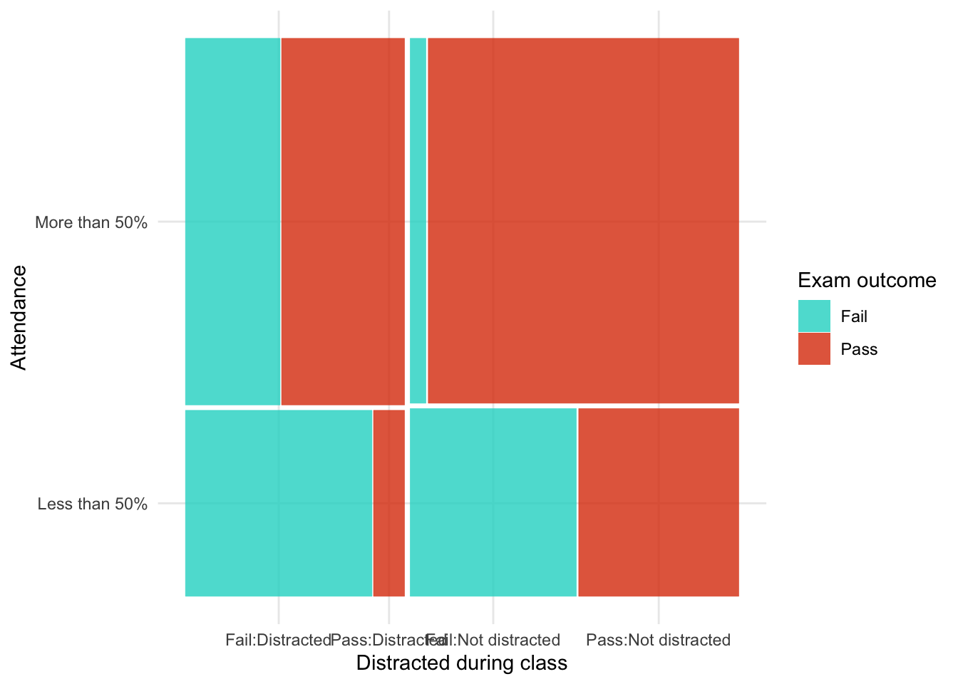
As in the book chapter, we build the model up each effect at a time
intcpt_glm <- glm(frequency ~ 1, family = "poisson", data = distracted_tib)
social_media_glm <- update(intcpt_glm, .~. + social_media)
attendance_glm <- update(social_media_glm, .~. + attendance)
all_main_glm <- update(attendance_glm, .~. + exam)
star_attendance_glm <- update(all_main_glm, .~. + social_media:attendance)
exam_attendance_glm <- update(star_attendance_glm, .~. + exam:attendance)
all_two_way_glm <- update(exam_attendance_glm, .~. + social_media:exam)
saturated_glm <- update(all_two_way_glm, .~. + social_media:attendance:exam)Table 238 compares models going from the saturated model to the model without the three-way interaction (all_two_way_glm), then to the model without any two-way interactions (all_main_glm) and finally to the model without any main effects (intcpt_glm). This shows us that:
- Removing the three way interaction does not significantly affect the fit of the model, \(\chi^2\)(-1) = 1.57, p = 0.210. In other words, the three way interaction is not significant, and we can remove it from the model.
- Removing the two-way interactions significantly affects the fit of the model, \(\chi^2\)(-3) = 99.68, p < 0.001. In other words, the two-way interactions should be retained.
test_lrt(saturated_glm, all_two_way_glm, all_main_glm, intcpt_glm) |>
display()| Name | Model | df | df_diff | Chi2 | p |
|---|---|---|---|---|---|
| saturated_glm | glm | 8 | |||
| all_two_way_glm | glm | 7 | -1 | 1.57 | 0.210 |
| all_main_glm | glm | 4 | -3 | 99.68 | < .001 |
| intcpt_glm | glm | 1 | -3 | 60.65 | < .001 |
We can now look at which two-way interaction to retain by working backwards through our from all_two_way_glm to all_main_glm. Table 239 shows us that:
- Removing the
social_media:examinteraction (which is what differentiatesall_two_way_glmfromexam_attendance_glm) significantly affects the model so we should retain this interaction, \(\chi^2\)(-1) = 49.77, p < 0.001. - Removing the
exam:attendanceinteraction (which is what differentiatesexam_attendance_glmfromstar_attendance_glm) significantly affects the model so we should retain this interaction, \(\chi^2\)(-1) = 49.91, p < 0.001. - Removing the
social_media:attendanceinteraction (which is what differentiatesstar_attendance_glmfromall_main_glm) does not significantly affect the model so we should remove this interaction, \(\chi^2\)(-1) = 0.00, p = 0.957.
Note that the variables exam, attendance and social_media are represented in the interactions we are retaining so we must retain all main effects of these variables. The final mode, therefore needs to contain the following effects:
- Main effect of
social_media - Main effect of
attendance - Main effect of
exam - The
social_media:examinteraction - The
exam:attendanceinteraction
None of our existing models contain only these effects so we’ll fit the final model as:
exam_final_glm <- glm(frequency ~ social_media + exam + attendance + exam:attendance + social_media:exam,
family = "poisson",
data = distracted_tib)test_lrt(all_two_way_glm, exam_attendance_glm, star_attendance_glm, all_main_glm) |>
display()| Name | Model | df | df_diff | Chi2 | p |
|---|---|---|---|---|---|
| all_two_way_glm | glm | 7 | |||
| exam_attendance_glm | glm | 6 | -1 | 49.77 | < .001 |
| star_attendance_glm | glm | 5 | -1 | 49.91 | < .001 |
| all_main_glm | glm | 4 | -1 | 2.86e-03 | 0.957 |
Table 237 shows the parameter estimates for the final model. The interactions of interest are 2 by 2 so we can usually include exponentiate = TRUE and interpret the parameter estimates as odds ratios. These confirm that there was a significant relationship between passing the exam and attendance \(\hat{b}\) = 7.20 (4.10, 12.93), z = 6.74, p < 0.001, a significant relationship between passing the exam and looking at social media \(\hat{b}\) = 0.19 (0.11, 0.33), z = -5.93, p < 0.001.
model_parameters(exam_final_glm, exponentiate = TRUE) |>
display()| Parameter | IRR | SE | 95% CI | z | p |
|---|---|---|---|---|---|
| (Intercept) | 19.83 | 3.86 | (13.26, 28.50) | 15.34 | < .001 |
| social media (Looked at social media) | 1.88 | 0.41 | (1.23, 2.91) | 2.87 | 0.004 |
| exam (Pass) | 1.15 | 0.31 | (0.68, 1.96) | 0.53 | 0.594 |
| attendance (More than 50%) | 0.61 | 0.13 | (0.40, 0.93) | -2.27 | 0.023 |
| exam (Pass) × attendance (More than 50%) | 7.20 | 2.11 | (4.10, 12.93) | 6.74 | < .001 |
| social media (Looked at social media) × exam (Pass) | 0.19 | 0.05 | (0.11, 0.33) | -5.93 | < .001 |
Chapter 19
Task 19.1
A ‘display rule’ refers to displaying an appropriate emotion in a situation. For example, if you receive a present that you don’t like, you should smile politely and say ‘Thank you, Auntie Kate, I’ve always wanted a rotting cabbage’; you do not start crying and scream ‘Why did you buy me a rotting cabbage?!’ A psychologist measured children’s understanding of display rules (with a task that they could pass or fail), their age (months), and their ability to understand others’ mental states (‘theory of mind’, measured with a false belief task that they could pass or fail). Can
displayrule understanding (did the child pass the test: yes/no?) be predicted from theory of mind (did the child pass the false belief,fb, task: yes/no?),ageand their interaction? (display.csv.)
Load the data using (see Tip 2):
display_tib <- discovr::displayTable 241 summarises the relationship between the false belief task and display rule understanding. Of those failing the false belief task (e.g. underdeveloped ‘theory of mind’) about 80% also did not show display rule understanding whereas 20% did. This pattern is reversed in those passing the false belief task (e.g. developed ‘theory of mind’): about 20% did not show display rule understanding whereas 80% did. This suggests a strong relationship between the two.
data_tabulate(x = display_tib,
select = "fb",
by = "display",
proportions = "row",
remove_na = TRUE) |>
display()| fb | No | Yes | Total |
|---|---|---|---|
| No | 23 (79.3%) | 6 (20.7%) | 29 |
| Yes | 8 (19.5%) | 33 (80.5%) | 41 |
| Total | 31 | 39 | 70 |
Let’s build the model sequentially as in the Chapter:
Table 242 compares the fit of the models. Adding false belief understanding as a predictor substantially increases \(R^2\) from 0.00% to 35.17%, the AIC, BIC and RMSE all decrease too. Adding age to the model only slightly reduces AIC and RMSE, makes relatively little difference to \(R^2\) and increases BIC.
Significance tests confirm these conclusions: adding false believe understanding significantly improves the fit of the model, \(\chi^2\)(1) = 26.08, p < 0.001, but adding age, \(\chi^2\)(1) = 2.28, p = 0.131, and the interaction, \(\chi^2\)(1) = 0.12, p = 0.726, do not. Therefore, we’ll interpret the mopdel that includes only fb as a predictor (fb_glm).
The effect of interest has two categories (as does the outcome variable) so we can include exponentiate = TRUE and interpret the parameter estimates as odds ratios (Table 244). The parameter estimate and associated tests confirm a significant association between theory of mind (passing the false belief test) and display rule understanding, \(\hat{b}\) = 15.81 (5.14, 56.16), z = 4.57, p < 0.001. Those that passed the false belief task were 15.81 times more likely to also pass the display rule understanding task.
Figure 92 shows the assumptions are met. Top left shows that the observed values fall with the corresponding prediction interval so the model is capturing what we observed. The top right shows that the average deviance residuals and their intervals fall within the error bounds. The bottom right plot shows the dots fall along the diagonal line (which they do), so are distributed as we’d like.
compare_performance(intcpt_glm, fb_glm, age_glm, full_glm, metrics = "common") |>
display()| Name | Model | AIC (weights) | BIC (weights) | Tjur’s R2 | RMSE |
|---|---|---|---|---|---|
| intcpt_glm | glm | 98.1 (<.001) | 100.4 (<.001) | 0.00 | 0.50 |
| fb_glm | glm | 74.0 (0.38) | 78.5 (0.70) | 0.35 | 0.40 |
| age_glm | glm | 73.8 (0.44) | 80.5 (0.26) | 0.37 | 0.39 |
| full_glm | glm | 75.6 (0.17) | 84.6 (0.03) | 0.37 | 0.39 |
test_lrt(intcpt_glm, fb_glm, age_glm, full_glm) |>
display()| Name | Model | df | df_diff | Chi2 | p |
|---|---|---|---|---|---|
| intcpt_glm | glm | 1 | |||
| fb_glm | glm | 2 | 1 | 26.08 | < .001 |
| age_glm | glm | 3 | 1 | 2.28 | 0.131 |
| full_glm | glm | 4 | 1 | 0.12 | 0.726 |
model_parameters(fb_glm, exponentiate = TRUE) |>
display()| Parameter | Odds Ratio | SE | 95% CI | z | p |
|---|---|---|---|---|---|
| (Intercept) | 0.26 | 0.12 | (0.10, 0.60) | -2.93 | 0.003 |
| fb (Yes) | 15.81 | 9.56 | (5.14, 56.16) | 4.57 | < .001 |
check_model(fb_glm)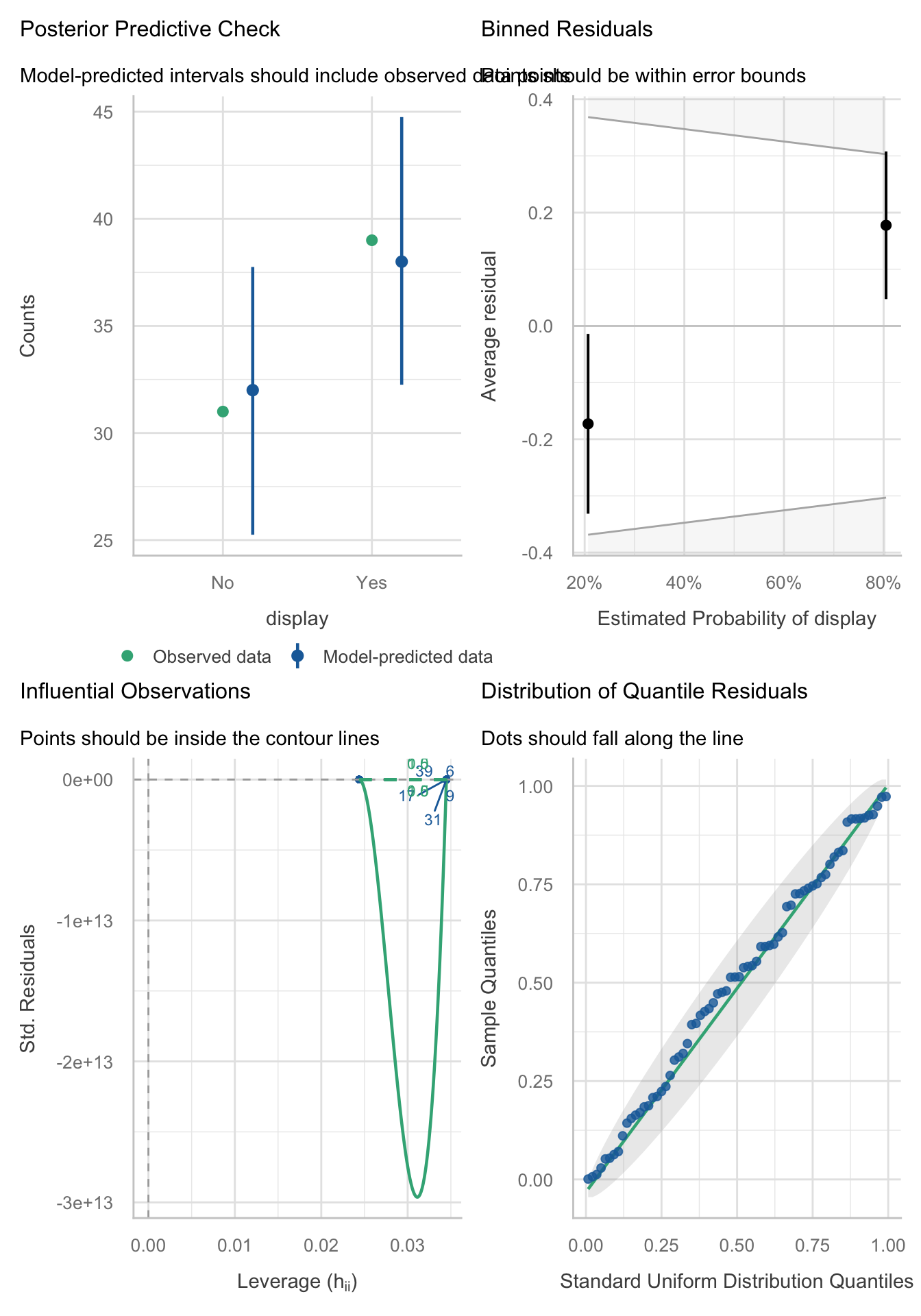
Task 19.2
Are there any influential cases or outliers in the model for Task 1?
The influence plot (Figure 93) from this model isn’t really interpretable because of the way the yaxis is scaled. Instead we can apply some of the techniques from Chapter 8 to look at casewise diagnostics.
check_model(fb_glm)
First, let’s store the influence measures from the model:
display_inf <- influence.measures(fb_glm)$infmat |>
as_tibble() |>
rowid_to_column(var = "case_no")Because the model has one predictor that has two categories, there are relatively few unique leverage values and Cook’s distances. Let’s look at whether any leverage values exceed three times the expected (mean) value. The expected value (see Cramming Sam 19.4) is \((k + 1)/N\). There was one predictor (k = 1) and 70 participants (N = 70), which gives an expected value of 2/70 = 1/35 = 0.0286. We can estimate this result directly from the data by taking the mean of the values stored in hat in our tibble of influence statistics.
We then list any values greater than, say, three times this value. The code below takes the influence stats, filters the table by whether the hat value is more than three times the means then prints the number of rows. There are zero rows indicating no rows with excessive leverage.
[1] 0Let’s check the cook’s distances using similar code, but displaying Cook’s distances greater than 0.5. Again,. no cases exceed this value. We can also display the maximum value of Cook’s distance, which is 0.07.
Finally, we can check for outliers by using check_ouliers() on the residuals, which are stored within the model object (and can be accessed using fb_glm$residuals). No outliers are detected.
check_outliers(fb_glm$residuals)OK: No outliers detected.
- Based on the following method and threshold: zscore_robust (3.291).
- For variable: fb_glm$residualsTo sum up, there are no outliers or influenctial cases in this model.
Task 19.3
The behaviour of drivers has been used to claim that people of a higher social class are more unpleasant (Piff et al., 2012). Piff and colleagues classified social class by the type of car (
vehicle) on a five-point scale and observed whether the drivers cut in front of other cars at a busy intersection (vehicle_cut). Do a logistic regression to see whether social class predicts whether a driver cut in front of other vehicles (piff_2012_vehicle.csv).
Load the data using (see Tip 2):
vehicle_tib <- discovr::piff_2012_vehicleTable 245 summarises the relationship between the vehicle status and whether the driver cut up another vehicle. Note that for vehicles of status 1 to 3 roughly 90% of drivers did not cut up other vehicles and 10% did but this pattern switches as status reaches 4 with roughly 90% cutting up compared to 10% not. For highest status vehicles this trend continues although slighly weaker with 70% cutting up and 30% not. It’s also noteworthy that in general the number of vehicles that are cut up is low (only 34 out of 274 observations).
data_tabulate(x = vehicle_tib,
select = "vehicle",
by = "vehicle_cut",
proportions = "row",
remove_na = TRUE) |>
display()| vehicle | No | Yes | Total |
|---|---|---|---|
| 1 | 24 (92.3%) | 2 (7.7%) | 26 |
| 2 | 31 (93.9%) | 2 (6.1%) | 33 |
| 3 | 99 (86.8%) | 15 (13.2%) | 114 |
| 4 | 67 (90.5%) | 7 (9.5%) | 74 |
| 5 | 19 (70.4%) | 8 (29.6%) | 27 |
| Total | 240 | 34 | 274 |
Let’s build the model using the following code:
Table 246 shows that social status accounts for \(R^2\) = 0.0164 (1.64%) of the variance in whether vehicles are cut up. This is a small amount. The parameter estimate and associated tests (Table 247) confirm a significant association between social status and cutting up vehicles, \(\hat{b}\) = 1.44 (1.01, 2.09), z = 1.98, p = 0.047. As social status increase by 1 category, the driver is 1.44 times more likely to cut up another vehicle. Remembering that an odds ratio of 1 equates to ‘no effect’ this is a weak effect.
Figure 94 shows the assumptions are largely met. Top-left shows that the observed values fall with the corresponding prediction interval so the model is capturing what we observed. The top-right shows that the average deviance residuals and their intervals do not fall within the error bounds. The bottom-left plot shows no influential cases, and the bottom-right plot shows the dots fall along the diagonal line (which they do), so are distributed as we’d like.
model_performance(vehicle_glm) |>
display()| AIC | AICc | BIC | Tjur’s R2 | RMSE | Sigma | Log_loss | Score_log | Score_spherical | PCP |
|---|---|---|---|---|---|---|---|---|---|
| 205.3 | 205.4 | 212.6 | 0.02 | 0.33 | 1 | 0.37 | -4.34 | 0.04 | 0.79 |
model_parameters(vehicle_glm, exponentiate = TRUE) |>
display()| Parameter | Odds Ratio | SE | 95% CI | z | p |
|---|---|---|---|---|---|
| (Intercept) | 0.04 | 0.03 | (0.01, 0.14) | -4.78 | < .001 |
| vehicle | 1.44 | 0.27 | (1.01, 2.09) | 1.98 | 0.047 |
check_model(vehicle_glm)
Task 19.4
In a second study, Piff et al. (2012) observed the behaviour of drivers and classified social class by the type of car (
vehicle), but the outcome was whether the drivers cut off a pedestrian at a crossing (pedestrian_cut). Do a logistic regression to see whether social class predicts whether or not a driver prevents a pedestrian from crossing (piff_2012_pedestrian.csv).
Load the data using (see Tip 2):
pedestrian_tib <- discovr::piff_2012_pedestrianTable 248 summarises the relationship between the vehicle status and whether the driver cut up a pedestrian. Note that for vehicles of status 1 to 3 at least 67.2% of drivers did not cut up a pedestrian and the remainder did but this pattern changes as social status reaches 4 and 5 where roughly 55% cut up a pedestrian compared to around 45% who did not.
data_tabulate(x = pedestrian_tib,
select = "vehicle",
by = "pedestrian_cut",
proportions = "row",
remove_na = TRUE) |>
display()| vehicle | No | Yes | Total |
|---|---|---|---|
| 1 | 5 (100.0%) | 0 (0.0%) | 5 |
| 2 | 20 (71.4%) | 8 (28.6%) | 28 |
| 3 | 41 (67.2%) | 20 (32.8%) | 61 |
| 4 | 25 (55.6%) | 20 (44.4%) | 45 |
| 5 | 7 (53.8%) | 6 (46.2%) | 13 |
| Total | 98 | 54 | 152 |
Let’s build the model using the following code:
Table 249 shows that social status accounts for \(R^2\) = 0.0308 (3.08%) of the variance in whether pedestrians are cut up. This is a small amount. The parameter estimate and associated tests (Table 250) confirm a significant association between social status and cutting up pedestrians, \(\hat{b}\) = 1.49 (1.04, 2.18), z = 2.15, p = 0.031. As social status increase by 1 category, the driver is 1.49 times more likely to cut up pedestrians. Remembering that an odds ratio of 1 equates to ‘no effect’ this is a weak effect.
Figure 95 shows the assumptions are met. Top-left shows that the observed values fall with the corresponding prediction interval so the model is capturing what we observed. The top-right shows that the average deviance residuals and their intervals fall within the error bounds. The bottom-left plot shows no influential cases, and the bottom-right plot shows the dots fall along the diagonal line (which they do), so are distributed as we’d like.
model_performance(pedestrian_glm) |>
display()| AIC | AICc | BIC | Tjur’s R2 | RMSE | Sigma | Log_loss | Score_log | Score_spherical | PCP |
|---|---|---|---|---|---|---|---|---|---|
| 196.9 | 197.0 | 203.0 | 0.03 | 0.47 | 1 | 0.63 | -22.96 | 0.02 | 0.56 |
model_parameters(pedestrian_glm, exponentiate = TRUE) |>
display()| Parameter | Odds Ratio | SE | 95% CI | z | p |
|---|---|---|---|---|---|
| (Intercept) | 0.15 | 0.10 | (0.04, 0.50) | -2.97 | 0.003 |
| vehicle | 1.49 | 0.28 | (1.04, 2.18) | 2.15 | 0.031 |
check_model(pedestrian_glm)
Task 19.5
Four hundred and sixty-seven lecturers completed questionnaire measures of
burnout(burnt out or not), perceivedcontrol(high score = low perceived control),copingability (high score = high ability to cope with stress), stress fromteaching(high score = teaching creates a lot of stress for the person), stress fromresearch(high score = research creates a lot of stress for the person) and stress from providingpastoralcare (high score = providing pastoral care creates a lot of stress for the person). Cooper et al. (1988) model of stress indicates that perceived control and coping style are important predictors of burnout. The remaining predictors were measured to see the unique contribution of different aspects of a lecturer’s work to their burnout. Conduct a logistic regression to see which factors predict burnout. (burnout.csv).
Load the data using (see Tip 2):
burnout_tib <- discovr::burnoutThe model should be fit hierarchically because Cooper’s model indicates that perceived control and coping style are important predictors of burnout. So, these variables should be entered in the first block. We might add all other predictors in the second block (although we could also add them one by one.
compare_performance(intcpt_glm, block_1_glm, block_2_glm, metrics = "common") |>
display()| Name | Model | AIC (weights) | BIC (weights) | Tjur’s R2 | RMSE |
|---|---|---|---|---|---|
| intcpt_glm | glm | 532.1 (<.001) | 536.3 (<.001) | 0.00 | 0.44 |
| block_1_glm | glm | 370.2 (<.001) | 382.6 (<.001) | 0.35 | 0.36 |
| block_2_glm | glm | 333.2 (>.999) | 358.1 (>.999) | 0.43 | 0.33 |
model_parameters(block_2_glm) |>
display()| Parameter | Log-Odds | SE | 95% CI | z | p |
|---|---|---|---|---|---|
| (Intercept) | -4.44 | 1.09 | (-6.63, -2.36) | -4.09 | < .001 |
| control | 0.11 | 0.01 | (0.08, 0.14) | 7.41 | < .001 |
| coping | 0.14 | 0.02 | (0.11, 0.18) | 8.68 | < .001 |
| teaching | -0.11 | 0.02 | (-0.15, -0.07) | -5.67 | < .001 |
| research | 0.02 | 0.01 | (-8.85e-04, 0.04) | 1.86 | 0.062 |
| pastoral | 0.05 | 0.01 | (0.02, 0.07) | 3.45 | < .001 |
check_model(block_2_glm)
Task 19.6
An HIV researcher explored the factors that influenced condom use with a new partner (relationship less than 1 month old). The outcome measure was whether a condom was used (use: condom used = 1, not used = 0). The predictor variables were mainly scales from the Condom Attitude Scale (Sacco et al., 1991):
gender; the degree to which the person views their relationship as ‘safe’ from sexually transmitted disease (safety); the degree to which previous experience influences attitudes towards condom use (experience); whether or not the couple used a condom in their previous encounter (previous: 1 = condom used, 0 = not used, 2 = no previous encounter with this partner); the degree of self-control that a person has when it comes to condom use (self_control); the degree to which the person perceives a risk from unprotected sex (risk_perception). Previous research has shown that gender, relationship safety and perceived risk predict condomuse(Sacco et al., 1991). Verify these previous findings and test whether self-control, previous usage and sexual experience predict condom use (condom.csv).
Load the data using (see Tip 2):
condom_tib <- discovr::condomWe will fit the model hierarchically, entering risk_perception, safety and gender in the first block. In the second block we’ll add previous, self_control and experience.
Table 254 compares the fit of the models. The model with risk_perception, safety and gender \(R^2\) = 0.274 (27.4%) of the variance in condom use. Adding previous use, self_control sexual experience increased this to \(R^2\) = 0.414 (41.4%). This increase represented a significant improvement in fit, \(\chi^2\)(4) = 17.80, p = 0.001 (Table 255)
Table 256 shows the parameter estimates and Table 257 the accompanying odds ratios. Let’s look at each predictor in turn focussing on the odds ratios.
- Perceived risk was a significant predictor of condom use, \(\hat{OR}\) = 2.58 (1.70, 4.36), z = 4.01, p < 0.001. If the value of perceived risk goes up by 1, then the odds of using a condom also increase (because the odds ratio is greater than 1). The confidence interval for this value ranges from 1.70 to 4.36, so if this is one of the 95% of samples for which the confidence interval contains the population value the odds ratio in the population lies somewhere between these two values. In short, as perceived risk increases by 1, people are 2.6 times more likely to use a condom.
- Relationship safety was a significant predictor of condom use, \(\hat{OR}\) = 0.62 (0.37, 0.94), z = -2.04, p = 0.041. If the relationship safety increases by one point, then the odds of using a condom decreased (because the odds ratio is less than 1). The confidence interval for this value ranges from 0.37 to 0.94, so if this is one of the 95% of samples for which the confidence interval contains the population value the odds ratio in the population lies somewhere between these two values. In short, as safety increases increases by 1, people are 0.6 times as likely to use a condom (i.e. less likely).
- Gender was not a significant predictor of condom use, \(\hat{OR}\) = 1.00 (0.32, 3.10), z = 0.00, p = 0.996. Females were just as likely to use condoms as males.
- Those who used a condom on the previous occasion with the partner were significantly more likely to use a condom again compared to those who did not use a condom previously, \(\hat{OR}\) = 2.97 (1.03, 9.18), z = 1.97, p = 0.049. The confidence interval for this value ranges from 1.03 to 9.18, so if this is one of the 95% of samples for which the confidence interval contains the population value the odds ratio in the population lies somewhere between these two values. In short, people who used a condom on the previous encounter were 3.0 times as likely to use one again compared to those who did not use one on the previous occasion.
- If the sexual encounter was the first time with the current partner the person was not significantly more likely to use a condom compared to those who did not use a condom previously with the current partner, \(\hat{OR}\) = 0.98 (0.04, 13.95), z = -0.01, p = 0.991. In short, people who were having their first encounter with the current partner were no more likely to use a condom than those who did not use a condom previously with their partner.
- Self control was a significant predictor of condom use, \(\hat{OR}\) = 1.42 (1.12, 1.85), z = 2.74, p = 0.006. If the value of self control goes up by 1, then the odds of using a condom also increase (because the odds ratio is greater than 1). The confidence interval for this value ranges from 1.12 to 1.85, so if this is one of the 95% of samples for which the confidence interval contains the population value the odds ratio in the population lies somewhere between these two values. In short, as self control increases by 1, people are 1.4 times more likely to use a condom.
- Sexual experience was not a significant predictor of condom use, \(\hat{OR}\) = 1.20 (0.97, 1.51), z = 1.62, p = 0.106. As sexual experience increases by 1, the liklihood of using a condom doesn’t change significantly.
compare_performance(intcpt_glm, block_1_glm, block_2_glm, metrics = "common") |>
display()| Name | Model | AIC (weights) | BIC (weights) | Tjur’s R2 | RMSE |
|---|---|---|---|---|---|
| intcpt_glm | glm | 138.7 (<.001) | 141.3 (<.001) | 0.00 | 0.50 |
| block_1_glm | glm | 113.8 (7.00e-03) | 124.2 (0.58) | 0.27 | 0.42 |
| block_2_glm | glm | 104.0 (0.99) | 124.8 (0.42) | 0.41 | 0.38 |
test_lrt(intcpt_glm, block_1_glm, block_2_glm) |>
display()| Name | Model | df | df_diff | Chi2 | p |
|---|---|---|---|---|---|
| intcpt_glm | glm | 1 | |||
| block_1_glm | glm | 4 | 3 | 30.89 | < .001 |
| block_2_glm | glm | 8 | 4 | 17.80 | 0.001 |
model_parameters(block_2_glm) |>
display()| Parameter | Log-Odds | SE | 95% CI | z | p |
|---|---|---|---|---|---|
| (Intercept) | -4.96 | 1.15 | (-7.45, -2.90) | -4.33 | < .001 |
| risk perception | 0.95 | 0.24 | (0.53, 1.47) | 4.01 | < .001 |
| safety | -0.48 | 0.24 | (-1.00, -0.06) | -2.04 | 0.041 |
| gender (Female) | 2.66e-03 | 0.57 | (-1.14, 1.13) | 4.64e-03 | 0.996 |
| previous (Condom used) | 1.09 | 0.55 | (0.03, 2.22) | 1.97 | 0.049 |
| previous (First Time with partner) | -0.02 | 1.40 | (-3.32, 2.64) | -0.01 | 0.991 |
| self control | 0.35 | 0.13 | (0.11, 0.62) | 2.74 | 0.006 |
| experience | 0.18 | 0.11 | (-0.03, 0.41) | 1.62 | 0.106 |
model_parameters(block_2_glm, exponentiate = TRUE) |>
display()| Parameter | Odds Ratio | SE | 95% CI | z | p |
|---|---|---|---|---|---|
| (Intercept) | 7.01e-03 | 8.04e-03 | (5.82e-04, 0.05) | -4.33 | < .001 |
| risk perception | 2.58 | 0.61 | (1.70, 4.36) | 4.01 | < .001 |
| safety | 0.62 | 0.15 | (0.37, 0.94) | -2.04 | 0.041 |
| gender (Female) | 1.00 | 0.57 | (0.32, 3.10) | 4.64e-03 | 0.996 |
| previous (Condom used) | 2.97 | 1.64 | (1.03, 9.18) | 1.97 | 0.049 |
| previous (First Time with partner) | 0.98 | 1.38 | (0.04, 13.95) | -0.01 | 0.991 |
| self control | 1.42 | 0.18 | (1.12, 1.85) | 2.74 | 0.006 |
| experience | 1.20 | 0.13 | (0.97, 1.51) | 1.62 | 0.106 |
Task 19.7
How reliable is the model in Task 6?
Figure 97 shows the assumptions are largely met. Top left shows that the observed values fall with the corresponding prediction interval so the model is capturing what we observed. The top right shows that the average deviance residuals and their intervals do not fall within the error bounds. The middle-left plot indicates no influential cases and the middle right suggests no reason to suspect multicollinearity. The bottom left plot shows the residuals fall along the diagonal line, so are distributed as we’d like.
check_model(block_2_glm)
Task 19.8
Using the final model from Task 6, what are the probabilities that participants 12, 53 and 75 will use a condom?
The code below produces Table 259. This code does the following:
- Gets the predicted probabilities from the model (
estimate_prediction(block_2_glm)) - Converts them to a tibble and places the row numbers in a variable called
case_id - Filters this tibble to display rows if the variable
case_idis equal to 12 or (|) 53 or 75.
For case 12 there is a probability of 0.92 of using a condom (i.e. very likley), and for cases 12 and 75 there is a probability of 0.45 and 0.44 respectively (slightly unlikley).
# A tibble: 3 × 11
case_id risk_perception safety gender previous self_control experience
<chr> <dbl> <dbl> <fct> <fct> <dbl> <dbl>
1 12 6 3 Female No Condom 1 1
2 53 6 5 Male Condom used 7 3
3 75 3 2 Female Condom used 4 2
# ℹ 4 more variables: Predicted <dbl>, CI_low <dbl>, CI_high <dbl>,
# Residuals <lgl>
Task 19.9
A female who used a condom in her previous encounter scores 2 on all variables except perceived risk (for which she scores 6). Use the model in Task 6 to estimate the probability that she will use a condom in her next encounter.
Use the logistic regression equation:
\[ p(Y_i) = \frac{1}{1 + e^{-Z}} \] where
\[ Z = b_0 + b_1X_{1i} + b_2X_{2i} + ... + b_nX_{ni} \]
We need to use the values of b from the final model in Table 256 and the values of X for each variable (from the question). For the values of X, remember that we need to remember how the categorical variables were coded. We can check this using the following code. which tells us:
-
gender: males are coded as 0. The person in question was female so \(X = 1\). -
previous: the base category (coded as 0) is no condom. The person in question used a condom with her previous partner so this will be coded as 1 forprevious [Condom used]and 0 forprevious [First Time with partner]
levels(condom_tib$gender)[1] "Male" "Female"levels(condom_tib$previous)[1] "No Condom" "Condom used"
[3] "First Time with partner"The table below shows the values of b and X and then multiplies them.
| Predictor | *b* | *X* | *bX* |
|---|---|---|---|
| (Intercept) | -4.960 | 1 | -4.960 |
| risk_perception | 0.949 | 6 | 5.694 |
| safety | -0.482 | 2 | -0.964 |
| genderFemale | 0.003 | 1 | 0.003 |
| previousCondom used | 1.087 | 1 | 1.087 |
| previousFirst Time with partner | -0.017 | 0 | 0.000 |
| self_control | 0.348 | 2 | 0.696 |
| experience | 0.180 | 2 | 0.360 |
We now sum the values in the last column to get the number in the brackets in the equation above:
\[ \begin{align} Z &= -4.960 + 5.694 -0.964 + 0.000 + 1.087 + 0.000 + 0.696 + 0.360 \\ &= 1.913 \end{align} \]
Replace this value of z into the logistic regression equation:
\[ \begin{align} p(Y_i) &= \frac{1}{1 + e^{-Z}} \\ &= \frac{1}{1 + e^{-1.913}} \\ &= \frac{1}{1 + 0.148} \\ &= \frac{1}{1.148} \\ &= 0.87 \end{align} \]
Therefore, there is a 0.87 probability (87% if you prefer) that she will use a condom on her next encounter.
Task 19.10
At the start of the chapter we looked at whether the type of instrument a person plays is connected to their personality. A musicologist measured
extroversionandagreeablenessin 200 singers and guitarists (instrument). Use logistic regression to see which personality variables (ignore their interaction) predict which instrument a person plays (sing_or_guitar.csv).
Load the data using (see Tip 2):
sing_tib <- discovr::sing_or_guitarLet’s build the model using the following code:
Table 261 shows that adding extroversion and agreeableness as predictors allows us to account for \(R^2\) = 0.866 (86.6%) of the variance in whether a person plays guitar or sings. This is a huge amount - nearly all of the variance.
Table 262 shows us the parameter estimates in their exponentiated form (i.e. as odds ratios). These coefficients represent the change in the odds of the outcome variable associated with a one-unit change in the predictor variable. From this table, we conclude that extroversion is a significant predictor of the instrument played, \(\hat{b}\) = 0.24 (0.12, 0.39), z = -4.79, p < 0.001. The corresponding odds ratio (\(\hat{OR}\) = 0.24) is less than 1 meaning that as the predictor (extroversion) increases, the odds of the outcome decrease, that is, the odds of being a guitarist (compared to a singer) decrease. In other words, more extroverted band members are more likely to be singers. Agreeqableness is also a significant predictor of the instrument played, \(\hat{b}\) = 1.43 (1.23, 1.76), z = 3.91, p < 0.001. The corresponding odds ratio (\(\hat{OR}\) = 1.43) is greater than 1 meaning that as agreeableness increases, the odds of the outcome increase; that is, the odds of being a guitarist (compared to a singer) increase. In other words, more agreeable people are more likely to be guitarists. Note that the odds ratio for the constant is insanely large (\(\hat{OR}\) = 39248829860889.12), which brings us neatly onto the next task …
model_performance(sing_glm) |>
display()| AIC | AICc | BIC | Tjur’s R2 | RMSE | Sigma | Log_loss | Score_log | Score_spherical | PCP |
|---|---|---|---|---|---|---|---|---|---|
| 52.8 | 52.9 | 62.6 | 0.87 | 0.18 | 1 | 0.12 | -Inf | 0.04 | 0.93 |
model_parameters(sing_glm, exponentiate = T) |>
display()| Parameter | Odds Ratio | SE | 95% CI | z | p |
|---|---|---|---|---|---|
| (Intercept) | 3.92e+13 | 3.02e+14 | (9.22e+07, 1.98e+21) | 4.07 | < .001 |
| extroversion | 0.24 | 0.07 | (0.12, 0.39) | -4.79 | < .001 |
| agreeableness | 1.43 | 0.13 | (1.23, 1.76) | 3.91 | < .001 |
Task 19.11
Which problem associated with logistic regression might we have in the analysis in Task 10?
Figure 99 shows a plot of the predicted probabilities. The code is based on Section 19.7.5 of the book. From the plot, it looks as though we might have complete separation: for each level of agreeableness (each coloured line) the model can almost perfectly predict group membership based on extroversion.
pred_p <- estimate_means(sing_glm, by = c("extroversion", "agreeableness"))
plot(pred_p) +
scale_fill_viridis_c(option = "turbo") +
scale_color_viridis_c(option = "turbo") +
labs(x = "Extroversion", y = "Probability of playing guitar", colour = "Agreeableness", fill = "Agreeableness") +
theme_minimal()
Task 19.12
In a new study, the musicologist in Task 10 extended her previous one by collecting data from 430 musicians who played their voice (singers), guitar, bass, or drums (
instrument). She measured the same personality variables but also theirconscientiousness(band_personality.csv). Use multinomial logistic regression to see which of these three variables (ignore interactions) predict which instrument a person plays (use drums as the reference category).
This task was supposed to be deleted because I ended up not covering multinomial logistic regression. Oops.