Labcoat Leni

Leni is a budding young scientist and he’s fascinated by real research. He says, ‘Andy, I like an example about using an eel as a cure for constipation as much as the next guy, but all of your data are made up. We need some real examples, buddy!’ Leni walked the globe, a lone data warrior in a thankless quest for real data. When Leni appears in Discovering Statistics Using R and RStudio (2nd edition) he brings with him real data, from a real research study, to analyse. These examples let you practice your
Keep it real.
If a chapter isn’t listed it’s because it doesn’t contain a Labcoat Leni box
These solutions assume you have a setup code chunk at the start of your document that loads the easystats and tidyverse packages:
This document contains abridged sections from Discovering Statistics Using R and RStudio by Andy Field so there are some copyright considerations. You can use this material for teaching and non-profit activities but please do not meddle with it or claim it as your own work. See the full license terms at the bottom of the page.
Many tasks will require you to load data. You can do this in one of two ways. The easiest is to grab the data directly from the discovr package using the general code:
my_tib <- discovr::name_of_datain which you replace my_tib with the name you wish to give the data once loaded and name_of_data is the data you wish to load. In RStudio if you type discovr:: it will list the datasets available. For example, to load the data called students into a tibble called students_tib we’d execute:
students_tib <- discovr::studentsAlternatively, download the CSV file from https://www.discovr.rocks/csv/name_of_file replacing name_of_file with the name of the csv file. For example, to download students.csv use this url: https://www.discovr.rocks/csv/students.csv
Set up an RStudio project (exactly as described in Chapter 4), place the csv file in your data folder and use this general code:
in which you replace my_tib with the name you wish to give the data once loaded and name_of_file.csv is the name of the file you wish to read into here to locate the file within the project and read_csv() to read it into students.csv you would execute
Chapter 1
Is Friday 13th unlucky?
Let’s begin with accidents and poisoning on Friday the 6th. First, arrange the scores in ascending order: 1, 1, 4, 6, 9, 9.
The median will be the (n + 1)/2th score. There are 6 scores, so this will be the 7/2 = 3.5th. The 3.5th score in our ordered list is half way between the 3rd and 4th scores which is (4+6)/2= 5 accidents.
The mean is 5 accidents:
\[ \begin{align} \bar{X} &= \frac{\sum_{i = 1}^{n}x_i}{n} \\ &= \frac{1 + 1 + 4 + 6 + 9 + 9}{6} \\ &= \frac{30}{6} \\ &= 5 \end{align} \]
The lower quartile is the median of the lower half of scores. If we split the data in half, there will be 3 scores in the bottom half (lowest scores) and 3 in the top half (highest scores). The median of the bottom half will be the (3+1)/2 = 2nd score below the mean. Therefore, the lower quartile is 1 accident.
The upper quartile is the median of the upper half of scores. If we again split the data in half and take the highest 3 scores, the median will be the (3+1)/2 = 2nd score above the mean. Therefore, the upper quartile is 9 accidents.
The interquartile range is the difference between the upper and lower quartiles: 9 − 1 = 8 accidents.
To calculate the sum of squares, first take the mean from each score, then square this difference, and finally, add up these squared values:
| Score | Error (Score − Mean) |
Error Squared |
|---|---|---|
| 1 | –4 | 16 |
| 1 | –4 | 16 |
| 4 | –1 | 1 |
| 6 | 1 | 1 |
| 9 | 4 | 16 |
| 9 | 4 | 16 |
So, the sum of squared errors is: 16 + 16 + 1 + 1 + 16 + 16 = 66.
The variance is the sum of squared errors divided by the degrees of freedom (N − 1):
\[ s^{2} = \frac{\text{sum of squares}}{N- 1} = \frac{66}{5} = 13.20 \]
The standard deviation is the square root of the variance:
\[ s = \sqrt{\text{variance}} = \sqrt{13.20} = 3.63 \]
Next let’s look at accidents and poisoning on Friday the 13th. First, arrange the scores in ascending order: 5, 5, 6, 6, 7, 7.
The median will be the (n + 1)/2th score. There are 6 scores, so this will be the 7/2 = 3.5th. The 3.5th score in our ordered list is half way between the 3rd and 4th scores which is (6+6)/2 = 6 accidents.
The mean is 6 accidents:
\[ \begin{align} \bar{X} &= \frac{\sum_{i = 1}^{n}x_{i}}{n} \\ &= \frac{5 + 5 + 6 + 6 + 7 + 7}{6} \\ &= \frac{36}{6} \\ &= 6 \\ \end{align} \]
The lower quartile is the median of the lower half of scores. If we split the data in half, there will be 3 scores in the bottom half (lowest scores) and 3 in the top half (highest scores). The median of the bottom half will be the (3+1)/2 = 2nd score below the mean. Therefore, the lower quartile is 5 accidents.
The upper quartile is the median of the upper half of scores. If we again split the data in half and take the highest 3 scores, the median will be the (3+1)/2 = 2nd score above the mean. Therefore, the upper quartile is 7 accidents.
The interquartile range is the difference between the upper and lower quartiles: 7 − 5 = 2 accidents.
To calculate the sum of squares, first take the mean from each score, then square this difference, finally, add up these squared values:
| Score | Error (Score − Mean) |
Error Squared |
|---|---|---|
| 7 | 1 | 1 |
| 6 | 0 | 0 |
| 5 | –1 | 1 |
| 5 | –1 | 1 |
| 7 | 1 | 1 |
| 6 | 0 | 0 |
So, the sum of squared errors is: 1 + 0 + 1 + 1 + 1 + 0 = 4.
The variance is the sum of squared errors divided by the degrees of freedom (N − 1):
\[ s^{2} = \frac{\text{sum of squares}}{N - 1} = \frac{4}{5} = 0.8 \]
The standard deviation is the square root of the variance:
\[ s = \sqrt{\text{variance}} = \sqrt{0.8} = 0.894 \]
Next, let’s look at traffic accidents on Friday the 6th. First, arrange the scores in ascending order: 3, 5, 6, 9, 11, 11.
The median will be the (n + 1)/2th score. There are 6 scores, so this will be the 7/2 = 3.5th. The 3.5th score in our ordered list is half way between the 3rd and 4th scores. The 3rd score is 6 and the 4th score is 9. Therefore the 3.5th score is (6+9)/2 = 7.5 accidents.
The mean is 7.5 accidents:
\[ \begin{align} \bar{X} &= \frac{\sum_{i = 1}^{n}x_{i}}{n} \\ &= \frac{3 + 5 + 6 + 9 + 11 + 11}{6} \\ &= \frac{45}{6} \\ &= 7.5 \end{align} \]
The lower quartile is the median of the lower half of scores. If we split the data in half, there will be 3 scores in the bottom half (lowest scores) and 3 in the top half (highest scores). The median of the bottom half will be the (3+1)/2 = 2nd score below the mean. Therefore, the lower quartile is 5 accidents.
The upper quartile is the median of the upper half of scores. If we again split the data in half and take the highest 3 scores, the median will be the (3+1)/2 = 2nd score above the mean. Therefore, the upper quartile is 11 accidents.
The interquartile range is the difference between the upper and lower quartiles: 11 − 5 = 6 accidents.
To calculate the sum of squares, first take the mean from each score, then square this difference, finally, add up these squared values:
| Score | Error (Score − Mean) |
Error Squared |
|---|---|---|
| 9 | 1.5 | 2.25 |
| 6 | –1.5 | 2.25 |
| 11 | 3.5 | 12.25 |
| 11 | 3.5 | 12.25 |
| 3 | –4.5 | 20.25 |
| 5 | –2.5 | 6.25 |
So, the sum of squared errors is: 2.25 + 2.25 + 12.25 + 12.25 + 20.25 + 6.25 = 55.5.
The variance is the sum of squared errors divided by the degrees of freedom (N − 1):
\[ s^{2} = \frac{\text{sum of squares}}{N - 1} = \frac{55.5}{5} = 11.10 \]
The standard deviation is the square root of the variance:
\[ s = \sqrt{\text{variance}} = \sqrt{11.10} = 3.33 \]
Finally, let’s look at traffic accidents on Friday the 13th. First, arrange the scores in ascending order: 4, 10, 12, 12, 13, 14.
The median will be the (n + 1)/2th score. There are 6 scores, so this will be the 7/2 = 3.5th. The 3.5th score in our ordered list is half way between the 3rd and 4th scores. The 3rd score is 12 and the 4th score is 12. Therefore the 3.5th score is (12+12)/2= 12 accidents.
The mean is 10.83 accidents:
\[ \begin{align} \bar{X} &= \frac{\sum_{i = 1}^{n}x_{i}}{n} \\ &= \frac{4 + 10 + 12 + 12 + 13 + 14}{6} \\ &= \frac{65}{6} \\ &= 10.83 \end{align} \]
The lower quartile is the median of the lower half of scores. If we split the data in half, there will be 3 scores in the bottom half (lowest scores) and 3 in the top half (highest scores). The median of the bottom half will be the (3+1)/2 = 2nd score below the mean. Therefore, the lower quartile is 10 accidents.
The upper quartile is the median of the upper half of scores. If we again split the data in half and take the highest 3 scores, the median will be the (3+1)/2 = 2nd score above the mean. Therefore, the upper quartile is 13 accidents.
The interquartile range is the difference between the upper and lower quartile: 13 − 10 = 3 accidents.
To calculate the sum of squares, first take the mean from each score, then square this difference, finally, add up these squared values:
| Score | Error (Score − Mean) |
Error Squared |
|---|---|---|
| 4 | –6.83 | 46.65 |
| 10 | –0.83 | 0.69 |
| 12 | 1.17 | 1.37 |
| 12 | 1.17 | 1.37 |
| 13 | 2.17 | 4.71 |
| 14 | 3.17 | 10.05 |
So, the sum of squared errors is: 46.65 + 0.69 + 1.37 + 1.37 + 4.71 + 10.05 = 64.84.
The variance is the sum of squared errors divided by the degrees of freedom (N − 1):
\[ s^{2} = \frac{\text{sum of squares}}{N- 1} = \frac{64.84}{5} = 12.97 \]
The standard deviation is the square root of the variance:
\[ s = \sqrt{\text{variance}} = \sqrt{12.97} = 3.6 \]
Chapter 3
Researcher degrees of freedom: a sting in the tale
No solution required.
Chapter 4
Gonna be a rock ‘n’ roll singer
Data from Oxoby (2008).
Using a task from experimental economics called the ultimatum game, individuals are assigned the role of either proposer or responder and paired randomly. Proposers were allocated $10 from which they had to make a financial offer to the responder (i.e., $2). The responder can accept or reject this offer. If the offer is rejected neither party gets any money, but if the offer is accepted the responder keeps the offered amount (e.g., $2), and the proposer keeps the original amount minus what they offered (e.g., $8). For half of the participants the song ‘It’s a long way to the top’ sung by Bon Scott was playing in the background; for the remainder ‘Shoot to thrill’ sung by Brian Johnson was playing. Oxoby measured the offers made by proposers, and the minimum accepted by responders (called the minimum acceptable offer). He reasoned that people would accept lower offers and propose higher offers when listening to something they like (because of the ‘feel-good factor’ the music creates). Therefore, by comparing the value of offers made and the minimum acceptable offers in the two groups he could see whether people have more of a feel-good factor when listening to Bon or Brian. These data are estimated from Figures 1 and 2 in the paper because I couldn’t get hold of the author to get the original data files. The offers made (in dollars) are as follows (there were 18 people per group):
- Bon Scott group: 1, 2, 2, 2, 2, 3, 3, 3, 3, 3, 4, 4, 4, 4, 4, 5, 5, 5
- Brian Johnson group: 2, 3, 3, 3, 3, 3, 4, 4, 4, 4, 4, 5, 5, 5, 5, 5, 5, 5
Create a tibble called
oxoby_tiband enter these data into it. (Hint: There should be two variables, singer which is a factor and offer which is a double).
There are several ways to enter the Oxoby data, here’s one of them (the resulting data are in Table 1):
DT::datatable(oxoby_tib)Chapter 5
Gonna be a rock ‘n’ roll singer (again!)
Data from Oxoby (2008).
In Labcoat Leni’s Real Research 4.1 we came across a study that compared economic behaviour while different music by AC/DC played in the background. Specifically, Oxoby manipulated whether the background song was sung by AC/DC’s original singer (Bonn Scott) or his replacement (Brian Johnson). He measured how many offers participants accepted and the minimum offer they would accept (
acdc.csv). See Labcoat Leni’s Real Research 4.1 for more detail on the study. We entered the data for this study in the previous chapter; now let’s plot it. Produce separate histograms for the number of offers and the minumum acceptable offer and in both cases split the data by which singer was singing in the background music. Compare these plots with Figures 1 and 2 in the original article.
Load the data using (see Tip 1):
oxoby_tib <- discovr::acdcWe can produce a plot of mao as in Figure 1.
ggplot(oxoby_tib, aes(mao)) +
  geom_histogram(binwidth = 1, fill = "#56B4E9", colour = "#336c8b", alpha = 0.2) +
  labs(y = "Frequency", x = "Minimum Acceptable Offer", title = "Oxoby 2008 Figure 1 data") +
  scale_x_continuous(breaks = seq(0, 5, 1)) +
  facet_wrap(~singer) +
  theme_minimal()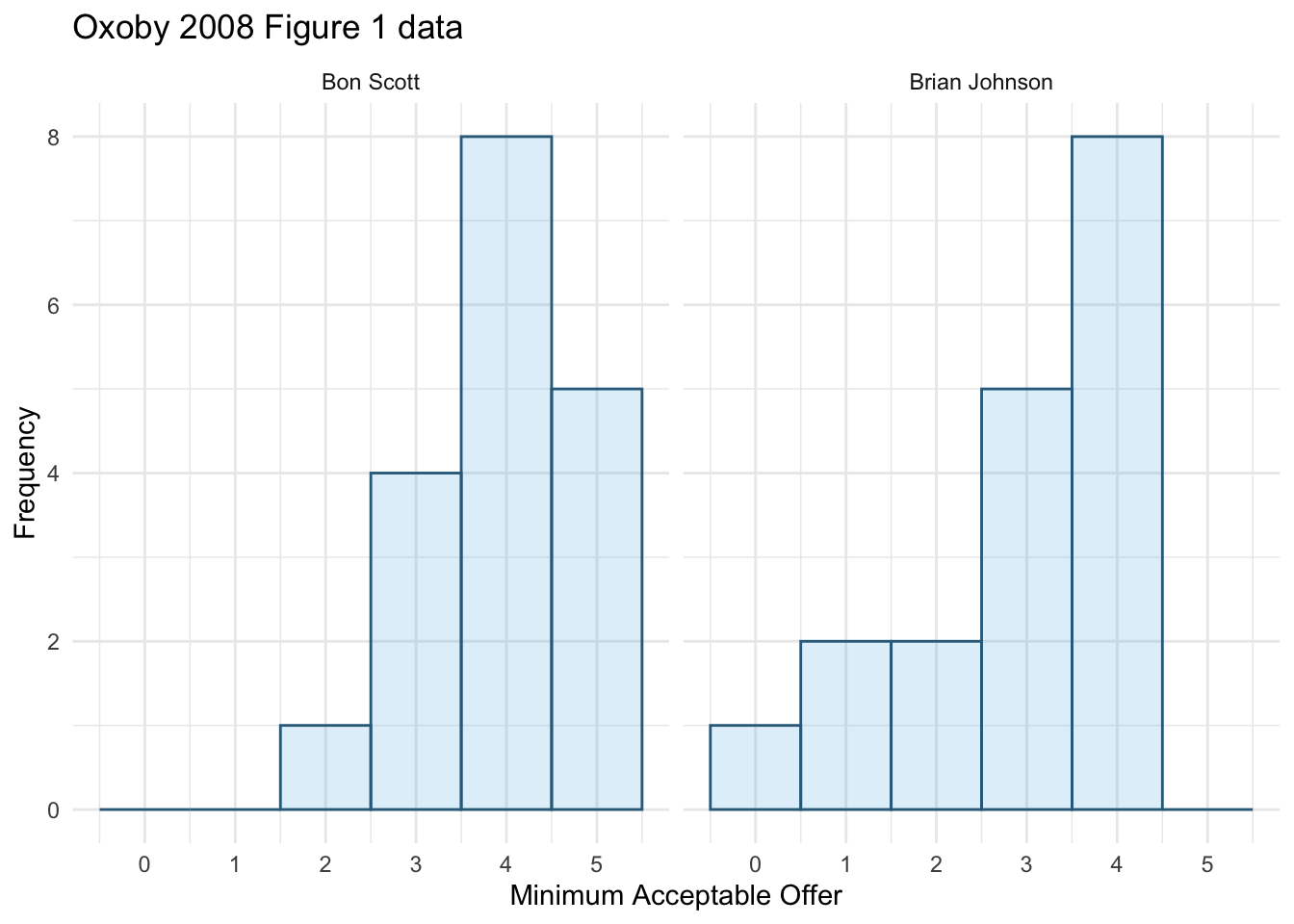
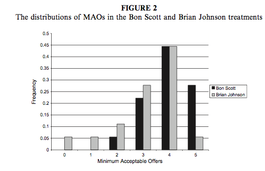
We can compare the resulting histogram with Figure 2 from the original article (reproduced in Figure 2). Both plots show that MAOs were higher when participants heard the music of Bon Scott. This suggests that more offers would be rejected when listening to Bon Scott than when listening to Brian Johnson.
Next we want to produce a histogram for number of offers made. To do this, use the same code except edit the name of the x-variable in the first line to be offer and also change the label for the x-axis.
We can produce a plot of offer as in Figure 3.
ggplot(oxoby_tib, aes(offer)) +
  geom_histogram(binwidth = 1, fill = "#56B4E9", colour = "#336c8b", alpha = 0.2) +
  labs(y = "Frequency", x = "Offers made", title = "Oxoby 2008 Figure 1 data") +
  scale_x_continuous(breaks = seq(0, 5, 1)) +
  facet_wrap(~singer) +
  theme_minimal()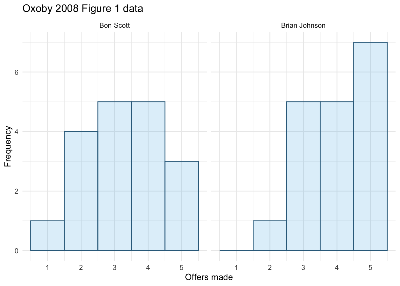
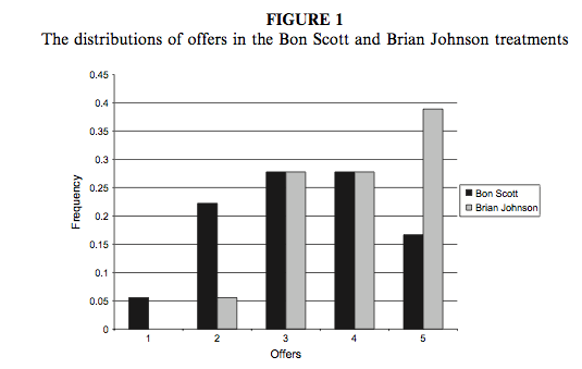
We can compare the resulting population pyramid above with Figure 1 from the original article (reproduced in Figure 4). Both graphs show that offers made were lower when participants heard the music of Bon Scott.
Seeing red
The data are from Johns et al. (2012).
Certain theories suggest that heterosexual males have evolved a predisposition towards the colour red because it is sexually salient. The theory also suggests that women use the colour red as a proxy signal for genital colour to indicate ovulation and sexual proceptivity. Decide for yourself how plausible this theory seems, but a hypothesis to test it is that using the colour red in this way ought to attract men (otherwise it’s a pointless strategy). In a novel study, Johns et al. (2012) tested this idea by manipulating the colour of four pictures of female genitalia to make them increasing shades of red (pale pink, light pink, dark pink, red) relative to the surrounding skin colour. Heterosexual males rated the resulting 16 pictures from 0 (unattractive) to 100 (attractive). The data are in the file
johns_2012.csv. Draw an error bar chart of the mean ratings for the four different colours. Do you think men preferred red genitals? (Remember, if the theory is correct then red should be rated highest.) (We analyse these data at the end of Chapter 16.)
Load the data using (see Tip 1):
johns_tib <- discovr::johns_2012The plot (Figure 5) can be made using the following code:
ggplot(johns_tib, aes(colour, attractiveness)) +
  stat_summary(fun.data = "mean_cl_normal", geom = "pointrange") +
  labs(x = "Colour of genetalia", y = "Attractiveness rating (0 to 100)") +
  coord_cartesian(ylim = c(0, 50)) +
  scale_y_continuous(breaks = seq(0, 50, 5)) +
  theme_minimal()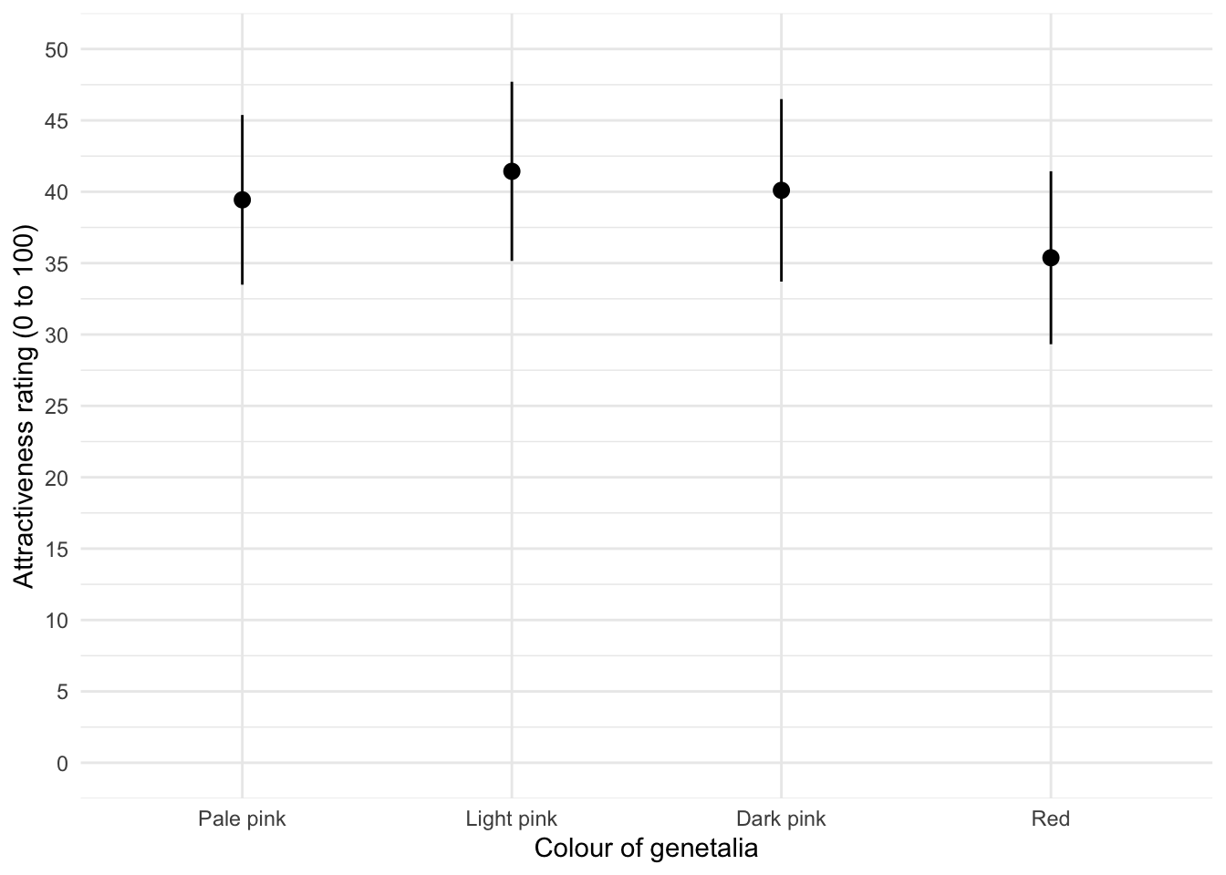
The mean ratings for all colours are fairly similar, suggesting that men don’t prefer the colour red. In fact, the colour red has the lowest mean rating, suggesting that men liked the red genitalia the least. The light pink genital colour had the highest mean rating, but don’t read anything into that: the means are all very similar.
Chapter 7
Why do you like your lecturers?
Data from Chamorro-Premuzic et al. (2008).
As students you probably have to rate your lecturers at the end of the course. There will be some lecturers you like and others you don’t. As a lecturer I find this process horribly depressing (although this has a lot to do with the fact that I tend to focus on negative feedback and ignore the good stuff). There is some evidence that students tend to pick courses of lecturers they perceive to be enthusastic and good communicators. In a fascinating study, Tomas Chamorro-Premuzic and his colleagues (Chamorro-Premuzic et al., 2008) tested the hypothesis that students tend to like lecturers who are like themselves. (This hypothesis will have the students on my course who like my lectures screaming in horror.)
The authors measured students’ own personalities using a very well established measure (the NEO-FFI) which measures five fundamental personality traits: neuroticism, extroversion, openness to experience, agreeableness and conscientiousness. Students also completed a questionnaire in which they were given descriptions (e.g., ‘warm: friendly, warm: sociable, cheerful, affectionate, outgoing’) and asked to rate how much they wanted to see this in a lecturer from −5 (I don’t want this characteristic in my lecturer at all) through 0 (the characteristic is not important) to +5 (I really want this characteristic in my lecturer). The characteristics were the same as those measured by the NEO-FFI.
As such, the authors had a measure of how much a student had each of the five core personality characteristics but also a measure of how much they wanted to see those same characteristics in their lecturer. Tomas and his colleagues could then test whether, for instance, extroverted students want extroverted lecturers. The data from this study are in the file
chamorro_premuzic.csv. Run Pearson correlations on these variables to see if students with certain personality characteristics want to see those characteristics in their lecturers. What conclusions can you draw
Load the data using (see Tip 1):
chamorro_tib <- discovr::chamorro_premuzicTo get the correlations use correlation() (note I have set p_adjust = "none" because they didn’t correct p-values for multiple tests in the paper). We’re interested only in the correlations between students’ personality and what they want in lecturers. We’re not interested in how their own five personality traits correlate with each other (i.e. if a student is neurotic are they conscientious too?). To focus in on these correlations we can use a trick not discussed in the book. In the book we saw that correlation() has a select argument that enables you to select the variables in the tibble that you want to include in the correlation matrix. By default the function computes that correlation between all pairs of those variables. So, if we specified:
chamorro_r <- chamorro_tib |>
  correlation(data = chamorro_tib,
              select = c("stu_neurotic", "stu_extro", "stu_open", "stu_agree", "stu_consc", "lec_neurotic", "lec_extro", "lec_open", "lec_agree", "lec_consc"))
We would get, for example, stu_neurotic correlated with all 9 other variables. However, only care about 5 of those (the ones with the variables that relate to lecturers and begin lec_). In total, we’d get 45 correlations but we only care about 25 of them (each of the 5 student variables correlated with each of the 5 lecturer variables). In fact, correlation() has an argument select2 that allows you to select a second list of variables. When both select and select2 arguments are used, rather than correlating every variable with every other variable, the variables in the one list are correlated with all of the variables in the other list but not with the variables within the same list. Therefore we’ll use the code below to generate Table 2. (Note that every variable beginning with stu_ is correlated with every variable beginning with lec_ but not with other variables beginning with stu_].
| Parameter1 | Parameter2 | r | 95% CI | t | df | p |
|---|---|---|---|---|---|---|
| stu_neurotic | lec_neurotic | 6.54e-03 | (-0.09, 0.10) | 0.13 | 411 | 0.895 |
| stu_neurotic | lec_extro | -0.08 | (-0.20, 0.04) | -1.36 | 279 | 0.176 |
| stu_neurotic | lec_open | -0.02 | (-0.11, 0.08) | -0.37 | 414 | 0.712 |
| stu_neurotic | lec_agree | 0.10 | (4.16e-03, 0.20) | 2.05 | 411 | 0.041* |
| stu_neurotic | lec_consc | 2.72e-03 | (-0.09, 0.10) | 0.06 | 411 | 0.956 |
| stu_extro | lec_neurotic | -0.10 | (-0.19, -2.31e-03) | -2.01 | 409 | 0.045* |
| stu_extro | lec_extro | 0.15 | (0.04, 0.27) | 2.59 | 279 | 0.010* |
| stu_extro | lec_open | 0.07 | (-0.03, 0.16) | 1.39 | 412 | 0.165 |
| stu_extro | lec_agree | 4.25e-03 | (-0.09, 0.10) | 0.09 | 409 | 0.932 |
| stu_extro | lec_consc | -9.73e-03 | (-0.11, 0.09) | -0.20 | 409 | 0.844 |
| stu_open | lec_neurotic | -0.10 | (-0.20, -4.35e-03) | -2.05 | 409 | 0.041* |
| stu_open | lec_extro | 0.04 | (-0.08, 0.16) | 0.68 | 279 | 0.499 |
| stu_open | lec_open | 0.20 | (0.11, 0.29) | 4.16 | 412 | < .001*** |
| stu_open | lec_agree | -0.16 | (-0.26, -0.07) | -3.34 | 409 | < .001*** |
| stu_open | lec_consc | -0.03 | (-0.13, 0.06) | -0.68 | 409 | 0.494 |
| stu_agree | lec_neurotic | -0.02 | (-0.12, 0.08) | -0.43 | 404 | 0.667 |
| stu_agree | lec_extro | 0.05 | (-0.07, 0.17) | 0.82 | 274 | 0.412 |
| stu_agree | lec_open | 0.11 | (9.52e-03, 0.20) | 2.16 | 406 | 0.031* |
| stu_agree | lec_agree | 0.16 | (0.07, 0.26) | 3.33 | 403 | < .001*** |
| stu_agree | lec_consc | 0.20 | (0.10, 0.29) | 4.05 | 403 | < .001*** |
| stu_consc | lec_neurotic | -0.14 | (-0.23, -0.04) | -2.85 | 407 | 0.005** |
| stu_consc | lec_extro | 0.10 | (-0.02, 0.22) | 1.70 | 278 | 0.090 |
| stu_consc | lec_open | 0.03 | (-0.07, 0.12) | 0.55 | 410 | 0.582 |
| stu_consc | lec_agree | 0.13 | (0.04, 0.23) | 2.70 | 407 | 0.007** |
| stu_consc | lec_consc | 0.22 | (0.12, 0.31) | 4.47 | 407 | < .001*** |
p-value adjustment method: none Observations: 276-416
These values replicate the values reported in the original research paper (part of the authors’ table is reproduced in Figure 6 so you can see how they reported these values – match these values to the values in your output). In fact, we can display our results in a similar for using summary() as in Table 3.
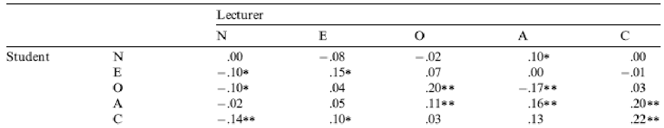
| Parameter | lec_neurotic | lec_extro | lec_open | lec_agree | lec_consc |
|---|---|---|---|---|---|
| stu_neurotic | 0.01 | -0.08 | -0.02 | 0.10* | 0.00 |
| stu_extro | -0.10* | 0.15* | 0.07 | 0.00 | -0.01 |
| stu_open | -0.10* | 0.04 | 0.20*** | -0.16*** | -0.03 |
| stu_agree | -0.02 | 0.05 | 0.11* | 0.16*** | 0.20*** |
| stu_consc | -0.14** | 0.10 | 0.03 | 0.13** | 0.22*** |
p-value adjustment method: none
As for what we can conclude, well, neurotic students tend to want agreeable lecturers, \(r = .10, p = .041\); extroverted students tend to want extroverted lecturers, $r = .15, p = .010 $; students who are open to experience tend to want lecturers who are open to experience, \(r = .20, p < .001\), and don’t want agreeable lecturers, \(r = -.16, p < .001\); agreeable students want every sort of lecturer apart from neurotic. Finally, conscientious students tend to want conscientious lecturers, \(r = .22, p < .001\), and extroverted ones, \(r = .10, p = .09\) (note that the authors report the one-tailed p-value), but don’t want neurotic ones, \(r = -.14, p = .005\).
Chapter 8
I want to be loved (on Facebook)
Data from Ong et al. (2011).
Social media websites such as Facebook offer an unusual opportunity to carefully manage your self-presentation to others (i.e., you can appear rad when in fact you write statistics books and wear 1980s heavy metal band T-shirts). Ong et al. (2011) examined the relationship between narcissism and behaviour on Facebook in 275 adolescents. They measured the age, sex and grade (at school), as well as extroversion and narcissism. They also measured how often (per week) these people updated their Facebook status (status), and also how they rated their own profile picture on each of four dimensions: coolness, glamour, fashionableness and attractiveness. These ratings were summed as an indicator of how positively they perceived the profile picture they had selected for their page (profile). Ong et al. hypothesized that narcissism would predict the frequency of status updates, and how positive a profile picture the person chose. To test this, they conducted two hierarchical regressions: one with status as the outcome and one with profile as the outcome. In both models they entered age, sex and grade in the first block, then added extroversion in a second block and finally narcissism in a third block. Using
ong_2011.csv, Labcoat Leni wants you to replicate the two hierarchical regressions and create a table of the results for each.
Load the data using (see Tip 1):
ong_tib <- discovr::ong_2011The first linear model predicts the frequency of status updates from the demographic variables:
status_base_lm <- lm(status ~ sex + age + grade, data = ong_tib, na.action = na.exclude)The second model adds extraversion:
status_ext_lm <- update(status_base_lm, .~. + extraversion)The final model adds narcissism:
status_ncs_lm <- update(status_ext_lm, .~. + narcissism)Table 4 compares the models. Adding extroversion, \(\chi^2\)(1) = 4.02, p = 0.045 and narcissim, \(\chi^2\)(1) = 8.98, p = 0.003, both significantly improve the fit of the model (i.e. they are significant predictors). So basically, Ong et al.’s prediction was supported in that after adjusting for age, grade and gender, narcissism significantly predicted the frequency of Facebook status updates over and above extroversion. Table 5 shows the model parameters. The positive standardized beta value (0.21) indicates a positive relationship between frequency of Facebook updates and narcissism, in that more narcissistic adolescents updated their Facebook status more frequently than their less narcissistic peers did. Compare these results to the results reported in Ong et al. (2011). The Table 2 from their paper is reproduced in Figure 7.
test_lrt(status_base_lm, status_ext_lm, status_ncs_lm) |>
display()| Name | Model | df | df_diff | Chi2 | p |
|---|---|---|---|---|---|
| status_base_lm | lm | 6 | |||
| status_ext_lm | lm | 7 | 1 | 4.02 | 0.045 |
| status_ncs_lm | lm | 8 | 1 | 8.98 | 0.003 |
model_parameters(model = status_ncs_lm, standardize = "refit") |>
display()| Parameter | Coefficient | SE | 95% CI | t(244) | p |
|---|---|---|---|---|---|
| (Intercept) | 0.38 | 0.21 | (-0.03, 0.80) | 1.80 | 0.072 |
| sex (Male) | -0.38 | 0.13 | (-0.64, -0.12) | -2.83 | 0.005 |
| age | -3.35e-03 | 0.13 | (-0.25, 0.24) | -0.03 | 0.979 |
| grade (Sec 2) | -0.17 | 0.21 | (-0.58, 0.25) | -0.80 | 0.422 |
| grade (Sec 3) | -0.42 | 0.31 | (-1.02, 0.19) | -1.36 | 0.175 |
| extraversion | 0.03 | 0.07 | (-0.11, 0.16) | 0.37 | 0.714 |
| narcissism | 0.21 | 0.07 | (0.07, 0.35) | 3.00 | 0.003 |
OK, now let’s fit more models to investigate whether narcissism predicts, above and beyond the other variables, the Facebook profile picture ratings. We use the same code as before but change the outcome from status to profile:
Table 6 compares the models. Adding extroversion, \(\chi^2\)(1) = 29.61, p < 0.001 and narcissim, \(\chi^2\)(1) = 21.60, p < 0.001, both significantly improve the fit of the model (i.e. they are significant predictors). So basically, Ong et al.’s prediction was supported in that after adjusting for age, grade and gender, narcissism significantly predicted the Facebook profile picture ratings over and above extroversion. The positive beta value (0.37) indicates a positive relationship between profile picture ratings and narcissism, in that more narcissistic adolescents rated their Facebook profile pictures more positively than their less narcissistic peers did. Compare these results to the results reported in Table 2 of Ong et al. (2011) reproduced in Figure 7.
test_lrt(prof_base_lm, prof_ext_lm, prof_ncs_lm) |>
display()| Name | Model | df | df_diff | Chi2 | p |
|---|---|---|---|---|---|
| prof_base_lm | lm | 6 | |||
| prof_ext_lm | lm | 7 | 1 | 29.61 | < .001 |
| prof_ncs_lm | lm | 8 | 1 | 21.60 | < .001 |
model_parameters(model = prof_ncs_lm, standardize = "refit") |>
display()| Parameter | Coefficient | SE | 95% CI | t(186) | p |
|---|---|---|---|---|---|
| (Intercept) | 0.05 | 0.21 | (-0.36, 0.47) | 0.26 | 0.798 |
| sex (Male) | 0.16 | 0.15 | (-0.13, 0.45) | 1.10 | 0.271 |
| age | 0.10 | 0.12 | (-0.14, 0.34) | 0.80 | 0.424 |
| grade (Sec 2) | -0.13 | 0.22 | (-0.57, 0.30) | -0.60 | 0.551 |
| grade (Sec 3) | -0.16 | 0.30 | (-0.75, 0.44) | -0.51 | 0.607 |
| extraversion | 0.17 | 0.08 | (0.02, 0.32) | 2.20 | 0.029 |
| narcissism | 0.37 | 0.08 | (0.21, 0.52) | 4.65 | < .001 |

Why do you like your lecturers?
Data from Chamorro-Premuzic et al. (2008).
In the previous chapter we encountered a study by Chamorro-Premuzic et al. that linked students’ personality traits with those they want to see in lecturers (see Labcoat Leni’s Real Research 7.1 for a full description). In that chapter we correlated these scores, but now Labcoat Leni wants you to carry out five multiple regression analyses: the outcome variables across the five models are the ratings of how much students want to see neuroticism, extroversion, openness to experience, agreeableness and conscientiousness. For each of these outcomes, force age and gender into the analysis in the first step of the hierarchy, then in the second block force in the five student personality traits (neuroticism, extroversion, openness to experience, agreeableness and conscientiousness). For each analysis create a table of the results. View the solutions at www.discovr.rocks (or look at Table 4 in the original article). The data are in the file
chamorro_premuzic.csv.
Load the data using (see Tip 1):
chamorro_tib <- discovr::chamorro_premuzicLecturer neuroticism
All of the models follow a similar pattern:
- We fit a baseline model predicting the degree to which students want lecturers to be a trait (in this example neurotic) from
ageandsex - We fit a second model that adds all of the student personality variables (five variables in all)
- Compare the models using
compare_performance()to see whether adding the personality variables improves fit - Interpret the parameter estimates of the second model
We fit the models and compare their fit using the code below. Table 8 shows that adding the personality variables increases the variance explained from 3.1% to 6.4%. Table 8 shows that age, \(\hat{b}\) = 0.30 (0.05, 0.55), t(365) = 2.35, p = 0.019, openness, \(\hat{b}\) = -0.17 (-0.32, -0.03), t(365) = -2.39, p = 0.017, and conscientiousness, \(\hat{b}\) = -0.20 (-0.36, -0.04), t(365) = -2.48, p = 0.013, were significant predictors of wanting a neurotic lecturer. Note that for openness and conscientiousness the relationship is negative; that is, the higher a student scored on these characteristics, the less they wanted a neurotic lecturer.
# Fit the baseline model
neuro_base_lm <- lm(lec_neurotic ~ age + sex,
               data = chamorro_tib,
               na.action = na.exclude)
# Add personality variables
neuro_full_lm <- lm(lec_neurotic ~ age + sex + stu_neurotic + stu_extro + stu_open + stu_agree + stu_consc,
                    data = chamorro_tib,
                    na.action = na.exclude)

compare_performance(neuro_base_lm, neuro_full_lm) |>
  display()
Warning in w * res^2: longer object length is not a multiple of shorter object
lengthWarning in log(w) - (log(2 * pi) + log(s2) + (w * res^2)/s2): longer object
length is not a multiple of shorter object lengthWarning in w * res^2: longer object length is not a multiple of shorter object
lengthWarning in log(w) - (log(2 * pi) + log(s2) + (w * res^2)/s2): longer object
length is not a multiple of shorter object lengthWarning in w * res^2: longer object length is not a multiple of shorter object
lengthWarning in log(w) - (log(2 * pi) + log(s2) + (w * res^2)/s2): longer object
length is not a multiple of shorter object lengthWarning in w * res^2: longer object length is not a multiple of shorter object
lengthWarning in log(w) - (log(2 * pi) + log(s2) + (w * res^2)/s2): longer object
length is not a multiple of shorter object lengthWarning in w * res^2: longer object length is not a multiple of shorter object
lengthWarning in log(w) - (log(2 * pi) + log(s2) + (w * res^2)/s2): longer object
length is not a multiple of shorter object lengthWarning in w * res^2: longer object length is not a multiple of shorter object
lengthWarning in log(w) - (log(2 * pi) + log(s2) + (w * res^2)/s2): longer object
length is not a multiple of shorter object lengthWhen comparing models, please note that probably not all models were fit
from same data.| Name | Model | R2 | R2 (adj.) | RMSE | Sigma |
|---|---|---|---|---|---|
| neuro_base_lm | lm | 0.03 | 0.03 | 9.04 | 9.08 |
| neuro_full_lm | lm | 0.06 | 0.05 | 8.58 | 8.67 |
model_parameters(neuro_full_lm) |>
display()| Parameter | Coefficient | SE | 95% CI | t(365) | p |
|---|---|---|---|---|---|
| (Intercept) | -16.77 | 5.30 | (-27.19, -6.36) | -3.17 | 0.002 |
| age | 0.30 | 0.13 | (0.05, 0.55) | 2.35 | 0.019 |
| sex (Male) | 1.90 | 1.08 | (-0.23, 4.04) | 1.75 | 0.080 |
| stu neurotic | -0.06 | 0.06 | (-0.18, 0.06) | -1.02 | 0.307 |
| stu extro | -0.11 | 0.08 | (-0.26, 0.04) | -1.43 | 0.154 |
| stu open | -0.17 | 0.07 | (-0.32, -0.03) | -2.39 | 0.017 |
| stu agree | 0.09 | 0.07 | (-0.05, 0.23) | 1.22 | 0.224 |
| stu consc | -0.20 | 0.08 | (-0.36, -0.04) | -2.48 | 0.013 |
Lecturer extroversion
The second variable we want to predict is lecturer extroversion. You can follow the steps of the first example but with the outcome variable of lec_extro.
We fit the models and compare their fit using the code below. Table 10 shows that adding the personality variables increases the variance explained from 0.4% to 4.6%. Table 10 shows that only extroversion, \(\hat{b}\) = 0.16 (0.03, 0.29), t(264) = 2.34, p = 0.020, was a significant predictor of wanting a extroverted lecturer. The higher a student scored on extroversion, the more they wanted an extroverted lecturer.
# Fit the baseline model
extro_base_lm <- lm(lec_extro ~ age + sex,
               data = chamorro_tib,
               na.action = na.exclude)
# Add personality variables
extro_full_lm <- lm(lec_extro ~ age + sex + stu_neurotic + stu_extro + stu_open + stu_agree + stu_consc,
                    data = chamorro_tib,
                    na.action = na.exclude)

compare_performance(extro_base_lm, extro_full_lm) |>
  display()
Warning in w * res^2: longer object length is not a multiple of shorter object
lengthWarning in log(w) - (log(2 * pi) + log(s2) + (w * res^2)/s2): longer object
length is not a multiple of shorter object lengthWarning in w * res^2: longer object length is not a multiple of shorter object
lengthWarning in log(w) - (log(2 * pi) + log(s2) + (w * res^2)/s2): longer object
length is not a multiple of shorter object lengthWarning in w * res^2: longer object length is not a multiple of shorter object
lengthWarning in log(w) - (log(2 * pi) + log(s2) + (w * res^2)/s2): longer object
length is not a multiple of shorter object lengthWarning in w * res^2: longer object length is not a multiple of shorter object
lengthWarning in log(w) - (log(2 * pi) + log(s2) + (w * res^2)/s2): longer object
length is not a multiple of shorter object lengthWarning in w * res^2: longer object length is not a multiple of shorter object
lengthWarning in log(w) - (log(2 * pi) + log(s2) + (w * res^2)/s2): longer object
length is not a multiple of shorter object lengthWarning in w * res^2: longer object length is not a multiple of shorter object
lengthWarning in log(w) - (log(2 * pi) + log(s2) + (w * res^2)/s2): longer object
length is not a multiple of shorter object lengthWhen comparing models, please note that probably not all models were fit
from same data.| Name | Model | R2 | R2 (adj.) | RMSE | Sigma |
|---|---|---|---|---|---|
| extro_base_lm | lm | 3.80e-03 | -3.34e-03 | 6.91 | 6.95 |
| extro_full_lm | lm | 0.05 | 0.02 | 6.70 | 6.80 |
model_parameters(extro_full_lm) |>
display()| Parameter | Coefficient | SE | 95% CI | t(264) | p |
|---|---|---|---|---|---|
| (Intercept) | 2.03 | 4.77 | (-7.37, 11.43) | 0.43 | 0.670 |
| age | 5.46e-03 | 0.11 | (-0.21, 0.22) | 0.05 | 0.960 |
| sex (Male) | 1.58 | 1.01 | (-0.41, 3.57) | 1.56 | 0.119 |
| stu neurotic | 0.02 | 0.06 | (-0.10, 0.13) | 0.30 | 0.761 |
| stu extro | 0.16 | 0.07 | (0.03, 0.29) | 2.34 | 0.020 |
| stu open | 0.05 | 0.07 | (-0.09, 0.18) | 0.66 | 0.507 |
| stu agree | 0.01 | 0.06 | (-0.11, 0.14) | 0.20 | 0.840 |
| stu consc | 0.11 | 0.08 | (-0.04, 0.26) | 1.46 | 0.145 |
Lecturer openness to experience
You can follow the steps of the first example but using lec_open as the outcome.
We fit the models and compare their fit using the code below. Table 12 shows that adding the personality variables increases the variance explained from 0.0% to 6.4%. Table 12 shows that openness to experience, \(\hat{b}\) = 0.28 (0.15, 0.41), t(367) = 4.24, p < 0.001, and agreeableness \(\hat{b}\) = 0.15 (0.02, 0.27), t(367) = 2.23, p = 0.026, were significant predictors of wanting a lecturer who was open to experience. The higher a student scored on these traits, the more they wanted a lecturer open to experience.
# Fit the baseline model
open_base_lm <- lm(lec_open ~ age + sex,
               data = chamorro_tib,
               na.action = na.exclude)
# Add personality variables
open_full_lm <- lm(lec_open ~ age + sex + stu_neurotic + stu_extro + stu_open + stu_agree + stu_consc,
                    data = chamorro_tib,
                    na.action = na.exclude)

compare_performance(open_base_lm, open_full_lm) |>
  display()
Warning in w * res^2: longer object length is not a multiple of shorter object
lengthWarning in log(w) - (log(2 * pi) + log(s2) + (w * res^2)/s2): longer object
length is not a multiple of shorter object lengthWarning in w * res^2: longer object length is not a multiple of shorter object
lengthWarning in log(w) - (log(2 * pi) + log(s2) + (w * res^2)/s2): longer object
length is not a multiple of shorter object lengthWarning in w * res^2: longer object length is not a multiple of shorter object
lengthWarning in log(w) - (log(2 * pi) + log(s2) + (w * res^2)/s2): longer object
length is not a multiple of shorter object lengthWarning in w * res^2: longer object length is not a multiple of shorter object
lengthWarning in log(w) - (log(2 * pi) + log(s2) + (w * res^2)/s2): longer object
length is not a multiple of shorter object lengthWarning in w * res^2: longer object length is not a multiple of shorter object
lengthWarning in log(w) - (log(2 * pi) + log(s2) + (w * res^2)/s2): longer object
length is not a multiple of shorter object lengthWarning in w * res^2: longer object length is not a multiple of shorter object
lengthWarning in log(w) - (log(2 * pi) + log(s2) + (w * res^2)/s2): longer object
length is not a multiple of shorter object lengthWhen comparing models, please note that probably not all models were fit
from same data.| Name | Model | R2 | R2 (adj.) | RMSE | Sigma |
|---|---|---|---|---|---|
| open_base_lm | lm | 2.38e-04 | -4.81e-03 | 8.08 | 8.11 |
| open_full_lm | lm | 0.06 | 0.05 | 7.84 | 7.92 |
model_parameters(open_full_lm) |>
display()| Parameter | Coefficient | SE | 95% CI | t(367) | p |
|---|---|---|---|---|---|
| (Intercept) | -5.51 | 4.83 | (-15.01, 3.99) | -1.14 | 0.255 |
| age | -0.04 | 0.12 | (-0.27, 0.18) | -0.37 | 0.712 |
| sex (Male) | -0.22 | 0.99 | (-2.17, 1.73) | -0.22 | 0.824 |
| stu neurotic | 6.17e-03 | 0.05 | (-0.10, 0.11) | 0.12 | 0.908 |
| stu extro | 0.07 | 0.07 | (-0.07, 0.20) | 0.94 | 0.345 |
| stu open | 0.28 | 0.07 | (0.15, 0.41) | 4.24 | < .001 |
| stu agree | 0.15 | 0.07 | (0.02, 0.27) | 2.23 | 0.026 |
| stu consc | -0.06 | 0.07 | (-0.21, 0.09) | -0.81 | 0.417 |
Lecturer agreeableness
The fourth variable we want to predict is lecturer agreeableness. You can follow the steps of the first example but using lec_agree as the outcome.
We fit the models and compare their fit using the code below. Table 14 shows that adding the personality variables increases the variance explained from 3.0% to 10.3%. Table 14 shows that age, \(\hat{b}\) = -0.48 (-0.74, -0.21), t(364) = -3.52, p < 0.001, neuroticism, \(\hat{b}\) = 0.17 (0.05, 0.29), t(364) = 2.74, p = 0.006, openness to experience, \(\hat{b}\) = -0.21 (-0.37, -0.06), t(364) = -2.79, p = 0.006, and agreeableness \(\hat{b}\) = 0.17 (0.02, 0.32), t(364) = 2.25, p = 0.025, were significant predictors of wanting a lecturer who was agreeable. Age and openness to experience had negative estimates suggesting that the older and more open to experienced you are, the less you want an agreeable lecturer, whereas students with higher neuroticism and agreeableness had more desire for an agreeable lecturer (not surprisingly, because neurotics will lack confidence and probably feel more able to ask an agreeable lecturer questions).
# Fit the baseline model
agree_base_lm <- lm(lec_agree ~ age + sex,
               data = chamorro_tib,
               na.action = na.exclude)
# Add personality variables
agree_full_lm <- lm(lec_agree ~ age + sex + stu_neurotic + stu_extro + stu_open + stu_agree + stu_consc,
                    data = chamorro_tib,
                    na.action = na.exclude)

compare_performance(agree_base_lm, agree_full_lm) |>
  display()
Warning in w * res^2: longer object length is not a multiple of shorter object
lengthWarning in log(w) - (log(2 * pi) + log(s2) + (w * res^2)/s2): longer object
length is not a multiple of shorter object lengthWarning in w * res^2: longer object length is not a multiple of shorter object
lengthWarning in log(w) - (log(2 * pi) + log(s2) + (w * res^2)/s2): longer object
length is not a multiple of shorter object lengthWarning in w * res^2: longer object length is not a multiple of shorter object
lengthWarning in log(w) - (log(2 * pi) + log(s2) + (w * res^2)/s2): longer object
length is not a multiple of shorter object lengthWarning in w * res^2: longer object length is not a multiple of shorter object
lengthWarning in log(w) - (log(2 * pi) + log(s2) + (w * res^2)/s2): longer object
length is not a multiple of shorter object lengthWarning in w * res^2: longer object length is not a multiple of shorter object
lengthWarning in log(w) - (log(2 * pi) + log(s2) + (w * res^2)/s2): longer object
length is not a multiple of shorter object lengthWarning in w * res^2: longer object length is not a multiple of shorter object
lengthWarning in log(w) - (log(2 * pi) + log(s2) + (w * res^2)/s2): longer object
length is not a multiple of shorter object lengthWhen comparing models, please note that probably not all models were fit
from same data.| Name | Model | R2 | R2 (adj.) | RMSE | Sigma |
|---|---|---|---|---|---|
| agree_base_lm | lm | 0.03 | 0.02 | 9.46 | 9.49 |
| agree_full_lm | lm | 0.10 | 0.09 | 9.08 | 9.18 |
model_parameters(agree_full_lm) |>
display()| Parameter | Coefficient | SE | 95% CI | t(364) | p |
|---|---|---|---|---|---|
| (Intercept) | 7.04 | 5.61 | (-4.00, 18.07) | 1.25 | 0.211 |
| age | -0.48 | 0.14 | (-0.74, -0.21) | -3.52 | < .001 |
| sex (Male) | 1.00 | 1.15 | (-1.27, 3.27) | 0.87 | 0.386 |
| stu neurotic | 0.17 | 0.06 | (0.05, 0.29) | 2.74 | 0.006 |
| stu extro | 0.06 | 0.08 | (-0.09, 0.22) | 0.81 | 0.421 |
| stu open | -0.21 | 0.08 | (-0.37, -0.06) | -2.79 | 0.006 |
| stu agree | 0.17 | 0.08 | (0.02, 0.32) | 2.25 | 0.025 |
| stu consc | 0.10 | 0.09 | (-0.07, 0.27) | 1.16 | 0.246 |
Lecturer conscientiousness
The final variable we want to predict is lecturer conscientiousness. You can follow the steps of the first example but replacing the outcome variable with lec_consc.
We fit the models and compare their fit using the code below. Table 16 shows that adding the personality variables increases the variance explained from 2.9% to 7.4%. Table 16 shows that agreeableness \(\hat{b}\) = 0.15 (0.03, 0.26), t(364) = 2.44, p = 0.015 and conscientiousness \(\hat{b}\) = 0.14 (0.00, 0.27), t(364) = 2.02, p = 0.044 were significant predictors of wanting a lecturer who was conscientious. Students higher on these traits have a greater desire for a conscientious lecturer.
# Fit the baseline model
consc_base_lm <- lm(lec_consc ~ age + sex,
               data = chamorro_tib,
               na.action = na.exclude)
# Add personality variables
consc_full_lm <- lm(lec_consc ~ age + sex + stu_neurotic + stu_extro + stu_open + stu_agree + stu_consc,
                    data = chamorro_tib,
                    na.action = na.exclude)

compare_performance(consc_base_lm, consc_full_lm) |>
  display()
Warning in w * res^2: longer object length is not a multiple of shorter object
lengthWarning in log(w) - (log(2 * pi) + log(s2) + (w * res^2)/s2): longer object
length is not a multiple of shorter object lengthWarning in w * res^2: longer object length is not a multiple of shorter object
lengthWarning in log(w) - (log(2 * pi) + log(s2) + (w * res^2)/s2): longer object
length is not a multiple of shorter object lengthWarning in w * res^2: longer object length is not a multiple of shorter object
lengthWarning in log(w) - (log(2 * pi) + log(s2) + (w * res^2)/s2): longer object
length is not a multiple of shorter object lengthWarning in w * res^2: longer object length is not a multiple of shorter object
lengthWarning in log(w) - (log(2 * pi) + log(s2) + (w * res^2)/s2): longer object
length is not a multiple of shorter object lengthWarning in w * res^2: longer object length is not a multiple of shorter object
lengthWarning in log(w) - (log(2 * pi) + log(s2) + (w * res^2)/s2): longer object
length is not a multiple of shorter object lengthWarning in w * res^2: longer object length is not a multiple of shorter object
lengthWarning in log(w) - (log(2 * pi) + log(s2) + (w * res^2)/s2): longer object
length is not a multiple of shorter object lengthWhen comparing models, please note that probably not all models were fit
from same data.| Name | Model | R2 | R2 (adj.) | RMSE | Sigma |
|---|---|---|---|---|---|
| consc_base_lm | lm | 0.03 | 0.02 | 7.52 | 7.54 |
| consc_full_lm | lm | 0.07 | 0.06 | 7.18 | 7.26 |
model_parameters(consc_full_lm) |>
display()| Parameter | Coefficient | SE | 95% CI | t(364) | p |
|---|---|---|---|---|---|
| (Intercept) | 6.36 | 4.43 | (-2.36, 15.07) | 1.43 | 0.152 |
| age | 0.10 | 0.11 | (-0.11, 0.31) | 0.90 | 0.368 |
| sex (Male) | -1.56 | 0.91 | (-3.36, 0.24) | -1.71 | 0.089 |
| stu neurotic | 0.01 | 0.05 | (-0.09, 0.11) | 0.21 | 0.832 |
| stu extro | -0.07 | 0.06 | (-0.19, 0.06) | -1.08 | 0.283 |
| stu open | -0.01 | 0.06 | (-0.13, 0.11) | -0.18 | 0.858 |
| stu agree | 0.15 | 0.06 | (0.03, 0.26) | 2.44 | 0.015 |
| stu consc | 0.14 | 0.07 | (3.55e-03, 0.27) | 2.02 | 0.044 |
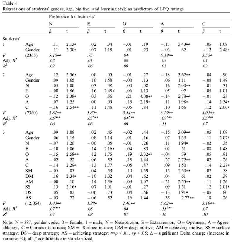
Compare all of your results to Table 4 in the actual article (reproduced in Figure 8) - our five analyses are represented by the columns labelled N, E, O, A and C).
Chapter 9
Bladder control
Data from Tuk et al. (2011).
Visceral factors that require us to engage in self control (such as a filling bladder) can affect our inhibtory abilities in unrelated domains. In a fascinating study by Tuk et al. (2011), participants were given five cups of water: one group was asked to drink them all, whereas another was asked to take a sip from each. This manipulation led one group to have full bladders and the other group to have relatively empty ones (
urgency). Later on, these participants were given eight trials in which they had to choose between a small financial reward that they would receive soon (SS) and a large financial reward for which they would wait longer (LL). They counted the number of trials in which participants chose the LL reward as an indicator of inhibitory control (ll_sum). Do a t-test to see whether people with full bladders were inhibited more than those without (tuk_2011.csv).
Load the data using (see Tip 1):
tuk_tib <- discovr::tuk_2011Let’s get the summary statistics in Table 18 and the plot in Figure 9. The results of the t-test itself are in Table 19. Note that I have used es_type to estimate Cohen’s \(d\).
| urgency | Variable | Mean | SD | IQR | Range | Skewness | Kurtosis | n | n_Missing |
|---|---|---|---|---|---|---|---|---|---|
| High urgency (drink everything) | ll_sum | 4.50 | 1.59 | 3.00 | (2.00, 7.00) | 0.19 | -1.15 | 50 | 0 |
| Low urgency (take sips from the water) | ll_sum | 3.83 | 1.49 | 1.75 | (0.00, 7.00) | 0.57 | 0.57 | 52 | 0 |
ggplot(tuk_tib, aes(x = urgency, y = ll_sum)) +
  geom_violin(colour = "#C4F134FF", fill = "#C4F134FF", alpha = 0.5) +
  stat_summary(fun.data = "mean_cl_normal") +
  labs(x = "Urgency condition", y = "Number of long term rewards") +
  theme_minimal()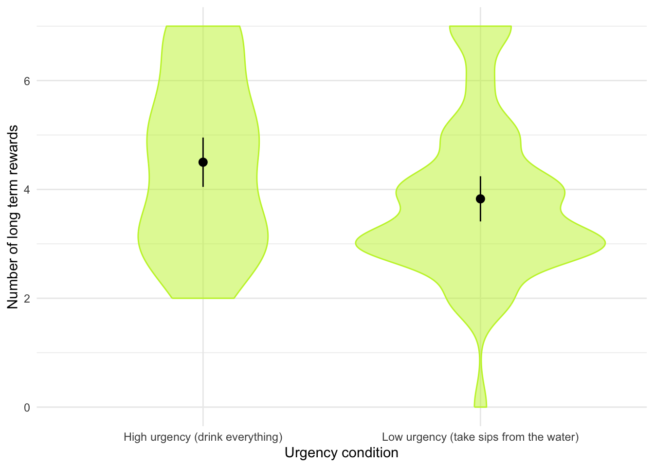
Warning: Unable to retrieve data from htest object.
Returning an approximate effect size using t_to_d().| Parameter | Group | Mean_Group1 | Mean_Group2 | Difference | 95% CI | d | d 95% CI | t(98.89) | p |
|---|---|---|---|---|---|---|---|---|---|
| ll_sum | urgency | 4.50 | 3.83 | 0.67 | (0.07, 1.28) | 0.44 | (0.04, 0.84) | 2.20 | 0.030 |
Alternative hypothesis: true difference in means between group High urgency (drink everything) and group Low urgency (take sips from the water) is not equal to 0
The beautiful people
Data from Gelman & Weakliem (2009).
Apparently there are more beautiful women in the world than there are handsome men. Satoshi Kanazawa explains this finding in terms of good-looking parents being more likely to have a baby daughter as their first child than a baby son. Perhaps more controversially, he suggests that, from an evolutionarily perspective, beauty is a more valuable trait for women than for men (Kanazawa, 2007). In a playful and very informative paper, Andrew Gelman and David Weakliem discuss various statistical errors and misunderstandings, some of which have implications for Kanazawa’s claims. The ‘playful’ part of the paper is that to illustrate their point they collected data on the 50 most beautiful celebrities (as listed by People magazine) of 1995–2000. They counted how many male and female children they had as of 2007. If Kanazawa is correct, these beautiful people would have produced more girls than boys. Do a t-test to find out whether they did. The data are in
gelman_2009.csv.
We need to run a paired samples t-test on these data because the researchers recorded the number of daughters and sons for each participant (repeated-measures design).
Load the data using (see Tip 1). We also need to convert it to messy format. The restructured data is in Table 20, note that we have two new variables sons and daughters containing the number of sons and daughters respectively.
# Load data
gelman_tib <- discovr::gelman_2009

# Convert to messy
gelman_mess <- gelman_tib |>
  pivot_wider(
    id_cols = person,
    names_from = child,
    values_from = number
  )

# Display using datatable

DT::datatable(gelman_mess)Let’s get the summary statistics in Table 21 and the plot in Figure 10. The results of the t-test itself are in Table 22 and the effect size is shown in Table 23.
| child | Variable | Mean | SD | IQR | Range | Skewness | Kurtosis | n | n_Missing |
|---|---|---|---|---|---|---|---|---|---|
| daughters | number | 0.62 | 0.90 | 1 | (0.00, 7.00) | 2.78 | 13.83 | 254 | 20 |
| sons | number | 0.68 | 0.90 | 1 | (0.00, 4.00) | 1.24 | 0.78 | 254 | 20 |
ggplot(gelman_tib, aes(x = child, y = number)) +
  geom_violin(colour = "#C4F134FF", fill = "#C4F134FF", alpha = 0.5) +
  stat_summary(fun.data = "mean_cl_normal") +
  labs(x = "Gender of child", y = "Number produced") +
  theme_minimal()
Warning: Removed 40 rows containing non-finite outside the scale range
(`stat_ydensity()`).Warning: Removed 40 rows containing non-finite outside the scale range
(`stat_summary()`).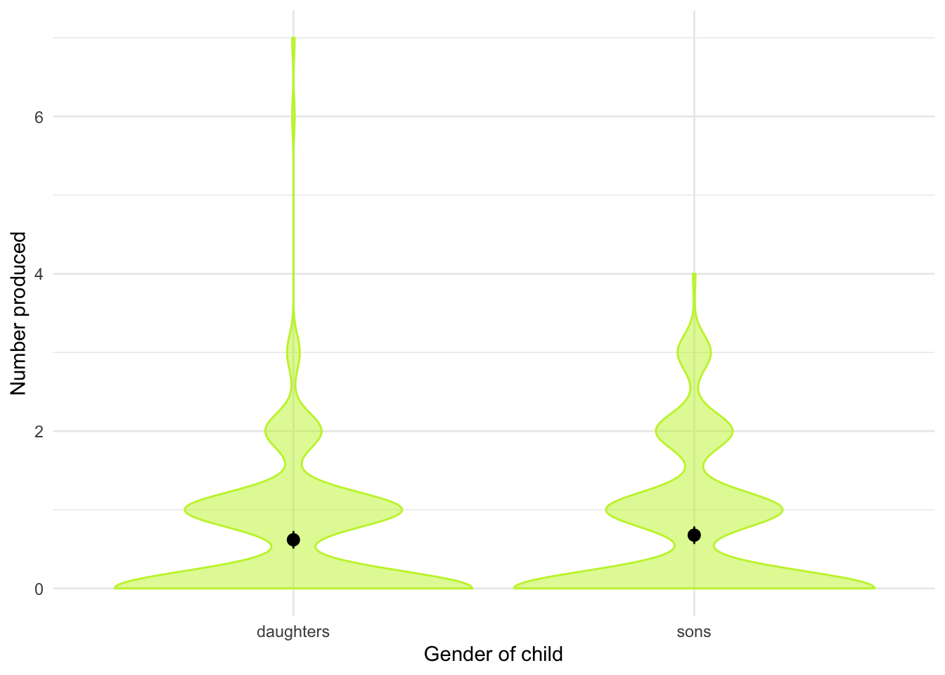
| Parameter | Difference | t(253) | p | 95% CI |
|---|---|---|---|---|
| Pair(sons, daughters) | 0.06 | 0.81 | 0.420 | (-0.09, 0.20) |
Alternative hypothesis: true mean difference is not equal to 0
Chapter 10
I heard that Jane has a boil and kissed a tramp
Data from Massar et al. (2012).
Everyone likes a good gossip from time to time, but apparently it has an evolutionary function. One school of thought is that gossip is used as a way to derogate sexual competitors – especially by questioning their appearance and sexual behaviour. For example, if you’ve got your eyes on a guy, but he has his eyes on Jane, then a good strategy is to spread gossip that Jane has something unappealing about her or kissed someone unpopular. Apparently men rate gossiped-about women as less attractive, and they are more influenced by the gossip if it came from a woman with a high mate value (i.e., attractive and sexually desirable). Karlijn Massar and her colleagues hypothesized that if this theory is true, then (1) younger women will gossip more because there is more mate competation at younger ages and (2) this relationship will be mediated by the mate value of the person (because for those with high mate value, gossiping for the purpose of sexual competition will be more effective). Eighty-three women aged from 20 to 50 (
age) completed questionnaire measures of their tendency to gossip (gossip) and their sexual desirability (mate_value). Test Massar et al.’s mediation model using Baron and Kenny’s method (as they did) but also using PROCESS to estimate the indirect effect (massar_2012.csv). View the solutions at www.discovr.rocks (or look at Figure 1 in the original article, which shows the parameters for the various regressions).
Load the data using (see Tip 1):
massar_tib <- discovr::massar_2012Solution using Baron and Kenny’s method
Baron and Kenny suggested that mediation is tested through three linear models:
- A linear model predicting the outcome (
gossip) from the predictor variable (age). - A linear model predicting the mediator (
mate_value) from the predictor variable (age). - A linear model predicting the outcome (
gossip) from both the predictor variable (age) and the mediator (mate_value).
These models test the four conditions of mediation: (1) the predictor variable (age) must significantly predict the outcome variable (gossip) in model 1; (2) the predictor variable (age) must significantly predict the mediator (mate_value) in model 2; (3) the mediator (mate_value) must significantly predict the outcome (gossip) variable in model 3; and (4) the predictor variable (age) must predict the outcome variable (gossip) less strongly in model 3 than in model 1.
The paper reports standardized betas so I’ve used the standardize = "refit" within model_parameters() to get these coefficients.
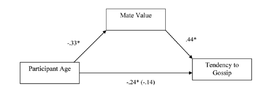
Model 1 (Table 24) indicates that the first condition of mediation was met, in that participant age was a significant predictor of the tendency to gossip, \(\hat{\beta}\) = -0.28 (-0.49, -0.06), t(8) = -2.59, p = 0.011. The parameter estimate approximately matches the value of -0.24 for the path between age and gossip in Figure 11.
Model 2 (Table 25) shows that the second condition of mediation was met: participant age was a significant predictor of mate value, \(\hat{\beta}\) = -0.38 (-0.59, -0.17), t(79) = -3.67, p < 0.001. The parameter estimate approximately matches the value of -0.33 for the path between age and gossip in Figure 11.
Model 3 (Table 26) shows that the third condition of mediation has been met: mate value significantly predicted the tendency to gossip while adjusting for participant age, \(\hat{\beta}\) = 0.39 (0.17, 0.61), t(78) = 3.59, p < 0.001. The parameter estimate approximately matches the value of 0.44 for the path between mate value and gossip in Figure 11.
The fourth condition of mediation has also been met: the parameter estimate between participant age and tendency to gossip decreased substantially when adjusting for mate value, in fact it is no longer significant, \(\hat{\beta}\) = -0.14 (-0.35, 0.08), t(78) = -1.28, p = 0.206. The parameter estimate matches the value (in parenthesis) of -0.14 for the path between age and gossip in Figure 11.
If you buy into the Baron and Kenny method, the author’s prediction is supported, and the relationship between participant age and tendency to gossip is mediated by mate value. However, these days, we’d fit all paths simultaneously, which brings us to the next part of the task.
| Parameter | Coefficient | SE | 95% CI | t(80) | p |
|---|---|---|---|---|---|
| (Intercept) | -2.39e-17 | 0.11 | (-0.21, 0.21) | -2.24e-16 | > .999 |
| age | -0.28 | 0.11 | (-0.49, -0.06) | -2.59 | 0.011 |
| Parameter | Coefficient | SE | 95% CI | t(79) | p |
|---|---|---|---|---|---|
| (Intercept) | 2.47e-16 | 0.10 | (-0.21, 0.21) | 2.39e-15 | > .999 |
| age | -0.38 | 0.10 | (-0.59, -0.17) | -3.67 | < .001 |
| Parameter | Coefficient | SE | 95% CI | t(78) | p |
|---|---|---|---|---|---|
| (Intercept) | -1.49e-16 | 0.10 | (-0.20, 0.20) | -1.49e-15 | > .999 |
| age | -0.14 | 0.11 | (-0.35, 0.08) | -1.28 | 0.206 |
| mate value | 0.39 | 0.11 | (0.17, 0.61) | 3.59 | < .001 |
Solution using lavaan
Table 27 shows that age significantly predicts mate value, \(\hat{b}\) = -0.03 (-0.04, -0.01), z = -3.64, p < 0.001. We can see that while age does not significantly predict tendency to gossip with mate value in the model, \(\hat{b}\) = -0.01 (-0.03, 0.00), z = -1.36, p = 0.174, mate value does significantly predict tendency to gossip, \(\hat{b}\) = 0.45 (0.18, 0.72), z = 3.26, p = 0.001. The negative b for age tells us that as age increases, tendency to gossip declines (and vice versa), but the positive b for mate value indicates that as mate value increases, tendency to gossip increases also. These relationships are in the predicted direction.
The total effect shows that when mate value is not in the model, age significantly predicts tendency to gossip, \(\hat{b}\) = -0.02 (-0.04, -0.01), z = -2.89, p = 0.004. Finally, the indirect effect of age on gossip is significant, \(\hat{b}\) = -0.01 (-0.02, -0.00), z = -2.21, p = 0.027. Put another way, mate value is a significant mediator of the relationship between age and tendency to gossip.
| Link | Coefficient | SE | 95% CI | z | p |
|---|---|---|---|---|---|
| gossip ~ age (c) | -0.01 | 7.66e-03 | (-0.03, 4.60e-03) | -1.36 | 0.174 |
| gossip ~ mate_value (b) | 0.45 | 0.14 | (0.18, 0.72) | 3.26 | 0.001 |
| mate_value ~ age (a) | -0.03 | 7.24e-03 | (-0.04, -0.01) | -3.64 | < .001 |
| To | Coefficient | SE | 95% CI | z | p |
|---|---|---|---|---|---|
| (indirect_effect) | -0.01 | 5.39e-03 | (-0.02, -1.34e-03) | -2.21 | 0.027 |
| (total_effect) | -0.02 | 7.72e-03 | (-0.04, -7.17e-03) | -2.89 | 0.004 |
Chapter 11
Scraping the barrel?
Data from Gallup et al. (2003).
Evolution has endowed us with many beautiful things (cats, dolphins, the Great Barrier Reef, etc.), all selected to fit their ecological niche. Given evolution’s seemingly limitless capacity to produce beauty, it’s something of a wonder how it managed to produce the human penis. One theory is sperm competition: the human penis has an unusually large glans (the ‘bell-end’) compared to other primates, and this may have evolved so that the penis can displace seminal fluid from other males by ‘scooping it out’ during intercourse. Armed with various female masturbatory devices from Hollywood Exotic Novelties, an artificial vagina from California Exotic Novelties and some water and cornstarch to make fake sperm, Gallup and colleagues put this theory to the test. They loaded an artificial vagina with 2.6 ml of fake sperm and inserted one of three female sex toys into it before withdrawing it: a control phallus that had no coronal ridge (i.e., no bell-end), a phallus with a minimal coronal ridge (small bellend) and a phallus with a coronal ridge.
They measured sperm displacement as a percentage using the following expression (included here because it is more interesting than all of the other equations in this book): \[ \frac{\text{Weight of vagina with semen - weight of vagina following insertion and removal of phallus}}{\text{Weight of vagina with semen - weight of empty vagina}} \times 100 \]
A value of 100% means that all the sperm was displaced, and 0% means that none of the sperm was displaced. If the human penis evolved as a sperm displacement device, then Gallup et al. predicted (1) that having a bell-end would displace more sperm than not and (2) that the phallus with the larger coronal ridge would displace more sperm than the phallus with the minimal coronal ridge. The conditions are ordered (no ridge, minimal ridge, normal ridge) so we might also predict a linear trend. The data are in the file
gallup_2003.csv. Plot error bars of the means of the three conditions. Fit a model with planned contrasts to test the two hypotheses above. What did Gallup et al. find? View the solutions at www.discovr.rocks (or look at pages 280–281 in the original article).
Load the data using (see Tip 1):
gallup_tib <- discovr::gallup_2003Let’s do the plot first. There are two variables: phallus (the predictor variable that has three levels: no ridge, minimal ridge and normal ridge) and displace (the outcome variable, the percentage of sperm displaced). The plot should therefore plot phallus on the x-axis and displace on the y-axis as in Figure 12. The plot shows that having a coronal ridge results in more sperm displacement than not having one. The size of ridge made very little difference.
ggplot(gallup_tib, aes(x = phallus, y = displace)) +
  stat_summary(fun.data = "mean_cl_boot", colour = "#7A0403FF") +
  coord_cartesian(ylim = c(0, 100)) +
  scale_y_continuous(breaks = seq(0, 100, 10)) +
  labs(x = "Phallus shape", y = "Percentage of sperm displaced") +
  theme_minimal()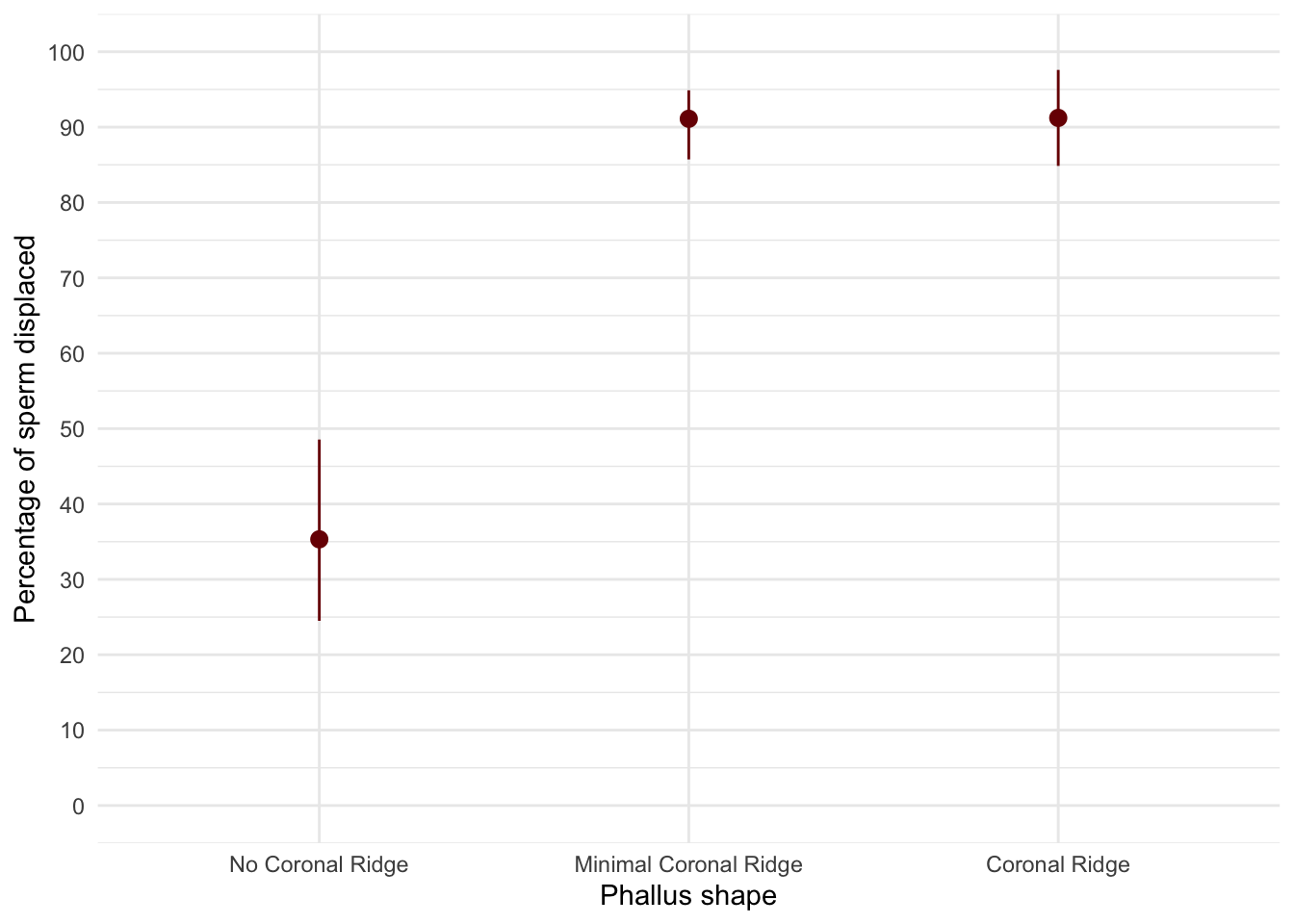
To test the hypotheses we need to first enter the codes in Table 28 for the contrasts. Contrast 1 tests hypothesis 1: that having a bell-end will displace more sperm than not. To test this we compare the two conditions with a ridge against the control condition (no ridge). So we compare chunk 1 (no ridge) to chunk 2 (minimal ridge, coronal ridge). The numbers assigned to the groups are the number of groups in the opposite chunk divided by the number of groups that have non-zero codes, and we randomly assigned one chunk to be a negative value (the codes 2/3, −1/3, −1/3 would work fine as well).
Contrast 2 tests hypothesis 2: the phallus with the larger coronal ridge will displace more sperm than the phallus with the minimal coronal ridge. First we get rid of the control phallus by assigning a code of 0; next we compare chunk 1 (minimal ridge) to chunk 2 (coronal ridge). The numbers assigned to the groups are the number of groups in the opposite chunk divided by the number of groups that have non-zero codes, and then we randomly assigned one chunk to be a negative value (the codes 0, 1/2, −1/2 would work fine as well).
| Group | No ridge vs. ridge | Minimal vs. coronal |
|---|---|---|
| No Ridge | -2/3 | 0 |
| Minimal ridge | 1/3 | -1/2 |
| Coronal ridge | 1/3 | 1/2 |
We set these contrasts for the variable phallus as follows:
                      ridge_vs_none minimal_vs_coronal
No Coronal Ridge         -0.6666667                0.0
Minimal Coronal Ridge     0.3333333               -0.5
Coronal Ridge             0.3333333                0.5
The results of fitting the model are shown in Table 30 and the parameter estimates in Table 31. Table 30 tells us that there was a significant effect of the type of phallus, F(2, 12) = 41.56, p < 0.001. (This is exactly the same result as reported in the paper on page 280.). Table 31 shows that hypothesis 1 is supported (phallus [ridge_vs_none]): having some kind of ridge led to greater sperm displacement than not having a ridge, \(\hat{b}\) = 55.85 (42.50, 69.20), t(12) = 9.12, p < 0.001. Hypothesis 2 is not supported (phallus [minimal_vs_coronal]): the amount of sperm displaced by the normal coronal ridge was not significantly different from the amount displaced by a minimal coronal ridge, \(\hat{b}\) = 0.11 (-15.30, 15.53), t(12) = 0.02, p = 0.987.
| Parameter | Sum_Squares | df | Mean_Square | F | p |
|---|---|---|---|---|---|
| phallus | 10397.66 | 2 | 5198.83 | 41.56 | < .001 |
| Residuals | 1501.13 | 12 | 125.09 |
Anova Table (Type 1 tests)
model_parameters(gallup_lm) |>
display()| Parameter | Coefficient | SE | 95% CI | t(12) | p |
|---|---|---|---|---|---|
| (Intercept) | 72.55 | 2.89 | (66.26, 78.84) | 25.12 | < .001 |
| phallus (ridge_vs_none) | 55.85 | 6.13 | (42.50, 69.20) | 9.12 | < .001 |
| phallus (minimal_vs_coronal) | 0.11 | 7.07 | (-15.30, 15.53) | 0.02 | 0.987 |
Evaluate the model assumptions using Figure 13. The Q-Q plot suggests non-normal residuals and the residual vs fitted plot and the scale-location plot suggest heterogeneity of variance. Let’s fit a robust model as a sensitivity check. Table 32 shows that the Welch F is highly significant still, F(2, 7.31) = 24.49, p < 0.001. Table 33 shows that the first contrast is still highly significant, \(\hat{b}\) = 55.85 (39.15, 72.55), t(12) = 7.29, p < 0.001, and the second contrast highly non-significant, \(\hat{b}\) = 55.85 (39.15, 72.55), t(12) = 7.29, p < 0.001. As such, our conclusions are unchanged when fitting a model that is robust to heteroscedasticity.
check_model(gallup_lm)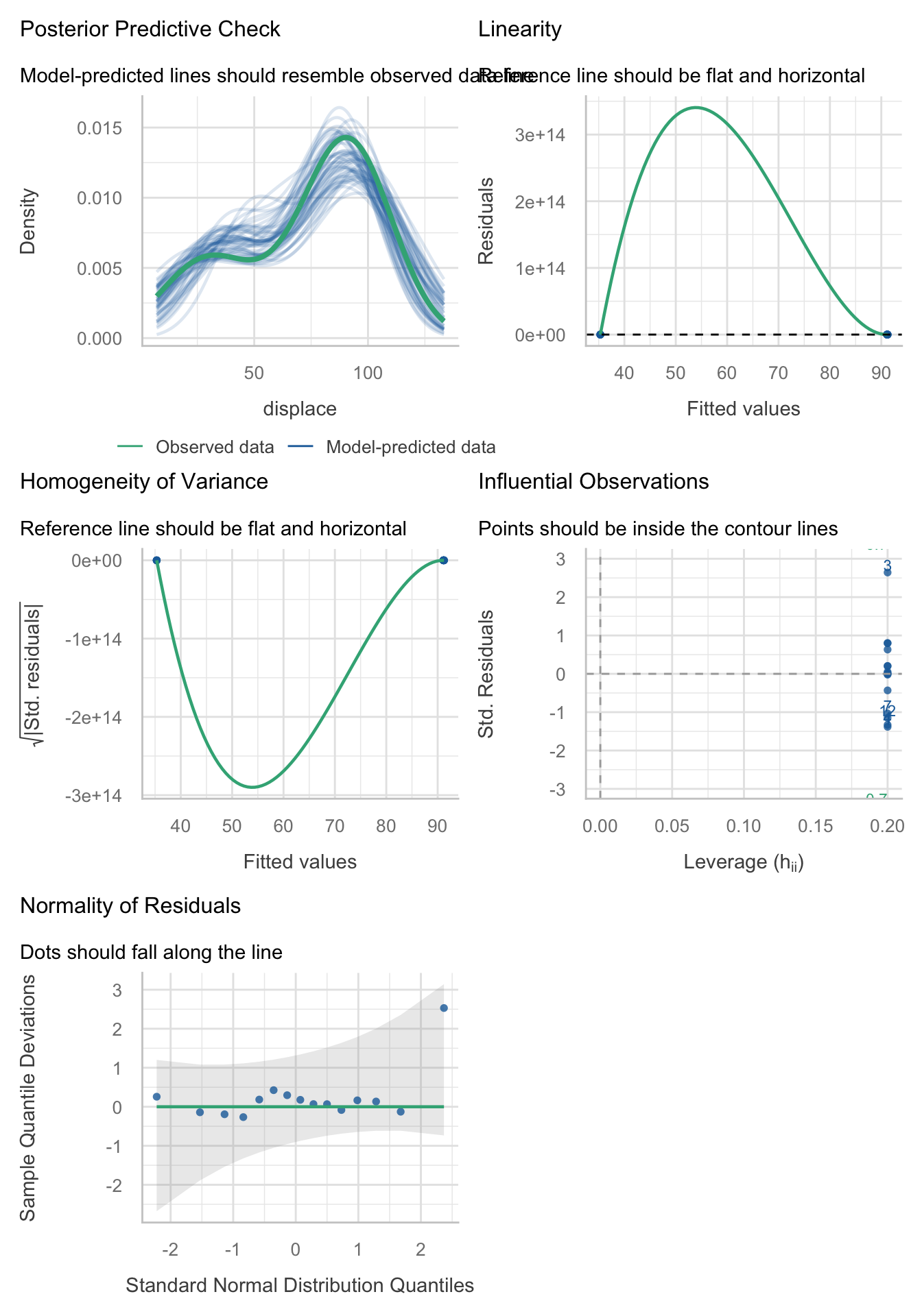
oneway.test(displace ~ phallus, data = gallup_tib) |>
  model_parameters() |>
display()| F | df | df (error) | p |
|---|---|---|---|
| 24.49 | 2 | 7.31 | < .001 |
model_parameters(gallup_lm, vcov = "HC4") |>
display()| Parameter | Coefficient | SE | 95% CI | t(12) | p |
|---|---|---|---|---|---|
| (Intercept) | 72.55 | 2.89 | (66.26, 78.84) | 25.12 | < .001 |
| phallus (ridge_vs_none) | 55.85 | 7.67 | (39.15, 72.55) | 7.29 | < .001 |
| phallus (minimal_vs_coronal) | 0.11 | 4.66 | (-10.04, 10.27) | 0.02 | 0.981 |
Eggs-traordinary
Data from Çetinkaya & Domjan (2006).
Science has bestowed upon us the knowledge that quail develop fetishes. Really. In studies where a terrycloth object acts as a sign that a mate will shortly become available, some quail start to direct their sexual behaviour towards the terrycloth object. (I will regret this anology, but in human terms if everytime you were going to have sex with your boyfriend you gave him a green towel a few moments before seducing him, then after enough seductions he would start getting really excited by green towels. If you’re planning to dump your boyfriend, a towel fetish could be an entertaining parting gift). In evolutionary terms, this fetishistic behaviour seems counterproductive because sexual behaviour becomes directed towards something that cannot provide reproductive success. However, perhaps this behaviour serves to prepare the organism for the ‘real’ mating behaviour.
Hakan Çetinkaya and Mike Domjan sexually conditioned male quail (Çetinkaya & Domjan, 2006). All quail experienced the terrycloth stimulus and an opportunity to mate, but for some the terrycloth stimulus immediately preceded the mating opportunity (paired group) whereas others experienced a 2-hour delay (this acted as a control group because the terrycloth stimulus did not predict a mating opportunity). In the paired group, quail were classified as fetishistic or not depending on whether they engaged in sexual behaviour with the terrycloth object.
During a test trial the quail mated with a female and the researchers measured the percentage of eggs fertilized, the time spent near the terrycloth object, the latency to initiate copulation and copulatory efficiency. If this fetishistic behaviour provides an evolutionary advantage, then we would expect the fetishistic quail to fertilize more eggs, initiate copulation faster and be more efficient in their copulations.
The data from this study are in the file
cetinkaya_2006.csv. Labcoat Leni wants you to carry out a robust model to see whether fetishistic quail (groups) produced a higher percentage of fertilized eggs (egg_percent) and initiated sex more quickly (latency). You can view the solutions at www.discovr.rocks.
Load the data using (see Tip 1):
cetinkaya_tib <- discovr::cetinkaya_2006The authors conducted a Kruskal-Wallis test (a test not covered in the book because of our focus on robust methods). For the percentage of eggs, they report (p. 429):
Kruskal–Wallis analysis of variance (ANOVA) confirmed that female quail partnered with the different types of male quail produced different percentages of fertilized eggs, $ ^{2} $(2, N = 59) =11.95, p < .05, $ ^{2} $ = 0.20. Subsequent pairwise comparisons with the Mann–Whitney U test (with the Bonferroni correction) indicated that fetishistic male quail yielded higher rates of fertilization than both the nonfetishistic male quail (U = 56.00, N1 = 17, N2 = 15, effect size = 8.98, p < .05) and the control male quail (U= 100.00, N1 = 17, N2 = 27, effect size = 12.42, p < .05). However, the nonfetishistic group was not significantly different from the control group (U = 176.50, N1 = 15, N2 = 27, effect size = 2.69, p > .05).
For the latency data they reported as follows:
A Kruskal–Wallis analysis indicated significant group differences,$ ^{2} $(2, N = 59) = 32.24, p < .05, $ ^{2} $ = 0.56. Pairwise comparisons with the Mann–Whitney U test (with the Bonferroni correction) showed that the nonfetishistic males had significantly shorter copulatory latencies than both the fetishistic male quail (U = 0.00, N1 = 17, N2 = 15, effect size = 16.00, p < .05) and the control male quail (U = 12.00, N1 = 15, N2 = 27, effect size = 19.76, p < .05). However, the fetishistic group was not significantly different from the control group (U = 161.00, N1 = 17, N2 = 27, effect size = 6.57, p > .05). (p. 430)
These results support the authors’ theory that fetishist behaviour may have evolved because it offers some adaptive function (such as preparing for the real thing).
Percentage of eggs
Figure 14 shows that the percentage of eggs fertilized increases from control group to non-fetishistic to fetishistic group. There is an outlier and skew in the non-fetishistic group and skew in the control group also. The authors were wise to fit a nonparametric test. We’ll use a 20% trimmed mean test with post hoc tests. Table 35 tells us that there was a significant effect, F(2, 22.2) = 5.02, p = 0.016. Table 36 shows the robust post hoc tests, which reveal that there was no significant difference between the control group and the non-fetishistic group, \(\hat{\Psi}\) = 8.45 (-10.63, 27.52), p = 0.268, but significant differences were found between the control group and the fetishistic group, \(\hat{\Psi}\) = 24.34 (3.76, 44.91), p = 0.017, and between the fetishistic group and the non-fetishistic group, \(\hat{\Psi}\) = 15.89 (-0.99, 32.77), p = 0.048. We know by looking at the boxplot (the medians in particular) that the fetishistic males yielded significantly higher rates of fertilization than both the non-fetishistic male quail and the control male quail. These results confirm the findings reported from the nonparametric tests in the paper.
ggplot(cetinkaya_tib, aes(x = groups, y = egg_percent)) +
  geom_boxplot(colour = "#3E9BFEFF", fill = "#3E9BFEFF", alpha = 0.4) +
  coord_cartesian(ylim = c(0, 100)) +
  scale_y_continuous(breaks = seq(0, 100, 10)) +
  labs(x = "Fetish group", y = "Percentage of eggs fertilised") +
  theme_minimal()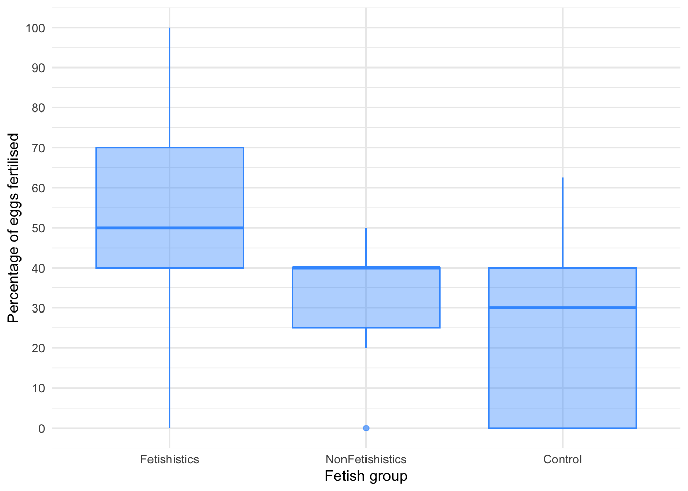
| F | df | df (error) | p | Estimate | 95% CI | Effectsize |
|---|---|---|---|---|---|---|
| 5.02 | 2 | 22.20 | 0.016 | 0.62 | (0.20, 1.21) | Explanatory measure of effect size |
Latency to copulate
Figure 15 shows that the latency to copulate was lowest in the non-fetishistic group and higher but similar in the fetishistic and control groups. These groups have very different variances, which means the residuals will likely have too. As with the percentage of eggs, we’ll use a 20% trimmed mean test with post hoc tests. Table 37 tells us that there was a significant effect, F(2, 21.28) = 68.12, p < 0.001. Although we’ve applied a robust test rather than a nonparametric one the results of the study are confirmed.
Table 38 shows the robust post hoc tests, which reveal that there was no significant difference between the control group and the fetishistic group, \(\hat{\Psi}\) = -6.65 (-16.19, 2.90), p = 0.084, but significant differences were found between the control group and the non-fetishistic group, \(\hat{\Psi}\) = -15.65 (-25.12, -6.17), p < 0.001, and between the fetishistic group and the non-fetishistic group, \(\hat{\Psi}\) = 9.00 (6.88, 11.12), p < 0.001. We know by looking at the boxplot (the medians in particular) that the non-fetishistic males yielded significantly lower rates of fertilization than the fetishistic male quail and the control male quail. Again, these results confirm the findings reported from the nonparametric tests in the paper.
ggplot(cetinkaya_tib, aes(x = groups, y = latency)) +
  geom_boxplot(colour = "#46F884FF", fill = "#46F884FF", alpha = 0.4) +
  coord_cartesian(ylim = c(0, 60)) +
  scale_y_continuous(breaks = seq(0, 60, 10)) +
  labs(x = "Fetish group", y = "Latency to copulate (seconds)") +
  theme_minimal()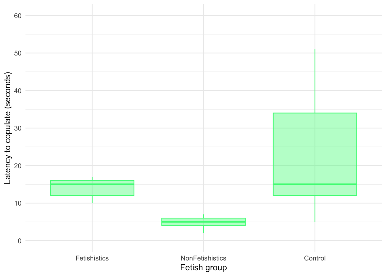
| F | df | df (error) | p | Estimate | 95% CI | Effectsize |
|---|---|---|---|---|---|---|
| 68.12 | 2 | 21.28 | < .001 | 1.12 | (0.78, 1.61) | Explanatory measure of effect size |
Chapter 12
Space invaders
Data from Muris et al. (2008).
Anxious people tend to interpret ambiguous information in a negative way. For example, being highly anxious myself, if I overheard a student saying ‘Andy Field’s lectures are really different’, I would assume that ‘different’ meant rubbish, but it could also mean ‘refreshing’ or ‘innovative’. Muris et al. (2008) addressed how these interpretational biases develop in children. Children imagined that they were astronauts who had discovered a new planet. They were given scenarios about their time on the planet (e.g., ‘Onthe street, you encounter a spaceman. He has a toy handgun and he fires at you …’) and the child had to decide whether a positive (‘You laugh: it is a water pistol and the weather is fine anyway’) or negative (‘Oops, this hurts! The pistol produces a red beam which burns your skin!’) outcome occurred. After each response the child was told whether their choice was correct. Half of the children were always told that the negative interpretation was correct, and the reminder were told that the positive interpretation was correct.
In over 30 scenarios children were trained to interpret their experiences on the planet as negative or positive. Muris et al. then measured interpretational biases in everyday life to see whether the training had created a bias to interpret things negatively. In doing so, they could ascertain whether children might learn interpretational biases through feedback (e.g., from parents).
The data from this study are in the file
muris_2008.csv. The independent variable istraining(positive or negative) and the outcome is the child’s interpretational bias score (int_bias) – a high score reflects a tendency to interpret situations negatively. It is important to adjust for theageandgenderof the child and also their natural anxiety level (which they measured with a standard questionnaire of child anxiety called the screen for child anxiety related disorders (scared) because these things affect interpretational biases also). Labcoat Leni wants you to fit a model to see whether training significantly affected children’sint_biasusingage,genderandscaredas covariates. What can you conclude? View the solutions at www.discovr.rocks (or look at pages 475–476 in the original article).
Load the data using (see Tip 1):
muris_tib <- discovr::muris_2008In the chapter we looked at how to select contrasts, but because our main predictor variable (the type of training) has only two levels (positive or negative) we don’t need contrasts: the main effect of this variable can only reflect differences between the two types of training. We can, therefore, use the default behaviour of
First visualise the data (Figure 16, Figure 17 and Figure 18)
ggplot(muris_tib, aes(x = training, y = int_bias, colour = training)) +
  geom_point(position = position_jitter(width = 0.1), alpha = 0.6) +
  geom_violin(alpha = 0.2) +
  stat_summary(fun.data = "mean_cl_normal", geom = "pointrange", position = position_dodge(width = 0.9)) +
  coord_cartesian(ylim = c(0, 250)) +
  scale_y_continuous(breaks = seq(0, 250, 10)) +
  scale_colour_viridis_d(begin = 0.3, end = 0.8) +
  labs(x = "Type of training", y = "Interpretation bias", colour = "Type of training") +
  theme_minimal() +
  theme(legend.position = "none")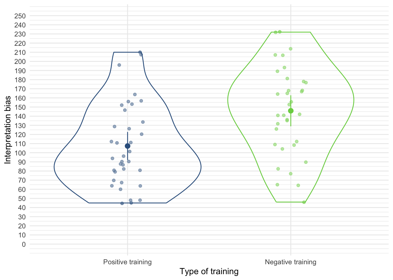
ggplot(muris_tib, aes(x = age, y = int_bias)) +
  geom_smooth(method = "lm", colour = "#A2FC3CFF", fill = "#A2FC3CFF", alpha = 0.2) +
  geom_point(colour = "#30123BFF") +
  coord_cartesian(ylim = c(0, 250)) +
  scale_x_continuous(breaks = seq(0, 15, 1)) +
  scale_y_continuous(breaks = seq(0, 250, 10)) +
  labs(x = "Child's age", y = "Interpretation bias") +
  facet_wrap(~training) +
  theme_minimal()
`geom_smooth()` using formula = 'y ~ x'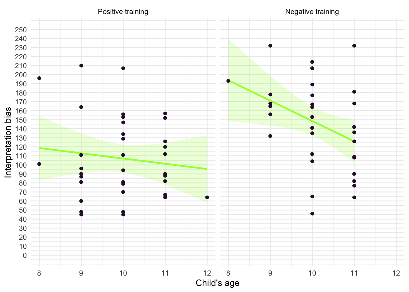
ggplot(muris_tib, aes(x = scared, y = int_bias)) +
  geom_smooth(method = "lm", colour = "#CC6677", fill = "#CC6677", alpha = 0.2) +
  geom_point(colour = "#882255") +
  coord_cartesian(ylim = c(0, 250)) +
  scale_x_continuous(breaks = seq(0, 40, 5)) +
  scale_y_continuous(breaks = seq(0, 250, 10)) +
  labs(x = "Child's anxiety (SCARED)", y = "Interpretation bias") +
  facet_wrap(~training) +
  theme_minimal()
`geom_smooth()` using formula = 'y ~ x'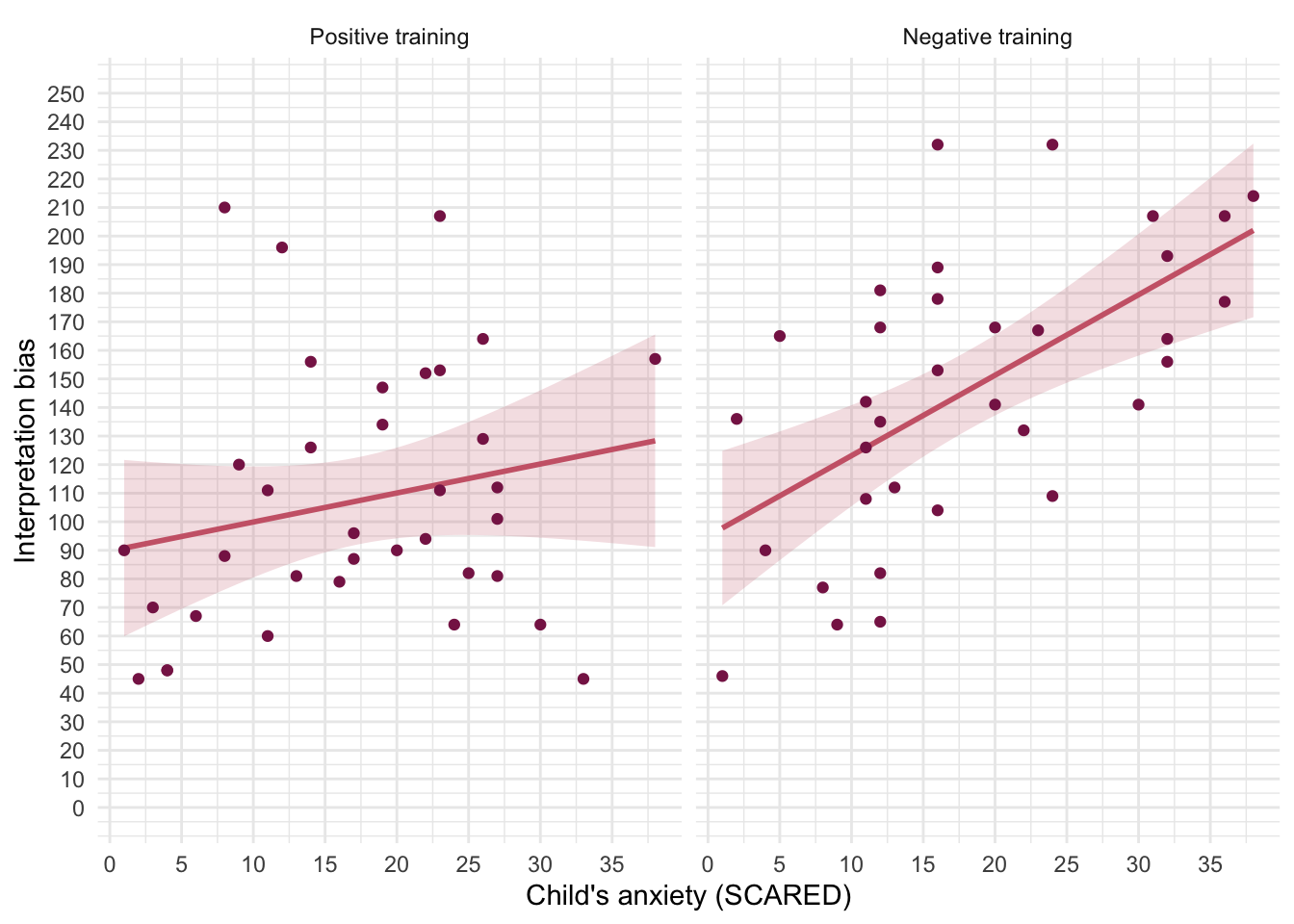
With only two training groups we don’t need to set contrasts. First let’s test the assumption of parallel slopes/homogeneity of regression slopes. With three covariates we’ll enter each interaction in turn. Table 40 shows non-significant interactions between the training group and gender, F(1, 64) = 0.04, p = 0.837, age, F(1, 63) = 0.59, p = 0.445, and anxiety, F(1, 62) = 3.96, p = 0.051. The final interaction term is only just non-significant, which might give us pause for thought about whether it’s reasonable to fit the parallel slopes model for anxiety (SCARED) but we’ll follow what the authors did and use the model in muris_lm.
| Name | Model | df | df_diff | F | p |
|---|---|---|---|---|---|
| muris_lm | lm | 65 | |||
| gen_lm | lm | 64 | 1 | 0.04 | 0.837 |
| age_lm | lm | 63 | 1 | 0.59 | 0.445 |
| scared_lm | lm | 62 | 1 | 3.96 | 0.051 |
Models were detected as nested (in terms of fixed parameters) and are compared in sequential order.
Table 41 summarizes the main model. Of the covariates, gender, F(1, 65) = 6.72, p = 0.012, and anxiety, F(1, 65) = 16.02, p < 0.001 significantly predicted interpretation bias, but age did not, F(1, 65) = 1.60, p = 0.210. The interpretation bias depended on child anxiety and gender, but not age. After adjusting for the effect of age, gender and anxiety the type of training significant affected the interpretation bias score, F(1, 65) = 13.42, p < 0.001. The adjusted means (Table 42) tell us that interpretational biases were stronger (higher) after negative training (adjusting for age, gender and SCARED). This result is as expected. It seems then that giving children feedback that tells them to interpret ambiguous situations negatively induces an interpretational bias that persists into everyday situations, which is an important step towards understanding how these biases develop.
To interpret the covariates look at the parameter estimates (Table 43), which show that there were positive relationships between gender and interpretation bias, \(\hat{b}\) = 26.12 (6.00, 46.24), t(65) = 2.59, p = 0.012, and anxiety and interpretation bias, \(\hat{b}\) = 2.01 (1.01, 3.01), t(65) = 4.00, p < 0.001. For anxiety (scared), \(\hat{b}\) = 2.01, which reflects a positive relationship. Therefore, as anxiety increases, the interpretational bias increases also (this is what you would expect, because anxious children would be more likely to naturally interpret ambiguous situations in a negative way).
For gender (Girl), \(\hat{b}\) = 26.12, which again is positive, but to interpret this we need to think about how the children were coded in the data editor. The fact that the effect is named gender (Girl) tells us that this is the effect of girls relative to boys (i.e. boys are the reference category). Therefore, as a child ‘changes’ (not literally) from a boy to a girl, their interpretation biases increase. In other words, girls show a stronger natural tendency to interpret ambiguous situations negatively.
One important thing to remember is that although anxiety and gender naturally affected whether children interpreted ambiguous situations negatively, the training (the experiences on the alien planet) had an effect adjusting for these natural tendencies (in other words, the effect of training is expressed at average levels of these covariates).
Have a look at the original article to see how Muris et al. reported the results of this analysis – this can help you to see how you can report your own data from an ANCOVA. (One bit of good practice that you should note is that they report effect sizes from their analysis – as you will see from the book chapter, this is an excellent thing to do.)
| Parameter | Sum_Squares | df | Mean_Square | F | p | ω² (partial) | ω² 95% CI |
|---|---|---|---|---|---|---|---|
| training | 22129.49 | 1 | 22129.49 | 13.42 | < .001 | 0.15 | (0.04, 1.00) |
| gender | 11083.25 | 1 | 11083.25 | 6.72 | 0.012 | 0.08 | (5.43e-03, 1.00) |
| age | 2643.44 | 1 | 2643.44 | 1.60 | 0.210 | 8.55e-03 | (0.00, 1.00) |
| scared | 26400.36 | 1 | 26400.36 | 16.02 | < .001 | 0.18 | (0.06, 1.00) |
| Residuals | 1.07e+05 | 65 | 1648.41 |
Anova Table (Type 3 tests)
| training | Mean | SE | 95% CI | t(65) |
|---|---|---|---|---|
| Positive training | 108.21 | 6.80 | ( 94.63, 121.79) | 15.92 |
| Negative training | 144.24 | 7.02 | (130.22, 158.27) | 20.54 |
Variable predicted: int_bias; Predictors modulated: training; Predictors averaged: gender, age (10), scared (18)
model_parameters(muris_lm) |>
display()| Parameter | Coefficient | SE | 95% CI | t(65) | p |
|---|---|---|---|---|---|
| (Intercept) | 132.61 | 60.37 | (12.04, 253.19) | 2.20 | 0.032 |
| training (Negative training) | 36.03 | 9.83 | (16.39, 55.68) | 3.66 | < .001 |
| gender (Girl) | 26.12 | 10.07 | (6.00, 46.24) | 2.59 | 0.012 |
| age | -7.28 | 5.75 | (-18.76, 4.20) | -1.27 | 0.210 |
| scared | 2.01 | 0.50 | (1.01, 3.01) | 4.00 | < .001 |
Evaluate the model assumptions using Figure 19. The plots suggest heterogeneity of variance so we should look at robust confidence intervals and tests (Table 44), but these show the same profile as results as the non-robust ones.
check_model(muris_lm)
model_parameters(muris_lm, vcov = "HC4") |>
display()| Parameter | Coefficient | SE | 95% CI | t(65) | p |
|---|---|---|---|---|---|
| (Intercept) | 132.61 | 65.72 | (1.36, 263.86) | 2.02 | 0.048 |
| training (Negative training) | 36.03 | 9.75 | (16.55, 55.51) | 3.69 | < .001 |
| gender (Girl) | 26.12 | 9.68 | (6.78, 45.46) | 2.70 | 0.009 |
| age | -7.28 | 6.22 | (-19.71, 5.15) | -1.17 | 0.247 |
| scared | 2.01 | 0.48 | (1.04, 2.97) | 4.15 | < .001 |
Chapter 13
Don’t forget your toothbrush
Data from Davey et al. (2003).
Many of us have experienced that feeling after we have left the house of wondering whether we remembered to lock the door, close the window or remove the bodies from the fridge in case the police turn up. However, some people with obsessive compulsive disorder (OCD) check things so excessively that they might, for example, take hours to leave the house. One theory is that this checking behaviour is caused by the mood you are in (positive or negative) interacting with the rules you use to decide when to stop a task (do you continue until you feel like stopping, or until you have done the task as best as you can?). Davey et al. (2003) tested this hypothesis by getting people to think of as many things as they could that they should check before going on holiday (
checks) after putting them into a negative, positive or neutral mood (mood). Within each mood group, half of the participants were instructed to generate as many items as they could, whereas the remainder were asked to generate items for as long as they felt like continuing the task (stop_rule).Plot an error bar chart and then conduct the appropriate analysis to test Davey et al.’s hypotheses that (1) people in negative moods who use an ‘as many as can’ stop rule would generate more items than those using a ‘feel like continuing’ stop rule; (2) people in a positive mood would generate more items when using a ‘feel like continuing’ stop rule compared to an ‘as many as can’ stop rule; and (3) in neutral moods, the stop rule used won’t have an effect (
davey_2003.csv). View the solutions at www.discovr.rocks (or look at pages 148–149 in the original article).
Load the data using (see Tip 1):
davey_tib <- discovr::davey_2003First visualise the data (Figure 20). The plot shows that when in a negative mood people performed more checks when using an as many as can stop rule than when using a feel like continuing stop rule. In a positive mood the opposite was true, and in neutral moods the number of checks was very similar in the two stop rule conditions.
ggplot(davey_tib, aes(x = mood, y = checks, colour = stop_rule)) +
  geom_violin(alpha = 0.5) +
  stat_summary(fun.data = "mean_cl_normal", position = position_dodge(width = 0.9)) +
  scale_y_continuous(breaks = seq(0, 40, 5)) +
  scale_colour_viridis_d(option = "turbo", begin = 0.2, end = 0.85) +
  labs(y = "Checks (out of 10)", x = "Mood induction", colour = "Stop rule") +
  theme_minimal()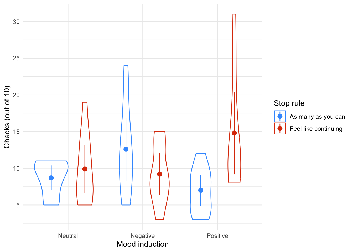
Table 46 shows the model fitted using afex::aov_4(). The stop rule × mood interaction was significant, F(2, 54) = 6.35, p = 0.003, indicating that the effect of the stop rule on the number of checks was significantly moderated by mood. This effect supersedes the main effects, so we’ll ignore them. Figure 20 shows that in a neutral mood the number of checks was similar for each stop rule, in a negative mood more checks were performed when an ‘as many as can’ rule was applied and in a positive mood more checks were performed when a ‘feel like continuing’ rule was applied.
The simple effects analysis (Table 47) shows (in combination with the means) that:
- The number of checks did not differ by stop rule when in a neutral mood, F(1, 54) = 0.29, p = 1.000.
- The number of checks did not differ by stop rule when in a negative mood, F(1, 54) = 2.31, p = 0.402.
- The number of checks was significantly higher when using a ‘feel like continuing’ stop rule when in a positive mood, F(1, 54) = 12.18, p = 0.003.
davey_afx <- afex::aov_4(checks ~ mood*stop_rule + (1|id), data = davey_tib)Contrasts set to contr.sum for the following variables: mood, stop_rulemodel_parameters(davey_afx) |>
display()| Parameter | Sum_Squares | df | Mean_Square | F | p |
|---|---|---|---|---|---|
| mood | 34.13 | 2 | 17.07 | 0.68 | 0.509 |
| stop_rule | 52.27 | 1 | 52.27 | 2.09 | 0.154 |
| mood:stop_rule | 316.93 | 2 | 158.47 | 6.35 | 0.003 |
| Residuals | 1348.60 | 54 | 24.97 |
Anova Table (Type 3 tests)
davey_se <- estimate_contrasts(model = davey_afx,
                               contrast = "stop_rule",
                               by = "mood",
                               comparison = "joint",
                               p_adjust = "bonferroni")

model_parameters(davey_se) |>
display()| Contrast | mood | df1 | df2 | F | p |
|---|---|---|---|---|---|
| stop_rule | Neutral | 1 | 54 | 0.29 | > .999 |
| stop_rule | Negative | 1 | 54 | 2.31 | 0.402 |
| stop_rule | Positive | 1 | 54 | 12.18 | 0.003 |
p-value adjustment method: Bonferroni
Chapter 14
Please release me
Data from Van Bourg et al. (2020).
Pet dogs often engage in behaviours helpful to their owners (mine likes to cuddle me when I’ve had a bad day, and in fact when I’ve had a good day, and now I think of it, pretty much any day regardless of how good or bad it has been). It’s unclear whether these behaviours are truly prosocial. Can a dog engage in prosocial behaviours that haven’t been explicitly trained? Van Bourg et al. (2020) addressed this question by trapping some dog’s owners in boxes! In the study 60 dogs were tested in three conditions, all of which involved being in a room with large restrainer box (a large acrylic box with holes in the side that could be closed by resting a foam board door across its opening). Each dog had three experiences in the room, and each time the experimenters were interested in whether the dog would open the restrainer box within 120 seconds. The order of the three experiences was counterbalanced so different dogs completed the experiences in different orders.
- The food condition: food was dropped into the restrainer. This condition was to test whether the dog was capable of moving the foam board door to open the box (to get the food).
- The distress condition: the dogs’ owner was placed in the restrainer and was instructed to call for help in a distressed tone.
- The reading condition: the dogs’ owner was placed in the restrainer and was instructed to read from a magazine at the same pace and in the same tone as in the distress condition.
The researchers did several analyses, but we will focus on the time for the dog to open the restrainer up to a maximum of 120s (
latency). Create a variableln_latencythat is the log of the latencies, filter out dogs that did not open the compartment in the food condition, then filter out data from the food condition. Fit a model in which the natural log of time taken to open the box is predicted from the type of experience (condition), the order in which the condition was experienced (test_number) and their interaction. The authors allowed overall latencies to vary by dog. Labcoat Leni wants you to replicate their analysis. The subset of variables we need are invan_bourg_2020.csv. View the solutions at www.discovr.rocks (or page 10 and
Load the data using (see Tip 1):
van_bourg_tib <- discovr::van_bourg_2020In their method they state:
To assess whether dogs freed the owner faster in the distress test than in the reading test, a linear regression analysis of latency to open the apparatus was conducted using a linear mixed model (LMM). A latency of 120 seconds (the length of the test) was assigned to tests in which the dog did not open the apparatus. Latency data were natural log-transformed to reduce skew and kurtosis. To control for task ability, only dogs that demonstrated the capacity to open the apparatus in the food control task were included in this analysis. To assess whether potential learning and desensitization effects differed among conditions, test number and the interaction between test number and condition were included in the model as fixed effect predictors. Study subject was treated as a random effect.
First, lets create a variable ln_latency that is the log of the latencies. We can do this using mutate():
Next, they filtered out dogs that did not open the compartment in the food condition. To filter out these dogs we can use the variable could_open, which identifies the dogs that opened the compartment for food (1) from those that did not (0). First let’s identify the dogs that could open the door in the food condition using this code
 [1] 4  8  11 22 24 25 29 36 41 43 46 54 59 60 61 62 63 64 67
67 Levels: 1 2 3 4 5 6 7 8 9 10 11 12 13 14 15 16 17 18 19 20 21 22 23 ... 67
This code creates an object called dogs_to_include that contains the ID of any dog that was able to open the door in the food condition. Let’s look at what the main lines of code do:
-
filter(condition == "Food" & opened_door == 1): this filters van_bourg_tib to retain cases that meet two conditions, the first is that the condition was the food condition, and the second is that the the dog opened the door. This filtered tibble will contain only the dogs that passes the test of opening the door in the food condition. -
select(dog_id): having filtered the data we select the variabledog_id -
pull(): extracts the values from the selected variable.
The end result is we how have all of the IDs for the 19 dogs that passed the test of opening the door for food stored in dogs_to_include. We’ll now use this variables to create a version of the data containing only these dogs:
# filter the data to include only dogs who could open the door and to ignore the food condition
dog_tib <- van_bourg_tib |>
  filter(dog_id %in% dogs_to_include & condition != "Food") |>
  mutate(
    condition = droplevels(condition)
  )
This creates a new version of the data containing values only if they meet two criteria:
- The value of
dog_idhas to be found withindogs_to_include. The%in%can be read as ‘is in’ or ‘is found in’. So having extracted the ids of the dogs we want to include, we select cases only if the ID matches one of those we stored indogs_to_include. - The experimental condition is not the food condition (
condition != "Food")
As such, we’ve retained only dogs that passed the test and only the conditions where food wasn’t used and we’ve stored these data in dog_tib. Note I’ve also used mutate() to tidy up the condition variable so that the redundant level of “Food” is dropped.
To fit the model let’s think about the data structure. Multiple scores are nested within each dog. Therefore, the level 2 variable is the participant (the dog) and this variable is represented by the variable labelled dog_id. The authors allowed latency to vary by dog (random intercept) but included no random slopes. The model will need to include (1|dog_id) to achieve this. The authors report the fixed effects using Type III sums of squares (see TIP-TOP 14.3 in the chapter). To get these effects we need to set orthogonal contrasts for both condition aand test_number. We can do this in numerous ways, but I’m just goijg to use the built in function contr.sum().
So we can fit this model using the code below, which first sets orthogonal contrasts, and then fits the model.
The fixed effects using Type III sums of squares can be found in Table 48. Note that the values match what the authors report; they write
The main effect of test number was significant, \(\chi^2(2, N = 19) = 9.62, p < .01\). The main effect of test condition was not significant but dogs tended to open the apparatus more quickly in the distress test than in the reading test, \(\chi^2(1, N = 19) = 3.60, p < .10\). However, the interaction between test condition and number was significant, \(\chi^2(2, N = 19) = 8.83, p < .05\). Specifically, latency to release the owner decreased with test number in the distress test but not in the reading test.
Type 3 ANOVAs only give sensible and informative results when covariates
  are mean-centered and factors are coded with orthogonal contrasts (such
  as those produced by `contr.sum`, `contr.poly`, or `contr.helmert`, but
*not* by the default `contr.treatment`).| Parameter | χ² | df | p |
|---|---|---|---|
| test_number | 2.19 | 2 | 0.335 |
| condition | 3.60 | 1 | 0.058 |
| test_number:condition | 8.83 | 2 | 0.012 |
Anova Table (Type 3 tests)
Chapter 15
Are splattered cadavers distracting?
Data from Perham & Sykora (2012).
In Chapter 9, I used the example of whether listening to my favourite music would interfere with people’s ability to write an essay. It turns out that Nick Perham has tested this hypothesis (sort of). He was interested in the effects of liked and disliked music (compared to quiet) on people’s ability to remember things. Twenty-five participants remembered lists of eight letters. Perham & Sykora (2012) manipulated the background noise while each list was presented: silence (the control), liked music or disliked music. They used music that they believed most participants would like (a popular song called ‘From Paris to Berlin’ by Infernal) and dislike (songs such as Repulsion’s ‘Acid Bath’, ‘Eaten Alive’ and ‘Splattered Cadavers’ – in other words, the sort of thing I listen to, although I don’t actually have any stuff by Repulsion). Participants recalled each list of eight letters, and the authors calculated the probability of correctly recalling a letter in each position in the list. There are two variables: position in the list (which letter in the sequence is being recalled, from 1 to 8) and sound playing when the list is presented (quiet, liked, disliked). Fit a model to see whether recall is affected by the type of sound played while learning the sequences (
perham_2012.csv). View the solutions at www.discovr.rocks (or look at page 552 in the original article).
Load the data using (see Tip 1):
perham_tib <- discovr::perham_2012Let’s do a plot first. Figure 21 shows the means of letters recalled in each of the positions of the lists when no music was played (blue line), when liked music was played (green line) and when disliked music was played (red line). The plot shows that the typical serial curve was elicited for all sound conditions (participants’ memory was best for letters towards the beginning of the list and at the end of the list, and poorest for letters in the middle of the list) and that performance was best in the quiet condition, poorer in the disliked music condition and poorest in the liked music condition.
ggplot(perham_tib, aes(x = position, y = recall, colour = sound)) +
  stat_summary(fun.data = "mean_cl_boot") +
  stat_summary(fun = "mean", geom = "line", aes(group = sound)) +
  coord_cartesian(ylim = c(0, 1), xlim = c(0, 8)) +
  scale_y_continuous(breaks = seq(0, 1, 0.1)) +
  scale_colour_viridis_d(option = "turbo", begin = 0.1, end = 0.9) +
  labs(x = "Positionin list", y = "Proportion recalled", colour = "Background noise") +
  theme_minimal()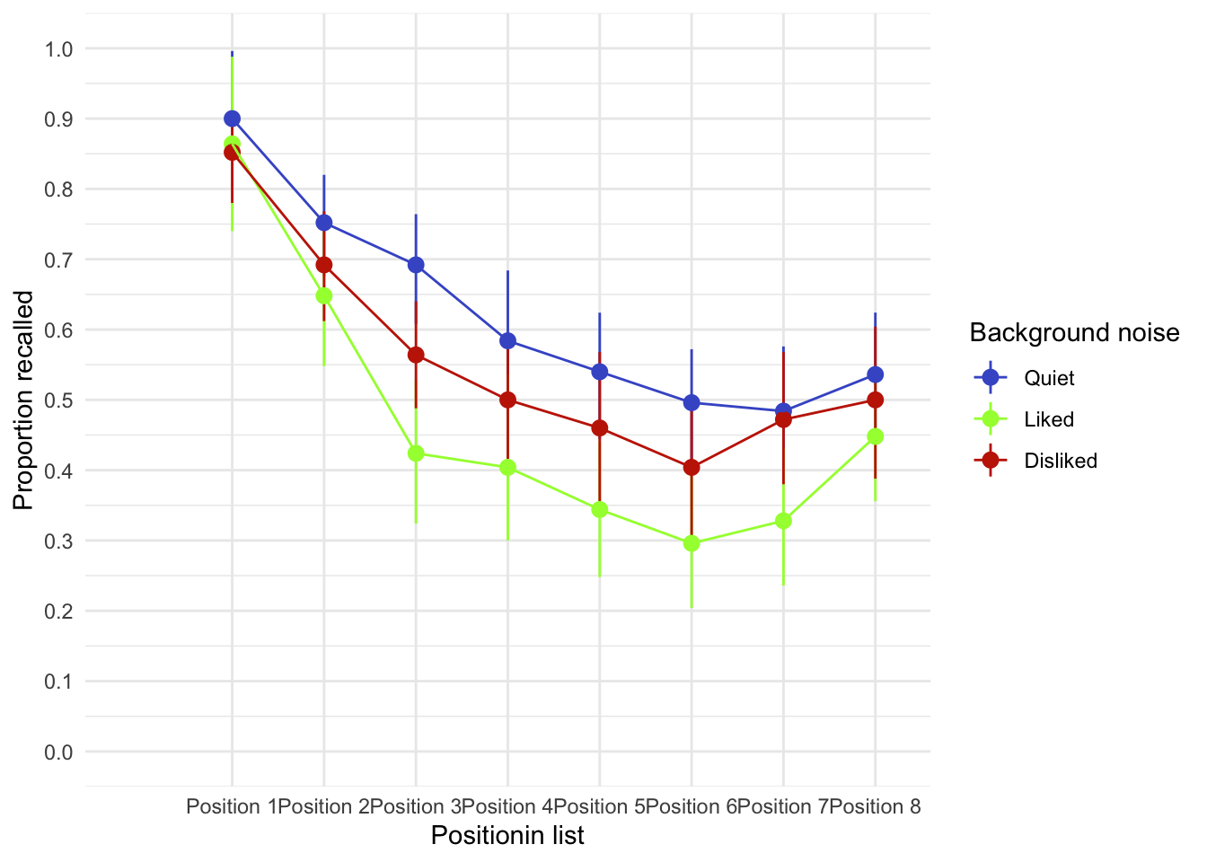
Table 49 shows the main summary table from the model. There was a significant main effect of the type of sound on memory performance, F(1.62, 38.9) = 9.46, p < 0.001. Looking at the earlier plot, we can see that performance was best in the quiet condition, poorer in the disliked music condition and poorest in the liked music condition. However, we cannot tell where the significant differences lie without looking at some contrasts or post hoc tests. These are in Table 50, which shows that recall in the quiet condition was significantly better than both the liked condition, \(\bar{X}_\text{Diff}\) = -0.15 (-0.24, -0.07), t(24) = -3.62, p = 0.001 and in the disliked condition, \(\bar{X}_\text{Diff}\) = -0.07 (-0.12, -0.01), t(24) = -2.45, p = 0.022. Recall in the disliked condition was significantly better than in the liked condition, \(\bar{X}_\text{Diff}\) = 0.09 (0.01, 0.16), t(24) = 2.49, p = 0.020. We can conclude that liked music interferes more with performance on a memory task than disliked music.
Back in Table 49, there was also a significant main effect of position, F(3.83, 91.92) = 41.43, p < 0.001, which reflects the typical serial curve (we don’t really need post hoc tests here because we’re not interested in which positions differ from which). There was no significant position by sound interaction, F(6.39, 153.39) = 1.43, p = 0.201 suggesting that the main effect of sound described above was not significantly moderated by the list position.
| Parameter | Sum_Squares | Sum_Squares_Error | df | df (error) | Mean_Square | F | p | ω² (partial) |
|---|---|---|---|---|---|---|---|---|
| sound | 2.37 | 6.01 | 1.62 | 38.90 | 0.15 | 9.46 | < .001 | 0.10 |
| position | 13.47 | 7.81 | 3.83 | 91.92 | 0.08 | 41.43 | < .001 | 0.40 |
| sound:position | 0.57 | 9.45 | 6.39 | 153.39 | 0.06 | 1.43 | 0.201 | 7.79e-03 |
Anova Table (Type 3 tests)
estimate_contrasts(model = perham_afx, contrast = "sound") |>
display()| Level1 | Level2 | Difference | SE | 95% CI | t(24) | p |
|---|---|---|---|---|---|---|
| Liked | Quiet | -0.15 | 0.04 | (-0.24, -0.07) | -3.62 | 0.001 |
| Disliked | Quiet | -0.07 | 0.03 | (-0.12, -0.01) | -2.45 | 0.022 |
| Disliked | Liked | 0.09 | 0.03 | ( 0.01, 0.16) | 2.49 | 0.020 |
Variable predicted: recall; Predictors contrasted: sound; Predictors averaged: position, id; p-values are uncorrected.
Chapter 16
The objection of desire
Data from Bernard et al. (2012).
There is a concern that images that portray women as sexually desirable objectify them. Philippe Bernard and colleagues tested this idea in an inventive study that used the ‘inversion effect’, which describes the phenomenon that people find it harder to recognize upside-down (inverted) pictures than ones the right way up. It turns out that this ‘inversion effect’ occurs for pictures of humans but not objects, so by seeing how easily people recognize inverted sexualized pictures of women, Bernard could see whether these pictures were processed more like people or objects (Bernard et al., 2012). Participants were presented with pictures of sexualized (i.e., not wearing many clothes) males and females, half of which were inverted (
inverted_womenandinverted_men) whereas the remainder were upright (upright_womenandupright_men). Participants self-reported theirgender. After each trial, participants were shown two pictures and asked to identify the one they had just seen. The outcome was the proportion of correctly identified pictures. An inversion effect is demonstrated by higher recognition scores for upright pictures than for inverted ones. If sexualized females are processed as objects, you would expect an inversion effect for the male pictures but not the female ones. The data are inbernard_2012.csv. Fit a model to see whether picturegender (male or female) and picture orientation (upright or inverted) significantly interact. Include participant gender as the between-group factor. Follow up the analysis with t-tests looking at (1) the inversion effect for male pictures; (2) the inversion effect for female pictures; (3) the gender effect for upright pictures; and (4) the gender effect for inverted pictures. View the solutions at www.discovr.rocks (or look at page 470 in the original article).
Load the data using (see Tip 1):
bernard_tib <- discovr::bernard_2012Annoyingly the data are in messy format, so our first job is to make them tidy. The code below takes the original data then splits the columns from inverted_women to upright_men into three new columns. The proportions are placed in a variable called proportion, whereas the column names are placed into two columns named target_location and target_gender using the underscore to split them (this is what names_pattern = "(.*)_(.*)" does). So, for example inverted_women is split so that ’inverted” is placed in the target_location variable and “women” is placed in the target_gender variable. We then use mutate to tidy up the new variables by using str_to_sentence() to capitalize the first letter of each word in target_location and target_gender.
bernard_tidy <- bernard_tib |>
  pivot_longer(
    cols = inverted_women:upright_men,
    names_to = c("target_location", "target_gender"),
    values_to = "proportion",
    names_pattern = "(.*)_(.*)"
  ) |>
  mutate(
    target_location = str_to_sentence(target_location),
    target_gender = str_to_sentence(target_gender),
  )
To see what the code has done you could display the data before and after the transformation:
bernard_tib# A tibble: 78 × 6
id gender inverted_women upright_women inverted_men upright_men
<chr> <fct> <dbl> <dbl> <dbl> <dbl>
1 1 Female 0.917 0.917 1 0.833
2 2 Female 0.917 1 0.917 1
3 3 Female 0.833 1 0.75 0.917
4 4 Male 0.917 0.917 0.833 1
5 5 Male 0.5 0.5 0.5 0.5
6 6 Male 0.5 0.75 0.5 0.667
7 7 Female 0.917 1 0.75 1
8 8 Female 0.917 0.833 0.833 0.917
9 9 Female 0.833 0.917 0.75 0.833
10 10 Female 0.917 0.917 0.75 0.833
# ℹ 68 more rowsbernard_tidy# A tibble: 312 × 5
id gender target_location target_gender proportion
<chr> <fct> <chr> <chr> <dbl>
1 1 Female Inverted Women 0.917
2 1 Female Upright Women 0.917
3 1 Female Inverted Men 1
4 1 Female Upright Men 0.833
5 2 Female Inverted Women 0.917
6 2 Female Upright Women 1
7 2 Female Inverted Men 0.917
8 2 Female Upright Men 1
9 3 Female Inverted Women 0.833
10 3 Female Upright Women 1
# ℹ 302 more rowsThere are two repeated-measures variables: whether the target picture was of a male or female (we’ve called this variable target_gender) and whether the target picture was upright or inverted (we’ve called this variable target_location). The resulting model will be a 2 (target_gender: male or female) × 2 (target_location: upright or inverted) × 2 (gender: male or female) three-way mixed ANOVA with repeated measures on the first two variables.
Table 51 shows the main summary table from the model. There was a significant interaction between target gender and target location, F(1, 75) = 15.07, p < 0.001, \(\hat{\omega}_p\) = 0.03 [0.00, 1.00], indicating that if we ignore whether the participant was male or female, the relationship between recognition of upright and inverted targets was different for pictures depicting men and women. The two-way interaction between target location and participant gender was not significant, F(1, 75) = 0.96, p = 0.331, \(\hat{\omega}_p\) = 0.00 [0.00, 1.00], indicating that if we ignore whether the target depicted a picture of a man or a woman, male and female participants did not significantly differ in their recognition of inverted and upright targets. There was also no significant three-way interaction between target gender, target location and participant gender, F(1, 75) = 0.01, p = 0.904, \(\hat{\omega}_p\) = 0.00 [0.00, 1.00], indicating that the relationship between target location (whether the target picture was upright or inverted) and target gender (whether the target was of a male or female) was not significantly different in male and female participants.
bernard_afx <- afex::aov_4(proportion ~ gender*target_location*target_gender + (target_location*target_gender|id), data = bernard_tidy)Warning: Missing values for 1 ID(s), which were removed before analysis:
39
Below the first few rows (in wide format) of the removed cases with missing data.
id gender Inverted_Women Inverted_Men Upright_Women Upright_Men
# 31 39 <NA> 1 0.6666667 0.8333333 0.75Contrasts set to contr.sum for the following variables: gendermodel_parameters(bernard_afx, es_type = "omega") |>
display(use_symbols = TRUE)| Parameter | Sum_Squares | Sum_Squares_Error | df | df (error) | Mean_Square | F | p | ω² (partial) |
|---|---|---|---|---|---|---|---|---|
| gender | 0.04 | 5.43 | 1 | 75 | 0.07 | 0.59 | 0.446 | 0.00 |
| target_location | 0.39 | 0.89 | 1 | 75 | 0.01 | 32.86 | < .001 | 0.06 |
| gender:target_location | 0.01 | 0.89 | 1 | 75 | 0.01 | 0.96 | 0.331 | 0.00 |
| target_gender | 0.24 | 0.78 | 1 | 75 | 0.01 | 22.85 | < .001 | 0.03 |
| gender:target_gender | 0.02 | 0.78 | 1 | 75 | 0.01 | 1.66 | 0.202 | 1.08e-03 |
| target_location:target_gender | 0.18 | 0.89 | 1 | 75 | 0.01 | 15.07 | < .001 | 0.03 |
| gender:target_location:target_gender | 1.75e-04 | 0.89 | 1 | 75 | 0.01 | 0.01 | 0.904 | 0.00 |
Anova Table (Type 3 tests)
afex::afex_plot(object = bernard_afx,
                x = "target_location",
                trace = "target_gender",
                panel = "gender",
                legend_title = "Target gender",
                error = "within") +
  labs(x = "Target location", y = "Proportion of correctly identified images") +
  theme_minimal()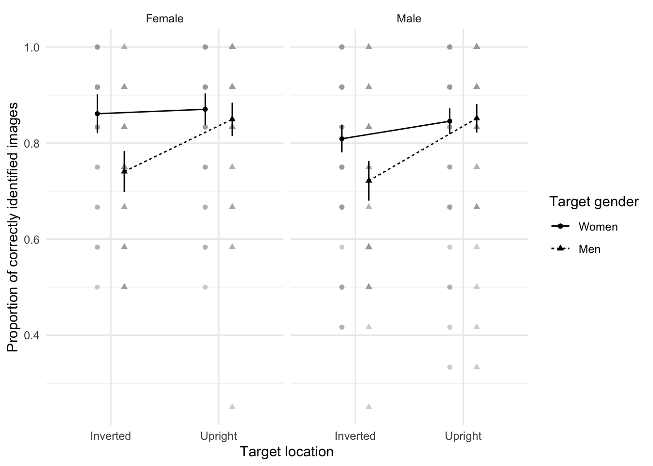
The next part of the question asks us to follow up the analysis with t-tests looking at inversion and gender effects. We can do these tests by running all possible simple effects. (Although these give us F-statistics, there is a direct relationship between t and F.)
Table 53 shows that participants recognized inverted females M = 0.84, SD = 0.16 significantly better than inverted males M = 0.73, SD = 0.17, F(1, 75) = 28.03, p < 0.001. This effect was not found for upright males and females, F(1, 75) = 0.28, p = 1.000.
Looking at the simple effects the other way around (Table 54), people recognized upright males M = 0.85, SD = 0.17 significantly better than inverted males M = 0.73, SD = 0.17, F(1, 75) = 37.90, p < 0.001, but this pattern did not emerge for females, F(1, 75) = 2.18, p = 0.288.
estimate_contrasts(model = bernard_afx,
                   contrast = "target_gender",
                   by = "target_location",
                   comparison = "joint",
                   p_adjust = "bonferroni") |>
display()| Contrast | target_location | df1 | df2 | F | p |
|---|---|---|---|---|---|
| target_gender | Inverted | 1 | 75 | 28.03 | < .001 |
| target_gender | Upright | 1 | 75 | 0.28 | > .999 |
Predictors averaged: gender, id; p-value adjustment method: Bonferroni
estimate_contrasts(model = bernard_afx,
                   contrast = "target_location",
                   by = "target_gender",
                   comparison = "joint",
                   p_adjust = "bonferroni") |>
display()| Contrast | target_gender | df1 | df2 | F | p |
|---|---|---|---|---|---|
| target_location | Women | 1 | 75 | 2.18 | 0.288 |
| target_location | Men | 1 | 75 | 37.90 | < .001 |
Predictors averaged: gender, id; p-value adjustment method: Bonferroni
Consistent with the authors’ hypothesis, the results showed that the inversion effect emerged only when participants saw sexualized males. This suggests that, at a basic cognitive level, sexualized men were perceived as people, whereas sexualized women were perceived as objects.
Keep the faith(ful)?
Data from Schützwohl (2008).
People can be jealous when they think that their partner is being unfaithful. An evolutionary view suggests that men and women have evolved distinctive types of jealousy: specifically, a woman’s sexual infidelity deprives her mate of a reproductive opportunity and could burden him with years investing in a child that is not his. Conversely, a man’s sexual infidelity does not burden his mate with unrelated children, but may divert his resources from his mate’s progeny. This diversion of resources is signalled by emotional attachment to another female. Consequently, men’s jealousy mechanism should have evolved to prevent a mate’s sexual infidelity, whereas in women it has evolved to prevent emotional infidelity. If this is the case, women should be ‘on the lookout’ for emotional infidelity, whereas men should be watching out for sexual infidelity.
Whether or not you buy into this theory, it can be tested. Achim Schützwohl exposed men and women to sentences on a computer screen (Schützwohl, 2008). At each trial, participants saw a target sentence that was emotionally neutral (e.g., ‘The gas station is at the other side of the street’). However, before each of these targets, a distractor sentence was presented that could also be affectively neutral, or could indicate sexual infidelity (e.g., ‘Your partner suddenly has difficulty becoming sexually aroused when he and you want to have sex’) or emotional infidelity (e.g., ‘Your partner doesn’t say “I love you” to you any more’). Schützwohl reasoned that if these distractor sentences grabbed a person’s attention then (1) they would remember them, and (2) they would not remember the target sentence that came afterwards (because their attentional resources were focused on the distractor). These effects should show up only in people currently in a relationship. The outcome was the number of sentences that a participant could remember (out of six), and the predictors were whether the person had a partner or not (
relationship), whether the trial used a neutral distractor, an emotional infidelity distractor or a sexual infidelity distractor, and whether the sentence was a distractor or the target following a distractor. Schützwohl analysed the men’s and women’s data seperately. The predictions are that women should remember more emotional infidelity sentences (distractors) but fewer of the targets that followed those sentences (target). For men, the same effect should be found but for sexual infidelity sentences (schützwohl_2008.csv). Labcoat Leni wants you to fit two models (one for men and the other for women) to test these hypotheses. View the solutions at www.discovr.rocks (or look at pages 638–642 in the original article).
Load the data using (see Tip 1):
schutzwohl_tib <- discovr::schutzwohl_2008Let’s first create separate tibbles for male and female participants using filter() so we can mimic the original analysis (which was performed separately for males and females).
For the main model there are two repeated-measures variables: whether the sentence was a distracter or a target (sentence_type) and whether the distracter used on a trial was neutral, indicated sexual infidelity or emotional infidelity (distractor_type). The resulting model will be a 2 (relationship: with partner or not) × 2 (sentence type: distractor or target) × 3 (distractor type: neutral, emotional infidelity or sexual infidelity) three-way mixed ANOVA with repeated measures on the last two variables.
To pick apart the three-way interaction we can look at the table of contrasts in Table 56. The contrasts tell us that the effect of whether or not you are in a relationship and whether you were remembering a distractor or target was similar in trials in which an emotional infidelity distractor was used compared to when a neutral distractor was used, \(\bar{X}_\text{Diff}\) = 0.04 (-1.09, 1.16), t(37) = 0.07, p = 0.945. However, as predicted, there is a difference in trials in which a sexual infidelity distractor was used compared to those in which a neutral distractor was used, \(\bar{X}_\text{Diff}\) = -1.35 (-2.52, -0.17), t(37) = -2.32, p = 0.026. [Note that these tests are uncorrected for multiple comparisons.]
To further see what these contrasts tell us, look at Table 57. First off, those without partners remember many more targets than they do distractors, and this is true for all types of trials. In other words, it doesn’t matter whether the distractor is neutral, emotional or sexual; these people remember more targets than distractors. The same pattern is seen in those with partners except for distractors that indicate sexual infidelity (the blue line connecting squares). For these, the number of targets remembered is reduced. Put another way, the slopes of the red and green lines are more or less the same for those in and out of relationships (compare plots) and the slopes are more or less the same as each other (compare red with green). The only difference is for the blue line, which is comparable to the red and green lines for those not in relationships, but has a shallower slope for those in relationships suggesting they remember fewer targets that were preceded by a sexual infidelity distractor. This supports the predictions of the author: men in relationships have an attentional bias such that their attention is consumed by cues indicative of sexual infidelity.
male_afx <- afex::aov_4(recall ~ relationship*sentence_type*distractor_type + (sentence_type*distractor_type |id), data = male_tib)Contrasts set to contr.sum for the following variables: relationshipmodel_parameters(male_afx, es_type = "omega") |>
display(use_symbols = TRUE)Warning in summary.Anova.mlm(model$Anova): HF eps > 1 treated as 1| Parameter | Sum_Squares | Sum_Squares_Error | df | df (error) | Mean_Square | F | p | ω² (partial) |
|---|---|---|---|---|---|---|---|---|
| relationship | 0.62 | 55.49 | 1.00 | 37.00 | 1.50 | 0.41 | 0.525 | 0.00 |
| sentence_type | 81.25 | 55.70 | 1.00 | 37.00 | 1.51 | 53.97 | < .001 | 0.41 |
| relationship:sentence_type | 2.93 | 55.70 | 1.00 | 37.00 | 1.51 | 1.94 | 0.172 | 0.01 |
| distractor_type | 1.29 | 58.60 | 1.92 | 70.91 | 0.83 | 0.81 | 0.443 | 0.00 |
| relationship:distractor_type | 6.21 | 58.60 | 1.92 | 70.91 | 0.83 | 3.92 | 0.026 | 0.04 |
| sentence_type:distractor_type | 1.63 | 52.55 | 1.99 | 73.75 | 0.71 | 1.15 | 0.323 | 1.87e-03 |
| relationship:sentence_type:distractor_type | 5.39 | 52.55 | 1.99 | 73.75 | 0.71 | 3.79 | 0.027 | 0.03 |
Anova Table (Type 3 tests)
male_cons <- estimate_contrasts(male_afx,
                                contrast = c("sentence_type", "distractor_type", "relationship"),
                                interaction = c(sentence_type = "trt.vs.ctrl", distractor_type = "trt.vs.ctrl", relationship =
                                                  "trt.vs.ctrl"),
                                ref = 1,
                                p_adjust = "none",
                                backend = "emmeans")

model_parameters(male_cons) |>
display()| sentence_type_trt.vs.ctrl | distractor_type_trt.vs.ctrl | relationship_trt.vs.ctrl | Difference | 95% CI | SE | t(37) | p |
|---|---|---|---|---|---|---|---|
| Target - Distractor | Emotional - Neutral | With partner - Without partner | 0.04 | (-1.09, 1.16) | 0.56 | 0.07 | 0.945 |
| Target - Distractor | Sexual - Neutral | With partner - Without partner | -1.35 | (-2.52, -0.17) | 0.58 | -2.32 | 0.026 |
Variable predicted: recall Predictors contrasted: sentence_type, distractor_type, relationship p-values are uncorrected.
afex::afex_plot(object = male_afx,
                c("shape", "color"),
                x = "sentence_type",
                trace = "distractor_type",
                panel = "relationship",
                legend_title = "Distractor content",
                error = "within") +
  labs(x = "Type of sentence", y = "Number of sentences recalled (0-6)") +
  theme_minimal()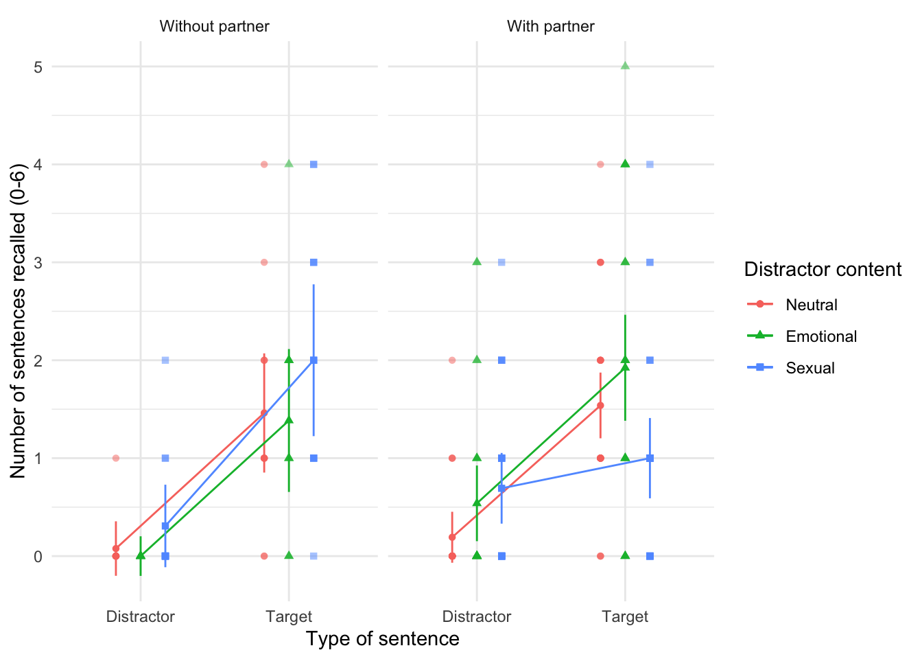
Let’s now look at the model for female participants.
To pick apart the three-way interaction we can look at the contrasts for the three-way interaction in Table 59. The contrasts tell us that the effect of whether or not you are in a relationship and whether you were remembering a distractor or target was significantly different in trials in which a emotional infidelity distractor was used compared to when a neutral distractor was used, \(\bar{X}_\text{Diff}\) = -1.88 (-3.27, -0.50), t(39) = -2.75, p = 0.009. However, there was not a significant difference in trials in which a sexual infidelity distractor was used compared to those in which a neutral distractor was used, \(\bar{X}_\text{Diff}\) = -0.32 (-1.50, 0.85), t(39) = -0.55, p = 0.582.
Table 60 shows that, as for the men, women without partners remember many more targets than they do distractors, and this is true for all types of trials (although it’s less true for the sexual infidelity trials because this line has a shallower slope). The same pattern is seen in those with partners except for distractors that indicate emotional infidelity (the green line). For these, the number of targets remembered is reduced. Put another way, the slopes of the red and blue lines are more or less the same for those in and out of relationships (compare plots). The only difference is for the green line, which is much shallower for those in relationships. They remember fewer targets that were preceded by a emotional infidelity distractor. This supports the predictions of the author: women in relationships have an attentional bias such that their attention is consumed by cues indicative of emotional infidelity.
female_afx <- afex::aov_4(recall ~ relationship*sentence_type*distractor_type + (sentence_type*distractor_type |id), data = female_tib)Contrasts set to contr.sum for the following variables: relationshipmodel_parameters(female_afx, es_type = "omega") |>
display(use_symbols = TRUE)Warning in summary.Anova.mlm(model$Anova): HF eps > 1 treated as 1| Parameter | Sum_Squares | Sum_Squares_Error | df | df (error) | Mean_Square | F | p | ω² (partial) |
|---|---|---|---|---|---|---|---|---|
| relationship | 1.32 | 49.64 | 1.00 | 39.00 | 1.27 | 1.03 | 0.315 | 8.52e-04 |
| sentence_type | 72.14 | 70.90 | 1.00 | 39.00 | 1.82 | 39.68 | < .001 | 0.36 |
| relationship:sentence_type | 2.03 | 70.90 | 1.00 | 39.00 | 1.82 | 1.11 | 0.298 | 1.68e-03 |
| distractor_type | 5.46 | 50.31 | 1.94 | 75.59 | 0.67 | 4.24 | 0.019 | 0.04 |
| relationship:distractor_type | 0.10 | 50.31 | 1.94 | 75.59 | 0.67 | 0.08 | 0.922 | 0.00 |
| sentence_type:distractor_type | 8.09 | 68.23 | 1.90 | 73.95 | 0.92 | 4.62 | 0.014 | 0.05 |
| relationship:sentence_type:distractor_type | 9.33 | 68.23 | 1.90 | 73.95 | 0.92 | 5.33 | 0.008 | 0.06 |
Anova Table (Type 3 tests)
female_cons <- estimate_contrasts(female_afx,
                                contrast = c("sentence_type", "distractor_type", "relationship"),
                                interaction = c(sentence_type = "trt.vs.ctrl", distractor_type = "trt.vs.ctrl", relationship =
                                                  "trt.vs.ctrl"),
                                ref = 1,
                                p_adjust = "none",
                                backend = "emmeans")

model_parameters(female_cons) |>
display()| sentence_type_trt.vs.ctrl | distractor_type_trt.vs.ctrl | relationship_trt.vs.ctrl | Difference | 95% CI | SE | t(39) | p |
|---|---|---|---|---|---|---|---|
| Target - Distractor | Emotional - Neutral | With partner - Without partner | -1.88 | (-3.27, -0.50) | 0.68 | -2.75 | 0.009 |
| Target - Distractor | Sexual - Neutral | With partner - Without partner | -0.32 | (-1.50, 0.85) | 0.58 | -0.55 | 0.582 |
Variable predicted: recall Predictors contrasted: sentence_type, distractor_type, relationship p-values are uncorrected.
afex::afex_plot(object = female_afx,
                c("shape", "color"),
                x = "sentence_type",
                trace = "distractor_type",
                panel = "relationship",
                legend_title = "Distractor content",
                error = "within") +
  labs(x = "Type of sentence", y = "Number of sentences recalled (0-6)") +
  theme_minimal()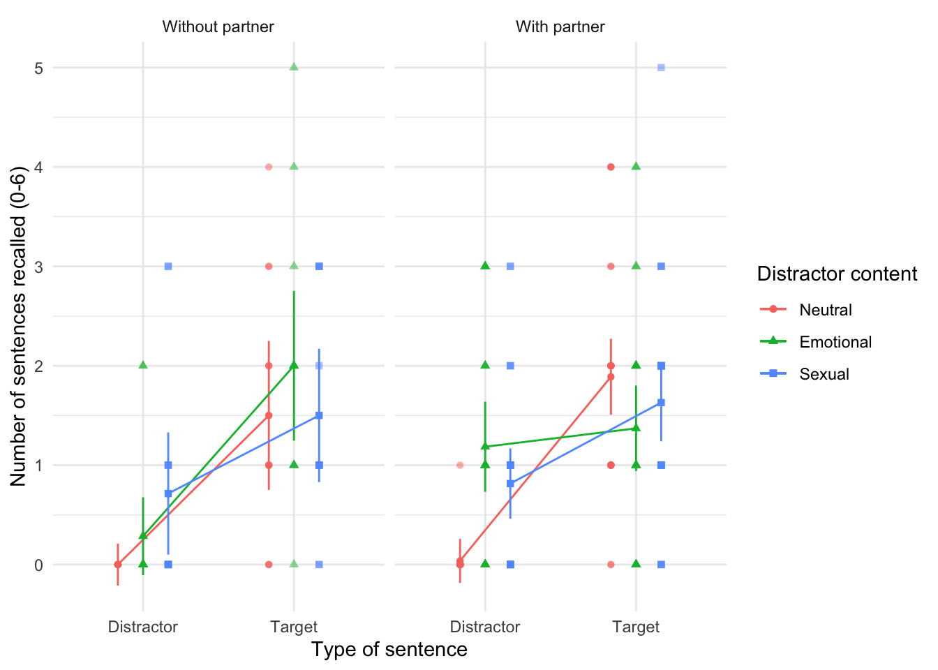
Chapter 17
World wide addiction?
Data from Nichols & Nicki (2004).
The increasing populatrity (and usefulness) of the Internet has led to the serious problem of Internet addiction. To research this construct it’s helpful to be able to measure it, so Laura Nichols and Richard Nicki developed the Internet Addiction Scale, IAS (Nichols & Nicki, 2004). This 36-item questionnaire contains items such as ‘I have stayed on the Internet longer than I intended to’ and ‘My grades/work have suffered because of my Internet use’, to which responses are made on a five-point scale (never, rarely, sometimes, frequently, always). (Incidentally, while researching this topic I encountered a deeply ironic Internet addiction recovery website that offered enough reasons to stay online for a week. A bit like a heroin addiction recovery centre with a huge pile of heroin in the reception area.) The authors dropped two items because they had low means and variances, and dropped three others because of relatively low correlations with other items. They performed a principal component analysis on the remaining 31 items, N = 207 (
nichols_2004.csv). Labcoat Leni wants you to run descriptive statistics to work out which two items were dropped for having low means/variances, then inspect a correlation matrix to find the three items that were dropped for having low correlations. Finally, he wants you to run a principal component analysis on the data. Answers are on the companion website (or look at the original article).
Load the data using (see Tip 1):
ias_tib <- discovr::nichols_2004Let’s create a version of the data that only contains the items (i.e. removes the participant ID and gender). Note that there are no items that need reverse scoring.
Let’s also make a tidy version of the data for plotting.
ias_tidy_tib <- ias_items |>
  pivot_longer(
    cols = ias1:ias36,
    names_to = "Item",
    values_to = "Response"
    ) |>
  mutate(
    Item = gsub("ias_", "IAS ", Item)
    )
Figure 22 shows the distributions of all items, most of which are severely positively skewed.
ggplot(ias_tidy_tib, aes(Response)) +
  geom_histogram(binwidth = 1, fill = "#CC6677", colour = "#882255", alpha = 0.5) +
  labs(y = "Frequency") +
  facet_wrap(~ Item, ncol = 6) +
  theme_minimal()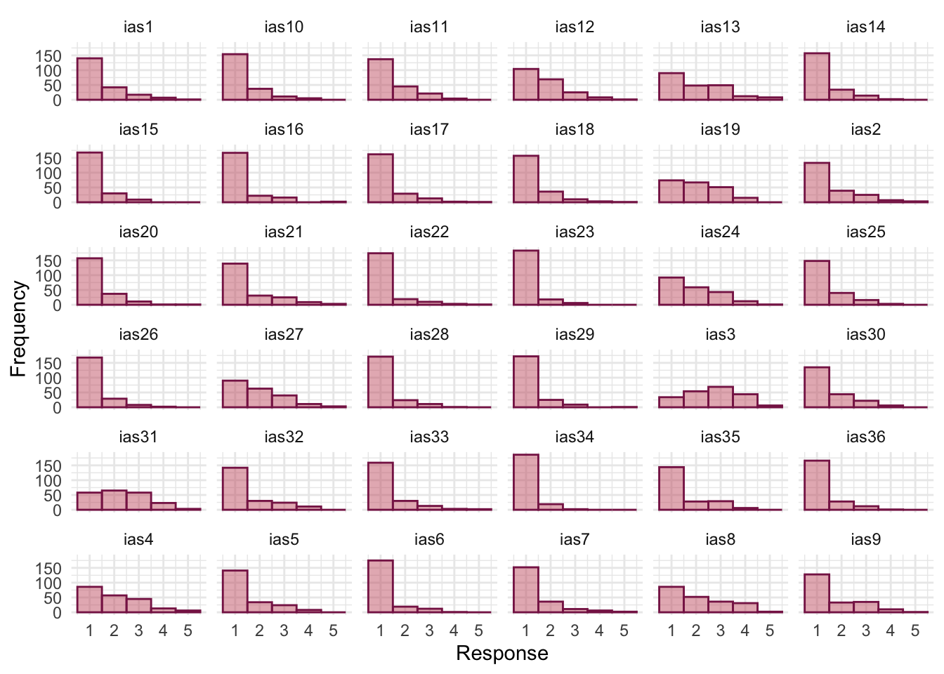
The authors note that:
We deleted from the IAS 2 items that had means distant from the center of the range and low variances. We eliminated an additional 3 items from the scale because the magnitude of their correlations was quite low (although still significant).
To work out which items these might be, let’s first look at the descriptive statistics in Table 61. To help identify the 2 items with low variances I have sorted the table by the standard deviations (in ascending order). Based on this table it seems likely that IAS-23 (I see my friends less often because of the time that I spend on the Internet) and IAS-34 (When I use the Internet, I experience a buzz or a high) were the excluded items, both of which have restricted ranges, low means and small standard deviations. [There is arguably a case to exclude ISA-15 on the same grounds, but this wasn’t done.]
In terms, of correlations, the IAS uses Likert responses, so like the example in the chapter we should use polychoric correlations. However, in the interests of replicating what the authors did, Figure 23 plots the Pearson correlations. We know that the authors eliminated three items for having low correlations. The cells are coloured according to the strength of correlation: the weaker the correlation the paler the shading of the cell with zero correlations having no shading at all (i.e. white). So, we’re looking for variables that have a lot of cells with very pale shading. [Note that the variables are ordreed in reverse on the x-axis.] The three items that stand out are IAS 13 (I have felt a persistent desire to cut down or control my use of the internet), IAS 22 (I have neglected things which are important and need doing), and IAS-32 (I find myself thinking/longing about when I will go on the internet again.). As such these variables will also be excluded from the analysis.
| Variable | Mean | SD | Range | Skewness | Kurtosis | n | n_Missing |
|---|---|---|---|---|---|---|---|
| ias34 | 1.11 | 0.34 | (1.00, 3.00) | 3.19 | 10.21 | 207 | 0 |
| ias23 | 1.14 | 0.43 | (1.00, 3.00) | 3.07 | 9.04 | 207 | 0 |
| ias15 | 1.23 | 0.52 | (1.00, 3.00) | 2.18 | 3.92 | 207 | 0 |
| ias28 | 1.24 | 0.56 | (1.00, 4.00) | 2.46 | 5.55 | 207 | 0 |
| ias6 | 1.22 | 0.57 | (1.00, 4.00) | 2.60 | 6.11 | 207 | 0 |
| ias29 | 1.23 | 0.57 | (1.00, 5.00) | 3.04 | 11.46 | 207 | 0 |
| ias26 | 1.25 | 0.57 | (1.00, 4.00) | 2.54 | 6.60 | 207 | 0 |
| ias36 | 1.27 | 0.58 | (1.00, 4.00) | 2.23 | 4.38 | 207 | 0 |
| ias20 | 1.32 | 0.64 | (1.00, 5.00) | 2.37 | 6.73 | 207 | 0 |
| ias14 | 1.33 | 0.64 | (1.00, 4.00) | 1.98 | 3.31 | 207 | 0 |
| ias22 | 1.25 | 0.66 | (1.00, 5.00) | 3.00 | 9.53 | 207 | 0 |
| ias17 | 1.31 | 0.68 | (1.00, 5.00) | 2.45 | 6.48 | 207 | 0 |
| ias18 | 1.33 | 0.68 | (1.00, 5.00) | 2.42 | 6.59 | 207 | 0 |
| ias25 | 1.39 | 0.69 | (1.00, 4.00) | 1.76 | 2.44 | 207 | 0 |
| ias16 | 1.30 | 0.69 | (1.00, 5.00) | 2.68 | 8.01 | 207 | 0 |
| ias10 | 1.36 | 0.70 | (1.00, 4.00) | 2.10 | 4.08 | 207 | 0 |
| ias33 | 1.35 | 0.75 | (1.00, 5.00) | 2.48 | 6.61 | 207 | 0 |
| ias11 | 1.48 | 0.76 | (1.00, 4.00) | 1.47 | 1.32 | 207 | 0 |
| ias30 | 1.51 | 0.80 | (1.00, 4.00) | 1.46 | 1.23 | 207 | 0 |
| ias7 | 1.41 | 0.80 | (1.00, 5.00) | 2.29 | 5.31 | 207 | 0 |
| ias1 | 1.49 | 0.82 | (1.00, 5.00) | 1.78 | 2.72 | 207 | 0 |
| ias35 | 1.50 | 0.84 | (1.00, 4.00) | 1.45 | 0.85 | 207 | 0 |
| ias5 | 1.51 | 0.85 | (1.00, 4.00) | 1.51 | 1.19 | 207 | 0 |
| ias12 | 1.71 | 0.86 | (1.00, 5.00) | 1.15 | 0.90 | 207 | 0 |
| ias32 | 1.54 | 0.90 | (1.00, 4.00) | 1.50 | 1.05 | 207 | 0 |
| ias2 | 1.59 | 0.93 | (1.00, 5.00) | 1.60 | 2.03 | 207 | 0 |
| ias19 | 2.03 | 0.95 | (1.00, 4.00) | 0.45 | -0.85 | 207 | 0 |
| ias9 | 1.66 | 0.96 | (1.00, 5.00) | 1.19 | 0.31 | 207 | 0 |
| ias24 | 1.89 | 0.96 | (1.00, 5.00) | 0.75 | -0.38 | 207 | 0 |
| ias21 | 1.58 | 0.96 | (1.00, 5.00) | 1.62 | 1.86 | 207 | 0 |
| ias27 | 1.91 | 0.98 | (1.00, 5.00) | 0.90 | 0.18 | 207 | 0 |
| ias31 | 2.27 | 1.03 | (1.00, 5.00) | 0.38 | -0.68 | 207 | 0 |
| ias3 | 2.68 | 1.07 | (1.00, 5.00) | -2.53e-03 | -0.81 | 207 | 0 |
| ias4 | 2.01 | 1.07 | (1.00, 5.00) | 0.85 | 0.02 | 207 | 0 |
| ias13 | 2.03 | 1.12 | (1.00, 5.00) | 0.85 | -0.05 | 207 | 0 |
| ias8 | 2.09 | 1.13 | (1.00, 5.00) | 0.63 | -0.88 | 207 | 0 |
ias_cor <- correlation(ias_items)

ias_cor |>
  summary() |>
  plot(stars = FALSE) +
  theme_minimal()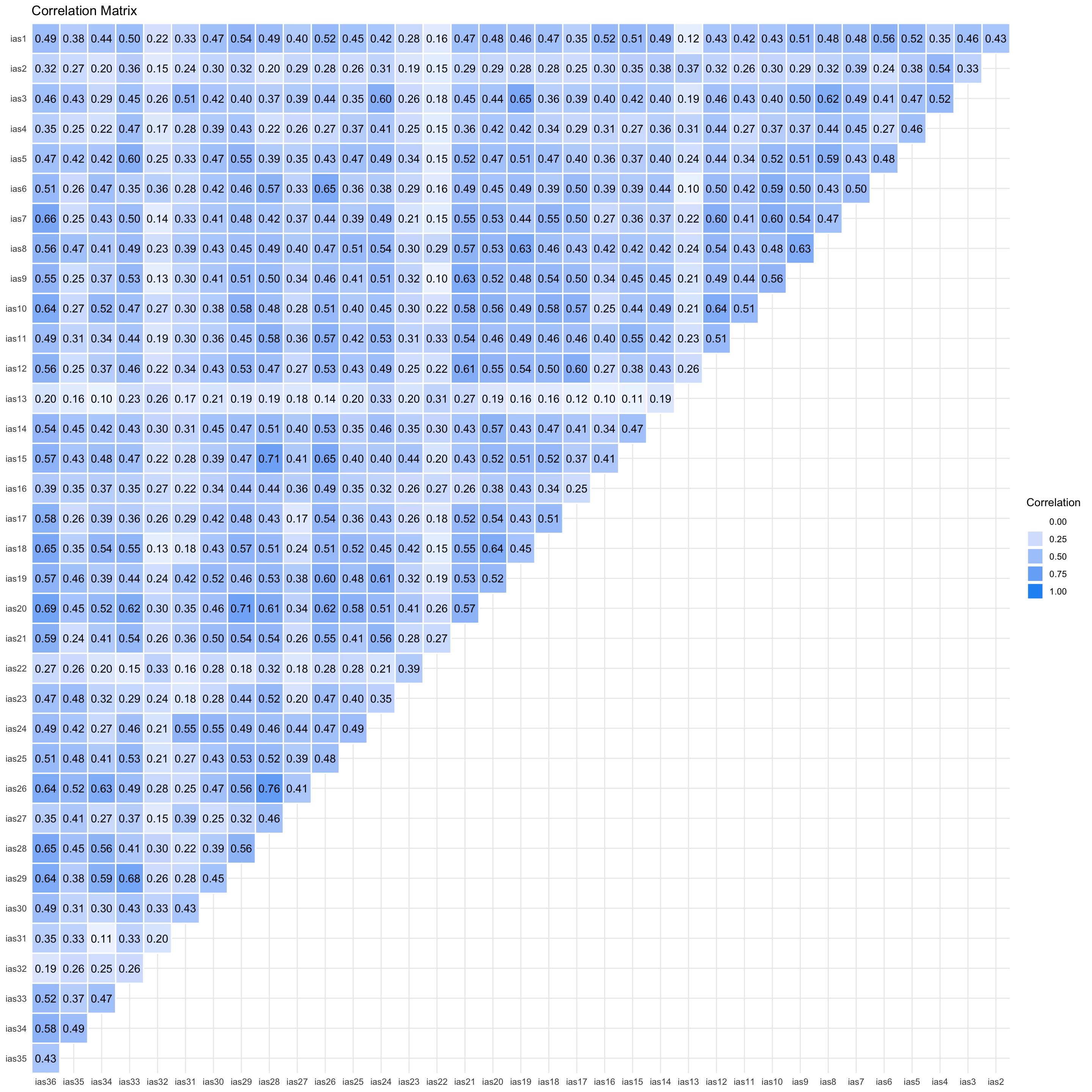
Based on the above, we want to remove items IAS 13, IAS 22, IAS 23, IAS 32, IAS 34. We can do this by recreating ias_items without these items:
To get Bartlett’s test and the KMO we use check_factorstructure(). The overall KMO statistic is 0.94, which is well above the minimum criterion of 0.5 and falls into the range of marvellous. The KMO values for individual variables range from 0.89 to 0.97. All values are, therefore, well above 0.5, which is good news. Bartlett’s test is significant, \(\chi^2\)(465) = 4238.98, p < 0.001, indicating that the correlations within the R-matrix are sufficiently different from zero to warrant PCA.
check_factorstructure(ias_items)# Is the data suitable for Factor Analysis?
- Sphericity: Bartlett's test of sphericity suggests that there is sufficient significant correlation in the data for factor analysis (Chisq(465) = 4238.98, p < .001).
- KMO: The Kaiser, Meyer, Olkin (KMO) overall measure of sampling adequacy suggests that data seems appropriate for factor analysis (KMO = 0.94). The individual KMO scores are: ias1 (0.95), ias2 (0.90), ias3 (0.94), ias4 (0.92), ias5 (0.95), ias6 (0.92), ias7 (0.92), ias8 (0.95), ias9 (0.96), ias10 (0.94), ias11 (0.95), ias12 (0.96), ias14 (0.94), ias15 (0.92), ias16 (0.94), ias17 (0.96), ias18 (0.96), ias19 (0.97), ias20 (0.96), ias21 (0.96), ias24 (0.95), ias25 (0.95), ias26 (0.94), ias27 (0.93), ias28 (0.92), ias29 (0.94), ias30 (0.95), ias31 (0.89), ias33 (0.93), ias35 (0.92), ias36 (0.95).The authors didn’t use parallel analysis, but let’s do it anyway.
psych::fa.parallel(ias_items, fa = "pc")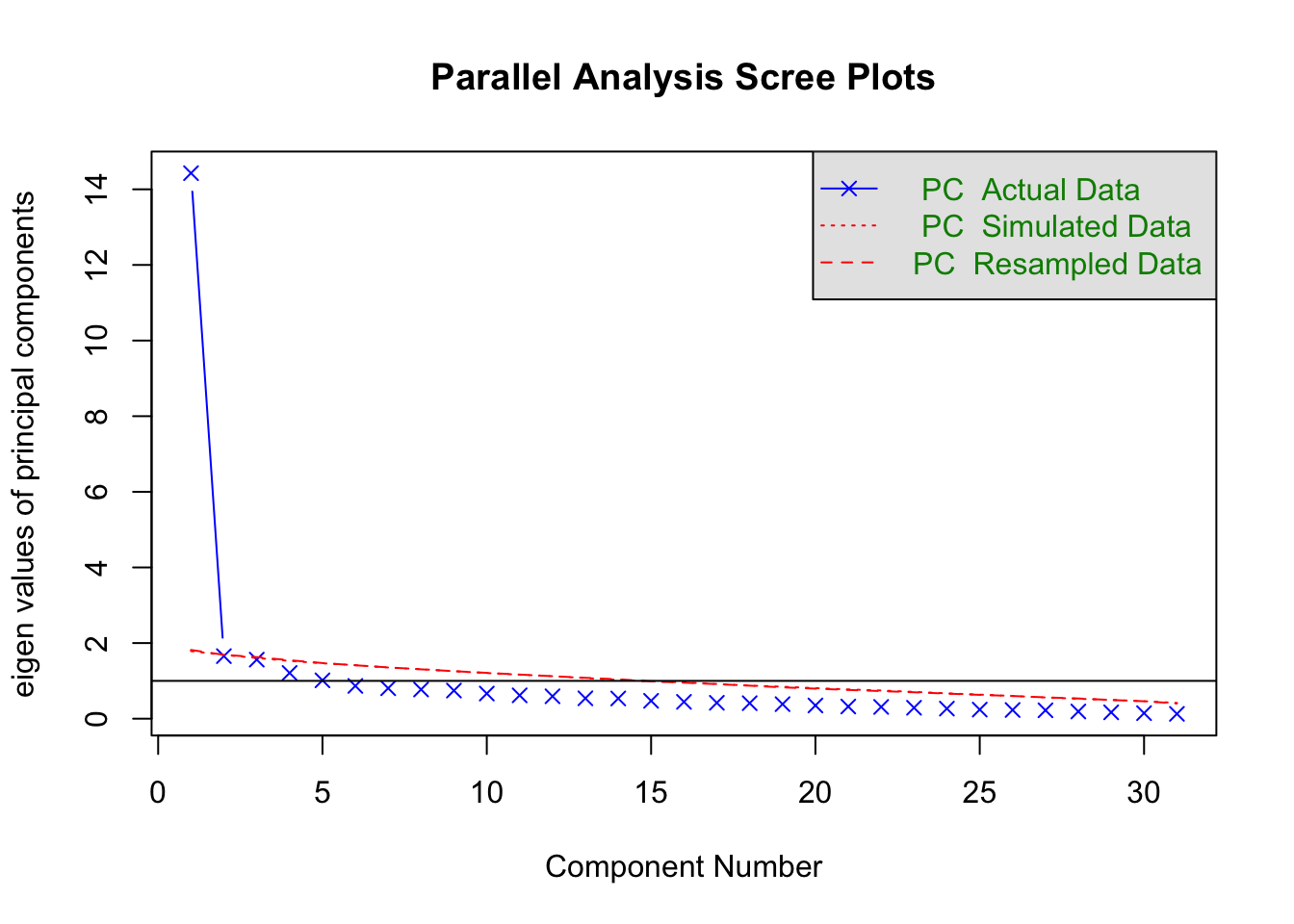
Parallel analysis suggests that the number of factors = NA and the number of components = 1 The parallel analysis suggests that a single component underlies the items, which is consistent with what the authors conclude based on the scree plot. To do the principal component analysis execute the code below. Because we are retaining only one component (n = 1) we don’t need to specify a rotation method. Note also that with PCA, functions that were used in the chapter such as model_performance() and check_residuals() don’t work. Table 62 shows that the component explained 46.54% of the variance.
Table 63 shows the component loadings. All items have a high loading on the one extracted component. The authors reported their analysis as follows (p. 382):
We conducted principal-components analyses on the log transformed scores of the IAS (see above). On the basis of the scree test (Cattell, 1978) and the percentage of variance accounted for by each factor, we judged a one-factor solution to be most appropriate. This component accounted for a total of 46.50% of the variance. A value for loadings of .30 (Floyd & Widaman, 1995) was used as a cut-off for items that did not relate to a component.
All 31 items loaded on this component, which was interpreted to represent aspects of a general factor relating to Internet addiction reflecting the negative consequences of excessive Internet use.
| Parameter | PC1 |
|---|---|
| Eigenvalues | 14.427 |
| Variance Explained | 0.465 |
| Variance Explained (Cumulative) | 0.465 |
| Variance Explained (Proportion) | 0.465 |
display(ias_pca)| Variable | PC1 | Complexity |
|---|---|---|
| ias1 | 0.70 | 1.00 |
| ias2 | 0.48 | 1.00 |
| ias3 | 0.68 | 1.00 |
| ias4 | 0.56 | 1.00 |
| ias5 | 0.69 | 1.00 |
| ias6 | 0.67 | 1.00 |
| ias7 | 0.70 | 1.00 |
| ias8 | 0.74 | 1.00 |
| ias9 | 0.72 | 1.00 |
| ias10 | 0.73 | 1.00 |
| ias11 | 0.67 | 1.00 |
| ias12 | 0.72 | 1.00 |
| ias14 | 0.67 | 1.00 |
| ias15 | 0.68 | 1.00 |
| ias16 | 0.55 | 1.00 |
| ias17 | 0.65 | 1.00 |
| ias18 | 0.71 | 1.00 |
| ias19 | 0.75 | 1.00 |
| ias20 | 0.79 | 1.00 |
| ias21 | 0.74 | 1.00 |
| ias24 | 0.72 | 1.00 |
| ias25 | 0.66 | 1.00 |
| ias26 | 0.77 | 1.00 |
| ias27 | 0.53 | 1.00 |
| ias28 | 0.74 | 1.00 |
| ias29 | 0.76 | 1.00 |
| ias30 | 0.64 | 1.00 |
| ias31 | 0.50 | 1.00 |
| ias33 | 0.71 | 1.00 |
| ias35 | 0.56 | 1.00 |
| ias36 | 0.80 | 1.00 |
The unique principal component accounted for 46.54% of the total variance of the original data.
Chapter 18
The impact of sexualized images on women’s self-evaluations
Data from Daniels (2012).
Women (and increasingly men) are bombared with ‘idealized’ images in the media and there is a growing concern about how these images affect our perceptions of ourselves. Daniels (2012) showed young women images of successful female athletes (e.g., Anna Kournikova) in which they were either playing sport (performance athlete images) or posing in bathing suits (sexualized images). Participants completed a short writing exercise after viewing these images. Each participant saw only one type of image, but several examples. Daniels then coded these written exercises and identified themes, one of which was whether women self-objectified (i.e., commented on their own appearance/attractiveness). Daniels hypothesized that women who viewed the sexualized images (n = 140) would self-objectify (i.e., this theme would be present in what they wrote) more than those who viewed the performance athlete pictures (n = 117, despite what the Participants section of the paper implies). Labcoat Leni wants you to enter the data from Daniels’ study (Table 18.3) and test her hypothesis that there is a significant association between the type of image viewed, and whether or not the women self-objectified (
daniels_2012.csv). View the solutions at www.discovr. rocks, or on page 85 of Daniels’ paper.
| Group | Theme present | Theme absent | Total |
|---|---|---|---|
| Performance athletes | 20 | 97 | 117 |
| Sexualized athletes | 56 | 84 | 140 |
Enter the data as follows
| picture | theme_present | n |
|---|---|---|
| Performance athletes | Absent | 97 |
| Performance athletes | Present | 20 |
| Sexualized athletes | Absent | 84 |
| Sexualized athletes | Present | 56 |
First, we need to create a contingency table from the data as in Table 65.
object_xtbl <- data_tabulate(x = objectify_freq,
                                select = "picture",
                                by = "theme_present",
                                weights = "n",
                                remove_na = TRUE,
                                proportions = NULL)

# view the table
display(object_xtbl)| picture | Absent | Present | Total |
|---|---|---|---|
| Performance athletes | 97 | 20 | 117 |
| Sexualized athletes | 84 | 56 | 140 |
| Total | 181 | 76 | 257 |
Let’s look at the column proportions (that is the proportion of cases within those that self-objectified (present) or not (absent) by creating Table 66. This table tells us that of all the women who did self-evaluate (theme present), 26.3% saw pictures of performance athletes and 73.7% saw sexualized pictures of female athletes (around three times more women who self-evaluated had seen the sexualised images). Conversely, of all the women who didn’t self-evaluate (theme absent), 53.6% saw pictures of performance athletes and 46.4% saw sexualized pictures of female athletes (so almost a 50:50 split).
prop_obj <- data_tabulate(x = objectify_freq,
                select = "picture",
                by = "theme_present",
                weights = "n",
                proportions = "column",
                remove_na = TRUE)

# view the table
display(prop_obj)| picture | Absent | Present | Total |
|---|---|---|---|
| Performance athletes | 97 (53.6%) | 20 (26.3%) | 117 |
| Sexualized athletes | 84 (46.4%) | 56 (73.7%) | 140 |
| Total | 181 | 76 | 257 |
The Pearson’s chi-square test examines whether there is an association between the type of picture and whether the women self-evaluated or not. This test was highly significant (Table 67), indicating that the type of picture used had a significant effect on whether women self-evaluated, \(\chi^2\)(1) = 16.06, p < 0.001. [Note that I used correct = FALSE which prevents the continuity correction from being applied, which matches what the authors did.] The effect size (Table 68) is really large, \(\hat{OR}\) = 3.23 [1.80, 5.82] indicating that the odds of objectifying were 3 times greater after viewing sexualized athletes than performance athletes.
We can check the assumptions using Table 69. There were no expected frequencies less than 5, so the chi-square statistic should be accurate. We can also look at the residuals to make sense of the result (Table 70). Absolute values greater than 1.96 indicate an observed cell frequency significantly above (positive value) or below (negative value) what would be expected. Essentially the cells for women who did self-evaluate/objectify are both significant indicating that significantly more women than expected self-objectified after looking at pictures of sexualized athletes and significantly fewer women than expected self-objectified after seeing pictures of performance athletes.
Below is an excerpt from Daniels’s (2012) conclusions:
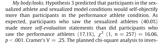
objecti_chi <- object_xtbl |>
  as.table(simplify = TRUE) |>
  chisq.test(correct = FALSE)

model_parameters(objecti_chi) |>
display()| Chi2(1) | p |
|---|---|
| 16.06 | < .001 |
| Odds ratio | 95% CI |
|---|---|
| 3.23 | [1.80, 5.82] |
get_predicted(objecti_chi) |>
display()| Absent | Present | |
|---|---|---|
| Performance athletes | 82.40 | 34.60 |
| Sexualized athletes | 98.60 | 41.40 |
get_residuals(objecti_chi) |>
display()| Absent | Present | |
|---|---|---|
| Performance athletes | 1.61 | -2.48 |
| Sexualized athletes | -1.47 | 2.27 |
Is the Black American happy?
Data from Beckham (1929).
During my psychology degree I spent a lot of time reading about the civil rights movement in the USA. Instead of reading psychology, I read about Malcolm X and Martin Luther King Jr. For this reason I find Beckham’s (1929) study of black Americans a fascinating historical piece of research. Beckham was a black American who founded the psychology laboratory at Howard University, Washington, DC, and his wife Ruth was the first black woman ever to be awarded a PhD (also in psychology) at the University of Minnesota. To put some context on the study, it was published 36 years before the Jim Crow laws were finally overthrown by the Civil Rights Act of 1964, and at a time when black Americans were segregated, openly discriminated against and victims of the most abominable violations of civil liberties and human rights (I recommend James Baldwin’s superb The fire next time for an insight into the times). The language of the study and the data from it are an uncomfortable reminder of the era in which it was conducted. Current affairs are an even more uncomfortable reminder that, unfathomably, some people with more power than intellect seem to want to return to this era.
Beckham sought to measure the psychological state of 3443 black Americans with three questions. He asked them to answer yes or no to whether they thought black Americans were happy, whether they personally were happy as a black American, and whether black Americans should be happy. Beckham did no formal statistical analysis of his data (Fisher’s article containing the popularized version of the chi-square test was published only 7 years earlier in a statistics journal that would not have been read by psychologists). I love this study, because it demonstrates that you do not need elaborate methods to answer important and far-reaching questions; with just three questions, Beckham told the world an enormous amount about very real and important psychological and sociological phenomena.
The frequency data (number of yes and no responses within each employment category) from this study are in the file
beckham_1929.csv. Labcoat Leni wants you to carry out three chi-square tests (one for each question that was asked). What conclusions can you draw? View the solutions at www.discovr.rocks.
Load the data using (see Tip 1):
beckham_tib <- discovr::beckham_1929Are Black Americans happy?
Let’s run the analysis on the first question. First, we need to create a contingency table from the data as in Table 72 The responses to this first question are in the variable happy, so we use weights = "happy" in our code.
q1_xtbl <- data_tabulate(x = beckham_tib,
                         select = "profession",
                         by = "response",
                         weights = "happy",
                         remove_na = TRUE,
                         proportions = NULL)

# view the table
display(q1_xtbl)| profession | Yes | No | Total |
|---|---|---|---|
| College students | 390 | 1610 | 2000 |
| Unskilled laborers | 378 | 122 | 500 |
| Preachers | 35 | 265 | 300 |
| Physicians | 159 | 51 | 210 |
| Housewives | 78 | 122 | 200 |
| School teachers | 108 | 38 | 146 |
| Lawyers | 11 | 64 | 75 |
| Musician | 31 | 19 | 50 |
| Total | 1190 | 2291 | 3481 |
Table 73 shows that the chi-square test is highly significant, \(\chi^2\)(7) = 936.14, p < 0.001. This indicates that the profile of yes and no responses differed across the professions. Table 74 shows that all expected values were above 5. To interpret the significant association between profession and response to the question, we can look at the row proportions (Table 75) and standardized residuals (Table 76). The only profession for which the zs are are non-significant are housewives who showed a fairly even split of whether they thought Black Americans were happy (39%) or not (61%). Within the other professions all of the standardized residuals are much higher than 1.96. To make sense of this we need to look at the direction of these residuals (i.e., whether they are positive or negative). For the following professions the residual for ‘no’ was positive but for ‘yes’ was negative indicating people who responded more than we would expect that Black Americans were not happy and less than expected that Black Americans were happy: college students, preachers and lawyers. The remaining professions (labourers, physicians, school teachers and musicians) show the opposite pattern: the residual for ‘no’ was negative but for ‘yes’ was positive; these are, therefore, people who responded less than we would expect that Black Americans were not happy and more than expected that Black Americans were happy.
q1_chi <- q1_xtbl |>
  as.table(simplify = TRUE) |>
  chisq.test()

model_parameters(q1_chi) |>
display()| Chi2(7) | p |
|---|---|
| 936.14 | < .001 |
get_predicted(q1_chi) |>
display()| Yes | No | |
|---|---|---|
| College students | 683.71 | 1316.29 |
| Unskilled laborers | 170.93 | 329.07 |
| Preachers | 102.56 | 197.44 |
| Physicians | 71.79 | 138.21 |
| Housewives | 68.37 | 131.63 |
| School teachers | 49.91 | 96.09 |
| Lawyers | 25.64 | 49.36 |
| Musician | 17.09 | 32.91 |
q1_prop <- data_tabulate(x = beckham_tib,
                         select = "profession",
                         by = "response",
                         weights = "happy",
                         remove_na = TRUE,
                         proportions = "row")

# view the table
display(q1_prop)| profession | Yes | No | Total |
|---|---|---|---|
| College students | 390 (19.5%) | 1610 (80.5%) | 2000 |
| Unskilled laborers | 378 (75.6%) | 122 (24.4%) | 500 |
| Preachers | 35 (11.7%) | 265 (88.3%) | 300 |
| Physicians | 159 (75.7%) | 51 (24.3%) | 210 |
| Housewives | 78 (39.0%) | 122 (61.0%) | 200 |
| School teachers | 108 (74.0%) | 38 (26.0%) | 146 |
| Lawyers | 11 (14.7%) | 64 (85.3%) | 75 |
| Musician | 31 (62.0%) | 19 (38.0%) | 50 |
| Total | 1190 | 2291 | 3481 |
get_residuals(q1_chi) |>
display()| Yes | No | |
|---|---|---|
| College students | -11.23 | 8.10 |
| Unskilled laborers | 15.84 | -11.42 |
| Preachers | -6.67 | 4.81 |
| Physicians | 10.29 | -7.42 |
| Housewives | 1.16 | -0.84 |
| School teachers | 8.22 | -5.93 |
| Lawyers | -2.89 | 2.08 |
| Musician | 3.36 | -2.42 |
Are they Happy as Black Americans?
We run this analysis using basically the same code except that we now have to weight the cases by the variable you_happy. First, we create a contingency table from the data as in Table 77 using weights = "you_happy".
q2_xtbl <- data_tabulate(x = beckham_tib,
                         select = "profession",
                         by = "response",
                         weights = "you_happy",
                         remove_na = TRUE,
                         proportions = NULL)

# view the table
display(q2_xtbl)| profession | Yes | No | Total |
|---|---|---|---|
| College students | 1822 | 48 | 1870 |
| Unskilled laborers | 305 | 195 | 500 |
| Preachers | 230 | 0 | 230 |
| Physicians | 203 | 7 | 210 |
| Housewives | 17 | 146 | 163 |
| School teachers | 79 | 28 | 107 |
| Lawyers | 30 | 0 | 30 |
| Musician | 16 | 34 | 50 |
| Total | 2702 | 458 | 3160 |
Table 78 shows that the chi-square test is highly significant, \(\chi^2\)(7) = 1390.74, p < 0.001. This indicates that the profile of yes and no responses differed across the professions. Table 69 shows that all expected values were above 5 except for Lawyers responding ‘No’, which was just under the threshold. To interpret the significant association between profession and response to the question, we look at the row proportions (Table 80) and standardized residuals (Table 81). The standardized residuals are significant in most cells with a few exceptions: physicians, lawyers and school teachers who responded ‘yes’. Within the other cells all of the standardized residuals are much higher than 1.96. We can look at the direction of these residuals (i.e., whether they are positive or negative). For labourers, housewives, school teachers and musicians the residual for ‘no’ was positive but for ‘yes’ was negative; these are, therefore, people who responded more than we would expect that they were not happy as Black Americans and less than expected that they were happy as Black Americans. The remaining professions (college students, physicians, preachers and lawyers) show the opposite pattern: the residual for ‘no’ was negative but for ‘yes’ was positive; these are, therefore, people who responded less than we would expect that they were not happy as Black Americans and more than expected that they were happy as Black Americans. Essentially, the former group are in low-paid jobs in which conditions would have been very hard (especially in the social context of the time). The latter group are in much more respected (and probably better-paid) professions. Therefore, the responses to this question could say more about the professions of the people asked than their views of being Black Americans.
q2_chi <- q2_xtbl |>
  as.table(simplify = TRUE) |>
  chisq.test()
Warning in chisq.test(as.table(q2_xtbl, simplify = TRUE)): Chi-squared
approximation may be incorrectmodel_parameters(q2_chi) |>
display()| Chi2(7) | p |
|---|---|
| 1390.74 | < .001 |
get_predicted(q2_chi) |>
display()| Yes | No | |
|---|---|---|
| College students | 1598.97 | 271.03 |
| Unskilled laborers | 427.53 | 72.47 |
| Preachers | 196.66 | 33.34 |
| Physicians | 179.56 | 30.44 |
| Housewives | 139.38 | 23.62 |
| School teachers | 91.49 | 15.51 |
| Lawyers | 25.65 | 4.35 |
| Musician | 42.75 | 7.25 |
q2_prop <- data_tabulate(x = beckham_tib,
                         select = "profession",
                         by = "response",
                         weights = "you_happy",
                         remove_na = TRUE,
                         proportions = "row")

# view the table
display(q2_prop)| profession | Yes | No | Total |
|---|---|---|---|
| College students | 1822 (97.4%) | 48 (2.6%) | 1870 |
| Unskilled laborers | 305 (61.0%) | 195 (39.0%) | 500 |
| Preachers | 230 (100.0%) | 0 (0.0%) | 230 |
| Physicians | 203 (96.7%) | 7 (3.3%) | 210 |
| Housewives | 17 (10.4%) | 146 (89.6%) | 163 |
| School teachers | 79 (73.8%) | 28 (26.2%) | 107 |
| Lawyers | 30 (100.0%) | 0 (0.0%) | 30 |
| Musician | 16 (32.0%) | 34 (68.0%) | 50 |
| Total | 2702 | 458 | 3160 |
get_residuals(q2_chi) |>
display()| Yes | No | |
|---|---|---|
| College students | 5.58 | -13.55 |
| Unskilled laborers | -5.93 | 14.39 |
| Preachers | 2.38 | -5.77 |
| Physicians | 1.75 | -4.25 |
| Housewives | -10.37 | 25.18 |
| School teachers | -1.31 | 3.17 |
| Lawyers | 0.86 | -2.09 |
| Musician | -4.09 | 9.94 |
Should Black Americans be happy?
We run this analysis using basically the same code except that we now have to weight the cases by the variable should_be_happy. First, we create a contingency table from the data as in Table 82 using weights = "should_be_happy".
q3_xtbl <- data_tabulate(x = beckham_tib,
                         select = "profession",
                         by = "response",
                         weights = "should_be_happy",
                         remove_na = TRUE,
                         proportions = NULL)

# view the table
display(q3_xtbl)| profession | Yes | No | Total |
|---|---|---|---|
| College students | 141 | 1810 | 1951 |
| Unskilled laborers | 396 | 104 | 500 |
| Preachers | 264 | 36 | 300 |
| Physicians | 174 | 36 | 210 |
| Housewives | 90 | 120 | 210 |
| School teachers | 75 | 33 | 108 |
| Lawyers | 7 | 57 | 64 |
| Musician | 36 | 14 | 50 |
| Total | 1183 | 2210 | 3393 |
Table 83 shows that the chi-square test is highly significant, \(\chi^2\)(7) = 1784.23, p < 0.001. This indicates that the profile of yes and no responses differed across the professions. Table 84 shows that all expected values were above 5. Looking at the row proportions (Table 85) and standardized residuals (Table 86) nearly all cells have significant z-values. Again, we can look at the direction of these residuals (i.e., whether they are positive or negative). For college students and lawyers the residual for ‘no’ was positive but for ‘yes’ was negative; these are, therefore, people who responded more than we would expect that they thought that Black Americans should not be happy and less than expected that they thought Black Americans should be happy. The remaining professions show the opposite pattern: the residual for ‘no’ was negative but for ‘yes’ was positive; these are, therefore, people who responded less than we would expect that they did not think that Black Americans should be happy and more than expected that they thought that Black Americans should be happy.
What is interesting here and in the first question is that college students and lawyers are in vocations in which they are expected to be critical about the world. Lawyers may well have defended Black Americans who had been the subject of injustice and discrimination or racial abuse, and college students would likely be applying their critically trained minds to the immense social injustice that prevailed at the time. Therefore, these groups can see that their racial group should not be happy and should strive for the equitable and just society to which they are entitled. People in the other professions perhaps adopt a different social comparison.
It’s also possible for this final question that the groups interpreted the question differently: perhaps the lawyers and students interpreted the question as ‘should they be happy given the political and social conditions of the time?’, while the others interpreted the question as ‘do they deserve happiness?’
It might seem strange to have picked a piece of research from so long ago to illustrate the chi-square test, but what I wanted to demonstrate is that simple research can sometimes be incredibly illuminating. This study asked three simple questions, yet the data are fascinating. It raised further hypotheses that could be tested, it unearthed very different views in different professions, and it illuminated very important social and psychological issues. There are others studies that sometimes use the most elegant paradigms and the highly complex methodologies, but the questions they address are meaningless for the real world. They miss the big picture. Albert Beckham was a remarkable man, trying to understand important and big real-world issues that mattered to hundreds of thousands of people.
q3_chi <- q3_xtbl |>
  as.table(simplify = TRUE) |>
  chisq.test()

model_parameters(q3_chi) |>
display()| Chi2(7) | p |
|---|---|
| 1784.23 | < .001 |
get_predicted(q3_chi) |>
display()| Yes | No | |
|---|---|---|
| College students | 680.23 | 1270.77 |
| Unskilled laborers | 174.33 | 325.67 |
| Preachers | 104.60 | 195.40 |
| Physicians | 73.22 | 136.78 |
| Housewives | 73.22 | 136.78 |
| School teachers | 37.66 | 70.34 |
| Lawyers | 22.31 | 41.69 |
| Musician | 17.43 | 32.57 |
q3_prop <- data_tabulate(x = beckham_tib,
                         select = "profession",
                         by = "response",
                         weights = "should_be_happy",
                         remove_na = TRUE,
                         proportions = "row")

# view the table
display(q3_prop)| profession | Yes | No | Total |
|---|---|---|---|
| College students | 141 (7.2%) | 1810 (92.8%) | 1951 |
| Unskilled laborers | 396 (79.2%) | 104 (20.8%) | 500 |
| Preachers | 264 (88.0%) | 36 (12.0%) | 300 |
| Physicians | 174 (82.9%) | 36 (17.1%) | 210 |
| Housewives | 90 (42.9%) | 120 (57.1%) | 210 |
| School teachers | 75 (69.4%) | 33 (30.6%) | 108 |
| Lawyers | 7 (10.9%) | 57 (89.1%) | 64 |
| Musician | 36 (72.0%) | 14 (28.0%) | 50 |
| Total | 1183 | 2210 | 3393 |
get_residuals(q3_chi) |>
display()| Yes | No | |
|---|---|---|
| College students | -20.68 | 15.13 |
| Unskilled laborers | 16.79 | -12.28 |
| Preachers | 15.59 | -11.40 |
| Physicians | 11.78 | -8.62 |
| Housewives | 1.96 | -1.43 |
| School teachers | 6.09 | -4.45 |
| Lawyers | -3.24 | 2.37 |
| Musician | 4.45 | -3.25 |
Chapter 19
Heavy metal and risk of harm
This example uses data from a study about suicide risk. Skip this example if you prefer.
Data from Lacourse et al. (2001).
My favourite kind of music is heavy metal. When not listening (and often while listening) to heavy metal, I sometimes research clinical psychology in youths. I stumbled on a paper that combined these two interests by testing whether a love of heavy metal could predict suicide risk (Lacourse et al., 2001). Eric Lacourse and his colleagues used questionnaires to measure suicide risk (yes or no), marital status of parents (together or divorced/separated), the extent to which the person experienced neglect, self-estrangement/powerlessness (adolescents who have negative self-perceptions, are bored with life, etc.), social isolation (feelings of a lack of support), normlessness (beliefs that socially disapproved behaviours can be used to achieve certain goals), meaninglessness (doubting that school is relevant to gaining employment) and drug use. In addition, the authors measured liking of heavy metal; they included the sub-genres of classic (Black Sabbath, Iron Maiden), thrash metal (Slayer, Metallica), death/black metal (Obituary, Burzum) and gothic (Marilyn Manson). As well as liking they measured behavioural manifestations of worshipping these bands (e.g., hanging posters, hanging out with other metal fans) and what the authors termed ‘vicarious music listening’ (whether music was used when angry or to bring out aggressive moods). They used logistic regression to predict suicide risk from these variables for those identifying as male and female separately.
The data for the female sample are in the file
lacourse_2001_females.csv. Labcoat Leni wants you to carry out a logistic regression predictingsuicide_riskfrom all the predictors (forced entry). (To make your results easier to compare to the published results, enter the predictors in the same order as Table 3 in the paper:age,marital_status,mother_negligence,father_negligence,self_estrangement,isolation,normlessness,meaninglessness,drug_use,metal,worshipping,vicarious). Does listening to heavy metal predict girls’ suicide rates? If not, what does? View the solutions at www.discovr. rocks (or look at Table 3 in the original paper
Load the data using (see Tip 1):
lacourse_tib <- discovr::lacourse_2001_femalesThe main analysis is fairly simple to specify because we’re forcing all predictors in at the same time. Table 87 shows the paremeter estimates as log odds and Table 88 shows the same results tranformed top odds ratios. We can combine these outputs into a single table to present them as in Table 89.
We can conclude that listening to heavy metal did not significantly predict suicide risk in women (of course not; anyone I’ve ever met who likes metal does not conform to the stereotype). However, in case you’re interested, listening to country music apparently does (Stack & Gundlach, 1992). The factors that did predict suicide risk were age (risk increased with age), father negligence (although this was significant only one-tailed, it showed that as negligence increased so did suicide risk), self-estrangement (basically low self-esteem predicted suicide risk, as you might expect), normlessness (again, only one-tailed), drug use (the more drugs used, the more likely a person was to be in the at-risk category), and worshipping (the more the person showed signs of worshipping bands, the more likely they were to be in the at-risk group). The authors report and interpret these one-tailed effects although as you’ll see in the book I’m more cautious aboput one-tailed tests.
The most significant predictor was drug use. So, this shows you that, for girls, listening to metal was not a risk factor for suicide, but drug use was. To find out what happens for boys, you’ll have to read the article! This is scientific proof that metal isn’t bad for your health, so download some Deathspell Omega and enjoy!
| Parameter | Log-Odds | SE | 95% CI | z | p |
|---|---|---|---|---|---|
| (Intercept) | -19.01 | 6.21 | (-32.33, -7.69) | -3.06 | 0.002 |
| age | 0.69 | 0.32 | (0.09, 1.37) | 2.14 | 0.032 |
| marital status (Separated or Divorced) | 0.18 | 0.68 | (-1.18, 1.50) | 0.27 | 0.786 |
| mother negligence | -0.02 | 0.05 | (-0.13, 0.08) | -0.37 | 0.713 |
| father negligence | 0.08 | 0.05 | (-6.79e-03, 0.18) | 1.77 | 0.077 |
| self estrangement | 0.16 | 0.06 | (0.03, 0.29) | 2.39 | 0.017 |
| isolation | -5.82e-03 | 0.08 | (-0.16, 0.14) | -0.08 | 0.939 |
| normlessness | 0.19 | 0.11 | (-0.01, 0.42) | 1.76 | 0.079 |
| meaninglessness | -0.07 | 0.06 | (-0.19, 0.05) | -1.09 | 0.275 |
| drug use | 0.32 | 0.10 | (0.12, 0.53) | 3.07 | 0.002 |
| metal | 0.14 | 0.09 | (-0.04, 0.32) | 1.48 | 0.139 |
| worshipping | 0.16 | 0.13 | (-0.10, 0.42) | 1.23 | 0.220 |
| vicarious | -0.34 | 0.20 | (-0.75, 0.03) | -1.74 | 0.082 |
model_parameters(metal_glm, exponentiate = TRUE) |>
display()| Parameter | Odds Ratio | SE | 95% CI | z | p |
|---|---|---|---|---|---|
| (Intercept) | 5.54e-09 | 3.44e-08 | (9.07e-15, 4.58e-04) | -3.06 | 0.002 |
| age | 2.00 | 0.65 | (1.09, 3.94) | 2.14 | 0.032 |
| marital status (Separated or Divorced) | 1.20 | 0.81 | (0.31, 4.49) | 0.27 | 0.786 |
| mother negligence | 0.98 | 0.05 | (0.88, 1.08) | -0.37 | 0.713 |
| father negligence | 1.09 | 0.05 | (0.99, 1.20) | 1.77 | 0.077 |
| self estrangement | 1.17 | 0.08 | (1.04, 1.34) | 2.39 | 0.017 |
| isolation | 0.99 | 0.08 | (0.85, 1.15) | -0.08 | 0.939 |
| normlessness | 1.21 | 0.13 | (0.99, 1.52) | 1.76 | 0.079 |
| meaninglessness | 0.94 | 0.06 | (0.82, 1.05) | -1.09 | 0.275 |
| drug use | 1.37 | 0.14 | (1.13, 1.70) | 3.07 | 0.002 |
| metal | 1.15 | 0.11 | (0.96, 1.38) | 1.48 | 0.139 |
| worshipping | 1.17 | 0.15 | (0.91, 1.52) | 1.23 | 0.220 |
| vicarious | 0.71 | 0.14 | (0.47, 1.03) | -1.74 | 0.082 |
| Predictor | b | SE | OR | Lower | Upper |
|---|---|---|---|---|---|
| Intercept | -19.01** | 6.21 | 0.00 | 0.00 | 0.00 |
| Age | 0.69* | 0.32 | 2.00 | 1.09 | 3.94 |
| Marital status | 0.18 | 0.68 | 1.20 | 0.31 | 4.49 |
| Mother negligence | -0.02 | 0.05 | 0.98 | 0.88 | 1.08 |
| Father negligence | 0.08 | 0.05 | 1.09 | 0.99 | 1.20 |
| Self estrangement | 0.16* | 0.06 | 1.17 | 1.04 | 1.34 |
| Isolation | -0.01 | 0.08 | 0.99 | 0.85 | 1.15 |
| Normlessness | 0.19 | 0.11 | 1.21 | 0.99 | 1.52 |
| Meaninglessness | -0.07 | 0.06 | 0.94 | 0.82 | 1.05 |
| Drug use | 0.32** | 0.10 | 1.37 | 1.13 | 1.70 |
| Metal | 0.14 | 0.09 | 1.15 | 0.96 | 1.38 |
| Worshipping | 0.16 | 0.13 | 1.17 | 0.91 | 1.52 |
| Vicarious | -0.34 | 0.20 | 0.71 | 0.47 | 1.03 |