Labcoat Leni solutions Chapter 5

This document contains abridged sections from Discovering Statistics Using R and RStudio by Andy Field so there are some copyright considerations. You can use this material for teaching and non-profit activities but please do not meddle with it or claim it as your own work. See the full license terms at the bottom of the page.
Gonna be a rock ‘n’ roll singer (again!)
First, let’s produce a histogram for the minimum acceptable offer data. Open the file and save it in a tibble called oxoby_tib. If you’re working from the CSV file and you have set up your project in the way described in the book (with the CSV file in a folder called data and your markdown file in a folder called r_docs) then this code should read in the data and convert the variable singer to a factor:
oxoby_tib <- readr::read_csv("../data/acdc.csv") %>%
  dplyr::mutate(
    singer = forcats::as_factor(singer)
  )
Alternative, load the data directly from the discovr package:
oxoby_tib <- discovr::acdc
We can produce a plot of mao as follows:
ggplot2::ggplot(oxoby_tib, aes(mao)) +
  geom_histogram(binwidth = 1, fill = "#56B4E9", colour = "#336c8b", alpha = 0.2) +
  labs(y = "Frequency", x = "Minimum Acceptable Offer", title = "Oxoby 2008 Figure 1 data") +
  scale_x_continuous(breaks = seq(0, 5, 1)) +
  facet_wrap(~singer) +
  theme_minimal()
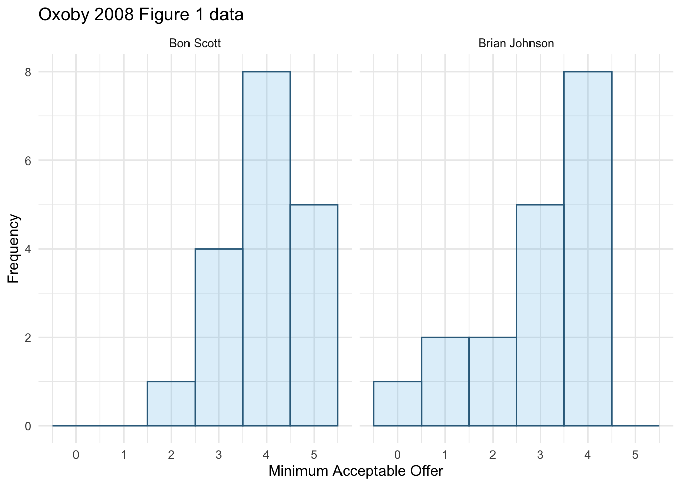
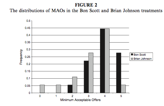
We can compare the resulting population pyramid above with Figure 2 from the original article (below). Both graphs show that MAOs were higher when participants heard the music of Bon Scott. This suggests that more offers would be rejected when listening to Bon Scott than when listening to Brian Johnson.
Next we want to produce a population pyramid for number of offers made. To do this, use this code (the only things that change are the x-variable in the first line and the label for the x-axis):
ggplot2::ggplot(oxoby_tib, aes(offer)) +
  geom_histogram(binwidth = 1, fill = "#56B4E9", colour = "#336c8b", alpha = 0.2) +
  labs(y = "Frequency", x = "Offers made", title = "Oxoby 2008 Figure 1 data") +
  scale_x_continuous(breaks = seq(0, 5, 1)) +
  facet_wrap(~singer) +
  theme_minimal()
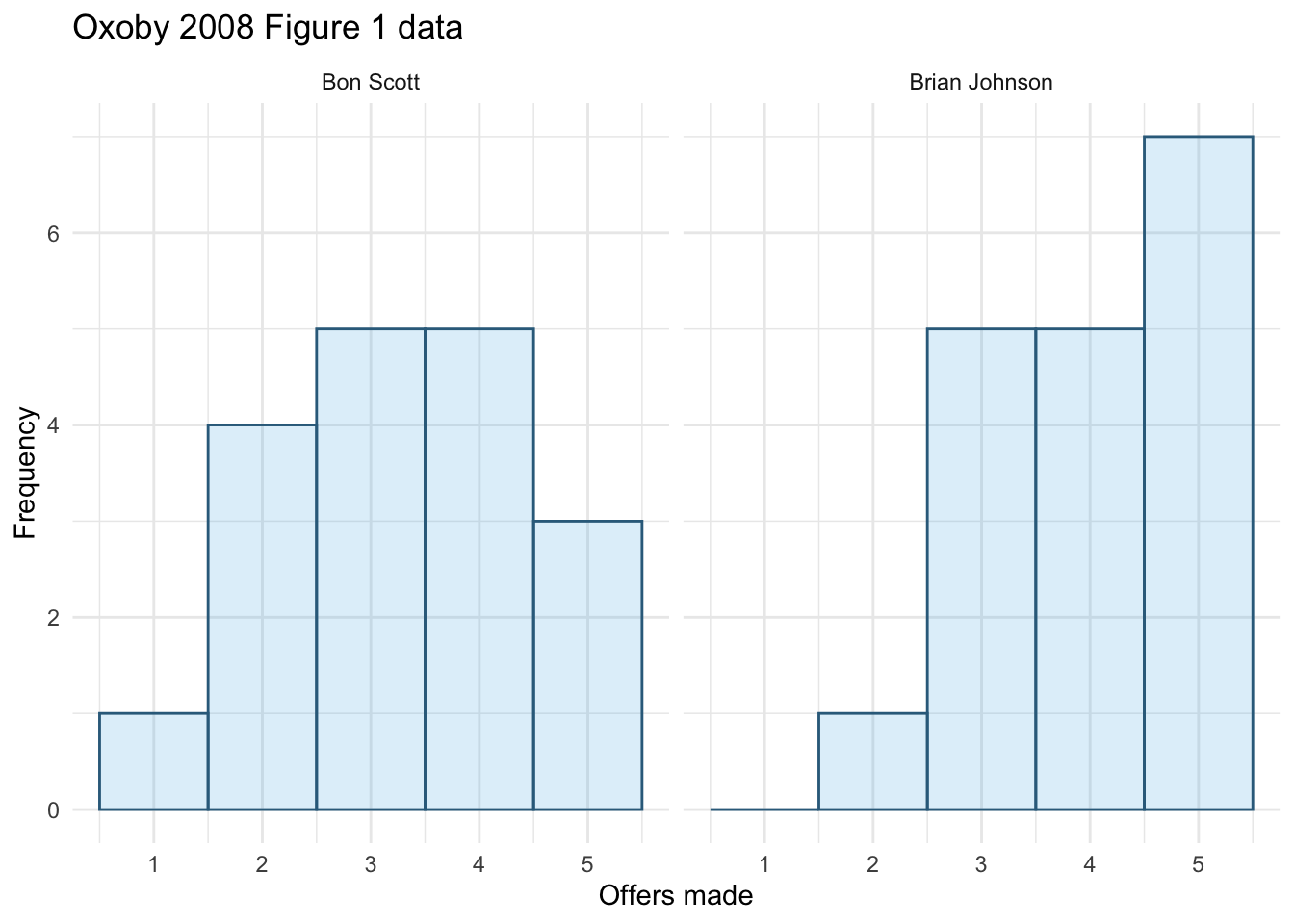
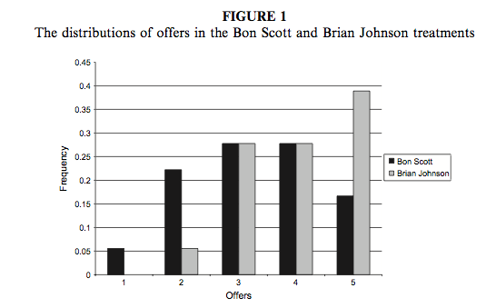
We can compare the resulting population pyramid above with Figure 1 from the original article (below). Both graphs show that offers made were lower when participants heard the music of Bon Scott.
Seeing red
Open the file and save it in a tibble called johns_tib. If you’re working from the CSV file and you have set up your project in the way described in the book (with the CSV file in a folder called data and your markdown file in a folder called r_docs) then this code should read in the data and convert the variable singer to a factor:
johns_tib <- readr::read_csv("../data/johns_2012.csv") %>%
  dplyr::mutate(
    singer = forcats::as_factor(singer)
  )
Alternative, load the data directly from the discovr package:
johns_tib <- discovr::johns_2012
The plot can be made using the following code:
ggplot2::ggplot(johns_tib, aes(colour, attractiveness)) +
  stat_summary(fun.data = "mean_cl_normal", geom = "pointrange") +
  labs(x = "Colour of genetalia", y = "Attractiveness rating (0 to 100)") +
  coord_cartesian(ylim = c(0, 50)) +
  scale_y_continuous(breaks = seq(0, 50, 5)) +
  theme_minimal()
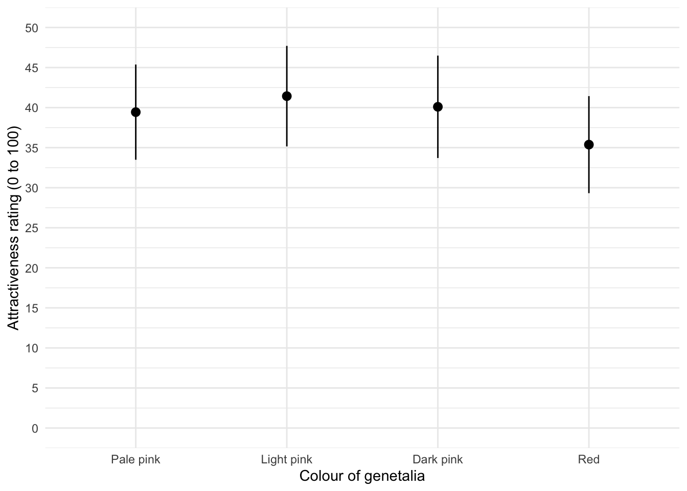
The mean ratings for all colours are fairly similar, suggesting that men don’t prefer the colour red. In fact, the colour red has the lowest mean rating, suggesting that men liked the red genitalia the least. The light pink genital colour had the highest mean rating, but don’t read anything into that: the means are all very similar.