Smart Alex solutions Chapter 11

This document contains abridged sections from Discovering Statistics Using R and RStudio by Andy Field so there are some copyright considerations. You can use this material for teaching and non-profit activities but please do not meddle with it or claim it as your own work. See the full license terms at the bottom of the page.
Task 11.1
To test how different teaching methods affected students’ knowledge I took three statistics modules (group) where I taught the same material. For one module I wandered around with a large cane and beat anyone who asked daft questions or got questions wrong (punish). In the second I encouraged students to discuss things that they found difficult and gave anyone working hard a nice sweet (reward). In the final course I neither punished nor rewarded students’ efforts (indifferent). I measured the students’ exam marks (percentage). The data are in the file teach_method.csv. Fit a model with planned contrasts to test the hypotheses that: (1) reward results in better exam results than either punishment or indifference; and (2) indifference will lead to significantly better exam results than punishment.
Load the data
To load the data from the CSV file (assuming you have set up a project folder as suggested in the book) and set the factor and its levels:
teach_tib <- readr::read_csv("../data/teach_method.csv") %>%
  dplyr::mutate(
    group = forcats::as_factor(group) %>% forcats::fct_relevel(., "Punish", "Indifferent", "Reward")
  )
Alternative, load the data directly from the discovr package:
teach_tib <- discovr::teach_method
Plot the data
Let’s do the plot first. We can get an error bar plot as follows:
ggplot2::ggplot(teach_tib, aes(group, exam)) +
  stat_summary(fun.data = "mean_cl_boot", colour = "#5c97bf") +
  coord_cartesian(ylim = c(0, 70)) +
  scale_y_continuous(breaks = seq(0, 70, 10)) +
  labs(x = "Method of teaching", y = "Percentage on exam") +
  theme_minimal()
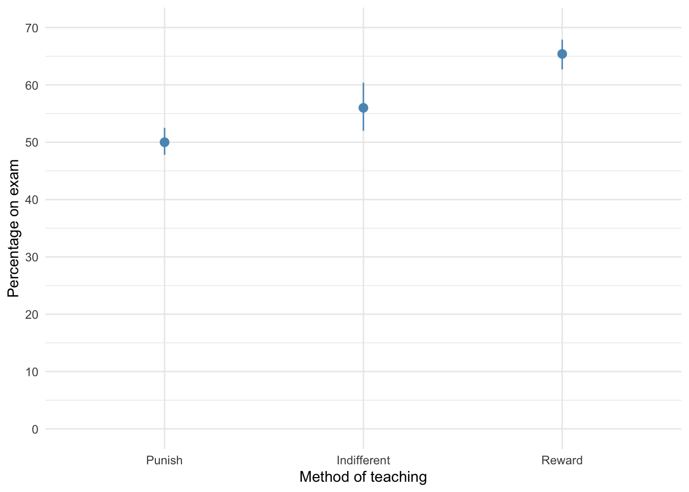
The plot shows that marks are highest after reward and lowest after punishment.
reward results in better exam results than either punishment or indifference; and (2) indifference will lead to significantly better exam results than punishment.
Fit the model
To test our hypotheses we need to first enter the following codes for the contrasts:
| Group | Reward vs. other | Indifference vs. punish |
|---|---|---|
| Punish | 1/3 | 1/2 |
| Indifferent | 1/3 | -1/2 |
| Reward | -2/3 | 0 |
Contrast 1 tests hypothesis 1: reward results in better exam results than either punishment or indifference. To test this we compare the reward condition against the other two. So we compare chunk 1 (punish, indifferent) to chunk 2 (reward). In the table, the numbers assigned to the groups are the number of groups in the opposite chunk divided by the number of groups that have non-zero codes, and we randomly assigned one chunk to be a negative value. (The codes -1/3, -1/3, 2/3 would work fine as well.)
Contrast 2 tests hypothesis 2: indifference will lead to significantly better exam results than punishment. First we get rid of the reward condition by assigning a code of 0; next we compare chunk 1 (indifferent) to chunk 2 (punish). The numbers assigned to the groups are the number of groups in the opposite chunk divided by the number of groups that have non-zero codes, and then we randomly assigned one chunk to be a negative value. (The codes -1/2, 1/2, 0 would work fine as well.)
We set these contrasts for the variable group as follows:
reward_vs_other <- c(1/3, 1/3, -2/3)
indifferent_vs_punish <- c(1/2, -1/2, 0)

contrasts(teach_tib$group) <- cbind(reward_vs_other, indifferent_vs_punish)
contrasts(teach_tib$group) # check the contrasts are set correctly
##             reward_vs_other indifferent_vs_punish
## Punish            0.3333333                   0.5
## Indifferent       0.3333333                  -0.5
## Reward           -0.6666667                   0.0
Next we fit the model using this code:
teach_lm <- lm(exam ~ group, data = teach_tib)

anova(teach_lm) %>%
  parameters::parameters(., omega_squared = "raw") %>%
  knitr::kable(digits = 3)
| Parameter | Sum_Squares | df | Mean_Square | F | p | Omega_Sq_partial |
|---|---|---|---|---|---|---|
| group | 1205.067 | 2 | 602.533 | 21.008 | 0 | 0.572 |
| Residuals | 774.400 | 27 | 28.681 | NA | NA | NA |
The output tells us that there was a significant effect of the teaching method on exam scores, F(2, 27) = 21.01, p < .001. View the parameters using:
broom::tidy(teach_lm, conf.int = TRUE) %>%
  knitr::kable(digits = 3)
| term | estimate | std.error | statistic | p.value | conf.low | conf.high |
|---|---|---|---|---|---|---|
| (Intercept) | 57.133 | 0.978 | 58.432 | 0.000 | 55.127 | 59.140 |
| groupreward_vs_other | -12.400 | 2.074 | -5.978 | 0.000 | -16.656 | -8.144 |
| groupindifferent_vs_punish | -6.000 | 2.395 | -2.505 | 0.019 | -10.914 | -1.086 |
The output shows that hypothesis 1 is supported (groupreward_vs_other): teaching with rewards led to significantly higher exam scores than the other methods, $ b = -12.40 \ [-16.66, -8.14]\text{, } t = -5.98\text{, } p < 0.001$. Hypothesis 2 is also supported (groupindifferent_vs_punish): teaching with indifference was associated with higher exam scores than teaching with punishment, $ b = -6.00 \ [-10.91, -1.09]\text{, } t = -2.51\text{, } p = 0.019 $.
Check model diagnostics
We can get some basic diagnostic plots as follows:
library(ggfortify) # remember to load this package
ggplot2::autoplot(teach_lm,
                  which = c(1, 3, 2, 4),
                  colour = "#5c97bf",
                  smooth.colour = "#ef4836",
                  alpha = 0.5,
                  size = 1) +
  theme_minimal()
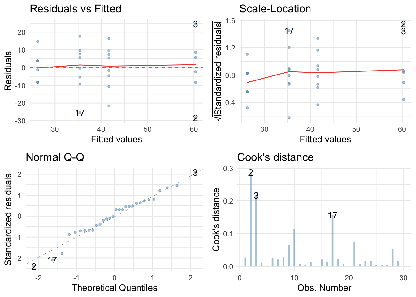
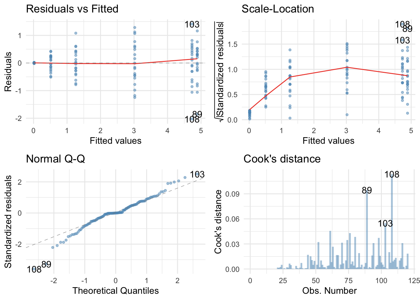
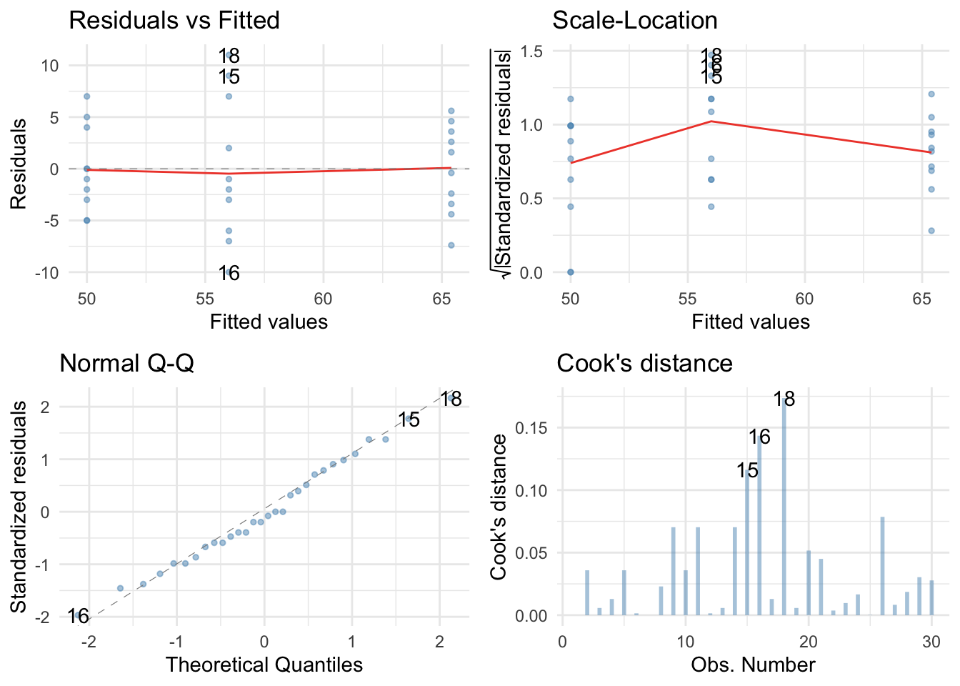 There are no large Cook’s distances, the Q-Q plot suggests normal residuals but the residual vs fitted plot and the scale-location plot suggest heterogeneity of variance (the columns of dots are different lengths and the red line is not flat especially in the scale location plot), which brings us to Task 2!
Task 11.2
Fit a robust model for Task 1.
Here’s a robust F for the teaching data:
oneway.test(exam ~ group, data = teach_tib)
##
## 	One-way analysis of means (not assuming equal variances)
##
## data:  exam and group
## F = 32.235, num df = 2.000, denom df = 17.336, p-value = 1.443e-06
The Welch F is highly significant still. Now the parameters:
parameters::model_parameters(teach_lm, robust = TRUE, vcov.type = "HC4", digits = 3)
## Parameter                  | Coefficient |    SE |          95% CI |      t | df |      p
## -----------------------------------------------------------------------------------------
## (Intercept)                |      57.133 | 1.031 | [ 55.02, 59.25] | 55.433 | 27 | < .001
## groupreward_vs_other       |     -12.400 | 1.983 | [-16.47, -8.33] | -6.254 | 27 | < .001
## groupindifferent_vs_punish |      -6.000 | 2.740 | [-11.62, -0.38] | -2.190 | 27 | 0.037
The first contrast is still highly significant and the second contrast is also still significant. As such, our conclusions are unchanged when fitting a model that is robust to heteroscedasticity.
Task 11.3
Children wearing superhero costumes are more likely to harm themselves because of the unrealistic impression of invincibility that these costumes could create. For example, children have reported to hospital with severe injuries because of trying ‘to initiate flight without having planned for landing strategies’ (Davies, Surridge, Hole, & Munro-Davies, 2007). I can relate to the imagined power that a costume bestows upon you; indeed, I have been known to dress up as Fisher by donning a beard and glasses and trailing a goat around on a lead in the hope that it might make me more knowledgeable about statistics. Imagine we had data (superhero.csv) about the severity of injury (on a scale from 0, no injury, to 100, death) for children reporting to the accident and emergency department at hospitals, and information on which superhero costume they were wearing (hero): Spiderman, Superman, the Hulk or a teenage mutant ninja turtle. Fit a model with planned contrasts to test the hypothesis that those wearing costumes of flying superheroes (Superman and Spiderman) have more severe injuries.
To get you into the mood for hulk-related data analysis, Figure 1 shows my wife and I on the Hulk rollercoaster at the islands of adventure in Orlando, on our honeymoon.

Not in the mood yet? OK, let’s ramp up the ‘weird’ with a photo (Figure 2) of some complete strangers reading one of my textbooks on the same Hulk roller-coaster that my wife and I rode (not at the same time as the book readers I should add). Nothing says ‘I love your textbook’ like taking it on a stomach-churning high speed ride. I dearly wish that reading my books on roller coasters would become a ‘thing’.

Load the data
To load the data from the CSV file (assuming you have set up a project folder as suggested in the book) and set the factor and its levels:
hero_tib <- readr::read_csv("../data/superhero.csv") %>%
  dplyr::mutate(
    hero = forcats::as_factor(hero) %>% forcats::fct_relevel(., "Superman", "Spiderman", "Hulk", "Ninja Turtle")
  )
Alternative, load the data directly from the discovr package:
hero_tib <- discovr::superhero
Plot the data
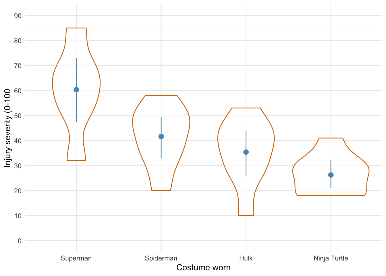
Lets start with a violin plot of the data with some error bars:
ggplot2::ggplot(hero_tib, aes(hero, injury)) +
  geom_violin(colour = "#d47500", alpha = 0.7) +
  stat_summary(fun.data = "mean_cl_boot", colour = "#5c97bf") +
  coord_cartesian(ylim = c(0, 90)) +
  scale_y_continuous(breaks = seq(0, 90, 10)) +
  labs(x = "Costume worn", y = "Injury severity (0-100") +
  theme_minimal()
Defining contrasts
To test our main hypotheses we need to first work out some contrasts. In the book, we learned rules to generate contrasts. Figure 3 shows how we would apply these to the Superhero example to plan the contrasts that we want. We’re told that we want to compare flying superheroes (i.e. Superman and Spiderman) against non-flying ones (the Hulk and Ninja Turtles) in the first instance. That will be contrast 1. However, because each of these chunks is made up of two groups (e.g., the flying superheroes chunk comprises both children wearing Spiderman and those wearing Superman costumes), we need a second and third contrast that breaks each of these chunks down into their constituent parts.
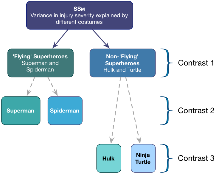
Contrast 1 compares flying (Superman, Spiderman) to non-flying (Hulk, Turtle) superheroes. Each chunk contains two groups, so the weights for the opposite chunks are both 2 divided by the number of groups with non-zero weights. This gives us \(\frac{2}{4} = \frac{1}{2}\).We assign one chunk positive weights and the other negative weights (in Table 1 I’ve chosen the flying superheroes to have positive weights, but you could do it the other way around).
Contrast two then compares the two flying superheroes to each other. First we assign both non-flying superheroes a 0 weight to remove them from the contrast. We’re left with two chunks: one containing the Superman group and the other containing the Spiderman group. Each chunk contains one group, so the weights for the opposite chunks are both 1 divided by the number of groups with non-zero weights (i.e. 1/2). We assign one chunk positive weights and the other negative weights (in Table 1 I’ve given Superman the positive weight, but you could do it the other way around).
Finally, Contrast three compares the two non-flying superheroes to each other. First we assign both flying superheroes a 0 weight to remove them from the contrast. We’re left with two chunks: one containing the Hulk group and the other containing the Turtle group. Each chunk contains one group, so the weights for the opposite chunks are both 1/2 (for the same reason as contrast 2). We assign one chunk positive weights and the other negative weights (in Table 2 I’ve given the Hulk the positive weight, but you could do it the other way around).
Table: (#tab:hero_tbl)Table 1 contrast codes for the superhero data
| Group | Flying vs. non | Superman vs. Spiderman | Hulk vs. Ninja turtle |
|---|---|---|---|
| Superman | 1/2 | 1/2 | 0 |
| Spiderman | 1/2 | -1/2 | 0 |
| Hulk | -1/2 | 0 | 1/2 |
| Ninja Turtle | -1/2 | 0 | -1/2 |
We set these contrasts for the variable hero as follows:
flying_vs_not <- c(1/2, 1/2, -1/2, -1/2)
super_vs_spider <- c(1/2, -1/2, 0, 0)
hulk_vs_ninja <- c(0, 0, 1/2, -1/2)

contrasts(hero_tib$hero) <- cbind(flying_vs_not, super_vs_spider, hulk_vs_ninja)
contrasts(hero_tib$hero) # check the contrasts are set correctly
##              flying_vs_not super_vs_spider hulk_vs_ninja
## Superman               0.5             0.5           0.0
## Spiderman              0.5            -0.5           0.0
## Hulk                  -0.5             0.0           0.5
## Ninja Turtle          -0.5             0.0          -0.5
Fit the model
Having set the contrasts, we fit the model using this code:
hero_lm <- lm(injury ~ hero, data = hero_tib)

anova(hero_lm) %>%
  parameters::parameters(., omega_squared = "raw") %>%
  knitr::kable(digits = 3)
| Parameter | Sum_Squares | df | Mean_Square | F | p | Omega_Sq_partial |
|---|---|---|---|---|---|---|
| hero | 4180.617 | 3 | 1393.539 | 8.317 | 0 | 0.423 |
| Residuals | 4356.583 | 26 | 167.561 | NA | NA | NA |
The output tells us that there was a significant effect of the costume on injury severity, F(3, 26) = 8.32, p < .001. View the parameters using:
broom::tidy(hero_lm, conf.int = TRUE) %>%
  knitr::kable(digits = 3)
| term | estimate | std.error | statistic | p.value | conf.low | conf.high |
|---|---|---|---|---|---|---|
| (Intercept) | 40.896 | 2.382 | 17.171 | 0.000 | 36.000 | 45.792 |
| heroflying_vs_not | 20.167 | 4.763 | 4.234 | 0.000 | 10.375 | 29.958 |
| herosuper_vs_spider | 18.708 | 6.991 | 2.676 | 0.013 | 4.338 | 33.078 |
| herohulk_vs_ninja | 9.125 | 6.472 | 1.410 | 0.170 | -4.179 | 22.429 |
The output shows that hypothesis 1 is supported (heroflying_vs_not): flying costumes were associated with more severe injuries than non-flying ones, $ b = 20.17 \ [10.38, 29.96]\text{, } t = 4.23\text{, } p < 0.001 $. The other contrasts tell us that Superman costumes were associated with more sever injuries than Spiderman costumes, $ b = 18.71 \ [4.34, 33.08]\text{, } t = 2.68\text{, } p = 0.013 $, but that injury severity was not significantly different between Hulk and Ninja turtle costumes, $ b = 9.13 \ [-4.18, 22.43]\text{, } t = 1.41\text{, } p = 0.170 $.
Check model diagnostics
We can get some basic diagnostic plots as follows:
library(ggfortify) # remember to load this package
ggplot2::autoplot(hero_lm,
                  which = c(1, 3, 2, 4),
                  colour = "#5c97bf",
                  smooth.colour = "#ef4836",
                  alpha = 0.5,
                  size = 1) +
  theme_minimal()
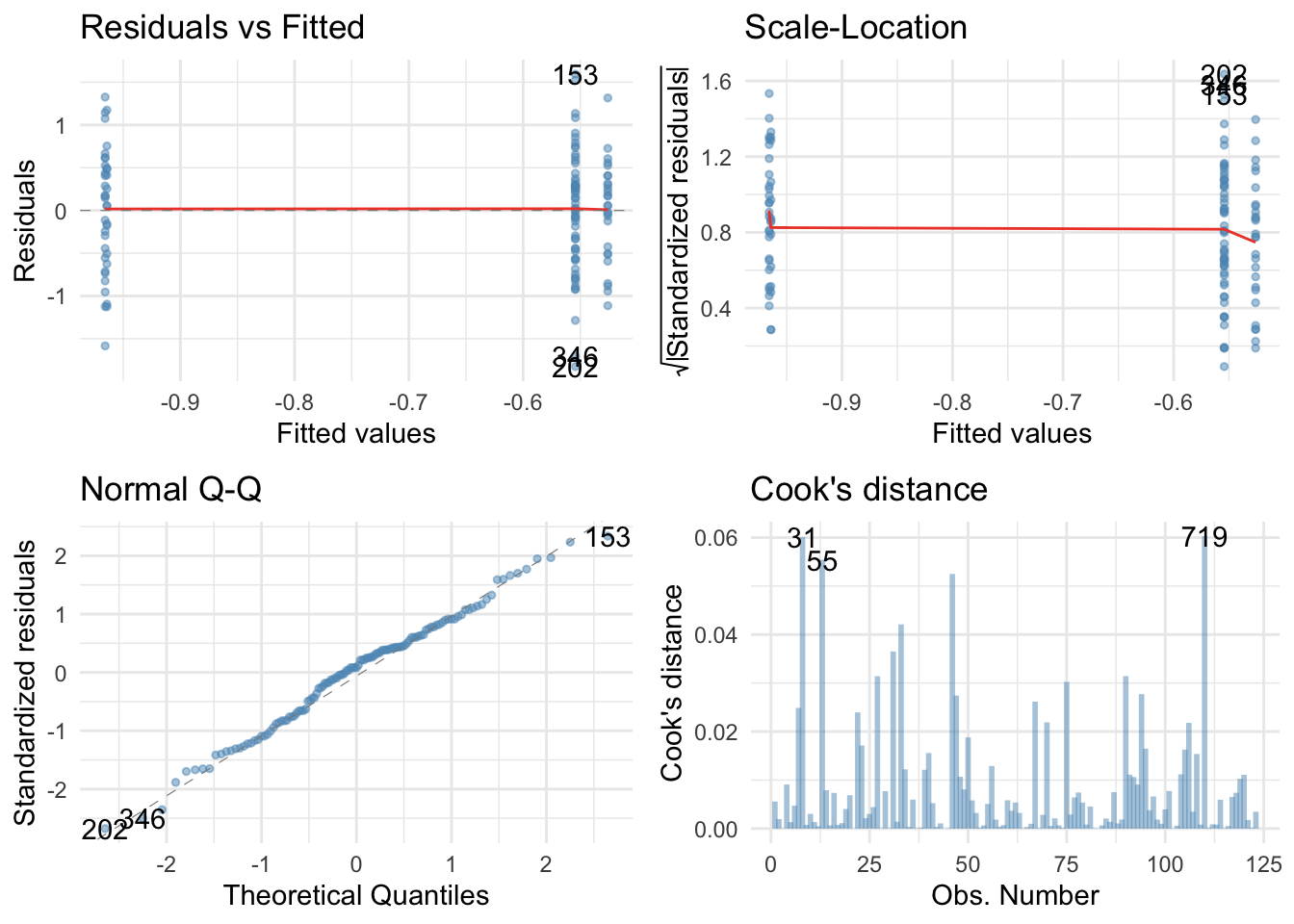
 There are no large Cook’s distances, the Q-Q plot suggests non-normal residuals and the residual vs fitted plot and the scale-location plot suggest heterogeneity of variance (the columns of dots are different lengths and the red line is not flat especially in the scale location plot). Let’s fit a robust model:
Here’s a robust F:
oneway.test(injury ~ hero, data = hero_tib)
##
## 	One-way analysis of means (not assuming equal variances)
##
## data:  injury and hero
## F = 7.0997, num df = 3.000, denom df = 13.018, p-value = 0.00453
The Welch F is highly significant still. Now the parameters:
parameters::model_parameters(hero_lm, robust = TRUE, vcov.type = "HC4", digits = 3)
## Parameter           | Coefficient |    SE |         95% CI |      t | df |      p
## ---------------------------------------------------------------------------------
## (Intercept)         |      40.896 | 2.740 | [35.26, 46.53] | 14.925 | 26 | < .001
## heroflying_vs_not   |      20.167 | 5.480 | [ 8.90, 31.43] |  3.680 | 26 | 0.001
## herosuper_vs_spider |      18.708 | 9.222 | [-0.25, 37.66] |  2.029 | 26 | 0.053
## herohulk_vs_ninja   |       9.125 | 5.924 | [-3.05, 21.30] |  1.540 | 26 | 0.136
The first contrast is still highly significant but the second contrast is not. As such, our main hypothesis is still supported: costumes of flying superheroes is associated with worse injuries than non-flying ones. Beyond that there are not significant differences.
Task 11.4
I read a story in a newspaper (yes, back when they existed) claiming that the chemical genistein, which is naturally occurring in soya, was linked to lowered sperm counts in Western males. When you read the actual study, it had been conducted on rats, it found no link to lowered sperm counts, but there was evidence of abnormal sexual development in male rats (probably because genistein acts like oestrogen). As journalists tend to do, a study showing no link between soya and sperm counts was used as the scientific basis for an article about soya being the cause of declining sperm counts in Western males. Imagine the rat study was enough for us to want to test this idea in humans. We recruit 80 males and split them into four groups that vary in the number of soya ‘meals’ (a dinner containing 75g of soya) they ate per week over a year: no soya meals (i.e., none in the whole year), one per week (52 over the year), four per week (208 over the year), and seven per week (364 over the year). At the end of the year, participants produced some sperm that I could count (when I say ‘I’, I mean someone else in a laboratory as far away from me as humanly possible). The data are in soya.csv
Load the data
To load the data from the CSV file (assuming you have set up a project folder as suggested in the book) and set the factor and its levels:
soya_tib <- readr::read_csv("../data/soya.csv") %>%
  dplyr::mutate(
    soya = forcats::as_factor(soya) %>% forcats::fct_relevel(., "No soya meals", "1 soya meal per week", "4 soya meals per week", "7 soya meals per week")
  )
Alternative, load the data directly from the discovr package:
soya_tib <- discovr::soya
Plot the data
Lets start with a boxplot of the data:
ggplot2::ggplot(soya_tib, aes(soya, sperm)) +
  geom_boxplot(colour = "#d47500", fill = "#d47500", alpha = 0.3) +
  coord_cartesian(ylim = c(0, 100)) +
  scale_y_continuous(breaks = seq(0, 100, 10)) +
  labs(x = "Number of soya meals per week", y = "Sperm count (Millions)") +
  theme_minimal()
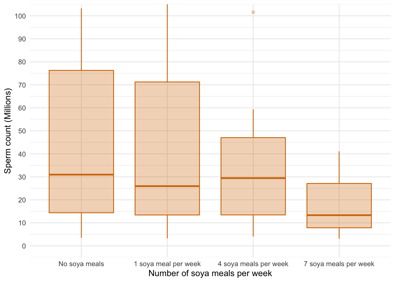
A boxplot of the data suggests that (1) scores within conditions are skewed; and (2) variability in scores is different across groups. Let’s verify this using some residual plots:
# library(ggfortify) # remember to load this package

lm(sperm ~ soya, data = soya_tib) %>%
  ggplot2::autoplot(.,
                  which = c(1, 3, 2, 4),
                  colour = "#5c97bf",
                  smooth.colour = "#ef4836",
                  alpha = 0.5,
                  size = 1) +
  theme_minimal()
Yep, just as I suspected, the residuals are properly fucked. They’re hideously non-normal and the non-flat red lines on the scale-location and residual vs fitted plots suggest heteroscedasticity. No problem, we’ll fit a robust model.
Fit the model
By default R will dummy code the predictor with the first category (no soya meals) as the reference, which makes sense so we don’t need to set contrasts.
oneway.test(sperm ~ soya, data = soya_tib)
##
## 	One-way analysis of means (not assuming equal variances)
##
## data:  sperm and soya
## F = 6.2844, num df = 3.000, denom df = 34.657, p-value = 0.001607
The Welch F is highly significant suggesting that sperm counts are significantly affected by the amount of Soya meals you eat per week. Now the parameters:
lm(sperm ~ soya, data = soya_tib) %>%
  parameters::model_parameters(., robust = TRUE, vcov.type = "HC4", digits = 3)
## Parameter                    | Coefficient |     SE |          95% CI |      t | df |      p
## --------------------------------------------------------------------------------------------
## (Intercept)                  |      49.868 | 11.664 | [ 26.64, 73.10] |  4.275 | 76 | < .001
## soya [1 soya meal per week]  |      -3.815 | 15.842 | [-35.37, 27.74] | -0.241 | 76 | 0.810
## soya [4 soya meals per week] |      -8.767 | 15.441 | [-39.52, 21.99] | -0.568 | 76 | 0.572
## soya [7 soya meals per week] |     -33.338 | 11.938 | [-57.11, -9.56] | -2.792 | 76 | 0.007
Basically, sperm counts in people who had 1 or 4 soya meals per week were not significantly different to having no soya in the diet; however, people who ate soya every day had significantly lower sperm counts than those with no soya in their diet, $ b = -33.34 \ [-57.11, -9.56]\text{, } t(76) = -2.79\text{, } p = 0.007 $.
Task 11.5
Mobile phones emit microwaves, and so holding one next to your brain for large parts of the day is a bit like sticking your brain in a microwave oven and pushing the ‘cook until well done’ button. If we wanted to test this experimentally, we could get six groups of people and strap a mobile phone on their heads, then by remote control turn the phones on for a certain amount of time each day. After six months, we measure the size of any tumour (in mm3) close to the site of the phone antenna (just behind the ear). The six groups experienced 0, 1, 2, 3, 4 or 5 hours per day of phone microwaves for six months. Do tumours significantly increase with greater daily exposure? The data are in tumour.csv.
Load the data
To load the data from the CSV file (assuming you have set up a project folder as suggested in the book) and set the factor and its levels:
tumour_tib <- readr::read_csv("../data/tumour.csv") %>%
  dplyr::mutate(
    usage = forcats::as_factor(usage) %>% forcats::fct_relevel(., "0 hours", "1 hour", "2 hours", "3 hours", "4 hours", "5 hours")
  )
Alternative, load the data directly from the discovr package:
tumour_tib <- discovr::tumour
Plot the data
Lets start with an error bar plot of the data:
ggplot2::ggplot(tumour_tib, aes(usage, tumour)) +
  stat_summary(fun.data = "mean_cl_boot", colour = "#5c97bf") +
  coord_cartesian(ylim = c(0, 7)) +
  scale_y_continuous(breaks = 0:7) +
  labs(x = "Hours on phone per day", y = bquote(Size~of~tumour~(mm^3))) +
  theme_minimal()
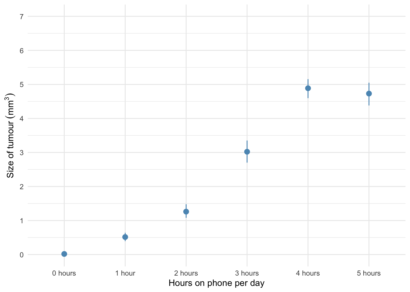
The error bar chart of the mobile phone data shows the mean size of brain tumour in each condition, and the funny ‘I’ shapes show the confidence interval of these means. Note that in the control group (0 hours), the mean size of the tumour is virtually zero (we wouldn’t expect them to have a tumour) and the error bar shows that there was very little variance across samples - this almost certainly means we cannot assume equal variances. Let’s verify this using some residual plots:
# library(ggfortify) # remember to load this package

lm(tumour ~ usage, data = tumour_tib) %>%
  ggplot2::autoplot(.,
                  which = c(1, 3, 2, 4),
                  colour = "#5c97bf",
                  smooth.colour = "#ef4836",
                  alpha = 0.5,
                  size = 1) +
  theme_minimal()
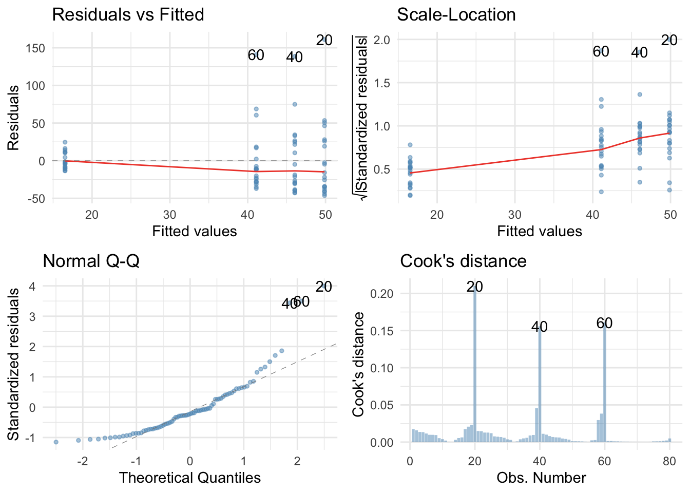
Holy shit, the residuals were bad in the last task, but these ones are fans of Rage against the machine: ‘Fuck you I won’t do what you tell me" they sing. They’re hideously non-normal and the non-flat red lines on the scale-location and residual vs. fitted plots suggest heteroscedasticity. However, we can have the last laugh by fitting a robust model.
Fit the model
By default R will dummy code the predictor with the first category (no hours on the phone) as the reference, which makes sense so we don’t need to set contrasts.
oneway.test(tumour ~ usage, data = tumour_tib)
##
## 	One-way analysis of means (not assuming equal variances)
##
## data:  tumour and usage
## F = 414.93, num df = 5.00, denom df = 44.39, p-value < 2.2e-16
The Welch F is highly significant suggesting that tumour size is significantly affected by the amount of hours the phone was active per day. Now the parameters:
lm(tumour ~ usage, data = tumour_tib) %>%
  parameters::model_parameters(., robust = TRUE, vcov.type = "HC4", digits = 3)
## Parameter       | Coefficient |    SE |       95% CI |      t |  df |      p
## ----------------------------------------------------------------------------
## (Intercept)     |       0.018 | 0.003 | [0.01, 0.02] |  6.308 | 114 | < .001
## usage [1 hour]  |       0.497 | 0.065 | [0.37, 0.63] |  7.621 | 114 | < .001
## usage [2 hours] |       1.244 | 0.113 | [1.02, 1.47] | 11.012 | 114 | < .001
## usage [3 hours] |       3.004 | 0.176 | [2.66, 3.35] | 17.102 | 114 | < .001
## usage [4 hours] |       4.870 | 0.160 | [4.55, 5.19] | 30.486 | 114 | < .001
## usage [5 hours] |       4.713 | 0.179 | [4.36, 5.07] | 26.280 | 114 | < .001
Basically, tumour sizes are significantly larger in every group compared to the control group. So, people with a phone active next to their head for 1, 2, 3, 4 or 5 hours per day had, on average, significantly larger tumours than people who did not have an active phone strapped to their heads.
Task 11.6
Using the Glastonbury data from Chapter 8 (glastonbury.csv), fit a model to see if the change in hygiene (change) is significant across people with different musical tastes (music). Use a simple contrast to compare each group against the no affiliation group.
Load the data
To load the data from the CSV file (assuming you have set up a project folder as suggested in the book) and set the factor and its levels:
glasters_tib <- readr::read_csv("../data/tumour.csv") %>%
  dplyr::mutate(
    subculture = forcats::as_factor(subculture) %>% forcats::fct_relevel(., "No subculture", "Raver", "Metalhead", "Hipster")
  )
Alternative, load the data directly from the discovr package:
glasters_tib <- discovr::glastonbury
Plot the data
Lets start with an boxplot of the data:
glasters_tib %>%
  dplyr::filter(!is.na(change)) %>% # filter out cases that have NA (missing values) on the outcome variable
  ggplot2::ggplot(., aes(subculture, change)) +
  geom_boxplot(colour = "#d47500", fill = "#d47500", alpha = 0.3) +
  coord_cartesian(ylim = c(-3, 1.5)) +
  scale_y_continuous(breaks = seq(-3, 1.5, 0.5)) +
  labs(x = "Subculture", y = "Change in hygiene scores across the festival") +
  theme_minimal()
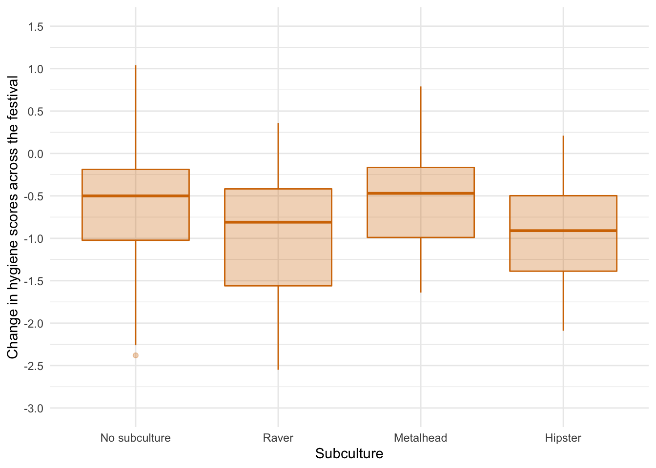
The error bar chart suggests that there was the lest decline in hygiene for people with no subculture and metalheads, and greater hygiene decline for ravers who had a similar change to hipsters. There looks like a bit of skew and different spreads of scores which might suggest the knock on effects of non-normal residuals and heteroscedasticity but let’s verify this using some residual plots:
# library(ggfortify) # remember to load this package

lm(change ~ subculture, data = glasters_tib) %>%
  ggplot2::autoplot(.,
                  which = c(1, 3, 2, 4),
                  colour = "#5c97bf",
                  smooth.colour = "#ef4836",
                  alpha = 0.5,
                  size = 1) +
  theme_minimal()
Actually the Q-Q plot suggests normal residuals and both residual plots have flat red lines suggesting homoscedasticity. Happy days..
Fit the model
By default R will dummy code the predictor with the first category (no subculture) as the reference, which makes sense so we don’t need to set contrasts. We fit the model using this code:
stink_lm <- lm(change ~ subculture, data = glasters_tib)

anova(stink_lm) %>%
  parameters::parameters(., omega_squared = "raw") %>%
  knitr::kable(digits = 3)
| Parameter | Sum_Squares | df | Mean_Square | F | p | Omega_Sq_partial |
|---|---|---|---|---|---|---|
| subculture | 4.646 | 3 | 1.549 | 3.27 | 0.024 | 0.052 |
| Residuals | 56.358 | 119 | 0.474 | NA | NA | NA |
The output tells us that there was a significant effect of the subculture membership on the change in hygiene scores, F(3, 119) = 3.27, p = .024. View the parameters using:
broom::tidy(stink_lm, conf.int = TRUE) %>%
  knitr::kable(digits = 3)
| term | estimate | std.error | statistic | p.value | conf.low | conf.high |
|---|---|---|---|---|---|---|
| (Intercept) | -0.554 | 0.090 | -6.134 | 0.000 | -0.733 | -0.375 |
| subcultureRaver | -0.412 | 0.167 | -2.464 | 0.015 | -0.742 | -0.081 |
| subcultureMetalhead | 0.028 | 0.160 | 0.177 | 0.860 | -0.289 | 0.346 |
| subcultureHipster | -0.410 | 0.205 | -2.001 | 0.048 | -0.816 | -0.004 |
The output shows that the change in hygiene scores was not statistically different between those with no subculture and metalheads, $ b = 0.03 \ [-0.29, 0.35]\text{, } t = 0.18\text{, } p = 0.860 $. However, ravers became significantly more smelly (the negative change in hygiene scores was greater in magnitude) than those with no subculture, $ b = -0.41 \ [-0.74, -0.08]\text{, } t = -2.46\text{, } p = 0.015 $, the same was true of hipsters compared to those with no subculture, $ b = -0.41 \ [-0.82, -0.00]\text{, } t = -2.00\text{, } p = 0.048 $.
Task 11.7
Repeat the analysis in Labcoat Leni’s Real Research 11.2 but using copulatory efficiency as the outcome.
Load the data
To load the data from the CSV file (assuming you have set up a project folder as suggested in the book) and set the factors and the order of their levels:
eggs_tib <- readr::read_csv("../data/cetinkaya_2006.csv") %>%
  dplyr::mutate(
    groups = forcats::as_factor(groups) %>% forcats::fct_relevel(., "Fetishistics",    "NonFetishistics", "Control"),
    paired = forcats::as_factor(paired) %>% forcats::fct_relevel(., "Paired")
  )
Alternative, load the data directly from the discovr package:
eggs_tib <- discovr::cetinkaya_2006
Let’s first plot some boxplots:
ggplot2::ggplot(eggs_tib, aes(groups, efficiency)) +
  geom_boxplot(colour = "#5c97bf", fill = "#5c97bf", alpha = 0.4) +
  coord_cartesian(ylim = c(0, 35)) +
  scale_y_continuous(breaks = seq(0, 35, 5)) +
  labs(x = "Fetish group", y = "Copulatory efficiency (out of 33)") +
  theme_minimal()
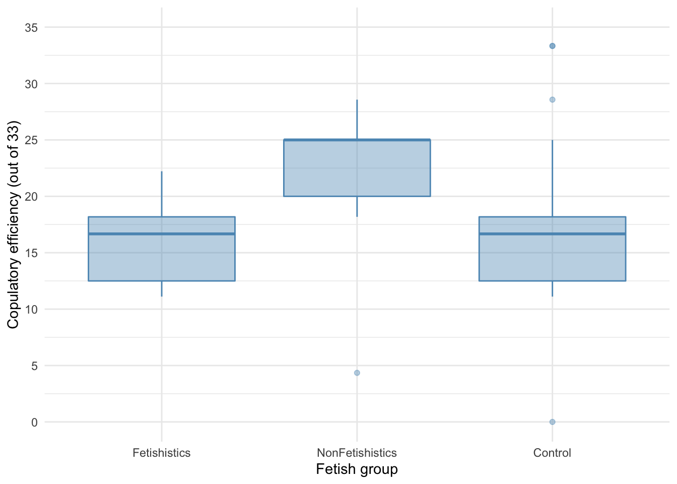
There are outliers and skew in the non-fetishistic group and skew in the control group also. The authors were wise to fit a nonparametric test. We’ll use a 20% trimmed mean test with post hoc tests.
WRS2::t1way(efficiency ~ groups, data = eggs_tib, nboot = 1000)
## Call:
## WRS2::t1way(formula = efficiency ~ groups, data = eggs_tib, nboot = 1000)
##
## Test statistic: F = 20.4689
## Degrees of freedom 1: 2
## Degrees of freedom 2: 19.64
## p-value: 2e-05
##
## Explanatory measure of effect size: 0.67
## Bootstrap CI: [0.46; 0.86]
The summary table tells us that there was a significant effect, F(2, 19.64) = 20.47, p < 0.001. Although we’ve applied a robust test rather than a nonparametric one the results of the study are confirmed. Let’s look at the post hoc tests:
WRS2::lincon(efficiency ~ groups, data = eggs_tib)
## Call:
## WRS2::lincon(formula = efficiency ~ groups, data = eggs_tib)
##
##                                    psihat  ci.lower ci.upper p.value
## Fetishistics vs. NonFetishistics -8.06818 -11.85627 -4.28009 0.00006
## Fetishistics vs. Control         -0.02818  -3.32658  3.27022 0.98268
## NonFetishistics vs. Control       8.04000   4.48846 11.59154 0.00004
There was no significant difference between the control group and the fetishistic group, $ \hat{\psi} = -0.03 [-3.33, 3.27]\text{, } p = 0.982 $, but significant differences were found between the control group and the nonfetishistic group, $ \hat{\psi} = 8.04 [4.49, 11.59]\text{, } p < 0.0017 $, and between the fetishistic group and the non-fetishistic group, $ \hat{\psi} = -8.07 [-11.86, -4.28]\text{, } p < 0.001 $. We know by looking at the boxplot (the medians in particular) that the nonfetishistic males yielded significantly higher efficiency scores than both the non-fetishistic male quail and the control male quail. These results confirm the findings reported from the nonparametric tests in the paper (page 430):
A one-way ANOVA yielded a significant main effect of groups, $ F(2, 56) = 6.04, \ p < .05, \ \eta^2 = 0.18 $. Paired comparisons (with the Bonferroni correction) indicated that the nonfetishistic male quail copulated with the live female quail (US) more efficiently than both the fetishistic male quail (mean difference = 6.61; 95% CI = 1.41, 11.82; p < .05) and the control male quail (mean difference = 5.83; 95% CI = 1.11, 10.56; p < .05). The difference between the efficiency scores of the fetishistic and the control male quail was not significant (mean difference = 0.78; 95% CI = $ -5.33, 3.77 $; p > .05).
Task 11.8
A sociologist wanted to compare murder rates (murder) recorded in each month in a year at three high-profile locations in London (street): Ruskin Avenue, Acacia Avenue and Rue Morgue. Fit a robust model with bootstrapping to see in which streets the most murders happened. The data are in murder.csv.
Load the data
To load the data from the CSV file (assuming you have set up a project folder as suggested in the book) and set the factors and the order of their levels:
murder_tib <- readr::read_csv("../data/murder.csv") %>%
  dplyr::mutate(
    street = forcats::as_factor(street) %>% forcats::fct_relevel(., "Ruskin Avenue", "Acacia Avenue", "Rue Morgue")
  )
Alternative, load the data directly from the discovr package:
murder_tib <- discovr::murder
Let’s first plot some boxplots:
ggplot2::ggplot(murder_tib, aes(street, murder)) +
  geom_boxplot(colour = "#5c97bf", fill = "#5c97bf", alpha = 0.4) +
  coord_cartesian(ylim = c(0, 7)) +
  scale_y_continuous(breaks = 0:7) +
  labs(x = "Street name", y = "Number of murders per month") +
  theme_minimal()
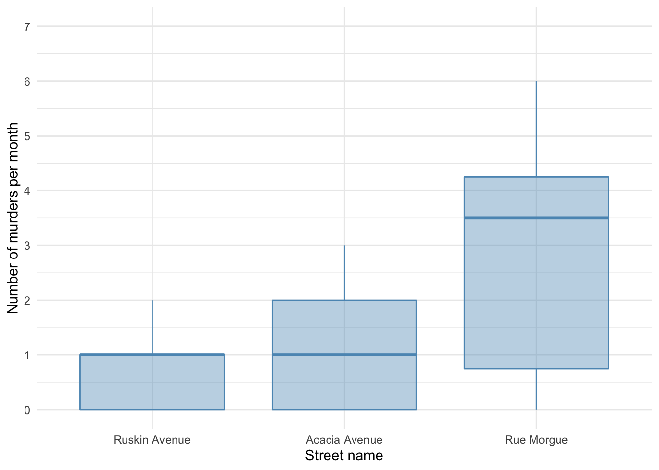
It looks like most murders were in the Rue Morgue, but there is skew in all of the groups. This is confirmed by diagnostic plots from a standard linear model:
# library(ggfortify) # remember to load this package

lm(murder ~ street, data = murder_tib) %>%
  ggplot2::autoplot(.,
                  which = c(1, 3, 2, 4),
                  colour = "#5c97bf",
                  smooth.colour = "#ef4836",
                  alpha = 0.5,
                  size = 1) +
  theme_minimal()
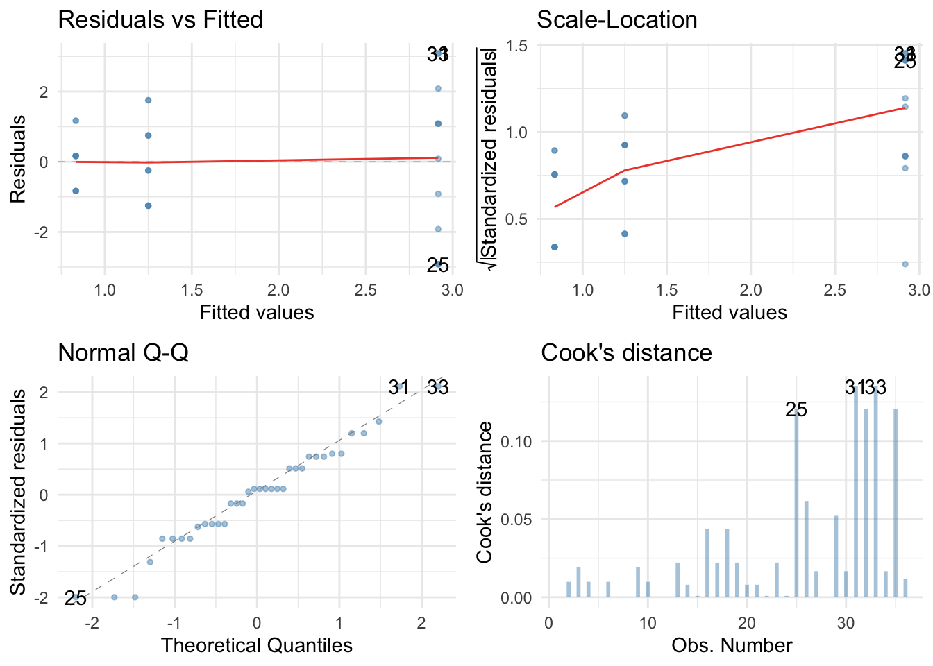
The residuals are both non-normal and heteroscedastic. We’ll use a 20% trimmed mean with bootstrap test with post hoc tests.
WRS2::t1waybt(murder ~ street, data = murder_tib, nboot = 1000)
## Call:
## WRS2::t1waybt(formula = murder ~ street, data = murder_tib, nboot = 1000)
##
## Effective number of bootstrap samples was 902.
##
## Test statistic: 2.6011
## p-value: 0.13193
## Variance explained: 0.384
## Effect size: 0.62
The summary table tells us that there was not a significant effect, F = 2.60, p = 0.135, although the effect size is large (38% of variance explained). We don’t need to look at the post hoc tests because the main effect is not significant.