Smart Alex solutions Chapter 6

This document contains abridged sections from Discovering Statistics Using R and RStudio by Andy Field so there are some copyright considerations. You can use this material for teaching and non-profit activities but please do not meddle with it or claim it as your own work. See the full license terms at the bottom of the page.
Task 6.1
Using the notebook.csv data from Chapter 5, create and interpret a Q-Q plot for the two films (ignore sex). (1).
Load the data directly from the discovr package:
notebook_tib <- discovr::notebook
Here’s the plot:
notebook_tib %>%
  ggplot2::ggplot(., aes(sample = arousal)) +
  qqplotr::stat_qq_band(fill = "#5c97bf", alpha = 0.3) +
  qqplotr::stat_qq_line(colour = "#5c97bf") +
  qqplotr::stat_qq_point(alpha = 0.2, size = 1) +
  labs(x = "Theoretical quantiles", y = "Sample quantiles") +
  facet_wrap(~film, ncol = 1, scales = "free") +
  theme_minimal()
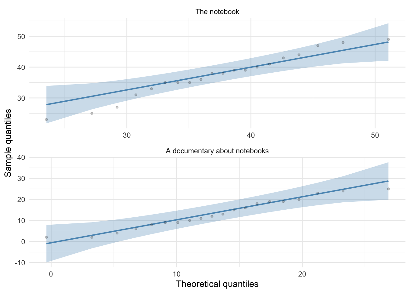
For both films the expected quantile points are close, on the whole, to those that would be expected from a normal distribution (i.e. the dots fall within the confidence interval for the line).
Task 6.2
The file r_exam.csv contains data on students’ performance on an SPSS exam. Four variables were measured: exam (first-year SPSS exam scores as a percentage), computer (measure of computer literacy in percent), lecture (percentage of statistics lectures attended) and numeracy (a measure of numerical ability out of 15). There is a variable called uni indicating whether the student attended Sussex University (where I work) or Duncetown University. Compute and interpret summary statistics for exam, computer, lecture and numeracy for the sample as a whole.
Load the data:
rexam_tib <- discovr::r_exam
Make the data long:
rexam_tidy_tib <- rexam_tib %>%
  tidyr::pivot_longer(
  cols = exam:numeracy,
  names_to = "measure",
  values_to = "score",
)
rexam_tidy_tib %>%
  dplyr::group_by(measure) %>%
  dplyr::summarize(
    valid_cases = sum(!is.na(score)),
    mean = ggplot2::mean_cl_normal(score)$y,
    ci_lower = ggplot2::mean_cl_normal(score)$ymin,
    ci_upper = ggplot2::mean_cl_normal(score)$ymax,
    skew = moments::skewness(score, na.rm = TRUE),
    kurtosis = moments::kurtosis(score, na.rm = TRUE)
  ) %>% knitr::kable(digits = 3)
| measure | valid_cases | mean | ci_lower | ci_upper | skew | kurtosis |
|---|---|---|---|---|---|---|
| computer | 100 | 50.710 | 49.071 | 52.349 | -0.172 | 3.286 |
| exam | 100 | 58.100 | 53.871 | 62.329 | -0.105 | 1.890 |
| lectures | 100 | 59.765 | 55.462 | 64.068 | -0.416 | 2.770 |
| numeracy | 100 | 4.850 | 4.313 | 5.387 | 0.947 | 3.840 |
The output shows the table of descriptive statistics for the four variables in this example. From this table, we can see that, on average, students attended nearly 60% of lectures, obtained 58% in their exam, scored only 51% on the computer literacy test, and only 5 out of 15 on the numeracy test. In addition, the confidence interval for computer literacy was relatively narrow compared to that of the percentage of lectures attended and exam scores.
Task 6.3
Produce histograms for each of the four measures in the previous task and interpret them
ggplot2::ggplot(rexam_tidy_tib, aes(score)) +
  geom_histogram(bins = 20, fill = "#56B4E9", colour = "#336c8b", alpha = 0.2) +
  labs(y = "Frequency", x = "Score") +
  facet_wrap(~measure, scale = "free") +
  theme_minimal() +
  theme(plot.title = element_text(hjust = 0.5))
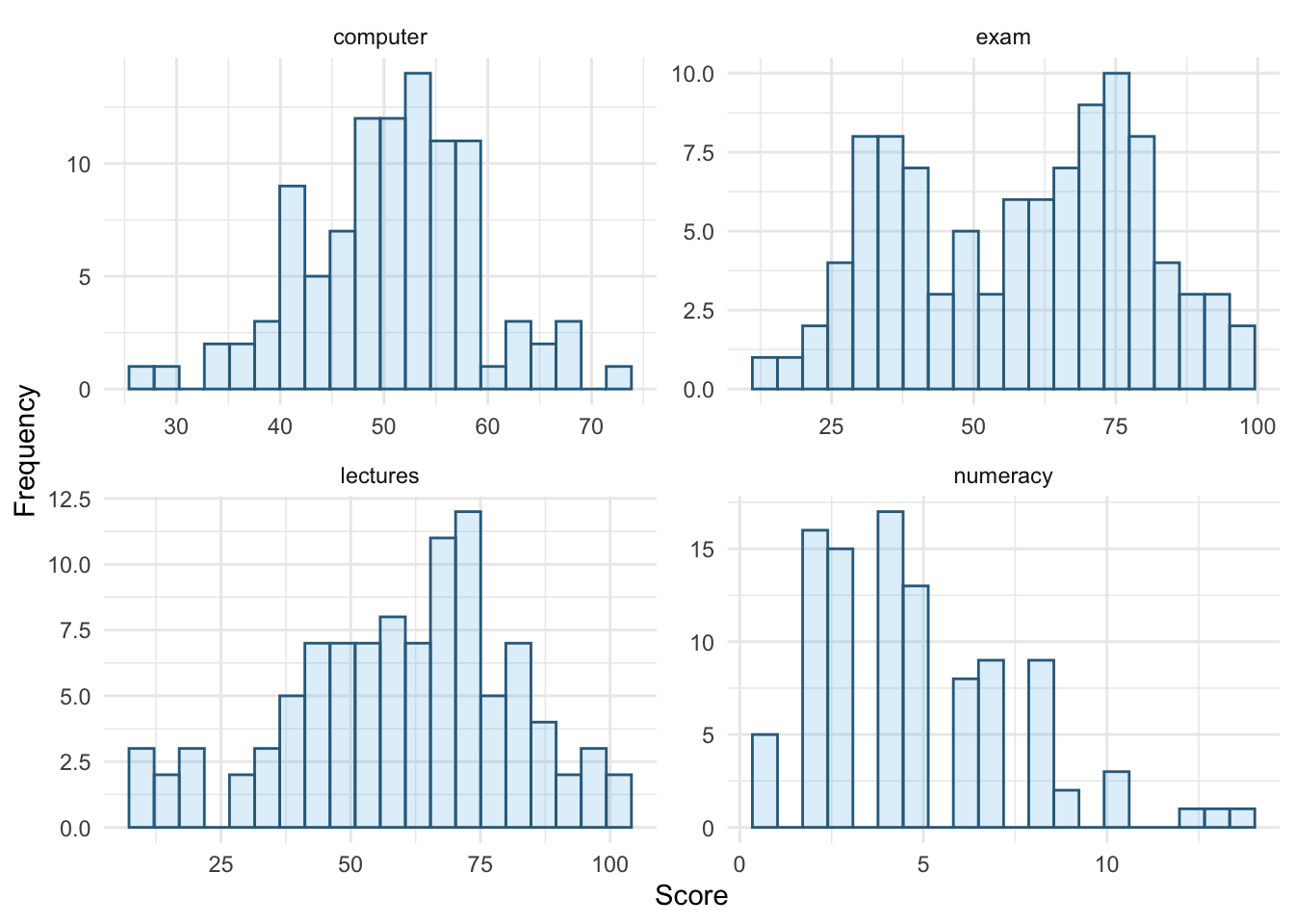
The histograms show us several things. The exam scores are very interesting because this distribution is quite clearly not normal; in fact, it looks suspiciously bimodal (there are two peaks, indicative of two modes). It looks as though computer literacy is fairly normally distributed (a few people are very good with computers and a few are very bad, but the majority of people have a similar degree of knowledge) as is the lecture attendance. Finally, the numeracy test has produced very positively skewed data (the majority of people did very badly on this test and only a few did well).
Descriptive statistics and histograms are a good way of getting an instant picture of the distribution of your data. This snapshot can be very useful: for example, the bimodal distribution of exam scores instantly indicates a trend that students are typically either very good at statistics or struggle with it (there are relatively few who fall in between these extremes). Intuitively, this finding fits with the nature of the subject: statistics is very easy once everything falls into place, but before that enlightenment occurs it all seems hopelessly difficult!
Task 6.4
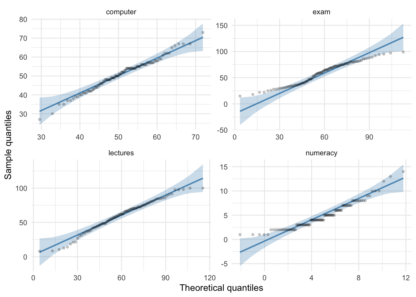
Produce Q-Q plots for the four measures in Task 2.
rexam_tidy_tib %>%
  ggplot2::ggplot(., aes(sample = score)) +
  qqplotr::stat_qq_band(fill = "#5c97bf", alpha = 0.3) +
  qqplotr::stat_qq_line(colour = "#5c97bf") +
  qqplotr::stat_qq_point(alpha = 0.2, size = 1) +
  labs(x = "Theoretical quantiles", y = "Sample quantiles") +
  facet_wrap(~measure, ncol = 2, scales = "free") +
  theme_minimal()
Task 6.5
Use Task 2 and 4 to interpret skew and kurtosis for each of the four measures.
The skewness values are calculated in the table for task 2. For all of the measures the value of skewness is fairly close to zero, indicating the expected value of 0. The exception is numeracy scores for which skew is about 1. This is within acceptable limits. Looking at the Q-Q plots, none of them show the characteristic upward or downward bend associated with skew.
For kurtosis, computer literacy and lecture attendance have kurtosis around the expected value of 3. The Q-Q plots confirm that these measures show the characteristic patterns of normality.
Exam scores have kurtosis below 2 suggesting lighter tails than you’d expect in a normal distribution, which is also shown in the Q-Q plot with observed quantiles at the low end being higher than expected and observed quantiles at the high end being lower than expected.
Numeracy scores have kurtosis close to 4 indicating heavier tails than expected in a normal distribution, but the Q-Q plot looks relatively normal (although observed quantiles rise above the normal line at the low end.
Task 6.6
Produce summary statistics for the four measures separately for each university.
rexam_tidy_tib %>%
  dplyr::group_by(uni, measure) %>%
  dplyr::summarize(
    valid_cases = sum(!is.na(score)),
    mean = ggplot2::mean_cl_normal(score)$y,
    ci_lower = ggplot2::mean_cl_normal(score)$ymin,
    ci_upper = ggplot2::mean_cl_normal(score)$ymax,
    skew = moments::skewness(score, na.rm = TRUE),
    kurtosis = moments::kurtosis(score, na.rm = TRUE)
  ) %>% knitr::kable(digits = 3)
| uni | measure | valid_cases | mean | ci_lower | ci_upper | skew | kurtosis |
|---|---|---|---|---|---|---|---|
| Duncetown University | computer | 50 | 50.26 | 47.967 | 52.553 | 0.219 | 2.418 |
| Duncetown University | exam | 50 | 40.18 | 36.602 | 43.758 | 0.300 | 2.371 |
| Duncetown University | lectures | 50 | 56.26 | 49.504 | 63.016 | -0.299 | 2.537 |
| Duncetown University | numeracy | 50 | 4.12 | 3.533 | 4.707 | 0.496 | 2.445 |
| Sussex University | computer | 50 | 51.16 | 48.743 | 53.577 | -0.522 | 4.127 |
| Sussex University | exam | 50 | 76.02 | 73.120 | 78.920 | 0.264 | 2.644 |
| Sussex University | lectures | 50 | 63.27 | 57.879 | 68.661 | -0.353 | 2.683 |
| Sussex University | numeracy | 50 | 5.58 | 4.707 | 6.453 | 0.769 | 3.117 |
From this tables it is clear that Sussex students scored higher on both their exam and the numeracy test than their Duncetown counterparts. In fact, looking at the means reveals that, on average, Sussex students scored an amazing 36% more on the exam than Duncetown students, and had higher numeracy scores too (what can I say, my students are the best). Skew statistics are all close to the expected value of 0 and most of the kurtosis values are close to the expected value of 3. The notable exception are the computer literacy scores in the Sussex students, which have a kurtosis value above 4 suggesting heavy tails.
Task 6.7
Produce and interpret histograms for the four measures split by the two universities.
ggplot2::ggplot(rexam_tidy_tib, aes(score)) +
  geom_histogram(bins = 15, fill = "#56B4E9", colour = "#336c8b", alpha = 0.2) +
  labs(y = "Frequency", x = "Score") +
  facet_grid(uni~measure, scales = "free") +
  theme_minimal() +
  theme(plot.title = element_text(hjust = 0.5))
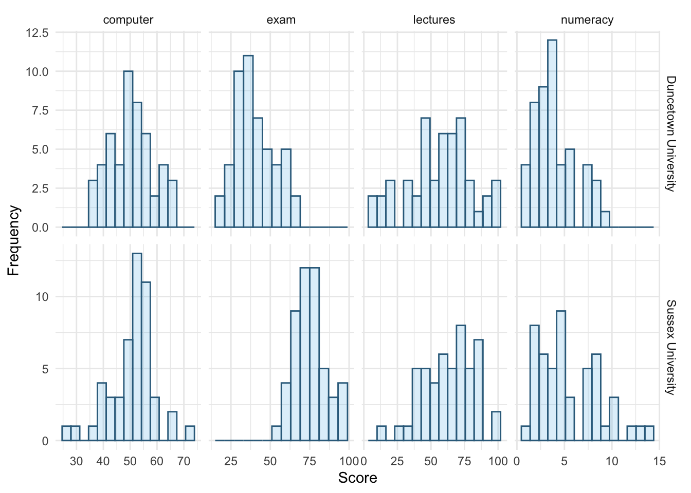
The histograms of these variables split according to the university attended show numerous things. The first interesting thing to note is that for exam marks, the distributions are both fairly normal. This seems odd because the overall distribution was bimodal. However, it starts to make sense when you consider that for Duncetown the distribution is centred around a mark of about 40%, but for Sussex the distribution is centred around a mark of about 76%. This illustrates how important it is to look at distributions within groups. If we were interested in comparing Duncetown to Sussex it wouldn’t matter that overall the distribution of scores was bimodal; all that’s important is that each group comes from a normal population, and in this case it appears to be true. When the two samples are combined, these two normal distributions create a bimodal one (one of the modes being around the centre of the Duncetown distribution, and the other being around the centre of the Sussex data!).
For numeracy scores, the distribution is slightly positively skewed (there is a larger concentration at the lower end of scores) in both the Duncetown and Sussex groups. Therefore, the overall positive skew observed before is due to the mixture of universities.
The remaining distributions look vaguely normal. The only exception is the computer literacy scores for the Sussex students. This is a fairly flat distribution apart from a huge peak between 50 and 60%. It looks potentially slightly heavy-tailed. This suggests positive kurtosis and, in fact kurtosis is above 4 in this group (see previous task).