Smart Alex solutions Chapter 5

This document contains abridged sections from Discovering Statistics Using R and RStudio by Andy Field so there are some copyright considerations. You can use this material for teaching and non-profit activities but please do not meddle with it or claim it as your own work. See the full license terms at the bottom of the page.
Task 5.1
The file students.csv contains some fictional data about students and lecturers including their number of friends, income (per anum), alcohol consumption per week (in units) and neuroticism (neurotic). Plot and interpret an error bar chart showing the mean number of friends for students and lecturers.
First, let’s load the data. If you have the discovr package loaded (which you have if you’re viewing this) you could execute:
student_tib <- discovr::students
To find out more about the data execute ?students.
To load the data into a tibble called student_tib. Alterntaively, load it from the csv file by downloading that file and setting up an rstudio project (exactly as described in Chapter 1) and executing:
student_tib <- readr::read_csv("../data/students.csv") %>%
  dplyr::mutate(
    group = forcats::as_factor(group),
  )
Remember at some point to load the tidyverse package:
library(tidyverse)
The code for the plot is:
ggplot2::ggplot(student_tib, aes(group, friends)) +
  stat_summary(fun.data = "mean_cl_normal", geom = "pointrange") +
  coord_cartesian(ylim = c(0, 20)) +
  scale_y_continuous(breaks = seq(0, 20, 2)) +
  labs(x = "Group", y = "Number of friends") +
  theme_minimal()
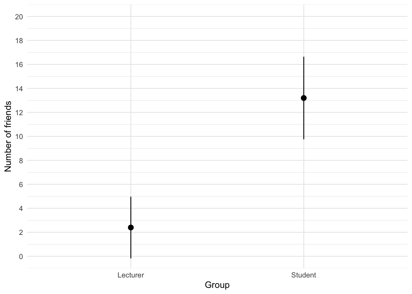
We can conclude that, on average, students had more friends than lecturers.
Task 5.2
Using the same data, plot and interpret an error bar chart showing the mean alcohol consumption for students and lecturers.
The code for the plot is:
ggplot2::ggplot(student_tib, aes(group, alcohol)) +
  stat_summary(fun.data = "mean_cl_normal", geom = "pointrange") +
  coord_cartesian(ylim = c(0, 30)) +
  scale_y_continuous(breaks = seq(0, 30, 5)) +
  labs(x = "Group", y = "Alcohol consumption per week (units)") +
  theme_minimal()
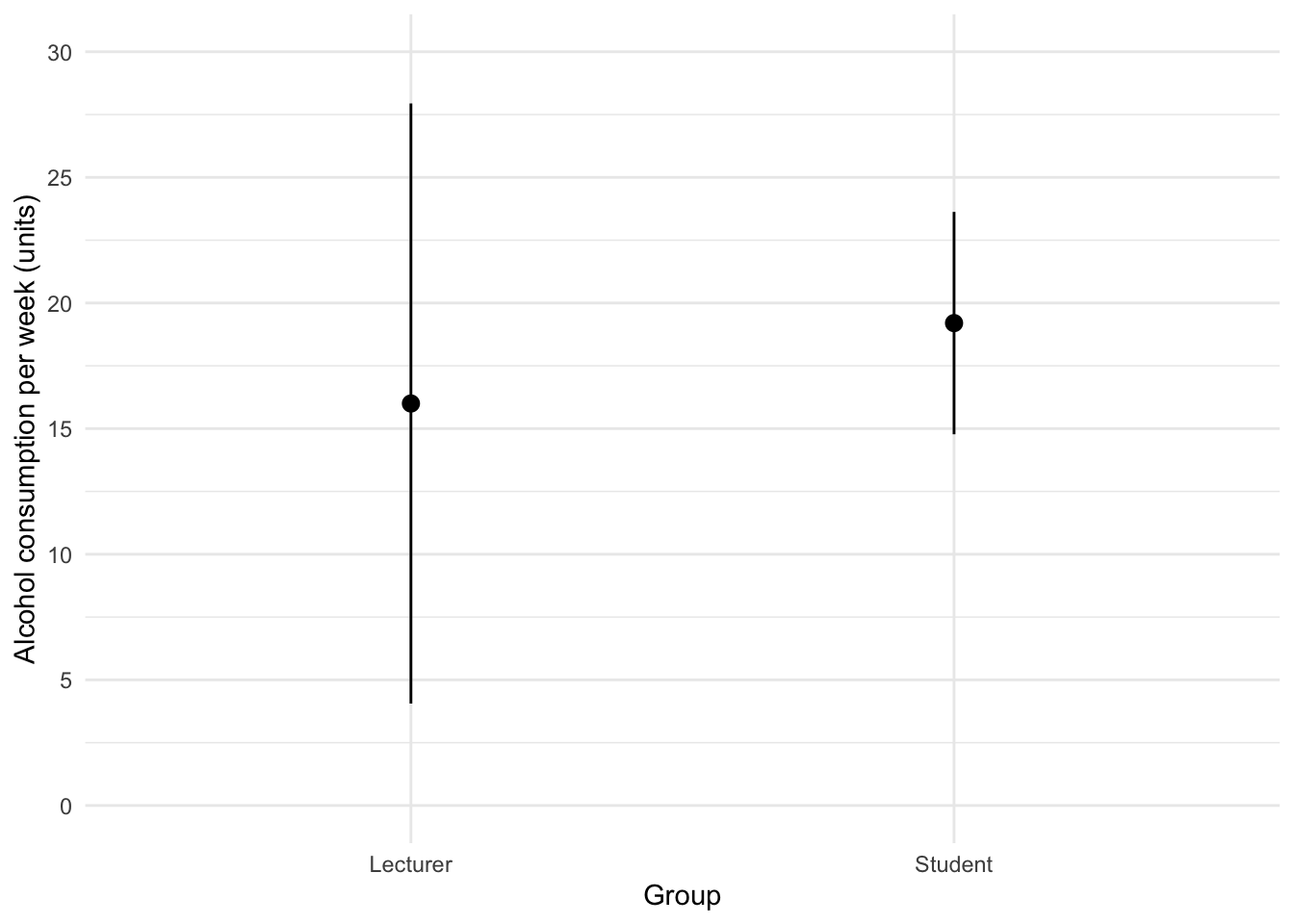
We can conclude that, on average, students and lecturers drank similar amounts, but the error bars tell us that the mean is a better representation of the population for students than for lecturers (there is more variability in lecturers’ drinking habits compared to students’).
Task 5.3
Using the same data, plot and interpret an error line chart showing the mean income for students and lecturers.
The code for the plot is:
ggplot2::ggplot(student_tib, aes(group, income)) +
  stat_summary(fun.data = "mean_cl_normal", geom = "pointrange") +
  coord_cartesian(ylim = c(0, 50000)) +
  scale_y_continuous(breaks = seq(0, 50000, 5000)) +
  labs(x = "Group", y = "Income (p.a.)") +
  theme_minimal()
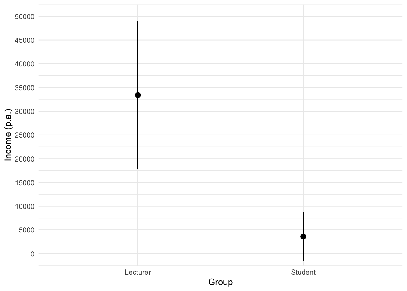
We can conclude that, on average, students earn less than lecturers, but the error bars tell us that the mean is a better representation of the population for students than for lecturers (there is more variability in lecturers’ income compared to students’).
Task 5.4
Using the same data, plot and interpret error a line chart showing the mean neuroticism for students and lecturers.
The code will be something like:
ggplot2::ggplot(student_tib, aes(group, neurotic)) +
  stat_summary(fun.data = "mean_cl_normal", geom = "pointrange") +
  coord_cartesian(ylim = c(0, 20)) +
  scale_y_continuous(breaks = seq(0, 20, 1)) +
  labs(x = "Group", y = "Neuroticism") +
  theme_minimal()
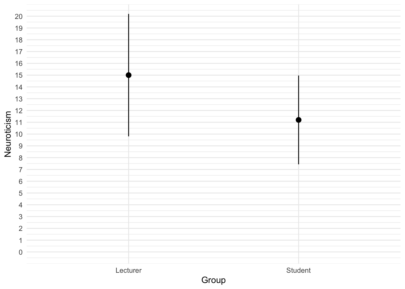
We can conclude that, on average, students are slightly less neurotic than lecturers.
Task 5.5
Using the same data, plot and interpret a scatterplot with regression lines of alcohol consumption and neuroticism grouped by lecturer/student.
The code will be something like:
ggplot2::ggplot(student_tib, aes(alcohol, neurotic, colour = group)) +
  geom_point() +
  geom_smooth(method = "lm", aes(fill = group), alpha = 0.1) +
  coord_cartesian(xlim = c(0, 30), ylim = c(0, 30)) +
  scale_x_continuous(breaks = seq(0, 30, 5)) +
  scale_y_continuous(breaks = seq(0, 30, 5)) +
  labs(x = "Alcohol consumption per week (units)", y = "Neuroticism", colour = "Group", fill = "Group") +
  theme_minimal()
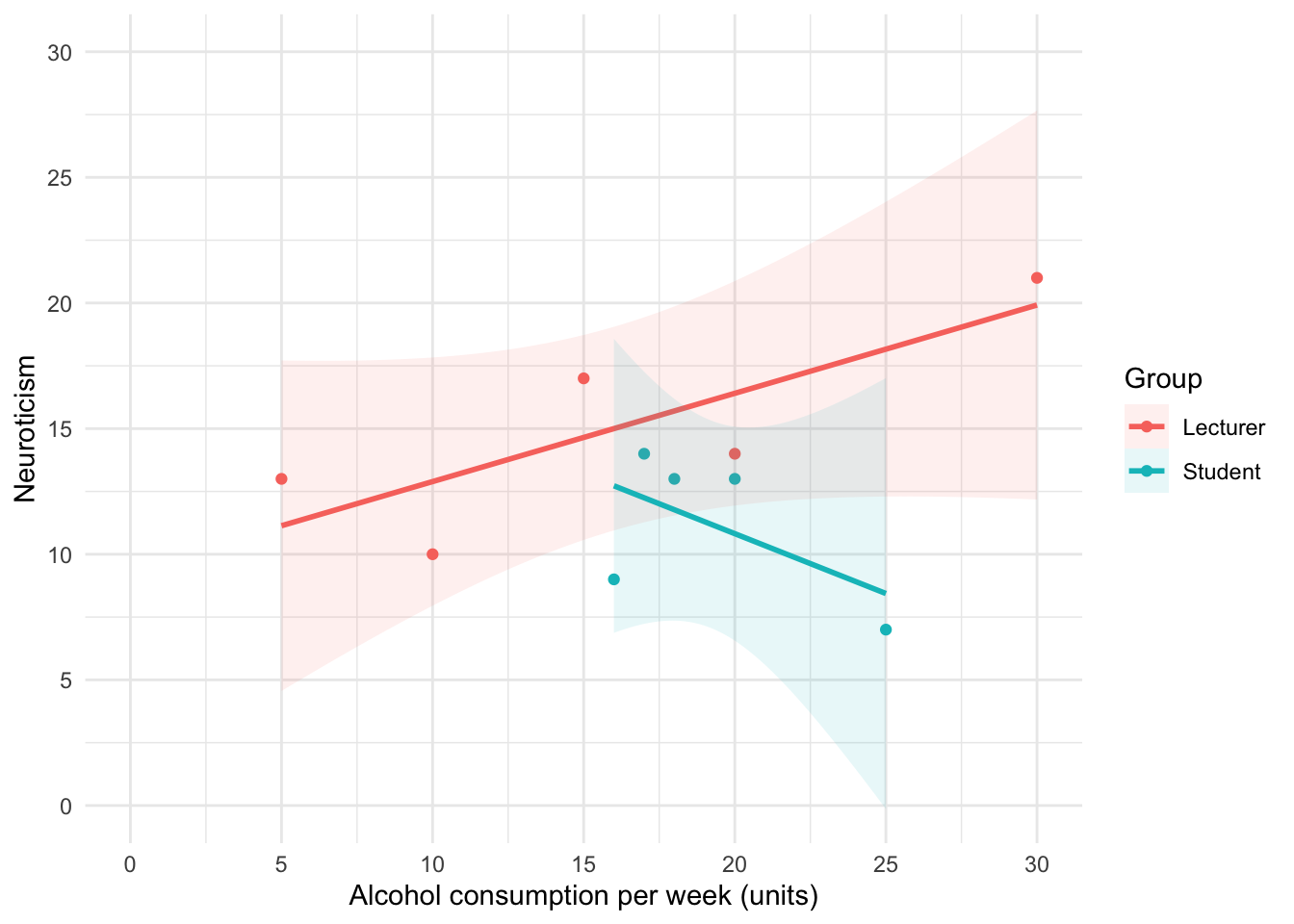
We can conclude that for lecturers, as neuroticism increases so does alcohol consumption (a positive relationship), but for students the opposite is true, as neuroticism increases alcohol consumption decreases.
Task 5.6
Using the same data, plot and interpret a scatterplot matrix with regression lines of alcohol consumption, neuroticism and number of friends.
Remember to load the GGally package:
library(GGally)
The code for the plot will be:
GGally::ggpairs(student_tib, columns = c("alcohol", "neurotic", "friends"))
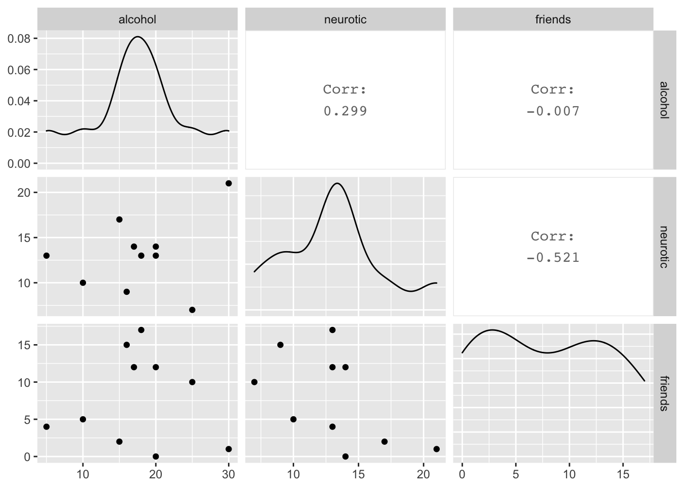
We can conclude that there is no relationship (flat line) between the number of friends and alcohol consumption; there was a negative relationship between how neurotic a person was and their number of friends ; and there was a slight positive relationship between how neurotic a person was and how much alcohol they drank.
Task 5.7
Using the zhang_2013_subsample.csv data from Chapter 1 (see Smart Alex’s task) plot a clustered error bar chart of the mean test accuracy as a function of the type of name participants completed the test under (x-axis) and whether they were male or female (different coloured bars).
First, let’s load the data. If you have the discovr package loaded (which you have if you’re viewing this) you could execute:
zhang_tib <- discovr::zhang_sample
To find out more about the data execute ?zhang_sample.
To load the data into a tibble called zhang_tib. Alternatively, load it from the csv file by downloading that file and setting up an rstudio project (exactly as described in Chapter 1) and executing:
zhang_tib <- readr::read_csv("../data/zhang_2013_subsample.csv") %>%
  dplyr::mutate(
    id = forcats::as_factor(id),
    sex = forcats::as_factor(sex),
    name_type = forcats::as_factor(name_type)
  )
To get the plot execute:
ggplot2::ggplot(zhang_tib, aes(name_type, accuracy, colour = sex)) +
  stat_summary(fun.data = "mean_cl_normal", geom = "pointrange", position = position_dodge(width = 0.5)) +
  coord_cartesian(ylim = c(0, 80)) +
  scale_y_continuous(breaks = seq(0, 80, 10)) +
  labs(x = "Type of name", y = "Accuracy (%)", colour = "Biological sex") +
  theme_minimal()
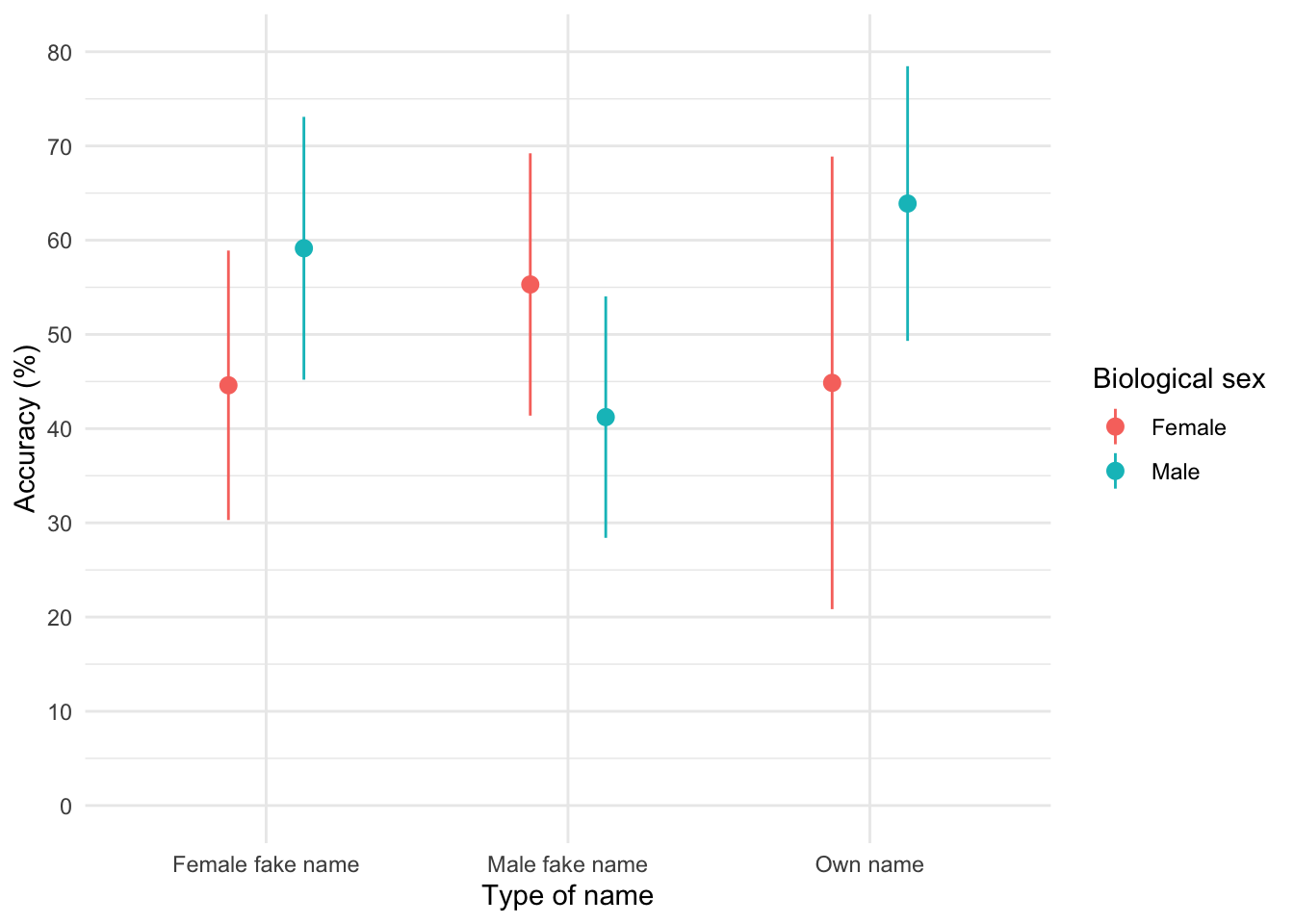
The graph shows that, on average, males did better on the test than females when using their own name (the control) but also when using a fake female name. However, for participants who did the test under a fake male name, the women did better than males.
Task 5.8
Using the method_of_teaching.csv data from Chapter 1, plot a clustered error line chart of the mean score when electric shocks were used compared to being nice, and plot males and females as different-coloured lines.
First, let’s load the data. If you have the discovr package loaded (which you have if you’re viewing this) you could execute:
teaching_tib <- discovr::teaching
To find out more about the data execute ?teaching.
To load the data into a tibble called teaching_tib. Alternatively, load it from the csv file by downloading that file and setting up an rstudio project (exactly as described in Chapter 1) and executing:
teaching_tib <- readr::read_csv("../data/method_of_teaching.csv") %>%
  dplyr::mutate(
    method = forcats::as_factor(method),
    sex = forcats::as_factor(sex)
  )
To get the plot execute:
ggplot2::ggplot(teaching_tib, aes(method, mark, colour = sex)) +
  stat_summary(fun.data = "mean_cl_normal", geom = "pointrange", position = position_dodge(width = 0.5)) +
  coord_cartesian(ylim = c(0, 20)) +
  scale_y_continuous(breaks = seq(0, 20, 1)) +
  labs(x = "Method of teaching", y = "Mark (out of 20)", colour = "Self-identified sex") +
  theme_minimal()
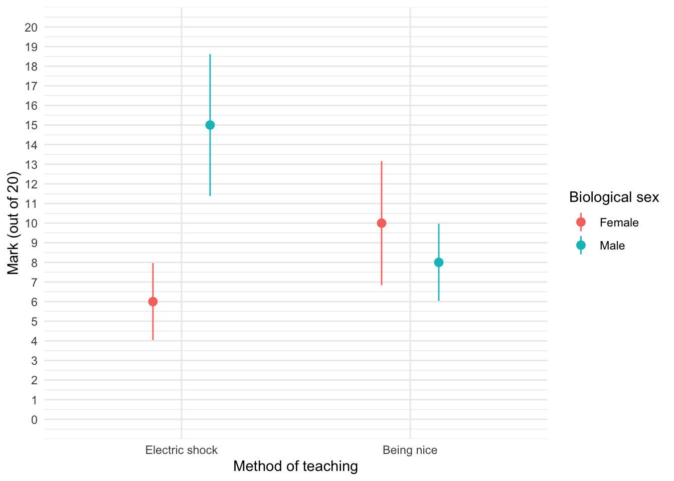
We can see that when the being nice method of teaching is used, males and females have comparable scores on their coursework, with females scoring slightly higher than males on average, although their scores are also more variable than the males’ scores as indicated by the longer error bar). However, when an electric shock is used, males score higher than females but there is more variability in the males’ scores than the females’ for this method (as seen by the longer error bar for males than for females). Additionally, the graph shows that females score higher when the being nice method is used compared to when an electric shock is used, but the opposite is true for males. This suggests that there may be an interaction effect of sex.
Task 5.9
Using the shopping_exercise.csv data from Chapter 3, plot two error bar graphs comparing men and women (x-axis): one for the distance walked, and the other of the time spent shopping.
Let’s load the data. If you have the discovr package loaded (which you have if you’re viewing this) you could execute:
shopping_tib <- discovr::shopping
To find out more about the data execute ?shopping.
To load the data into a tibble called shopping_tib. Alternatively, load it from the csv file by downloading that file and setting up an rstudio project (exactly as described in Chapter 1) and executing:
shopping_tib <- readr::read_csv("../data/shopping_exercise.csv") %>%
  dplyr::mutate(
    sex = forcats::as_factor(sex)
  )
To get the first plot execute:
ggplot2::ggplot(shopping_tib, aes(sex, distance)) +
  stat_summary(fun.data = "mean_cl_normal", geom = "pointrange", position = position_dodge(width = 0.5)) +
  coord_cartesian(ylim = c(0, 5)) +
  scale_y_continuous(breaks = seq(0, 5, 1)) +
  labs(x = "Biological sex", y = "Distance walked (Miles)") +
  theme_minimal()
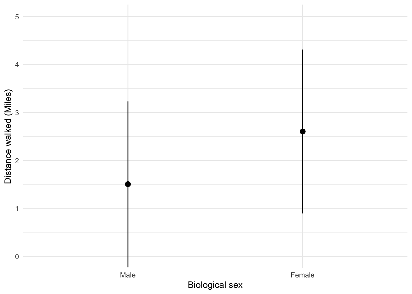
Looking at the graph above, we can see that, on average, females walk longer distances (probably not significantly so) while shopping than males.
To get the second plot execute:
ggplot2::ggplot(shopping_tib, aes(sex, time)) +
  stat_summary(fun.data = "mean_cl_normal", geom = "pointrange", position = position_dodge(width = 0.5)) +
  coord_cartesian(ylim = c(0, 260)) +
  scale_y_continuous(breaks = seq(0, 260, 20)) +
  labs(x = "Biological sex", y = "Time spent shopping (minutes)") +
  theme_minimal()
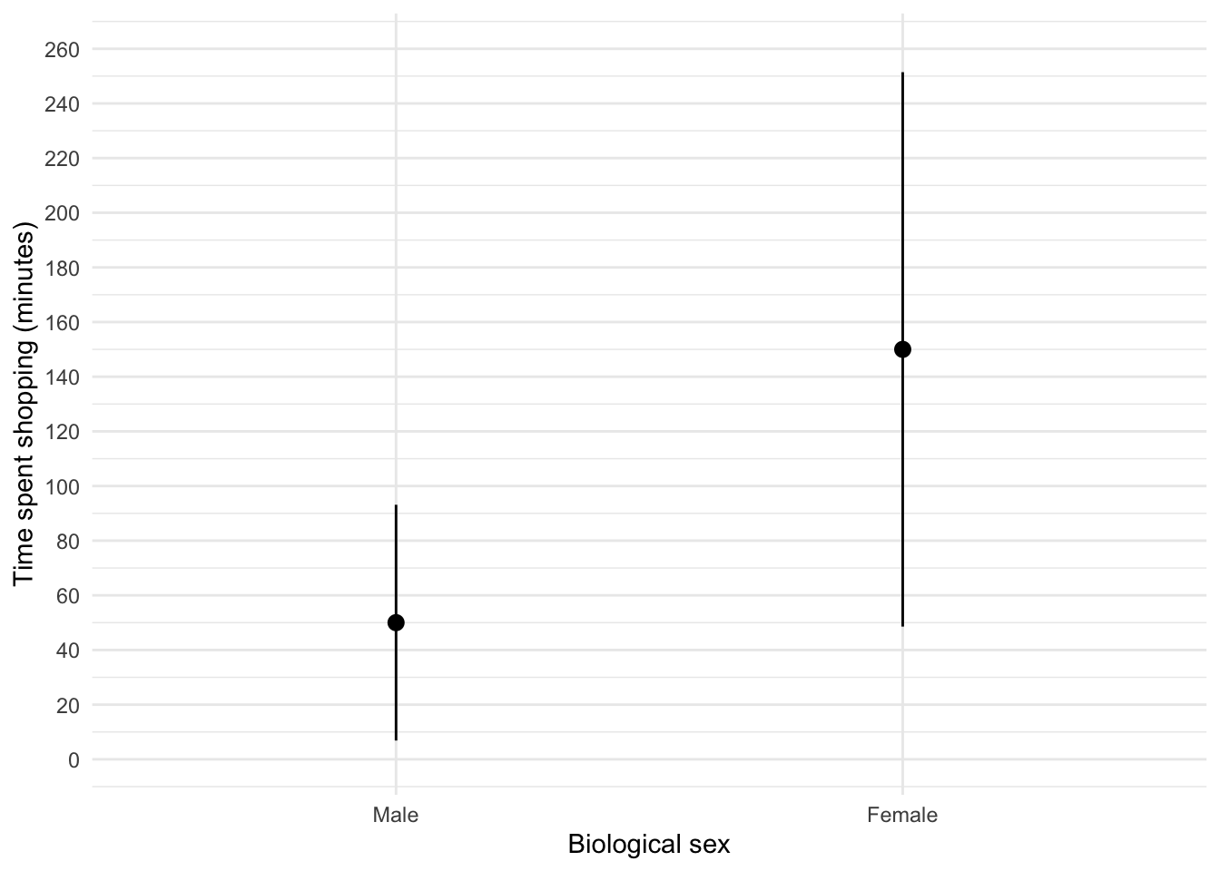
The graph shows that, on average, females spend more time shopping than males (but again, probably not significantly so). The females’ scores are more variable than the males’ scores (longer error bar).
Task 5.10
Using the goat_or_dog.csv data from Chapter 3, plot two error bar graphs comparing scores when married to a goat or a dog (x-axis): one for the animal liking variable, and the other of the life satisfaction.
Let’s load the data. If you have the discovr package loaded you could execute:
goat_tib <- discovr::animal_bride
To find out more about the data execute ?animal_bride.
To load the data into a tibble called goat_tib. Alternatively, load it from the csv file by downloading that file and setting up an rstudio project (exactly as described in Chapter 1) and executing:
goat_tib <- readr::read_csv("../data/goat_or_dog.csv") %>%
  dplyr::mutate(
    sex = forcats::as_factor(sex)
  )
To get the first plot execute:
ggplot2::ggplot(goat_tib, aes(wife, animal)) +
  stat_summary(fun.data = "mean_cl_normal", geom = "pointrange", position = position_dodge(width = 0.5)) +
  coord_cartesian(ylim = c(0, 60)) +
  scale_y_continuous(breaks = seq(0, 60, 5)) +
  labs(x = "Species of wife", y = "Liking of animals") +
  theme_minimal()
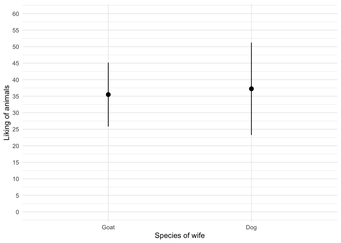
The graph shows that the mean love of animals was the same for men married to a goat as for those married to a dog. As an aside, hope that you will never in your career have to label an axis ‘Species of wife’. If ever you do , we’ve gone into strange times.
To get the second plot execute:
ggplot2::ggplot(goat_tib, aes(wife, life_satisfaction)) +
  stat_summary(fun.data = "mean_cl_normal", geom = "pointrange", position = position_dodge(width = 0.5)) +
  coord_cartesian(ylim = c(0, 80)) +
  scale_y_continuous(breaks = seq(0, 80, 10)) +
  labs(x = "Species of wife", y = "Life satisfaction") +
  theme_minimal()
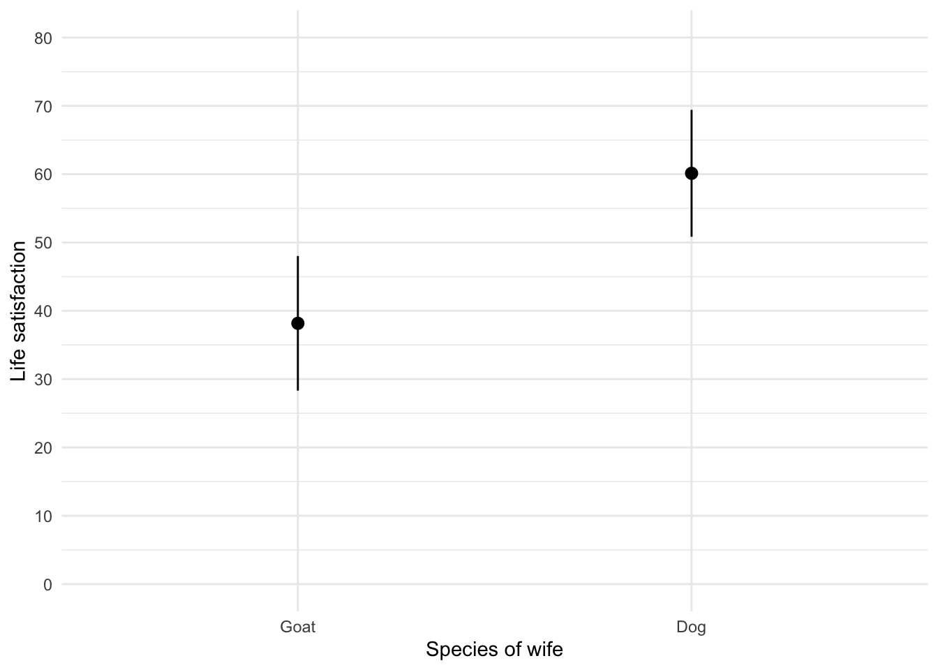
The graph shows that, on average, life satisfaction was higher in men who were married to a dog compared to men who were married to a goat.
Task 5.11
Using the same data as above, plot a scatterplot of animal liking scores against life satisfaction (plot scores for those married to dogs or goats in different colours).
The code will be something like:
ggplot2::ggplot(goat_tib, aes(animal, life_satisfaction, colour = wife)) +
  geom_point() +
  geom_smooth(method = "lm", aes(fill = wife), alpha = 0.1) +
  coord_cartesian(xlim = c(0, 75), ylim = c(0, 100)) +
  scale_x_continuous(breaks = seq(0, 75, 5)) +
  scale_y_continuous(breaks = seq(0, 100, 5)) +
  labs(x = "Animal liking", y = "Life satisfaction", colour = "Species of wife",  fill = "Species of wife") +
  theme_minimal()
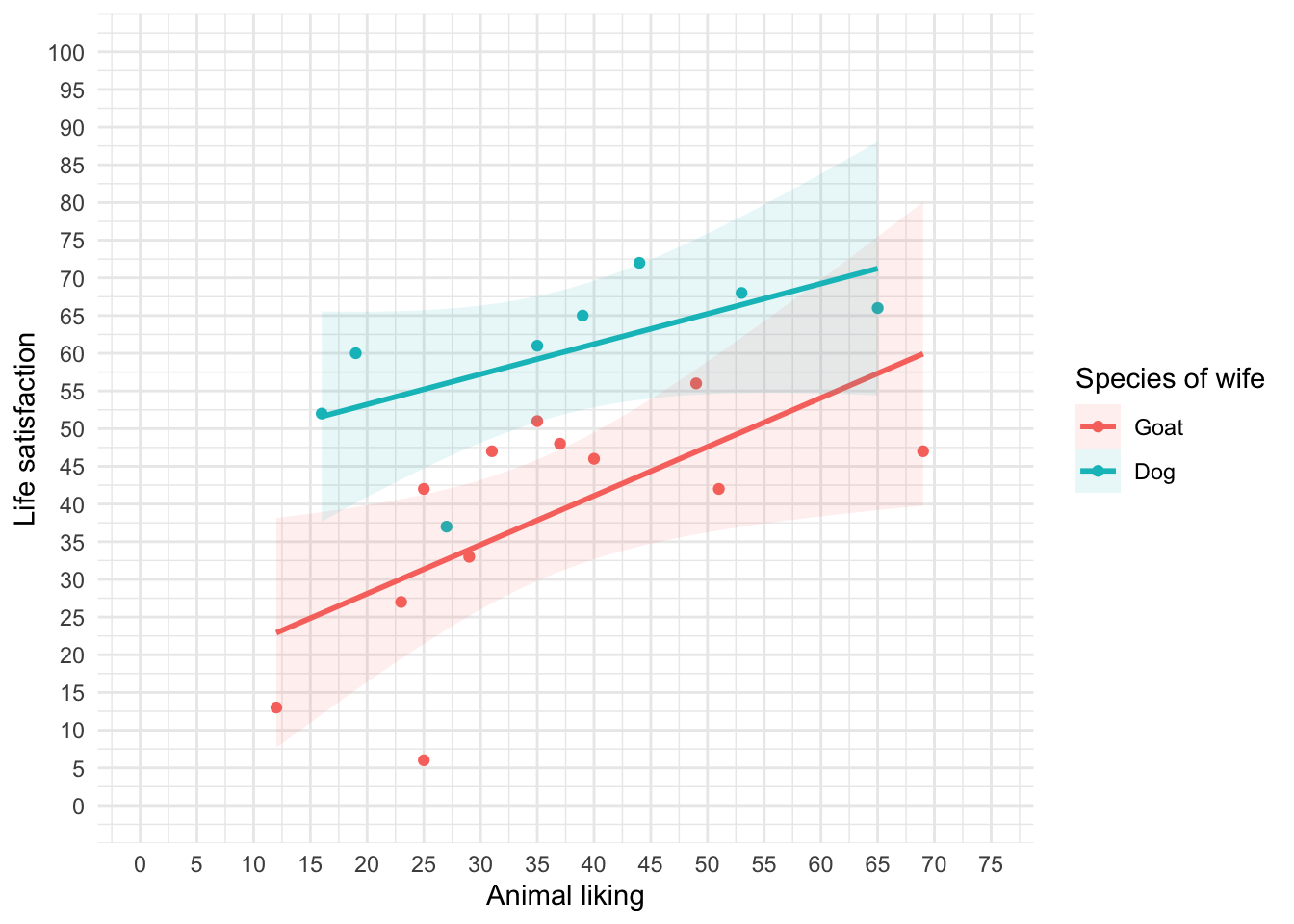
We can conclude that for men married to both goats and dogs, as love of animals increases so does life satisfaction (a positive relationship).
Task 5.12
Using the tea_makes_you_brainy_15.csv data from Chapter 3, plot a scatterplot showing the number of cups of tea drunk (tea) on the x-axis against cognitive functioning (cog_fun) and the y-axis.
Load the data. If you have the discovr package loaded you could execute:
tea15_tib <- discovr::tea_15
To find out more about the data execute ?tea_15.
To load the data into a tibble called tea15_tib. Alternatively, load it from the csv file by downloading that file and setting up an rstudio project (exactly as described in Chapter 1) and executing:
tea15_tib <- readr::read_csv("../data/tea_makes_you_brainy_15.csv") %>%
  dplyr::mutate(
    sex = forcats::as_factor(sex)
  )
The code will be something like:
ggplot2::ggplot(tea15_tib, aes(tea, cog_fun)) +
  geom_point() +
  geom_smooth(method = "lm") +
  coord_cartesian(xlim = c(0, 6), ylim = c(0, 70)) +
  scale_x_continuous(breaks = seq(0, 6, 1)) +
  scale_y_continuous(breaks = seq(0, 70, 5)) +
  labs(x = "Cups of tea drunk (per day)", y = "Cognitive functioning") +
  theme_minimal()
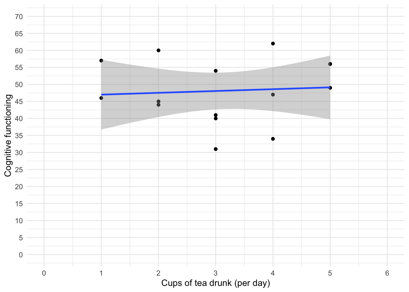
The scatterplot (and near-flat line especially) tells us that there is a tiny relationship (practically zero) between the number of cups of tea drunk per day and cognitive function.